一、组件概述
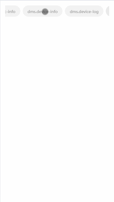
这是一个高度可定制、支持横向滚动的标签页(Tab)组件,主要用于在有限宽度的移动端展示多个标签项。组件具有以下核心特性:
- 横向滚动:当标签数量超出容器宽度时支持横向滚动
- 自动居中:选中标签自动滚动到可视区域中心
- 双向绑定 :支持
v-model控制选中状态 - 完全可定制:支持自定义标签内容和样式
- 响应式:自动适应不同屏幕宽度
- ✅ tab 样式 父组件可完全自定义(slot + class)
- ✅ 不传样式时有 默认样式
- ✅ 点击 tab 后 自动滚动到中间
- ✅ 计算 左右边界,不会滚过头
- ✅ 当前 tab 高亮
- ✅ 适配 H5 / App / 小程序(使用 scroll-view)
1️⃣ 组件能力边界
这个 Tabs 组件只负责:
- 渲染 tabs
- 管理 activeIndex
- 负责 横向滚动定位
- 提供 样式扩展能力
❌ 不负责路由
❌ 不关心业务数据结构
二、代码结构解析
2.1 模板部分
vue
<template>
   <view class="p-32rpx">
      <!-- 横向滚动容器 -->
      <scroll-view
         class="tabs-container"
         scroll-x
         :scroll-left="scrollLeft"
         scroll-with-animation
      >
         <!-- 内部容器,使用 flex 布局 -->
         <view class="tabs-inner">
            <!-- 循环渲染每个标签 -->
            <view
               v-for="(item, index) in tabs"
               :key="index"
               :ref="(el) => (tabRefs[index] = el)"
               class="tab-item"
               :class="[index === modelValue ? 'active' : '', tabClass]"
               @click="onTabClick(index)"
            >
               <!-- 插槽:允许自定义标签内容 -->
               <slot name="tab" :item="item" :index="index" :active="index === modelValue">
                  <!-- 默认内容:显示标签文本 -->
                  <text class="tab-text">{{ item.label }}</text>
               </slot>
            </view>
         </view>
      </scroll-view>
   </view>
</template>
关键点说明:
scroll-view的scroll-x属性启用横向滚动:scroll-left动态控制滚动位置scroll-with-animation启用平滑滚动动画- 使用
ref收集每个标签的 DOM 引用 - 插槽设计让组件高度可定制
2.2 逻辑部分
typescript
<script setup lang="ts">
import { ref, nextTick, watch } from "vue";

// 定义 Tab 项的数据结构
export interface TabItem {
   label: string;
   value?: any;
}

// 组件 Props
const props = defineProps<{
   tabs: TabItem[];           // Tab 数据源
   modelValue: number;        // 当前选中索引
   tabClass?: string;         // 自定义样式类
}>();

// 组件事件
const emit = defineEmits<{
   (e: "update:modelValue", val: number): void;
   (e: "change", val: number): void;
}>();

// 响应式数据
const scrollLeft = ref(0);    // 滚动位置
const tabRefs = ref<any[]>([]); // Tab DOM 引用集合

// 标签点击处理
function onTabClick(index: number) {
   if (index === props.modelValue) return; // 防止重复点击
   emit("update:modelValue", index);
   emit("change", index);
}

// 自动滚动到选中标签(核心功能)
function scrollToActive(index: number) {
   nextTick(() => {
      const query = uni.createSelectorQuery();

      query
         .select(".tabs-container")    // 获取容器信息
         .boundingClientRect()
         .selectAll(".tab-item")       // 获取所有标签信息
         .boundingClientRect()
         .exec((res) => {
            const container = res?.[0];
            const items = res?.[1];

            if (!container || !items?.length) return;

            const containerWidth = container.width;

            const current = items[index];
            if (!current) return;

            /* ===============================
             * 1️⃣ 计算真实内容宽度
             * =============================== */
            const contentWidth = Math.round(
               items[items.length - 1].right - items[0].left
            );

            /* ===============================
             * 2️⃣ 计算当前标签中心点
             * =============================== */
            const itemCenter = Math.round(
               current.left + current.width / 2 - items[0].left
            );

            /* ===============================
             * 3️⃣ 计算目标滚动位置
             * =============================== */
            let targetScroll = itemCenter - containerWidth / 2;

            // 最大可滚动距离
            const maxScroll = Math.max(0, contentWidth - containerWidth);

            /* ===============================
             * 4️⃣ 边界修正
             * =============================== */
            if (targetScroll < 0) targetScroll = 0;
            if (targetScroll > maxScroll) targetScroll = maxScroll;

            scrollLeft.value = Math.round(targetScroll);
         });
   });
}

// 监听选中索引变化
watch(
   () => props.modelValue,
   (val) => {
      scrollToActive(val);
   },
   { immediate: true }
);
</script>
2.3 样式部分
scss
<style scoped>
.tabs-container {
   white-space: nowrap; /* 防止换行 */
}

.tabs-inner {
   display: flex; /* 水平排列 */
}

.tab-item {
   flex-shrink: 0; /* 防止压缩 */
   padding: 16rpx 32rpx;
   border-radius: 999rpx; /* 圆形按钮 */
   margin-right: 16rpx;
   background: #f2f2f2;
   color: #999;
}

.tab-item.active {
   background: #eaeaea;
   color: #333;
}

.tab-text {
   font-size: 26rpx;
}
</style>
三、核心算法详解
3.1 自动居中滚动算法
这是组件的核心功能,算法分为四个步骤:
步骤1:计算真实内容宽度
javascript
const contentWidth = Math.round(
   items[items.length - 1].right - items[0].left
);- 使用最后一个标签的
right减去第一个标签的left - 得到所有标签的实际总宽度(包括间距)
- 比简单累加每个标签宽度更准确
步骤2:计算当前标签中心点
javascript
const itemCenter = Math.round(
   current.left + current.width / 2 - items[0].left
);current.left:当前标签相对于视口的左边距current.width / 2:标签宽度的一半- items[0].left:减去第一个标签的偏移,得到相对于内容起点的位置
步骤3:计算目标滚动位置
javascript
let targetScroll = itemCenter - containerWidth / 2;- 让标签中心点与容器中心点对齐
- 这是实现"居中"效果的关键计算
步骤4:边界修正
javascript
const maxScroll = Math.max(0, contentWidth - containerWidth);
if (targetScroll < 0) targetScroll = 0;
if (targetScroll > maxScroll) targetScroll = maxScroll;- 确保不会滚动到内容开始之前
- 确保不会滚动到内容结束之后
- 处理内容宽度小于容器宽度的情况
3.2 滚动动画优化
vue
<scroll-view scroll-with-animation>scroll-with-animation启用平滑滚动- 避免生硬的跳转,提升用户体验
- UniApp 内部使用 CSS transition 实现
四、使用示例
4.1 基础用法
vue
<template>
  <view>
    <CustomTabs
      v-model="activeIndex"
      :tabs="tabList"
      @change="onTabChange"
    />

    <!-- 内容区域 -->
    <view v-if="activeIndex === 0">内容1</view>
    <view v-if="activeIndex === 1">内容2</view>
  </view>
</template>

<script setup lang="ts">
import { ref } from 'vue';
import CustomTabs from '@/components/CustomTabs.vue';

const activeIndex = ref(0);

const tabList = [
  { label: '标签1', value: 'tab1' },
  { label: '标签2', value: 'tab2' },
  { label: '标签3', value: 'tab3' },
  { label: '标签4', value: 'tab4' },
  { label: '标签5', value: 'tab5' },
];

const onTabChange = (index: number) => {
  console.log('切换到标签:', index);
};
</script>
4.2 自定义标签样式
vue
<template>
  <CustomTabs
    v-model="activeIndex"
    :tabs="tabList"
    tab-class="custom-tab-style"
  >
    <template #tab="{ item, index, active }">
      <view :class="['custom-tab', { 'custom-active': active }]">
        <text class="icon">{{ item.icon }}</text>
        <text class="label">{{ item.label }}</text>
        <text v-if="item.badge" class="badge">{{ item.badge }}</text>
      </view>
    </template>
  </CustomTabs>
</template>

<script setup>
const tabList = [
  { label: '首页', icon: '🏠', badge: '3' },
  { label: '消息', icon: '📨', badge: '99+' },
  { label: '发现', icon: '🔍' },
];
</script>

<style>
.custom-tab {
  padding: 20rpx 40rpx;
  border-radius: 40rpx;
  background: linear-gradient(135deg, #667eea 0%, #764ba2 100%);
  color: white;
}

.custom-active {
  background: linear-gradient(135deg, #f093fb 0%, #f5576c 100%);
  transform: scale(1.05);
}
</style>
4.3 配合内容切换
vue
<template>
  <view class="page">
    <!-- Tab 导航 -->
    <CustomTabs v-model="activeTab" :tabs="tabs" />

    <!-- 内容区域,使用动态组件 -->
    <swiper
      class="content-swiper"
      :current="activeTab"
      @change="onSwiperChange"
      :duration="300"
    >
      <swiper-item v-for="(tab, index) in tabs" :key="index">
        <view class="content-item">
          <component :is="tab.component" />
        </view>
      </swiper-item>
    </swiper>
  </view>
</template>

<script setup lang="ts">
import { ref, defineAsyncComponent } from 'vue';

const activeTab = ref(0);

const tabs = [
  {
    label: '推荐',
    component: defineAsyncComponent(() => import('./Recommend.vue'))
  },
  {
    label: '热门',
    component: defineAsyncComponent(() => import('./Hot.vue'))
  },
  {
    label: '关注',
    component: defineAsyncComponent(() => import('./Follow.vue'))
  }
];

const onSwiperChange = (e: any) => {
  activeTab.value = e.detail.current;
};
</script>

<style>
.page {
  display: flex;
  flex-direction: column;
  height: 100vh;
}

.content-swiper {
  flex: 1;
}

.content-item {
  height: 100%;
  overflow-y: auto;
}
</style>
五、性能优化建议
5.1 避免不必要的重渲染
vue
<script setup lang="ts">
// 使用 shallowRef 优化 DOM 引用
const tabRefs = shallowRef<any[]>([]);

// 使用 computed 缓存计算结果
const activeTabStyle = computed(() => {
  return props.modelValue === index ? 'active' : '';
});

// 使用防抖处理频繁点击
const onTabClick = useDebounceFn((index: number) => {
  if (index === props.modelValue) return;
  emit("update:modelValue", index);
}, 200);
</script>
5.2 虚拟滚动支持
对于大量标签的情况(如城市选择器):
vue
<template>
  <scroll-view
    class="tabs-container"
    scroll-x
    :scroll-left="scrollLeft"
  >
    <!-- 虚拟滚动容器 -->
    <view
      class="virtual-container"
      :style="{ width: totalWidth + 'px' }"
    >
      <!-- 只渲染可见区域的标签 -->
      <view
        v-for="index in visibleRange"
        :key="index"
        class="tab-item"
        :style="{ left: positions[index] + 'px' }"
      >
        {{ tabs[index].label }}
      </view>
    </view>
  </scroll-view>
</template>

<script setup>
// 计算可见范围
const visibleRange = computed(() => {
  const start = Math.floor(scrollLeft.value / itemWidth);
  const end = start + Math.ceil(containerWidth / itemWidth) + 2;
  return Array.from({ length: end - start }, (_, i) => start + i);
});
</script>
5.3 懒加载标签内容
vue
<script setup>
// 使用 defineAsyncComponent 懒加载复杂标签
const ComplexTab = defineAsyncComponent({
  loader: () => import('./ComplexTabContent.vue'),
  loadingComponent: () => import('./TabLoading.vue'),
  delay: 100,
  timeout: 3000
});

// 按需渲染
const shouldLoadTab = (index: number) => {
  return Math.abs(index - props.modelValue) <= 1;
};
</script>
六、常见问题解决
6.1 滚动位置不准确
问题:在页面初始化或动态添加标签时,滚动位置计算错误。
解决方案:
javascript
function scrollToActive(index: number) {
  nextTick(() => {
    // 等待 DOM 更新
    setTimeout(() => {
      const query = uni.createSelectorQuery();
      // ... 计算逻辑
    }, 50);
  });
}
6.2 标签间距不一致
问题 :使用 margin-right 可能导致最后一个标签有额外间距。
解决方案:
scss
.tab-item {
  &:not(:last-child) {
    margin-right: 16rpx;
  }
}
6.3 安卓/iOS 滚动差异
问题:不同平台滚动行为不一致。
解决方案:
vue
<scroll-view
  :scroll-left="scrollLeft"
  scroll-with-animation
  :show-scrollbar="false"
  :enhanced="true"  <!-- 启用增强滚动 -->
  :bounces="false"  <!-- 禁用弹性效果 -->
>
</scroll-view>
七、扩展功能
7.1 添加底部指示器
vue
<template>
  <view class="tabs-wrapper">
    <scroll-view class="tabs-container" ...>
      <!-- 标签内容 -->
    </scroll-view>

    <!-- 底部指示器 -->
    <view class="indicator-wrapper">
      <view
        class="indicator"
        :style="indicatorStyle"
      ></view>
    </view>
  </view>
</template>

<script setup>
const indicatorStyle = computed(() => {
  const query = uni.createSelectorQuery();

  return {
    width: `${currentTabWidth}px`,
    transform: `translateX(${currentTabLeft}px)`,
    transition: 'all 0.3s ease'
  };
});
</script>
7.2 支持粘性定位
vue
<template>
  <view class="sticky-tabs" :style="{ top: stickyTop }">
    <CustomTabs :tabs="tabs" v-model="activeTab" />
  </view>
</template>

<style>
.sticky-tabs {
  position: sticky;
  z-index: 100;
  background: white;
  box-shadow: 0 2rpx 12rpx rgba(0,0,0,0.1);
}
</style>
八、总结
这个横向滚动 Tab 组件展示了 UniApp 开发中的几个重要技巧:
- 组件设计:良好的接口设计和插槽机制
- 滚动控制:精确的 DOM 测量和滚动位置计算
- 性能考虑 :合理使用
nextTick和watch - 用户体验:平滑的滚动动画和边界处理
- 这个组件已经解决了哪些"坑"
| 问题 | 是否解决 |
|---|---|
| tab 太多被挤压 | ✅ |
| 点击后不居中 | ✅ |
| 滚动越界 | ✅ |
| 初始化不定位 | ✅ |
| 父组件样式侵入 | ❌(完全隔离) |
| H5 / App / 小程序 | ✅ |
通过这个组件的学习,你可以掌握移动端横向导航的核心实现原理,并将其应用到各种需要标签导航的场景中。
示例演示