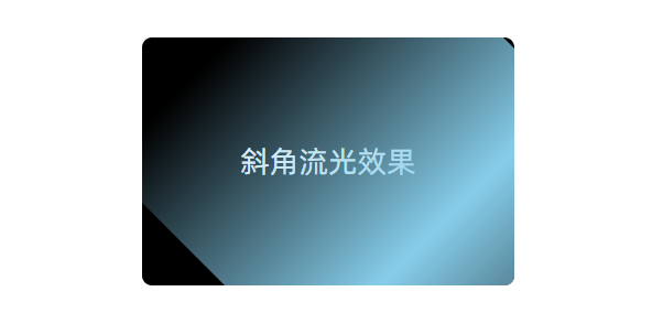
1. 效果图
代码实现
html
<div class="flow-wrap">
  <div class="flow-box">斜角流光效果</div>
</div>
css
.flow-wrap {
  position: relative;
  z-index: 1;
}
.flow-box {
  position: relative;
  width: 300px;
  height: 200px;
  background: #000;
  color: #fff;
  display: flex;
  justify-content: center;
  align-items: center;
  font-size: 24px;
  overflow: hidden;
  border-radius: 8px;
  margin: 0 auto;
}

.flow-box::before {
  content: '';
  position: absolute;
  width: 150%;
  height: 150%;
  background: linear-gradient(90deg, transparent, skyblue, transparent);
  animation: shine 3s linear infinite;
  transform: rotate(45deg);
}

@keyframes shine {
  0% {
    left: -100%;
    top: -100%;
  }
  30% {
    left: 100%;
    top: 100%;
  }
  100% {
    left: 100%;
    top: 100%;
  }
}