Modal 是移动端最"强势"的交互组件。
当它出现时,整个页面会被一层半透明遮罩覆盖,用户必须先处理 Modal 里的内容,才能继续操作页面其他部分。这种"阻断式"的特性让 Modal 特别适合那些需要用户明确响应的场景:确认删除、选择选项、填写表单。
我在项目里把弹出类组件分成三类:
- 非阻断式 不影响页面操作,比如 Toast、Alert
- 半阻断式 可以点击遮罩关闭,比如 Popover、Dropdown
- 阻断式 必须通过按钮关闭,比如 Modal、Dialog
Modal 属于第三类(虽然当前实现允许点击遮罩关闭,但核心定位是阻断式)。它的核心任务是"让用户专注于当前任务",排除其他干扰。
这篇文章会基于项目中真实存在的代码,把 Modal 的实现拆开讲清楚。全文代码片段都来自项目中的真实文件,路径是 src/components/ui/Modal.tsx。
Modal 在项目里的位置
这套 UI 组件库的文件组织比较统一。Modal 相关的文件主要在这几处:
src/components/ui/Modal.tsxsrc/screens/demos/ModalDemo.tsx
建议先看 Modal.tsx,理解组件的结构、动画逻辑和布局方式;再看 ModalDemo.tsx,了解组件在仓库里被期望怎么用。
依赖引入
tsx
import React, { useEffect, useRef } from 'react';
import {
  View,
  Text,
  TouchableOpacity,
  Modal as RNModal,
  Animated,
  StyleSheet,
  ViewStyle,
  Dimensions
} from 'react-native';
import { UITheme } from './theme';
这段引入包含几个关键模块:
useEffect和useRef用于管理动画的生命周期和存储动画值Modal as RNModal是 React Native 原生的 Modal 组件,我们在它基础上封装。用as RNModal重命名是为了避免和我们自己的 Modal 组件名冲突Animated用于实现遮罩淡入和内容滑入的动画效果Dimensions用于获取屏幕宽度,计算不同尺寸 Modal 的宽度UITheme来自项目的主题配置,保证组件风格统一
tsx
const { width: SCREEN_WIDTH } = Dimensions.get('window');在组件外部获取屏幕宽度。这个值用于计算 Modal 在不同 size 下的宽度。放在组件外部是因为屏幕宽度通常不会变化(除非旋转屏幕),不需要每次渲染都重新获取。
ModalProps:接口设计
tsx
interface ModalProps {
  visible: boolean;
  onClose: () => void;
  title?: string;
  children?: React.ReactNode;
  size?: 'sm' | 'md' | 'lg' | 'full';
  position?: 'center' | 'bottom';
  showCloseButton?: boolean;
  footer?: React.ReactNode;
  style?: ViewStyle;
}
接口设计覆盖了 Modal 的所有使用场景,我来逐个解释:
-
visible:控制 Modal 是否显示。这是一个受控属性,由外部状态管理
-
onClose:关闭回调函数。点击遮罩、点击关闭按钮、按返回键都会触发这个回调
-
title:可选的标题。简单的确认框可以有标题,复杂的表单 Modal 也可以没有标题
-
children:Modal 的主体内容。可以是任意 React 节点,文字、表单、列表都可以
-
size:Modal 的宽度,四种可选。sm 是屏幕宽度的 70%,md 是 85%,lg 是 95%,full 是 100%
-
position:显示位置,center 居中显示,bottom 从底部弹出。底部弹出适合操作菜单、选择器等场景
-
showCloseButton:是否显示右上角的关闭按钮。默认显示,某些场景(比如必须选择的对话框)可以隐藏
-
footer:底部内容,通常放操作按钮。比如"取消"和"确认"按钮
-
style:允许外部传入额外样式,用于微调或覆盖默认样式
组件函数签名与默认值
tsx
export const Modal: React.FC<ModalProps> = ({
  visible,
  onClose,
  title,
  children,
  size = 'md',
  position = 'center',
  showCloseButton = true,
  footer,
  style,
}) => {
这里用解构赋值的方式设置了默认值:
size = 'md':默认中等尺寸,屏幕宽度的 85%,适合大多数场景position = 'center':默认居中显示,这是最常见的 Modal 位置showCloseButton = true:默认显示关闭按钮,让用户有明确的关闭方式
为什么默认居中而不是底部?因为居中的 Modal 更"正式",适合确认对话框、表单等场景。底部弹出更适合操作菜单、选择器这类"轻量级"的交互。
动画值初始化
tsx
  const fadeAnim = useRef(new Animated.Value(0)).current;
  const slideAnim = useRef(new Animated.Value(position === 'bottom' ? 300 : 50)).current;
这两行初始化了两个动画值:
fadeAnim:控制遮罩层的透明度。初始值是 0(完全透明),动画时变到 1(完全不透明)。
slideAnim:控制内容区域的垂直位移。初始值根据 position 不同而不同:
- 如果是 bottom,初始值是 300(在屏幕下方 300px 的位置)
- 如果是 center,初始值是 50(在正常位置下方 50px)
动画时 slideAnim 会变到 0,也就是滑到正常位置。这样就实现了"从下往上滑入"的效果。
为什么 center 的初始偏移只有 50 而 bottom 是 300?因为居中的 Modal 只需要一点点"弹出感"就够了,太大的位移会显得突兀。而底部弹出的 Modal 需要从屏幕外滑入,所以偏移要大一些。
尺寸映射
tsx
  const sizeMap: Record<string, number | string> = {
    sm: SCREEN_WIDTH * 0.7,
    md: SCREEN_WIDTH * 0.85,
    lg: SCREEN_WIDTH * 0.95,
    full: '100%',
  };
这个对象定义了四种尺寸对应的宽度:
- sm:屏幕宽度的 70%,适合简短的确认对话框
- md:屏幕宽度的 85%,默认尺寸,适合大多数场景
- lg:屏幕宽度的 95%,适合需要展示较多内容的场景
- full:100% 宽度,适合全屏表单或复杂内容
注意 full 用的是字符串 '100%' 而不是数字。这是因为 React Native 的 width 属性支持百分比字符串,而且 '100%' 比 SCREEN_WIDTH 更准确(考虑到安全区域等因素)。
动画逻辑
tsx
  useEffect(() => {
    if (visible) {
      Animated.parallel([
        Animated.timing(fadeAnim, { toValue: 1, duration: 200, useNativeDriver: true }),
        Animated.spring(slideAnim, { toValue: 0, useNativeDriver: true }),
      ]).start();
    } else {
      fadeAnim.setValue(0);
      slideAnim.setValue(position === 'bottom' ? 300 : 50);
    }
  }, [visible]);
这段代码控制 Modal 的入场和退场:
入场动画(visible 为 true 时):
Animated.parallel:让遮罩淡入和内容滑入同时进行Animated.timing(fadeAnim, ...):遮罩在 200ms 内从透明变到不透明Animated.spring(slideAnim, ...):内容用弹簧动画滑到正常位置,有一点"弹性"
退场处理(visible 为 false 时):
- 直接用
setValue重置动画值,而不是播放退场动画 - 这是因为 RNModal 的 visible 变成 false 时会立即隐藏,没有时间播放动画
为什么入场用动画,退场直接重置?这是一个权衡。如果要实现退场动画,需要在 onClose 时先播放动画,动画完成后再把 visible 设为 false,逻辑会复杂很多。当前实现选择了简单的方案:入场有动画,退场直接消失。
如果你需要退场动画,可以这样改造:
tsx
const handleClose = () => {
  Animated.parallel([
    Animated.timing(fadeAnim, { toValue: 0, duration: 200, useNativeDriver: true }),
    Animated.timing(slideAnim, { toValue: position === 'bottom' ? 300 : 50, duration: 200, useNativeDriver: true }),
  ]).start(() => onClose());
};
然后把所有调用 onClose 的地方改成调用 handleClose。
原生 Modal 容器
tsx
  return (
    <RNModal visible={visible} transparent animationType="none" onRequestClose={onClose}>
这是 React Native 原生 Modal 组件的配置:
visible={visible}:控制 Modal 是否显示transparent:让 Modal 背景透明,这样我们可以自己实现半透明遮罩animationType="none":禁用原生动画,因为我们用 Animated 自己实现了动画onRequestClose={onClose}:Android 返回键的处理。在 Android 上按返回键会触发这个回调
为什么用原生 Modal 而不是自己用 View 实现?因为原生 Modal 有几个重要特性:
- 它会渲染在最顶层,不受父组件 overflow 或 zIndex 的影响
- 它能正确处理 Android 返回键
- 它能正确处理键盘弹出时的布局
遮罩层渲染
tsx
      <Animated.View style={[styles.overlay, { opacity: fadeAnim }]}>
        <TouchableOpacity style={styles.backdrop} onPress={onClose} activeOpacity={1} />
遮罩层由两部分组成:
Animated.View:带动画的容器,opacity 绑定到 fadeAnim,实现淡入效果。
TouchableOpacity :可点击的遮罩背景。点击时调用 onClose 关闭 Modal。activeOpacity={1} 让点击时没有透明度变化,因为遮罩本身就是半透明的,再变化会很奇怪。
styles.backdrop 用了 StyleSheet.absoluteFillObject,让遮罩铺满整个屏幕。
为什么遮罩要单独用一个 TouchableOpacity?因为我们需要区分"点击遮罩"和"点击内容"。点击遮罩应该关闭 Modal,点击内容不应该关闭。把遮罩单独做成一个可点击元素,就能实现这个区分。
内容区域渲染
tsx
        <Animated.View
          style={[
            styles.content,
            position === 'bottom' ? styles.bottomContent : styles.centerContent,
            { width: sizeMap[size], transform: [{ translateY: slideAnim }] },
            position === 'bottom' && { borderBottomLeftRadius: 0, borderBottomRightRadius: 0 },
            style,
          ]}
        >
内容区域的样式合并了五部分:
styles.content:基础样式,包括背景色、圆角、阴影、最大高度position === 'bottom' ? styles.bottomContent : styles.centerContent:根据位置选择定位方式{ width: sizeMap[size], transform: [{ translateY: slideAnim }] }:宽度和滑动动画position === 'bottom' && { borderBottomLeftRadius: 0, borderBottomRightRadius: 0 }:底部弹出时去掉底部圆角style:外部传入的自定义样式
底部弹出时为什么要去掉底部圆角?因为底部弹出的 Modal 是贴着屏幕底部的,底部圆角会显得很奇怪,好像悬浮在空中一样。去掉底部圆角,只保留顶部圆角,视觉上更自然。
头部渲染
tsx
          {(title || showCloseButton) && (
            <View style={styles.header}>
              <Text style={styles.title}>{title}</Text>
              {showCloseButton && (
                <TouchableOpacity onPress={onClose}>
                  <Text style={styles.closeBtn}>×</Text>
                </TouchableOpacity>
              )}
            </View>
          )}
头部的渲染逻辑:
条件渲染:只有当有 title 或 showCloseButton 为 true 时才渲染头部。如果两者都没有,就不显示头部区域。
标题:左侧显示标题文字。如果没传 title,这里会显示空字符串,但因为有关闭按钮,头部区域还是会显示。
关闭按钮 :右侧显示 × 符号,点击时调用 onClose。用 showCloseButton 控制是否显示。
头部有底部边框(borderBottomWidth: 1),和内容区域形成视觉分隔。
主体和底部渲染
tsx
          <View style={styles.body}>{children}</View>
          {footer && <View style={styles.footer}>{footer}</View>}
        </Animated.View>
      </Animated.View>
    </RNModal>
  );
};主体区域:直接渲染 children,外面包一层 View 加上内边距。
底部区域:条件渲染,只有传了 footer 才显示。底部有顶部边框,和主体区域形成视觉分隔。通常用来放操作按钮,比如"取消"和"确认"。
整个结构是:头部(可选)→ 主体 → 底部(可选)。这是 Modal 最常见的三段式布局。
样式定义
tsx
const styles = StyleSheet.create({
  overlay: { flex: 1, backgroundColor: 'rgba(0,0,0,0.5)' },
  backdrop: { ...StyleSheet.absoluteFillObject },
遮罩层样式:
overlay:flex: 1 占满整个屏幕,背景色是 50% 透明度的黑色backdrop:用 absoluteFillObject 铺满整个 overlay,作为可点击区域
tsx
  content: {
    backgroundColor: UITheme.colors.white,
    borderRadius: UITheme.borderRadius.xl,
    maxHeight: '80%',
    ...UITheme.shadow.lg,
  },
内容区域基础样式:
backgroundColor:白色背景borderRadius:大圆角(16px),让 Modal 看起来更柔和maxHeight: '80%':最大高度是屏幕的 80%,防止内容太多撑满整个屏幕shadow:大号阴影,让 Modal 有"浮起来"的感觉
tsx
  centerContent: { alignSelf: 'center', marginTop: 'auto', marginBottom: 'auto' },
  bottomContent: { position: 'absolute', bottom: 0, alignSelf: 'center' },
位置样式:
centerContent:用 margin auto 实现垂直居中,alignSelf: 'center' 实现水平居中bottomContent:绝对定位到底部,alignSelf: 'center' 实现水平居中
为什么居中用 margin auto 而不是 justifyContent?因为 overlay 已经有 flex: 1,如果用 justifyContent: 'center',遮罩的点击区域会被内容挤压。用 margin auto 可以让内容居中,同时遮罩保持铺满整个屏幕。
tsx
  header: {
    flexDirection: 'row',
    justifyContent: 'space-between',
    alignItems: 'center',
    padding: UITheme.spacing.lg,
    borderBottomWidth: 1,
    borderBottomColor: UITheme.colors.gray[200],
  },
  title: { fontSize: UITheme.fontSize.lg, fontWeight: '600', color: UITheme.colors.gray[800] },
  closeBtn: { fontSize: 28, color: UITheme.colors.gray[500] },
头部样式:
header:横向布局,标题在左,关闭按钮在右,有底部边框title:大字号(16px),加粗,深灰色closeBtn:× 符号用 28px 字号,比较大方便点击,浅灰色不会太抢眼
tsx
  body: { padding: UITheme.spacing.lg },
  footer: {
    padding: UITheme.spacing.lg,
    borderTopWidth: 1,
    borderTopColor: UITheme.colors.gray[200],
  },
});
主体和底部样式:
body:只有内边距,内容由 children 决定footer:有内边距和顶部边框,和主体区域分隔开
Demo 页面解析
Demo 页面展示了 Modal 的各种用法,路径是 src/screens/demos/ModalDemo.tsx:
tsx
import React, { useState } from 'react';
import { View, Text, StyleSheet } from 'react-native';
import { ComponentShowcase, ShowcaseSection } from '../ComponentShowcase';
import { Modal } from '../../components/ui/Modal';
import { Button } from '../../components/ui/Button';
import { UITheme } from '../../components/ui/theme';
引入了展示框架组件、Modal 组件和 Button 组件。Modal 的 Demo 需要用按钮来触发显示。
tsx
export const ModalDemo: React.FC<{ onBack: () => void }> = ({ onBack }) => {
  const [modal1, setModal1] = useState(false);
  const [modal2, setModal2] = useState(false);
  const [modal3, setModal3] = useState(false);
  const [modal4, setModal4] = useState(false);
用多个 useState 管理不同 Modal 的显示状态。每个 Modal 需要独立的状态,因为它们可能同时存在于页面上(虽然通常不会同时显示)。
tsx
  return (
    <ComponentShowcase title="Modal" icon="🪟" description="模态框用于显示需要用户关注的内容" onBack={onBack}>
      <ShowcaseSection title="基础用法" description="居中显示的模态框">
        <Button title="打开模态框" onPress={() => setModal1(true)} />
        <Modal visible={modal1} onClose={() => setModal1(false)} title="基础模态框">
          <Text style={styles.content}>这是模态框的内容区域,可以放置任意内容。</Text>
        </Modal>
      </ShowcaseSection>
第一个展示区块展示基础用法:
- 点击按钮把 modal1 设为 true,Modal 显示
- Modal 的 onClose 把 modal1 设回 false,Modal 隐藏
- 内容是一段简单的文字
tsx
      <ShowcaseSection title="底部弹出" description="从底部滑出的模态框">
        <Button title="底部弹出" variant="outline" onPress={() => setModal2(true)} />
        <Modal visible={modal2} onClose={() => setModal2(false)} title="底部模态框" position="bottom">
          <Text style={styles.content}>这是从底部弹出的模态框,适合用于操作菜单等场景。</Text>
        </Modal>
      </ShowcaseSection>
第二个展示区块展示底部弹出:
position="bottom"让 Modal 从底部滑出- 用 outline 样式的按钮和上面的实心按钮区分开
底部弹出适合的场景:
- 操作菜单(分享、删除、编辑等选项)
- 选择器(日期选择、地区选择)
- 评论输入框
tsx
      <ShowcaseSection title="尺寸" description="小、中、大、全屏四种尺寸">
        <View style={styles.row}>
          <Button title="小" size="sm" onPress={() => setModal3(true)} />
          <Button title="中" size="sm" onPress={() => setModal1(true)} style={styles.ml} />
          <Button title="大" size="sm" onPress={() => setModal4(true)} style={styles.ml} />
        </View>
        <Modal visible={modal3} onClose={() => setModal3(false)} title="小尺寸" size="sm">
          <Text style={styles.content}>小尺寸模态框</Text>
        </Modal>
        <Modal visible={modal4} onClose={() => setModal4(false)} title="大尺寸" size="lg">
          <Text style={styles.content}>大尺寸模态框,适合展示更多内容。</Text>
        </Modal>
      </ShowcaseSection>
第三个展示区块展示不同尺寸:
- 小尺寸(sm):屏幕宽度的 70%,适合简短的确认对话框
- 中尺寸(md):屏幕宽度的 85%,默认尺寸
- 大尺寸(lg):屏幕宽度的 95%,适合展示较多内容
选择尺寸的依据是内容量。内容少用小尺寸,内容多用大尺寸。不要为了"好看"而选择不合适的尺寸。
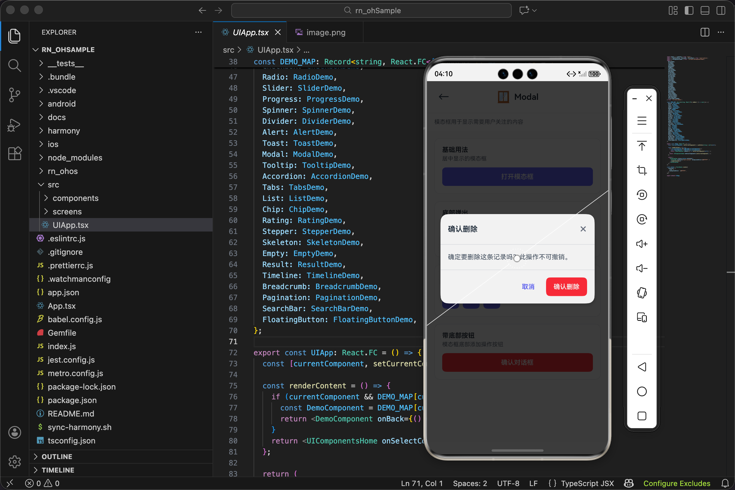
tsx
      <ShowcaseSection title="带底部按钮" description="模态框底部添加操作按钮">
        <Button title="确认对话框" color="danger" onPress={() => setModal1(true)} />
        <Modal
          visible={modal1}
          onClose={() => setModal1(false)}
          title="确认删除"
          footer={
            <View style={styles.footer}>
              <Button title="取消" variant="ghost" onPress={() => setModal1(false)} />
              <Button title="确认删除" color="danger" onPress={() => setModal1(false)} style={styles.ml} />
            </View>
          }
        >
          <Text style={styles.content}>确定要删除这条记录吗?此操作不可撤销。</Text>
        </Modal>
      </ShowcaseSection>
    </ComponentShowcase>
  );
};
第四个展示区块展示带底部按钮的 Modal:
footer属性传入一个包含两个按钮的 View- "取消"按钮用 ghost 样式,不太醒目
- "确认删除"按钮用 danger 颜色,强调危险操作
- 按钮靠右对齐(justifyContent: 'flex-end')
这是确认对话框的标准模式:标题说明要做什么,内容解释后果,底部提供"取消"和"确认"两个选项。
tsx
const styles = StyleSheet.create({
  content: { fontSize: UITheme.fontSize.md, color: UITheme.colors.gray[600], lineHeight: 22 },
  row: { flexDirection: 'row', alignItems: 'center' },
  ml: { marginLeft: UITheme.spacing.sm },
  footer: { flexDirection: 'row', justifyContent: 'flex-end' },
});
Demo 页面的样式:
content:Modal 内容的文字样式,灰色、适中字号、合适的行高row:让按钮横向排列ml:按钮之间的间距footer:让底部按钮靠右对齐
实际应用场景
确认对话框
最常见的场景是确认危险操作:
tsx
const DeleteConfirm = ({ visible, onClose, onConfirm, itemName }) => {
  return (
    <Modal
      visible={visible}
      onClose={onClose}
      title="确认删除"
      footer={
        <View style={styles.footer}>
          <Button title="取消" variant="ghost" onPress={onClose} />
          <Button title="删除" color="danger" onPress={onConfirm} />
        </View>
      }
    >
      <Text>确定要删除"{itemName}"吗?此操作不可撤销。</Text>
    </Modal>
  );
};
使用方式:
tsx
const [showDelete, setShowDelete] = useState(false);
const [selectedItem, setSelectedItem] = useState(null);

const handleDelete = (item) => {
  setSelectedItem(item);
  setShowDelete(true);
};

const confirmDelete = async () => {
  await api.delete(selectedItem.id);
  setShowDelete(false);
  // 刷新列表...
};

<DeleteConfirm
  visible={showDelete}
  onClose={() => setShowDelete(false)}
  onConfirm={confirmDelete}
  itemName={selectedItem?.name}
/>
操作菜单
底部弹出的操作菜单:
tsx
const ActionMenu = ({ visible, onClose, actions }) => {
  return (
    <Modal visible={visible} onClose={onClose} position="bottom" showCloseButton={false}>
      {actions.map((action, index) => (
        <TouchableOpacity
          key={index}
          style={styles.actionItem}
          onPress={() => {
            action.onPress();
            onClose();
          }}
        >
          <Text style={styles.actionIcon}>{action.icon}</Text>
          <Text style={styles.actionText}>{action.label}</Text>
        </TouchableOpacity>
      ))}
      <TouchableOpacity style={styles.cancelItem} onPress={onClose}>
        <Text style={styles.cancelText}>取消</Text>
      </TouchableOpacity>
    </Modal>
  );
};
使用方式:
tsx
<ActionMenu
  visible={showMenu}
  onClose={() => setShowMenu(false)}
  actions={[
    { icon: '📤', label: '分享', onPress: handleShare },
    { icon: '✏️', label: '编辑', onPress: handleEdit },
    { icon: '🗑️', label: '删除', onPress: handleDelete },
  ]}
/>
表单弹窗
在 Modal 里放表单:
tsx
const EditModal = ({ visible, onClose, initialData, onSave }) => {
  const [name, setName] = useState(initialData?.name || '');
  const [email, setEmail] = useState(initialData?.email || '');

  const handleSave = () => {
    onSave({ name, email });
    onClose();
  };

  return (
    <Modal
      visible={visible}
      onClose={onClose}
      title="编辑信息"
      size="lg"
      footer={
        <View style={styles.footer}>
          <Button title="取消" variant="ghost" onPress={onClose} />
          <Button title="保存" onPress={handleSave} />
        </View>
      }
    >
      <Input label="姓名" value={name} onChangeText={setName} />
      <Input label="邮箱" value={email} onChangeText={setEmail} style={{ marginTop: 12 }} />
    </Modal>
  );
};
表单弹窗通常用大尺寸(lg),给输入框足够的空间。
图片预览
全屏预览图片:
tsx
const ImagePreview = ({ visible, onClose, imageUrl }) => {
  return (
    <Modal visible={visible} onClose={onClose} size="full" showCloseButton={true}>
      <Image source={{ uri: imageUrl }} style={styles.previewImage} resizeMode="contain" />
    </Modal>
  );
};
图片预览用全屏尺寸,让图片尽可能大。
设计建议
何时使用 Modal
Modal 是"重型"组件,不要滥用。适合使用 Modal 的场景:
- 需要用户明确确认的操作(删除、提交、退出)
- 需要用户输入信息(表单、评论)
- 需要用户做出选择(选项列表、日期选择)
- 需要展示重要信息(协议、公告)
不适合使用 Modal 的场景:
- 简单的操作反馈(用 Toast)
- 可以忽略的提示(用 Alert)
- 下拉菜单(用 Dropdown)
关闭方式
Modal 应该提供清晰的关闭方式:
- 关闭按钮:右上角的 × 按钮,最直观
- 点击遮罩:点击 Modal 外部关闭,符合直觉
- 取消按钮:底部的"取消"按钮,明确的操作
- 返回键:Android 返回键,系统级的关闭方式
某些场景可能需要禁用部分关闭方式。比如必须选择的对话框,可以隐藏关闭按钮、禁用点击遮罩关闭。但要谨慎使用,强制用户做选择可能会造成不好的体验。
内容长度
Modal 的内容不宜过长。如果内容超过屏幕高度的 80%(maxHeight 的限制),会出现滚动。虽然技术上可行,但体验不好。
如果内容很长,考虑:
- 用独立页面而不是 Modal
- 分步骤展示(多个 Modal 或 Stepper)
- 精简内容
嵌套 Modal
尽量避免 Modal 里再弹 Modal。如果确实需要,要注意:
- 第二个 Modal 应该比第一个小
- 关闭第二个 Modal 不应该关闭第一个
- 遮罩层要能区分层级
当前实现不支持嵌套 Modal 的层级管理,如果需要这个功能,要额外处理 zIndex。
和 Alert 的区别
Modal 和 Alert 都可以展示重要信息,但定位不同:
- Alert:页面内的提示,不阻断操作,可以和页面内容共存
- Modal:覆盖整个页面,阻断操作,必须处理后才能继续
选择依据:
- 信息需要用户立即处理吗?需要就用 Modal
- 信息可以稍后再看吗?可以就用 Alert
- 需要用户输入或选择吗?需要就用 Modal
和 ActionSheet 的区别
底部弹出的 Modal 和 ActionSheet 很像,但有区别:
- Modal(bottom):通用的底部弹窗,可以放任意内容
- ActionSheet:专门用于操作选择,通常是一组按钮
如果只是展示几个操作选项,用 ActionSheet 更合适(语义更明确)。如果需要放表单、列表等复杂内容,用 Modal。
当前项目没有单独的 ActionSheet 组件,可以用 position="bottom" 的 Modal 来实现类似效果。
无障碍考虑
Modal 的无障碍需要特别注意:
- 焦点管理:Modal 打开时,焦点应该移到 Modal 内部;关闭时,焦点应该回到触发元素
- 键盘导航:Tab 键应该只在 Modal 内部循环,不能跳到 Modal 外面
- 屏幕阅读器:Modal 打开时应该朗读标题,让用户知道发生了什么
React Native 的原生 Modal 组件已经处理了大部分无障碍问题,但如果你自己实现 Modal(比如用 View + 绝对定位),需要手动处理这些。
欢迎加入开源鸿蒙跨平台社区:https://openharmonycrossplatform.csdn.net