你可能觉得分割线没什么好讲的,不就是画一条横线吗?
tsx
<View style={{ height: 1, backgroundColor: '#ccc' }} />一行代码搞定。但当你真正在项目里用起来,问题就来了:
- 想要虚线怎么办?
- 想在线中间加文字呢?
- 垂直方向的分割线怎么处理?
- 不同页面的分割线样式怎么统一?
这就是为什么我们需要一个 Divider 组件。
先看完整代码
文件路径:src/components/ui/Divider.tsx
tsx
import React from 'react';
import { View, Text, StyleSheet, ViewStyle } from 'react-native';
import { UITheme } from './theme';

interface DividerProps {
  orientation?: 'horizontal' | 'vertical';
  variant?: 'solid' | 'dashed' | 'dotted';
  thickness?: number;
  color?: string;
  label?: string;
  labelPosition?: 'left' | 'center' | 'right';
  spacing?: number;
  style?: ViewStyle;
}

export const Divider: React.FC<DividerProps> = ({
  orientation = 'horizontal',
  variant = 'solid',
  thickness = 1,
  color = UITheme.colors.gray[200],
  label,
  labelPosition = 'center',
  spacing = UITheme.spacing.md,
  style,
}) => {
  const lineStyle: ViewStyle = {
    backgroundColor: variant === 'solid' ? color : 'transparent',
    borderStyle: variant !== 'solid' ? variant : undefined,
    borderColor: variant !== 'solid' ? color : undefined,
  };

  if (orientation === 'vertical') {
    return (
      <View
        style={[
          styles.vertical,
          lineStyle,
          { width: thickness, marginHorizontal: spacing, borderLeftWidth: variant !== 'solid' ? thickness : 0 },
          style,
        ]}
      />
    );
  }

  if (!label) {
    return (
      <View
        style={[
          styles.horizontal,
          lineStyle,
          { height: thickness, marginVertical: spacing, borderTopWidth: variant !== 'solid' ? thickness : 0 },
          style,
        ]}
      />
    );
  }

  return (
    <View style={[styles.labelContainer, { marginVertical: spacing }, style]}>
      <View
        style={[
          styles.line,
          lineStyle,
          { height: thickness, flex: labelPosition === 'left' ? 0.2 : labelPosition === 'right' ? 1 : 1 },
        ]}
      />
      <Text style={styles.label}>{label}</Text>
      <View
        style={[
          styles.line,
          lineStyle,
          { height: thickness, flex: labelPosition === 'left' ? 1 : labelPosition === 'right' ? 0.2 : 1 },
        ]}
      />
    </View>
  );
};

const styles = StyleSheet.create({
  horizontal: { width: '100%' },
  vertical: { height: '100%' },
  labelContainer: { flexDirection: 'row', alignItems: 'center' },
  line: {},
  label: {
    marginHorizontal: UITheme.spacing.md,
    fontSize: UITheme.fontSize.sm,
    color: UITheme.colors.gray[500],
  },
});
70 多行代码,实现了一个功能完整的分割线组件。接下来我们逐块分析。
依赖与类型
tsx
import React from 'react';
import { View, Text, StyleSheet, ViewStyle } from 'react-native';
import { UITheme } from './theme';
为什么需要 Text?
普通分割线只需要 View,但我们的 Divider 支持在线中间显示文字,所以引入了 Text。UITheme 提供统一的颜色和间距配置。
tsx
interface DividerProps {
  orientation?: 'horizontal' | 'vertical';
  variant?: 'solid' | 'dashed' | 'dotted';
  thickness?: number;
  color?: string;
  label?: string;
  labelPosition?: 'left' | 'center' | 'right';
  spacing?: number;
  style?: ViewStyle;
}
八个属性,覆盖所有场景:
orientation 控制方向,水平还是垂直。大多数分割线是水平的,但在水平布局里需要垂直分割线。
variant 定义线条样式。solid 是实线,dashed 是虚线,dotted 是点线。不同样式传达不同的视觉语义------实线表示强分隔,虚线表示弱分隔。
thickness 是线条粗细,默认 1px。有时候你需要更粗的线来强调分隔。
color 自定义颜色。默认用主题里的浅灰色,但特殊场景可能需要品牌色或警告色。
label 是线中间的文字。登录页常见的"或"、列表里的日期分组,都需要这个功能。
labelPosition 控制文字位置,左中右三选一。
spacing 是分割线上下(或左右)的间距。
style 用于外部样式覆盖。
默认值设计
tsx
export const Divider: React.FC<DividerProps> = ({
  orientation = 'horizontal',
  variant = 'solid',
  thickness = 1,
  color = UITheme.colors.gray[200],
  label,
  labelPosition = 'center',
  spacing = UITheme.spacing.md,
  style,
}) => {
每个默认值都有讲究:
orientation = 'horizontal' ------ 水平分割线是最常见的,所以作为默认值。
variant = 'solid' ------ 实线是最基础的样式,视觉上最稳定。
thickness = 1 ------ 1px 的线条足够清晰又不会太抢眼。
color = UITheme.colors.gray[200] ------ 浅灰色,不会干扰主要内容。
labelPosition = 'center' ------ 文字居中是最常见的需求。
spacing = UITheme.spacing.md ------ 中等间距,给分割线足够的呼吸空间。
注意 label 没有默认值,因为大多数分割线不需要文字。
线条样式计算
tsx
const lineStyle: ViewStyle = {
  backgroundColor: variant === 'solid' ? color : 'transparent',
  borderStyle: variant !== 'solid' ? variant : undefined,
  borderColor: variant !== 'solid' ? color : undefined,
};
这段代码解决了一个技术问题:React Native 里怎么画虚线?
实线很简单,设置 backgroundColor 就行。但虚线和点线需要用 border 来实现。
当 variant === 'solid' 时:
- backgroundColor 设为指定颜色
- borderStyle 和 borderColor 都是 undefined
当 variant 是 dashed 或 dotted 时:
- backgroundColor 设为 transparent(透明)
- borderStyle 设为 'dashed' 或 'dotted'
- borderColor 设为指定颜色
这样同一个 lineStyle 对象可以适配三种线条样式。
垂直分割线的渲染
tsx
if (orientation === 'vertical') {
  return (
    <View
      style={[
        styles.vertical,
        lineStyle,
        { width: thickness, marginHorizontal: spacing, borderLeftWidth: variant !== 'solid' ? thickness : 0 },
        style,
      ]}
    />
  );
}
垂直分割线的特殊处理:
垂直线用 width 控制粗细,水平线用 height。这是方向不同带来的差异。
marginHorizontal: spacing 让垂直线左右有间距,不会紧贴相邻元素。
borderLeftWidth 只在非实线时生效。虚线和点线需要通过 border 来绘制,所以要设置 borderLeftWidth。实线直接用 backgroundColor,不需要 border。
styles.vertical 设置了 height: '100%',让垂直线自动撑满父容器高度。
无文字的水平分割线
tsx
if (!label) {
  return (
    <View
      style={[
        styles.horizontal,
        lineStyle,
        { height: thickness, marginVertical: spacing, borderTopWidth: variant !== 'solid' ? thickness : 0 },
        style,
      ]}
    />
  );
}
最简单的情况:一条横线
没有 label 时,分割线就是一个扁平的 View。
height: thickness 控制线条粗细。
marginVertical: spacing 提供上下间距。
borderTopWidth 的逻辑和垂直线的 borderLeftWidth 一样,用于绘制虚线和点线。
styles.horizontal 设置了 width: '100%',让线条撑满容器宽度。
带文字的分割线
tsx
return (
  <View style={[styles.labelContainer, { marginVertical: spacing }, style]}>
    <View
      style={[
        styles.line,
        lineStyle,
        { height: thickness, flex: labelPosition === 'left' ? 0.2 : labelPosition === 'right' ? 1 : 1 },
      ]}
    />
    <Text style={styles.label}>{label}</Text>
    <View
      style={[
        styles.line,
        lineStyle,
        { height: thickness, flex: labelPosition === 'left' ? 1 : labelPosition === 'right' ? 0.2 : 1 },
      ]}
    />
  </View>
);
这是最复杂的情况:线 + 文字 + 线
结构是一个水平 flex 容器,里面放左线、文字、右线三个元素。
labelPosition 通过调整左右线的 flex 值来控制文字位置:
center:左右线 flex 都是 1,平分空间,文字居中left:左线 flex 0.2,右线 flex 1,文字靠左right:左线 flex 1,右线 flex 0.2,文字靠右
为什么用 0.2 而不是 0?因为 0 会让那边的线完全消失,用 0.2 可以保留一小段线,视觉上更平衡。
样式定义
tsx
const styles = StyleSheet.create({
  horizontal: { width: '100%' },
  vertical: { height: '100%' },
  labelContainer: { flexDirection: 'row', alignItems: 'center' },
  line: {},
  label: {
    marginHorizontal: UITheme.spacing.md,
    fontSize: UITheme.fontSize.sm,
    color: UITheme.colors.gray[500],
  },
});
样式表很精简:
horizontal 和 vertical 只设置了一个属性,让线条撑满对应方向。
labelContainer 是水平 flex 布局,alignItems: 'center' 让文字和线条垂直居中对齐。
line 是空对象。你可能会问:为什么要定义一个空样式?因为在 style 数组里保持结构一致性,方便后续扩展。
label 定义了文字样式:左右间距、小号字体、中灰色。这些值让文字不会太突兀,和线条形成和谐的整体。
Demo 代码解读
看完组件实现,来看看怎么用。文件路径:src/screens/demos/DividerDemo.tsx
基础用法
tsx
<Text style={styles.text}>上方内容</Text>
<Divider />
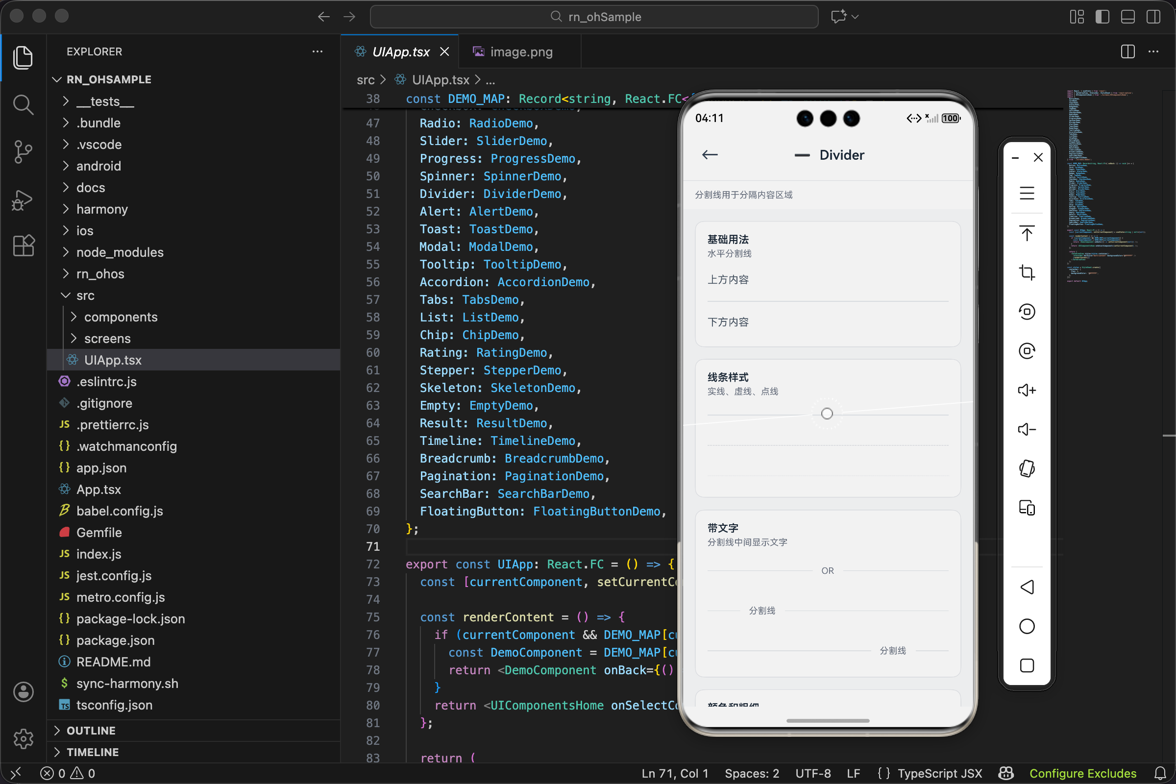
<Text style={styles.text}>下方内容</Text>最简单的场景
什么参数都不传,得到一条默认的水平实线。上下各有一段文字,分割线把它们分开。这就是分割线最本质的作用:划分内容区域。
线条样式
tsx
<Divider variant="solid" />
<View style={{ height: 16 }} />
<Divider variant="dashed" />
<View style={{ height: 16 }} />
<Divider variant="dotted" />
三种线条样式对比
solid 实线最常用,视觉上最"硬",表示明确的分隔。
dashed 虚线稍微"软"一些,常用于表示可选的分隔或临时的边界。
dotted 点线最"轻",适合装饰性的分隔。
中间用 View 加 16px 间距,避免三条线挤在一起。
带文字
tsx
<Divider label="OR" />
<View style={{ height: 16 }} />
<Divider label="分割线" labelPosition="left" />
<View style={{ height: 16 }} />
<Divider label="分割线" labelPosition="right" />
文字分割线的三种位置
label="OR" 是登录页的经典场景:"使用账号登录 OR 使用第三方登录"。
labelPosition="left" 和 labelPosition="right" 展示了文字偏左偏右的效果。实际项目中,左对齐的文字分割线常用于列表分组,比如按日期分组的消息列表。
自定义颜色和粗细
tsx
<Divider color={UITheme.colors.primary} thickness={2} />
<View style={{ height: 16 }} />
<Divider color={UITheme.colors.success} thickness={3} />
<View style={{ height: 16 }} />
<Divider color={UITheme.colors.danger} thickness={1} variant="dashed" />
打破默认,创造个性
第一条:主题色 + 2px 粗细,可以用于强调某个区域的开始。
第二条:成功色 + 3px,更粗更醒目。
第三条:危险色 + 虚线,可能用于警告区域的边界。
颜色和粗细的组合可以传达不同的语义,但要克制使用,太多花样会让界面显得杂乱。
垂直分割线
tsx
<View style={styles.row}>
  <Text style={styles.text}>左侧</Text>
  <Divider orientation="vertical" spacing={16} />
  <Text style={styles.text}>中间</Text>
  <Divider orientation="vertical" spacing={16} />
  <Text style={styles.text}>右侧</Text>
</View>
水平布局里的分隔
三段文字水平排列,用垂直分割线分开。这种布局常见于底部导航、工具栏、面包屑等场景。
spacing={16} 让分割线左右各有 16px 间距,不会紧贴文字。
外层 View 的样式:
tsx
row: { flexDirection: 'row', alignItems: 'center', height: 40 },flexDirection: 'row' 让子元素水平排列,height: 40 给垂直分割线一个明确的高度参考。
使用场景举例
表单分组
tsx
<Input label="用户名" />
<Input label="密码" />
<Divider label="可选信息" spacing={24} />
<Input label="昵称" />
<Input label="个人简介" />
用带文字的分割线把表单分成"必填"和"可选"两部分,用户一眼就能看出哪些是必须填的。
评论区分隔
tsx
{comments.map((comment, index) => (
  <React.Fragment key={comment.id}>
    <CommentItem data={comment} />
    {index < comments.length - 1 && <Divider spacing={12} />}
  </React.Fragment>
))}每条评论之间用分割线隔开,最后一条后面不加。spacing={12} 用较小的间距,让评论列表更紧凑。
设置页面
tsx
<SettingItem title="通知设置" />
<SettingItem title="隐私设置" />
<Divider thickness={8} color={UITheme.colors.gray[100]} spacing={0} />
<SettingItem title="关于我们" />
<SettingItem title="退出登录" />用一条粗分割线把"常规设置"和"其他操作"分开。thickness={8} 配合浅灰色背景,形成一个视觉上的"断层"。
价格展示
tsx
<View style={{ flexDirection: 'row', alignItems: 'center' }}>
  <Text>原价 ¥199</Text>
  <Divider orientation="vertical" spacing={12} color={UITheme.colors.gray[300]} />
  <Text style={{ color: 'red' }}>现价 ¥99</Text>
</View>
垂直分割线把原价和现价分开,让价格对比更清晰。
技术要点回顾
写一个分割线组件,看似简单,实际要考虑的点不少:
实线和虚线的实现方式不同
实线用 backgroundColor,虚线用 borderStyle + borderColor。组件内部统一处理了这个差异,使用者不需要关心。
水平和垂直的属性映射
水平线用 height 和 marginVertical,垂直线用 width 和 marginHorizontal。方向不同,控制尺寸和间距的属性也要跟着变。
带文字时的 flex 布局
用 flex 值控制左右线的比例,实现文字的左中右定位。这比用绝对定位更灵活,能自适应不同宽度的容器。
默认值的选择
每个默认值都应该是"最常见的需求"。这样大多数情况下,使用者不需要传任何参数就能得到合理的效果。
写在最后
分割线是 UI 里最不起眼的元素之一,但它对界面的整洁度影响很大。
好的分割线让内容层次分明,用户能快速找到想要的信息。滥用分割线则会让界面显得支离破碎,增加视觉噪音。
记住一个原则:分割线是用来"分"的,不是用来"装饰"的。只在真正需要划分内容的地方使用它。
欢迎加入开源鸿蒙跨平台社区:https://openharmonycrossplatform.csdn.net