python
from nicegui import ui

# 创建一个简单的3D场景测试程序
scene = ui.scene(width=800, height=600)

# 使用最简单的3D对象创建方式
# 先创建场景,然后添加基本几何体
with scene:
    # 创建立方体 - 使用默认参数
    cube = scene.box()
    cube.material = '#ff4466'

    # 创建球体
    sphere = scene.sphere()
    sphere.material = '#4488ff'

    # 设置球体位置(使用transform属性)
    sphere.transform = 'translate3d(3, 0, 0)'

# 添加简单的交互功能
def on_scene_click():
    ui.notify('你点击了3D场景!')

scene.on_click(on_scene_click)

# 添加说明文本
ui.label('这是一个简单的3D场景测试').classes('text-2xl font-bold')
ui.label('点击场景区域查看效果').classes('text-lg')

ui.run(title='3D场景测试', port=8081)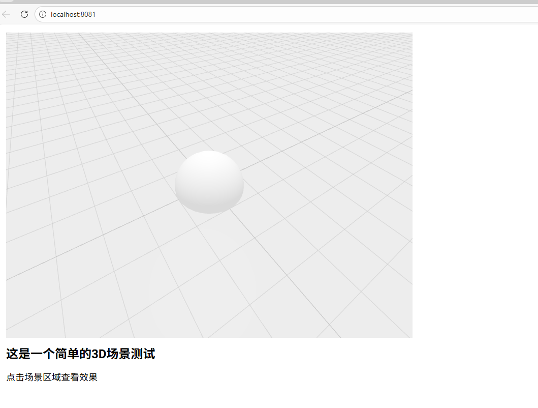
python
from nicegui import ui
import time
# 使用CSS 3D变换创建旋转效果
rotation_angle = 0
animation_running = True
# 创建3D场景容器
with ui.column().classes('w-full h-screen bg-gray-900 flex flex-col items-center justify-center'):
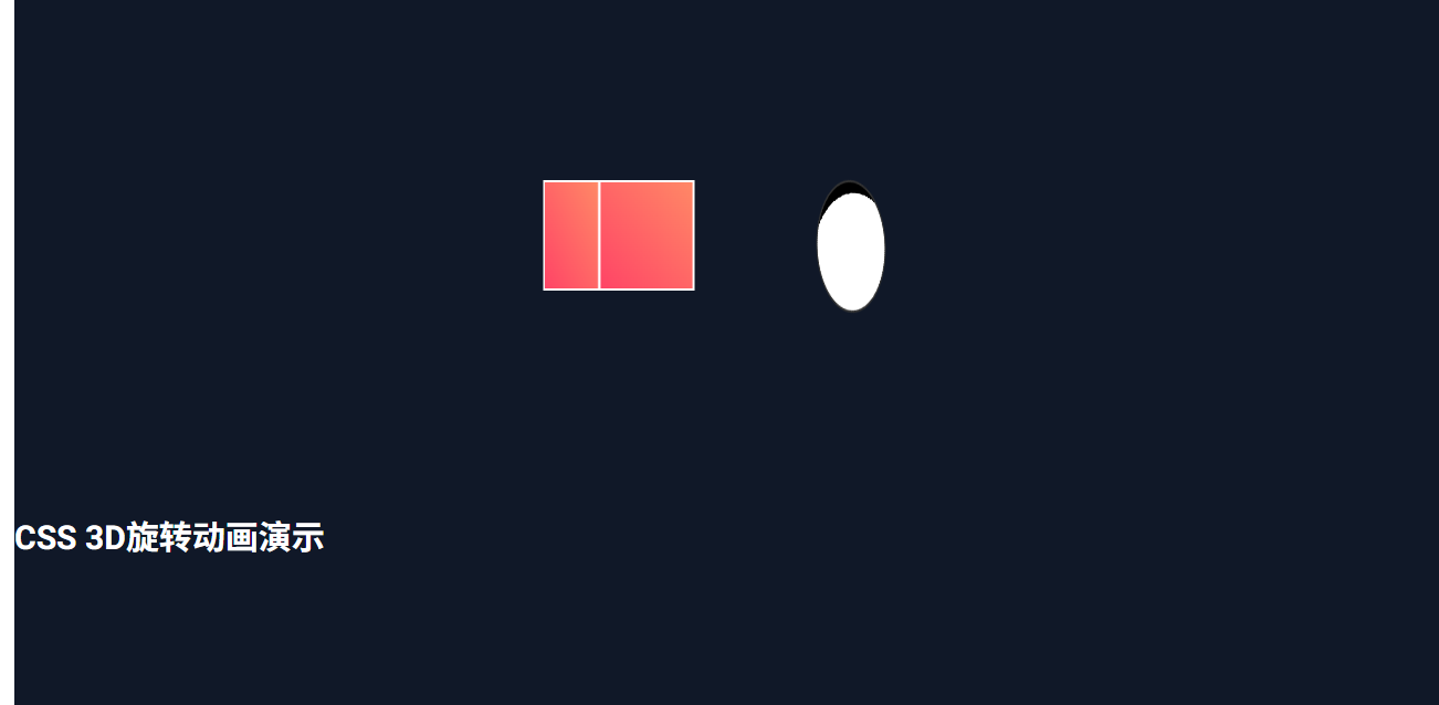
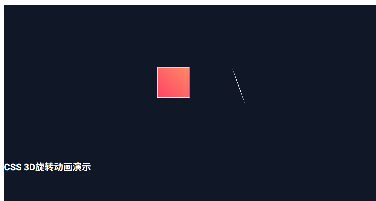
ui.label('CSS 3D旋转动画演示').classes('text-3xl font-bold text-white mb-8')
# 3D场景容器
with ui.column().classes('relative w-800 h-600 perspective-1000'):
# 创建立方体(使用CSS 3D)
cube_html = ui.html('''
<div id="cube" style="
width: 100px; height: 100px;
position: absolute; top: 200px; left: 200px;
transform-style: preserve-3d;
transform: rotateY(0deg);
">
<div style="
position: absolute; width: 100%; height: 100%;
background: linear-gradient(45deg, #ff4466, #ff8866);
border: 2px solid #fff;
transform: translateZ(50px);
"></div>
<div style="
position: absolute; width: 100%; height: 100%;
background: linear-gradient(45deg, #ff4466, #ff8866);
border: 2px solid #fff;
transform: rotateY(180deg) translateZ(50px);
"></div>
<div style="
position: absolute; width: 100%; height: 100%;
background: linear-gradient(45deg, #ff4466, #ff8866);
border: 2px solid #fff;
transform: rotateY(90deg) translateZ(50px);
"></div>
<div style="
position: absolute; width: 100%; height: 100%;
background: linear-gradient(45deg, #ff4466, #ff8866);
border: 2px solid #fff;
transform: rotateY(-90deg) translateZ(50px);
"></div>
<div style="
position: absolute; width: 100%; height: 100%;
background: linear-gradient(45deg, #ff4466, #ff8866);
border: 2px solid #fff;
transform: rotateX(90deg) translateZ(50px);
"></div>
<div style="
position: absolute; width: 100%; height: 100%;
background: linear-gradient(45deg, #ff4466, #ff8866);
border: 2px solid #fff;
transform: rotateX(-90deg) translateZ(50px);
"></div>
</div>
''', sanitize=False)
# 创建足球(使用CSS 3D球体)
football_html = ui.html('''
<div id="football" style="
width: 120px; height: 120px;
position: absolute; top: 200px; left: 400px;
transform-style: preserve-3d;
transform: rotateX(0deg) rotateY(0deg) rotateZ(0deg);
">
<div style="
position: absolute; width: 100%; height: 100%;
background: radial-gradient(circle at 30% 30%, white 0%, white 70%, black 70%, black 100%);
border-radius: 50%;
border: 2px solid #333;
transform-style: preserve-3d;
"></div>
</div>
''', sanitize=False)
# 状态显示
rotation_label = ui.label('旋转角度: 0°').classes('text-xl text-green-400 font-bold mt-4')
# 控制按钮
# 控制按钮
with ui.row().classes('mt-4'):
def start_animation():
global animation_running
animation_running = True
ui.notify('旋转动画已开始')
def stop_animation():
global animation_running, rotation_angle
animation_running = False
rotation_angle = 0
update_rotation()
ui.notify('旋转动画已停止')
ui.button('开始旋转', on_click=start_animation).classes('bg-green-500 text-white px-4 py-2 rounded')
ui.button('停止旋转', on_click=stop_animation).classes('bg-red-500 text-white px-4 py-2 rounded ml-4')
def update_rotation():
global rotation_angle, animation_running
if animation_running:
rotation_angle += 2
# 更新立方体旋转
cube_js = f'''
document.getElementById('cube').style.transform = 'rotateY({rotation_angle}deg)';
'''
# 更新足球旋转(多轴)
football_js = f'''
document.getElementById('football').style.transform =
'rotateX({rotation_angle * 1.5}deg) rotateY({-rotation_angle * 0.8}deg) rotateZ({rotation_angle * 0.5}deg)';
'''
ui.run_javascript(cube_js)
ui.run_javascript(football_js)
rotation_label.text = f'旋转角度: {rotation_angle % 360}°'
# 启动动画循环
ui.timer(0.05, update_rotation)
ui.run(title='CSS 3D旋转动画演示', port=8081)