目录
[一、基础认知:Button 组件核心定位与鸿蒙适配](#一、基础认知:Button 组件核心定位与鸿蒙适配)
[三、按钮实现方式:原生 Button 与自定义按钮](#三、按钮实现方式:原生 Button 与自定义按钮)
[3.1 原生 Button](#3.1 原生 Button)
[3.2 自定义按钮(鸿蒙常用)](#3.2 自定义按钮(鸿蒙常用))
一、基础认知:Button 组件核心定位与鸿蒙适配
Button 是 React Native 鸿蒙跨平台开发中核心的用户交互触发组件,所有表单提交、页面跳转、功能触发等操作均依赖其完成。
React Native 的 Button 组件底层桥接鸿蒙 ArkUI 原生 Button 组件,点击 / 长按事件与鸿蒙原生触摸事件体系无缝对接,样式单位默认适配鸿蒙 dp 屏幕尺寸,无兼容性问题;同时可通过 TouchableOpacity 等触摸组件封装自定义按钮,满足不同 UI 与交互需求。
二、核心属性与事件
| 属性名 | 类型 | 作用 | 示例 |
|---|---|---|---|
title |
string | 按钮显示文本 | title="确认" |
onPress |
() => void | 点击事件回调 | onPress={handleSubmit} |
onLongPress |
() => void | 长按事件回调 | onLongPress={handleLongPress} |
disabled |
boolean | 禁用按钮(置灰无响应) | disabled={!isValid} |
color |
string | 按钮主色调 | color="#007aff" |
三、按钮实现方式:原生 Button 与自定义按钮
3.1 原生 Button
原生 Button 轻量化、无性能问题,但样式可定制性弱,适合基础点击场景。
3.2 自定义按钮(鸿蒙常用)
通过 TouchableOpacity 封装自定义按钮,可完全控制样式,鸿蒙环境无性能损耗,是业务开发的主流方案。
四、完整代码
javascript
import React, { useState, useCallback } from 'react';
import { View, Text, Button, TouchableOpacity, StyleSheet, ScrollView } from 'react-native';
const ButtonAllInOne = () => {
const [count, setCount] = useState(0);
const [isDisabled, setIsDisabled] = useState(false);
// 点击事件:用useCallback避免重渲染,鸿蒙环境无性能损耗
const handleNativeBtnClick = useCallback(() => {
console.log('原生Button点击');
}, []);
const handleCustomBtnClick = useCallback(() => {
setCount(prev => prev + 1);
}, []);
const handleDisableBtnClick = useCallback(() => {
setIsDisabled(true);
}, []);
const handleLongPress = useCallback(() => {
console.log('按钮被长按');
}, []);
return (
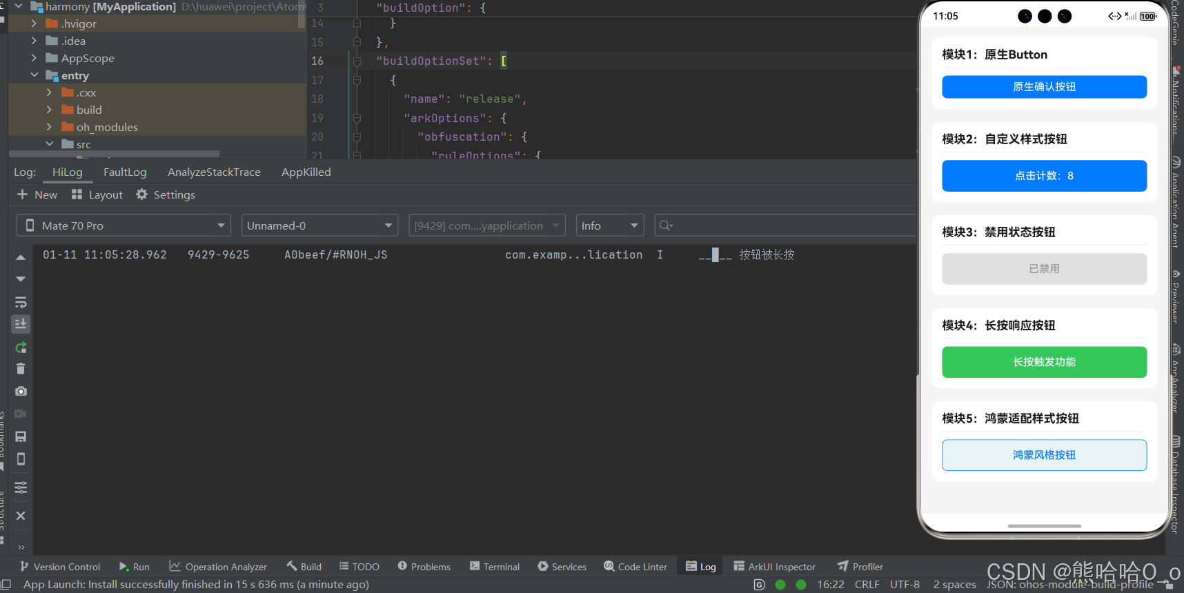
<ScrollView style={styles.pageContainer}>
{/* 模块1:原生Button */}
<View style={styles.moduleBox}>
<Text style={styles.moduleTitle}>模块1:原生Button</Text>
<Button
title="原生确认按钮"
onPress={handleNativeBtnClick}
color="#007aff"
/>
</View>
{/* 模块2:自定义样式按钮 */}
<View style={styles.moduleBox}>
<Text style={styles.moduleTitle}>模块2:自定义样式按钮</Text>
<TouchableOpacity
style={styles.customBtn}
onPress={handleCustomBtnClick}
>
<Text style={styles.customBtnText}>点击计数:{count}</Text>
</TouchableOpacity>
</View>
{/* 模块3:禁用状态按钮 */}
<View style={styles.moduleBox}>
<Text style={styles.moduleTitle}>模块3:禁用状态按钮</Text>
<TouchableOpacity
style={[styles.customBtn, isDisabled && styles.disabledBtn]}
onPress={handleDisableBtnClick}
disabled={isDisabled}
>
<Text style={[styles.customBtnText, isDisabled && styles.disabledBtnText]}>
{isDisabled ? '已禁用' : '点击后禁用'}
</Text>
</TouchableOpacity>
</View>
{/* 模块4:长按按钮 */}
<View style={styles.moduleBox}>
<Text style={styles.moduleTitle}>模块4:长按响应按钮</Text>
<TouchableOpacity
style={styles.longPressBtn}
onPress={() => {}}
onLongPress={handleLongPress}
>
<Text style={styles.customBtnText}>长按触发功能</Text>
</TouchableOpacity>
</View>
{/* 模块5:鸿蒙适配样式按钮 */}
<View style={styles.moduleBox}>
<Text style={styles.moduleTitle}>模块5:鸿蒙适配样式按钮</Text>
<TouchableOpacity
style={styles.harmonyBtn}
onPress={() => {}}
>
<Text style={styles.harmonyBtnText}>鸿蒙风格按钮</Text>
</TouchableOpacity>
</View>
</ScrollView>
);
};
const styles = StyleSheet.create({
pageContainer: {
flex: 1,
backgroundColor: '#f5f5f5',
padding: 16,
},
moduleBox: {
backgroundColor: '#fff',
borderRadius: 12,
padding: 16,
marginBottom: 20,
},
moduleTitle: {
fontSize: 18,
fontWeight: '700',
color: '#1a1a1a',
marginBottom: 12,
paddingBottom: 8,
borderBottomWidth: 1,
borderBottomColor: '#f0f0f0',
},
customBtn: {
height: 48,
backgroundColor: '#007aff',
borderRadius: 8,
justifyContent: 'center',
alignItems: 'center',
},
customBtnText: {
color: '#fff',
fontSize: 16,
fontWeight: '500',
},
disabledBtn: {
backgroundColor: '#e0e0e0',
},
disabledBtnText: {
color: '#999',
},
longPressBtn: {
height: 48,
backgroundColor: '#34c759',
borderRadius: 8,
justifyContent: 'center',
alignItems: 'center',
},
harmonyBtn: {
height: 48,
backgroundColor: '#e8f4f8',
borderWidth: 1,
borderColor: '#007aff',
borderRadius: 8,
justifyContent: 'center',
alignItems: 'center',
},
harmonyBtnText: {
color: '#007aff',
fontSize: 16,
fontWeight: '500',
},
});
export default ButtonAllInOne;
五、点击事件性能优化(鸿蒙环境)
-
用
useCallback包裹事件回调,避免组件重渲染时重复创建函数,鸿蒙环境无性能损耗; -
避免在
onPress中写复杂逻辑,将业务代码抽离为独立函数,减少点击响应延迟; -
高频点击场景(如点赞)可添加防重复点击逻辑:
const handleThrottleClick = useCallback(() => {
  if (isClicking) return;
  setIsClicking(true);
  // 业务逻辑
  setTimeout(() => setIsClicking(false), 500);
}, [isClicking]);
六、常见问题
| 问题现象 | 解决方法 |
|---|---|
| 自定义按钮点击无响应 | 检查是否设置 onPress,或父组件是否遮挡 |
| 按钮禁用后仍可点击 | 确保 disabled 属性绑定正确状态 |
| 长按事件无响应 | 检查是否同时绑定 onPress,鸿蒙环境需确保组件可交互 |
社区引导
欢迎加入开源鸿蒙跨平台社区:https://openharmonycrossplatform.csdn.net