目录协议 (catalog:)
一旦在 pnpm-workspace.yaml 中定义了目录,
pnpm-workspace.yaml
packages:
  - packages/*

# Define a catalog of version ranges.
catalog:
  react: ^18.3.1
  redux: ^5.0.1
可以使用 catalog: 协议代替版本范围本身。
packages/example-app/package.json
{
  "name": "@example/app",
  "dependencies": {
    "react": "catalog:",
    "redux": "catalog:"
  }
}
这相当于直接编写版本范围(例如 ^18.3.1)。
packages/example-app/package.json
{
  "name": "@example/app",
  "dependencies": {
    "react": "^18.3.1",
    "redux": "^5.0.1"
  }
}
工作区(即 monorepo 或多包存储库)中,许多包通常使用相同的依赖。目录在编写 package.json 文件时减少了重复,并提供了一些好处:
-
维护唯一版本 --- 通常希望工作区中只有一个版本的依赖。目录使其更易于维护。重复的依赖可能会在运行时发生冲突并导致错误。使用打包器时,重复项也会增加大小。
-
更容易升级 - 升级依赖时,只需要编辑
pnpm-workspace.yaml中的目录条目,而不是使用该依赖的所有package.json文件。这节省了时间 - 只需要更改一行,而不是很多行。 -
更少的合并冲突 --- 由于在升级依赖时不需要编辑
package.json文件,因此这些文件中不再发生 git 合并冲突。
可以通过
catalog:default引用这些版本范围。仅对于默认目录,也可以使用特殊的catalog:简写。将catalog:视为扩展为catalog:default的简写。
# pnpm-workspace.yaml

packages:
  - "packages/*"
  - "apps/*"

catalog:
  "@dcloudio/uni-app": "3.0.0-4080720251210001"
  "@dcloudio/uni-app-harmony": "3.0.0-4080720251210001"
  "@dcloudio/uni-app-plus": "3.0.0-4080720251210001"
  "@dcloudio/uni-components": "3.0.0-4080720251210001"
  "@dcloudio/uni-h5": "3.0.0-4080720251210001"
  "@dcloudio/uni-mp-alipay": "3.0.0-4080720251210001"
  "@dcloudio/uni-mp-baidu": "3.0.0-4080720251210001"
  "@dcloudio/uni-mp-harmony": "3.0.0-4080720251210001"
  "@dcloudio/uni-mp-jd": "3.0.0-4080720251210001"
  "@dcloudio/uni-mp-kuaishou": "3.0.0-4080720251210001"
  "@dcloudio/uni-mp-lark": "3.0.0-4080720251210001"
  "@dcloudio/uni-mp-qq": "3.0.0-4080720251210001"
  "@dcloudio/uni-mp-toutiao": "3.0.0-4080720251210001"
  "@dcloudio/uni-mp-weixin": "3.0.0-4080720251210001"
  "@dcloudio/uni-mp-xhs": "3.0.0-4080720251210001"
  "@dcloudio/uni-quickapp-webview": "3.0.0-4080720251210001"
  "vue": "3.4.21"
  "vue-i18n": "^9.1.9"
  "@dcloudio/types": "3.4.19"
  "@dcloudio/uni-automator": "3.0.0-4080720251210001"
  "@dcloudio/uni-cli-shared": "3.0.0-4080720251210001"
  "@dcloudio/uni-stacktracey": "3.0.0-4080720251210001"
  "@dcloudio/vite-plugin-uni": "3.0.0-4080720251210001"
  "@vue/runtime-core": "3.4.21"
  "vite": "5.2.8"

  "sass": "1.77.6"
  "sass-loader": "^10.1.1"
  "@dcloudio/uni-ui": "^1.5.10"

  "dependencies": {
    "@dcloudio/uni-app": "catalog:",
    "@dcloudio/uni-app-harmony": "catalog:",
    "@dcloudio/uni-app-plus": "catalog:",
    "@dcloudio/uni-components": "catalog:",
    "@dcloudio/uni-h5": "catalog:",
    "@dcloudio/uni-mp-alipay": "catalog:",
    "@dcloudio/uni-mp-baidu": "catalog:",
    "@dcloudio/uni-mp-harmony": "catalog:",
    "@dcloudio/uni-mp-jd": "catalog:",
    "@dcloudio/uni-mp-kuaishou": "catalog:",
    "@dcloudio/uni-mp-lark": "catalog:",
    "@dcloudio/uni-mp-qq": "catalog:",
    "@dcloudio/uni-mp-toutiao": "catalog:",
    "@dcloudio/uni-mp-weixin": "catalog:",
    "@dcloudio/uni-mp-xhs": "catalog:",
    "@dcloudio/uni-quickapp-webview": "catalog:",
    "vue": "catalog:",
    "vue-i18n": "catalog:",
    "@dcloudio/uni-ui": "catalog:",
    "monorepo-utils": "workspace:*"
  },
  "devDependencies": {
    "@dcloudio/types": "catalog:",
    "@dcloudio/uni-automator": "catalog:",
    "@dcloudio/uni-cli-shared": "catalog:",
    "@dcloudio/uni-stacktracey": "catalog:",
    "@dcloudio/vite-plugin-uni": "catalog:",
    "@vue/runtime-core": "catalog:",
    "vite": "catalog:",
    "sass": "catalog:",
    "sass-loader": "catalog:"
  }
uni-ui
在 vue-cli 项目中可以使用 npm 安装 uni-ui 库 ,或者直接在 HBuilderX 项目中使用 npm 。
注意 cli 项目默认是不编译
node_modules下的组件的,导致条件编译等功能失效 ,导致组件异常 需要在根目录创建vue.config.js文件 ,增加@dcloudio/uni-ui包的编译即可正常
// vue.config.js
module.exports = {
		transpileDependencies:['@dcloudio/uni-ui']
}
准备 sass
vue-cli 项目请先安装 sass 及 sass-loader,如在 HBuliderX 中使用,可跳过此步。
-
安装 sass
npm i sass -D 或 yarn add sass -D
-
安装 sass-loader
npm i sass-loader@10.1.1 -D 或 yarn add sass-loader@10.1.1 -D
如果
node版本小于 16 ,sass-loader 请使用低于 @11.0.0 的版本,sass-loader@11.0.0 不支持 vue@2.6.12 如果node版本大于 16 ,sass-loader建议使用v8.x版本
安装 uni-ui
npm i @dcloudio/uni-ui 或 yarn add @dcloudio/uni-ui配置easycom
使用 npm 安装好 uni-ui 之后,需要配置 easycom 规则,让 npm 安装的组件支持 easycom
打开项目根目录下的 pages.json 并添加 easycom 节点:
// pages.json
{
	"easycom": {
		"autoscan": true,
		"custom": {
			// uni-ui 规则如下配置
			"^uni-(.*)": "@dcloudio/uni-ui/lib/uni-$1/uni-$1.vue"
		}
	},

	// 其他内容
	pages:[
		// ...
	]
}
在 template 中使用组件:
<uni-badge text="1"></uni-badge>
<uni-badge text="2" type="success" @click="bindClick"></uni-badge>
<uni-badge text="3" type="primary" :inverted="true"></uni-badge>
注意
-
uni-ui 现在只推荐使用
easycom,如自己引用组件,可能会出现组件找不到的问题 -
使用 npm 安装的组件,默认情况下 babel-loader 会忽略所有 node_modules 中的文件 ,导致条件编译失效,需要通过配置
vue.config.js解决:// 在根目录创建 vue.config.js 文件,并配置如下 module.exports = { transpileDependencies: ['@dcloudio/uni-ui'] } // 如果是 vue3 + vite, 无需添加配置 -
uni-ui 是uni-app内置组件的扩展。注意与web开发不同,uni-ui不包括基础组件,它是基础组件的补充。web开发中有的开发者习惯用一个ui库完成所有开发,但在uni-app体系中,推荐开发者首先使用性能更高的基础组件,然后按需引入必要的扩展组件。
-
uni-ui不支持使用Vue.use()的方式安装
引入自定义组件
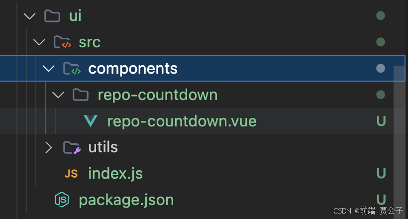
repo-countdown 组件
pnpm init -y
{
  "name": "monorepo-ui",
  "version": "1.0.0",
  "main": "src/index.js",
  "scripts": {
    "test": "echo \"Error: no test specified\" && exit 1"
  },
  "exports": {
    ".": "./src/index.js"
  },
  "keywords": [],
  "author": "",
  "license": "ISC",
  "description": ""
}
repo-countdown 组件
<template>
  <!-- 验证码倒计时按钮 -->
  <button
    class="sms-btn"
    :disabled="isDisabled"
    :hover-class="hover ? 'button-hover' : 'none'"
    @click="handleClick"
    :style="[buttonStyle]"
  >
    {{ buttonText }}
  </button>
</template>

<script>
/**
 * 验证码倒计时按钮组件
 * @description 用于发送短信验证码的倒计时按钮,支持自定义样式和倒计时时间
 * @property {String} text - 按钮默认文本
 * @property {String} sendText - 发送中的按钮文本
 * @property {String} countdownText - 倒计时文本后缀
 * @property {Number} seconds - 倒计时秒数
 * @property {String} width - 按钮宽度
 * @property {String} height - 按钮高度
 * @property {String} padding - 按钮内边距
 * @property {String} margin - 按钮外边距
 * @property {String} radius - 按钮圆角
 * @property {Number} size - 字体大小
 * @property {String} color - 字体颜色
 * @property {String} background - 背景颜色
 * @property {String} borderWidth - 边框宽度
 * @property {String} borderColor - 边框颜色
 * @property {Boolean} isOpacity - 倒计时状态是否透明
 * @property {Boolean} hover - 是否有点击效果
 * @property {Number/String} successVal - 触发倒计时的值,值变化时开始倒计时
 * @property {Number/String} resetVal - 重置倒计时的值,值变化时重置倒计时
 * @property {Boolean} start - 是否自动开始倒计时
 * @property {Number/String} params - 传递给事件的参数
 * @event {Function} send - 点击发送按钮时触发
 * @event {Function} countdown - 倒计时变化时触发
 * @event {Function} end - 倒计时结束时触发
 */
export default {
  name: "SmsCountdownButton",
  /**
   * Vue3 现在提供了一个emits选项,类似于现有props选项。此选项可用于定义组件可以向其父对象发出的事件
   强烈建议使用emits记录每个组件发出的所有事件。
   这一点特别重要,因为去除了.native修饰符。emits 现在在未使用声明的事件的所有侦听器都将包含在组件的中$attrs,默认情况下,该侦听器将绑定到组件的根节点。
   */
  emits: ["countdown", "send", "end"], // 显式声明自定义事件
  props: {
    text: { type: String, default: "发送验证码" }, // 按钮默认文本
    sendText: { type: String, default: "请稍候..." }, // 发送中的按钮文本
    countdownText: { type: String, default: "s后获取" }, // 倒计时文本后缀
    seconds: { type: Number, default: 60 }, // 倒计时秒数
    width: { type: String, default: "182rpx" }, // 按钮宽度
    height: { type: String, default: "56rpx" }, // 按钮高度
    padding: { type: String, default: "0" }, // 按钮内边距
    margin: { type: String, default: "0" }, // 按钮外边距
    radius: { type: String, default: "6rpx" }, // 按钮圆角
    size: { type: Number, default: 24 }, // 字体大小
    color: { type: String, default: "#5677fc" }, // 字体颜色
    background: { type: String, default: "transparent" }, // 背景颜色
    borderWidth: { type: String, default: "1px" }, // 边框宽度
    borderColor: { type: String, default: "#5677fc" }, // 边框颜色
    isOpacity: { type: Boolean, default: true }, // 倒计时状态是否透明
    hover: { type: Boolean, default: true }, // 是否有点击效果
    successVal: { type: [Number, String], default: 0 }, // 触发倒计时的值
    resetVal: { type: [Number, String], default: 0 }, // 重置倒计时的值
    start: { type: Boolean, default: false }, // 是否自动开始倒计时
    params: { type: [Number, String], default: 0 }, // 传递给事件的参数
    disabledColor: { type: String, default: "" } // 禁用状态的字体颜色
  },
  data() {
    return {
      state: "idle", // 按钮状态:idle(空闲)、pending(发送中)、countdown(倒计时)
      remaining: this.seconds, // 剩余秒数
      timer: null // 定时器
    }
  },
  computed: {
    /**
     * 按钮是否禁用
     * @return {Boolean} 非空闲状态时禁用按钮
     */
    isDisabled() {
      return this.state !== "idle"
    },
    /**
     * 按钮文本
     * @return {String} 根据状态返回不同的按钮文本
     */
    buttonText() {
      // 空闲状态
      if (this.state === "idle") {
        return this.text
        // 发送状态
      } else if (this.state === "pending") {
        return this.sendText
        // 倒计时状态
      } else if (this.state === "countdown") {
        return `${this.remaining}${this.countdownText}`
      }
      return ""
    },
    /**
     * 按钮样式
     * @return {Object} 样式对象
     */
    buttonStyle() {
      const style = {
        width: this.width,
        height: this.height,
        padding: this.padding,
        margin: this.margin,
        color: this.color,
        background: this.background,
        borderWidth: this.borderWidth,
        borderColor: this.borderColor,
        borderRadius: this.radius,
        fontSize: this.size + "rpx",
        borderStyle: "solid",
        display: "flex",
        alignItems: "center",
        justifyContent: "center"
      }
      // 倒计时状态且需要透明时设置透明度
      if (this.state === "countdown" && this.isOpacity) {
        style.opacity = 0.5
      }

      // 倒计时状态且需要禁用时设置背景颜色
      if (this.disabledColor && this.state === "countdown") {
        style.background = this.disabledColor
      }
      return style
    }
  },
  watch: {
    /**
     * 监听成功值变化,触发倒计时
     */
    successVal(newVal, oldVal) {
      if (newVal !== oldVal) {
        this.success()
      }
    },
    /**
     * 监听重置值变化,重置倒计时
     */
    resetVal(newVal, oldVal) {
      if (newVal !== oldVal) {
        this.reset()
      }
    }
  },
  mounted() {
    // 如果设置了自动开始,则立即开始倒计时
    if (this.start) {
      this.success()
    }
  },
  // 在 Vue3 中组件卸载的生命周期被重新命名  destroyed 修改为 unmounted
  // #ifdef VUE2
  beforeUnmount() {
    // 组件销毁前清除定时器
    if (this.timer) {
      clearInterval(this.timer)
      this.timer = null
    }
  },
  // #endif
  // #ifdef VUE3
  unmounted() {
    // 组件销毁前清除定时器
    if (this.timer) {
      clearInterval(this.timer)
      this.timer = null
    }
  },
  // #endif
  methods: {
    /**
     * 开始倒计时
     */
    startCountdown() {
      // 清除可能存在的定时器
      if (this.timer) {
        clearInterval(this.timer)
      }
      // 设置状态为倒计时
      this.state = "countdown"
      this.remaining = this.seconds
      // 触发倒计时事件 {因为倒计时事件是每秒触发一次,最开始要触发一次}
      this.$emit("countdown", { seconds: this.remaining, params: this.params })
      // 设置定时器
      this.timer = setInterval(() => {
        // 倒计时
        this.remaining--
        if (this.remaining > 0) {
          // 每秒触发倒计时事件
          this.$emit("countdown", {
            seconds: this.remaining,
            params: this.params
          })
        } else {
          // 倒计时结束,清除定时器
          clearInterval(this.timer)
          this.timer = null
          // 设置状态为空闲
          this.state = "idle"
          // 触发结束事件
          this.$emit("end", { params: this.params })
        }
      }, 1000)
    },
    /**
     * 成功发送验证码,开始倒计时
     */
    success() {
      // 如果按钮状态不为倒计时,则开始倒计时 [空闲状态|发送中状态都可以进入]
      // 自动开始时是空闲,手动点击时是发送中
      if (this.state !== "countdown") {
        this.startCountdown()
      }
    },
    /**
     * 重置按钮状态
     */
    reset() {
      // 清除定时器
      if (this.timer) {
        clearInterval(this.timer)
        this.timer = null
      }
      // 重置状态
      this.state = "idle"
      // 重置剩余秒数
      this.remaining = this.seconds
    },
    /**
     * 按钮点击处理
     */
    handleClick() {
      // 如果按钮状态为空闲,则设置状态为发送中,并触发发送事件
      if (this.state === "idle") {
        // 设置状态为发送中
        this.state = "pending"
        // 触发发送事件
        this.$emit("send", { params: this.params })
      }
    }
  }
}
</script>

<style scoped>
/* 按钮基本样式 */
.sms-btn {
  display: inline-block; /* 内联块级元素 */
  text-align: center; /* 文本居中 */
  cursor: pointer; /* 鼠标样式 */
}
/* 禁用状态样式 */
.sms-btn:disabled {
  cursor: not-allowed; /* 禁用状态的鼠标样式 */
}
.button-hover {
  transform: scale(0.98); /* 按钮悬停时的缩放 */
  box-shadow: 0 2px 5px rgba(0, 0, 0, 0.2); /* 按钮悬停时的阴影 */
}
</style>
index.js
import RepoCountdown from "./components/repo-countdown/repo-countdown.vue"
export { RepoCountdown }
加入组件
pnpm --filter app add monorepo-ui --workspace使用组件
<template>
  <view class="content">
    <image class="logo" @click="handleClick" src="/static/logo.png"></image>
    <view class="text-area">
      <text class="title">{{ title }}</text>
      <uni-badge text="1"></uni-badge>
      <uni-badge text="2" type="success"></uni-badge>
      <uni-badge text="3" type="primary" :inverted="true"></uni-badge>
      <repo-countdown></repo-countdown>
    </view>
  </view>
</template>

<script>
import { modal } from "monorepo-utils/extendApi"
import { RepoCountdown } from "monorepo-ui"

export default {
  components: {
    RepoCountdown
  },
  data() {
    return {
      title: "Hello"
    }
  },
  onLoad() {},
  methods: {
    handleClick() {
      modal({
        title: "提示",
        content: "您确定执行该操作吗?"
      })
    }
  }
}
</script>

<style>
.content {
  display: flex;
  flex-direction: column;
  align-items: center;
  justify-content: center;
}

.logo {
  height: 200rpx;
  width: 200rpx;
  margin-top: 200rpx;
  margin-left: auto;
  margin-right: auto;
  margin-bottom: 50rpx;
}

.text-area {
  display: flex;
  justify-content: center;
}

.title {
  font-size: 36rpx;
  color: #8f8f94;
}
</style>
自动引入
添加全部导出
  "exports": {
    ".": "./src/index.js",
    "./*": "./src/*"
  },
添加自动引入
  "easycom": {
    "autoscan": true,
    "custom": {
      "^uni-(.*)": "@dcloudio/uni-ui/lib/uni-$1/uni-$1.vue",
      "^repo-(.*)": "monorepo-ui/components/repo-$1/repo-$1.vue"
    }
  }