目录
- 手把手环境搭建
-
- [构建第一个Android App](#构建第一个Android App)
-
- 工具的安装与环境配置
- 工程结构介绍
- 实践:构建第一个Apk
- [Android Studio的完全卸载清除](#Android Studio的完全卸载清除)
- 开发语言------Kotlin
- [ANDROID UI ------搭建慕课APP学习页面](#ANDROID UI ——搭建慕课APP学习页面)
-
- [3.1 Android UI 必知必会](#3.1 Android UI 必知必会)
- [3.2 Android常用的基础布局容器](#3.2 Android常用的基础布局容器)
- [3.3 MaterialButton 丰富多彩的按钮](#3.3 MaterialButton 丰富多彩的按钮)
-
- MaterialButton
- MaterialButtonToggleGroup
- TextView控件
- ImageView控件
- [RecyclerView高级UI控件 & 案例实践](#RecyclerView高级UI控件 & 案例实践)
- AndROID网络编程------OKHTTP&RETROFIT
- ANDROID四大组件
手把手环境搭建
构建第一个Android App
工具的安装与环境配置
工程结构介绍
实践:构建第一个Apk
Android Studio的完全卸载清除
开发语言------Kotlin
Kotlin必知必会
Kotlin基本数据类型
基本数据类型
基本数据类型包括:Byte、Short、Int、Long、Float、Double
整数类型:Byte、Short、Int、Long
浮点类型:Float、Double
字符类型
字符串类型
类型强制转换
数字运算
Kotlin的数据类型
ANDROID UI ------搭建慕课APP学习页面
3.1 Android UI 必知必会
3.2 Android常用的基础布局容器
Android的UI可以分为两类,一类叫做ViewGroup容器 ,一类叫做View视图
- View视图:(TextView,Button,ImageView)都是常用常见的视图.
- ViewGroup容器 :内部可以承载、放置、添加View视图
包含关系
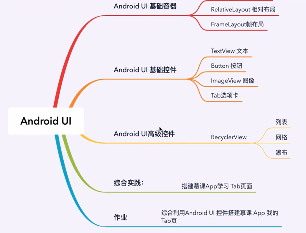
⭐️基础布局容器
- LinearLayout线性布局:横着或竖着按顺序排列
- RelativeLayout相对布局:起始坐标时屏幕坐上角,以同级或上级为参考系定位位置
- FrameLayout帧布局:像千层饼一样,一层压着一层
- ConstraintLayout约束布局:google于2016年新发布的一种布局方式,它不在android的基础api包里,需要额外引入。(暂时不学)
线性布局LinearLayout
线性布局就是从左到右或从上到下按顺序排列的一种布局。下面讲一讲LinearLayout的基础属性。
| 属性 | 可选值 | 说明 |
|---|---|---|
| orientation | 1.vertical:垂直排列 2.horizontal:水平排列 | 也就是这个线性布局到底是水平方向逐个排列还是垂直方向逐个排列 |
| layout_width layout_height | 1.match_parent:填充父容器的剩余空间 2.wrap_content:根据子视图宽高自适应自己的宽高 3.自定义大小50dp | layout_width 和 layout_height 是android中控件的必要属性,规定了控件的宽度和高度,这个两个属性的值可以是指定的值,也可以根据内容自适应,还可以填充整个剩余空间 |
| background | #ff0000红色 | 填充背景色 |
| gravity | 1.center:所有子视图相对于父容器居中显示 2.horizontal_center:所有子容器的横向方向上相对父容器居中显示 3.vertical_center:所有子视图的纵向方向上相对父容器居中显示 | 决定子控件 相对该父容器的位置 |
| layout_gravity | 1.center:该容器相对于它的父容器居中显示 2.horizontal_center:该容器横向方向上相对它的父容器居中显示 3.vertical_center:该容器纵向方向上相对它的父容器居中显示 | 决定该容器 相对它的父容器的位置 |
| weight | 按比例分配父容器剩余的宽度或高度 |
orientation:规定 子view 是按水平排列还是垂直排列,是必须要有的属性。
layout_width、layout_height :view 必须要有的属性
background:
gravity:
layout_gravity: 容易与gravity混淆
weight:
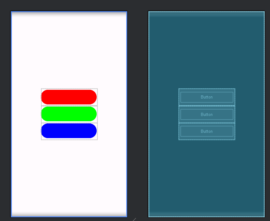
📚代码示例
xml
<?xml version="1.0" encoding="utf-8"?>
<LinearLayout xmlns:android="http://schemas.android.com/apk/res/android"
    android:orientation="vertical"
    android:layout_width="match_parent"
    android:gravity="center"
    android:layout_height="match_parent">

    <!-- 线性布局-->
<!--    android:orientation="vertical" 在垂直方向上依次排开 -->

<!--    android:gravity="center_horizontal" 使得子view在水平方向上居中显示-->
<!--    android:gravity="center_vertical" 使得子view在垂直方向上居中显示-->
<!--    android:gravity="center_vertical" 使得子view在水平、垂直方向上居中显示-->
    <Button
        android:layout_width="200dp"
        android:layout_height="60dp"
        android:backgroundTint="#ff0000" />
    <Button
        android:layout_width="200dp"
        android:layout_height="60dp"
        android:backgroundTint="#00ff00"/>
    <Button
        android:layout_width="200dp"
        android:layout_height="60dp"
        android:backgroundTint="#0000ff"/>

</LinearLayout>
🐱效果
相对布局RelativeLayout
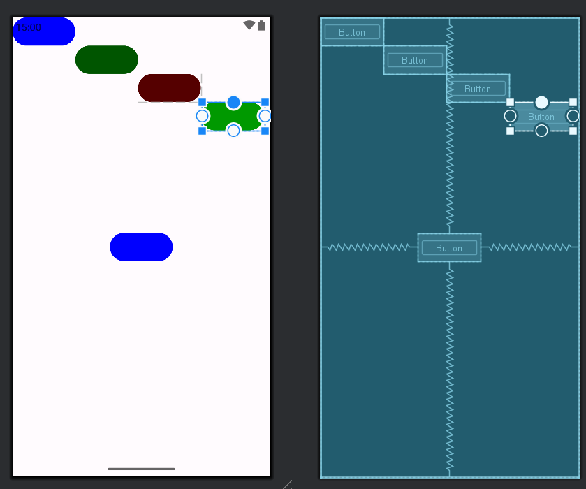
相对布局在摆放子视图位置时,按照指定的参考系来摆放子视图的位置,默认以屏幕左上角(0,0)位置作为参考系摆放位置
- 相对于父元素7个常用属性
| 属性 | 可选值 | 说明 |
|---|---|---|
| layout_alignParentTop | true/false | 是否让控件相对于父容器顶部对齐 |
| layout_alignParentBottom | true/false | 是否让控件相对于父容器底部对齐 |
| layout_alignParentLeft | true/false | 是否让控件相对于父容器左边对齐 |
| layout_alignParentRight | true/false | 是否让控件相对于父容器右边对齐 |
| layout_centerVertical | true/false | 相对父容器水平居中显示 |
| layout_centerHorizontal | true/false | 相对父容器垂直居中显示 |
| centerInParent | true/false | 相对父容器居中显示 |
相对于兄弟元素4个常用属性:
| 属性 | 可选值 | 说明 |
|---|---|---|
| layout_above | @+id/ | 指定在那个控件的上方 |
| layout_below | true/false | 指定在那个控件的下方 |
| android:layout_toLeftOf | true/false | 指定在那个控件的左侧 |
| android:layout_toRightOf | true/false | 指定在那个控件的右侧 |
相对于兄弟元素的对齐方式:
| 属性 | 可选值 | 说明 |
|---|---|---|
| layout_alignLeft | @+id/ | 该控件的左边沿与指定控件的左边对齐 |
| layout_aliginRight | true/false | 该控件的右边沿与指定控件的右边对齐 |
| layout_alignTop | true/false | 该控件的上边沿与指定控件的上边沿对齐 |
| layout_alignBottom | true/false | 该控件的下边沿与指定控件的下边沿对齐 |
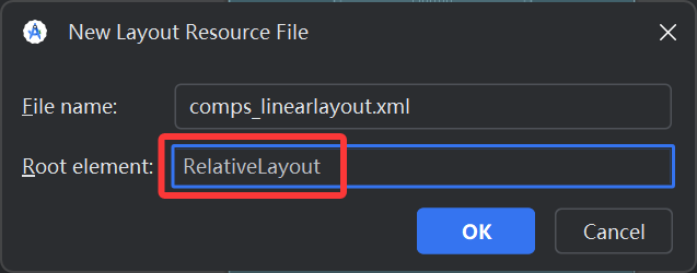
📚代码示例
xml
<?xml version="1.0" encoding="utf-8"?>
<RelativeLayout xmlns:android="http://schemas.android.com/apk/res/android"
             android:layout_width="match_parent"
             android:layout_height="match_parent">

    <Button
        android:id="@+id/btn1"
        android:layout_width="100dp"
        android:layout_height="45dp"
        android:insetTop="0dp"
        android:insetBottom="0dp"
        android:backgroundTint="#0000ff"/>
    <Button
        android:id="@+id/btn2"
        android:layout_width="100dp"
        android:layout_height="45dp"
        android:insetTop="0dp"
        android:insetBottom="0dp"
        android:layout_toRightOf="@+id/btn1"
        android:layout_below="@id/btn1"
        android:backgroundTint="#005500"/>
    <Button
        android:id="@+id/btn3"
        android:layout_width="100dp"
        android:layout_height="45dp"
        android:insetTop="0dp"
        android:insetBottom="0dp"
        android:layout_toRightOf="@id/btn2"
        android:layout_below="@id/btn2"
        android:backgroundTint="#550000"/>
    <Button
        android:id="@+id/btn4"
        android:layout_width="100dp"
        android:layout_height="45dp"
        android:insetTop="0dp"
        android:insetBottom="0dp"
        android:layout_toRightOf="@id/btn3"
        android:layout_below="@id/btn3"
        android:backgroundTint="#009900"/>

    <Button
        android:id="@+id/btn5"
        android:layout_width="100dp"
        android:layout_height="45dp"
        android:insetTop="0dp"
        android:insetBottom="0dp"
        android:layout_centerInParent="true"
        android:backgroundTint="#0000ff"/>
</RelativeLayout>
🐱效果
帧布局FrameLayout
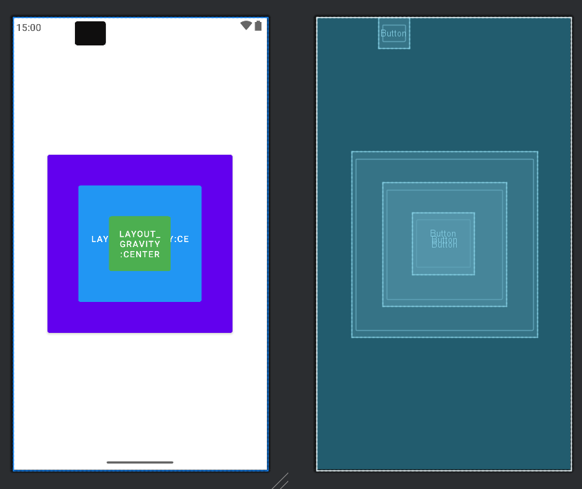
组件的默认位置都是左上角,组件之间可以重叠。像千层饼一样,一层压着一层可以设置上下左右的对齐、水平垂直居中、设置方式与线性布局相似。
⭐️常用属性
| 属性 | 可选值 | 说明 |
|---|---|---|
| layout_gravity | center/center_vertical/center_horizontal | 组件相对父容器的位置 |
| layout_marginLeft | 具体的数值100dp | 左侧外间距 |
| layout_marginTop | 具体的数值100dp | 上侧外间距 |
| layout_marginRight | 具体的数值100dp | 右侧外间距 |
| layout_marginBottom | 具体的数值100dp | 下侧外间距 |
📚代码示例
xml
<?xml version="1.0" encoding="utf-8"?>
<FrameLayout xmlns:android="http://schemas.android.com/apk/res/android"
    android:layout_width="match_parent"
    android:layout_height="match_parent">

    <Button
        android:layout_width="300dp"
        android:layout_height="300dp"
        android:text="layout_gravity:center"
        android:layout_gravity="center" />

    <Button
        android:layout_width="200dp"
        android:layout_height="200dp"
        android:layout_gravity="center"
        android:backgroundTint="#2196F3"
        android:text="layout_gravity:center" />

    <Button
        android:layout_width="100dp"
        android:layout_height="100dp"
        android:layout_gravity="center"
        android:backgroundTint="#4CAF50"
        android:text="layout_gravity:center" />

    <Button
        android:layout_width="50dp"
        android:layout_height="50dp"
        android:layout_marginLeft="100dp"
        android:backgroundTint="#0F0E0E" />

</FrameLayout>
🐱效果
3.3 MaterialButton 丰富多彩的按钮
MaterialButton
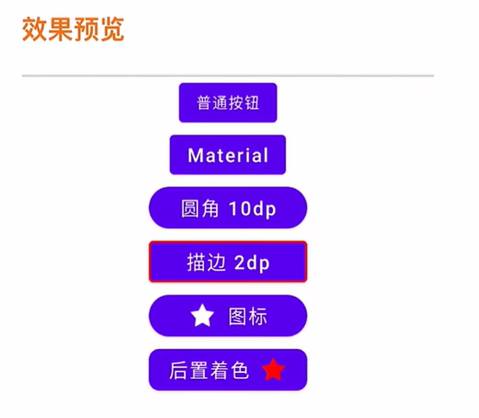
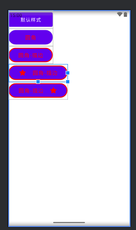
MaterialButton是Google于SDK28推出的新控件,当遇到按钮需要圆角、或者描边等,就不必使用xml文件或者Github上找第三方库实现。
🐱效果预览
如何使用MaterialButton呢?
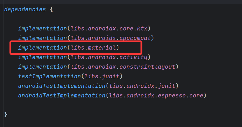
1️⃣依赖引入
- 添加依赖
project -> app -> build.gradle.kts
- app的theme主题更改
app -> src -> main -> AndroidMainfest.xml,ctrl+鼠标左键点击theme,来到theme.xml
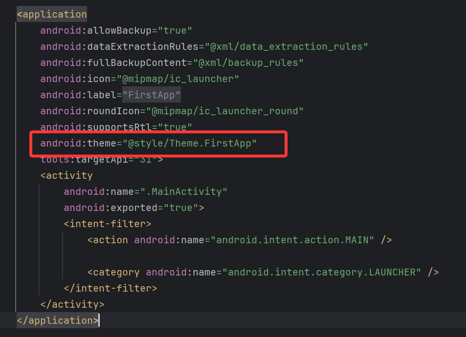
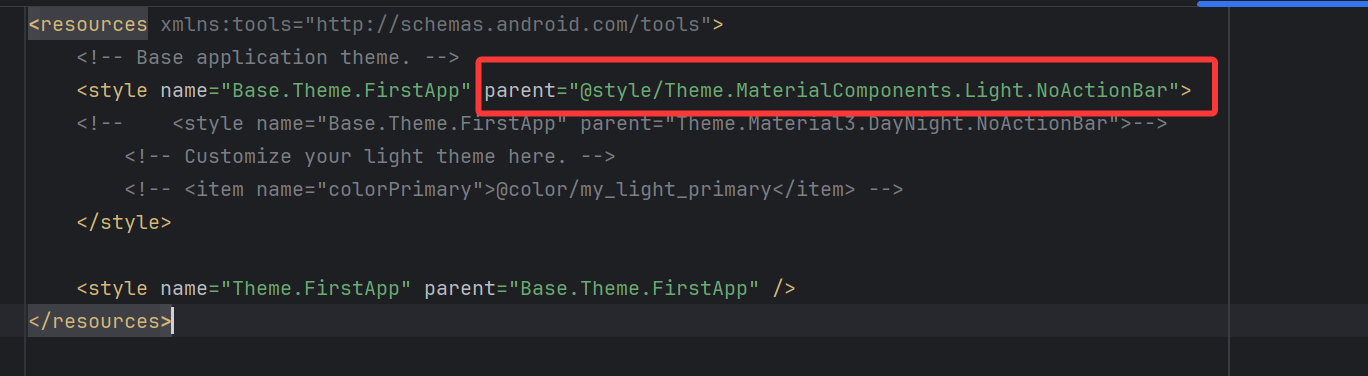
2️⃣继承关系
xml
java.lang.Object
	android.view.View
		android.widget.TextView
			android.widget.Button
				androidx.appcompat.widget.AppCompatButton
					com.google.android.material.button.MaterialButton
MaterialButton继承AppCompatButton,所以它拥有AppCompatButton所有的特性,且在其基础上做了一些扩展,如圆角、描边、前置和后置icon(支持设置Size、Tint、Padding、Gravity等),还支持按压水波纹并且自定义颜色。
3️⃣关键属性
| 属性 | 描述 | 参数 |
|---|---|---|
| app:backgroundTint | 背景着色 | 默认为?attr/colorPrimary |
| app:backgroundTintMode | 着色模式 | add,multiply,screen,src_atop,src_in,src_over |
| app:strokeColor | 描边颜色 | |
| app:strokeWidth | 描边宽度 | |
| app:cornerRadius | 圆角大小 | |
| app:rippleColor | 按压水波纹颜色 | |
| app:icon | 图标icon | |
| app:iconSize | 图标大小 | |
| app:iconGravity | 图标重心 | start,end.textStart,textEnd |
| app:iconTint | 图标着色 | |
| app:iconTintMode | 图标着色模式 | add,multiply,screen,src_atop,src_in,src_over |
| app:iconPadding | 图标和文本之间的间距 |
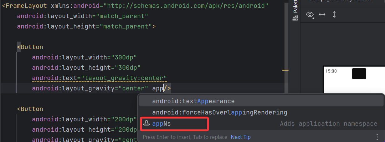
输入app,点击appNS,剪切到根结点上面,下面所有的空间就可以使用app这个命名空间了。
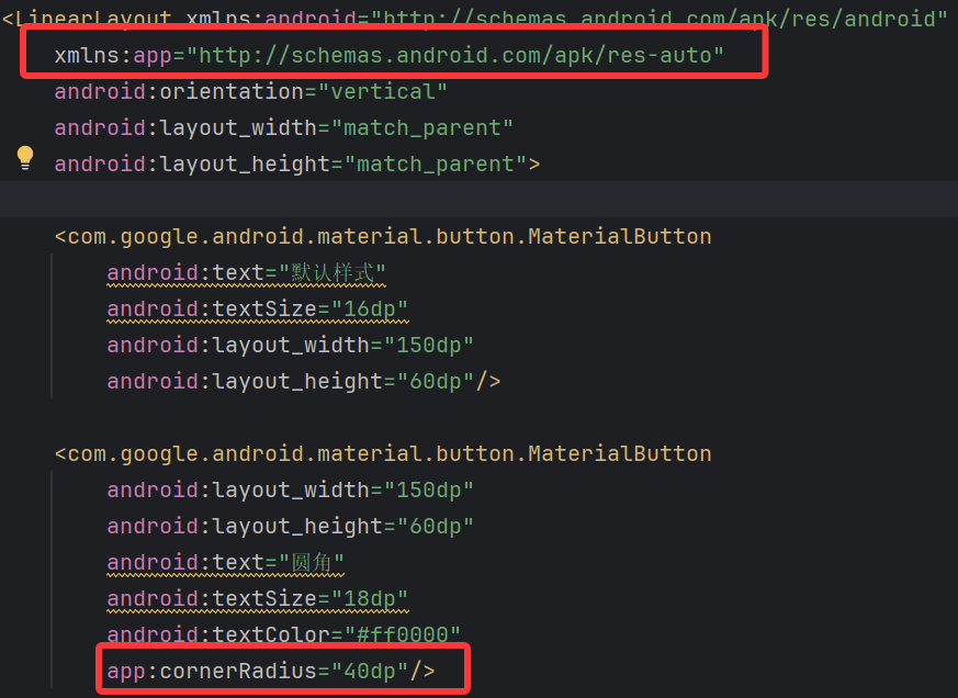
📚代码示例
xml
<?xml version="1.0" encoding="utf-8"?>
<LinearLayout xmlns:android="http://schemas.android.com/apk/res/android"
    xmlns:app="http://schemas.android.com/apk/res-auto"
    android:orientation="vertical"
    android:layout_width="match_parent"
    android:layout_height="match_parent">

    <com.google.android.material.button.MaterialButton
        android:text="默认样式"
        android:textSize="16dp"
        android:layout_width="150dp"
        android:layout_height="60dp"/>

    <com.google.android.material.button.MaterialButton
        android:layout_width="150dp"
        android:layout_height="60dp"
        android:text="圆角"
        android:textSize="18dp"
        android:textColor="#ff0000"
        app:cornerRadius="40dp"/>

    <com.google.android.material.button.MaterialButton
        android:layout_width="150dp"
        android:layout_height="60dp"
        android:text="圆角-描边"
        android:textSize="18dp"
        android:textColor="#ff0000"
        app:strokeColor="#ff0000"
        app:strokeWidth="3dp"
        app:cornerRadius="40dp"/>

    <com.google.android.material.button.MaterialButton
        android:layout_width="200dp"
        android:layout_height="60dp"
        android:text="圆角-描边"
        android:textSize="18dp"
        android:textColor="#ff0000"
        app:strokeColor="#ff0000"
        app:strokeWidth="3dp"
        app:icon="@android:drawable/star_on"
        app:iconTint="#ff0000"
        app:iconPadding="20dp"
        app:iconGravity="textStart"
        app:cornerRadius="40dp"/>

    <com.google.android.material.button.MaterialButton
        android:layout_width="200dp"
        android:layout_height="60dp"
        android:text="圆角-描边"
        android:textSize="18dp"
        android:textColor="#ff0000"
        app:strokeColor="#ff0000"
        app:strokeWidth="3dp"
        app:icon="@android:drawable/star_on"
        app:iconTint="#ff0000"
        app:iconPadding="20dp"
        app:iconGravity="textEnd"
        app:cornerRadius="40dp"/>
</LinearLayout>
🐱效果
4️⃣注意事项
- 不可以使用
android:background设置按钮背景,会破坏MaterialButton本身的绘制,而设置背景则推荐使用app:backgroundTint - MaterialButton创建后,按钮实际长度并不是设定值,因为它上下有留空,可以使用
android:insetBottom="0dp"和android:insetTop="0dp"去除 - 去除阴影
MD控件默认有阴影效果,但是有时候我们并不想要按钮有阴影,那么这时候可以指定style为
style="@style/Widget.MaterialComponents.Button.UnelevatedButton"这样就能去掉阴影,让视图看起来扁平化 - 闪退
修改APP主题
xml
android:theme="@style/Theme.MaterialComponents.Light.NoActionBar"MaterialButtonToggleGroup
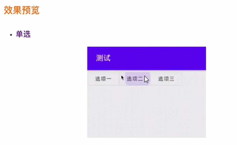
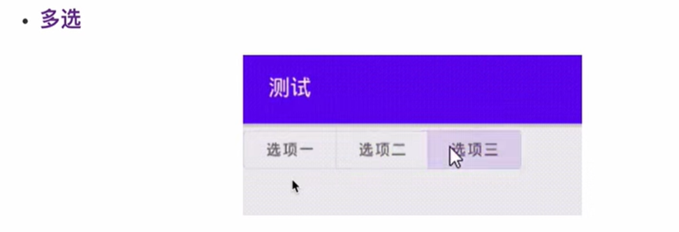
🐱效果预览
继承关系
java
java.lang.Object
	android.view.View
 		android.view.ViewGroup
			android.widget.LinearLayout
				com.google.android.material.button.MaterialButtonToggleGroup
类似一个LinearLayout,但只能添加MaterialButton,只有第一个子元素的最左边角和最后一个子元素的最右边角才能保留它们的形状外观圆角大小,类似于iOS中的SegmentedControl,用户可以从组中选择一个或多个选项。
⭐️公开属性
| 属性 | 描述 | 参数 |
|---|---|---|
| app:singleSelection | 默认选中 | 按钮ID |
| app:checkedButton | 是否单项选择 | true/false |
| app:selectionRequired | 设置为true后,强制至少选中一个 | true/false |
📚代码示例
xml
<?xml version="1.0" encoding="utf-8"?>
<LinearLayout xmlns:android="http://schemas.android.com/apk/res/android"
    xmlns:app="http://schemas.android.com/apk/res-auto"
    android:orientation="vertical"
    android:layout_width="match_parent"
    android:layout_height="match_parent">

    <com.google.android.material.button.MaterialButton
        android:text="默认样式"
        android:textSize="16dp"
        android:layout_width="150dp"
        android:layout_height="60dp"/>

    <com.google.android.material.button.MaterialButton
        android:layout_width="150dp"
        android:layout_height="60dp"
        android:text="圆角"
        android:textSize="18dp"
        android:textColor="#ff0000"
        app:cornerRadius="40dp"/>

    <com.google.android.material.button.MaterialButton
        android:layout_width="150dp"
        android:layout_height="60dp"
        android:text="圆角-描边"
        android:textSize="18dp"
        android:textColor="#ff0000"
        app:strokeColor="#ff0000"
        app:strokeWidth="3dp"
        app:cornerRadius="40dp"/>

    <com.google.android.material.button.MaterialButton
        android:layout_width="200dp"
        android:layout_height="60dp"
        android:text="圆角-描边"
        android:textSize="18dp"
        android:textColor="#ff0000"
        app:strokeColor="#ff0000"
        app:strokeWidth="3dp"
        app:icon="@android:drawable/star_on"
        app:iconTint="#ff0000"
        app:iconPadding="20dp"
        app:iconGravity="textStart"
        app:cornerRadius="40dp"/>

    <com.google.android.material.button.MaterialButton
        android:layout_width="200dp"
        android:layout_height="60dp"
        android:text="圆角-描边"
        android:textSize="18dp"
        android:textColor="#ff0000"
        app:strokeColor="#ff0000"
        app:strokeWidth="3dp"
        app:icon="@android:drawable/star_on"
        app:iconTint="#ff0000"
        app:iconPadding="20dp"
        app:iconGravity="textEnd"
        app:cornerRadius="40dp"/>

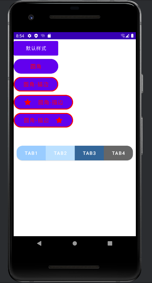
    <com.google.android.material.button.MaterialButtonToggleGroup
        android:layout_width="match_parent"
        android:layout_height="60dp"
        android:layout_marginTop="50dp"
        android:layout_marginLeft="10dp"
        android:layout_marginRight="10dp"
        android:id="@+id/toggle_group"
        app:checkedButton="@+id/btn1"
        app:singleSelection="true"
        app:selectionRequired="false">
    <com.google.android.material.button.MaterialButton
        android:text="Tab1"
        android:textSize="16dp"
        android:layout_width="0dp"
        android:layout_weight="1"
        android:layout_height="60dp"
        android:backgroundTint="@color/material_dynamic_tertiary60"
        app:cornerRadius="20dp"
        android:id="@+id/btn1"/>
    <com.google.android.material.button.MaterialButton
        android:text="Tab2"
        android:textSize="16dp"
        android:layout_width="0dp"
        android:layout_weight="1"
        android:layout_height="60dp"
        android:backgroundTint="@color/material_dynamic_tertiary80"
        android:id="@+id/btn2"/>
    <com.google.android.material.button.MaterialButton
        android:text="Tab3"
        android:textSize="16dp"
        android:layout_width="0dp"
        android:layout_weight="1"
        android:layout_height="60dp"
        android:backgroundTint="@color/material_dynamic_tertiary20"
        android:id="@+id/btn3"/>
        <com.google.android.material.button.MaterialButton
            android:text="Tab4"
            android:textSize="16dp"
            android:layout_width="0dp"
            android:layout_weight="1"
            android:layout_height="60dp"
            android:backgroundTint="@color/material_dynamic_neutral30"
            app:cornerRadius="20dp"
            android:id="@+id/btn4"/>
    </com.google.android.material.button.MaterialButtonToggleGroup>

</LinearLayout>
MainActivity.kt
kotlin
package com.example.firstapp

import android.os.Bundle
import android.util.Log
import android.view.View
import androidx.activity.enableEdgeToEdge
import androidx.appcompat.app.AppCompatActivity
import androidx.core.view.ViewCompat
import androidx.core.view.WindowInsetsCompat
import com.google.android.material.button.MaterialButtonToggleGroup

class MainActivity : AppCompatActivity() {
    override fun onCreate(savedInstanceState: Bundle?) {
        super.onCreate(savedInstanceState)
//        enableEdgeToEdge()
        setContentView(R.layout.comps_material_button)
//        ViewCompat.setOnApplyWindowInsetsListener(findViewById(R.id.toggle_group)) { v, insets ->
//            val systemBars = insets.getInsets(WindowInsetsCompat.Type.systemBars())
//            v.setPadding(systemBars.left, systemBars.top, systemBars.right, systemBars.bottom)
//            insets
//        }

        val toggleGroup: MaterialButtonToggleGroup = findViewById(R.id.toggle_group)

        toggleGroup.addOnButtonCheckedListener(
        object : MaterialButtonToggleGroup.OnButtonCheckedListener {
            override fun onButtonChecked(
                group: MaterialButtonToggleGroup?,
                checkedId: Int,
                isChecked: Boolean
            ) {
                Log.e("MainActivity", isChecked.toString())
            }
        })
    }
}
🐱效果
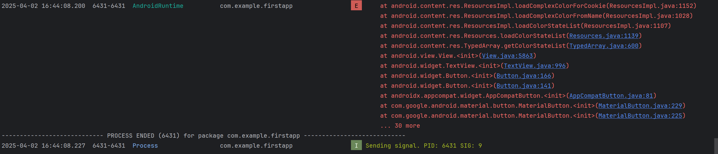
💩xxx isn't responding xxx keeps stopping
大无语时间,搞了半天,先是虚拟器显示
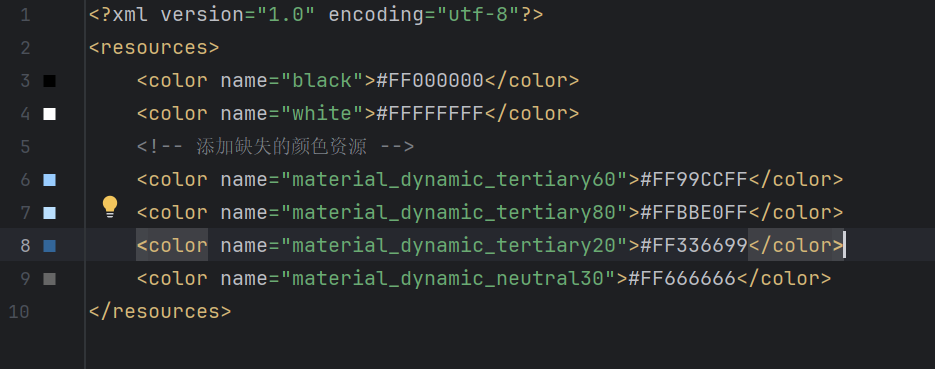
System UI isn't responding,应该是无法相应的意思吧,看了一些文章说清除一下数据就好了解决Android虚拟机启动时System UI isn't responding错误,清除重新启动后又出现xxx keeps stopping错误闪退了,看了文章后试着查看logcat日志Android studio虚拟调试出现"我的APP keeps stopping"问题,发现报错:问了ai后发现是引用了 material_dynamic_tertiary60 等未定义的颜色资源,要在
color.xml中补上,
然后就ok了。
TextView控件
⭐️常用属性
| 属性 | 属性值示例 | 属性说明 |
|---|---|---|
| id | @+id/tv | 设置一个组件id,通过findViewByld0的方法获取到该对象,然后进行相关设置 |
| layout_width | 100dp | 组件宽度 |
| layout_height | wrap_content | 组件高度 |
| text | 设置文本内容 | |
| background | #ff0000 | 背景颜色(或背景图片) |
| textColor | #ff0000 | 设置字体颜色 |
| textStyle | bold/ italic/normal | 设置字体样式 |
| textSize | 16sp | 字体大小 |
| gravity | center/center_horizontal/center_vertical | 内容的对齐方向 |
| drawableTop | @drawable/icon | TextView上部出现一个图片 |
| drawablePadding | 10dp | 图片和文本的间距 |
| drawableTint | *ffffff | 图片着色 |
| ellipsize | end,middle,marquee,start | 文字超出时的截断方式 |
| singleLine | true/false | 单行显示 |
| padding paddingLeft paddingRight paddingTop paddingBottom | 10dp | 内间距 |
| marginLeft marginTop marginRight marginBottom | 10dp | 外间距、控件间的间距 |
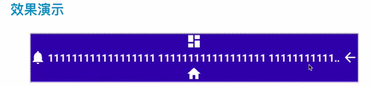
🐱效果演示
📚代码示例
xml
<TextView
        android:layout_width="match_parent"
        android:layout_marginTop="50dp"
        android:layout_height="60dp"
        android:background="#0000ff"
        android:text="1111111111111111111111111111111111111111111111111111"
        android:textColor="#ffffff"
        android:textSize="20dp"
        android:singleLine="true"
        android:focusableInTouchMode="true"
        android:focusable="true"
        android:ellipsize="marquee"
        android:clickable="true"
        android:marqueeRepeatLimit="marquee_forever"
        android:gravity="center"/>
🐱效果
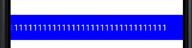
其实是有一个跑马灯效果的
📚代码示例
xml
<TextView
        android:layout_width="match_parent"
        android:layout_marginTop="50dp"
        android:layout_height="60dp"
        android:background="#0000ff"
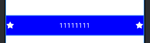
        android:text="11111111"
        android:textColor="#ffffff"
        android:textSize="20dp"
        android:singleLine="true"
        android:focusableInTouchMode="true"
        android:focusable="true"
        android:ellipsize="marquee"
        android:clickable="true"
        android:marqueeRepeatLimit="marquee_forever"
        android:gravity="center"
        android:drawableLeft="@android:drawable/star_on"
        android:drawableTint="#ffffff"
        android:drawableRight="@android:drawable/star_on"/>
🐱效果
ImageView控件
⭐️常见属性
| 属性 | 属性值示例 | 属性说明 |
|---|---|---|
| android:src | @drawable/icon_home | 给ImageView设置要显示的图片 |
| android:alpha | 0.50.0\~1.0 | 设置透明度 |
| android:background | @drawable/background | 给ImageView设置背景色、背景图片 |
| android:scaleType | 用于设置图片如何缩放以适应ImageView的大小 |
⭐️scaleType
- center :保持原图的犬小,显示在ImageView的中心。当原图的长(宽)大于ImageView的长(宽),超过部分裁剪处理。
- centerCrop :以填满整个ImageView为目的,将原图的中心对准ImageView的中心 ,等比例放大原图 ,直到填满ImageView为止(指的是ImageView的宽和高都要填满),原图超过ImageView的部分作裁剪处理。
- centerInside :以原图完全显示为目的,将图片的内容完整居中显示,通过按比例缩小原图的长(宽)等于或小于ImageView的长(宽)。如果原图的长宽本身就小于ImageView的长宽,则原图不作任何处理,居中显示在ImageView。
- fitCenter :把原图按比例扩大或缩小到ImageView的ImageView的高度,居中显示
- fitEnd :把原图按比例扩大(缩小)到ImageView的高度 ,显示在ImageView的下部分位置
- fitStart :把原图按比例扩大(缩小)到ImageView的高度 ,显示在ImageView的上部分位置(右边)
- fitXY :把原图按照指定的大小在View中显示,拉伸显示图片 ,不保持原比例,填满ImageView(左边)
- matrix :不改变原图的大小,从ImageView的左上角开始绘制原图 ,原图超过ImageView的部分作裁剪处理 。
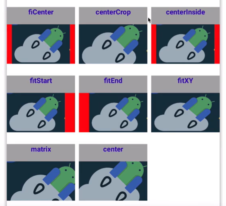
日常开发中用centerCrop比较多,八个字记忆:等比放大,居中显示。
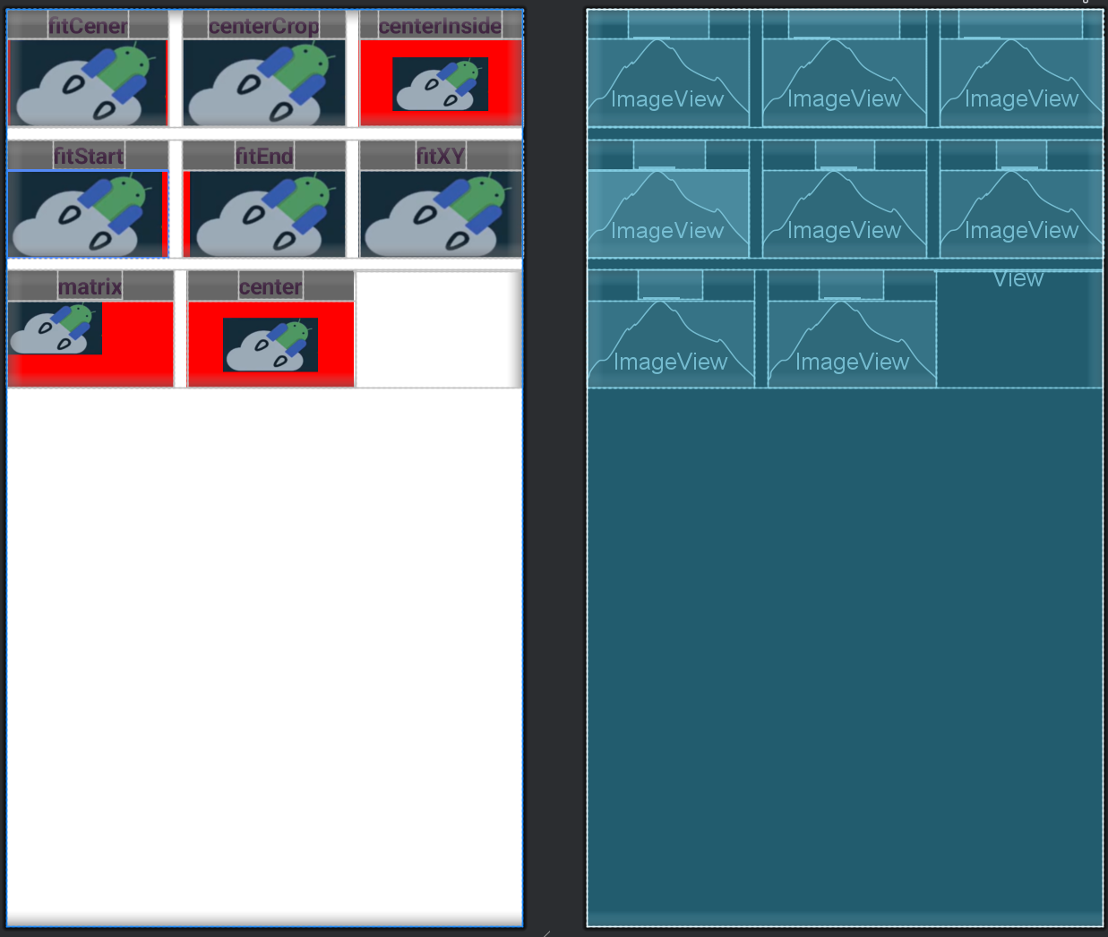
很多人都觉得fitCenter 和centerInside 没有区别,根据上面的效果图来分板,其实是有区别的。
fitCenter :是将原图等比例放大或缩小,使原图的高度等于ImageView的高度,并居中显示。
centerInside:在原图的原本长宽大于ImageView的长宽时,则缩小原图,效果同fitCenter;在原图的长宽小于ImageView的长宽时,则不进行任何处理,居中显示,效果同center。
📚代码示例
xml
<?xml version="1.0" encoding="utf-8"?>
<LinearLayout xmlns:android="http://schemas.android.com/apk/res/android"
    android:orientation="vertical"
    android:layout_width="match_parent"
    android:layout_height="match_parent">

<!--    第一行-->
    <LinearLayout
        android:layout_width="match_parent"
        android:layout_height="wrap_content"
        android:orientation="horizontal">

<!--        第一个元素-->
        <LinearLayout
            android:layout_width="0dp"
            android:layout_height="wrap_content"
            android:layout_weight="1"
            android:orientation="vertical"
            android:background="#666666"
            android:gravity="center">

            <TextView
                android:layout_width="wrap_content"
                android:layout_height="wrap_content"
                android:textSize="18dp"
                android:textStyle="bold"
                android:gravity="center"
                android:text="fitCener"
                android:textColor="@color/material_dynamic_tertiary20"/>

            <ImageView
                android:layout_width="match_parent"
                android:layout_height="70dp"
                android:src="@drawable/jetpack"
                android:background="#ff0000"
                android:scaleType="fitCenter"/>

        </LinearLayout>

        <!--        第二个元素-->
        <LinearLayout
            android:layout_width="0dp"
            android:layout_height="wrap_content"
            android:layout_weight="1"
            android:orientation="vertical"
            android:background="#666666"
            android:gravity="center"
            android:layout_marginLeft="10dp">

            <TextView
                android:layout_width="wrap_content"
                android:layout_height="wrap_content"
                android:textSize="18dp"
                android:textStyle="bold"
                android:gravity="center"
                android:text="centerCrop"
                android:textColor="@color/material_dynamic_tertiary20"/>

            <ImageView
                android:layout_width="match_parent"
                android:layout_height="70dp"
                android:src="@drawable/jetpack"
                android:background="#ff0000"
                android:scaleType="centerCrop"/>

        </LinearLayout>

        <!--        第三个元素-->
        <LinearLayout
            android:layout_width="0dp"
            android:layout_height="wrap_content"
            android:layout_weight="1"
            android:orientation="vertical"
            android:background="#666666"
            android:gravity="center"
            android:layout_marginLeft="10dp">

            <TextView
                android:layout_width="wrap_content"
                android:layout_height="wrap_content"
                android:textSize="18dp"
                android:textStyle="bold"
                android:gravity="center"
                android:text="centerInside"
                android:textColor="@color/material_dynamic_tertiary20"/>

            <ImageView
                android:layout_width="match_parent"
                android:layout_height="70dp"
                android:src="@drawable/jetpack"
                android:background="#ff0000"
                android:scaleType="centerInside"/>

        </LinearLayout>
    </LinearLayout>

    <!--    第二行-->
    <LinearLayout
        android:layout_width="match_parent"
        android:layout_height="wrap_content"
        android:orientation="horizontal"
        android:layout_marginTop="10dp">

        <!--        第一个元素-->
        <LinearLayout
            android:layout_width="0dp"
            android:layout_height="wrap_content"
            android:layout_weight="1"
            android:orientation="vertical"
            android:background="#666666"
            android:gravity="center">

            <TextView
                android:layout_width="wrap_content"
                android:layout_height="wrap_content"
                android:textSize="18dp"
                android:textStyle="bold"
                android:gravity="center"
                android:text="fitStart"
                android:textColor="@color/material_dynamic_tertiary20"/>

            <ImageView
                android:layout_width="match_parent"
                android:layout_height="70dp"
                android:src="@drawable/jetpack"
                android:background="#ff0000"
                android:scaleType="fitStart"/>

        </LinearLayout>

        <!--        第二个元素-->
        <LinearLayout
            android:layout_width="0dp"
            android:layout_height="wrap_content"
            android:layout_weight="1"
            android:orientation="vertical"
            android:background="#666666"
            android:gravity="center"
            android:layout_marginLeft="10dp">

            <TextView
                android:layout_width="wrap_content"
                android:layout_height="wrap_content"
                android:textSize="18dp"
                android:textStyle="bold"
                android:gravity="center"
                android:text="fitEnd"
                android:textColor="@color/material_dynamic_tertiary20"/>

            <ImageView
                android:layout_width="match_parent"
                android:layout_height="70dp"
                android:src="@drawable/jetpack"
                android:background="#ff0000"
                android:scaleType="fitEnd"/>

        </LinearLayout>

        <!--        第三个元素-->
        <LinearLayout
            android:layout_width="0dp"
            android:layout_height="wrap_content"
            android:layout_weight="1"
            android:orientation="vertical"
            android:background="#666666"
            android:gravity="center"
            android:layout_marginLeft="10dp">

            <TextView
                android:layout_width="wrap_content"
                android:layout_height="wrap_content"
                android:textSize="18dp"
                android:textStyle="bold"
                android:gravity="center"
                android:text="fitXY"
                android:textColor="@color/material_dynamic_tertiary20"/>

            <ImageView
                android:layout_width="match_parent"
                android:layout_height="70dp"
                android:src="@drawable/jetpack"
                android:background="#ff0000"
                android:scaleType="fitXY"/>

        </LinearLayout>
    </LinearLayout>


    <!--    第三行-->
    <LinearLayout
        android:layout_width="match_parent"
        android:layout_height="wrap_content"
        android:orientation="horizontal"
        android:layout_marginTop="10dp">

        <!--        第一个元素-->
        <LinearLayout
            android:layout_width="0dp"
            android:layout_height="wrap_content"
            android:layout_weight="1"
            android:orientation="vertical"
            android:background="#666666"
            android:gravity="center">

            <TextView
                android:layout_width="wrap_content"
                android:layout_height="wrap_content"
                android:textSize="18dp"
                android:textStyle="bold"
                android:gravity="center"
                android:text="matrix"
                android:textColor="@color/material_dynamic_tertiary20"/>

            <ImageView
                android:layout_width="match_parent"
                android:layout_height="70dp"
                android:src="@drawable/jetpack"
                android:background="#ff0000"
                android:scaleType="matrix"/>

        </LinearLayout>

        <!--        第二个元素-->
        <LinearLayout
            android:layout_width="0dp"
            android:layout_height="wrap_content"
            android:layout_weight="1"
            android:orientation="vertical"
            android:background="#666666"
            android:gravity="center"
            android:layout_marginLeft="10dp">

            <TextView
                android:layout_width="wrap_content"
                android:layout_height="wrap_content"
                android:textSize="18dp"
                android:textStyle="bold"
                android:gravity="center"
                android:text="center"
                android:textColor="@color/material_dynamic_tertiary20"/>

            <ImageView
                android:layout_width="match_parent"
                android:layout_height="70dp"
                android:src="@drawable/jetpack"
                android:background="#ff0000"
                android:scaleType="center"/>

        </LinearLayout>

        <View
            android:layout_width="0dp"
            android:layout_weight="1"
            android:layout_height="1dp"/>
    </LinearLayout>

</LinearLayout>
🐱效果
RecyclerView高级UI控件 & 案例实践
RecyclerView是Android及其重要的一个高级UI控件,使用频率及其的高,APP的90%以上的页面都会使用的到。由于其出色的性能 和插拔式的架构设计,被全世界广大开发者一致称赞。
出色的性能:存在四级回收和复用机制,导致RecyclerView的滑动是非常流畅的。
插拔式:想要哪一种能力就组装上,就像搭积木一样。
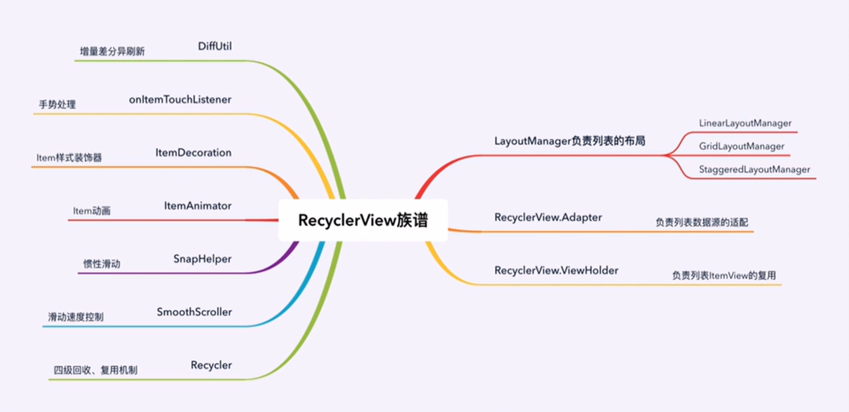
☝️左边是进阶,右边是基础。
Recycler:上下滑动的过程中有一些划出屏幕和滑进屏幕的item,所以要进行一些回收和复用,才能保证列表的滑动过程中保持丝滑。SmoothScroller:自定义Recycler的滑动速度。
SnapHelper:设定RecyclerView滑动松手之后的惯性滑动行为,其中有很多特效,比如:滑动之后中间对齐,上对齐,左对齐等。
ItemAnimator:
ItemDecoration:给列表上面一个个item添加一些装饰,比如描边,分隔线等。
onItemTouchListener:手势拦截,比如:点击、长按。
DiffUtil:列表刷新的时候,用他来实现列表的增量,差分异步刷新。
LinerLayoutManager列表布局
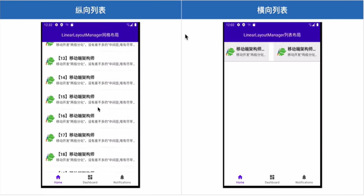
⭐️纵向列表
kotlin
recyclerView.layoutManager =LinearLayoutManager(context, VERTICAL, false)
recyclerView.adapter = MyAdapter()
需要传入一个context对象,
指定LinearLayoutManager布局这个item的时候是需要纵向列表还是横向列表,
第三个参数 是这个item要不要反转,
adapter:列表的数据源
⭐️横向列表
kotlin
recyclerView.layoutManager =LinearLayoutManager(context, HORIZONTAL, false)
recyclerView.adapter = MyAdapter()
⭐️数据源适配器
kotlin
inner class MyAdapter : RecyclerView.Adapter<ViewHolder>(){
	//【必须复写】创建ItemView的ViewHolder,用于后续的数据绑定
	override fun onCreateViewHolder(parent: ViewGroup, viewType: Int): ViewHolder {
		val view =LayoutInflater.from(context).inflate(R.layout.item_view_staggered, parent,false)
		return ViewHolder(view)
	}

	//【必须复写】告诉RecyclerView列表上item的条数
	override fun getItemCount(): Int {
		return 20
	}

	//【必须复写】item的数据绑定
	override fun onBindViewHolder(holder: ViewHolder, position: Int) {
	holder.itemView.item_head.setImageResource(R.drawable.icon_jetpack)
	holder.itemview.item_name.text="[${position}]移动端架构师体系课"
	holder.itemview.item_message.text =
	"移动开发"两极分化",没有差不多的"中间层,唯有尽早成长为架构师,你的职业道路才能走的更远更稳"

	//创建一个ViewHolder必须继承自RecyclerView.ViewHolder。用于后续的数据绑定
	inner class ViewHolder(itemView: View) : RecyclerView.ViewHolder(itemView) {

	}
}
onCreateViewHolder:创建一个ViewHolder:通过LayoutInflater类加载一个布局资源文件,实例化一个view对象,得到这个view对象之后呢,创建一个ViewHolder对象,把这个view对象传递进去。
getItemCount:
onBindViewHolder:两个规则参数,
holder: ViewHolder, position: Int。完成一个个数据的绑定,通过holder对象拿到在这个布局里面编写的 一个个实例对象,比如拿到imageview、textview,button等去给它绑定数据。
💩Unresolved reference: NavController
1、在 libs.versions.toml 文件中添加导航组件依赖
打开 libs.versions.toml 文件(如果没有则在项目根目录下创建),添加如下内容:
toml
[versions]
navigation = "2.7.4"

[libraries]
androidx-navigation-fragment-ktx = { group = "androidx.navigation", name = "navigation-fragment-ktx", version.ref = "navigation" }
androidx-navigation-ui-ktx = { group = "androidx.navigation", name = "navigation-ui-ktx", version.ref = "navigation" }
2、在 build.gradle 中引用依赖
在 dependencies 块里添加导航组件的依赖:
toml
implementation(libs.androidx.navigation.fragment.ktx)
implementation(libs.androidx.navigation.ui.ktx)
3、同步项目
添加完成后,点击 Android Studio 工具栏中的 "Sync Now" 来同步项目。
💩教程突然抽风,视频少了一节,导致这一节内容报废了。
AndROID网络编程------OKHTTP&RETROFIT
Android网络编程
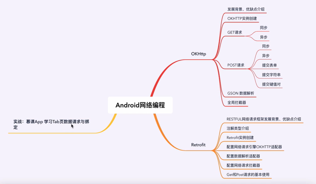
ANDROID四大组件
Android四大组件必知必会
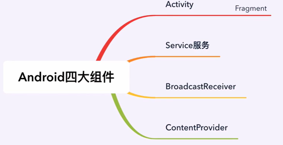
四大组件是每一个Android人必须要会,要掌握的知识点,因为他们是我们在日常开发工作中打交道最频繁的组件,而且他们四个在不同的领域扮演着极其重要的角色。
Activity :负责用户界面的展示和用户交互
Service服务 :不需要和用户交互,负责后台任务,比如播放音乐,Socket长连接
BroadcastReceiver广播接收者 :负责页面间通信,系统和APP通信,APP和APP通信,比如监听网络连接状态变化,就是通过BroadcastReceiver广播接收者来实现的
ContentProvider内容提供者 :负责数据存取,常用于APP进数据共享,跨进程数据存取等...比如读取相册,读取联系人,都是ContentProvider来实现的
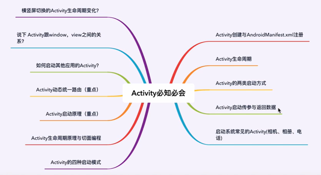
Activity必知必会
Activity 是Android的四大组件之一,Activity是一种能够显示用户界面的组件,用户通过和Activity交互完成相关操作。
一个应用中可以包含0个或多个Activity,但不包含任何Activity的应用程序是无法被用户看见的。
Tips
1.Activity用于显示用户界面,用户通过Activity交互完成相关操作
2.一个App允许有多个Activity
⭐️Activity生命周期
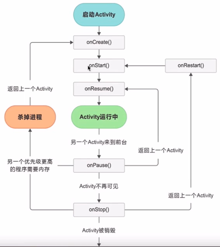
Activity类中定义了7个回调方法,覆盖了Activity生命周期的每一个环节,下面就来介绍一下这7个方法。
- onCreate()
该方法会在Activity第一次创建时进行调用,在这个方法中通常会做Activity初始化相关的操作,例如:加载布局、绑定事件等。 - onStart()
这个方法会在Activity由不可见变为可见的时候调用,但是还不能和用户进行交互。 - onResume()
表示Activity已经启动完成,进入到了前台,可以同用户进行交互了。 - onPause()
这个方法在系统准备去启动另一个Activity的时候调用。可以在这里释放系统资源,动画的停止,不宜在此做耗时操作。
onPause():系统准备去启动另一个Activity或即将结束当前Activity的时候调用
- onStop()
当Activity不可现的时候回调此方法。需要在这里释放全部用户使用不到的资源。可以做较重量级的工作,如对注册广播的解注册,对一些状态数据的存储。此时Activity还不会被销毁掉,而是保持在内存中,但随时都会被回收。通常发生在启动另一个Activity或切换到后台时。
onStop()和onPause()的启动时机是一样的
- onDestroy()
Activity即将被销毁。此时必须主动释放掉所有占用的资源。 - onRestart()
这个方法在Activity由停止状态变为运行状态之前调用,也就是Activity被重新启动了(APP切到后台会进入onStop(),再切换到前台时会触发onRestart()方法)
经常使用的是onCreate()、onResume()、onPause()、onDestroy()。
⭐️Activity组件注册
四大组件需要在AndroidManifest文件中配置否则无法使用,类似Activity无法启动,
一般情况下:在新建一个activity后,为了使intent可以调用此活动,我们要在androidManifest.xml文件中添加一个标签,标签的一般格式如下:
xml
<activity
	android:name=".MainActivity"
	android:label="@string/app_name">
	<intent-filter>
		<action android:name="android.intent.action.MAIN" />
		<category android:name="android.intent.category.LAUNCHER" />
	</intent-filter>
</activity>- android:name是对应Activity的类名称
- android:label是Activity标题栏显示的内容.现已不推荐使用
- <intent-filter>是意图过滤器.常用语隐式跳转
- <action> 是动作名称,是指intent要执行的动作
- <category> 是过滤器的类别一般情况下,每个中都要显示指定一个默认的类别名称,即
category android:name android.intent.category.DEFAULT
但是上面的代码中没有指定默认类别名称,这是一个例外情况,因为其中的
是"android.intent.action.MAIN",意思是这个Activity是应用程序的入口点,这种情况下可以不加默认类别名称。
kotlin
package com.example.activitytest

import android.os.Bundle
import android.util.Log
import android.view.Gravity
import android.widget.TextView
import androidx.activity.enableEdgeToEdge
import androidx.appcompat.app.AppCompatActivity
import androidx.core.view.ViewCompat
import androidx.core.view.WindowInsetsCompat

class MainActivity : AppCompatActivity() {
    override fun onCreate(savedInstanceState: Bundle?) {
        super.onCreate(savedInstanceState)
        val textview = TextView(this)
        textview.text="MainActivity"
        textview.gravity= Gravity.CENTER
        setContentView(textview)

        Log.e("MainActivity","onCreate")
    }

    override fun onStart() {
        super.onStart()
        Log.e("MainActivity","onStart")

    }

    override fun onResume() {
        super.onResume()
        Log.e("MainActivity","onResume")
    }

    override fun onPause() {
        super.onPause()
        Log.e("MainActivity","onPause")
    }

    override fun onStop() {
        super.onStop()
        Log.e("MainActivity","onStop")
    }

    override fun onDestroy() {
        super.onDestroy()
        Log.e("MainActivity","onDestroy")
    }

    override fun onRestart() {
        super.onRestart()
        Log.e("MainActivity","onRestart")
    }
}
展示一个Activity在前后台切换的时候,点击返回键的时候,生命周期执行的流程。
Activity启动方式与参数传递
在Android中我们可以通过下面两种方式来启动一个新的Activity,注意这里是怎么启动,分为显示启动和隐式启动!
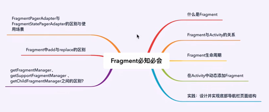
Fragment必知必会
Fragment出现背景
初衷:Fragment是Android3.0后引入的一个新的API,他出现的初衷是为了适应大屏幕的平板电脑,当然现在他仍然是平板APP UI设计的宠儿。
现状:现在我们普通APP开发也经常会用到Fragment,如果一个界面很复杂,我们把所有代码都写在一个Activity里面,页面布局都写在同一个xml文件中。过不了多久我们就会发现写不动了,一个Activity上万行代码,非常难以维护,后续如果有变动,更是无从下手。而使用Fragment我们可以把页面结构划分成几块,每块使用一个Fragment来管理。这样我们可以更加方便的在运行过程中动态地更新Activity中的用户界面,日后迭代更新、维护也是更加方便。
注意事项 :Fragment并不能单独使用,他需要嵌套在Activity中使用,尽管他拥有自己的生命周期,但是还是会受到宿主Activity的生命周期的影响,比如Activity被destory销毁了,他也会跟着销毁!一个Activity可以嵌套多个Fragment。