1. 前言
2026 年已经到来,前端技术又迎来了新一轮的革新。
今天,我为你精选了 4 个在 2025 年正式发布、2026 年必须掌握的 CSS 新特性,让你的技术更上一层楼!
2. 兄弟元素定位:sibling-index() 与 sibling-count()
早些时候这些还只是实验性质的功能,现在它们已经在稳定的 Chrome 和 Safari 浏览器中可用了!
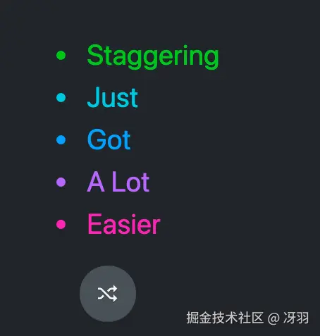
记得以前实现列表项交错动画时,要手动给每个元素设置不同的延迟吗?现在,用 sibling-index() 一行代码就能搞定!
css
li {
  transition: opacity 0.3s ease;
  transition-delay: calc((sibling-index() - 1) * 100ms);
}
这个函数会自动获取元素在兄弟节点中的位置(从 1 开始计数),通过简单的计算就能实现流畅的交错动画效果。
如果再搭配 @starting-style,连入场动画都能轻松搞定:
css
li {
  transition: opacity 0.3s ease;
  transition-delay: calc((sibling-index() - 1) * 100ms);

  @starting-style {
    opacity: 0;
  }
}
3. 滚动状态查询:@container scroll-state()
现在你可以精确地知道用户正在如何滚动页面。
不仅如此,你还可以查询滚动条的三种状态:粘附、贴靠、可滚动。
首先,给需要监测的容器加上 container-type: scroll-state,然后就可以用 @container scroll-state() 来查询它的状态了。
3.1. 粘附状态:stuck
css
/* 当导航栏被"粘住"时 */
@container scroll-state(stuck) {
  .inner-navbar {
    box-shadow: var(--shadow-3);
  }
}
3.2. 贴靠状态:snapped
css
section {
  overflow: auto hidden;
  scroll-snap-type: x mandatory;

  > article {
    container-type: scroll-state;
    scroll-snap-align: center;

    @supports (container-type: scroll-state) {
      > * {
        transition: opacity 0.5s ease;

        @container not scroll-state(snapped: x) {
          opacity: 0.25;
        }
      }
    }
  }
}
3.3. 可滚动状态:scrollable
而且你可以查询滚动方向:
css
@container scroll-state(scrollable: top) {
}
@container scroll-state(scrollable: right) {
}
@container scroll-state(scrollable: bottom) {
}
@container scroll-state(scrollable: left) {
}
我们来举一个例子:
css
.scroll-container {
  container-type: scroll-state size;
  overflow: auto;

  &::after {
    content: " ";

    background: var(--_shadow-top), var(--_shadow-bottom);
    transition: --_scroll-shadow-color-1-opacity 0.5s ease, --_scroll-shadow-color-2-opacity 0.5s ease;

    @container scroll-state(scrollable: top) {
      --_scroll-shadow-color-1-opacity: var(--_shadow-color-opacity, 25%);
    }

    @container scroll-state(scrollable: bottom) {
      --_scroll-shadow-color-2-opacity: var(--_shadow-color-opacity, 25%);
    }
  }
}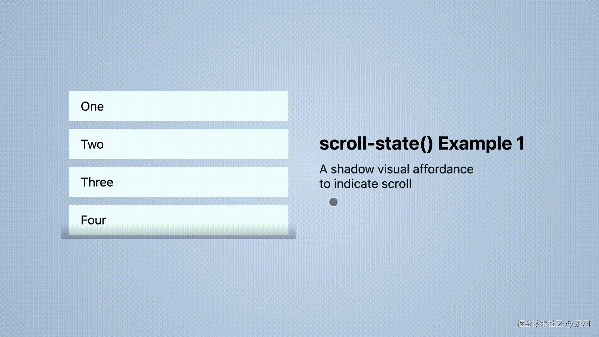
你可以发现,在滚动的时候,容器顶部和底部有一层阴影。
4. 文字精准对齐:text-box
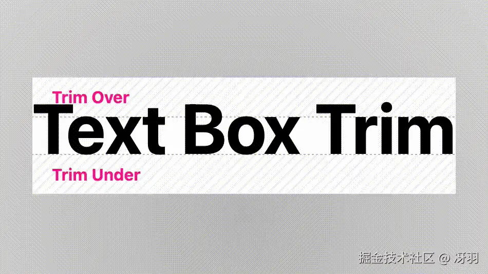
text-box 可以精确控制文字的边界框,实现像素级的对齐效果。
Web 字体渲染时会在字形上下方预留"安全间距":
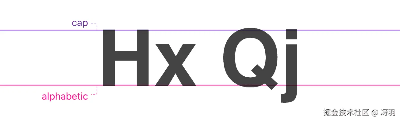
但有时我们需要进行像素级精确对齐,此时就需要使用 text-box:
css
h1 {
  text-box: trim-both cap alphabetic;
}
这一行代码就能:
trim-both:同时修剪上下方的空白cap:修剪到大写字母高度线以上alphabetic:修剪到字母基线以下
5. 类型安全:typed attr()
这是 attr() 函数的升级版,支持类型检查和回退值,在 HTML 和 CSS 之间搭建了强大的桥梁。
5.1. 传递颜色
html
<div data-bg="white" data-fg="deeppink"></div>
css
.theme {
  background: attr(data-bg color, black); /* 类型:颜色,默认:黑色 */
  color: attr(data-fg color, white);
}
5.2. 传递数字
html
<div class="grid" data-columns="3">...</div>
css
.grid {
  --_columns: attr(data-columns number, 3);
  grid-template-columns: repeat(var(--_columns), 1fr);
}
5.3. 类型验证(枚举值)
html
<li scroll-snap="start"></li>
<li scroll-snap="center"></li>
<li scroll-snap="end"></li>
<li scroll-snap="nothing"></li>
css
[scroll-snap] {
  scroll-snap-align: attr(scroll-snap type(start | center | end));
}
type() 函数会验证属性值是否在允许的关键字列表中,无效值会被优雅地回退。
6. 浏览器支持现状
你可能会说:"这些功能就像那些时髦衣服......等我们能用了,它们可能已经过时了 😂"
确实,浏览器兼容性是每一位前端开发者需要关注的问题。
但这些功能其实大多属于渐进增强,我们可以先在支持的浏览器中提供更好的体验,不支持的浏览器回退。
7. 最后
这 4 个 CSS 新特性其实也代表了 CSS 的未来方向:
- 更智能的布局控制(sibling-index)
- 更精细的交互感知(scroll-state)
- 更精准的视觉设计(text-box)
- 更强大的 HTML-CSS 桥梁(typed attr)
2026 年,前端开发不再只是"让页面显示出来",而是"让体验完美起来"。
这些工具让我们能够创造出更精致、更智能、更用户友好的网页体验。
我是冴羽,10 年笔耕不辍,专注前端领域,更新了 10+ 系列、300+ 篇原创技术文章,翻译过 Svelte、Solid.js、TypeScript 文档,著有小册《Next.js 开发指南》、《Svelte 开发指南》、《Astro 实战指南》。
欢迎围观我的"网页版朋友圈",关注我的公众号:冴羽(或搜索 yayujs),每天分享前端知识、AI 干货。