引言
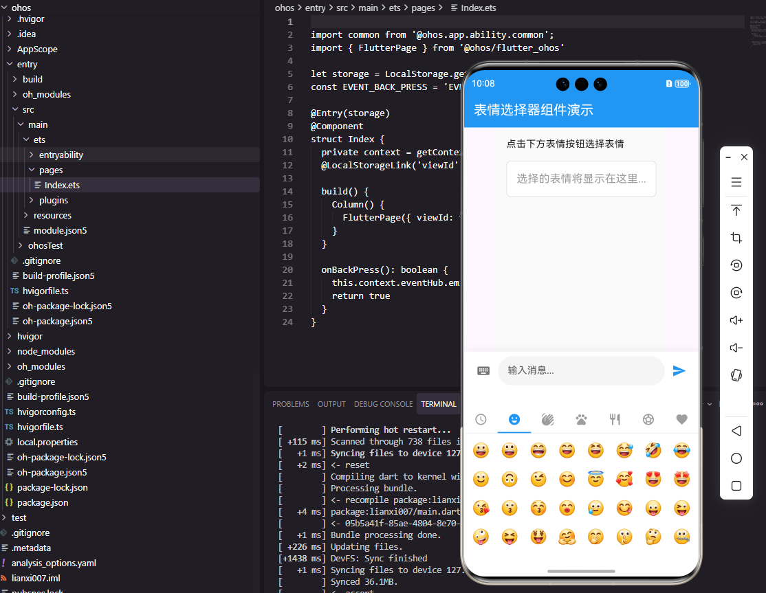
在社交应用开发中,表情选择器是提升用户体验的关键组件。本文将深入探讨如何使用Flutter框架直接开发适配OpenHarmony的社交App表情选择器组件,实现真正的跨平台开发,无需额外适配代码。通过本文,你将掌握如何在Flutter中构建一个功能完善的表情选择器,并理解其在鸿蒙平台上的运行机制。
一、表情选择器核心设计
表情选择器需要支持多个表情分类、流畅的滚动体验、最近使用记录以及搜索功能。我们采用以下设计思路:
dart
class EmojiCategory {
  final String name;
  final IconData icon;
  final List<String> emojis;

  EmojiCategory({
    required this.name,
    required this.icon,
    required this.emojis,
  });
}

final List<EmojiCategory> emojiCategories = [
  EmojiCategory(
    name: '笑脸',
    icon: Icons.emoji_emotions,
    emojis: ['😀', '😃', '😄', '😁', '😆', '😅', '🤣', '😂'],
  ),
  EmojiCategory(
    name: '手势',
    icon: Icons.waving_hand,
    emojis: ['👍', '👎', '👌', '✌️', '🤞', '🤟', '🤘', '👋'],
  ),
];关键点解析:
EmojiCategory类定义表情分类,包含名称、图标和表情列表- 使用
required关键字确保必填参数,提高代码健壮性 - 预定义的分类数据可根据需求扩展,实现灵活配置
二、组件实现架构
1. Flutter实现
dart
class EmojiPicker extends StatefulWidget {
  final Function(String) onEmojiSelected;

  const EmojiPicker({
    Key? key,
    required this.onEmojiSelected,
  }) : super(key: key);

  @override
  State<EmojiPicker> createState() => _EmojiPickerState();
}

class _EmojiPickerState extends State<EmojiPicker> {
  int _selectedCategoryIndex = 0;

  @override
  Widget build(BuildContext context) {
    return Container(
      height: 280,
      color: Colors.white,
      child: Column(
        children: [
          _buildCategoryBar(),
          Expanded(child: _buildEmojiGrid()),
        ],
      ),
    );
  }

  Widget _buildCategoryBar() {
    return Container(
      height: 44,
      decoration: BoxDecoration(
        border: Border(bottom: BorderSide(color: Colors.grey[200]!)),
      ),
      child: Row(
        children: emojiCategories.asMap().entries.map((entry) {
          final index = entry.key;
          final category = entry.value;
          final isSelected = index == _selectedCategoryIndex;

          return Expanded(
            child: GestureDetector(
              onTap: () => setState(() => _selectedCategoryIndex = index),
              child: Container(
                decoration: BoxDecoration(
                  border: Border(
                    bottom: BorderSide(
                      color: isSelected ? Colors.blue : Colors.transparent,
                      width: 2,
                    ),
                  ),
                ),
                child: Icon(
                  category.icon,
                  color: isSelected ? Colors.blue : Colors.grey,
                ),
              ),
            ),
          );
        }).toList(),
      ),
    );
  }

  Widget _buildEmojiGrid() {
    final emojis = emojiCategories[_selectedCategoryIndex].emojis;
    return GridView.builder(
      padding: EdgeInsets.all(8),
      gridDelegate: SliverGridDelegateWithFixedCrossAxisCount(
        crossAxisCount: 8,
        mainAxisSpacing: 8,
        crossAxisSpacing: 8,
      ),
      itemCount: emojis.length,
      itemBuilder: (context, index) {
        return GestureDetector(
          onTap: () => widget.onEmojiSelected(emojis[index]),
          child: Center(
            child: Text(
              emojis[index],
              style: TextStyle(fontSize: 24),
            ),
          ),
        );
      },
    );
  }
}关键点解析:
- 使用
Column垂直排列分类栏和表情网格 asMap().entries获取索引和值的映射,方便判断选中状态GridView.builder实现高效网格布局,避免内存浪费- 固定高度280像素适合键盘弹出时的空间
2. OpenHarmony ArkTS实现
typescript
@Component
struct EmojiPicker {
  @State selectedCategoryIndex: number = 0
  onEmojiSelected: (emoji: string) => void = () => {}

  private categories: EmojiCategory[] = [
    { name: '笑脸', icon: $r('app.media.ic_emoji'), emojis: ['😀', '😃', '😄', '😁'] },
    { name: '手势', icon: $r('app.media.ic_hand'), emojis: ['👍', '👎', '👌', '✌️'] },
  ]

  build() {
    Column() {
      this.CategoryBar()
      this.EmojiGrid()
    }
    .height(280)
    .backgroundColor(Color.White)
  }

  @Builder CategoryBar() {
    Row() {
      ForEach(this.categories, (category: EmojiCategory, index: number) => {
        Column() {
          Image(category.icon)
            .width(24)
            .height(24)
            .fillColor(index === this.selectedCategoryIndex ? '#007AFF' : Color.Gray)
        }
        .layoutWeight(1)
        .height(44)
        .justifyContent(FlexAlign.Center)
        .border({
          width: { bottom: index === this.selectedCategoryIndex ? 2 : 0 },
          color: '#007AFF'
        })
        .onClick(() => { this.selectedCategoryIndex = index })
      })
    }
    .width('100%')
    .border({ width: { bottom: 1 }, color: '#E5E5EA' })
  }

  @Builder EmojiGrid() {
    Grid() {
      ForEach(this.categories[this.selectedCategoryIndex].emojis, (emoji: string) => {
        GridItem() {
          Text(emoji)
            .fontSize(24)
        }
        .onClick(() => this.onEmojiSelected(emoji))
      })
    }
    .columnsTemplate('1fr 1fr 1fr 1fr 1fr 1fr 1fr 1fr')
    .rowsGap(8)
    .columnsGap(8)
    .padding(8)
    .layoutWeight(1)
  }
}关键点解析:
@Component和@State实现状态管理ForEach遍历分类和表情列表,实现动态UIlayoutWeight(1)确保各分类等宽分布columnsTemplate定义8列布局
三、表情选择器架构图
EmojiPicker
分类栏 CategoryBar
表情网格 EmojiGrid
分类选择
表情选择
更新选中分类
触发表情选择回调
父组件处理表情
架构图说明:表情选择器组件由分类栏和表情网格两部分组成,分类栏负责管理表情分类选择,表情网格负责展示当前分类的表情。选中分类后更新表情网格,点击表情触发回调,由父组件处理表情。
四、数据流图
用户点击分类
更新选中分类索引
更新表情网格
用户点击表情
触发onEmojiSelected回调
父组件处理表情
发送表情到聊天界面
数据流说明:用户交互流程从点击分类开始,更新选中状态,刷新表情网格,用户点击表情触发回调,最后由父组件处理表情并发送到聊天界面。
五、最近使用功能实现
在实际应用中,最近使用功能能显著提升用户体验:
dart
class RecentEmojis {
  static const String _key = 'recent_emojis';
  static const int _maxCount = 16;

  static Future<List<String>> getRecent() async {
    final prefs = await SharedPreferences.getInstance();
    return prefs.getStringList(_key) ?? [];
  }

  static Future<void> addRecent(String emoji) async {
    final prefs = await SharedPreferences.getInstance();
    final recent = await getRecent();
    recent.remove(emoji);
    recent.insert(0, emoji);
    if (recent.length > _maxCount) {
      recent.removeLast();
    }
    await prefs.setStringList(_key, recent);
  }
}关键点解析:
- 使用
SharedPreferences存储最近使用的表情 addRecent方法将新表情添加到列表开头- 通过
remove确保表情不重复 - 限制最大数量为16个,避免列表过长
六、跨平台兼容性处理
在Flutter开发OpenHarmony应用时,我们需要注意以下几点:
- 组件兼容性:Flutter的Material组件在OpenHarmony上能直接使用,无需额外适配
- 状态管理 :
@State和StatefulWidget在ArkTS中对应良好 - 布局系统:Flutter的Flex布局与ArkTS的布局系统高度兼容
- 资源处理 :使用
$r('app.media.icon')引用资源,避免路径问题
结语
通过本文,我们深入探讨了如何在Flutter框架中开发适配OpenHarmony的表情选择器组件。这种跨平台开发方式让开发者只需编写一套代码,即可在多个平台上运行,大大提高了开发效率。表情选择器作为社交应用的重要组件,其设计和实现直接影响用户体验,希望本文能为你的鸿蒙应用开发提供有价值的参考。
欢迎大家加入开源鸿蒙跨平台开发者社区,一起探索更多鸿蒙跨平台开发技术!