让用户做出决定
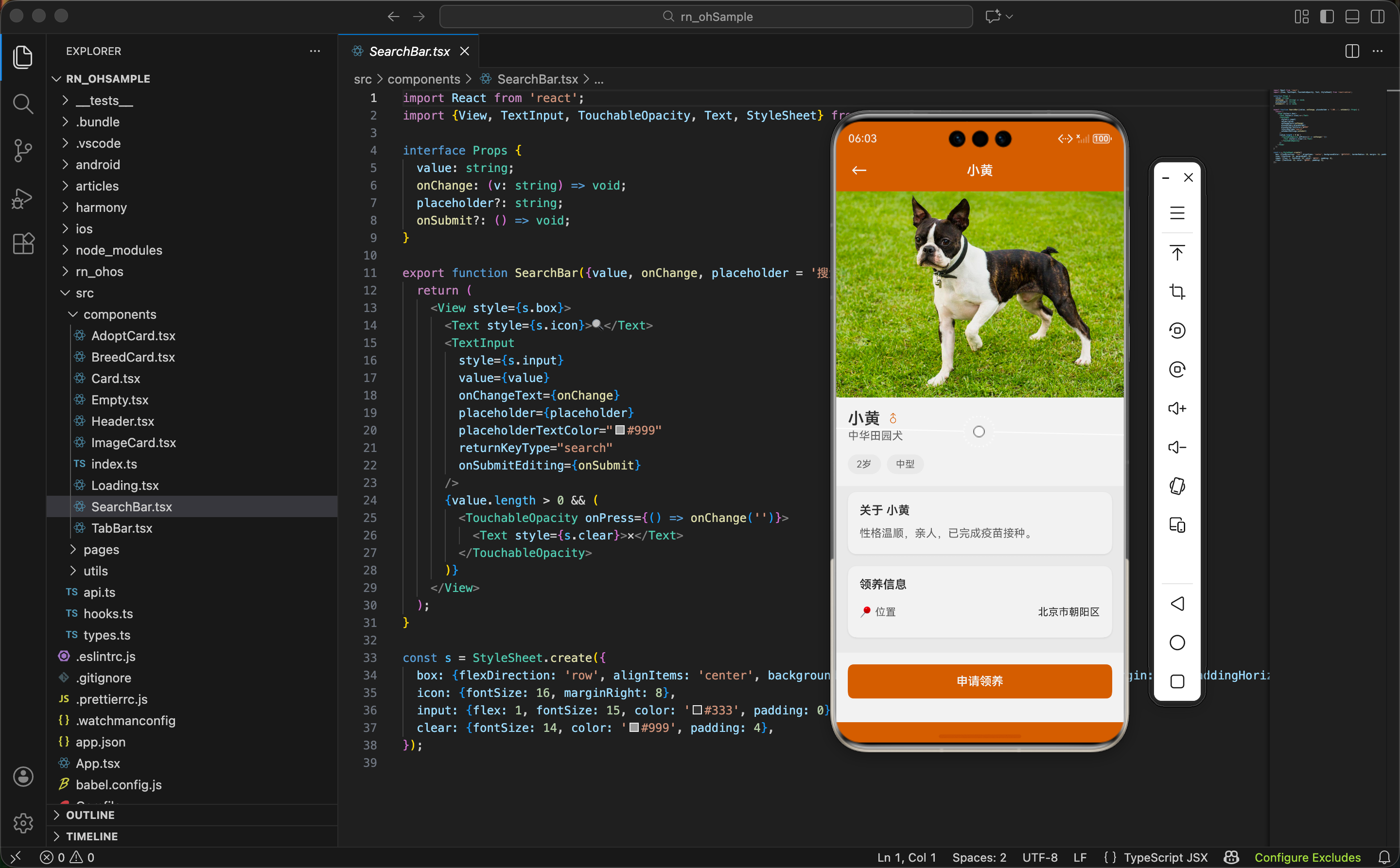
列表页展示的是概要信息,用户看到感兴趣的狗狗后,需要一个详情页来了解更多。详情页的目标是提供足够的信息,帮助用户做出领养决定。
这篇文章讲 AdoptDetailPage 的实现,涉及到路由参数获取、页面布局、Card 组件的使用等内容。
获取路由参数
页面需要知道展示哪只狗狗的信息:
typescript
import {useNavigation, useRoute} from '../../hooks';
import type {AdoptDog} from '../../types';

export function AdoptDetailPage() {
  const {navigate} = useNavigation();
  const {params} = useRoute<{dog: AdoptDog}>();
  const dog = params.dog;
useRoute 是自定义 Hook,返回当前路由的参数。
泛型 <{dog: AdoptDog}> 告诉 TypeScript 参数的结构,这样访问 params.dog 时就有类型提示。
const dog = params.dog 把参数解构出来,后面用起来更方便,不用每次都写 params.dog。
从列表页跳转时传的参数:
typescript
navigate('AdoptDetail', {dog})这里用了 ES6 的属性简写,等价于 {dog: dog}。
页面整体结构
typescript
return (
  <View style={s.container}>
    <Header title={dog.name} />
    <ScrollView style={s.content}>
      ...
    </ScrollView>
    <View style={s.footer}>
      ...
    </View>
  </View>
);
三层结构:
Header:顶部导航栏,标题是狗狗的名字。
ScrollView:中间的滚动内容区。
footer:底部固定的操作栏。
这种布局在详情页很常见,内容可以滚动,但操作按钮始终可见。
大图展示
typescript
<Image source={{uri: dog.image}} style={s.img} />详情页的图片比列表页大很多:
typescript
img: {width: '100%', height: 280, backgroundColor: '#eee'},宽度 100% 撑满屏幕,高度固定 280。
backgroundColor: '#eee' 在图片加载前显示灰色占位。
为什么不用 aspectRatio 保持图片原始比例?因为不同图片的比例不同,固定高度能保证页面布局的一致性。
名字和性别区域
typescript
<View style={s.header}>
  <View style={s.nameRow}>
    <Text style={s.name}>{dog.name}</Text>
    <Text style={s.gender}>{dog.gender === '公' ? '♂' : '♀'}</Text>
  </View>
  <Text style={s.breed}>{dog.breed}</Text>
</View>
名字和性别在同一行,品种在下一行。
性别用符号而不是文字,更简洁直观。三元表达式 dog.gender === '公' ? '♂' : '♀' 根据数据显示对应符号。
typescript
header: {backgroundColor: '#fff', padding: 16},
nameRow: {flexDirection: 'row', alignItems: 'center'},
name: {fontSize: 22, fontWeight: '600', color: '#333'},
gender: {fontSize: 18, marginLeft: 8, color: '#D2691E'},
breed: {fontSize: 15, color: '#666', marginTop: 2},
header 区域白色背景,和图片区分开。
名字用 22 号加粗字体,是页面里最大的文字。
性别符号用主题色,和名字形成视觉区分。
品种用小一号的灰色字体,作为补充信息。
标签展示
typescript
<View style={s.tags}>
  {[dog.age, dog.size].map((t, i) => (
    <View key={i} style={s.tag}>
      <Text style={s.tagText}>{t}</Text>
    </View>
  ))}
</View>
把年龄和体型放进数组,用 map 渲染成标签。
这种写法比写两个重复的 View 更简洁。如果以后要加更多标签,只需要往数组里加元素。
key={i} 用索引作为 key。通常不推荐用索引,但这里数组是固定的,不会变化,所以没问题。
typescript
tags: {
  flexDirection: 'row',
  backgroundColor: '#fff',
  paddingHorizontal: 16,
  paddingBottom: 16
},
tag: {
  backgroundColor: '#f5f5f5',
  paddingHorizontal: 12,
  paddingVertical: 6,
  borderRadius: 16,
  marginRight: 8
},
tagText: {fontSize: 13, color: '#666'},
标签容器和 header 区域背景色相同,视觉上是一体的。
每个标签是灰色背景的胶囊形状,borderRadius: 16 让它看起来圆润。
Card 组件的使用
详情页用 Card 组件来组织内容块:
typescript
<Card>
  <Text style={s.sectionTitle}>关于 {dog.name}</Text>
  <Text style={s.desc}>{dog.desc}</Text>
</Card>
Card 是个通用的容器组件,提供白色背景、圆角、阴影等样式。
看看 Card 的实现:
typescript
import {View, StyleSheet, ViewStyle} from 'react-native';
import {useStore} from '../hooks';
import {getTheme} from '../utils/store';

export function Card({children, style}: {children: React.ReactNode; style?: ViewStyle}) {
  const {darkMode} = useStore();
  const colors = getTheme(darkMode);

  return (
    <View style={[s.card, {backgroundColor: colors.card}, style]}>
      {children}
    </View>
  );
}
children 是 React 的特殊属性,代表组件的子元素。
style 是可选的自定义样式,可以覆盖默认样式。
useStore 获取深色模式状态,getTheme 根据状态返回对应的颜色。这样 Card 在深色模式下会自动切换背景色。
style={[s.card, {backgroundColor: colors.card}, style]} 用数组合并多个样式,后面的会覆盖前面的。
Card 的默认样式
typescript
const s = StyleSheet.create({
  card: {
    borderRadius: 12,
    padding: 16,
    marginHorizontal: 16,
    marginVertical: 8,
    shadowColor: '#000',
    shadowOffset: {width: 0, height: 1},
    shadowOpacity: 0.08,
    shadowRadius: 3,
    elevation: 2,
  },
});
borderRadius: 12 圆角,看起来更柔和。
padding: 16 内边距,内容不贴边。
marginHorizontal: 16 左右外边距,卡片不贴屏幕边缘。
marginVertical: 8 上下外边距,卡片之间有间隔。
shadow 系列 是 iOS 的阴影属性。
elevation 是 Android 的阴影属性。
这样 Card 在两个平台都有阴影效果。
描述区域
typescript
<Card>
  <Text style={s.sectionTitle}>关于 {dog.name}</Text>
  <Text style={s.desc}>{dog.desc}</Text>
</Card>
标题用狗狗的名字,比通用的"简介"更亲切。
typescript
sectionTitle: {fontSize: 16, fontWeight: '600', color: '#333', marginBottom: 10},
desc: {fontSize: 15, color: '#666', lineHeight: 24},
标题 16 号加粗,和正文区分开。
描述文字 15 号,lineHeight: 24 让多行文字有足够的行间距,阅读更舒适。
领养信息区域
typescript
<Card>
  <Text style={s.sectionTitle}>领养信息</Text>
  <View style={s.row}>
    <Text style={s.label}>📍 位置</Text>
    <Text style={s.value}>{dog.location}</Text>
  </View>
</Card>
用 emoji 📍 作为位置的图标,简单直观。
typescript
row: {flexDirection: 'row', justifyContent: 'space-between', paddingVertical: 10},
label: {fontSize: 14, color: '#666'},
value: {fontSize: 14, color: '#333'},
label 和 value 在同一行,justifyContent: 'space-between' 让它们分别靠左和靠右。
label 用灰色,value 用深色,形成主次关系。
底部操作栏
typescript
<View style={s.footer}>
  <TouchableOpacity style={s.btn} onPress={() => navigate('AdoptForm', {dog})}>
    <Text style={s.btnText}>申请领养</Text>
  </TouchableOpacity>
</View>
点击按钮跳转到领养申请页面,把 dog 对象传过去。
typescript
footer: {backgroundColor: '#fff', padding: 16, paddingBottom: 32},
btn: {backgroundColor: '#D2691E', paddingVertical: 14, borderRadius: 8, alignItems: 'center'},
btnText: {fontSize: 16, fontWeight: '600', color: '#fff'},
footer 白色背景,paddingBottom: 32 为底部安全区留空间。
按钮用主题色背景,白色文字,圆角 8。
alignItems: 'center' 让文字水平居中。
为什么 footer 不在 ScrollView 里
把 footer 放在 ScrollView 外面,是为了让它始终可见。
如果放在 ScrollView 里,用户滚动到页面中间时,按钮就看不到了,需要滚到底部才能点击。
这种"固定底部按钮"的设计在电商、预订类 App 里很常见,核心操作要随时可触达。
扩展:更多领养信息
当前只显示了位置,可以加更多信息:
typescript
<Card>
  <Text style={s.sectionTitle}>领养信息</Text>
  <View style={s.row}>
    <Text style={s.label}>📍 位置</Text>
    <Text style={s.value}>{dog.location}</Text>
  </View>
  <View style={s.row}>
    <Text style={s.label}>💉 疫苗</Text>
    <Text style={s.value}>已完成</Text>
  </View>
  <View style={s.row}>
    <Text style={s.label}>✂️ 绝育</Text>
    <Text style={s.value}>已绝育</Text>
  </View>
  <View style={s.row}>
    <Text style={s.label}>📅 入站时间</Text>
    <Text style={s.value}>2024-01-15</Text>
  </View>
</Card>
疫苗、绝育状态是领养者很关心的信息。
入站时间能让用户知道狗狗等待领养多久了,可能会激发同情心。
扩展:联系方式
typescript
<Card>
  <Text style={s.sectionTitle}>联系方式</Text>
  <View style={s.row}>
    <Text style={s.label}>📞 电话</Text>
    <TouchableOpacity onPress={() => Linking.openURL('tel:13800138000')}>
      <Text style={[s.value, s.link]}>138-0013-8000</Text>
    </TouchableOpacity>
  </View>
  <View style={s.row}>
    <Text style={s.label}>💬 微信</Text>
    <Text style={s.value}>adopt_dog_2024</Text>
  </View>
</Card>
电话号码可以点击直接拨打,用 Linking.openURL('tel:xxx') 实现。
s.link 可以加个下划线或者蓝色,提示用户这是可点击的。
扩展:收藏功能
typescript
const {favoriteAdopts, toggleAdopt} = useStore();
const isFav = favoriteAdopts.includes(dog.id);

<Header
  title={dog.name}
  right={
    <TouchableOpacity onPress={() => toggleAdopt(dog.id)}>
      <Text style={s.favIcon}>{isFav ? '❤️' : '🤍'}</Text>
    </TouchableOpacity>
  }
/>
在 Header 右侧加个收藏按钮,用户可以先收藏,以后再决定是否领养。
扩展:分享功能
typescript
<View style={s.footer}>
  <TouchableOpacity style={s.shareBtn} onPress={handleShare}>
    <Text style={s.shareBtnText}>分享</Text>
  </TouchableOpacity>
  <TouchableOpacity style={s.btn} onPress={() => navigate('AdoptForm', {dog})}>
    <Text style={s.btnText}>申请领养</Text>
  </TouchableOpacity>
</View>
加个分享按钮,用户可以把狗狗信息分享给朋友。
"帮它找个家"这种分享能扩大领养信息的传播范围。
扩展:图片轮播
一张图片可能不够,可以支持多张:
typescript
interface AdoptDog {
  ...
  images: string[];  // 改成数组
}

<ScrollView horizontal pagingEnabled style={s.imageScroll}>
  {dog.images.map((img, i) => (
    <Image key={i} source={{uri: img}} style={s.img} />
  ))}
</ScrollView>
horizontal 让 ScrollView 横向滚动。
pagingEnabled 让滚动按页停止,每次滑动切换一张图片。
页面容器样式
typescript
container: {flex: 1, backgroundColor: '#f5f5f5'},
content: {flex: 1},
container 是整个页面,灰色背景。
content 是 ScrollView,flex: 1 让它占据 Header 和 footer 之间的所有空间。
深色模式的适配
Card 组件已经支持深色模式,但页面的其他部分也需要适配:
typescript
const {darkMode} = useStore();
const colors = getTheme(darkMode);

<View style={[s.container, {backgroundColor: colors.background}]}>
  ...
  <View style={[s.header, {backgroundColor: colors.card}]}>
    <Text style={[s.name, {color: colors.text}]}>{dog.name}</Text>
    ...
  </View>
</View>
从全局状态获取 darkMode,根据它选择对应的颜色。
这样整个页面在深色模式下都会切换颜色。
小结
领养详情页的实现要点:
- 路由参数:用 useRoute 获取从列表页传来的狗狗数据
- 固定底部按钮:footer 放在 ScrollView 外面,始终可见
- Card 组件:统一的内容块样式,支持深色模式
- 信息层次:标题、正文、标签用不同的字号和颜色区分
- 可扩展性:可以加更多信息、收藏、分享等功能
详情页是用户做决定的关键页面,信息要全面但不杂乱,操作要明显但不打扰。
下一篇讲领养申请页面,用户填写个人信息提交领养申请。
欢迎加入开源鸿蒙跨平台社区:https://openharmonycrossplatform.csdn.net