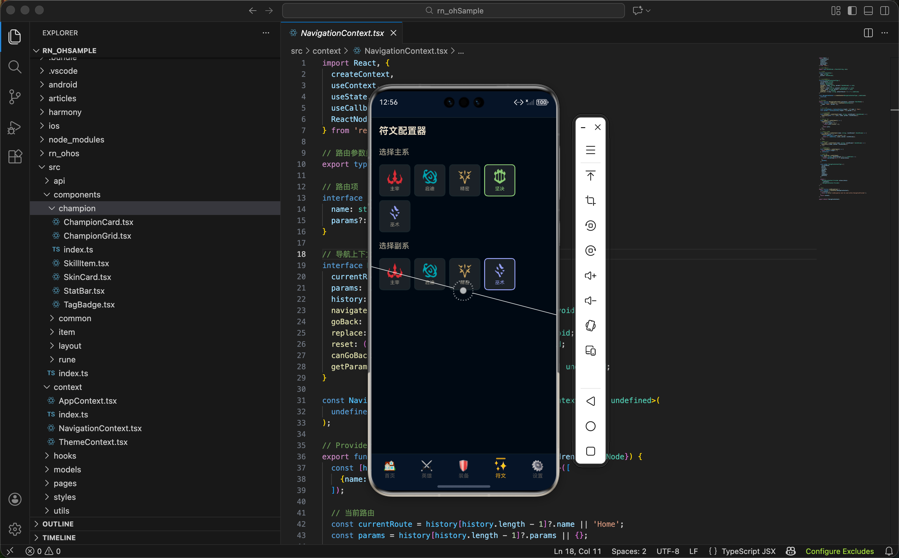
在游戏中,玩家需要为每个英雄配置符文。符文配置器让用户可以在 App 中模拟这个过程:先选择主系,再选择副系,然后在每一层选择具体的符文。这个功能可以帮助玩家在游戏外提前规划符文搭配。
这篇文章我们来实现符文配置器,重点是多步骤选择的状态管理、条件渲染的层级控制、以及选中状态的视觉反馈。
符文配置的规则
在实现之前,先了解一下游戏中符文配置的规则:
- 必须选择一个主系:主系决定了可用的基石符文
- 必须选择一个副系:副系不能和主系相同
- 主系选择 4 个符文:基石符文 1 个 + 普通符文 3 个
- 副系选择 2 个符文:从副系的普通符文中选择
这个页面我们先实现主系和副系的选择,符文的具体选择可以作为后续扩展。
状态设计
tsx
import React, {useState} from 'react';
import {View, Text, ScrollView, Image, TouchableOpacity, StyleSheet} from 'react-native';
import {colors} from '../../styles/colors';
import {useApp} from '../../context/AppContext';
import {getRuneIconUrl} from '../../utils/image';
import {getRunePathName, getRunePathColor} from '../../models/Rune';
import type {RunePath, Rune} from '../../models/Rune';

export function RuneBuilderPage() {
  const {state} = useApp();
  const [primaryPath, setPrimaryPath] = useState<RunePath | null>(null);
  const [secondaryPath, setSecondaryPath] = useState<RunePath | null>(null);
const [selectedRunes, setSelectedRunes] = useState<Record<number, number>>({});状态说明:
primaryPath:选中的主系,类型是RunePath | nullsecondaryPath:选中的副系,类型是RunePath | nullselectedRunes:选中的具体符文,用对象存储,key 是槽位索引,value 是符文 ID
为什么 selectedRunes 用对象而不是数组?
用对象可以方便地按槽位索引存取:
tsx
// 设置第 0 层的符文
setSelectedRunes(prev => ({...prev, [0]: runeId}));

// 获取第 0 层的符文
const rune = selectedRunes[0];
如果用数组,需要处理索引越界、空位等问题,代码会更复杂。
选择符文的处理函数
tsx
  const handleSelectRune = (slotIndex: number, runeId: number) => {
    setSelectedRunes(prev => ({...prev, [slotIndex]: runeId}));
};这个函数用于选择具体的符文。...prev 保留之前的选择,[slotIndex]: runeId 更新或添加指定槽位的符文。
这种更新对象的方式是 React 状态更新的标准模式------创建新对象而不是修改原对象。
主系选择区域
tsx
  return (
    <ScrollView style={styles.container} showsVerticalScrollIndicator={false}>
      <Text style={styles.title}>符文配置器</Text>
      <Text style={styles.subtitle}>选择主系</Text>
      <View style={styles.pathRow}>
        {state.runes.map(path => {
          const isSelected = primaryPath?.id === path.id;
          const pathColor = getRunePathColor(path.key);
          return (
            <TouchableOpacity
              key={path.id}
              style={[styles.pathBtn, isSelected && {borderColor: pathColor}]}
              onPress={() => {
                setPrimaryPath(path);
                setSecondaryPath(null);
                setSelectedRunes({});
              }}>
              <Image
                source={{uri: getRuneIconUrl(path.icon)}}
                style={[styles.pathIcon, {tintColor: pathColor}]}
              />
              <Text style={[styles.pathLabel, {color: isSelected ? pathColor : colors.textSecondary}]}>
                {getRunePathName(path.key)}
              </Text>
            </TouchableOpacity>
          );
        })}
</View>选中状态的判断:
tsx
const isSelected = primaryPath?.id === path.id;用可选链 ?. 安全地访问 primaryPath.id。如果 primaryPath 是 null,整个表达式返回 undefined,不会报错。
选中时的联动重置:
tsx
onPress={() => {
  setPrimaryPath(path);
  setSecondaryPath(null);
  setSelectedRunes({});
}}
当用户切换主系时,需要重置副系和已选符文。因为不同主系的符文是不同的,之前的选择不再有效。
选中状态的视觉反馈:
- 边框颜色变成符文系的主题色
- 文字颜色变成符文系的主题色
未选中时边框是默认的灰色,文字是次要颜色,视觉上比较低调。
副系选择区域
tsx
      {primaryPath && (
        <>
          <Text style={styles.subtitle}>选择副系</Text>
          <View style={styles.pathRow}>
            {state.runes.filter(p => p.id !== primaryPath.id).map(path => {
              const isSelected = secondaryPath?.id === path.id;
              const pathColor = getRunePathColor(path.key);
              return (
                <TouchableOpacity
                  key={path.id}
                  style={[styles.pathBtn, isSelected && {borderColor: pathColor}]}
                  onPress={() => setSecondaryPath(path)}>
                  <Image
                    source={{uri: getRuneIconUrl(path.icon)}}
                    style={[styles.pathIcon, {tintColor: pathColor}]}
                  />
                  <Text style={[styles.pathLabel, {color: isSelected ? pathColor : colors.textSecondary}]}>
                    {getRunePathName(path.key)}
                  </Text>
                </TouchableOpacity>
              );
            })}
          </View>
        </>
      )}
      <View style={styles.bottomSpace} />
    </ScrollView>
  );
}条件渲染:
tsx
{primaryPath && (...)}只有选择了主系后,才显示副系选择区域。这是一种渐进式的交互设计------用户完成一步后才显示下一步,避免一开始就展示太多选项造成困惑。
过滤掉主系:
tsx
state.runes.filter(p => p.id !== primaryPath.id)副系不能和主系相同,所以用 filter 过滤掉已选的主系。这样用户只能看到 4 个可选的副系。
Fragment 的使用:
<> 和 </> 是 React Fragment 的简写,用于包裹多个元素而不产生额外的 DOM 节点。这里用它包裹标题和选择区域。
样式设计
tsx
const styles = StyleSheet.create({
  container: {flex: 1, backgroundColor: colors.background, padding: 16},
  title: {fontSize: 20, fontWeight: 'bold', color: colors.textPrimary, marginBottom: 8},
  subtitle: {fontSize: 16, fontWeight: '600', color: colors.textSecondary, marginTop: 16, marginBottom: 12},
  pathRow: {flexDirection: 'row', flexWrap: 'wrap', marginHorizontal: -4},
  pathBtn: {
    width: '18%',
    alignItems: 'center',
    padding: 8,
    margin: 4,
    borderRadius: 8,
    backgroundColor: colors.backgroundCard,
    borderWidth: 2,
    borderColor: colors.border
  },
  pathIcon: {width: 32, height: 32, marginBottom: 4},
  pathLabel: {fontSize: 10, textAlign: 'center'},
  bottomSpace: {height: 20},
});
pathRow 的布局:
flexDirection: 'row':横向排列flexWrap: 'wrap':允许换行marginHorizontal: -4:抵消按钮的外边距
pathBtn 的宽度:
width: '18%' 让每个按钮占容器宽度的 18%。5 个按钮加上间距,刚好一行放下。
图标和文字的尺寸:
图标 32x32,文字 10px。因为要在一行放 5 个按钮,每个按钮的空间有限,所以用较小的尺寸。
功能扩展方向
当前实现只完成了主系和副系的选择,还可以继续扩展:
具体符文的选择
选择主系后,显示主系的 4 层符文,让用户在每层选择一个:
tsx
{primaryPath && primaryPath.slots.map((slot, index) => (
  <View key={index}>
    <Text>{index === 0 ? '基石符文' : `第 ${index} 层`}</Text>
    {slot.runes.map(rune => (
      <TouchableOpacity
        key={rune.id}
        onPress={() => handleSelectRune(index, rune.id)}
        style={[
          styles.runeBtn,
          selectedRunes[index] === rune.id && styles.runeBtnSelected
        ]}>
        {/* 符文内容 */}
      </TouchableOpacity>
    ))}
  </View>
))}
配置保存
让用户可以保存自己的符文配置,下次打开时恢复:
tsx
const saveConfig = async () => {
  const config = {
    primaryPath: primaryPath?.id,
    secondaryPath: secondaryPath?.id,
    selectedRunes,
  };
  await AsyncStorage.setItem('runeConfig', JSON.stringify(config));
};
配置分享
生成配置的文本或图片,方便用户分享给朋友。
小结
符文配置器展示了多步骤选择的实现方法:
- 渐进式交互:完成一步后才显示下一步
- 联动重置:切换主系时重置副系和已选符文
- 条件过滤:副系选项中过滤掉已选的主系
- 选中状态:用动态颜色反馈选中状态
下一篇我们来实现符文预设功能,提供一些常用的符文搭配供用户参考。
欢迎加入开源鸿蒙跨平台社区:https://openharmonycrossplatform.csdn.net