📋 项目概述
本文档详细介绍如何在 HarmonyOS 平台上使用 Flutter 框架集成 image_picker 插件,实现图片选择、拍照和图片管理等功能。通过实际开发案例,展示从插件配置到功能实现的完整流程,并记录开发过程中遇到的问题及解决方案。本项目构建了一个现代化的照片墙应用,采用 Material Design 3 设计规范,提供了流畅的用户体验和丰富的交互功能。
运行截图说明:本文档中的代码已在 HarmonyOS 设备上实际运行测试,功能正常运行。建议读者在阅读时结合实际操作,以获得更好的学习效果。
🎯 项目目标
- ✅ 在 HarmonyOS 平台上集成
image_picker插件 - ✅ 实现图片选择功能(从相册选择)
- ✅ 实现拍照功能
- ✅ 构建美观的 Material Design 3 风格照片墙UI
- ✅ 实现图片预览、删除、布局切换等功能
- ✅ 添加流畅的动画效果和交互体验
- ✅ 处理平台兼容性和权限配置
🛠️ 技术栈
- 开发框架: Flutter 3.6.2+
- 三方库 : image_picker (OpenHarmony TPC 适配版本)
- UI 框架: Material Design 3
- 目标平台: HarmonyOS (OpenHarmony)
- 开发工具: DevEco Studio / VS Code
📦 一、项目初始化
1.1 创建 Flutter 项目
bash
flutter create --platforms=ohos image_picker_demo
cd image_picker_demo
1.2 配置依赖
在 pubspec.yaml 中添加 image_picker 依赖:
yaml
dependencies:
  flutter:
    sdk: flutter
  cupertino_icons: ^1.0.8
  image_picker:
    git:
      url: https://gitcode.com/openharmony-tpc/flutter_packages.git
      path: packages/image_picker/image_picker
ref: br_image_picker-v1.1.2_ohos重要说明:
- 必须使用 OpenHarmony TPC 提供的适配版本,pub.dev 上的官方版本不支持 HarmonyOS 平台
- 需要指定正确的分支引用
br_image_picker-v1.1.2_ohos
1.3 安装依赖
bash
flutter pub get🔐 二、权限配置
2.1 添加媒体文件访问权限
在 ohos/entry/src/main/module.json5 中添加权限配置:
json5
{
  "module": {
    "requestPermissions": [
      {
        "name": "ohos.permission.INTERNET",
        "reason": "$string:network_reason",
        "usedScene": {
          "abilities": ["EntryAbility"],
          "when": "inuse"
        }
      },
      {
        "name": "ohos.permission.READ_MEDIA",
        "reason": "$string:read_media_reason",
        "usedScene": {
          "abilities": ["EntryAbility"],
          "when": "inuse"
        }
      },
      {
        "name": "ohos.permission.WRITE_MEDIA",
        "reason": "$string:write_media_reason",
        "usedScene": {
          "abilities": ["EntryAbility"],
          "when": "inuse"
        }
      }
    ]
  }
}
2.2 添加权限说明
在 ohos/entry/src/main/resources/base/element/string.json 中添加权限说明:
json
{
  "string": [
    {
      "name": "network_reason",
      "value": "Network access"
    },
    {
      "name": "read_media_reason",
      "value": "Read media files to select images"
    },
    {
      "name": "write_media_reason",
      "value": "Write media files to save images"
    }
  ]
}
在 ohos/entry/src/main/resources/zh_CN/element/string.json 中添加中文说明:
json
{
  "string": [
    {
      "name": "network_reason",
      "value": "使用网络"
    },
    {
      "name": "read_media_reason",
      "value": "读取媒体文件以选择图片"
    },
    {
      "name": "write_media_reason",
      "value": "写入媒体文件以保存图片"
    }
  ]
}
💻 三、核心功能实现
3.1 图片选择器初始化
dart
import 'package:image_picker/image_picker.dart';

class _PhotoWallPageState extends State<PhotoWallPage> {
  final ImagePicker _picker = ImagePicker();
  final List<XFile> _images = [];

  // ...
}
3.2 从相册选择图片
dart
Future<void> _pickImage(ImageSource source) async {
  try {
    final XFile? image = await _picker.pickImage(
      source: source,
      imageQuality: 85,  // 图片质量压缩,平衡清晰度和文件大小
    );
    if (image != null) {
      setState(() {
        _images.add(image);
      });
      // 触发FAB按钮动画
      _fabAnimationController.forward(from: 0.0);
    }
  } catch (e) {
    if (mounted) {
      ScaffoldMessenger.of(context).showSnackBar(
        SnackBar(
          content: Text('选择图片失败: $e'),
          backgroundColor: Colors.red,
          behavior: SnackBarBehavior.floating,
        ),
      );
    }
  }
}
3.3 拍照功能
dart
Future<void> _pickImage(ImageSource source) async {
// source 参数可以是 ImageSource.gallery 或 ImageSource.camera
final XFile? image = await _picker.pickImage(
source: ImageSource.camera, // 使用相机拍照
imageQuality: 85,
);
// ... 处理图片
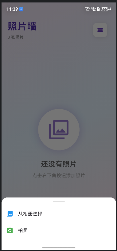
}3.4 图片选择器弹窗
为了提供更好的用户体验,我们实现了一个优雅的底部弹窗:
dart
void _showImagePickerDialog() {
  showModalBottomSheet(
    context: context,
    backgroundColor: Colors.transparent,
    builder: (BuildContext context) {
      return Container(
        decoration: const BoxDecoration(
          color: Colors.white,
          borderRadius: BorderRadius.vertical(top: Radius.circular(20)),
        ),
        child: SafeArea(
          child: Column(
            mainAxisSize: MainAxisSize.min,
            children: [
              // 拖拽指示器
              Container(
                width: 40,
                height: 4,
                margin: const EdgeInsets.symmetric(vertical: 12),
                decoration: BoxDecoration(
                  color: Colors.grey[300],
                  borderRadius: BorderRadius.circular(2),
                ),
              ),
              // 从相册选择
              ListTile(
                leading: const Icon(Icons.photo_library, color: Colors.blue),
                title: const Text('从相册选择'),
                onTap: () {
                  Navigator.pop(context);
                  _pickImage(ImageSource.gallery);
                },
              ),
              // 拍照
              ListTile(
                leading: const Icon(Icons.camera_alt, color: Colors.green),
                title: const Text('拍照'),
                onTap: () {
                  Navigator.pop(context);
                  _pickImage(ImageSource.camera);
                },
              ),
              const SizedBox(height: 10),
            ],
          ),
        ),
      );
    },
  );
}
🎨 四、UI 实现
4.1 Material Design 3 风格设计
使用 Material Design 3 设计语言,创建现代化的用户界面:
dart
class PhotoWallApp extends StatelessWidget {
  const PhotoWallApp({super.key});

  @override
  Widget build(BuildContext context) {
    return MaterialApp(
      title: '照片墙',
      debugShowCheckedModeBanner: false,
      theme: ThemeData(
        useMaterial3: true,
        colorScheme: ColorScheme.fromSeed(
          seedColor: Colors.deepPurple,
          brightness: Brightness.light,
        ),
      ),
      home: const PhotoWallPage(),
    );
  }
}
4.2 渐变背景设计
使用 LinearGradient 创建现代化的渐变背景:
dart
Container(
  decoration: BoxDecoration(
    gradient: LinearGradient(
      begin: Alignment.topLeft,
      end: Alignment.bottomRight,
      colors: [
        Colors.purple.shade50,
        Colors.blue.shade50,
        Colors.pink.shade50,
      ],
    ),
  ),
  child: SafeArea(
    child: Column(
      children: [
        // UI内容
      ],
    ),
  ),
)
4.3 顶部标题栏
dart
FadeTransition(
  opacity: _headerFadeAnimation,
  child: Container(
    padding: const EdgeInsets.all(20),
    child: Row(
      mainAxisAlignment: MainAxisAlignment.spaceBetween,
      children: [
        Column(
          crossAxisAlignment: CrossAxisAlignment.start,
          children: [
            Text(
              '照片墙',
              style: TextStyle(
                fontSize: 32,
                fontWeight: FontWeight.bold,
                color: Colors.deepPurple.shade700,
                letterSpacing: 1.2,
              ),
            ),
            const SizedBox(height: 4),
            Text(
              '${_images.length} 张照片',
              style: TextStyle(
                fontSize: 14,
                color: Colors.grey.shade600,
              ),
            ),
          ],
        ),
        // 布局切换和清空按钮
        Row(
          children: [
            // 布局切换按钮
            Container(
              decoration: BoxDecoration(
                color: Colors.white,
                borderRadius: BorderRadius.circular(12),
                boxShadow: [
                  BoxShadow(
                    color: Colors.black.withValues(alpha: 0.1),
                    blurRadius: 10,
                    offset: const Offset(0, 2),
                  ),
                ],
              ),
              child: IconButton(
                icon: Icon(
                  _isGridView ? Icons.view_stream : Icons.grid_view,
                  color: Colors.deepPurple,
                ),
                onPressed: () {
                  setState(() {
                    _isGridView = !_isGridView;
                  });
                },
              ),
            ),
            // 清空按钮
            if (_images.isNotEmpty) /* ... */,
          ],
        ),
      ],
    ),
  ),
)
4.4 网格布局实现
dart
Widget _buildGridView() {
  return Padding(
    padding: const EdgeInsets.all(12),
    child: GridView.builder(
      gridDelegate: const SliverGridDelegateWithFixedCrossAxisCount(
        crossAxisCount: 2,
        crossAxisSpacing: 12,
        mainAxisSpacing: 12,
        childAspectRatio: 0.8,
      ),
      itemCount: _images.length,
      itemBuilder: (context, index) {
        return _buildImageCard(index, true);
      },
    ),
  );
}
4.5 列表布局实现
dart
Widget _buildListView() {
  return ListView.builder(
    padding: const EdgeInsets.all(12),
    itemCount: _images.length,
    itemBuilder: (context, index) {
      return Padding(
        padding: const EdgeInsets.only(bottom: 12),
        child: _buildImageCard(index, false),
      );
    },
  );
}
4.6 图片卡片组件
dart
Widget _buildImageCard(int index, bool isGrid) {
return Hero(
tag: 'image_$index',
child: Material(
color: Colors.transparent,
child: InkWell(
onTap: () => _viewImage(index),
borderRadius: BorderRadius.circular(16),
child: Container(
decoration: BoxDecoration(
color: Colors.white,
borderRadius: BorderRadius.circular(16),
boxShadow: [
BoxShadow(
color: Colors.black.withValues(alpha: 0.1),
blurRadius: 10,
offset: const Offset(0, 4),
),
],
),
child: Stack(
children: [
// 图片显示
ClipRRect(
borderRadius: BorderRadius.circular(16),
child: Image.file(
File(_images[index].path),
width: double.infinity,
height: isGrid ? null : 200,
fit: BoxFit.cover,
errorBuilder: (context, error, stackTrace) {
return Container(
height: isGrid ? 150 : 200,
color: Colors.grey[300],
child: const Icon(
Icons.broken_image,
size: 50,
color: Colors.grey,
),
);
},
),
),
// 删除按钮
Positioned(
top: 8,
right: 8,
child: Material(
color: Colors.red.shade400,
shape: const CircleBorder(),
child: InkWell(
onTap: () => _deleteImage(index),
borderRadius: BorderRadius.circular(20),
child: Container(
padding: const EdgeInsets.all(6),
child: const Icon(
Icons.close,
color: Colors.white,
size: 18,
),
),
),
),
),
// 图片索引标签
Positioned(
bottom: 8,
left: 8,
child: Container(
padding: const EdgeInsets.symmetric(
horizontal: 8,
vertical: 4,
),
decoration: BoxDecoration(
color: Colors.black.withValues(alpha: 0.6),
borderRadius: BorderRadius.circular(12),
),
child: Text(
'#${index + 1}',
style: const TextStyle(
color: Colors.white,
fontSize: 12,
fontWeight: FontWeight.bold,
),
),
),
),
],
),
),
),
),
);
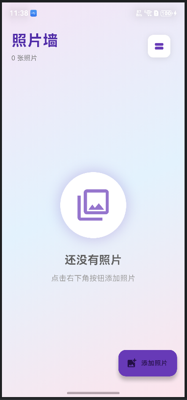
}4.7 空状态设计
dart
Widget _buildEmptyState() {
  return Center(
    child: Column(
      mainAxisAlignment: MainAxisAlignment.center,
      children: [
        Container(
          padding: const EdgeInsets.all(30),
          decoration: BoxDecoration(
            color: Colors.white,
            shape: BoxShape.circle,
            boxShadow: [
              BoxShadow(
                color: Colors.deepPurple.withValues(alpha: 0.2),
                blurRadius: 20,
                spreadRadius: 5,
              ),
            ],
          ),
          child: Icon(
            Icons.photo_library_outlined,
            size: 80,
            color: Colors.deepPurple.shade300,
          ),
        ),
        const SizedBox(height: 30),
        Text(
          '还没有照片',
          style: TextStyle(
            fontSize: 24,
            fontWeight: FontWeight.bold,
            color: Colors.grey.shade700,
          ),
        ),
        const SizedBox(height: 10),
        Text(
          '点击右下角按钮添加照片',
          style: TextStyle(
            fontSize: 16,
            color: Colors.grey.shade500,
          ),
        ),
      ],
    ),
  );
}
🎬 五、动画效果实现
5.1 Hero 动画
使用 Hero 动画实现图片查看时的流畅过渡效果:
dart
// 在主页面
Hero(
  tag: 'image_$index',
  child: Image.file(File(_images[index].path)),
)

// 在查看页面
Hero(
  tag: 'image_$index',
  child: Image.file(File(widget.images[widget.initialIndex].path)),
)
5.2 FAB 按钮弹性动画
dart
class _PhotoWallPageState extends State<PhotoWallPage>
    with TickerProviderStateMixin {
  late AnimationController _fabAnimationController;
  late Animation<double> _fabScaleAnimation;

  @override
  void initState() {
    super.initState();
    _fabAnimationController = AnimationController(
      vsync: this,
      duration: const Duration(milliseconds: 300),
    );

    _fabScaleAnimation = Tween<double>(begin: 0.0, end: 1.0).animate(
      CurvedAnimation(
        parent: _fabAnimationController,
        curve: Curves.elasticOut,  // 弹性曲线
      ),
    );

    _fabAnimationController.forward();
  }

  // 在添加图片后重新触发动画
  if (image != null) {
    setState(() {
      _images.add(image);
    });
    _fabAnimationController.forward(from: 0.0);
  }

  // 在UI中使用
  floatingActionButton: ScaleTransition(
    scale: _fabScaleAnimation,
    child: FloatingActionButton.extended(
      onPressed: _showImagePickerDialog,
      // ...
    ),
  ),
}
5.3 页面标题淡入动画
dart
late AnimationController _headerAnimationController;
late Animation<double> _headerFadeAnimation;

@override
void initState() {
  super.initState();
  _headerAnimationController = AnimationController(
    vsync: this,
    duration: const Duration(milliseconds: 800),
  );

  _headerFadeAnimation = Tween<double>(begin: 0.0, end: 1.0).animate(
    CurvedAnimation(
      parent: _headerAnimationController,
      curve: Curves.easeInOut,
    ),
  );

  _headerAnimationController.forward();
}

// 在UI中使用
FadeTransition(
  opacity: _headerFadeAnimation,
  child: Container(/* 标题栏内容 */),
)
📸 六、图片查看功能
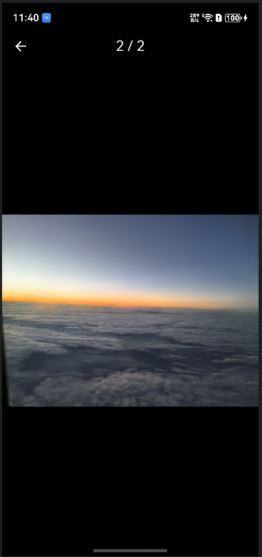
6.1 全屏图片查看页面
dart
class ImageViewerPage extends StatefulWidget {
  final List<XFile> images;
  final int initialIndex;

  const ImageViewerPage({
    super.key,
    required this.images,
    required this.initialIndex,
  });

  @override
  State<ImageViewerPage> createState() => _ImageViewerPageState();
}

class _ImageViewerPageState extends State<ImageViewerPage> {
  late PageController _pageController;
  late int _currentIndex;

  @override
  void initState() {
    super.initState();
    _currentIndex = widget.initialIndex;
    _pageController = PageController(initialPage: widget.initialIndex);
  }

  @override
  Widget build(BuildContext context) {
    return Scaffold(
      backgroundColor: Colors.black,
      appBar: AppBar(
        backgroundColor: Colors.transparent,
        elevation: 0,
        leading: IconButton(
          icon: const Icon(Icons.arrow_back, color: Colors.white),
          onPressed: () => Navigator.pop(context),
        ),
        title: Text(
          '${_currentIndex + 1} / ${widget.images.length}',
          style: const TextStyle(color: Colors.white),
        ),
        centerTitle: true,
      ),
      body: PageView.builder(
        controller: _pageController,
        itemCount: widget.images.length,
        onPageChanged: (index) {
          setState(() {
            _currentIndex = index;
          });
        },
        itemBuilder: (context, index) {
          return Center(
            child: InteractiveViewer(
              minScale: 0.5,
              maxScale: 4.0,
              child: Hero(
                tag: 'image_$index',
                child: Image.file(
                  File(widget.images[index].path),
                  fit: BoxFit.contain,
                ),
              ),
            ),
          );
        },
      ),
    );
  }
}
6.2 图片缩放功能
使用 InteractiveViewer 组件实现图片缩放:
dart
InteractiveViewer(
  minScale: 0.5,   // 最小缩放比例
  maxScale: 4.0,   // 最大缩放比例
  child: Image.file(File(imagePath)),
)
⚠️ 七、遇到的问题及解决方案
7.1 问题一:废弃API警告
错误信息:
info • 'withOpacity' is deprecated and shouldn't be used. Use .withValues() to avoid precision loss原因分析:
Flutter 新版本中 Color.withOpacity() 方法已被废弃,推荐使用 Color.withValues() 方法。
解决方案:
将所有 withOpacity() 调用替换为 withValues(alpha: value):
dart
// 旧代码
color: Colors.black.withOpacity(0.1)

// 新代码
color: Colors.black.withValues(alpha: 0.1)
7.2 问题二:权限配置不完整
问题描述:
- 应用无法访问相册或相机
- 图片选择器无法正常工作
解决方案:
-
在
module.json5中添加必要的权限:ohos.permission.READ_MEDIA:读取媒体文件权限ohos.permission.WRITE_MEDIA:写入媒体文件权限
-
在
string.json中添加权限使用说明 -
重新安装应用以应用权限更改
7.3 问题三:依赖版本不兼容
问题描述:
- pub.dev 上的
image_picker版本不支持 HarmonyOS 平台 - 直接使用会报错:
No registered handler for message
解决方案:
使用 OpenHarmony TPC 提供的适配版本,并指定正确的分支:
yaml
image_picker:
  git:
    url: https://gitcode.com/openharmony-tpc/flutter_packages.git
    path: packages/image_picker/image_picker
    ref: br_image_picker-v1.1.2_ohos  # 必须指定正确的分支
7.4 问题四:图片加载失败处理
问题描述:
- 某些图片文件可能损坏或格式不支持
- 直接显示会导致UI异常
解决方案:
使用 errorBuilder 处理图片加载失败的情况:
dart
Image.file(
  File(_images[index].path),
  errorBuilder: (context, error, stackTrace) {
    return Container(
      height: 150,
      color: Colors.grey[300],
      child: const Icon(
        Icons.broken_image,
        size: 50,
        color: Colors.grey,
      ),
    );
  },
)
7.5 问题五:内存管理
问题描述:
- 大量图片可能导致内存占用过高
- 应用运行缓慢或崩溃
解决方案:
- 图片质量压缩 :设置
imageQuality: 85,平衡清晰度和文件大小 - 懒加载 :使用
GridView.builder和ListView.builder实现懒加载 - 及时释放:在删除图片时及时释放资源
- 限制数量:可以添加图片数量限制(可选)
📱 八、平台支持情况
根据 OpenHarmony TPC 文档,image_picker 插件在 HarmonyOS 平台上的支持情况:
| 功能 | API | HarmonyOS 支持 | 说明 |
|---|---|---|---|
| 选择图片 | pickImage |
✅ 支持 | 完全支持 |
| 拍照功能 | pickImage(source: ImageSource.camera) |
✅ 支持 | 完全支持 |
| 选择视频 | pickVideo |
✅ 支持 | 完全支持 |
| 图片质量设置 | imageQuality |
✅ 支持 | 支持质量压缩 |
| 多图片选择 | pickMultiImage |
⚠️ 需验证 | 建议测试验证 |
🚀 九、运行和测试
9.1 运行项目
bash
# 清理构建缓存
flutter clean

# 获取依赖
flutter pub get

# 运行到鸿蒙设备
flutter run
9.2 测试功能
- 选择图片:点击"添加照片"按钮,选择"从相册选择",选择图片文件
- 拍照功能:点击"添加照片"按钮,选择"拍照",使用相机拍摄照片
- 图片预览:点击任意图片,进入全屏预览模式
- 图片缩放:在全屏模式下使用双指缩放查看细节
- 切换图片:在全屏模式下左右滑动切换图片
- 删除图片:点击图片右上角的删除按钮
- 布局切换:点击右上角的布局切换按钮,在网格和列表之间切换
- 清空图片:点击右上角的清空按钮,删除所有图片
📚 十、API 参考
10.1 ImagePicker 初始化
dart
final ImagePicker _picker = ImagePicker();10.2 pickImage
选择单张图片。
参数:
source: 图片来源,ImageSource.gallery(相册)或ImageSource.camera(相机)imageQuality: 图片质量(0-100),默认100maxWidth: 最大宽度(可选)maxHeight: 最大高度(可选)
返回值 :Future<XFile?> - 选择的图片文件,如果取消则返回 null
示例:
dart
final XFile? image = await _picker.pickImage(
  source: ImageSource.gallery,
  imageQuality: 85,
);
10.3 pickMultiImage
选择多张图片(需要验证HarmonyOS支持情况)。
参数 :与 pickImage 相同(除了 source)
返回值 :Future<List<XFile>> - 选择的图片文件列表
示例:
dart
final List<XFile> images = await _picker.pickMultiImage(
  imageQuality: 85,
);
10.4 pickVideo
选择视频文件。
参数:
source: 视频来源maxDuration: 最大时长(可选)
返回值 :Future<XFile?> - 选择的视频文件
🎯 十一、最佳实践
11.1 错误处理
始终使用 try-catch 包装图片选择操作:
dart
Future<void> _pickImage(ImageSource source) async {
  try {
    final XFile? image = await _picker.pickImage(
      source: source,
      imageQuality: 85,
    );
    if (image != null) {
      // 处理图片
    }
  } catch (e) {
    // 显示错误提示
    ScaffoldMessenger.of(context).showSnackBar(
      SnackBar(content: Text('选择图片失败: $e')),
    );
  }
}
11.2 图片质量优化
设置合适的图片质量,平衡清晰度和文件大小:
dart
final XFile? image = await _picker.pickImage(
  source: ImageSource.gallery,
  imageQuality: 85,  // 85%质量,适合大多数场景
);
11.3 内存管理
- 使用懒加载(
GridView.builder、ListView.builder) - 及时释放不需要的图片资源
- 考虑添加图片数量限制
11.4 用户体验优化
- 提供清晰的操作反馈(SnackBar、Toast)
- 显示图片选择结果和数量
- 处理用户取消操作的情况
- 添加加载状态指示
- 实现优雅的错误处理
11.5 动画效果
- 使用 Hero 动画实现流畅的页面过渡
- 添加适当的动画反馈,提升用户体验
- 注意动画性能,避免过度使用
📝 十二、项目结构
image_picker_demo/
├── lib/
│   └── main.dart              # 主应用文件
│       ├── PhotoWallApp       # 应用入口
│       ├── PhotoWallPage      # 主页面
│       │   ├── _buildEmptyState    # 空状态UI
│       │   ├── _buildGridView      # 网格布局
│       │   ├── _buildListView      # 列表布局
│       │   └── _buildImageCard     # 图片卡片
│       └── ImageViewerPage    # 图片查看页面
├── ohos/
│   └── entry/
│       └── src/
│           └── main/
│               ├── ets/
│               │   ├── entryability/
│               │   │   └── EntryAbility.ets
│               │   └── plugins/
│               │       └── GeneratedPluginRegistrant.ets
│               ├── module.json5          # 模块配置(权限)
│               └── resources/
│                   ├── base/
│                   │   └── element/
│                   │       └── string.json  # 权限说明(英文)
│                   └── zh_CN/
│                       └── element/
│                           └── string.json  # 权限说明(中文)
├── pubspec.yaml              # 依赖配置
├── README.md                 # 项目说明
└── Flutter跨平台三方库image_picker在鸿蒙中的使用指南.md  # 本文档
🔗 十三、参考资源
- OpenHarmony TPC image_picker 文档
- Flutter 官方文档
- HarmonyOS 开发者文档
- OpenHarmony PC 开发者专区
- Material Design 3 设计规范
🎉 十四、总结
通过本文档,我们成功在 HarmonyOS 平台上集成了 image_picker 插件,构建了一个功能完整、UI美观的照片墙应用。主要成果包括:
- ✅ 成功集成插件:使用 OpenHarmony TPC 适配版本
- ✅ 实现核心功能:图片选择、拍照、图片管理
- ✅ 完善权限配置:添加必要的媒体文件访问权限
- ✅ 构建美观 UI:Material Design 3 风格界面,渐变背景设计
- ✅ 丰富交互功能:图片预览、缩放、删除、布局切换
- ✅ 流畅动画效果:Hero动画、弹性动画、淡入动画
- ✅ 记录问题解决:详细记录开发过程中的问题和解决方案
设计亮点
-
现代化UI设计:
- 渐变背景营造视觉吸引力
- 卡片式设计提升层次感
- Material Design 3 规范
-
流畅的用户体验:
- Hero动画实现平滑过渡
- 弹性动画增加趣味性
- 底部弹窗提供优雅选择
-
丰富的功能:
- 双布局模式(网格/列表)
- 全屏预览和缩放
- 图片管理功能
-
完善的错误处理:
- 图片加载失败处理
- 权限错误提示
- 用户操作反馈
注意事项
- ⚠️ 权限配置:必须正确配置权限,否则功能无法正常工作
- ⚠️ 版本兼容性:必须使用 OpenHarmony TPC 提供的适配版本
- ⚠️ 图片质量:合理设置图片质量,平衡清晰度和文件大小
- ⚠️ 内存管理:大量图片时注意内存占用,及时释放资源
- ⚠️ API废弃:注意使用最新的API,避免使用废弃方法
后续优化方向
- 添加图片编辑功能(裁剪、滤镜等)
- 支持多图片选择
- 添加图片分享功能
- 实现图片云存储同步
- 优化大量图片的性能表现
- 添加图片搜索和分类功能
🌐 社区支持
欢迎加入开源鸿蒙跨平台社区,与其他开发者交流学习,共同推进鸿蒙跨平台生态建设:
开源鸿蒙跨平台社区 :https://openharmonycrossplatform.csdn.net
在这里你可以:
- 📚 获取最新的跨平台开发技术文档
- 💬 与其他开发者交流开发经验
- 🐛 反馈问题和建议
- 🎯 参与开源项目贡献
- 📖 学习更多跨平台开发最佳实践