目录
[二、Flutter Text 控件核心排版技巧](#二、Flutter Text 控件核心排版技巧)
[1. 精准控制文本样式:TextStyle 的高级应用](#1. 精准控制文本样式:TextStyle 的高级应用)
[2. 响应式文本适配:MediaQuery 与 LayoutBuilder](#2. 响应式文本适配:MediaQuery 与 LayoutBuilder)
[3. 复杂文本布局:RichText 与 TextSpan](#3. 复杂文本布局:RichText 与 TextSpan)
[4. 文本溢出处理:优雅的省略与提示](#4. 文本溢出处理:优雅的省略与提示)
[1. 自定义字体嵌入](#1. 自定义字体嵌入)
[2. 文本对齐与布局优化](#2. 文本对齐与布局优化)
[3. 性能优化建议](#3. 性能优化建议)
引言
随着鸿蒙系统(HarmonyOS/OpenHarmony)生态的快速发展,越来越多开发者开始探索基于 Flutter 框架进行鸿蒙跨平台应用开发 。Flutter 凭借其高性能渲染引擎和丰富的 UI 组件,成为构建一致用户体验的理想选择。然而,在鸿蒙设备多样化的屏幕尺寸、分辨率和系统字体环境下,Text控件的文本排版面临着新的挑战。
如何在保证跨平台一致性的同时,充分发挥鸿蒙系统的原生能力,实现美观、可读、适配性强的文本展示 ?本文将深入探讨 Text 控件在鸿蒙 + Flutter 开发中的实用排版技巧,助你打造更精致的用户界面。
一、鸿蒙环境下文本排版的特殊性
在鸿蒙系统中进行 Flutter 开发,需特别关注以下几点:
- 系统字体与语言支持:
○ 鸿蒙系统默认使用"鸿蒙黑体"(HarmonyOS Sans),具有良好的可读性和现代感。
○ 需支持中文、英文及多语言混排,注意字体 fallback 机制。
- 设备碎片化:
○ 从手机、平板到智慧屏、手表,屏幕尺寸和 DPI 差异巨大,要求文本具备良好的响应式排版能力。
- 分布式特性:
○ 应用可能在多设备间流转,文本样式需在不同设备上保持视觉一致性。
二、Flutter Text 控件核心排版技巧
1. 精准控制文本样式: TextStyle的高级应用
TextStyle 是排版的基础。除了常规的 fontSize、color、fontWeight,以下属性在鸿蒙开发中尤为重要:
Dart
Text(
  '鸿蒙 + Flutter:文本排版的艺术',
  style: TextStyle(
    fontSize: 16.sp, // 使用 scalable pixels 适配不同屏幕
    fontWeight: FontWeight.w500,
    height: 1.5, // 行高,建议 1.4-1.6,提升可读性
    letterSpacing: 0.5, // 字符间距,微调可提升美感
    wordSpacing: 2.0, // 单词间距,对英文排版友好
    textBaseline: TextBaseline.alphabetic,
    // 鸿蒙黑体优先,fallback 到系统默认
    fontFamily: 'HarmonyOS Sans, sans-serif',
  ),
)
● height(行高):避免行距过密,提升阅读舒适度。
● letterSpacing& wordSpacing:微调间距,使文本更"透气"。
● fontFamily:优先使用鸿蒙黑体,确保视觉统一。
2. 响应式文本适配: MediaQuery与 LayoutBuilder
利用 MediaQuery 获取屏幕尺寸,动态调整字体大小和布局。
Dart
@override
Widget build(BuildContext context) {
  final width = MediaQuery.of(context).size.width;
  final isLargeScreen = width > 600;

  return Text(
    '这是一段根据屏幕尺寸自适应的文本',
    style: TextStyle(
      fontSize: isLargeScreen ? 20.sp : 16.sp,
      height: isLargeScreen ? 1.6 : 1.4,
    ),
  );
}
3. 复杂文本布局: RichText与 TextSpan
对于需要部分加粗、变色、点击事件 的文本,使用 RichText。
Dart
RichText(
  text: TextSpan(
    style: DefaultTextStyle.of(context).style,
    children: [
      TextSpan(text: '同意 '),
      TextSpan(
        text: '《用户协议》',
        style: TextStyle(color: Colors.blue, fontWeight: FontWeight.bold),
        recognizer: TapGestureRecognizer()..onTap = () {
          // 打开协议页面
        },
      ),
      TextSpan(text: ' 和 '),
      TextSpan(
        text: '《隐私政策》',
        style: TextStyle(color: Colors.blue, fontWeight: FontWeight.bold),
        recognizer: TapGestureRecognizer()..onTap = () {
          // 打开政策页面
        },
      ),
    ],
  ),
)
4. 文本溢出处理:优雅的省略与提示
鸿蒙设备屏幕多样,文本溢出是常见问题。
Dart
Text(
  '这是一段非常长的文本,可能会在小屏幕上溢出',
  maxLines: 2,
  overflow: TextOverflow.ellipsis, // 超出显示省略号
  // overflow: TextOverflow.fade, // 超出渐隐
  // overflow: TextOverflow.clip, // 超出裁剪
)
三、高级技巧:提升排版质感
1. 自定义字体嵌入
若需使用非鸿蒙黑体的字体,可将字体文件放入 assets 并在 pubspec.yaml 中声明。
Dart
flutter:
  fonts:
    - family: CustomFont
      fonts:
        - asset: assets/fonts/CustomFont.ttf
2. 文本对齐与布局优化
● 使用 TextAlign.justify 实现两端对齐,但需注意中文排版中慎用,避免字间距过大。
● 结合 Padding、Container 等控件,为文本留出舒适的留白空间。
3. 性能优化建议
● 避免在 Text 中频繁创建 TextStyle,可将其提取为常量。
● 对于静态文本,使用 const 构造函数。
四、案例展示
1.效果展示
2.源码
Dart
import 'package:flutter/material.dart';
void main() {
runApp(const MyApp());
}
class MyApp extends StatelessWidget {
const MyApp({super.key});
@override
Widget build(BuildContext context) {
// 鸿蒙风格主题配置 - 严格遵循鸿蒙OS设计规范
final harmonyTheme = ThemeData(
// 鸿蒙OS核心色彩系统
colorScheme: ColorScheme.fromSeed(
seedColor: const Color(0xFF007DFF), // 鸿蒙蓝 - 主色调
primary: const Color(0xFF007DFF),
secondary: const Color(0xFF34C759), // 鸿蒙绿 - 辅助色
background: const Color(0xFFF2F2F7), // 鸿蒙背景色
surface: Colors.white,
error: const Color(0xFFFF3B30), // 错误色
onPrimary: Colors.white,
onSecondary: Colors.white,
onBackground: const Color(0xFF000000),
onSurface: const Color(0xFF000000),
onError: Colors.white,
),
useMaterial3: true,
// 鸿蒙风格文本主题 - 严格遵循鸿蒙字体规范
textTheme: const TextTheme(
headlineLarge: TextStyle(fontSize: 32, fontWeight: FontWeight.bold),
headlineMedium: TextStyle(fontSize: 24, fontWeight: FontWeight.bold),
headlineSmall: TextStyle(fontSize: 20, fontWeight: FontWeight.bold),
titleLarge: TextStyle(fontSize: 18, fontWeight: FontWeight.w600),
titleMedium: TextStyle(fontSize: 16, fontWeight: FontWeight.w500),
titleSmall: TextStyle(fontSize: 14, fontWeight: FontWeight.w500),
bodyLarge: TextStyle(fontSize: 16, fontWeight: FontWeight.normal),
bodyMedium: TextStyle(fontSize: 14, fontWeight: FontWeight.normal),
bodySmall: TextStyle(fontSize: 12, fontWeight: FontWeight.normal),
labelLarge: TextStyle(fontSize: 14, fontWeight: FontWeight.w600),
labelMedium: TextStyle(fontSize: 12, fontWeight: FontWeight.w500),
labelSmall: TextStyle(fontSize: 11, fontWeight: FontWeight.w500),
),
// 鸿蒙风格AppBar - 无阴影,居中标题
appBarTheme: const AppBarTheme(
backgroundColor: Color(0xFF007DFF),
foregroundColor: Colors.white,
elevation: 0,
centerTitle: true,
),
// 鸿蒙风格Scaffold背景色
scaffoldBackgroundColor: Color(0xFFF2F2F7),
);
return MaterialApp(
title: 'Flutter鸿蒙Text组件演示',
theme: harmonyTheme,
home: const HarmonyTextDemo(),
);
}
}
/// 鸿蒙风格Text组件演示页面
/// 展示Flutter Text组件在鸿蒙OS中的各种使用方式和样式效果
class HarmonyTextDemo extends StatelessWidget {
const HarmonyTextDemo({super.key});
@override
Widget build(BuildContext context) {
return Scaffold(
appBar: AppBar(
title: const Text('Flutter鸿蒙Text组件演示'),
),
body: SingleChildScrollView(
padding: const EdgeInsets.all(16.0),
child: Column(
crossAxisAlignment: CrossAxisAlignment.center,
children: [
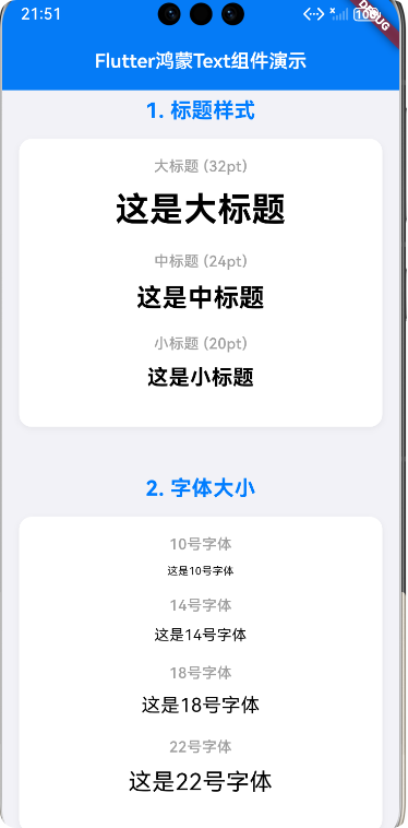
// 1. 标题样式演示 - 鸿蒙OS标题层级
_buildSectionTitle('1. 标题样式'),
_buildMergedTextExample([
_buildTextItem(
'大标题 (32pt)',
const Text(
'这是大标题',
style: TextStyle(fontSize: 32, fontWeight: FontWeight.bold),
textAlign: TextAlign.center,
)),
_buildTextItem(
'中标题 (24pt)',
const Text(
'这是中标题',
style: TextStyle(fontSize: 24, fontWeight: FontWeight.bold),
textAlign: TextAlign.center,
)),
_buildTextItem(
'小标题 (20pt)',
const Text(
'这是小标题',
style: TextStyle(fontSize: 20, fontWeight: FontWeight.bold),
textAlign: TextAlign.center,
)),
]),
// 2. 字体大小演示 - 鸿蒙OS字体规范
_buildSectionTitle('2. 字体大小'),
_buildMergedTextExample([
_buildTextItem(
'10号字体',
const Text(
'这是10号字体',
style: TextStyle(fontSize: 10),
textAlign: TextAlign.center,
)),
_buildTextItem(
'14号字体',
const Text(
'这是14号字体',
style: TextStyle(fontSize: 14),
textAlign: TextAlign.center,
)),
_buildTextItem(
'18号字体',
const Text(
'这是18号字体',
style: TextStyle(fontSize: 18),
textAlign: TextAlign.center,
)),
_buildTextItem(
'22号字体',
const Text(
'这是22号字体',
style: TextStyle(fontSize: 22),
textAlign: TextAlign.center,
)),
]),
// 3. 字体颜色演示 - 鸿蒙OS色彩系统
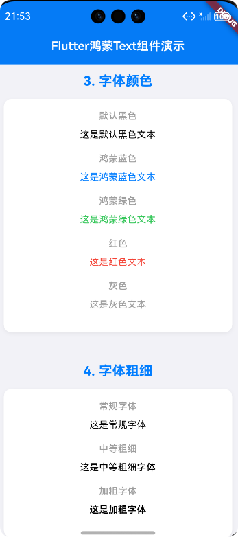
_buildSectionTitle('3. 字体颜色'),
_buildMergedTextExample([
_buildTextItem(
'默认黑色', const Text('这是默认黑色文本', textAlign: TextAlign.center)),
_buildTextItem(
'鸿蒙蓝色',
const Text(
'这是鸿蒙蓝色文本',
style: TextStyle(color: Color(0xFF007DFF)),
textAlign: TextAlign.center,
)),
_buildTextItem(
'鸿蒙绿色',
const Text(
'这是鸿蒙绿色文本',
style: TextStyle(color: Color(0xFF34C759)),
textAlign: TextAlign.center,
)),
_buildTextItem(
'红色',
const Text(
'这是红色文本',
style: TextStyle(color: Colors.red),
textAlign: TextAlign.center,
)),
_buildTextItem(
'灰色',
const Text(
'这是灰色文本',
style: TextStyle(color: Colors.grey),
textAlign: TextAlign.center,
)),
]),
// 4. 字体粗细演示
_buildSectionTitle('4. 字体粗细'),
_buildMergedTextExample([
_buildTextItem(
'常规字体',
const Text(
'这是常规字体',
style: TextStyle(fontWeight: FontWeight.normal),
textAlign: TextAlign.center,
)),
_buildTextItem(
'中等粗细',
const Text(
'这是中等粗细字体',
style: TextStyle(fontWeight: FontWeight.w500),
textAlign: TextAlign.center,
)),
_buildTextItem(
'加粗字体',
const Text(
'这是加粗字体',
style: TextStyle(fontWeight: FontWeight.bold),
textAlign: TextAlign.center,
)),
]),
// 5. 字体样式演示
_buildSectionTitle('5. 字体样式'),
_buildMergedTextExample([
_buildTextItem(
'正常字体', const Text('这是正常样式字体', textAlign: TextAlign.center)),
_buildTextItem(
'斜体字体',
const Text(
'这是斜体样式字体',
style: TextStyle(fontStyle: FontStyle.italic),
textAlign: TextAlign.center,
)),
]),
// 6. 文本装饰演示
_buildSectionTitle('6. 文本装饰'),
_buildMergedTextExample([
_buildTextItem(
'下划线',
const Text(
'这是带下划线的文本',
style: TextStyle(decoration: TextDecoration.underline),
textAlign: TextAlign.center,
)),
_buildTextItem(
'删除线',
const Text(
'这是带删除线的文本',
style: TextStyle(decoration: TextDecoration.lineThrough),
textAlign: TextAlign.center,
)),
_buildTextItem(
'上划线',
const Text(
'这是带上划线的文本',
style: TextStyle(decoration: TextDecoration.overline),
textAlign: TextAlign.center,
)),
_buildTextItem(
'自定义下划线',
const Text(
'这是带蓝色下划线的文本',
style: TextStyle(
decoration: TextDecoration.underline,
decorationColor: Color(0xFF007DFF),
decorationThickness: 2.0,
),
textAlign: TextAlign.center,
)),
]),
// 7. 文本对齐方式
_buildSectionTitle('7. 文本对齐方式'),
_buildMergedTextExample([
_buildTextItem(
'左对齐',
const Text(
'这是左对齐文本,演示文本对齐方式的效果。',
textAlign: TextAlign.left,
)),
_buildTextItem(
'居中对齐',
const Text(
'这是居中对齐文本,演示文本对齐方式的效果。',
textAlign: TextAlign.center,
)),
_buildTextItem(
'右对齐',
const Text(
'这是右对齐文本,演示文本对齐方式的效果。',
textAlign: TextAlign.right,
)),
_buildTextItem(
'两端对齐',
const Text(
'这是两端对齐文本,演示文本对齐方式的效果。',
textAlign: TextAlign.justify,
)),
]),
// 8. 文本溢出处理
_buildSectionTitle('8. 文本溢出处理'),
_buildMergedTextExample([
_buildTextItem(
'单行溢出(省略号)',
SizedBox(
width: 200,
child: const Text(
'这是一段很长的文本,用于演示单行文本溢出时的处理方式。',
overflow: TextOverflow.ellipsis,
maxLines: 1,
textAlign: TextAlign.center,
),
)),
_buildTextItem(
'单行溢出(裁剪)',
SizedBox(
width: 200,
child: const Text(
'这是一段很长的文本,用于演示单行文本溢出时的处理方式。',
overflow: TextOverflow.clip,
maxLines: 1,
textAlign: TextAlign.center,
),
)),
_buildTextItem(
'多行溢出',
SizedBox(
width: 200,
child: const Text(
'这是一段很长的文本,用于演示多行文本溢出时的处理方式。这是一段很长的文本,用于演示多行文本溢出时的处理方式。',
overflow: TextOverflow.ellipsis,
maxLines: 2,
textAlign: TextAlign.center,
),
)),
]),
// 9. 富文本演示 - 混合样式
_buildSectionTitle('9. 富文本样式'),
_buildMergedTextExample([
_buildTextItem(
'富文本',
const Text.rich(
TextSpan(
text: '这是',
style: TextStyle(fontSize: 16, color: Colors.black),
children: [
TextSpan(
text: '蓝色',
style: TextStyle(
color: Color(0xFF007DFF),
fontWeight: FontWeight.bold),
),
const TextSpan(text: '和'),
TextSpan(
text: '红色',
style: TextStyle(
color: Colors.red, fontStyle: FontStyle.italic),
),
const TextSpan(text: '混合的'),
TextSpan(
text: '富文本',
style: TextStyle(
fontWeight: FontWeight.bold,
decoration: TextDecoration.underline,
),
),
],
),
textAlign: TextAlign.center,
)),
]),
// 10. 行高演示 - 鸿蒙OS行高规范
_buildSectionTitle('10. 行高设置'),
_buildMergedTextExample([
_buildTextItem(
'默认行高',
const Text(
'这是默认行高的文本。\n这是第二行文本。',
style: TextStyle(fontSize: 16),
textAlign: TextAlign.center,
)),
_buildTextItem(
'行高1.2',
const Text(
'这是行高1.2的文本。\n这是第二行文本。',
style: TextStyle(fontSize: 16, height: 1.2),
textAlign: TextAlign.center,
)),
_buildTextItem(
'行高2.0',
const Text(
'这是行高2.0的文本。\n这是第二行文本。',
style: TextStyle(fontSize: 16, height: 2.0),
textAlign: TextAlign.center,
)),
]),
],
),
),
);
}
/// 构建章节标题
/// 参数: title - 章节标题文本
/// 返回: 带有鸿蒙风格样式的章节标题组件
Widget _buildSectionTitle(String title) {
return Padding(
padding: const EdgeInsets.only(top: 24.0, bottom: 12.0),
child: Text(
title,
style: const TextStyle(
fontSize: 20,
fontWeight: FontWeight.bold,
color: Color(0xFF007DFF), // 鸿蒙蓝色
),
textAlign: TextAlign.center,
),
);
}
/// 构建单个文本示例项
/// 参数:
/// title - 示例标题
/// textWidget - 要展示的文本组件
/// 返回: 带有标题和文本的示例项
Widget _buildTextItem(String title, Widget textWidget) {
return Padding(
padding: const EdgeInsets.only(bottom: 16.0),
child: Column(
crossAxisAlignment: CrossAxisAlignment.center,
children: [
Text(
title,
style: const TextStyle(
fontSize: 14,
color: Colors.grey,
fontWeight: FontWeight.w500,
),
textAlign: TextAlign.center,
),
const SizedBox(height: 8.0),
textWidget,
],
),
);
}
/// 构建合并的文本示例容器
/// 将多个文本示例合并到一个容器中,减少用户滑动
/// 参数: items - 文本示例项列表
/// 返回: 带有鸿蒙风格卡片样式的合并文本示例容器
Widget _buildMergedTextExample(List<Widget> items) {
return Container(
margin: const EdgeInsets.only(bottom: 20.0),
padding: const EdgeInsets.all(16.0),
decoration: BoxDecoration(
color: Colors.white,
borderRadius: BorderRadius.circular(12.0), // 鸿蒙风格圆角
boxShadow: [
BoxShadow(
color: Colors.black.withOpacity(0.05), // 轻微阴影效果
blurRadius: 4,
offset: const Offset(0, 2),
),
],
),
child: Center(
child: Column(
crossAxisAlignment: CrossAxisAlignment.center,
children: items,
),
),
);
}
}五、总结
在鸿蒙 + Flutter 的跨平台开发中,Text 控件虽小,却是用户界面中最基础、最频繁出现的元素。掌握其排版技巧,不仅能提升应用的视觉美感和可读性 ,更能体现开发者的专业素养。
欢迎加入开源鸿蒙跨平台社区:https://openharmonycrossplatform.csdn.net