购物车是电商应用的核心功能,用户在这里管理选择的商品、调整数量、计算总价。一个好的购物车实现需要提供流畅的交互体验、准确的价格计算和清晰的商品展示。本文将详细讲解如何在 Flutter for OpenHarmony 项目中实现一个功能完整的购物车页面,包括商品列表展示、数量调整、价格计算和清空购物车等功能。
通用卡片组件
在购物车中,我们使用 ShopCard 组件来展示商品和总价信息。这是一个可复用的卡片组件,提供了统一的样式。
dart
class ShopCard extends StatelessWidget {
  const ShopCard({
    super.key,
    required this.child,      // 卡片内容
    this.padding,             // 内边距(可选)
  });

  final Widget child;
  final EdgeInsetsGeometry? padding;

  @override
  Widget build(BuildContext context) {
    // 使用提供的内边距,或使用默认值
    final p = padding ?? const EdgeInsets.all(12);

    return Card(
      // 不显示阴影,使用边框代替
      elevation: 0,
      shape: RoundedRectangleBorder(
        // 圆角边框
        borderRadius: BorderRadius.circular(14),
        // 使用主题的分割线颜色作为边框颜色
        side: BorderSide(color: Theme.of(context).dividerColor),
      ),
      // 添加内边距
      child: Padding(padding: p, child: child),
    );
  }
}
这个卡片组件展示了如何创建可复用的UI组件:
设计特点:
- 使用
Card作为基础,提供Material Design风格 elevation: 0移除阴影,使用边框代替,更加简洁- 圆角边框
borderRadius: BorderRadius.circular(14)提供现代感 - 使用主题的分割线颜色保持风格一致
灵活性:
- 内边距可选,允许调用者自定义
- 默认内边距为12,适合大多数场景
- 通过
child参数接收任意内容
通用按钮组件
ShopButton 是一个通用的按钮组件,支持主按钮和次按钮两种样式。
dart
class ShopButton extends StatelessWidget {
  const ShopButton({
    super.key,
    required this.label,      // 按钮文字
    required this.onPressed,  // 点击回调
    this.icon,                // 按钮图标(可选)
    this.isPrimary = true,    // 是否为主按钮
  });

  final String label;
  final VoidCallback? onPressed;
  final IconData? icon;
  final bool isPrimary;

  @override
  Widget build(BuildContext context) {
    // 获取主题的颜色方案
    final colorScheme = Theme.of(context).colorScheme;

    // 根据按钮类型选择样式
    final ButtonStyle style = isPrimary
        ? ElevatedButton.styleFrom(
            // 主按钮:使用主色作为背景
            backgroundColor: colorScheme.primary,
            foregroundColor: colorScheme.onPrimary,
            padding: const EdgeInsets.symmetric(horizontal: 14, vertical: 12),
            shape: RoundedRectangleBorder(borderRadius: BorderRadius.circular(10)),
          )
        : OutlinedButton.styleFrom(
            // 次按钮:使用主色作为边框和文字颜色
            foregroundColor: colorScheme.primary,
            padding: const EdgeInsets.symmetric(horizontal: 14, vertical: 12),
            shape: RoundedRectangleBorder(borderRadius: BorderRadius.circular(10)),
          );

    // 构建按钮内容(图标+文字)
    final Widget child = Row(
      mainAxisSize: MainAxisSize.min,
      children: <Widget>[
        // 如果提供了图标,则显示图标
        if (icon != null) ...<Widget>[
          Icon(icon, size: 18),
          const SizedBox(width: 8),
        ],
        // 显示按钮文字
        Text(label),
      ],
    );

    // 根据按钮类型返回不同的按钮
    if (isPrimary) {
      return ElevatedButton(onPressed: onPressed, style: style, child: child);
    }
    return OutlinedButton(onPressed: onPressed, style: style, child: child);
  }
}
这个按钮组件展示了如何创建灵活的按钮组件:
样式管理:
- 主按钮使用
ElevatedButton,背景色为主色 - 次按钮使用
OutlinedButton,只有边框和文字 - 两种样式都使用圆角,保持一致性
内容组合:
- 支持图标和文字的组合
- 使用
Row和mainAxisSize: MainAxisSize.min实现紧凑布局 - 图标和文字之间有适当的间距
主题集成:
- 使用
Theme.of(context).colorScheme获取主题颜色 - 确保按钮与应用风格一致
- 支持深色模式和浅色模式
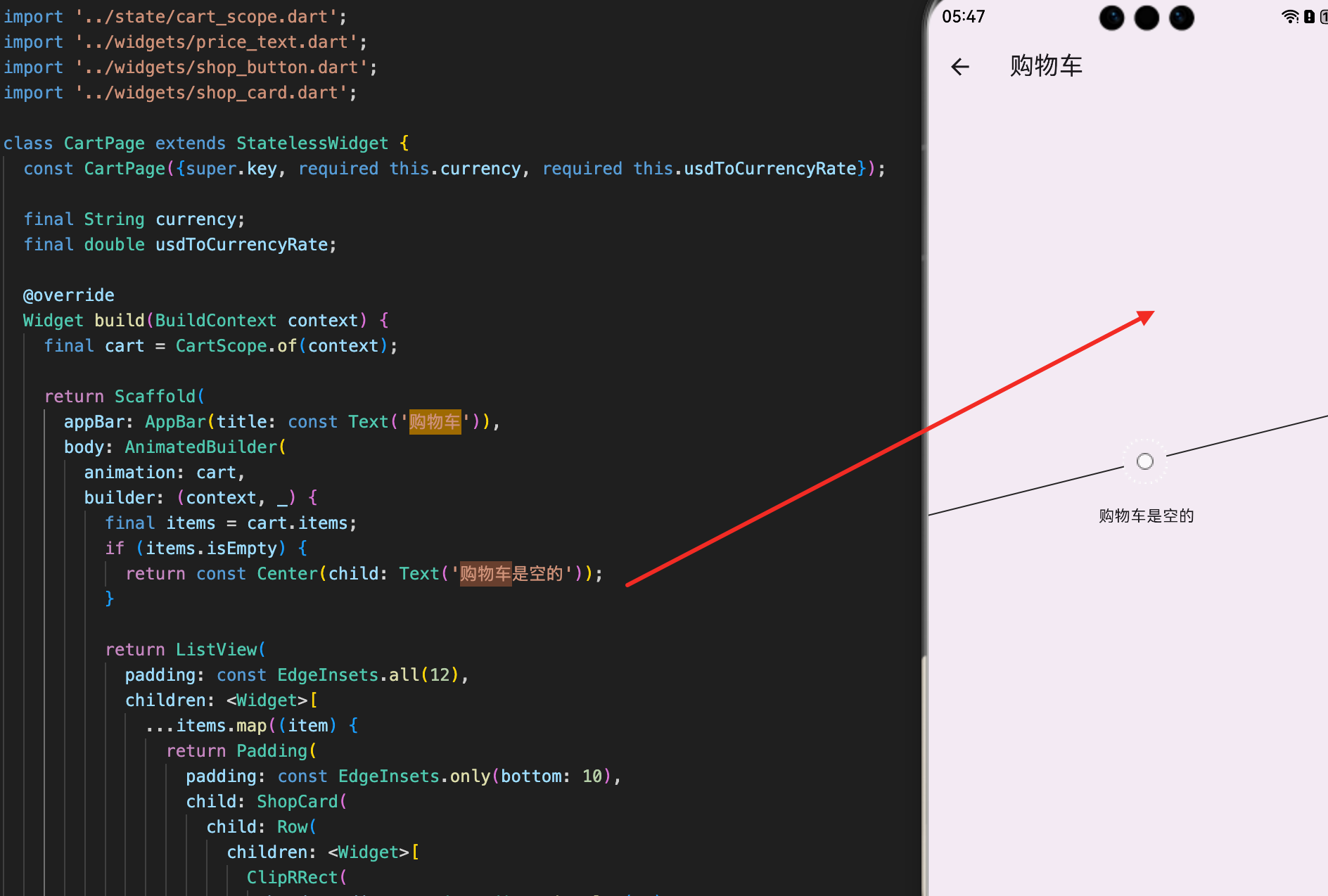
购物车页面
CartPage 是购物车的主页面,负责显示购物车中的商品、处理数量调整和计算总价。
dart
class CartPage extends StatelessWidget {
  const CartPage({
    super.key,
    required this.currency,         // 当前货币
    required this.usdToCurrencyRate, // 汇率
  });

  final String currency;
  final double usdToCurrencyRate;

  @override
  Widget build(BuildContext context) {
    // 获取购物车实例
    final cart = CartScope.of(context);

    return Scaffold(
      appBar: AppBar(title: const Text('购物车')),
      body: AnimatedBuilder(
        // 监听购物车的变化
        animation: cart,
        builder: (context, _) {
          // 获取购物车中的所有商品
          final items = cart.items;

          // 如果购物车为空,显示提示信息
          if (items.isEmpty) {
            return const Center(child: Text('购物车是空的'));
          }

          // 显示购物车列表
          return ListView(
            padding: const EdgeInsets.all(12),
            children: <Widget>[
              // 显示每个购物车项
              ...items.map((item) {
                return Padding(
                  padding: const EdgeInsets.only(bottom: 10),
                  child: ShopCard(
                    child: Row(
                      children: <Widget>[
                        // 商品图片
                        ClipRRect(
                          borderRadius: BorderRadius.circular(10),
                          child: Image.network(
                            item.product.imageUrl,
                            width: 54,
                            height: 54,
                            fit: BoxFit.contain,
                            // 图片加载失败时显示空白区域
                            errorBuilder: (_, __, ___) => const SizedBox(
                              width: 54,
                              height: 54,
                            ),
                          ),
                        ),
                        const SizedBox(width: 12),

                        // 商品信息
                        Expanded(
                          child: Column(
                            crossAxisAlignment: CrossAxisAlignment.start,
                            children: <Widget>[
                              // 商品标题
                              Text(
                                item.product.title,
                                maxLines: 2,
                                overflow: TextOverflow.ellipsis,
                                style: Theme.of(context).textTheme.titleSmall,
                              ),
                              const SizedBox(height: 8),

                              // 价格和数量
                              Row(
                                children: <Widget>[
                                  // 显示小计价格
                                  PriceText(
                                    amount: item.subtotalUsd * usdToCurrencyRate,
                                    currency: currency,
                                  ),
                                  const SizedBox(width: 10),
                                  // 显示数量
                                  Text('x${item.quantity}'),
                                ],
                              ),
                            ],
                          ),
                        ),
                        const SizedBox(width: 10),

                        // 数量调整按钮
                        Column(
                          children: <Widget>[
                            // 增加按钮
                            IconButton(
                              tooltip: '增加',
                              onPressed: () => cart.add(item.product),
                              icon: const Icon(Icons.add),
                            ),
                            // 减少按钮
                            IconButton(
                              tooltip: '减少',
                              onPressed: () => cart.removeOne(item.product.id),
                              icon: const Icon(Icons.remove),
                            ),
                          ],
                        ),
                      ],
                    ),
                  ),
                );
              }),
              const SizedBox(height: 6),

              // 总价和清空按钮
              ShopCard(
                child: Row(
                  children: <Widget>[
                    Expanded(
                      child: Column(
                        crossAxisAlignment: CrossAxisAlignment.start,
                        children: <Widget>[
                          // 商品总数
                          Text('共 ${cart.totalItems} 件商品'),
                          const SizedBox(height: 6),
                          // 总价
                          PriceText(
                            amount: cart.totalUsd * usdToCurrencyRate,
                            currency: currency,
                          ),
                        ],
                      ),
                    ),
                    // 清空购物车按钮
                    ShopButton(
                      label: '清空',
                      isPrimary: false,
                      icon: Icons.delete_outline,
                      onPressed: cart.clear,
                    ),
                  ],
                ),
              ),
            ],
          );
        },
      ),
    );
  }
}
这段代码展示了完整的购物车页面实现:
状态监听:
- 使用
AnimatedBuilder监听购物车的变化 - 当购物车中的商品改变时,页面自动更新
- 无需手动调用
setState
空状态处理:
- 当购物车为空时显示友好的提示信息
- 提示用户购物车是空的
- 改善用户体验
商品列表展示:
- 使用
ListView显示购物车中的所有商品 - 每个商品显示图片、标题、价格和数量
- 使用
map方法遍历商品列表
数量调整:
- 提供增加和减少按钮
- 点击增加按钮调用
cart.add() - 点击减少按钮调用
cart.removeOne() - 实时更新购物车状态
总价计算:
- 显示购物车中的总商品数量
- 显示购物车的总价(转换为用户选择的货币)
- 提供清空购物车按钮
购物车项的布局设计
购物车中的每个商品项需要清晰地展示商品信息和操作按钮。
dart
// 购物车项的布局结构
ShopCard(
  child: Row(
    children: <Widget>[
      // 左侧:商品图片
      ClipRRect(
        borderRadius: BorderRadius.circular(10),
        child: Image.network(
          item.product.imageUrl,
          width: 54,
          height: 54,
          fit: BoxFit.contain,
        ),
      ),
      const SizedBox(width: 12),

      // 中间:商品信息(可扩展)
      Expanded(
        child: Column(
          crossAxisAlignment: CrossAxisAlignment.start,
          children: <Widget>[
            Text(item.product.title),
            const SizedBox(height: 8),
            Row(
              children: <Widget>[
                PriceText(
                  amount: item.subtotalUsd * usdToCurrencyRate,
                  currency: currency,
                ),
                const SizedBox(width: 10),
                Text('x${item.quantity}'),
              ],
            ),
          ],
        ),
      ),
      const SizedBox(width: 10),

      // 右侧:数量调整按钮
      Column(
        children: <Widget>[
          IconButton(
            onPressed: () => cart.add(item.product),
            icon: const Icon(Icons.add),
          ),
          IconButton(
            onPressed: () => cart.removeOne(item.product.id),
            icon: const Icon(Icons.remove),
          ),
        ],
      ),
    ],
  ),
)
这个布局设计展示了如何组织购物车项的内容:
布局结构:
- 使用
Row实现水平布局 - 左侧是商品图片,中间是商品信息,右侧是操作按钮
- 使用
Expanded让商品信息占据剩余空间
信息展示:
- 商品图片使用
ClipRRect实现圆角 - 商品标题显示商品名称
- 价格显示该商品的小计
- 数量显示购物车中该商品的数量
操作按钮:
- 增加和减少按钮垂直排列
- 点击增加按钮增加商品数量
- 点击减少按钮减少商品数量
总价计算与显示
购物车的总价需要根据用户选择的货币进行转换。
dart
// 总价卡片
ShopCard(
  child: Row(
    children: <Widget>[
      Expanded(
        child: Column(
          crossAxisAlignment: CrossAxisAlignment.start,
          children: <Widget>[
            // 显示商品总数
            Text('共 ${cart.totalItems} 件商品'),
            const SizedBox(height: 6),
            // 显示总价(转换为用户选择的货币)
            PriceText(
              amount: cart.totalUsd * usdToCurrencyRate,
              currency: currency,
            ),
          ],
        ),
      ),
      // 清空购物车按钮
      ShopButton(
        label: '清空',
        isPrimary: false,
        icon: Icons.delete_outline,
        onPressed: cart.clear,
      ),
    ],
  ),
)
这段代码展示了如何显示购物车的总价:
价格计算:
cart.totalUsd获取美元总价- 乘以
usdToCurrencyRate转换为用户选择的货币 - 使用
PriceText组件格式化显示
信息展示:
- 显示购物车中的总商品数量
- 显示转换后的总价
- 提供清空购物车的快捷方式
用户交互:
- 清空按钮使用次按钮样式(
isPrimary: false) - 点击清空按钮调用
cart.clear() - 清空后购物车为空,显示空状态提示
多货币价格转换
购物车需要支持多种货币的价格显示。
dart
// 在购物车中进行价格转换
// 商品小计
PriceText(
  amount: item.subtotalUsd * usdToCurrencyRate,
  currency: currency,
)

// 购物车总价
PriceText(
  amount: cart.totalUsd * usdToCurrencyRate,
  currency: currency,
)
这个转换过程展示了如何在购物车中应用多货币支持:
转换公式:
- 后端返回的是美元价格
- 乘以汇率得到本地货币价格
- 使用
PriceText组件显示
一致性保证:
- 所有价格显示都使用相同的转换公式
- 确保购物车中的价格与商品列表一致
- 用户看到的价格始终准确
总结
购物车的实现涉及多个重要的技术点。首先是通用组件的设计,包括卡片组件和按钮组件,提供了可复用的UI元素。其次是购物车页面的实现,使用 AnimatedBuilder 监听购物车变化,提供流畅的交互体验。再次是购物车项的布局设计,清晰地展示商品信息和操作按钮。最后是多货币价格转换,确保价格显示的准确性。
这种设计确保了购物车的功能完整性和用户体验的流畅性。用户可以轻松查看购物车中的商品、调整数量、计算总价,整个流程自然而直观。
欢迎加入开源鸿蒙跨平台社区:https://openharmonycrossplatform.csdn.net