
React Native for OpenHarmony 实战:DisplayInfo 显示信息详解
摘要
本文深入探讨 React Native for OpenHarmony 中 DisplayInfo 显示信息的使用方法与适配技巧。作为跨平台开发的关键环节,准确获取设备显示信息对实现响应式布局至关重要。文章详细解析了 DisplayInfo 的核心概念、基础与进阶用法,并通过实战案例展示了在 OpenHarmony 设备上的具体应用。通过本文,开发者将掌握在 OpenHarmony 平台上高效使用 DisplayInfo 的最佳实践,解决跨平台显示适配的常见痛点,包括折叠屏适配、多窗口模式处理和安全区域计算等关键问题,为构建高质量的跨平台应用奠定坚实基础。
引言
在移动应用开发中,屏幕适配始终是一个重要课题。随着 OpenHarmony 生态的快速发展,越来越多的开发者开始关注如何在这一新兴平台上进行高效开发。React Native 作为广受欢迎的跨平台框架,其与 OpenHarmony 的结合为开发者提供了新的可能性。
作为一位拥有 5 年 React Native 开发经验的工程师,我在最近的 OpenHarmony 项目中深入研究了 DisplayInfo 的使用方法。记得在一次实际项目中,我们遇到了一个棘手的问题:应用在折叠屏设备上展开时 UI 布局错乱,横竖屏切换时内容被状态栏遮挡。经过深入研究,我发现问题的根源在于对 OpenHarmony 显示信息获取机制的理解不足。
DisplayInfo 作为 OpenHarmony 提供的显示信息获取 API,在实现响应式布局、适配不同屏幕尺寸和分辨率方面发挥着关键作用。然而,由于 React Native 原生的 Dimensions API 与 OpenHarmony 的 DisplayInfo 存在差异,开发者在实际使用中常常遇到各种适配问题。
本文将分享我在 OpenHarmony 项目中的实战经验,包括如何正确获取屏幕尺寸、处理安全区域、适配折叠屏设备等。通过详细的技术解析和可运行的代码示例,帮助你避免我曾经踩过的坑,高效开发出在 OpenHarmony 设备上表现优异的 React Native 应用。
DisplayInfo 核心概念介绍
什么是 DisplayInfo
DisplayInfo 是 OpenHarmony 系统中用于获取设备显示信息的核心 API。它提供了丰富的设备显示参数,包括但不限于:
- 屏幕尺寸(宽度和高度)
- 分辨率
- 像素密度(DPI)
- 屏幕方向
- 安全区域
- 多窗口模式信息
- 折叠屏状态
在 OpenHarmony 中,DisplayInfo 是通过系统服务获取的,它能够准确反映当前设备的显示状态,特别是在处理折叠屏、多窗口等复杂场景时表现出色。
与 React Native 原生的 Dimensions API 不同,DisplayInfo 是 OpenHarmony 平台特有的 API,提供了更精确、更全面的显示信息。在 React Native for OpenHarmony 开发中,我们需要将两者结合起来使用,以实现最佳的跨平台体验。
DisplayInfo 的主要功能和属性
DisplayInfo 提供了多个关键属性,这些属性对于实现响应式布局至关重要:
| 属性 | 类型 | 描述 | OpenHarmony 特有 |
|---|---|---|---|
width |
number | 屏幕宽度(像素) | ❌ |
height |
number | 屏幕高度(像素) | ❌ |
density |
number | 像素密度(DPI) | ⚠️(更精确) |
scaledDensity |
number | 缩放密度 | ✅ |
xdpi |
number | 水平 DPI | ✅ |
ydpi |
number | 垂直 DPI | ✅ |
orientation |
string | 屏幕方向('portrait' | 'landscape') | ⚠️(更精细) |
rotation |
number | 屏幕旋转角度(0-360) | ✅ |
safeArea |
object | 安全区域信息 | ✅ |
foldState |
string | 折叠屏状态 | ✅ |
hingeAngle |
number | 铰链角度(0-180°) | ✅ |
isTabletopMode |
boolean | 是否桌面模式 | ✅ |
windowWidth |
number | 当前窗口宽度 | ✅ |
windowHeight |
number | 当前窗口高度 | ✅ |
这些属性使得开发者能够精确控制 UI 布局,适配各种不同的设备和场景。特别是对于 OpenHarmony 特有的功能,如折叠屏支持和多窗口模式,DisplayInfo 提供了 React Native Dimensions API 无法获取的关键信息。
为什么在 React Native 中需要使用 DisplayInfo
在 React Native 应用开发中,我们通常使用 Dimensions API 来获取设备的显示信息。然而,在 OpenHarmony 平台上,由于系统架构和 API 设计的差异,原生的 Dimensions API 可能无法准确获取所有必要的显示信息,特别是在处理折叠屏、多窗口等特殊场景时。
DisplayInfo 作为 OpenHarmony 平台的原生 API,能够提供更全面、更准确的显示信息,帮助开发者解决以下问题:
-
精确的屏幕尺寸获取:在某些设备上,Dimensions API 可能无法准确区分状态栏、导航栏等系统 UI 所占用的空间,而 DisplayInfo 提供了安全区域信息,可以更精确地进行布局。
-
折叠屏设备适配:OpenHarmony 的 DisplayInfo 能够检测到折叠屏的状态变化,提供当前展开的屏幕区域信息,这对于开发折叠屏应用至关重要。例如,当设备从折叠状态变为展开状态时,应用需要能够动态调整布局以充分利用更大的屏幕空间。
-
多窗口模式支持:在多窗口模式下,Dimensions API 通常只能获取整个屏幕的尺寸,而无法获取当前应用窗口的实际尺寸。DisplayInfo 则能够提供当前窗口的精确尺寸,使应用能够在有限的空间内提供最佳用户体验。
-
高 DPI 设备适配:DisplayInfo 提供了详细的 DPI 信息,包括水平和垂直方向的 DPI,帮助开发者更好地处理高分辨率设备的显示问题,确保图像和文本的清晰度。
-
桌面模式检测:对于支持桌面模式的折叠屏设备,DisplayInfo 可以检测设备是否处于桌面模式(半折叠状态),使应用能够提供适合该模式的 UI 布局。
与 React Native Dimensions API 的关系
React Native 的 Dimensions API 是一个跨平台的 API,用于获取设备的屏幕尺寸和分辨率。它提供了 get 和 addEventListener 等方法,可以方便地获取和监听屏幕尺寸的变化。
然而,Dimensions API 在不同平台上的实现有所不同:
- 在 iOS 和 Android 上,Dimensions API 基于原生平台的 API 实现
- 在 OpenHarmony 上,由于缺乏直接对应的支持,Dimensions API 可能无法提供完整或准确的信息
DisplayInfo 可以看作是 OpenHarmony 平台上 Dimensions API 的补充或替代方案。在 React Native for OpenHarmony 中,我们通常需要将两者结合起来使用:
OpenHarmony
iOS/Android
React Native App
Platform Check
Use DisplayInfo API
Use Dimensions API
Get Detailed Display Info
Get Basic Display Info
Responsive Layout
在实际开发中,我们可以通过创建一个统一的 API 层,根据平台自动选择使用 Dimensions API 还是 DisplayInfo,从而简化应用代码。这种封装方式不仅提高了代码的可维护性,还确保了在不同平台上的行为一致性。
React Native与OpenHarmony平台适配要点
React Native 原生支持的显示信息 API
React Native 提供了 Dimensions API 用于获取设备的显示信息:
javascript
import { Dimensions } from 'react-native';

// 获取屏幕尺寸
const { width, height } = Dimensions.get('window');

// 监听尺寸变化
const subscription = Dimensions.addEventListener('change', ({ window }) => {
  console.log('New dimensions:', window);
});
Dimensions API 在 iOS 和 Android 上工作良好,但在 OpenHarmony 上存在以下限制:
-
无法准确获取安全区域信息:Dimensions API 在 OpenHarmony 上无法区分状态栏、导航栏等系统 UI 所占用的空间,导致内容可能被遮挡。
-
不支持折叠屏状态检测:OpenHarmony 的折叠屏设备需要特殊处理,但 Dimensions API 无法提供折叠状态信息。
-
多窗口模式支持不足:在多窗口模式下,Dimensions API 返回的是整个屏幕的尺寸,而非当前应用窗口的实际尺寸。
-
DPI 信息不准确:Dimensions API 在 OpenHarmony 上可能无法提供准确的 DPI 信息,影响高分辨率设备的显示效果。
-
屏幕方向检测不精细:Dimensions API 只能区分横屏和竖屏,无法获取精确的旋转角度,这在桌面模式(半折叠)下尤为重要。
OpenHarmony 平台的特殊性
OpenHarmony 作为新兴的操作系统,在显示管理方面有其独特之处:
-
分布式架构:OpenHarmony 支持设备间的分布式能力,这意味着显示信息可能来自不同的物理设备。例如,应用可能在手机上运行,但显示在电视上,这种场景下需要特殊的显示信息处理。
-
折叠屏支持:OpenHarmony 对折叠屏设备有原生支持,DisplayInfo 能够反映当前的折叠状态,包括完全展开、半折叠(桌面模式)和完全折叠等状态。
-
多窗口模式:OpenHarmony 的多窗口实现与 Android 有所不同,应用可能在部分屏幕区域运行,需要根据窗口尺寸调整 UI。
-
自适应 UI 框架:OpenHarmony 提供了自适应 UI 框架,与 React Native 的响应式布局理念有相似之处,但也存在差异。例如,OpenHarmony 的自适应布局更注重设备能力的动态调整。
-
安全区域计算:OpenHarmony 设备可能有各种屏幕形状(如刘海屏、打孔屏、曲面屏等),安全区域计算更为复杂,需要精确获取各边缘的偏移量。
需要适配的关键方面
在将 React Native 应用迁移到 OpenHarmony 平台时,显示信息相关的适配主要包括:
-
安全区域处理:OpenHarmony 设备可能有不同的屏幕形状和系统 UI 布局,需要正确计算安全区域。例如,华为 Mate X 系列折叠屏设备在展开状态下有特殊的屏幕形状,需要特别处理。
-
折叠屏适配:当设备折叠状态变化时,应用需要能够动态调整布局。这包括检测折叠状态、处理展开/折叠过渡动画,以及为不同状态提供合适的 UI 布局。
-
多窗口模式支持:在多窗口模式下,应用应该能够根据可用空间调整 UI。例如,当窗口宽度小于 600px 时,应切换到紧凑布局;当宽度大于 992px 时,可以显示更丰富的 UI 元素。
-
DPI 适配:不同 OpenHarmony 设备可能有不同的 DPI 设置,需要正确处理像素密度。例如,平板设备通常有更高的 DPI,需要提供更高分辨率的图像资源。
-
屏幕方向变化:OpenHarmony 对屏幕方向的处理可能与 Android 有所不同,特别是在桌面模式下,设备可能处于中间旋转角度。
OpenHarmony DisplayInfo 与 React Native 的集成方案
为了在 React Native for OpenHarmony 中有效使用 DisplayInfo,我们需要创建一个适配层。这个适配层应该:
-
封装原生模块:创建 React Native 原生模块,将 OpenHarmony 的 DisplayInfo API 暴露给 JavaScript。
-
统一 API 接口 :提供与 Dimensions API 类似的接口,降低迁移成本。例如,实现
get和addEventListener方法。 -
处理平台差异:自动处理不同平台的差异,提供一致的 API。例如,在 OpenHarmony 上使用 DisplayInfo,在其他平台上使用 Dimensions。
-
事件监听机制:实现类似 Dimensions 的事件监听机制,支持动态尺寸变化。
下面是一个详细的架构图,展示了 React Native 与 OpenHarmony DisplayInfo 的集成方式:
调用
iOS/Android
OpenHarmony
React Native App
DisplayInfo API
平台判断
Dimensions API
DisplayInfo Native Module
OpenHarmony DisplayInfo Service
系统显示信息
基本显示信息
详细显示信息
响应式布局
适配的UI
在这个架构中,DisplayInfo API 会根据当前运行平台自动选择使用原生的 Dimensions API 还是 OpenHarmony 的 DisplayInfo 服务,为上层应用提供一致的接口。这种设计确保了代码的可移植性,同时充分利用了 OpenHarmony 平台的特有能力。
DisplayInfo基础用法实战
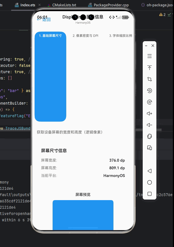
获取屏幕尺寸
获取屏幕尺寸是应用开发中最基本的需求之一。在 OpenHarmony 上,我们可以使用 DisplayInfo 来获取更精确的屏幕尺寸信息。
首先,我们需要创建一个原生模块来访问 OpenHarmony 的 DisplayInfo API:
javascript
// displayInfo.js
import { NativeModules, Platform } from 'react-native';

const { DisplayInfoModule } = NativeModules;

/**
 * 获取当前显示信息
 * @returns {Promise<DisplayInfo>}
 */
export const getDisplayInfo = () => {
  if (Platform.OS === 'openharmony') {
    return DisplayInfoModule.getDisplayInfo();
  }
  // 对于其他平台,可以返回 Dimensions 的信息作为 fallback
  const { width, height } = Dimensions.get('window');
  return Promise.resolve({
    width,
    height,
    density: 1,
    orientation: width > height ? 'landscape' : 'portrait',
    safeArea: { top: 0, right: 0, bottom: 0, left: 0 }
  });
};

/**
 * DisplayInfo 接口定义
 * @typedef {Object} DisplayInfo
 * @property {number} width - 屏幕宽度(像素)
 * @property {number} height - 屏幕高度(像素)
 * @property {number} density - 像素密度
 * @property {string} orientation - 屏幕方向('portrait' | 'landscape')
 * @property {Object} safeArea - 安全区域
 * @property {number} safeArea.top - 顶部安全区域
 * @property {number} safeArea.right - 右侧安全区域
 * @property {number} safeArea.bottom - 底部安全区域
 * @property {number} safeArea.left - 左侧安全区域
 */
然后,我们可以在应用中使用这个 API:
javascript
// ScreenInfo.js
import React, { useEffect, useState } from 'react';
import { View, Text, StyleSheet } from 'react-native';
import { getDisplayInfo } from './displayInfo';

const ScreenInfo = () => {
  const [displayInfo, setDisplayInfo] = useState(null);

  useEffect(() => {
    const loadDisplayInfo = async () => {
      try {
        const info = await getDisplayInfo();
        setDisplayInfo(info);
      } catch (error) {
        console.error('Failed to get display info:', error);
      }
    };

    loadDisplayInfo();
  }, []);

  if (!displayInfo) {
    return <Text>Loading...</Text>;
  }

  return (
    <View style={styles.container}>
      <Text style={styles.text}>Width: {displayInfo.width}px</Text>
      <Text style={styles.text}>Height: {displayInfo.height}px</Text>
      <Text style={styles.text}>Density: {displayInfo.density}</Text>
      <Text style={styles.text}>Orientation: {displayInfo.orientation}</Text>
    </View>
  );
};

const styles = StyleSheet.create({
  container: {
    flex: 1,
    justifyContent: 'center',
    alignItems: 'center',
    padding: 20,
  },
  text: {
    fontSize: 18,
    marginVertical: 5,
  },
});

export default ScreenInfo;
代码解释:
-
我们创建了一个
getDisplayInfo函数,它会根据当前平台返回相应的显示信息。 -
在 OpenHarmony 平台上,它会调用原生模块获取 DisplayInfo;在其他平台上,它会使用 Dimensions API 作为 fallback。
-
在组件中,我们使用 useEffect 钩子异步获取显示信息并更新状态。
-
显示信息包括屏幕宽度、高度、像素密度和方向。
OpenHarmony平台适配要点:
-
OpenHarmony 的 DisplayInfo 会返回物理像素值,而 React Native 的 Dimensions 返回的是逻辑像素值,需要注意单位转换。例如,如果设备的 density 是 2.625,那么 1080px 的物理宽度对应 411.43 逻辑像素。
-
在 OpenHarmony 上,屏幕尺寸可能会随着折叠状态变化而动态改变,需要监听变化事件。例如,当折叠屏设备从折叠状态变为展开状态时,宽度可能从 600px 变为 1920px。
-
多窗口模式下,返回的尺寸是当前窗口的尺寸,而非整个屏幕的尺寸。例如,在分屏模式下,应用可能只占用屏幕的一半。
获取安全区域
安全区域是指可以安全显示内容的区域,避开状态栏、导航栏等系统 UI。在 OpenHarmony 设备上,由于屏幕形状多样(如刘海屏、打孔屏等),正确处理安全区域尤为重要。
javascript
// safeArea.js
import { NativeModules, Platform } from 'react-native';

const { DisplayInfoModule } = NativeModules;

/**
 * 获取安全区域
 * @returns {Promise<Object>}
 */
export const getSafeArea = () => {
  if (Platform.OS === 'openharmony') {
    return DisplayInfoModule.getSafeArea();
  }

  // 对于 iOS,可以使用 SafeAreaView 或 constants
  if (Platform.OS === 'ios') {
    const constants = require('react-native/Libraries/Utilities/Platform').Constants;
    return Promise.resolve({
      top: constants.statusBarHeight,
      bottom: 0, // 需要根据实际情况调整
      left: 0,
      right: 0
    });
  }

  // Android 和其他平台的 fallback
  return Promise.resolve({
    top: 0,
    bottom: 0,
    left: 0,
    right: 0
  });
};

/**
 * 使用安全区域创建样式
 * @param {Object} baseStyle - 基础样式
 * @returns {Object} 包含安全区域的样式
 */
export const withSafeArea = (baseStyle = {}) => {
  return async () => {
    const safeArea = await getSafeArea();
    return {
      ...baseStyle,
      paddingTop: baseStyle.paddingTop !== undefined
        ? baseStyle.paddingTop + safeArea.top
        : safeArea.top,
      paddingBottom: baseStyle.paddingBottom !== undefined
        ? baseStyle.paddingBottom + safeArea.bottom
        : safeArea.bottom,
      paddingLeft: baseStyle.paddingLeft !== undefined
        ? baseStyle.paddingLeft + safeArea.left
        : safeArea.left,
      paddingRight: baseStyle.paddingRight !== undefined
        ? baseStyle.paddingRight + safeArea.right
        : safeArea.right,
    };
  };
};
使用示例:
javascript
// SafeAreaExample.js
import React, { useState, useEffect } from 'react';
import { View, Text, StyleSheet } from 'react-native';
import { withSafeArea } from './safeArea';

const SafeAreaExample = () => {
  const [containerStyle, setContainerStyle] = useState({});

  useEffect(() => {
    const loadStyle = async () => {
      const style = await withSafeArea({
        flex: 1,
        backgroundColor: '#f0f0f0',
        alignItems: 'center',
        justifyContent: 'center'
      })();
      setContainerStyle(style);
    };

    loadStyle();
  }, []);

  return (
    <View style={containerStyle}>
      <Text style={styles.text}>This content is within the safe area</Text>
      <Text style={styles.subText}>Top: Status bar area</Text>
      <Text style={styles.subText}>Bottom: Navigation bar area</Text>
    </View>
  );
};

const styles = StyleSheet.create({
  text: {
    fontSize: 20,
    fontWeight: 'bold',
    marginBottom: 10,
  },
  subText: {
    fontSize: 16,
    color: '#666',
  },
});

export default SafeAreaExample;
代码解释:
-
getSafeArea函数获取当前设备的安全区域信息,包括顶部(状态栏)、底部(导航栏)、左右侧(打孔区域)的偏移。 -
withSafeArea函数用于将安全区域应用到现有样式中,自动计算并添加必要的内边距。 -
在组件中,我们异步获取安全区域样式并应用到容器,确保内容不会被系统 UI 遮挡。
OpenHarmony平台适配要点:
-
OpenHarmony 的 DisplayInfo 会提供精确的安全区域信息,这些值可能因设备型号而异。例如,华为 Mate X3 的展开状态下,顶部安全区域可能为 44px,底部为 34px。
-
在折叠屏设备上,安全区域可能会随着折叠状态变化而动态改变。例如,当设备从折叠状态变为展开状态时,顶部安全区域可能从 44px 变为 0px。
-
多窗口模式下,安全区域需要根据窗口位置重新计算。例如,当应用位于屏幕左侧时,右侧安全区域可能为 0。
-
安全区域的值是物理像素,需要根据 density 转换为逻辑像素。例如,如果 density 是 2.625,44px 物理像素对应约 16.76 逻辑像素。
获取屏幕方向
屏幕方向是响应式布局的重要参考因素。在 OpenHarmony 上,我们可以使用 DisplayInfo 获取更精确的屏幕方向信息。
javascript
// orientation.js
import { NativeModules, Platform, Dimensions } from 'react-native';

const { DisplayInfoModule } = NativeModules;

/**
 * 屏幕方向类型
 * @typedef {'portrait' | 'landscape' | 'unknown'} Orientation
 */

/**
 * 获取当前屏幕方向
 * @returns {Promise<Orientation>}
 */
export const getOrientation = () => {
  if (Platform.OS === 'openharmony') {
    return DisplayInfoModule.getOrientation();
  }

  // 使用 Dimensions 作为 fallback
  const { width, height } = Dimensions.get('window');
  return Promise.resolve(width > height ? 'landscape' : 'portrait');
};

/**
 * 监听屏幕方向变化
 * @param {(orientation: Orientation) => void} callback
 * @returns {Object} 取消监听的方法
 */
export const addOrientationListener = (callback) => {
  if (Platform.OS === 'openharmony') {
    const subscription = DisplayInfoModule.addOrientationListener(callback);
    return {
      remove: () => DisplayInfoModule.removeOrientationListener(subscription)
    };
  }

  // 使用 Dimensions 监听作为 fallback
  const dimensionsSubscription = Dimensions.addEventListener('change', ({ window }) => {
    callback(window.width > window.height ? 'landscape' : 'portrait');
  });

  return {
    remove: () => dimensionsSubscription?.remove?.()
  };
};
使用示例:
javascript
// OrientationExample.js
import React, { useState, useEffect } from 'react';
import { View, Text, StyleSheet, Platform } from 'react-native';
import { getOrientation, addOrientationListener } from './orientation';

const OrientationExample = () => {
  const [orientation, setOrientation] = useState('unknown');

  useEffect(() => {
    let isMounted = true;

    const loadOrientation = async () => {
      try {
        const currentOrientation = await getOrientation();
        if (isMounted) {
          setOrientation(currentOrientation);
        }
      } catch (error) {
        console.error('Failed to get orientation:', error);
      }
    };

    loadOrientation();

    const orientationListener = addOrientationListener((newOrientation) => {
      if (isMounted) {
        setOrientation(newOrientation);
      }
    });

    return () => {
      isMounted = false;
      orientationListener.remove();
    };
  }, []);

  return (
    <View style={styles.container}>
      <Text style={styles.title}>Screen Orientation</Text>
      <View style={[styles.indicator,
        orientation === 'landscape' ? styles.landscape : styles.portrait]}>
        <Text style={styles.orientationText}>{orientation.toUpperCase()}</Text>
      </View>
      <Text style={styles.instructions}>
        {orientation === 'portrait'
          ? 'Rotate your device to landscape mode'
          : 'Rotate your device to portrait mode'}
      </Text>
    </View>
  );
};

const styles = StyleSheet.create({
  container: {
    flex: 1,
    justifyContent: 'center',
    alignItems: 'center',
    padding: 20,
  },
  title: {
    fontSize: 24,
    fontWeight: 'bold',
    marginBottom: 30,
  },
  indicator: {
    width: 200,
    height: 200,
    borderRadius: 10,
    justifyContent: 'center',
    alignItems: 'center',
    marginBottom: 20,
  },
  portrait: {
    backgroundColor: '#4CAF50',
  },
  landscape: {
    backgroundColor: '#2196F3',
    width: 300,
    height: 150,
  },
  orientationText: {
    color: 'white',
    fontSize: 24,
    fontWeight: 'bold',
  },
  instructions: {
    fontSize: 18,
    textAlign: 'center',
    color: '#666',
  },
});

export default OrientationExample;
代码解释:
-
getOrientation函数获取当前屏幕方向,返回 'portrait'、'landscape' 或 'unknown'。 -
addOrientationListener函数用于监听屏幕方向变化,当方向改变时触发回调。 -
在组件中,我们首先获取初始方向,然后设置监听器,当方向变化时更新 UI 显示。
-
我们使用不同的样式来表示横屏和竖屏状态,提供直观的视觉反馈。
OpenHarmony平台适配要点:
-
OpenHarmony 的 DisplayInfo 提供了更精确的方向信息,包括 90°、180°、270° 等旋转角度,而不仅仅是横屏/竖屏。这对于桌面模式(半折叠)尤为重要。
-
在折叠屏设备上,方向变化可能与折叠状态相关联。例如,当设备从折叠状态变为展开状态时,方向可能从竖屏变为横屏。
-
多窗口模式下,方向信息可能与整个屏幕的方向不同。例如,当应用在竖屏设备上以横屏窗口运行时,应用的方向是横屏,而整个设备的方向是竖屏。
-
方向变化事件可能非常频繁,特别是在桌面模式下,需要适当节流处理以避免性能问题。
处理像素密度
像素密度(DPI)对于处理高分辨率设备的显示至关重要。在 OpenHarmony 上,我们可以使用 DisplayInfo 获取准确的像素密度信息。
javascript
// density.js
import { NativeModules, Platform, PixelRatio } from 'react-native';

const { DisplayInfoModule } = NativeModules;

/**
 * 获取像素密度信息
 * @returns {Promise<Object>}
 */
export const getDensityInfo = () => {
  if (Platform.OS === 'openharmony') {
    return DisplayInfoModule.getDensityInfo();
  }

  // 使用 PixelRatio 作为 fallback
  return Promise.resolve({
    density: PixelRatio.get(),
    fontScale: PixelRatio.getFontScale(),
    dpi: PixelRatio.get()*160
  });
};

/**
 * 根据像素密度调整尺寸
 * @param {number} size - 基础尺寸
 * @returns {number} 调整后的尺寸
 */
export const scaleSize = (size) => {
  return getDensityInfo().then(info => {
    // 在 OpenHarmony 上,我们可能需要不同的缩放逻辑
    if (Platform.OS === 'openharmony') {
      // OpenHarmony 可能使用不同的缩放因子
      return size * (info.density / 1.5); // 假设 OpenHarmony 的基准密度是 1.5
    }
    // 其他平台使用标准的 PixelRatio
    return PixelRatio.roundToNearestPixel(size);
  });
};
使用示例:
javascript
// DensityExample.js
import React, { useState, useEffect } from 'react';
import { View, Text, StyleSheet } from 'react-native';
import { getDensityInfo, scaleSize } from './density';

const DensityExample = () => {
  const [densityInfo, setDensityInfo] = useState(null);
  const [scaledSize, setScaledSize] = useState(0);

  useEffect(() => {
    const loadDensityInfo = async () => {
      try {
        const info = await getDensityInfo();
        setDensityInfo(info);

        // 测试缩放一个 100px 的尺寸
        const size = await scaleSize(100);
        setScaledSize(size);
      } catch (error) {
        console.error('Failed to get density info:', error);
      }
    };

    loadDensityInfo();
  }, []);

  if (!densityInfo) {
    return <Text>Loading density info...</Text>;
  }

  return (
    <View style={styles.container}>
      <Text style={styles.info}>Density: {densityInfo.density}</Text>
      <Text style={styles.info}>Font Scale: {densityInfo.fontScale}</Text>
      <Text style={styles.info}>DPI: {densityInfo.dpi}</Text>

      <View style={styles.sizeContainer}>
        <Text style={styles.label}>Original size: 100px</Text>
        <View style={[styles.sizeBox, { width: 100, height: 100 }]} />

        <Text style={styles.label}>Scaled size: {scaledSize}px</Text>
        <View style={[styles.sizeBox, { width: scaledSize, height: scaledSize }]} />
      </View>
    </View>
  );
};

const styles = StyleSheet.create({
  container: {
    flex: 1,
    padding: 20,
    justifyContent: 'center',
  },
  info: {
    fontSize: 18,
    marginVertical: 5,
  },
  sizeContainer: {
    marginTop: 30,
    alignItems: 'center',
  },
  label: {
    fontSize: 16,
    marginTop: 10,
    fontWeight: 'bold',
  },
  sizeBox: {
    backgroundColor: '#3F51B5',
    marginVertical: 10,
  },
});

export default DensityExample;
代码解释:
-
getDensityInfo函数获取像素密度相关信息,包括 density、fontScale 和 dpi。 -
scaleSize函数根据像素密度调整尺寸,确保在不同 DPI 设备上显示一致。 -
在组件中,我们展示原始密度信息和缩放后的尺寸效果,直观地展示 DPI 适配的效果。
OpenHarmony平台适配要点:
-
OpenHarmony 的 DisplayInfo 提供了更详细的 DPI 信息,包括水平和垂直方向的 DPI,这在某些设备上可能不同(如长宽比特殊的屏幕)。
-
在 OpenHarmony 上,可能需要使用不同的缩放基准(例如,基准密度可能不是 160 DPI)。例如,某些平板设备可能使用 1.5 作为基准密度。
-
高 DPI 设备上,需要注意文本和图像的清晰度。对于图像资源,应提供 @2x、@3x 等不同分辨率的版本。
-
字体缩放(fontScale)可能受系统设置影响,应尊重用户的可访问性偏好。
DisplayInfo进阶用法
动态监听显示信息变化
在移动应用中,显示信息可能会动态变化,例如屏幕旋转、窗口大小调整、折叠状态变化等。我们需要能够监听这些变化并相应地更新 UI。
javascript
// displayInfo.js (扩展)
/**
 * 监听显示信息变化
 * @param {(displayInfo: DisplayInfo) => void} callback
 * @returns {Object} 取消监听的方法
 */
export const addDisplayInfoListener = (callback) => {
  if (Platform.OS === 'openharmony') {
    const subscription = DisplayInfoModule.addDisplayInfoListener((info) => {
      callback({
        width: info.width,
        height: info.height,
        density: info.density,
        orientation: info.orientation,
        safeArea: info.safeArea
      });
    });

    return {
      remove: () => DisplayInfoModule.removeDisplayInfoListener(subscription)
    };
  }

  // 使用 Dimensions 监听作为 fallback
  const dimensionsSubscription = Dimensions.addEventListener('change', ({ window }) => {
    callback({
      width: window.width,
      height: window.height,
      density: 1,
      orientation: window.width > window.height ? 'landscape' : 'portrait',
      safeArea: { top: 0, right: 0, bottom: 0, left: 0 }
    });
  });

  return {
    remove: () => dimensionsSubscription?.remove?.()
  };
};

/**
 * 使用显示信息的 Hook
 * @returns {DisplayInfo}
 */
export const useDisplayInfo = () => {
  const [displayInfo, setDisplayInfo] = useState(null);

  useEffect(() => {
    let isMounted = true;

    const loadDisplayInfo = async () => {
      try {
        const info = await getDisplayInfo();
        if (isMounted) {
          setDisplayInfo(info);
        }
      } catch (error) {
        console.error('Failed to get display info:', error);
      }
    };

    loadDisplayInfo();

    const listener = addDisplayInfoListener((info) => {
      if (isMounted) {
        setDisplayInfo(info);
      }
    });

    return () => {
      isMounted = false;
      listener.remove();
    };
  }, []);

  return displayInfo;
};
使用示例:
javascript
// DynamicLayout.js
import React from 'react';
import { View, Text, StyleSheet, Platform } from 'react-native';
import { useDisplayInfo } from './displayInfo';

const DynamicLayout = () => {
  const displayInfo = useDisplayInfo();

  if (!displayInfo) {
    return <Text>Loading...</Text>;
  }

  const isLandscape = displayInfo.orientation === 'landscape';
  const containerStyle = {
    flexDirection: isLandscape ? 'row' : 'column',
    padding: 20,
    backgroundColor: isLandscape ? '#E3F2FD' : '#FBE9E7'
  };

  return (
    <View style={[styles.container, containerStyle]}>
      <View style={[styles.box, styles.primaryBox]}>
        <Text style={styles.boxText}>Main Content</Text>
        <Text style={styles.detail}>Width: {displayInfo.width}px</Text>
        <Text style={styles.detail}>Height: {displayInfo.height}px</Text>
        <Text style={styles.detail}>Orientation: {displayInfo.orientation}</Text>
      </View>

      {isLandscape && (
        <View style={[styles.box, styles.secondaryBox]}>
          <Text style={styles.boxText}>Sidebar</Text>
          <Text style={styles.detail}>Safe Area Top: {displayInfo.safeArea.top}px</Text>
          <Text style={styles.detail}>Safe Area Bottom: {displayInfo.safeArea.bottom}px</Text>
        </View>
      )}
    </View>
  );
};

const styles = StyleSheet.create({
  container: {
    flex: 1,
  },
  box: {
    flex: 1,
    margin: 10,
    padding: 20,
    borderRadius: 10,
    alignItems: 'center',
    justifyContent: 'center',
  },
  primaryBox: {
    backgroundColor: '#BBDEFB',
  },
  secondaryBox: {
    backgroundColor: '#FFECB3',
  },
  boxText: {
    fontSize: 24,
    fontWeight: 'bold',
    marginBottom: 10,
  },
  detail: {
    fontSize: 16,
    color: '#555',
  },
});

export default DynamicLayout;
代码解释:
-
我们扩展了
displayInfo.js,添加了addDisplayInfoListener和useDisplayInfoHook。 -
useDisplayInfoHook 封装了获取和监听显示信息的逻辑,自动处理组件挂载和卸载时的资源清理。 -
在
DynamicLayout组件中,我们使用这个 Hook 来实现动态布局,当屏幕方向变化时,布局会自动从纵向切换到横向,添加侧边栏。 -
我们还根据方向变化调整了背景颜色,提供视觉反馈,帮助开发者理解布局变化。
OpenHarmony平台适配要点:
-
OpenHarmony 的 DisplayInfo 事件监听更加精确,能够捕获到折叠状态变化等特殊事件。例如,当折叠屏设备从折叠状态变为展开状态时,会触发显示信息变化事件。
-
在多窗口模式下,窗口大小变化会触发显示信息变化事件。例如,当用户调整分屏比例时,应用窗口尺寸会变化。
-
折叠屏设备上,展开/折叠操作会触发显示信息变化。需要注意的是,这些事件可能非常频繁,特别是在用户缓慢展开设备时。
-
需要处理快速连续变化的情况,避免频繁重渲染。可以使用节流(throttle)或防抖(debounce)技术来优化性能。
处理多窗口模式
OpenHarmony 支持多窗口模式,应用可能在部分屏幕区域运行。我们需要能够检测并适应这种场景。
javascript
// multiWindow.js
import { NativeModules, Platform } from 'react-native';

const { DisplayInfoModule } = NativeModules;

/**
 * 多窗口模式信息
 * @typedef {Object} MultiWindowInfo
 * @property {boolean} isInMultiWindow - 是否在多窗口模式
 * @property {number} windowWidth - 当前窗口宽度
 * @property {number} windowHeight - 当前窗口高度
 * @property {number} screenWidth - 整个屏幕宽度
 * @property {number} screenHeight - 整个屏幕高度
 */

/**
 * 获取多窗口模式信息
 * @returns {Promise<MultiWindowInfo>}
 */
export const getMultiWindowInfo = () => {
  if (Platform.OS === 'openharmony') {
    return DisplayInfoModule.getMultiWindowInfo();
  }

  // 其他平台的 fallback(通常不支持多窗口)
  return Promise.resolve({
    isInMultiWindow: false,
    windowWidth: Dimensions.get('window').width,
    windowHeight: Dimensions.get('window').height,
    screenWidth: Dimensions.get('screen').width,
    screenHeight: Dimensions.get('screen').height
  });
};

/**
 * 监听多窗口模式变化
 * @param {(info: MultiWindowInfo) => void} callback
 * @returns {Object} 取消监听的方法
 */
export const addMultiWindowListener = (callback) => {
  if (Platform.OS === 'openharmony') {
    const subscription = DisplayInfoModule.addMultiWindowListener(callback);
    return {
      remove: () => DisplayInfoModule.removeMultiWindowListener(subscription)
    };
  }

  // 其他平台通常不支持多窗口变化监听
  return { remove: () => {} };
};
使用示例:
javascript
// MultiWindowExample.js
import React, { useState, useEffect } from 'react';
import { View, Text, StyleSheet, Platform } from 'react-native';
import { getMultiWindowInfo, addMultiWindowListener } from './multiWindow';

const MultiWindowExample = () => {
  const [multiWindowInfo, setMultiWindowInfo] = useState(null);
  const [isCompact, setIsCompact] = useState(false);

  useEffect(() => {
    let isMounted = true;

    const loadMultiWindowInfo = async () => {
      try {
        const info = await getMultiWindowInfo();
        if (isMounted) {
          setMultiWindowInfo(info);
          setIsCompact(info.windowWidth < 600);
        }
      } catch (error) {
        console.error('Failed to get multi-window info:', error);
      }
    };

    loadMultiWindowInfo();

    const listener = addMultiWindowListener((info) => {
      if (isMounted) {
        setMultiWindowInfo(info);
        setIsCompact(info.windowWidth < 600);
      }
    });

    return () => {
      isMounted = false;
      listener.remove();
    };
  }, []);

  if (!multiWindowInfo) {
    return <Text>Loading multi-window info...</Text>;
  }

  return (
    <View style={styles.container}>
      <View style={[styles.header,
        multiWindowInfo.isInMultiWindow ? styles.multiWindowHeader : styles.fullScreenHeader]}>
        <Text style={styles.headerText}>
          {multiWindowInfo.isInMultiWindow ? 'Multi-Window Mode' : 'Full Screen Mode'}
        </Text>
      </View>

      <View style={styles.content}>
        {isCompact ? (
          <View style={styles.compactLayout}>
            <Text style={styles.compactText}>
              Compact layout for small window size ({multiWindowInfo.windowWidth}px)
            </Text>
            <View style={styles.compactItem}>
              <Text>Main Content</Text>
            </View>
          </View>
        ) : (
          <View style={styles.expandedLayout}>
            <Text style={styles.expandedText}>
              Expanded layout for larger window size ({multiWindowInfo.windowWidth}px)
            </Text>
            <View style={styles.grid}>
              <View style={[styles.gridItem, styles.primaryItem]}>
                <Text>Main Content</Text>
              </View>
              <View style={[styles.gridItem, styles.secondaryItem]}>
                <Text>Sidebar</Text>
              </View>
            </View>
          </View>
        )}
      </View>

      <View style={styles.footer}>
        <Text>Window: {multiWindowInfo.windowWidth}x{multiWindowInfo.windowHeight}</Text>
        <Text>Screen: {multiWindowInfo.screenWidth}x{multiWindowInfo.screenHeight}</Text>
      </View>
    </View>
  );
};

const styles = StyleSheet.create({
  container: {
    flex: 1,
  },
  header: {
    padding: 15,
    alignItems: 'center',
  },
  multiWindowHeader: {
    backgroundColor: '#FFECB3',
  },
  fullScreenHeader: {
    backgroundColor: '#E8F5E9',
  },
  headerText: {
    fontSize: 20,
    fontWeight: 'bold',
  },
  content: {
    flex: 1,
    padding: 15,
  },
  compactLayout: {
    flex: 1,
  },
  compactText: {
    marginBottom: 10,
    textAlign: 'center',
  },
  compactItem: {
    flex: 1,
    backgroundColor: '#BBDEFB',
    justifyContent: 'center',
    alignItems: 'center',
    borderRadius: 8,
  },
  expandedLayout: {
    flex: 1,
  },
  expandedText: {
    marginBottom: 10,
    textAlign: 'center',
  },
  grid: {
    flex: 1,
    flexDirection: 'row',
  },
  gridItem: {
    flex: 1,
    margin: 5,
    borderRadius: 8,
    justifyContent: 'center',
    alignItems: 'center',
  },
  primaryItem: {
    backgroundColor: '#BBDEFB',
  },
  secondaryItem: {
    backgroundColor: '#FFCCBC',
  },
  footer: {
    padding: 10,
    borderTopWidth: 1,
    borderTopColor: '#ddd',
    alignItems: 'center',
  },
});

export default MultiWindowExample;
代码解释:
-
getMultiWindowInfo获取多窗口模式相关信息,包括是否在多窗口模式、当前窗口尺寸和整个屏幕尺寸。 -
addMultiWindowListener监听多窗口模式变化,当窗口尺寸变化时触发回调。 -
在组件中,我们根据窗口宽度判断是否使用紧凑布局(windowWidth < 600px)。
-
当窗口大小变化时,自动切换布局模式,提供最佳的用户体验。
OpenHarmony平台适配要点:
-
OpenHarmony 的多窗口实现与 Android 有差异,需要使用 DisplayInfo 获取准确的窗口尺寸。例如,在 OpenHarmony 上,窗口尺寸可能不是整数,而是带有小数的值。
-
在多窗口模式下,应用应该能够优雅降级,提供适合小窗口的 UI。例如,当窗口宽度小于 600px 时,应隐藏侧边栏,使用单列布局。
-
窗口大小可能频繁变化,需要优化布局计算性能。可以使用 useMemo 或 useCallback 来避免不必要的重新渲染。
-
需要处理窗口从多窗口模式进入全屏模式的过渡,提供平滑的用户体验。可以使用 Animated API 实现过渡效果。
适配折叠屏设备
折叠屏设备是 OpenHarmony 重点支持的设备类型,DisplayInfo 提供了检测折叠状态的能力。
javascript
// foldable.js
import { NativeModules, Platform } from 'react-native';

const { DisplayInfoModule } = NativeModules;

/**
 * 折叠屏状态
 * @typedef {'unfolded' | 'half_folded' | 'folded' | 'unknown'} FoldState
 */

/**
 * 折叠屏信息
 * @typedef {Object} FoldableInfo
 * @property {FoldState} foldState - 折叠状态
 * @property {boolean} isTabletopMode - 是否桌面模式
 * @property {number} hingeAngle - 铰链角度(0-180度)
 * @property {DisplayInfo} displayInfo - 当前显示信息
 */

/**
 * 获取折叠屏信息
 * @returns {Promise<FoldableInfo>}
 */
export const getFoldableInfo = () => {
  if (Platform.OS === 'openharmony') {
    return DisplayInfoModule.getFoldableInfo();
  }

  // 非折叠屏设备的 fallback
  return Promise.resolve({
    foldState: 'unknown',
    isTabletopMode: false,
    hingeAngle: 0,
    displayInfo: {
      width: Dimensions.get('window').width,
      height: Dimensions.get('window').height,
      density: 1,
      orientation: Dimensions.get('window').width > Dimensions.get('window').height ? 'landscape' : 'portrait',
      safeArea: { top: 0, right: 0, bottom: 0, left: 0 }
    }
  });
};

/**
 * 监听折叠状态变化
 * @param {(info: FoldableInfo) => void} callback
 * @returns {Object} 取消监听的方法
 */
export const addFoldableListener = (callback) => {
  if (Platform.OS === 'openharmony') {
    const subscription = DisplayInfoModule.addFoldableListener(callback);
    return {
      remove: () => DisplayInfoModule.removeFoldableListener(subscription)
    };
  }

  // 非折叠屏设备不支持监听
  return { remove: () => {} };
};
使用示例:
javascript
// FoldableExample.js
import React, { useState, useEffect } from 'react';
import { View, Text, StyleSheet, Platform, Animated } from 'react-native';
import { getFoldableInfo, addFoldableListener } from './foldable';

const FoldableExample = () => {
  const [foldableInfo, setFoldableInfo] = useState(null);
  const [hingeAngleAnim] = useState(new Animated.Value(0));
  const [isUnfolded, setIsUnfolded] = useState(false);

  useEffect(() => {
    let isMounted = true;

    const loadFoldableInfo = async () => {
      try {
        const info = await getFoldableInfo();
        if (isMounted) {
          setFoldableInfo(info);
          setIsUnfolded(info.foldState === 'unfolded');
          Animated.timing(hingeAngleAnim, {
            toValue: info.hingeAngle,
            duration: 300,
            useNativeDriver: false
          }).start();
        }
      } catch (error) {
        console.error('Failed to get foldable info:', error);
      }
    };

    loadFoldableInfo();

    const listener = addFoldableListener((info) => {
      if (isMounted) {
        setFoldableInfo(info);
        setIsUnfolded(info.foldState === 'unfolded');
        Animated.timing(hingeAngleAnim, {
          toValue: info.hingeAngle,
          duration: 300,
          useNativeDriver: false
        }).start();
      }
    });

    return () => {
      isMounted = false;
      listener.remove();
    };
  }, []);

  if (!foldableInfo) {
    return <Text>Loading foldable info...</Text>;
  }

  const hingeAngle = hingeAngleAnim.interpolate({
    inputRange: [0, 180],
    outputRange: ['0deg', '180deg']
  });

  return (
    <View style={styles.container}>
      <View style={styles.header}>
        <Text style={styles.title}>Foldable Device Demo</Text>
        <Text style={styles.status}>
          Fold State: {foldableInfo.foldState.toUpperCase()}
        </Text>
        {foldableInfo.isTabletopMode && (
          <Text style={styles.tabletop}>Tabletop Mode Active</Text>
        )}
      </View>

      <View style={styles.deviceContainer}>
        <View style={styles.deviceFrame}>
          <View style={[styles.screen, isUnfolded ? styles.unfoldedScreen : styles.foldedScreen]}>
            <Text style={styles.screenText}>
              {isUnfolded ? 'Unfolded Mode' : 'Folded Mode'}
            </Text>
            <Text style={styles.screenDetail}>
              Size: {foldableInfo.displayInfo.width}x{foldableInfo.displayInfo.height}
            </Text>
          </View>

          {!isUnfolded && (
            <Animated.View style={[styles.hinge, { transform: [{ rotate: hingeAngle }] }]} />
          )}
        </View>
      </View>

      <View style={styles.content}>
        {isUnfolded ? (
          <View style={styles.unfoldedContent}>
            <Text style={styles.contentTitle}>Expanded View</Text>
            <Text>This layout is optimized for unfolded state with larger screen area.</Text>
            <View style={styles.grid}>
              <View style={[styles.card, styles.card1]}><Text>Content 1</Text></View>
              <View style={[styles.card, styles.card2]}><Text>Content 2</Text></View>
              <View style={[styles.card, styles.card3]}><Text>Content 3</Text></View>
              <View style={[styles.card, styles.card4]}><Text>Content 4</Text></View>
            </View>
          </View>
        ) : (
          <View style={styles.foldedContent}>
            <Text style={styles.contentTitle}>Compact View</Text>
            <Text>This layout is optimized for folded state with smaller screen.</Text>
            <View style={styles.list}>
              <View style={styles.listItem}><Text>List Item 1</Text></View>
              <View style={styles.listItem}><Text>List Item 2</Text></View>
              <View style={styles.listItem}><Text>List Item 3</Text></View>
            </View>
          </View>
        )}
      </View>
    </View>
  );
};

const styles = StyleSheet.create({
  container: {
    flex: 1,
    padding: 20,
  },
  header: {
    marginBottom: 20,
  },
  title: {
    fontSize: 24,
    fontWeight: 'bold',
    marginBottom: 5,
  },
  status: {
    fontSize: 18,
    color: '#555',
  },
  tabletop: {
    fontSize: 16,
    color: '#D32F2F',
    fontWeight: 'bold',
    marginTop: 5,
  },
  deviceContainer: {
    alignItems: 'center',
    marginVertical: 20,
  },
  deviceFrame: {
    width: 300,
    height: 300,
    backgroundColor: '#616161',
    borderRadius: 20,
    padding: 10,
    justifyContent: 'center',
    alignItems: 'center',
  },
  screen: {
    flex: 1,
    width: '100%',
    backgroundColor: '#E0E0E0',
    borderRadius: 10,
    padding: 15,
    justifyContent: 'center',
    alignItems: 'center',
  },
  unfoldedScreen: {
    flexDirection: 'row',
  },
  foldedScreen: {
    // 单屏显示
  },
  screenText: {
    fontSize: 18,
    fontWeight: 'bold',
    marginBottom: 5,
  },
  screenDetail: {
    fontSize: 14,
    color: '#666',
  },
  hinge: {
    position: 'absolute',
    width: 4,
    height: '100%',
    backgroundColor: '#424242',
  },
  content: {
    flex: 1,
  },
  unfoldedContent: {
    flex: 1,
  },
  foldedContent: {
    flex: 1,
  },
  contentTitle: {
    fontSize: 20,
    fontWeight: 'bold',
    marginBottom: 10,
  },
  grid: {
    flexDirection: 'row',
    flexWrap: 'wrap',
  },
  card: {
    width: '50%',
    padding: 10,
  },
  card1: { backgroundColor: '#BBDEFB' },
  card2: { backgroundColor: '#FFECB3' }
  card3: { backgroundColor: '#C8E6C9' }
  card4: { backgroundColor: '#F8BBD0' }
  list: {
    flex: 1,
  }
  listItem: {
    padding: 15,
    backgroundColor: '#E0E0E0',
    marginBottom: 10,
    borderRadius: 5,
  }
});

export default FoldableExample;
代码解释:
-
getFoldableInfo获取折叠屏状态和相关信息,包括折叠状态、铰链角度和桌面模式。 -
addFoldableListener监听折叠状态变化,当折叠状态改变时触发回调。 -
在组件中,我们使用 Animated API 平滑过渡铰链角度变化,提供更好的视觉体验。
-
根据折叠状态,展示不同的 UI 布局:展开状态下显示网格布局,折叠状态下显示列表布局。
OpenHarmony平台适配要点:
-
OpenHarmony 的 DisplayInfo 提供了详细的折叠状态信息,包括铰链角度(0-180度)。这可以用于创建更自然的过渡效果。
-
在展开状态下,可以利用更大的屏幕空间提供更丰富的 UI,例如网格布局、分栏显示等。
-
在折叠状态下,应该提供适合小屏幕的紧凑布局,例如单列列表、简化导航等。
-
桌面模式(半折叠)需要特殊处理,可能需要固定应用在屏幕的一部分。例如,当设备处于桌面模式时,应用可能只占用下半部分屏幕。
-
折叠状态变化可能非常频繁,特别是在用户缓慢展开设备时,需要优化性能,避免卡顿。
实现响应式布局系统
基于 DisplayInfo,我们可以构建一个更强大的响应式布局系统,自动适应不同设备和场景。
javascript
// responsive.js
import { useState, useEffect } from 'react';
import { Dimensions, Platform } from 'react-native';
import { getDisplayInfo, addDisplayInfoListener } from './displayInfo';

/**
 * 响应式断点配置
 * @typedef {Object} Breakpoints
 * @property {number} xs - 超小屏幕 (<576px)
 * @property {number} sm - 小屏幕 (≥576px)
 * @property {number} md - 中等屏幕 (≥768px)
 * @property {number} lg - 大屏幕 (≥992px)
 * @property {number} xl - 超大屏幕 (≥1200px)
 * @property {number} xxl - 特大屏幕 (≥1400px)
 */

/**
 * 默认断点配置
 * @type {Breakpoints}
 */
const DEFAULT_BREAKPOINTS = {
  xs: 0,
  sm: 576,
  md: 768,
  lg: 992,
  xl: 1200,
  xxl: 1400
};

/**
 * 响应式信息
 * @typedef {Object} ResponsiveInfo
 * @property {string} breakpoint - 当前断点 (xs, sm, md, lg, xl, xxl)
 * @property {boolean} isMobile - 是否移动设备
 * @property {boolean} isTablet - 是否平板设备
 * @property {boolean} isDesktop - 是否桌面设备
 * @property {boolean} isLandscape - 是否横屏
 * @property {boolean} isPortrait - 是否竖屏
 * @property {number} width - 屏幕宽度
 * @property {number} height - 屏幕高度
 * @property {Object} safeArea - 安全区域
 */

/**
 * 获取响应式信息
 * @param {Breakpoints} [breakpoints=DEFAULT_BREAKPOINTS] - 自定义断点
 * @returns {ResponsiveInfo}
 */
export const getResponsiveInfo = (breakpoints = DEFAULT_BREAKPOINTS) => {
  const { width, height, orientation, safeArea } = Dimensions.get('window');

  // 确定断点
  let breakpoint = 'xs';
  if (width >= breakpoints.xxl) breakpoint = 'xxl';
  else if (width >= breakpoints.xl) breakpoint = 'xl';
  else if (width >= breakpoints.lg) breakpoint = 'lg';
  else if (width >= breakpoints.md) breakpoint = 'md';
  else if (width >= breakpoints.sm) breakpoint = 'sm';

  // 确定设备类型
  const isMobile = width < breakpoints.md;
  const isTablet = width >= breakpoints.md && width < breakpoints.lg;
  const isDesktop = width >= breakpoints.lg;

  return {
    breakpoint,
    isMobile,
    isTablet,
    isDesktop,
    isLandscape: orientation === 'landscape',
    isPortrait: orientation === 'portrait',
    width,
    height,
    safeArea
  };
};

/**
 * 响应式 Hook
 * @param {Breakpoints} [breakpoints=DEFAULT_BREAKPOINTS] - 自定义断点
 * @returns {ResponsiveInfo}
 */
export const useResponsive = (breakpoints = DEFAULT_BREAKPOINTS) => {
  const [responsiveInfo, setResponsiveInfo] = useState(() =>
    getResponsiveInfo(breakpoints)
  );

  useEffect(() => {
    let isMounted = true;

    const updateResponsiveInfo = () => {
      if (isMounted) {
        setResponsiveInfo(getResponsiveInfo(breakpoints));
      }
    };

    // OpenHarmony 专用监听
    if (Platform.OS === 'openharmony') {
      const listener = addDisplayInfoListener(() => {
        updateResponsiveInfo();
      });

      return () => {
        isMounted = false;
        listener.remove();
      };
    }

    // 其他平台使用 Dimensions 监听
    const dimensionsListener = Dimensions.addEventListener('change', updateResponsiveInfo);

    return () => {
      isMounted = false;
      dimensionsListener?.remove?.();
    };
  }, [breakpoints]);

  return responsiveInfo;
};

/**
 * 响应式样式助手
 */
export const responsiveStyle = (breakpoints = DEFAULT_BREAKPOINTS) => ({
  /**
   * 根据断点应用样式
   * @param {Object} styles - 断点样式映射
   * @returns {Object} 合并后的样式
   */
  breakpoint: (styles) => {
    const { breakpoint } = getResponsiveInfo(breakpoints);
    return styles[breakpoint] || {};
  },

  /**
   * 根据设备类型应用样式
   * @param {Object} styles - 设备类型样式映射
   * @returns {Object} 合并后的样式
   */
  device: (styles) => {
    const { isMobile, isTablet, isDesktop } = getResponsiveInfo(breakpoints);
    if (isDesktop && styles.desktop) return styles.desktop;
    if (isTablet && styles.tablet) return styles.tablet;
    if (isMobile && styles.mobile) return styles.mobile;
    return {};
  },

  /**
   * 根据屏幕方向应用样式
   * @param {Object} styles - 方向样式映射
   * @returns {Object} 合并后的样式
   */
  orientation: (styles) => {
    const { isLandscape, isPortrait } = getResponsiveInfo(breakpoints);
    if (isLandscape && styles.landscape) return styles.landscape;
    if (isPortrait && styles.portrait) return styles.portrait;
    return {};
  }
});
使用示例:
javascript
// ResponsiveExample.js
import React from 'react';
import { View, Text, StyleSheet } from 'react-native';
import { useResponsive, responsiveStyle } from './responsive';

const ResponsiveExample = () => {
  const responsive = useResponsive();
  const rs = responsiveStyle();

  const containerStyle = [
    styles.container,
    rs.breakpoint({
      xs: styles.containerXs,
      sm: styles.containerSm,
      md: styles.containerMd,
      lg: styles.containerLg
    }),
    rs.orientation({
      landscape: styles.landscape,
      portrait: styles.portrait
    })
  ];

  const contentStyle = rs.device({
    mobile: styles.contentMobile,
    tablet: styles.contentTablet,
    desktop: styles.contentDesktop
  });

  return (
    <View style={containerStyle}>
      <View style={styles.header}>
        <Text style={styles.title}>Responsive Layout</Text>
        <Text style={styles.subtitle}>
          Breakpoint: {responsive.breakpoint} |
          Device: {responsive.isMobile ? 'Mobile' : responsive.isTablet ? 'Tablet' : 'Desktop'} |
          Orientation: {responsive.isLandscape ? 'Landscape' : 'Portrait'}
        </Text>
      </View>

      <View style={[styles.content, contentStyle]}>
        <Text style={styles.contentText}>
          This layout adapts to different screen sizes and orientations.
        </Text>

        <View style={styles.grid}>
          <View style={[styles.card, styles.card1]}>
            <Text>XS/SM Layout</Text>
            <Text>Width: {responsive.width}px</Text>
          </View>
          {responsive.width >= 768 && (
            <View style={[styles.card, styles.card2]}>
              <Text>MD+ Layout</Text>
              <Text>Only shown on medium+ screens</Text>
            </View>
          )}
          {responsive.width >= 992 && (
            <View style={[styles.card, styles.card3]}>
              <Text>LG+ Layout</Text>
              <Text>Only shown on large+ screens</Text>
            </View>
          )}
        </View>
      </View>

      <View style={styles.footer}>
        <Text>Safe Area: Top {responsive.safeArea.top}, Bottom {responsive.safeArea.bottom}</Text>
      </View>
    </View>
  );
};

const styles = StyleSheet.create({
  container: {
    flex: 1,
    padding: 20,
  },
  containerXs: {
    backgroundColor: '#FFEBEE',
  },
  containerSm: {
    backgroundColor: '#FBE9E7',
  },
  containerMd: {
    backgroundColor: '#E8F5E9',
  },
  containerLg: {
    backgroundColor: '#E3F2FD',
  },
  landscape: {
    backgroundColor: '#E0F7FA',
  },
  portrait: {
    backgroundColor: '#F3E5F5',
  },
  header: {
    marginBottom: 20,
  },
  title: {
    fontSize: 24,
    fontWeight: 'bold',
  },
  subtitle: {
    fontSize: 16,
    color: '#555',
    marginTop: 5,
  },
  content: {
    flex: 1,
  },
  contentMobile: {
    backgroundColor: '#FFCCBC',
  },
  contentTablet: {
    backgroundColor: '#C5E1A5',
  },
  contentDesktop: {
    backgroundColor: '#80DEEA',
  },
  contentText: {
    fontSize: 18,
    marginBottom: 20,
    textAlign: 'center',
  },
  grid: {
    flexDirection: 'row',
    flexWrap: 'wrap',
  },
  card: {
    flex: 1,
    minWidth: 150,
    padding: 15,
    margin: 5,
    borderRadius: 8,
  },
  card1: { backgroundColor: '#BBDEFB' },
  card2: { backgroundColor: '#FFECB3' },
  card3: { backgroundColor: '#C8E6C9' },
  footer: {
    marginTop: 20,
    padding: 10,
    borderTopWidth: 1,
    borderTopColor: '#ddd',
  },
});

export default ResponsiveExample;
代码解释:
-
我们创建了一个响应式系统,基于 DisplayInfo 和 Dimensions API,提供断点、设备类型和屏幕方向的检测。
-
useResponsiveHook 提供了响应式信息,自动处理显示信息变化。 -
responsiveStyle提供了样式助手,可以根据断点、设备类型和方向应用不同样式。 -
在组件中,我们根据响应式信息动态调整 UI,实现真正的响应式布局。
OpenHarmony平台适配要点:
-
OpenHarmony 的 DisplayInfo 提供了更精确的显示信息,使响应式系统更加准确。例如,可以检测到折叠屏设备的展开状态,并将其视为"桌面"设备。
-
在折叠屏设备上,断点判断应该考虑当前展开的屏幕区域。例如,当设备展开时,可能从"平板"断点变为"桌面"断点。
-
多窗口模式下,响应式系统应该基于窗口尺寸而非整个屏幕尺寸。例如,当应用在大屏幕上以小窗口运行时,应该使用移动设备的布局。
-
桌面模式(半折叠)可能需要特殊的断点处理。例如,可以定义一个"half-folded"断点,提供适合该状态的 UI。
-
响应式系统应该考虑性能,避免频繁重新计算和渲染。可以使用 useMemo 和 useCallback 来优化性能。
OpenHarmony平台特定注意事项
OpenHarmony 与 Android 的显示系统差异
OpenHarmony 的显示系统与 Android 有显著差异,这影响了 DisplayInfo 的使用方式:
-
显示服务架构不同:
- Android 使用 WindowManagerService 管理显示
- OpenHarmony 使用自己的 DisplayManager 服务
- 这导致 DisplayInfo 的获取方式和数据结构有所不同
-
折叠屏支持:
- OpenHarmony 对折叠屏有原生支持,提供详细的折叠状态信息
- Android 需要通过额外的 API(如 Samsung 的 Folding API)获取类似信息
-
多窗口模式:
- OpenHarmony 的多窗口实现与 Android 有差异
- 在 OpenHarmony 中,应用可能在部分物理屏幕区域运行
-
安全区域计算:
- OpenHarmony 的安全区域计算考虑了更多设备特性
- 不同品牌设备的安全区域可能有显著差异
下面是 OpenHarmony 与 Android 显示系统的主要差异对比表:
| 特性 | OpenHarmony | Android | 注意事项 |
|---|---|---|---|
| 显示服务 | DisplayManager | WindowManagerService | OpenHarmony 的 API 更简洁,但功能略有不同 |
| 折叠屏支持 | 原生支持,提供铰链角度等详细信息 | 需要厂商特定 API(如 Samsung) | OpenHarmony 提供统一的折叠状态 API |
| 多窗口模式 | 窗口尺寸可能小于物理屏幕 | 通常全屏或分屏 | OpenHarmony 需要特别处理窗口尺寸 |
| 安全区域 | 包含更详细的设备特定信息 | 标准安全区域 | OpenHarmony 的安全区域可能更复杂 |
| DPI 计算 | 基于物理像素的精确计算 | 逻辑像素转换 | OpenHarmony 的 DPI 信息更准确 |
| 屏幕方向 | 提供更精细的旋转角度 | 基本方向(横/竖) | OpenHarmony 支持更多中间状态 |
| 桌面模式 | 原生支持 | 无直接支持 | OpenHarmony 可检测半折叠状态 |
OpenHarmony 显示信息获取的最佳实践
在 React Native for OpenHarmony 应用中,获取显示信息的最佳实践包括:
1. 使用统一的 API 层
创建一个统一的 API 层来处理不同平台的差异:
javascript
// display.js
import { Platform } from 'react-native';
import { getDisplayInfo as getOpenHarmonyDisplayInfo } from './openharmony/displayInfo';
import { getDisplayInfo as getAndroidDisplayInfo } from './android/displayInfo';
import { getDisplayInfo as getIosDisplayInfo } from './ios/displayInfo';

/**
 * 统一的显示信息获取函数
 * @returns {Promise<DisplayInfo>}
 */
export const getDisplayInfo = () => {
  switch (Platform.OS) {
    case 'openharmony':
      return getOpenHarmonyDisplayInfo();
    case 'android':
      return getAndroidDisplayInfo();
    case 'ios':
      return getIosDisplayInfo();
    default:
      throw new Error(`Unsupported platform: ${Platform.OS}`);
  }
};

/**
 * 统一的显示信息监听
 * @param {(displayInfo: DisplayInfo) => void} callback
 * @returns {Object} 取消监听的方法
 */
export const addDisplayInfoListener = (callback) => {
  switch (Platform.OS) {
    case 'openharmony':
      return addOpenHarmonyDisplayInfoListener(callback);
    case 'android':
      return addAndroidDisplayInfoListener(callback);
    case 'ios':
      return addIosDisplayInfoListener(callback);
    default:
      throw new Error(`Unsupported platform: ${Platform.OS}`);
  }
};
2. 处理异步初始化
由于 DisplayInfo 可能需要异步获取,在应用启动时应该妥善处理:
javascript
// App.js
import React, { useState, useEffect } from 'react';
import { View, Text, ActivityIndicator } from 'react-native';
import { getDisplayInfo } from './display';

const App = () => {
  const [displayInfo, setDisplayInfo] = useState(null);
  const [error, setError] = useState(null);

  useEffect(() => {
    let isMounted = true;

    const initDisplayInfo = async () => {
      try {
        const info = await getDisplayInfo();
        if (isMounted) {
          setDisplayInfo(info);
        }
      } catch (err) {
        if (isMounted) {
          setError(err);
        }
      }
    };

    initDisplayInfo();

    return () => {
      isMounted = false;
    };
  }, []);

  if (error) {
    return (
      <View style={{ flex: 1, justifyContent: 'center', alignItems: 'center' }}>
        <Text style={{ color: 'red' }}>Error: {error.message}</Text>
      </View>
    );
  }

  if (!displayInfo) {
    return (
      <View style={{ flex: 1, justifyContent: 'center', alignItems: 'center' }}>
        <ActivityIndicator size="large" />
        <Text>Loading display information...</Text>
      </View>
    );
  }

  return (
    // 应用主内容
    <MainApp displayInfo={displayInfo} />
  );
};
3. 优雅降级与回退机制
为确保应用在不支持的平台上也能正常运行,应该实现优雅降级:
javascript
// display.js (简化版)
import { Platform, Dimensions, PixelRatio } from 'react-native';

/**
 * 获取显示信息(带优雅降级)
 * @returns {Promise<DisplayInfo>}
 */
export const getDisplayInfo = async () => {
  try {
    if (Platform.OS === 'openharmony') {
      // 尝试使用 OpenHarmony 原生 API
      return await NativeModules.DisplayInfoModule.getDisplayInfo();
    }

    // 其他平台使用 Dimensions 和 PixelRatio
    const { width, height } = Dimensions.get('window');
    return {
      width,
      height,
      density: PixelRatio.get(),
      orientation: width > height ? 'landscape' : 'portrait',
      safeArea: {
        top: 0,
        right: 0,
        bottom: 0,
        left: 0
      }
    };
  } catch (error) {
    console.warn('Fallback to basic display info:', error);
    // 最终回退到基础信息
    const { width, height } = Dimensions.get('window');
    return {
      width,
      height,
      density: 1,
      orientation: width > height ? 'landscape' : 'portrait',
      safeArea: {
        top: 0,
        right: 0,
        bottom: 0,
        left: 0
      }
    };
  }
};
4. 性能优化
频繁获取显示信息可能影响性能,需要注意:
- 避免频繁调用:在渲染循环中避免直接调用获取显示信息的 API
- 使用 Memoization:对计算结果进行缓存
- 节流处理:对频繁触发的事件进行节流
javascript
// performance.js
import { useMemo, useState, useEffect } from 'react';
import _ from 'lodash';
import { getDisplayInfo } from './display';

/**
 * 获取优化后的显示信息
 * @returns {DisplayInfo}
 */
export const useOptimizedDisplayInfo = () => {
  const [displayInfo, setDisplayInfo] = useState(null);

  useEffect(() => {
    let isMounted = true;

    const loadDisplayInfo = async () => {
      try {
        const info = await getDisplayInfo();
        if (isMounted) {
          setDisplayInfo(info);
        }
      } catch (error) {
        console.error('Failed to get display info:', error);
      }
    };

    // 初始加载
    loadDisplayInfo();

    // 节流处理显示信息变化
    const throttledUpdate = _.throttle(async () => {
      const info = await getDisplayInfo();
      if (isMounted) {
        setDisplayInfo(info);
      }
    }, 100); // 100ms 节流

    const listener = addDisplayInfoListener(throttledUpdate);

    return () => {
      isMounted = false;
      listener.remove();
      throttledUpdate.cancel();
    };
  }, []);

  // 使用 useMemo 避免不必要的重新计算
  const optimizedInfo = useMemo(() => {
    if (!displayInfo) return null;

    return {
      ...displayInfo,
      // 添加一些预计算的值
      isLargeScreen: displayInfo.width >= 1024,
      isTablet: displayInfo.width >= 768 && displayInfo.width < 1024,
      isPhone: displayInfo.width < 768,
      aspectRatio: displayInfo.width / displayInfo.height
    };
  }, [displayInfo]);

  return optimizedInfo;
};
OpenHarmony 显示适配的常见陷阱
在使用 DisplayInfo 时,开发者常遇到以下问题:
1. 混淆物理像素和逻辑像素
OpenHarmony 的 DisplayInfo 返回的是物理像素值,而 React Native 通常使用逻辑像素。这可能导致尺寸计算错误。
解决方案:创建一个转换函数:
javascript
/**
 * 将物理像素转换为逻辑像素
 * @param {number} physicalPixels - 物理像素值
 * @param {number} density - 像素密度
 * @returns {number} 逻辑像素值
 */
export const toLogicalPixels = (physicalPixels, density) => {
  // OpenHarmony 的基准密度可能与 Android 不同
  const baseDensity = Platform.OS === 'openharmony' ? 160 : 160;
  return physicalPixels / (density * (baseDensity / 160));
};

/**
 * 将逻辑像素转换为物理像素
 * @param {number} logicalPixels - 逻辑像素值
 * @param {number} density - 像素密度
 * @returns {number} 物理像素值
 */
export const toPhysicalPixels = (logicalPixels, density) => {
  const baseDensity = Platform.OS === 'openharmony' ? 160 : 160;
  return logicalPixels * (density * (baseDensity / 160));
};
2. 忽略安全区域
在刘海屏、打孔屏设备上,忽略安全区域会导致内容被系统 UI 遮挡。
解决方案:始终考虑安全区域:
javascript
// safeArea.js
import { View, StyleSheet } from 'react-native';
import { getSafeArea } from './safeArea';

/**
 * 安全区域容器组件
 */
export const SafeAreaContainer = ({ children, style }) => {
  const [containerStyle, setContainerStyle] = useState({});

  useEffect(() => {
    const loadStyle = async () => {
      const safeArea = await getSafeArea();
      setContainerStyle({
        paddingTop: safeArea.top,
        paddingBottom: safeArea.bottom,
        paddingLeft: safeArea.left,
        paddingRight: safeArea.right
      });
    };

    loadStyle();
  }, []);

  return (
    <View style={[styles.container, containerStyle, style]}>
      {children}
    </View>
  );
};

const styles = StyleSheet.create({
  container: {
    flex: 1
  }
});
3. 折叠状态变化处理不当
在折叠屏设备上,折叠状态变化可能导致布局突变。
解决方案:平滑过渡和状态管理:
javascript
// foldableTransition.js
import { useState, useEffect, useRef } from 'react';
import { Animated, Easing } from 'react-native';
import { getFoldableInfo, addFoldableListener } from './foldable';

/**
 * 折叠状态过渡 Hook
 */
export const useFoldableTransition = () => {
  const [foldState, setFoldState] = useState('unknown');
  const transitionAnim = useRef(new Animated.Value(0)).current;

  useEffect(() => {
    let isMounted = true;

    const loadFoldableInfo = async () => {
      try {
        const info = await getFoldableInfo();
        if (isMounted) {
          setFoldState(info.foldState);
          transitionAnim.setValue(info.foldState === 'unfolded' ? 1 : 0);
        }
      } catch (error) {
        console.error('Failed to get foldable info:', error);
      }
    };

    loadFoldableInfo();

    const listener = addFoldableListener((info) => {
      if (isMounted) {
        setFoldState(info.foldState);
        Animated.timing(transitionAnim, {
          toValue: info.foldState === 'unfolded' ? 1 : 0,
          duration: 300,
          easing: Easing.out(Easing.ease),
          useNativeDriver: false
        }).start();
      }
    });

    return () => {
      isMounted = false;
      listener.remove();
    };
  }, []);

  return {
    foldState,
    transitionAnim
  };
};
4. 多窗口模式下的布局问题
在多窗口模式下,应用可能只占用部分屏幕空间,但 Dimensions API 可能返回整个屏幕的尺寸。
解决方案:使用 DisplayInfo 获取窗口尺寸:
javascript
// multiWindowLayout.js
import { useState, useEffect } from 'react';
import { View, Text, StyleSheet } from 'react-native';
import { getMultiWindowInfo, addMultiWindowListener } from './multiWindow';

/**
 * 多窗口自适应布局组件
 */
export const MultiWindowLayout = ({ children }) => {
  const [isCompact, setIsCompact] = useState(false);

  useEffect(() => {
    let isMounted = true;

    const loadMultiWindowInfo = async () => {
      try {
        const info = await getMultiWindowInfo();
        if (isMounted) {
          setIsCompact(info.windowWidth < 600);
        }
      } catch (error) {
        console.error('Failed to get multi-window info:', error);
      }
    };

    loadMultiWindowInfo();

    const listener = addMultiWindowListener((info) => {
      if (isMounted) {
        setIsCompact(info.windowWidth < 600);
      }
    });

    return () => {
      isMounted = false;
      listener.remove();
    };
  }, []);

  return (
    <View style={isCompact ? styles.compact : styles.expanded}>
      {children}
    </View>
  );
};

const styles = StyleSheet.create({
  compact: {
    // 紧凑布局样式
  },
  expanded: {
    // 扩展布局样式
  }
});
OpenHarmony 显示适配的性能考量
在 OpenHarmony 上使用 DisplayInfo 时,性能是一个重要考量因素:
1. 事件监听频率
频繁的显示信息变化事件可能导致性能问题。
优化策略:
- 使用节流(throttle)处理频繁事件
- 只在需要时订阅事件
- 避免在事件处理中进行复杂计算
javascript
// throttle.js
import _ from 'lodash';

/**
 * 节流显示信息变化监听
 * @param {(displayInfo: DisplayInfo) => void} callback
 * @param {number} [wait=100] - 节流等待时间(毫秒)
 * @returns {Object} 取消监听的方法
 */
export const throttleDisplayInfoListener = (callback, wait = 100) => {
  const throttledCallback = _.throttle(callback, wait);
  const listener = addDisplayInfoListener(throttledCallback);

  return {
    remove: () => {
      listener.remove();
      throttledCallback.cancel();
    }
  };
};
2. 布局计算优化
复杂的响应式布局计算可能影响渲染性能。
优化策略:
- 预计算常用值
- 使用 useMemo 优化计算
- 避免在渲染函数中进行复杂计算
javascript
// layout.js
import { useMemo } from 'react';
import { useDisplayInfo } from './displayInfo';

/**
 * 计算响应式布局参数
 */
export const useLayoutParams = () => {
  const displayInfo = useDisplayInfo();

  return useMemo(() => {
    if (!displayInfo) return null;

    const { width, height } = displayInfo;
    const isLargeScreen = width >= 1024;
    const isTablet = width >= 768 && width < 1024;
    const isPhone = width < 768;
    const aspectRatio = width / height;

    // 预计算常用布局值
    const gridColumns = isLargeScreen ? 4 : isTablet ? 3 : 2;
    const itemSize = isLargeScreen ? 200 : isTablet ? 150 : 100;

    return {
      isLargeScreen,
      isTablet,
      isPhone,
      aspectRatio,
      gridColumns,
      itemSize
    };
  }, [displayInfo]);
};
3. 图像资源管理
在不同 DPI 设备上,需要提供合适的图像资源。
优化策略:
- 使用矢量图形(SVG)
- 按需加载不同分辨率的图像
- 使用 React Native 的 Image 组件的 resizeMode 属性
javascript
// image.js
import { Image, Dimensions } from 'react-native';
import { getDensityInfo } from './density';

/**
 * 响应式图像组件
 */
export const ResponsiveImage = ({ source, style, ...props }) => {
  const [displayInfo] = useState(() => Dimensions.get('window'));
  const [densityInfo, setDensityInfo] = useState(null);

  useEffect(() => {
    getDensityInfo().then(setDensityInfo);
  }, []);

  // 选择适当的图像资源
  const getSource = () => {
    if (!densityInfo || !source) return source;

    const { density } = densityInfo;
    const { width, height } = displayInfo;

    // 根据密度选择图像
    if (density >= 3 && source['@3x']) {
      return source['@3x'];
    } else if (density >= 2 && source['@2x']) {
      return source['@2x'];
    }

    return source;
  };

  return (
    <Image
      source={getSource()}
      style={[
        style,
        // 根据屏幕尺寸调整图像大小
        width && { width },
        height && { height }
      ]}
      {...props}
    />
  );
};
OpenHarmony 显示适配的调试技巧
调试 OpenHarmony 上的显示适配问题可能比较困难,以下是一些有用的技巧:
1. 显示信息可视化
创建一个调试组件,实时显示当前的显示信息:
javascript
// DisplayDebug.js
import React from 'react';
import { View, Text, StyleSheet, Platform } from 'react-native';
import { useDisplayInfo } from './displayInfo';

const DisplayDebug = () => {
  const displayInfo = useDisplayInfo();

  if (!displayInfo) return null;

  return (
    <View style={styles.container}>
      <Text style={styles.title}>Display Info</Text>
      <View style={styles.infoRow}>
        <Text style={styles.label}>Width:</Text>
        <Text style={styles.value}>{displayInfo.width}px</Text>
      </View>
      <View style={styles.infoRow}>
        <Text style={styles.label}>Height:</Text>
        <Text style={styles.value}>{displayInfo.height}px</Text>
      </View>
      <View style={styles.infoRow}>
        <Text style={styles.label}>Density:</Text>
        <Text style={styles.value}>{displayInfo.density}</Text>
      </View>
      <View style={styles.infoRow}>
        <Text style={styles.label}>Orientation:</Text>
        <Text style={styles.value}>{displayInfo.orientation}</Text>
      </View>
      <View style={styles.infoRow}>
        <Text style={styles.label}>Safe Area:</Text>
        <Text style={styles.value}>
          T:{displayInfo.safeArea.top} R:{displayInfo.safeArea.right}
          B:{displayInfo.safeArea.bottom} L:{displayInfo.safeArea.left}
        </Text>
      </View>
      <Text style={styles.platform}>
        Platform: {Platform.OS} {Platform.Version}
      </Text>
    </View>
  );
};

const styles = StyleSheet.create({
  container: {
    position: 'absolute',
    top: 20,
    right: 20,
    backgroundColor: 'rgba(0,0,0,0.7)',
    padding: 10,
    borderRadius: 5,
    zIndex: 9999,
  },
  title: {
    color: 'white',
    fontWeight: 'bold',
    marginBottom: 5,
  },
  infoRow: {
    flexDirection: 'row',
  },
  label: {
    color: '#aaa',
    width: 90,
  },
  value: {
    color: 'white',
  },
  platform: {
    color: '#66F',
    fontSize: 12,
    marginTop: 5,
  },
});

export default DisplayDebug;
2. 模拟不同设备场景
在开发过程中,可能需要模拟不同的设备场景:
javascript
// deviceSimulator.js
import { NativeModules } from 'react-native';

const { DisplayInfoModule } = NativeModules;

/**
 * 模拟设备场景(仅用于开发调试)
 * @param {Object} options
 * @param {number} [options.width] - 模拟宽度
 * @param {number} [options.height] - 模拟高度
 * @param {string} [options.orientation] - 模拟方向
 * @param {number} [options.density] - 模拟密度
 */
export const simulateDevice = (options) => {
  if (__DEV__ && Platform.OS === 'openharmony') {
    DisplayInfoModule.simulateDisplayInfo(options);
  }
};

/**
 * 重置设备模拟
 */
export const resetDeviceSimulation = () => {
  if (__DEV__ && Platform.OS === 'openharmony') {
    DisplayInfoModule.resetDisplayInfoSimulation();
  }
};
然后在应用中添加调试按钮:
javascript
// DebugControls.js
import React from 'react';
import { View, Button, Platform } from 'react-native';
import { simulateDevice, resetDeviceSimulation } from './deviceSimulator';

const DebugControls = () => {
  if (!__DEV__ || Platform.OS !== 'openharmony') {
    return null;
  }

  return (
    <View style={{ padding: 10, backgroundColor: '#f0f0f0' }}>
      <View style={{ flexDirection: 'row', marginBottom: 5 }}>
        <Button title="Phone (Portrait)" onPress={() =>
          simulateDevice({ width: 360, height: 640, orientation: 'portrait' })
        } />
        <Button title="Phone (Landscape)" onPress={() =>
          simulateDevice({ width: 640, height: 360, orientation: 'landscape' })
        } />
      </View>
      <View style={{ flexDirection: 'row' }}>
        <Button title="Tablet (Portrait)" onPress={() =>
          simulateDevice({ width: 800, height: 1280, orientation: 'portrait' })
        } />
        <Button title="Tablet (Landscape)" onPress={() =>
          simulateDevice({ width: 1280, height: 800, orientation: 'landscape' })
        } />
      </View>
      <Button
        title="Reset Simulation"
        onPress={resetDeviceSimulation}
        color="#D32F2F"
      />
    </View>
  );
};

export default DebugControls;
3. 日志记录
详细的日志记录有助于诊断显示适配问题:
javascript
// logger.js
import { Platform } from 'react-native';
import { getDisplayInfo } from './displayInfo';

/**
 * 记录显示信息变化
 */
export const logDisplayInfoChanges = () => {
  let lastInfo = null;

  const logInfo = async () => {
    try {
      const info = await getDisplayInfo();

      // 检查是否有变化
      if (!lastInfo ||
          info.width !== lastInfo.width ||
          info.height !== lastInfo.height ||
          info.orientation !== lastInfo.orientation) {

        console.log('[DisplayInfo]', {
          platform: Platform.OS,
          width: info.width,
          height: info.height,
          density: info.density,
          orientation: info.orientation,
          safeArea: info.safeArea,
          timestamp: new Date().toISOString()
        });

        lastInfo = info;
      }
    } catch (error) {
      console.error('[DisplayInfo] Error:', error);
    }
  };

  // 初始记录
  logInfo();

  // 监听变化
  const listener = addDisplayInfoListener(logInfo);

  return {
    stop: () => listener.remove()
  };
};
在应用启动时启用:
javascript
// App.js
import { useEffect } from 'react';
import { logDisplayInfoChanges } from './logger';

const App = () => {
  useEffect(() => {
    if (__DEV__) {
      const logger = logDisplayInfoChanges();
      return () => logger.stop();
    }
  }, []);

  // ... 其他代码
};
常见问题与解决方案
在 React Native for OpenHarmony 开发中,DisplayInfo 相关的常见问题及解决方案如下表所示:
DisplayInfo 常见问题与解决方案
| 问题描述 | 可能原因 | 解决方案 | 适用平台 |
|---|---|---|---|
| 获取的屏幕尺寸不准确 | 1. 混淆了物理像素和逻辑像素 2. 未考虑状态栏/导航栏高度 3. 多窗口模式下获取了整个屏幕尺寸 | 1. 使用 toLogicalPixels 转换物理像素 2. 使用 getSafeArea 获取安全区域 3. 在 OpenHarmony 上使用 getMultiWindowInfo |
OpenHarmony ✅ Android ⚠️ |
| 横竖屏切换时布局错乱 | 1. 未监听方向变化 2. 样式未根据方向动态调整 3. 折叠屏设备上未处理半折叠状态 | 1. 使用 addOrientationListener 监听方向变化 2. 使用响应式布局系统 3. 对于折叠屏,使用 addFoldableListener |
OpenHarmony ✅ iOS ⚠️ |
| 折叠屏设备上 UI 不适配 | 1. 未检测折叠状态 2. 未针对展开/折叠状态提供不同布局 3. 未处理桌面模式 | 1. 使用 getFoldableInfo 获取折叠状态 2. 为不同状态设计专用布局 3. 检测 isTabletopMode 并调整 UI |
OpenHarmony ✅ |
| 高 DPI 设备上图像模糊 | 1. 未提供高分辨率图像资源 2. 未正确处理像素密度 3. 使用固定像素值而非比例布局 | 1. 提供 @2x、@3x 图像资源 2. 使用 scaleSize 处理尺寸 3. 优先使用 flex 布局和百分比 |
所有平台 ✅ |
| 多窗口模式下布局异常 | 1. 假设应用总是全屏运行 2. 未根据窗口尺寸调整布局 3. 未处理窗口大小动态变化 | 1. 使用 getMultiWindowInfo 获取窗口尺寸 2. 实现紧凑/扩展两种布局模式 3. 使用节流处理窗口大小变化 |
OpenHarmony ✅ Android ⚠️ |
| 安全区域计算不准确 | 1. 未考虑设备特定的屏幕形状 2. 使用硬编码值而非动态获取 3. 未处理横竖屏切换时的安全区域变化 | 1. 使用 getSafeArea 获取动态安全区域 2. 避免硬编码安全区域值 3. 监听显示信息变化并更新 |
OpenHarmony ✅ iOS ⚠️ |
| DisplayInfo 获取超时 | 1. 在 UI 线程同步调用 2. 网络或系统服务延迟 3. 未处理异步初始化 | 1. 始终使用异步方式获取 2. 添加超时处理 3. 实现加载状态和错误处理 | 所有平台 ✅ |
| 响应式布局性能问题 | 1. 频繁重新计算布局 2. 未使用 memoization 3. 在渲染函数中进行复杂计算 | 1. 使用节流处理频繁事件 2. 使用 useMemo 优化计算 3. 预计算常用布局值 |
所有平台 ✅ |
OpenHarmony 与 React Native Dimensions API 对比
| 特性 | OpenHarmony DisplayInfo | React Native Dimensions API | 建议 |
|---|---|---|---|
| 获取方式 | 异步获取,需调用原生模块 | 同步获取,Dimensions.get() | OpenHarmony 上优先使用 DisplayInfo |
| 屏幕尺寸 | 返回物理像素 | 返回逻辑像素 | 注意单位转换 |
| 安全区域 | 提供精确的安全区域信息 | iOS 有部分支持,Android 有限 | OpenHarmony 上必须使用 DisplayInfo |
| 折叠屏支持 | 原生支持,提供详细状态 | 不支持 | 需要 DisplayInfo 实现 |
| 多窗口模式 | 支持获取窗口尺寸 | 通常返回整个屏幕尺寸 | OpenHarmony 上必须使用 DisplayInfo |
| 事件监听 | 提供详细的显示变化事件 | 基本的尺寸变化事件 | OpenHarmony 上使用 DisplayInfo 监听 |
| DPI 信息 | 提供精确的 DPI 信息 | 有限的密度信息 | OpenHarmony 上优先使用 DisplayInfo |
| 跨平台兼容 | 仅 OpenHarmony | 所有 React Native 支持的平台 | 创建统一 API 层处理差异 |
总结与展望
本文要点回顾
本文深入探讨了 React Native for OpenHarmony 中 DisplayInfo 显示信息的使用方法与适配技巧:
-
DisplayInfo 核心概念:我们了解了 DisplayInfo 的主要功能和属性,以及它与 React Native Dimensions API 的关系。DisplayInfo 作为 OpenHarmony 平台特有的 API,提供了更精确、更全面的显示信息,特别是在处理折叠屏、多窗口等复杂场景时表现出色。
-
基础用法:通过代码示例,我们学习了如何获取屏幕尺寸、安全区域、屏幕方向和像素密度等基本信息。这些基础用法是构建响应式 UI 的基石,对于确保应用在各种设备上正确显示至关重要。
-
进阶用法:我们探讨了动态监听显示信息变化、处理多窗口模式、适配折叠屏设备以及实现响应式布局系统的高级技术。这些进阶用法使我们能够创建更加智能、适应性更强的 UI,提供卓越的用户体验。
-
OpenHarmony 特定注意事项:我们分析了 OpenHarmony 与 Android 的显示系统差异,讨论了最佳实践和常见陷阱。理解这些差异对于成功开发 OpenHarmony 应用至关重要,能够帮助我们避免常见的适配问题。
-
性能与调试:我们分享了性能优化策略和实用的调试技巧,帮助开发者更高效地解决显示适配问题。在实际开发中,性能和调试往往是决定应用质量的关键因素。
技术展望
随着 OpenHarmony 生态的不断发展,DisplayInfo 相关技术也将持续演进:
-
更精细的设备适配:未来 OpenHarmony 可能会提供更详细的设备特性信息,如屏幕曲率、刷新率等,帮助开发者实现更精确的适配。例如,可以根据屏幕刷新率调整动画帧率,提供更流畅的用户体验。
-
分布式显示支持:随着 OpenHarmony 分布式能力的增强,DisplayInfo 可能会支持跨设备的显示信息获取,实现真正的分布式 UI。例如,应用可以在手机上运行,但显示在电视上,DisplayInfo 将提供电视的显示信息。
-
AI 驱动的自适应布局:结合 AI 技术,未来的 DisplayInfo 可能会提供智能布局建议,自动优化 UI 以适应不同设备。例如,AI 可以分析用户习惯,自动调整布局以提高可用性。
-
标准化跨平台 API:React Native 社区可能会推动标准化的跨平台显示信息 API,减少平台差异带来的适配成本。这将使开发者能够更轻松地构建跨平台应用,而无需处理复杂的平台特定代码。
后续优化方向
对于正在开发 React Native for OpenHarmony 应用的开发者,以下方向值得关注:
-
构建更完善的响应式系统:基于本文介绍的技术,可以进一步开发更强大的响应式布局库,支持更复杂的场景。例如,可以集成 CSS 媒体查询的概念,提供更灵活的布局控制。
-
优化折叠屏体验:深入研究折叠屏设备的使用模式,设计更自然的展开/折叠过渡动画和交互。例如,可以创建自定义的折叠动画,使 UI 变化更加流畅。
-
性能监控与优化:实现 DisplayInfo 相关操作的性能监控,持续优化布局计算和渲染性能。可以使用 React Native 的性能工具,如 Performance Monitor,来识别和解决性能瓶颈。
-
跨平台兼容层:开发更健壮的跨平台兼容层,简化 React Native 应用向 OpenHarmony 的迁移过程。这可以包括统一的 API 层、样式系统和组件库,使代码更加可移植。
通过持续学习和实践,我们可以在 React Native for OpenHarmony 开发中取得更大的成功,为用户提供卓越的跨平台体验。
完整项目Demo地址
本文所有代码示例均已整合到完整项目中,您可以在以下地址获取:
完整项目Demo地址:https://atomgit.com/pickstar/AtomGitDemos
欢迎加入开源鸿蒙跨平台社区:https://openharmonycrossplatform.csdn.net
在这里,您可以与其他开发者交流 React Native for OpenHarmony 的开发经验,共同推动跨平台技术的发展。我们定期分享技术文章、举办线上研讨会,并提供项目支持,帮助您更好地掌握 OpenHarmony 跨平台开发技能。
无论您是刚刚开始接触 OpenHarmony,还是已经有一定经验的开发者,这个社区都将为您提供有价值的学习资源和实践机会。期待与您一起探索 React Native for OpenHarmony 的无限可能!