HarmonyOS6 - 鸿蒙CustomDialog封装信息提示框
开发环境为:
开发工具:DevEco Studio 6.0.1 Release
API版本是:API21
本文所有代码都已使用模拟器测试成功!
1. 背景
在开发中,我们经常需要使用信息提示框,如Web端组件库ElementUI中,有如下通知框:
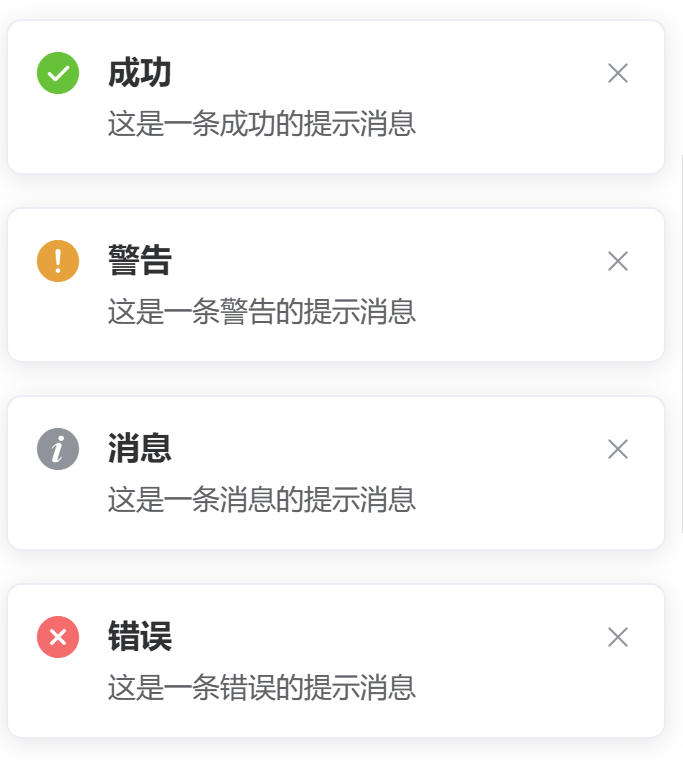
一般都包含:成功,警告,消息,错误等类型的提示消息或通知消息
那么移动端的话,在鸿蒙中,我们接下来也自己封装一个组件,实现上述提示框功能,可以在业务场景中灵活的使用
2. 需求
- 信息提示框组件代码可以复用
- 可以给用户弹框提示的消息类型支持:成功,警告,消息,错误等
3. 分析
基于以上需求,我的开发思路如下:
- 分析需求,确定组件功能和UI设计
- 创建组件文件,导入必要模块
- 使用@CustomDialog装饰器定义组件类
- 定义组件属性和控制器
- 实现build方法,构建UI布局
- 设置外层容器样式(宽度、背景、圆角)
- 条件渲染标题区域(使用if判断)
- 构建内容区域(图标+文本)
- 根据tipsType动态选择图标和颜色
- 配置文本样式(字体、行高、字重)
- 设置内边距和对齐方式
- 测试四种消息类型的显示效果
- 验证条件渲染逻辑(有无标题)
- 优化代码结构和可读性
4. 开发
基于以上编码思路,弹框组件代码如下:
js
/**
 * Author: 波波老师(weixin:javabobo0513)
 * Desc: 通用信息弹框
 */
@CustomDialog
export struct DialogTips {
  controller: CustomDialogController
  dialogTitle: string = '' //弹框标题文本
  dialogContent: string = '' //弹框内容文本
  /**
   * 消息类型(不同类型提示图标是不一样的)
   * 1:成功消息
   * 2:错误消息
   * 3:警告消息
   * 4:普通信息
   */
  tipsType: number = 1

  build() {
    Column() {
      if (this.dialogTitle) {
        Row() {
          //标题
          Text(this.dialogTitle)
            .fontSize(20)
            .fontWeight(700)
        }
        .padding({ left: 20, top: 20, bottom: 12 })
        .justifyContent(FlexAlign.Start)
        .width('100%')
      }

      if (this.dialogContent) {
        //内容
        Column({ space: 12 }) {
          Image(this.tipsType == 1 ? $r('app.media.svg_success') : (this.tipsType == 2 ? $r('app.media.svg_error') :
            (this.tipsType == 3 ? $r('app.media.svg_warn') : $r('app.media.svg_info'))))
            .fillColor(this.tipsType == 1 ? '#40c873' :
              (this.tipsType == 2 ? '#f56c6c' : (this.tipsType == 3 ? '#e6a23c' : '#909399')))
            .width(42)
          Text(this.dialogContent)
            .lineHeight(26)
            .fontSize(18)
            .fontWeight(300)
        }
        .padding(20)
        .width('100%')
        .justifyContent(FlexAlign.Center)
      }
    }
    .width('70%')
    .backgroundColor('#ffffffff')
    .borderRadius(8)
  }
}
使用上述组件的页面测试代码如下:
js
import { DialogTips } from '../../component/DialogTips'

@Entry
@Component
struct Page016 {
  @State message: string = ''; //提示信息内容
  @State tipsType: number = 1; //消息类型(1:成功消息;2:错误消息;3:警告消息;4:普通消息)
  //消息提示弹框-声明
  dialogTips: CustomDialogController = new CustomDialogController({
    builder: DialogTips({
      dialogTitle: '', //标题(为空则不显示)
      dialogContent: this.message, //提示信息内容
      tipsType: this.tipsType, //消息类型(1:成功消息;2:错误消息;3:警告消息;4:普通消息)
    }),
    customStyle: true, //开启自定义样式
    alignment: DialogAlignment.Center, // 可设置dialog的对齐方式,设定显示在底部或中间等,默认为底部显示
  })

  build() {
    Column({ space: 10 }) {
      Button('成功')
        .borderRadius(3)
        .width('40%')
        .onClick(() => {
          this.message = '这是一条成功消息!'
          this.tipsType = 1
          this.dialogTips.open();
        })
      Button('错误')
        .borderRadius(3)
        .width('40%')
        .onClick(() => {
          this.message = '这是一条错误消息!'
          this.tipsType = 2
          this.dialogTips.open();
        })
      Button('警告')
        .borderRadius(3)
        .width('40%')
        .onClick(() => {
          this.message = '这是一条警告消息!'
          this.tipsType = 3
          this.dialogTips.open();
        })
      Button('普通')
        .borderRadius(3)
        .width('40%')
        .onClick(() => {
          this.message = '这是一条普通消息!'
          this.tipsType = 4
          this.dialogTips.open();
        })
    }
    .width('100%')
    .height('100%')
  }
}
4. 演示
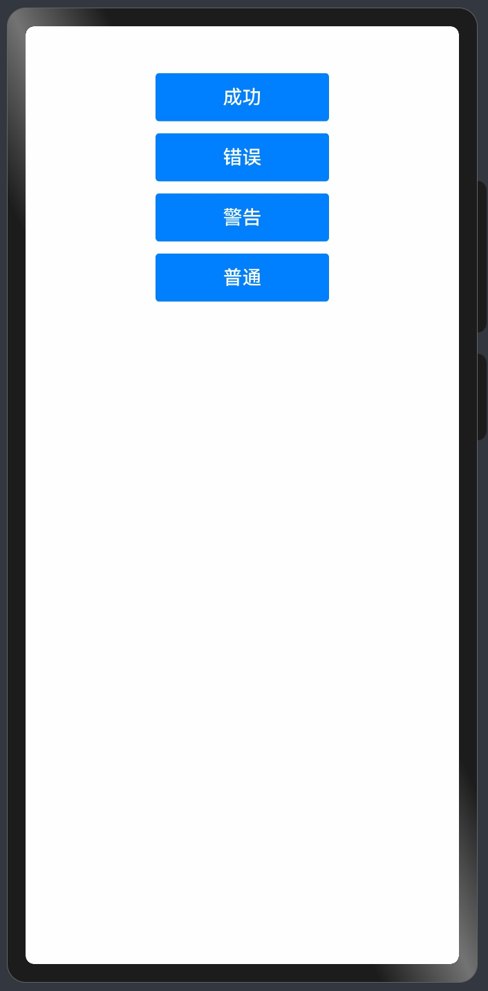
这样以后我们就可以在不同的页面,使用自己封装消息提示组件进行消息弹框通知了
最后
- 希望本文对你有所帮助!
- 本人如有任何错误或不当之处,请留言指出,谢谢!