自定义组件是Flutter开发的核心技能,把重复使用的UI封装成组件,可以提高代码复用性和可维护性。今天我们来讲解自定义组件的实现方式。
自定义组件的设计思路
好的自定义组件应该:功能单一、接口清晰、可配置、易复用。设计组件时要考虑它会在哪些场景使用,需要哪些配置项,如何与外部交互。我们来看几个项目中的自定义组件示例。
商品卡片组件
商品卡片在首页、搜索结果、分类列表等多个地方使用:
dart
class ProductCard extends StatelessWidget {
final Map<String, dynamic> product;
final VoidCallback? onTap;
final VoidCallback? onFavorite;
final bool showFavoriteButton;
const ProductCard({
super.key,
required this.product,
this.onTap,
this.onFavorite,
this.showFavoriteButton = false,
});
@override
Widget build(BuildContext context) {
return GestureDetector(
onTap: onTap,
child: Container(
decoration: BoxDecoration(
color: Colors.white,
borderRadius: BorderRadius.circular(12),
),
child: Column(
crossAxisAlignment: CrossAxisAlignment.start,
children: [
_buildImage(),
_buildInfo(),
],
),
),
);
}
Widget _buildImage() {
return Expanded(
flex: 3,
child: Stack(
children: [
Positioned.fill(
child: ClipRRect(
borderRadius: const BorderRadius.vertical(top: Radius.circular(12)),
child: Container(
color: Colors.grey[200],
child: Center(
child: Icon(Icons.image, size: 60, color: Colors.grey[400]),
),
),
),
),
if (showFavoriteButton)
Positioned(
top: 8,
right: 8,
child: GestureDetector(
onTap: onFavorite,
child: Container(
padding: const EdgeInsets.all(4),
decoration: BoxDecoration(
color: Colors.black.withOpacity(0.3),
shape: BoxShape.circle,
),
child: Icon(
product['isFavorite'] == true ? Icons.favorite : Icons.favorite_border,
color: product['isFavorite'] == true ? Colors.red : Colors.white,
size: 16,
),
),
),
),
],
),
);
}
Widget _buildInfo() {
return Expanded(
flex: 2,
child: Padding(
padding: const EdgeInsets.all(10),
child: Column(
crossAxisAlignment: CrossAxisAlignment.start,
children: [
Text(
product['title'] ?? '',
style: const TextStyle(fontSize: 14),
maxLines: 2,
overflow: TextOverflow.ellipsis,
),
const Spacer(),
Row(
children: [
Text(
'¥${product['price']?.toStringAsFixed(0) ?? '0'}',
style: const TextStyle(
color: Color(0xFFFF4D4F),
fontSize: 16,
fontWeight: FontWeight.bold,
),
),
if (product['originalPrice'] != null) ...[
const SizedBox(width: 4),
Text(
'¥${product['originalPrice'].toStringAsFixed(0)}',
style: const TextStyle(
color: Colors.grey,
fontSize: 12,
decoration: TextDecoration.lineThrough,
),
),
],
],
),
const SizedBox(height: 4),
Row(
children: [
const Icon(Icons.location_on, size: 12, color: Colors.grey),
const SizedBox(width: 2),
Expanded(
child: Text(
product['location'] ?? '',
style: const TextStyle(color: Colors.grey, fontSize: 10),
overflow: TextOverflow.ellipsis,
),
),
Text(
product['time'] ?? '',
style: const TextStyle(color: Colors.grey, fontSize: 10),
),
],
),
],
),
),
);
}
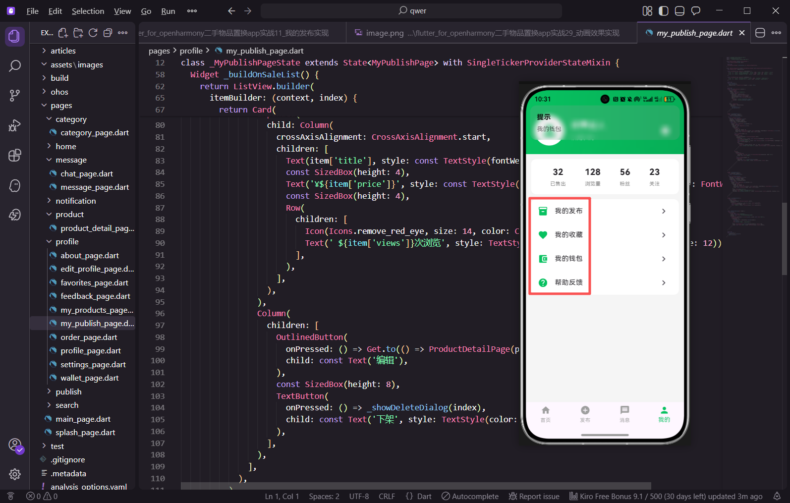
}商品卡片组件接收product数据和几个回调函数。onTap处理点击跳转,onFavorite处理收藏操作,showFavoriteButton控制是否显示收藏按钮。组件内部分成图片区域和信息区域两部分,用Expanded按比例分配空间。收藏按钮用Stack叠加在图片右上角,根据isFavorite状态显示不同图标和颜色。
使用时:
dart
ProductCard(
  product: products[index],
  onTap: () => Get.to(() => ProductDetailPage(productId: products[index]['id'])),
  showFavoriteButton: true,
  onFavorite: () => _toggleFavorite(products[index]),
)
调用非常简洁,传入数据和回调就行。不同页面可以根据需要决定是否显示收藏按钮,业务逻辑都在父组件处理。
空状态组件
dart
class EmptyState extends StatelessWidget {
  final IconData icon;
  final String title;
  final String? subtitle;
  final String? buttonText;
  final VoidCallback? onButtonPressed;

  const EmptyState({
    super.key,
    required this.icon,
    required this.title,
    this.subtitle,
    this.buttonText,
    this.onButtonPressed,
  });

  @override
  Widget build(BuildContext context) {
    return Center(
      child: Column(
        mainAxisAlignment: MainAxisAlignment.center,
        children: [
          Icon(icon, size: 80, color: Colors.grey[300]),
          const SizedBox(height: 16),
          Text(
            title,
            style: TextStyle(color: Colors.grey[500], fontSize: 16),
          ),
          if (subtitle != null) ...[
            const SizedBox(height: 8),
            Text(
              subtitle!,
              style: TextStyle(color: Colors.grey[400], fontSize: 14),
            ),
          ],
          if (buttonText != null && onButtonPressed != null) ...[
            const SizedBox(height: 24),
            ElevatedButton(
              onPressed: onButtonPressed,
              style: ElevatedButton.styleFrom(
                backgroundColor: const Color(0xFF07C160),
              ),
              child: Text(buttonText!, style: const TextStyle(color: Colors.white)),
            ),
          ],
        ],
      ),
    );
  }
}
空状态组件用于列表为空时的展示,比如"暂无收藏"、"暂无消息"等场景。icon和title是必填的,subtitle和按钮是可选的。用if语句配合展开运算符,只有传了参数才渲染对应的Widget,这样组件更灵活。
使用时:
dart
EmptyState(
  icon: Icons.favorite_border,
  title: '暂无收藏',
  subtitle: '去首页逛逛吧',
  buttonText: '去首页',
  onButtonPressed: () => Get.offAll(() => const MainPage()),
)
加载按钮组件
dart
class LoadingButton extends StatelessWidget {
  final String text;
  final bool isLoading;
  final VoidCallback? onPressed;
  final Color? backgroundColor;
  final Color? textColor;

  const LoadingButton({
    super.key,
    required this.text,
    this.isLoading = false,
    this.onPressed,
    this.backgroundColor,
    this.textColor,
  });

  @override
  Widget build(BuildContext context) {
    return ElevatedButton(
      onPressed: isLoading ? null : onPressed,
      style: ElevatedButton.styleFrom(
        backgroundColor: backgroundColor ?? const Color(0xFF07C160),
        padding: const EdgeInsets.symmetric(vertical: 14),
        shape: RoundedRectangleBorder(
          borderRadius: BorderRadius.circular(8),
        ),
      ),
      child: isLoading
          ? const SizedBox(
              width: 20,
              height: 20,
              child: CircularProgressIndicator(
                strokeWidth: 2,
                valueColor: AlwaysStoppedAnimation<Color>(Colors.white),
              ),
            )
          : Text(
              text,
              style: TextStyle(color: textColor ?? Colors.white),
            ),
    );
  }
}
加载按钮在提交表单时很常用,点击后显示loading状态,防止重复提交。isLoading为true时按钮显示转圈动画且不可点击,为false时显示正常文字。颜色参数提供了默认值,大多数情况下不用传。
使用时:
dart
LoadingButton(
  text: '发布',
  isLoading: _isSubmitting,
  onPressed: _publish,
)
搜索标签组件
dart
class SearchTag extends StatelessWidget {
  final String text;
  final bool isHot;
  final VoidCallback? onTap;

  const SearchTag({
    super.key,
    required this.text,
    this.isHot = false,
    this.onTap,
  });

  @override
  Widget build(BuildContext context) {
    return GestureDetector(
      onTap: onTap,
      child: Container(
        padding: const EdgeInsets.symmetric(horizontal: 14, vertical: 8),
        decoration: BoxDecoration(
          color: isHot
            ? const Color(0xFF07C160).withOpacity(0.1)
            : Colors.grey[100],
          borderRadius: BorderRadius.circular(16),
        ),
        child: Text(
          text,
          style: TextStyle(
            color: isHot ? const Color(0xFF07C160) : Colors.black87,
            fontSize: 14,
          ),
        ),
      ),
    );
  }
}
搜索标签用于展示热门搜索和历史搜索。isHot参数区分热门和普通标签,热门标签用绿色背景突出显示。圆角胶囊形状的设计让标签看起来更精致。
使用时:
dart
Wrap(
  spacing: 10,
  runSpacing: 10,
  children: _hotSearches.map((item) => SearchTag(
    text: item,
    isHot: true,
    onTap: () => _search(item),
  )).toList(),
)
用Wrap组件让标签自动换行,spacing控制水平间距,runSpacing控制行间距。
通知角标组件
dart
class BadgeIcon extends StatelessWidget {
  final IconData icon;
  final int count;
  final Color? iconColor;
  final double iconSize;

  const BadgeIcon({
    super.key,
    required this.icon,
    this.count = 0,
    this.iconColor,
    this.iconSize = 24,
  });

  @override
  Widget build(BuildContext context) {
    return Stack(
      children: [
        Icon(icon, color: iconColor, size: iconSize),
        if (count > 0)
          Positioned(
            right: 0,
            top: 0,
            child: Container(
              padding: const EdgeInsets.all(2),
              decoration: const BoxDecoration(
                color: Colors.red,
                shape: BoxShape.circle,
              ),
              constraints: const BoxConstraints(
                minWidth: 16,
                minHeight: 16,
              ),
              child: Text(
                count > 99 ? '99+' : count.toString(),
                style: const TextStyle(
                  color: Colors.white,
                  fontSize: 10,
                ),
                textAlign: TextAlign.center,
              ),
            ),
          ),
      ],
    );
  }
}
角标组件用于显示未读消息数量。count为0时不显示角标,超过99显示"99+"。用Stack把红色圆点叠加在图标右上角,constraints确保角标有最小尺寸。
使用时:
dart
BadgeIcon(
  icon: Icons.message,
  count: unreadCount,
)
组件设计原则
单一职责:每个组件只做一件事,商品卡片只负责展示商品信息,不负责数据加载。可配置:通过参数控制组件的行为和样式,比如showFavoriteButton控制是否显示收藏按钮。回调函数:组件不直接处理业务逻辑,通过回调函数把事件传给父组件处理。默认值:参数提供合理的默认值,减少使用时的配置。
小结
这篇讲解了自定义组件的实现方式,包括商品卡片、空状态、加载按钮、搜索标签、通知角标等组件。好的自定义组件能提高代码复用性和可维护性,是Flutter开发的核心技能。
欢迎加入开源鸿蒙跨平台社区:https://openharmonycrossplatform.csdn.net