Matplotlib 是 Python 生态中最基础、最强大的数据可视化库 ,被誉为 Python 可视化的"祖父 "和"瑞士军刀 "。它的核心价值在于提供了无与伦比的灵活性和控制力,允许你从零开始创建和定制几乎任何类型的静态、动画或交互式图表。
核心定位与特点
-
定位 :Python 科学计算栈(NumPy, SciPy, Pandas)的基础绘图库。许多高级可视化库(如 Seaborn, pandas.plot)都构建在 Matplotlib 之上。
-
核心特点:
-
全面控制:你可以控制图表的每一个像素,从坐标轴刻度到图例样式,实现出版级精度的输出。
-
广泛的图表支持:支持折线图、散点图、柱状图、直方图、饼图、等高线图、3D图等数十种图表。
-
多输出格式:可将图表输出为 PNG, PDF, SVG, EPS 等多种图片或矢量格式。
-
跨平台交互:在 Jupyter Notebook、独立脚本、Web 应用服务器中均可使用。
-
一 画直线图
1.1 figure使用
import numpy as np
import matplotlib.pyplot as plt

# 从-3到中取50个数
x = np.linspace(-3, 3, 50)
print(x)
y1 = 2*x+1
y2 = x**2
plt.figure()
plt.plot(x, y1)
plt.figure(num=3, figsize=(8, 5))   # figsize的设置长和宽
plt.plot(x, y2)
plt.plot(x, y1, color='red', linewidth=10.0, linestyle='--')   # linewidth 设置线的宽度, linesyyle设置线的形状
# savefig  保存图片
plt.savefig("./image_dir/xianxing.png")
plt.show()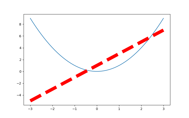
1.2 设置坐标轴
# 从-3到中取50个数
    x = np.linspace(-3, 3, 50)

    y1 = 2 * x + 1
    y2 = x ** 2
    plt.figure(num=3, figsize=(8, 5))  # figsize的设置长和宽
    plt.plot(x, y2)
    plt.plot(x, y1, color='red', linewidth=10.0, linestyle='--')
    plt.xlim((-1, 2))   # 设置x轴的范围
    plt.ylim((-2, 3))   # 设置y轴的范围
    plt.xlabel('I am x')  # 设置x轴的名称
    plt.ylabel('I am y')   # 设置y轴额名称
    new_ticks = np.linspace(-1, 2, 5)
    print(new_ticks)
    plt.xticks(new_ticks)   # 设置x轴的范围的刻度值
    # 设置y轴的范围的刻度值
    plt.yticks([-2, -1, 0, 1, 2, 3],
               [r'$really\ bad$', r'$bad$', r'$normal$', r'$good$', r'$really\ good$'])
    plt.savefig('./image_dir/xlim.png')
    plt.show()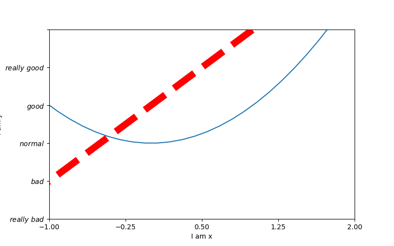
# 从-3到中取50个数
    x = np.linspace(-3, 3, 50)

    y1 = 2 * x + 1
    y2 = x ** 2
    plt.figure(num=3, figsize=(8, 5))  # figsize的设置长和宽
    plt.plot(x, y2)
    plt.plot(x, y1, color='red', linewidth=10.0, linestyle='--')
    plt.xlim((-1, 2))   # 设置x轴的范围
    plt.ylim((-2, 3))   # 设置y轴的范围
    plt.xlabel('I am x')  # 设置x轴的名称
    plt.ylabel('I am y')   # 设置y轴额名称
    new_ticks = np.linspace(-1, 2, 5)
    print(new_ticks)
    plt.xticks(new_ticks)   # 设置x轴的范围的刻度值
    # 设置y轴的范围的刻度值
    plt.yticks([-2, -1, 0, 1, 2, 3],
               [r'$really\ bad$', r'$bad$', r'$normal$', r'$good$', r'$really\ good$'])
    # gca = 'get current axis'
    ax = plt.gca()
    #  将轴的右边去掉
    ax.spines['right'].set_color('none')
    #  将轴的上边去掉
    ax.spines['top'].set_color('none')
    #  将下轴设置为x
    ax.xaxis.set_ticks_position('bottom')
    # 将左轴设置为y
    ax.yaxis.set_ticks_position('left')
    # 设置下轴的位置  set_position(outward, axes)
    ax.spines['bottom'].set_position(('data', 0))
    # 设置左轴位置
    ax.spines['left'].set_position(('data', '0'))
    plt.savefig('./image_dir/xlim2.png')
    plt.show()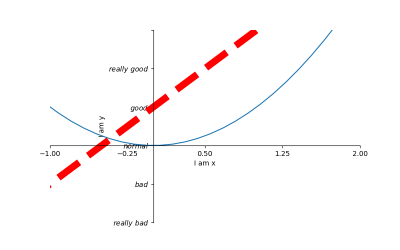
1.3 legend 图例
# 从-3到中取50个数
    x = np.linspace(-3, 3, 50)

    y1 = 2 * x + 1
    y2 = x ** 2
    plt.figure(num=3, figsize=(8, 5))  # figsize的设置长和宽

    plt.xlim((-1, 2))   # 设置x轴的范围
    plt.ylim((-2, 3))   # 设置y轴的范围
    plt.xlabel('I am x')  # 设置x轴的名称
    plt.ylabel('I am y')   # 设置y轴额名称
    new_ticks = np.linspace(-1, 2, 5)
    print(new_ticks)
    plt.xticks(new_ticks)   # 设置x轴的范围的刻度值
    # 设置y轴的范围的刻度值
    plt.yticks([-2, -1, 0, 1, 2, 3],
               [r'$really\ bad$', r'$bad$', r'$normal$', r'$good$', r'$really\ good$'])

    # plt.plot是有返回值的
    l1, =  plt.plot(x, y2, label='up')
    l2, = plt.plot(x, y1, color='red', linewidth=10.0, linestyle='--', label='down')
    # handles,   labels是设置名称, loc是设置位置
    plt.legend(handles=[l1, l2], labels=['aaa', 'bbb'], loc='best')
    plt.savefig('./image_dir/xlim3.png')
    plt.show()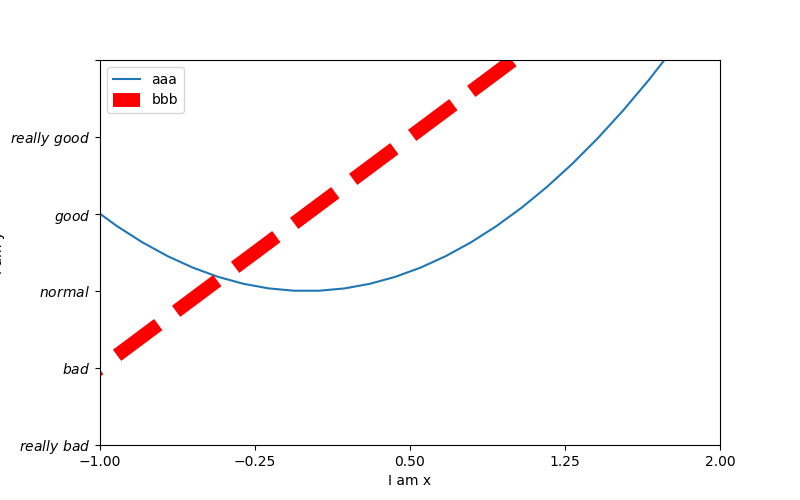
1.4 annotation标注
# 从-3到中取50个数
    x = np.linspace(-3, 3, 50)
    y1 = 2 * x + 1
    # y2 = x ** 2
    plt.figure(num=3, figsize=(8, 5))  # figsize的设置长和宽
    # plt.plot(x, y2)
    plt.plot(x, y1, color='red', linewidth=1.0, linestyle='--')
    # gca = 'get current axis'
    ax = plt.gca()
    #  将轴的右边去掉
    ax.spines['right'].set_color('none')
    #  将轴的上边去掉
    ax.spines['top'].set_color('none')
    #  将下轴设置为x
    ax.xaxis.set_ticks_position('bottom')
    # 将左轴设置为y
    ax.yaxis.set_ticks_position('left')
    # 设置下轴的位置  set_position(outward, axes)
    ax.spines['bottom'].set_position(('data', 0))
    # 设置左轴位置
    ax.spines['left'].set_position(('data', '0'))
    x0 = 1
    y0 = 2 * x0 + 1
    plt.scatter(x0, y0, s=50, color='b')
    plt.plot([x0, x0], [y0, 0], 'k--', lw=2.5)

    # method1   xycoords依赖的数据集
    plt.annotate(r'$2x+1=%s$' % y0, xy=(x0, y0), xycoords='data', xytext=(+30, -30), textcoords='offset points',
                 fontsize=16, arrowprops=dict(arrowstyle='->', connectionstyle='arc3, rad=.2'))

    # method2
    plt.text(-3.7, 3, r'$ this is the some test mu sigma_i alpha_t$', fontdict={'size':16, 'color':'r'})
    plt.savefig('./image_dir/xlim4.png')
    plt.show()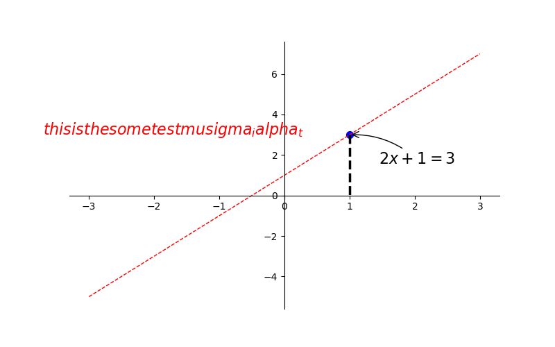
1.5 tick能见度
# 从-3到中取50个数
    x = np.linspace(-3, 3, 50)
    y1 = 0.1*x
    # y2 = x ** 2
    plt.figure(num=3, figsize=(8, 5))  # figsize的设置长和宽
    # plt.plot(x, y2)
    plt.plot(x, y1, linewidth=10)
    plt.ylim(-2, 2)
    # gca = 'get current axis'
    ax = plt.gca()
    #  将轴的右边去掉
    ax.spines['right'].set_color('none')
    #  将轴的上边去掉
    ax.spines['top'].set_color('none')
    #  将下轴设置为x
    ax.xaxis.set_ticks_position('bottom')
    # 将左轴设置为y
    ax.yaxis.set_ticks_position('left')
    # 设置下轴的位置  set_position(outward, axes)
    ax.spines['bottom'].set_position(('data', 0))
    # 设置左轴位置
    ax.spines['left'].set_position(('data', '0'))
    for label in ax.get_xticklabels() + ax.get_yticklabels():
        label.set_fontsize(12)
        label.set_bbox(dict(facecolor='blue', edgecolor='None', alpha=0.9))
    plt.savefig('./image_dir/xlim5.png')
    plt.show()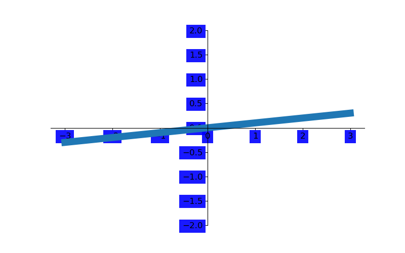
二 散点图
scatter函数原型:
其中散点的形状参数marker如下:
其中颜色参数c如下:

    n = 1024
    # 均值是0, 方差是1, 取1024个数
    x = np.random.normal(0, 1, n)
    y = np.random.normal(0, 1, n)
    # 设置颜色值
    T = np.arctan2(y, x)
    bar = plt.scatter(x, y, s=10, c=T, alpha=0.5, cmap='hot')
    # plt.xticks(())
    # plt.yticks(())
    plt.colorbar(bar)
    plt.savefig('./image_dir/scatter.png')
    plt.show()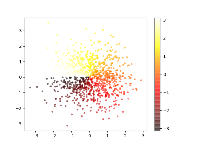
三 柱状图
    n = 12
    x = np.arange(n)
    print(x)
    # np.random.uniform(0.5, 1.0, n)  去、取0.5 到 1 之间12个数
    y1 = (1-x/float(n)) * np.random.uniform(0.5, 1.0, n)
    y2 = (1 - x / float(n)) * np.random.uniform(0.5, 1.0, n)
    plt.bar(x, +y1, facecolor='#9999ff', edgecolor='white')
    plt.bar(x, -y2, facecolor='#ff9999', edgecolor='white')
    plt.xticks(())
    plt.yticks(())
    for x, y, y2 in zip(x, y1, y2):
        # 给每根柱子加上标识
        plt.text(x, y+0.05, '%.2f'%y, ha='center', va='bottom')
        plt.text(x, -y2 - 0.05, f'{round(y2, 2)}', ha='center', va='top')

    plt.savefig('./image_dir/bar.png')
    plt.show()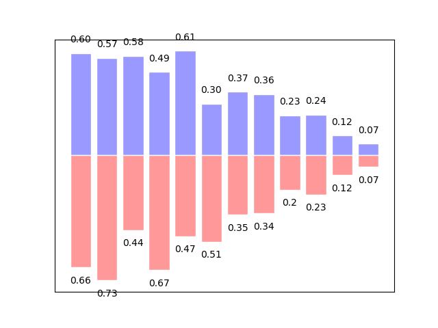
四:等高线图
    def f(x, y):
        return (1-x/2+x**5+y**3)*np.exp(-x**2-y**2)
    n = 256
    x = np.linspace(-3, 3, n)
    y = np.linspace(-3, 3, n)
    '''
    meshgrid函数就是用两个坐标轴上的点在平面上画网格(当然这里传入的参数是两个的时候)。
    当然我们可以指定多个参数,比如三个参数,
    那么我们的就可以用三个一维的坐标轴上的点在三维平面上画网格。
    '''
    X, Y = np.meshgrid(x, y)
    # use plt.contourf to filling contours
    # X, Y and value for (X, Y)point
    plt.contourf(X, Y, f(X, Y), 8, alpha=0.75, cmap='hot')
    # plt.xticks(())
    # plt.yticks(())

    # use plt.contour to add contour lines   8表示分成10份, 0分成2份
    C = plt.contour(X, Y, f(X, Y), 8, colors='black', linewidth=.5)
    # adding label
    plt.clabel(C, inline=True, fontsize=10)
    plt.savefig('./image_dir/contourf.png')
    plt.show()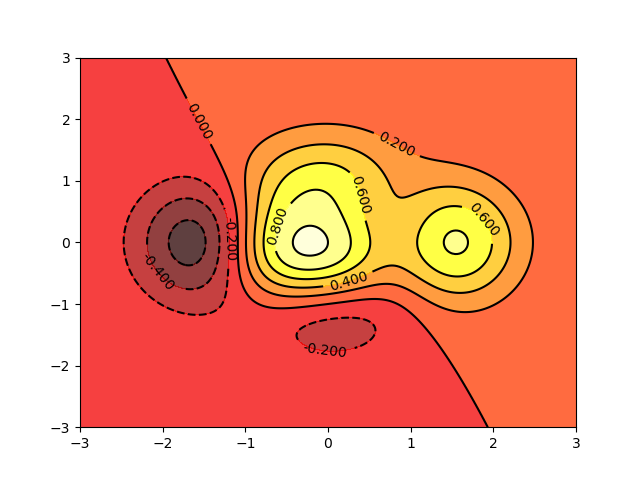
五 直方图
import matplotlib.pyplot as plt
import numpy as np
import matplotlib

def hist1():
    # 设置matplotlib正常显示中文和负号
    matplotlib.rcParams['font.sans-serif'] = ['SimHei']    # 用黑体显示中文
    matplotlib.rcParams['axes.unicode_minus'] = False  # 正常显示负号
    data = np.random.randn(10000)
    '''
    data: 绘图数据
    bins:直方图的长方形数目, 可选项, 默认为10
    normed:是否将得到的直方图向量归一化, 可选项, 默认为0, 代表不归一化, 显示频数。 normed=1,表示归一化,显示频率
    facecolor: 长方形的颜色
    edgecolor: 长方形边框的颜色
    alpha: 透明度
    '''
    plt.hist(data, bins=40, density=1, facecolor='blue', edgecolor='black', alpha=0.7)
    # 显示横轴标签
    plt.xlabel("区间")
    # 显示纵轴标签
    plt.ylabel("频数/频率")
    # 显示图标数
    plt.title("频数/频率分布直方图")
    plt.show()


if __name__ == '__main__':
    hist1()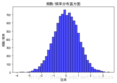
六 条形图
import matplotlib.pyplot as plt
import matplotlib
# 设置中文字体和负号正常显示
matplotlib.rcParams['font.sans-serif'] = ['SimHei']
matplotlib.rcParams['axes.unicode_minus'] = False

label_list = ['2014', '2015', '2016', '2017']    # 横坐标刻度显示值
num_list1 = [20, 30, 15, 35]      # 纵坐标值1
num_list2 = [15, 30, 40, 20]      # 纵坐标值2
x = range(len(num_list1))
"""
绘制条形图
left:长条形中点横坐标
height:长条形高度
width:长条形宽度,默认值0.8
label:为后面设置legend准备
"""
rects1 = plt.bar(left=x, height=num_list1, width=0.4, alpha=0.8, color='red', label="一部门")
rects2 = plt.bar(left=[i + 0.4 for i in x], height=num_list2, width=0.4, color='green', label="二部门")
plt.ylim(0, 50)     # y轴取值范围
plt.ylabel("数量")
"""
设置x轴刻度显示值
参数一:中点坐标
参数二:显示值
"""
plt.xticks([index + 0.2 for index in x], label_list)
plt.xlabel("年份")
plt.title("某某公司")
plt.legend()     # 设置题注
# 编辑文本
for rect in rects1:
    height = rect.get_height()
    plt.text(rect.get_x() + rect.get_width() / 2, height+1, str(height), ha="center", va="bottom")
for rect in rects2:
    height = rect.get_height()
    plt.text(rect.get_x() + rect.get_width() / 2, height+1, str(height), ha="center", va="bottom")
plt.show()
七 水平条形图
import matplotlib.pyplot as plt
import matplotlib

matplotlib.rcParams['font.sans-serif'] = ['SimHei']
matplotlib.rcParams['axes.unicode_minus'] = False

price = [39.5, 39.9, 45.4, 38.9, 33.34]
"""
绘制水平条形图方法barh
参数一:y轴
参数二:x轴
"""
plt.barh(range(5), price, height=0.7, color='steelblue', alpha=0.8)      # 从下往上画
plt.yticks(range(5), ['亚马逊', '当当网', '中国图书网', '京东', '天猫'])
plt.xlim(30,47)
plt.xlabel("价格")
plt.title("不同平台图书价格")
for x, y in enumerate(price):
    plt.text(y + 0.2, x - 0.1, '%s' % y)
plt.show()
八 堆叠条形图
import matplotlib.pyplot as plt
import matplotlib

matplotlib.rcParams['font.sans-serif'] = ['SimHei']
matplotlib.rcParams['axes.unicode_minus'] = False

label_list = ['2014', '2015', '2016', '2017']
num_list1 = [20, 30, 15, 35]
num_list2 = [15, 30, 40, 20]
x = range(len(num_list1))
rects1 = plt.bar(left=x, height=num_list1, width=0.45, alpha=0.8, color='red', label="一部门")
rects2 = plt.bar(left=x, height=num_list2, width=0.45, color='green', label="二部门", bottom=num_list1)
plt.ylim(0, 80)
plt.ylabel("数量")
plt.xticks(x, label_list)
plt.xlabel("年份")
plt.title("某某公司")
plt.legend()
plt.show()
九 饼图
import matplotlib.pyplot as plt
import matplotlib

matplotlib.rcParams['font.sans-serif'] = ['SimHei']
matplotlib.rcParams['axes.unicode_minus'] = False

label_list = ["第一部分", "第二部分", "第三部分"]    # 各部分标签
size = [55, 35, 10]    # 各部分大小
color = ["red", "green", "blue"]     # 各部分颜色
explode = [0.05, 0, 0]   # 各部分突出值
"""
绘制饼图
explode:设置各部分突出
label:设置各部分标签
labeldistance:设置标签文本距圆心位置,1.1表示1.1倍半径
autopct:设置圆里面文本
shadow:设置是否有阴影
startangle:起始角度,默认从0开始逆时针转
pctdistance:设置圆内文本距圆心距离
返回值
l_text:圆内部文本,matplotlib.text.Text object
p_text:圆外部文本
"""
patches, l_text, p_text = plt.pie(size, explode=explode, colors=color, labels=label_list, labeldistance=1.1, autopct="%1.1f%%", shadow=False, startangle=90, pctdistance=0.6)
plt.axis("equal")    # 设置横轴和纵轴大小相等,这样饼才是圆的
plt.legend()
plt.show()
十 保存image图像:
    a = np.random.rand(9).reshape(3, 3)

    plt.imshow(a, interpolation='nearest', cmap='bone', origin='upper')
    plt.colorbar()
    plt.xticks(())
    plt.yticks(())
    plt.savefig('./image_dir/imshow.png')
    plt.show()
十一 画3d图
import numpy as np
import matplotlib.pyplot as plt
from mpl_toolkits.mplot3d import Axes3D


def test1():
    fig = plt.figure()
    ax = Axes3D(fig)
    x = np.arange(-4, 4, 0.25)
    print(x)
    y = np.arange(-4, 4, 0.25)
    x, y = np.meshgrid(x, y)
    # np.sqrt(x) : 计算数组各元素的平方根
    R = np.sqrt(x ** 2 + y ** 2)
    # height value
    z = np.sin(R)
    ax.plot_surface(x, y, z, rstride=1, cstride=1, cmap='rainbow')
    # zdir 表示向那个轴投影
    ax.contourf(x, y, z, zdir='z', offset=-2, cmap='rainbow')
    # 设置等高线的高度
    ax.set_zlim(-2, 2)

    plt.show()


if __name__ == '__main__':
    test1()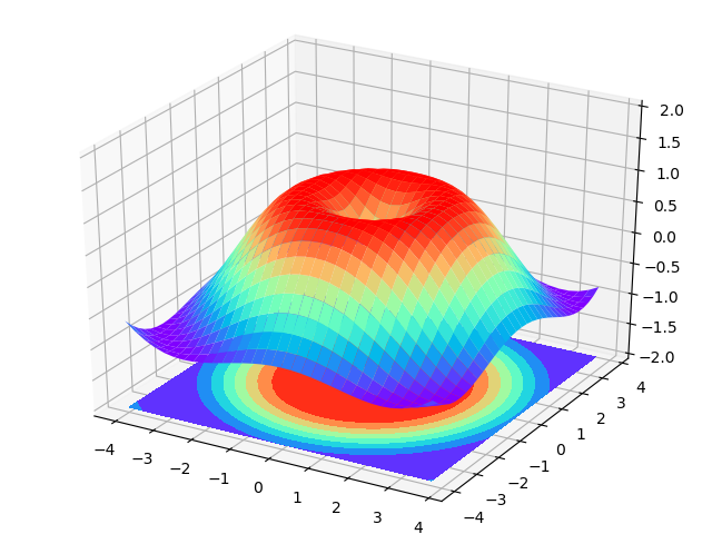
十二 subplot多图合一
方法一
# method1: subplot2grid
    #################
    '''
    第一个参数(3, 3) 是把图分成3行3列
    第二个参数是位置 (0, 0)表示从0行0列开始
    第三个参数  colspan=3  表示列占3列 ,
    第四个参数 rowspan=1  表示行占一行

    '''
    plt.figure()
    ax1 = plt.subplot2grid((3, 3), (0, 0), colspan=3, rowspan=1)
    ax1.plot([1, 2], [1, 2])
    ax1.set_title('al1_title')
    ax2 = plt.subplot2grid((3, 3), (1, 0), colspan=2,)
    ax3 = plt.subplot2grid((3, 3), (1, 2), rowspan=2)
    ax4 = plt.subplot2grid((3, 3), (2, 0))
    ax5 = plt.subplot2grid((3, 3), (2, 1))

    plt.savefig('./image_dir/grid1.png')
    plt.show()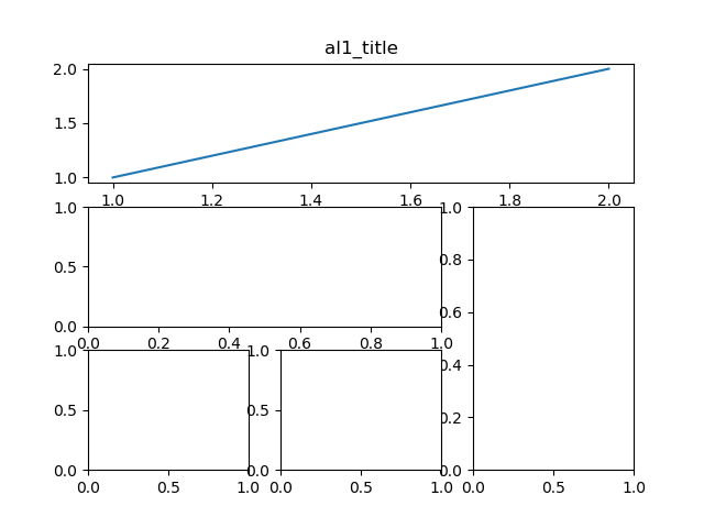
方法二
    import matplotlib.pyplot as plt
    import matplotlib.gridspec as gridspec

    plt.figure()
    gs = gridspec.GridSpec(3, 3)
    ax1 = plt.subplot(gs[0, :])
    ax2 = plt.subplot(gs[1, :2])
    ax3 = plt.subplot(gs[1:, 2])
    ax4 = plt.subplot(gs[-1, 0])
    ax5 = plt.subplot(gs[-1, -2])

    plt.savefig('./image_dir/grid2.png')
    plt.show()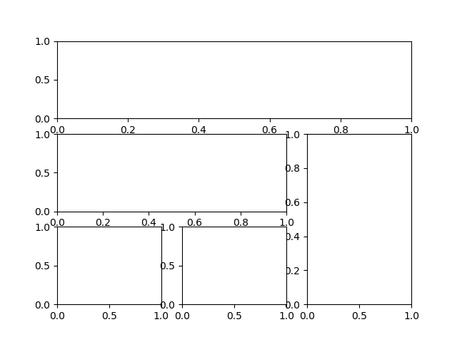
方法三
    # method4
    plt.figure()
    plt.subplot(2, 2, 1)
    plt.plot([0, 1], [0, 1])
    plt.subplot(222)
    plt.plot([0, 1], [0, 2])
    plt.subplot(223)
    plt.plot([0, 1], [0, 3])
    plt.subplot(224)
    plt.plot([0, 1], [0, 4])
    plt.savefig('./image_dir/grid4.png')
    plt.tight_layout()
    plt.show()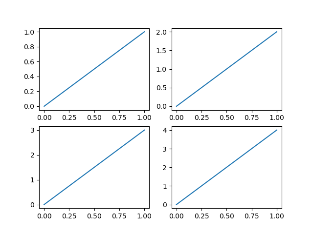
方法四
    # method 3 : easy to define structure
    f, ((ax11, ax12), (ax21, ax22)) = plt.subplots(2, 2, sharex=True, sharey=True)
    ax11.scatter([1, 2], [1, 2])
    plt.savefig('./image_dir/grid3.png')
    plt.tight_layout()
    plt.show()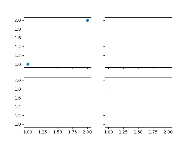
十三 画图中图
    fig = plt.figure()
    x = np.arange(1, 9, 1)
    y = np.linspace(1, 10, 8)
    left, bottom, width, height = 0.1, 0.1, 0.8, 0.8
    ax1 = fig.add_axes([left, bottom, width, height])
    ax1.plot(x, y, 'r')
    ax1.set_xlabel('x')
    ax1.set_ylabel('y')
    ax1.set_title('title')

    left, bottom, width, height = 0.2, 0.6, 0.25, 0.25
    ax2 = fig.add_axes([left, bottom, width, height])
    ax2.plot(y, x, 'b')
    ax2.set_xlabel('x')
    ax2.set_ylabel('y')
    ax2.set_title('title inside 1')

    left, bottom, width, height = 0.6, 0.2, 0.25, 0.25
    ax3 = fig.add_axes([left, bottom, width, height])
    ax3.plot(y, x, 'g')
    ax3.set_xlabel('x')
    ax3.set_ylabel('y')
    ax3.set_title('title inside 2')
    plt.savefig('./image_dir/tu1.png')
    plt.tight_layout()
    plt.show()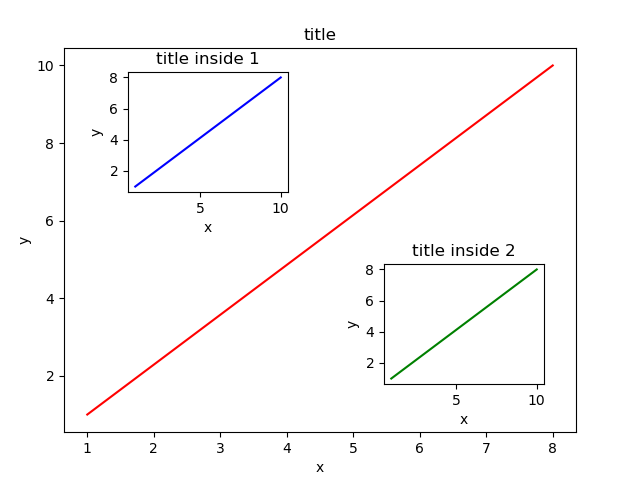
十四 次坐标轴
x = np.arange(0, 10, 0.1)
y1 = 0.5*x**2
y2 = -1*x**2
fig, ax1 = plt.subplots()
ax2 = ax1.twinx()
ax1.plot(x, y1, 'g-')
ax2.plot(x, y2, 'b--')
ax1.set_xlabel('X data')
ax1.set_ylabel('Y1', color='g')
ax2.set_ylabel('Y2', color='b')
plt.savefig('./image_dir/xy.png')
plt.tight_layout()
plt.show()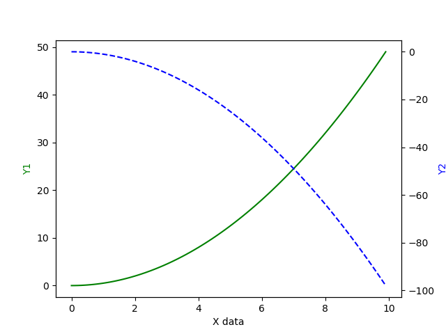
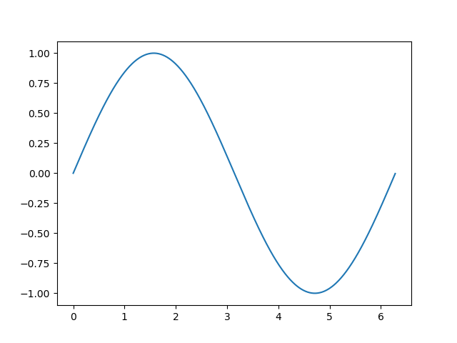
十五 animation
import numpy as np
from matplotlib import pyplot as plt
from matplotlib import animation

fig, ax = plt.subplots()
x = np.arange(0, 2*np.pi, 0.01)
print(len(x))
print(x)
line, =  ax.plot(x, np.sin(x))

def animate(i):
    line.set_ydata(np.sin(x+i/10))
    return line,

def init():
    line.set_ydata(np.sin(x))
    return line,


#  func 表示animation的动画, frames表示100个时间点, init_func 表示初始点,
#  inyterval 表示每隔多少时间点刷新 一次, blit是否是全部更新, 如果为FLASE则更新需要更新的点
ani = animation.FuncAnimation(fig=fig, func=animate, frames=100, init_func=init, interval=20, blit=False)

plt.savefig('./image_dir/animation.png')
plt.tight_layout()
plt.show()