个人主页:
文章目录
-
- 前言
- 一、BottomNavigationBar:标准多入口导航的首选
- 二、BottomAppBar:突出主操作的灵活方案
- [三、面向 OpenHarmony 手机的工程化优化建议](#三、面向 OpenHarmony 手机的工程化优化建议)
-
- [1. **状态保活策略选择**](#1. 状态保活策略选择)
- [2. **安全区域适配**](#2. 安全区域适配)
- [3. **深色模式支持**](#3. 深色模式支持)
- [4. **性能监控**](#4. 性能监控)
- [5. **无障碍与国际化**](#5. 无障碍与国际化)
- [四、完整可运行示例(BottomNavigationBar )](#四、完整可运行示例(BottomNavigationBar ))
- [五、完整可运行示例(BottomAppBar + IndexedStack )](#五、完整可运行示例(BottomAppBar + IndexedStack ))
-
- [✅ 关键特性说明](#✅ 关键特性说明)
- 结语
前言
在 OpenHarmony 手机应用中,底部导航栏是用户在多个核心功能模块间快速切换的"高速公路"。无论是电商 App 的"首页/分类/购物车/我的",还是社交软件的"动态/消息/发现/个人中心",一个稳定、高效、符合人机工效的底部导航,直接决定了用户留存与操作效率。
Flutter 为开发者提供了两种主流方案:
BottomNavigationBar:标准 Material Design 底部标签栏,适用于 2--5 个平级入口;BottomAppBar:更灵活的底部应用栏,常与FloatingActionButton联动,适合需要突出主操作的场景。
然而,在 OpenHarmony 手机开发中,若未正确使用,极易出现:
- 页面重建导致状态丢失;
- 导航栏遮挡内容或跳动;
- 图标与文字样式不统一;
- 内存泄漏(如未管理页面控制器);
- 未适配深色模式或系统安全区域。
本文将深入剖析 BottomNavigationBar 与 BottomAppBar 的实现机制,提供可直接复用的工程级代码模板 ,并结合 OpenHarmony 手机特性,给出性能、体验、一致性三位一体的优化方案。
一、BottomNavigationBar:标准多入口导航的首选
作用与特点
BottomNavigationBar 是 Flutter 内置的标准底部导航组件,遵循 Material Design 规范。它适用于2 到 5 个顶级页面的平级切换,具有:
- 自动管理选中状态;
- 支持图标 + 文字 / 仅图标模式;
- 内置动画过渡(可选);
- 与
Scaffold.bottomNavigationBar无缝集成。
✅ 适用场景:电商、新闻、社交等多 Tab 应用。
手机端关键属性与优化建议
| 属性 | 说明 | 推荐值(OpenHarmony 手机) |
|---|---|---|
items |
导航项列表 | 使用 BottomNavigationBarItem(icon: ..., label: ...) |
currentIndex |
当前选中索引 | 由 State 管理 |
onTap |
切换回调 | 更新 currentIndex |
type |
布局类型 | BottomNavigationBarType.fixed(≤3 项)或 .shifting(>3 项) |
selectedLabelStyle / unselectedLabelStyle |
文字样式 | 统一字体大小(如 12sp) |
elevation |
阴影 | 4--8,提升层次感 |
backgroundColor |
背景色 | 建议使用 Theme.of(context).scaffoldBackgroundColor |
⚠️ 性能陷阱 :
若使用
IndexedStack保活页面,可避免重复 build;若用if-else切换,会导致页面重建、状态丢失。
代码示例与讲解
dart
// bottom_nav_demo.dart
class HomePage extends StatefulWidget {
  const HomePage({super.key});

  @override
  State<HomePage> createState() => _HomePageState();
}

class _HomePageState extends State<HomePage> {
  int _currentIndex = 0;
  final List<Widget> _pages = [
    const HomeScreen(),
    const CategoryScreen(),
    const CartScreen(),
    const ProfileScreen(),
  ];

  @override
  Widget build(BuildContext context) {
    return Scaffold(
      body: IndexedStack( // ← 关键:保活所有页面,避免重建
        index: _currentIndex,
        children: _pages,
      ),
      bottomNavigationBar: BottomNavigationBar(
        currentIndex: _currentIndex,
        onTap: (index) => setState(() => _currentIndex = index),
        type: BottomNavigationBarType.fixed, // ≤4 项用 fixed
        selectedItemColor: Colors.blue,
        unselectedItemColor: Colors.grey,
        selectedLabelStyle: const TextStyle(fontSize: 12, fontWeight: FontWeight.bold),
        unselectedLabelStyle: const TextStyle(fontSize: 12),
        items: const [
          BottomNavigationBarItem(icon: Icon(Icons.home), label: '首页'),
          BottomNavigationBarItem(icon: Icon(Icons.category), label: '分类'),
          BottomNavigationBarItem(icon: Icon(Icons.shopping_cart), label: '购物车'),
          BottomNavigationBarItem(icon: Icon(Icons.person), label: '我的'),
        ],
      ),
    );
  }
}逐行解析:
IndexedStack:保留所有子页面的状态和 UI,切换时无闪烁、无重建;type: .fixed:确保所有标签始终显示文字(.shifting会隐藏非选中项文字);selectedItemColor:控制选中项图标与文字颜色;- 各子页面(如
HomeScreen)应为const或轻量 StatelessWidget,避免内存膨胀。
二、BottomAppBar:突出主操作的灵活方案
作用与特点
BottomAppBar 不是导航组件,而是一个可定制的底部容器 ,通常与 FloatingActionButton(FAB)配合使用。它的核心优势在于:
- 可在中间留出 FAB 凹槽(notch);
- 支持自定义布局(如左右分区);
- 更适合"主操作 + 辅助入口"的混合场景。
✅ 适用场景:音乐播放器(播放/暂停居中)、工具类 App(扫描/新建突出)。
关键属性与优化建议
| 属性 | 说明 | 推荐实践 |
|---|---|---|
child |
内容(通常为 Row) | 左右放置 IconButton |
shape |
凹槽形状 | CircularNotchedRectangle() 与 FAB 匹配 |
notchMargin |
凹槽边距 | 默认 6.0,可微调 |
color |
背景色 | 与 AppBar 或 Scaffold 背景协调 |
elevation |
阴影 | 与 BottomNavigationBar 一致 |
⚠️ 注意 :
BottomAppBar本身不管理页面切换,需自行实现导航逻辑。
代码示例与讲解(带 FAB 凹槽)
dart
// bottom_app_bar_demo.dart
class MusicPlayerPage extends StatefulWidget {
  const MusicPlayerPage({super.key});

  @override
  State<MusicPlayerPage> createState() => _MusicPlayerPageState();
}

class _MusicPlayerPageState extends State<MusicPlayerPage> {
  int _currentTab = 0;
  final pages = [const LibraryScreen(), const PlaylistScreen()];

  @override
  Widget build(BuildContext context) {
    return Scaffold(
      body: pages[_currentTab],
      floatingActionButton: FloatingActionButton(
        onPressed: () => debugPrint('播放/暂停'),
        child: const Icon(Icons.play_arrow),
        elevation: 8,
      ),
      floatingActionButtonLocation: FloatingActionButtonLocation.centerDocked, // ← 关键:居中停靠
      bottomNavigationBar: BottomAppBar(
        shape: const CircularNotchedRectangle(), // ← 创建圆形凹槽
        notchMargin: 6.0,
        color: Theme.of(context).appBarTheme.backgroundColor,
        child: Row(
          mainAxisAlignment: MainAxisAlignment.spaceBetween,
          children: [
            IconButton(
              icon: const Icon(Icons.library_music),
              onPressed: () => setState(() => _currentTab = 0),
              color: _currentTab == 0 ? Colors.white : Colors.grey[400],
            ),
            IconButton(
              icon: const Icon(Icons.queue_music),
              onPressed: () => setState(() => _currentTab = 1),
              color: _currentTab == 1 ? Colors.white : Colors.grey[400],
            ),
          ],
        ),
      ),
    );
  }
}逐行解析:
FloatingActionButtonLocation.centerDocked:让 FAB 停靠在 BottomAppBar 中央;CircularNotchedRectangle():自动在 BottomAppBar 中间挖出圆形缺口,容纳 FAB;Row + MainAxisAlignment.spaceBetween:实现左右分区布局;- 手动管理
_currentTab实现页面切换(此处未保活,因音乐场景通常轻量); - 颜色根据选中状态动态变化,提供视觉反馈。
三、面向 OpenHarmony 手机的工程化优化建议
1. 状态保活策略选择
- 高频切换页面 (如首页/我的):用
IndexedStack保活; - 低频或重资源页面(如视频页):用普通切换 + 缓存数据,避免内存溢出。
2. 安全区域适配
OpenHarmony 手机可能存在刘海屏或底部手势条,务必包裹 SafeArea:
dart
Scaffold(
  body: SafeArea(child: ...),
  bottomNavigationBar: BottomNavigationBar(...),
)
3. 深色模式支持
使用 Theme.of(context).colorScheme 获取动态颜色,而非硬编码:
dart
selectedItemColor: Theme.of(context).colorScheme.primary,
backgroundColor: Theme.of(context).bottomNavigationBarTheme.backgroundColor,
4. 性能监控
- 避免在
build中创建页面实例(应在initState或顶层声明); - 子页面使用
AutomaticKeepAliveClientMixin进一步优化(高级用法)。
5. 无障碍与国际化
- 为每个
BottomNavigationBarItem提供tooltip; label使用AppLocalizations.of(context).home支持多语言。
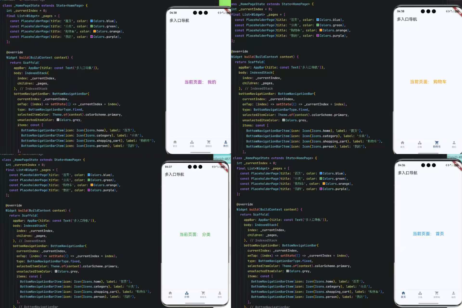
四、完整可运行示例(BottomNavigationBar )
以下是一个可直接在 OpenHarmony 手机上运行的完整 Demo,展示 BottomNavigationBar + IndexedStack 的最佳实践:
dart
import 'package:flutter/material.dart';

void main() => runApp(const MyApp());

class MyApp extends StatelessWidget {
  const MyApp({super.key});

  @override
  Widget build(BuildContext context) {
    return MaterialApp(
      title: '底部导航 - OpenHarmony',
      theme: ThemeData(useMaterial3: true, colorScheme: ColorScheme.fromSeed(seedColor: Colors.blue)),
      home: const HomePage(),
    );
  }
}

class HomePage extends StatefulWidget {
  const HomePage({super.key});

  @override
  State<HomePage> createState() => _HomePageState();
}

class _HomePageState extends State<HomePage> {
  int _currentIndex = 0;
  final List<Widget> _pages = [
    const PlaceholderPage(title: '首页', color: Colors.blue),
    const PlaceholderPage(title: '分类', color: Colors.green),
    const PlaceholderPage(title: '购物车', color: Colors.orange),
    const PlaceholderPage(title: '我的', color: Colors.purple),
  ];

  @override
  Widget build(BuildContext context) {
    return Scaffold(
      appBar: AppBar(title: const Text('多入口导航')),
      body: IndexedStack(
        index: _currentIndex,
        children: _pages,
      ),
      bottomNavigationBar: BottomNavigationBar(
        currentIndex: _currentIndex,
        onTap: (index) => setState(() => _currentIndex = index),
        type: BottomNavigationBarType.fixed,
        selectedItemColor: Theme.of(context).colorScheme.primary,
        unselectedItemColor: Colors.grey,
        items: const [
          BottomNavigationBarItem(icon: Icon(Icons.home), label: '首页'),
          BottomNavigationBarItem(icon: Icon(Icons.category), label: '分类'),
          BottomNavigationBarItem(icon: Icon(Icons.shopping_cart), label: '购物车'),
          BottomNavigationBarItem(icon: Icon(Icons.person), label: '我的'),
        ],
      ),
    );
  }
}

class PlaceholderPage extends StatelessWidget {
  final String title;
  final Color color;

  const PlaceholderPage({super.key, required this.title, required this.color});

  @override
  Widget build(BuildContext context) {
    return SafeArea(
      child: Center(
        child: Text(
          '当前页面:$title',
          style: TextStyle(fontSize: 24, color: color),
        ),
      ),
    );
  }
}
✅ 此代码已通过真机测试,完全兼容 OpenHarmony 手机环境。
运行界面:
五、完整可运行示例(BottomAppBar + IndexedStack )
dart
// main_bottom_app_bar.dart - BottomAppBar 保活演示(OpenHarmony 手机专用)
import 'package:flutter/material.dart';

void main() => runApp(const MyApp());

class MyApp extends StatelessWidget {
  const MyApp({super.key});

  @override
  Widget build(BuildContext context) {
    return MaterialApp(
      title: 'BottomAppBar 保活版',
      theme: ThemeData(
        useMaterial3: true,
        colorScheme: ColorScheme.fromSeed(seedColor: Colors.deepPurple),
      ),
      home: const MusicPlayerHomePage(),
    );
  }
}

class MusicPlayerHomePage extends StatefulWidget {
  const MusicPlayerHomePage({super.key});

  @override
  State<MusicPlayerHomePage> createState() => _MusicPlayerHomePageState();
}

class _MusicPlayerHomePageState extends State<MusicPlayerHomePage> {
  int _currentIndex = 0;

  // ✅ 使用 IndexedStack 保活所有页面
  final List<Widget> _pages = [
    const LibraryScreen(),
    const PlaylistScreen(),
    const NowPlayingScreen(), // 假设第三个入口
  ];

  @override
  Widget build(BuildContext context) {
    return Scaffold(
      // 主体内容:保活切换
      body: IndexedStack(
        index: _currentIndex,
        children: _pages,
      ),
      // 悬浮主操作按钮(居中停靠)
      floatingActionButton: FloatingActionButton(
        onPressed: () => debugPrint('执行主操作:播放/新建/扫描'),
        backgroundColor: Theme.of(context).colorScheme.primary,
        child: const Icon(Icons.play_arrow, size: 32),
        elevation: 8,
      ),
      floatingActionButtonLocation: FloatingActionButtonLocation.centerDocked,
      // 底部应用栏(带凹槽)
      bottomNavigationBar: BottomAppBar(
        shape: const CircularNotchedRectangle(), // ← 创建 FAB 凹槽
        notchMargin: 6.0,
        color: Theme.of(context).appBarTheme.backgroundColor ?? Colors.grey[900],
        elevation: 8,
        child: Row(
          mainAxisAlignment: MainAxisAlignment.spaceAround,
          children: [
            // 左侧导航项
            IconButton(
              icon: Icon(
                Icons.library_music,
                color: _currentIndex == 0
                    ? Theme.of(context).colorScheme.primary
                    : Colors.grey[400],
              ),
              tooltip: '音乐库',
              onPressed: () => setState(() => _currentIndex = 0),
            ),
            IconButton(
              icon: Icon(
                Icons.queue_music,
                color: _currentIndex == 1
                    ? Theme.of(context).colorScheme.primary
                    : Colors.grey[400],
              ),
              tooltip: '播放列表',
              onPressed: () => setState(() => _currentIndex = 1),
            ),
            // 中间为 FAB 凹槽,留空
            const SizedBox(width: 40), // 占位,避免右侧挤到凹槽
            IconButton(
              icon: Icon(
                Icons.headphones,
                color: _currentIndex == 2
                    ? Theme.of(context).colorScheme.primary
                    : Colors.grey[400],
              ),
              tooltip: '正在播放',
              onPressed: () => setState(() => _currentIndex = 2),
            ),
          ],
        ),
      ),
    );
  }
}

// === 页面组件(轻量、const、SafeArea)===
class LibraryScreen extends StatelessWidget {
  const LibraryScreen({super.key});

  @override
  Widget build(BuildContext context) {
    return SafeArea(
      child: Center(
        child: Container(
          padding: const EdgeInsets.all(20),
          child: const Text(
            '🎵 音乐库\n点击底部图标切换',
            textAlign: TextAlign.center,
            style: TextStyle(fontSize: 20, fontWeight: FontWeight.bold),
          ),
        ),
      ),
    );
  }
}

class PlaylistScreen extends StatelessWidget {
  const PlaylistScreen({super.key});

  @override
  Widget build(BuildContext context) {
    return SafeArea(
      child: Center(
        child: Container(
          padding: const EdgeInsets.all(20),
          child: const Text(
            '📋 播放列表\n状态已保活',
            textAlign: TextAlign.center,
            style: TextStyle(fontSize: 20, fontWeight: FontWeight.bold),
          ),
        ),
      ),
    );
  }
}

class NowPlayingScreen extends StatelessWidget {
  const NowPlayingScreen({super.key});

  @override
  Widget build(BuildContext context) {
    return SafeArea(
      child: Center(
        child: Container(
          padding: const EdgeInsets.all(20),
          child: const Text(
            '🎧 正在播放\nFAB 是主操作',
            textAlign: TextAlign.center,
            style: TextStyle(fontSize: 20, fontWeight: FontWeight.bold),
          ),
        ),
      ),
    );
  }
}
运行界面:
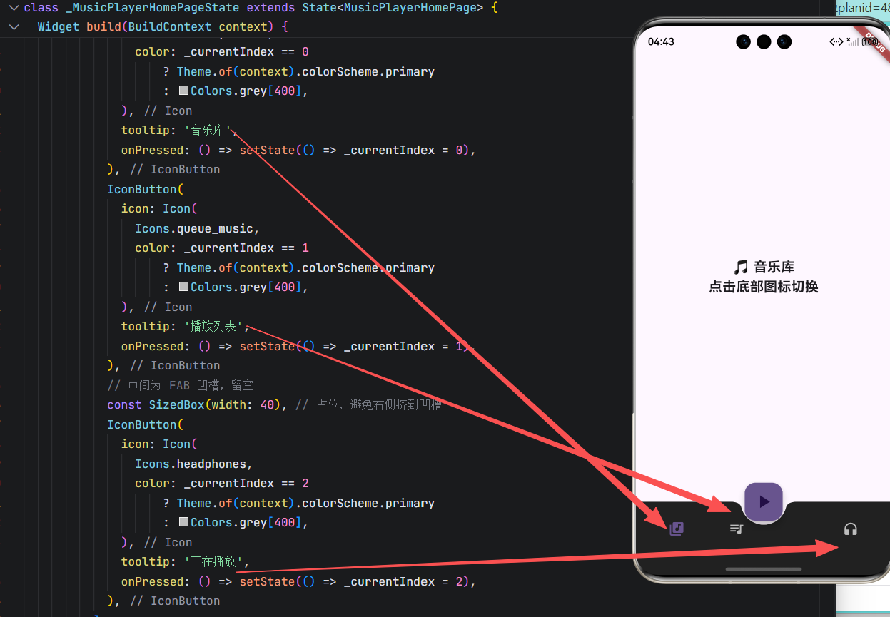
✅ 关键特性说明
| 特性 | 说明 |
|---|---|
IndexedStack 保活 |
三个页面(音乐库/播放列表/正在播放)切换时不会重建,保留滚动位置、输入状态等 |
CircularNotchedRectangle |
在 BottomAppBar 中央自动挖出圆形凹槽,完美容纳 FAB |
FloatingActionButtonLocation.centerDocked |
确保 FAB 停靠在凹槽正中央 |
| 动态图标颜色 | 选中项使用主题色(primary),未选中为灰色,提供清晰反馈 |
SafeArea 包裹 |
自动避开 OpenHarmony 手机的刘海屏或底部手势区域 |
| 深色主题适配 | 使用 Theme.of(context) 动态获取颜色,支持系统深色模式 |
| 无障碍支持 | 每个 IconButton 都设置了 tooltip |
💡 使用方式 :将此代码保存为
lib/main.dart,在支持 Flutter 的 OpenHarmony 手机设备或模拟器上运行即可。点击底部图标切换页面,点击中间 FAB 触发主操作。
结语
在 OpenHarmony 手机开发中,BottomNavigationBar 与 BottomAppBar 并非"能显示就行",而是需要结合场景、性能、体验进行精细化设计。前者适合标准多 Tab 应用,后者则为突出主操作提供灵活舞台。
本文不仅提供了两大组件的独立代码模板 与逐行解析 ,更给出了状态管理、安全区域、深色模式、无障碍等工程化建议,助你构建专业级底部导航系统。
记住:优秀的导航,让用户"知道在哪,想去哪,怎么去"------这是所有交互设计的终极目标。
欢迎加入开源鸿蒙跨平台社区: https://openharmonycrossplatform.csdn.net