PyQtGraph应用(一):常用图表图形绘制
前言
前面的文章具体介绍了PyQtGraph的基本概念、核心组件及其之间的交互,本文则通过几个常用的图表示例来加深对PyQtGraph的理解及应用。
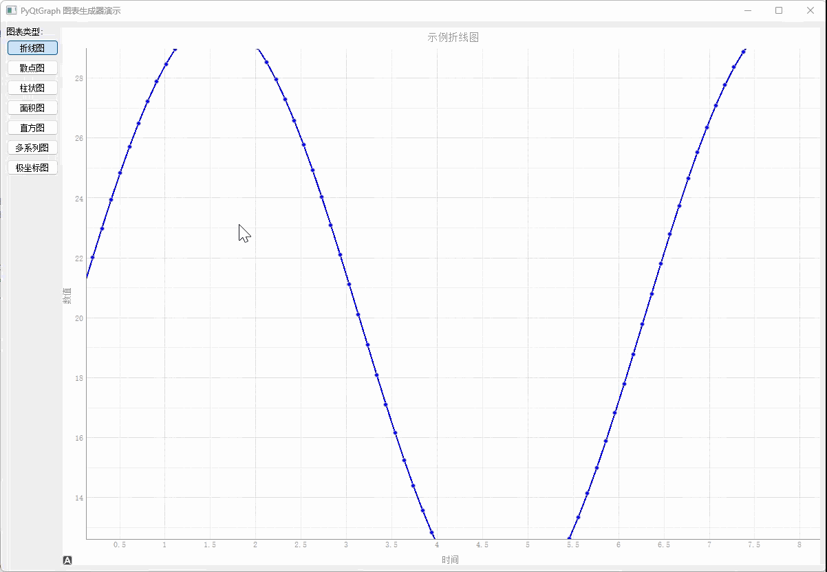
效果预览
实现逻辑
因为常用的图表(如:折线图、散点图、柱状图、面积图等),都可在一个scene、view中绘制,因此这里使用工厂模式创建一个图表绘制工厂,代码如下:
python
class ChartGenerator:
    """基于PyQtGraph的图表生成器,提供多种常见图表类型的绘制功能"""

    @staticmethod
    def create_line_chart(plot_widget, x_data, y_data, title="折线图", x_label="X轴", y_label="Y轴",
                         color='b', symbol='o', symbol_size=6, name="折线", pen_width=2):
        """
        绘制折线图

        Args:
            plot_widget: pyqtgraph PlotWidget实例
            x_data: X轴数据
            y_data: Y轴数据
            title: 图表标题
            x_label: X轴标签
            y_label: Y轴标签
            color: 线条颜色
            symbol: 数据点标记样式
            symbol_size: 数据点大小
            name: 图例名称
            pen_width: 线条宽度
        """
        plot_widget.clear()
        plot_widget.setTitle(title)
        plot_widget.setLabel('left', y_label)
        plot_widget.setLabel('bottom', x_label)
        plot_widget.showGrid(x=True, y=True, alpha=0.3)

        curve = plot_widget.plot(
            x=x_data,
            y=y_data,
            pen=pg.mkPen(color=color, width=pen_width),
            symbol=symbol,
            symbolSize=symbol_size,
            symbolBrush=color,
            name=name
        )

        plot_widget.addLegend()
        return curve

    @staticmethod
    def create_scatter_plot(plot_widget, x_data, y_data, title="散点图", x_label="X轴", y_label="Y轴",
                           color='red', symbol='o', symbol_size=10, name="散点"):
        """
        绘制散点图

        Args:
            plot_widget: pyqtgraph PlotWidget实例
            x_data: X轴数据
            y_data: Y轴数据
            title: 图表标题
            x_label: X轴标签
            y_label: Y轴标签
            color: 点的颜色
            symbol: 点的形状
            symbol_size: 点的大小
            name: 图例名称
        """
        plot_widget.clear()
        plot_widget.setTitle(title)
        plot_widget.setLabel('left', y_label)
        plot_widget.setLabel('bottom', x_label)
        plot_widget.showGrid(x=True, y=True, alpha=0.3)

        scatter = pg.ScatterPlotItem(
            x=x_data,
            y=y_data,
            pen=pg.mkPen(None),
            brush=pg.mkBrush(color=color),
            size=symbol_size,
            symbol=symbol,
            name=name
        )

        plot_widget.addItem(scatter)
        plot_widget.addLegend()
        return scatter

    @staticmethod
    def create_bar_chart(plot_widget, x_data, y_data, title="柱状图", x_label="X轴", y_label="Y轴",
                        color='#1f77b4', name="柱状图", bar_width=None):
        """
        绘制柱状图

        Args:
            plot_widget: pyqtgraph PlotWidget实例
            x_data: X轴数据(通常是位置)
            y_data: Y轴数据(柱子高度)
            title: 图表标题
            x_label: X轴标签
            y_label: Y轴标签
            color: 柱子颜色
            name: 图例名称
            bar_width: 柱子宽度,默认自动计算
        """
        plot_widget.clear()
        plot_widget.setTitle(title)
        plot_widget.setLabel('left', y_label)
        plot_widget.setLabel('bottom', x_label)
        plot_widget.showGrid(x=True, y=True, alpha=0.3)

        if bar_width is None:
            bar_width = max(0.5, min(np.diff(x_data)) * 0.8) if len(x_data) > 1 else 0.8

        bargraph = pg.BarGraphItem(
            x=x_data,
            height=y_data,
            width=bar_width,
            brush=color,
            pen={'color': '#0f4d8f', 'width': 1},
            name=name
        )

        plot_widget.addItem(bargraph)
        plot_widget.addLegend()
        return bargraph

    @staticmethod
    def create_area_chart(plot_widget, x_data, y_data, title="面积图", x_label="X轴", y_label="Y轴",
                         color='green', name="面积图"):
        """
        绘制面积图

        Args:
            plot_widget: pyqtgraph PlotWidget实例
            x_data: X轴数据
            y_data: Y轴数据
            title: 图表标题
            x_label: X轴标签
            y_label: Y轴标签
            color: 填充颜色
            name: 图例名称
        """
        plot_widget.clear()
        plot_widget.setTitle(title)
        plot_widget.setLabel('left', y_label)
        plot_widget.setLabel('bottom', x_label)
        plot_widget.showGrid(x=True, y=True, alpha=0.3)

        # 创建填充曲线
        curve = pg.PlotCurveItem(
            x=x_data,
            y=y_data,
            fillLevel=0,
            brush=pg.mkBrush(color=color),
            pen=pg.mkPen(color=color, width=2),
            name=name
        )

        plot_widget.addItem(curve)
        plot_widget.addLegend()
        return curve

    @staticmethod
    def create_histogram(plot_widget, data, bins=20, title="直方图", x_label="X轴", y_label="频率",
                        color='purple', name="直方图"):
        """
        绘制直方图

        Args:
            plot_widget: pyqtgraph PlotWidget实例
            data: 输入数据
            bins: 直方图分箱数量
            title: 图表标题
            x_label: X轴标签
            y_label: Y轴标签
            color: 柱子颜色
            name: 图例名称
        """
        plot_widget.clear()
        plot_widget.setTitle(title)
        plot_widget.setLabel('left', y_label)
        plot_widget.setLabel('bottom', x_label)
        plot_widget.showGrid(x=True, y=True, alpha=0.3)

        # 计算直方图
        hist, edges = np.histogram(data, bins=bins)

        # 创建直方图
        bargraph = pg.BarGraphItem(
            x=edges[:-1],
            height=hist,
            width=np.diff(edges)[0] * 0.8,
            brush=color,
            pen={'color': '#0f4d8f', 'width': 1},
            name=name
        )

        plot_widget.addItem(bargraph)
        plot_widget.addLegend()
        return bargraph

    @staticmethod
    def create_multiple_series(plot_widget, series_data, title="多系列图表", x_label="X轴", y_label="Y轴"):
        """
        绘制多系列图表(支持折线图和散点图混合)

        Args:
            plot_widget: pyqtgraph PlotWidget实例
            series_data: 包含多个系列数据的列表,每个元素是字典,包含'x', 'y', 'type', 'name', 'color'等键
            title: 图表标题
            x_label: X轴标签
            y_label: Y轴标签
        """
        plot_widget.clear()
        plot_widget.setTitle(title)
        plot_widget.setLabel('left', y_label)
        plot_widget.setLabel('bottom', x_label)
        plot_widget.showGrid(x=True, y=True, alpha=0.3)

        for idx, series in enumerate(series_data):
            x = series['x']
            y = series['y']
            chart_type = series.get('type', 'line')  # 'line', 'scatter', 'bar'
            name = series.get('name', f'系列{idx}')
            color = series.get('color', f'C{idx}')

            if chart_type == 'line':
                symbol = series.get('symbol', 'o')
                symbol_size = series.get('symbol_size', 6)

                plot_widget.plot(
                    x=x,
                    y=y,
                    pen=pg.mkPen(color=color, width=2),
                    symbol=symbol,
                    symbolSize=symbol_size,
                    symbolBrush=color,
                    name=name
                )
            elif chart_type == 'scatter':
                plot_widget.plot(
                    x=x,
                    y=y,
                    pen=None,
                    symbol='o',
                    symbolSize=series.get('size', 10),
                    symbolBrush=color,
                    name=name
                )
            elif chart_type == 'bar':
                bar_width = series.get('width', 0.8)
                bargraph = pg.BarGraphItem(
                    x=x,
                    height=y,
                    width=bar_width,
                    brush=color,
                    pen={'color': '#0f4d8f', 'width': 1},
                    name=name
                )
                plot_widget.addItem(bargraph)

        plot_widget.addLegend()

    @staticmethod
    def create_polar_plot(plot_widget, angles, radii, title="极坐标图", color='blue', name="极坐标"):
        """
        创建极坐标图(通过转换为笛卡尔坐标)

        Args:
            plot_widget: pyqtgraph PlotWidget实例
            angles: 角度数据(弧度)
            radii: 半径数据
            title: 图表标题
            color: 线条颜色
            name: 图例名称
        """
        plot_widget.clear()
        plot_widget.setTitle(title)
        plot_widget.setLabel('left', 'Y')
        plot_widget.setLabel('bottom', 'X')
        plot_widget.showGrid(x=True, y=True, alpha=0.3)

        # 转换为笛卡尔坐标
        x = radii * np.cos(angles)
        y = radii * np.sin(angles)

        curve = plot_widget.plot(
            x=x,
            y=y,
            pen=pg.mkPen(color=color, width=2),
            symbol='o',
            symbolSize=6,
            symbolBrush=color,
            name=name
        )

        plot_widget.addLegend()
        return curve
这里再补充一个随机数据生成接口:
python
def generate_sample_data(self):
    """生成示例数据"""
    # 基础数学函数数据
    self.x_data = np.linspace(0, 10, 100)
    self.y_data = np.sin(self.x_data) * 10 + 20
    self.y_data_cos = np.cos(self.x_data) * 10 + 20
    self.y_data_tan = np.tan(self.x_data[:50])

    # 随机数据
    self.scatter_x = np.random.normal(5, 2, 200)
    self.scatter_y = np.random.normal(5, 2, 200)

    # 分类数据
    self.categories = ['A', 'B', 'C', 'D', 'E', 'F', 'G', 'H']
    self.category_values = np.random.randint(20, 100, 8)
    self.bar_x = np.arange(len(self.categories))
    self.bar_y = self.category_values

    # 时间序列数据
    self.time_x = np.arange(30)  # 30天
    self.time_sales = np.random.randint(1000, 5000, 30)
    self.time_expenses = np.random.randint(500, 3000, 30)

    # 正态分布数据(用于直方图)
    self.hist_data = np.random.normal(50, 15, 2000)
    self.hist_data2 = np.random.normal(60, 10, 1500)

    # 股票价格模拟数据
    self.stock_days = np.arange(50)
    self.stock_prices = 100 + np.cumsum(np.random.randn(50) * 0.5)
    self.stock_volume = np.random.randint(1000, 10000, 50)

    # 温度数据(一周)
    self.temp_days = ['周一', '周二', '周三', '周四', '周五', '周六', '周日']
    self.temp_high = [22, 25, 27, 24, 26, 28, 29]
    self.temp_low = [15, 16, 18, 17, 19, 21, 22]
    self.temp_x = np.arange(len(self.temp_days))

    # 销售数据
    self.months = ['1月', '2月', '3月', '4月', '5月', '6月',
                '7月', '8月', '9月', '10月', '11月', '12月']
    self.sales_data = [120, 135, 148, 125, 160, 175, 190, 185, 170, 155, 140, 165]
    self.profit_data = [25, 30, 35, 28, 40, 45, 50, 48, 42, 38, 32, 40]
    self.monthly_x = np.arange(len(self.months))

    # 调查数据
    self.survey_options = ['非常满意', '满意', '一般', '不满意', '非常不满意']
    self.survey_responses = [120, 250, 180, 60, 30]
    self.survey_x = np.arange(len(self.survey_options))

    # 多系列数据
    x_multi = np.linspace(0, 10, 100)
    self.multi_series_data = [
        {
            'x': x_multi,
            'y': np.sin(x_multi) * 10,
            'type': 'line',
            'name': 'sin(x) * 10',
            'color': 'blue'
        },
        {
            'x': x_multi,
            'y': np.cos(x_multi) * 10,
            'type': 'line',
            'name': 'cos(x) * 10',
            'color': 'red'
        },
        {
            'x': x_multi[::4],  # 每第四个点
            'y': np.exp(-x_multi[::4]/3) * 10,
            'type': 'scatter',
            'name': 'exp decay',
            'color': 'green'
        },
        {
            'x': x_multi[::5],
            'y': x_multi[::5]**1.5,
            'type': 'scatter',
            'name': 'sqrt growth',
            'color': 'orange'
        }
    ]

    # 混合图表数据
    self.hybrid_series_data = [
        {
            'x': self.bar_x,
            'y': self.category_values,
            'type': 'bar',
            'name': '分类数据',
            'color': '#1f77b4'
        },
        {
            'x': np.arange(len(self.category_values)),
            'y': [v * 0.8 for v in self.category_values],
            'type': 'line',
            'name': '趋势线',
            'color': 'red'
        }
    ]

    # 极坐标数据
    self.angles = np.linspace(0, 2*np.pi, 200)
    self.radii = 1 + 0.5 * np.sin(8 * self.angles)  # 更多花瓣
    self.radii2 = 0.5 + 0.3 * np.cos(5 * self.angles)  # 第二个极坐标曲线

    # 饼图数据(使用pyqtgraph的替代方案)
    self.pie_labels = ['产品A', '产品B', '产品C', '产品D', '其他']
    self.pie_values = [35, 25, 20, 15, 5]

    # 统计数据
    self.stats_x = np.arange(1, 11)
    self.stats_mean = [2.3, 3.1, 2.8, 4.2, 3.9, 4.5, 5.1, 4.8, 5.3, 6.0]
    self.stats_std = [0.5, 0.7, 0.4, 0.6, 0.8, 0.5, 0.7, 0.6, 0.8, 0.9]

    # 金融数据
    self.finance_dates = np.arange(60)  # 两个月数据
    self.finance_open = 100 + np.cumsum(np.random.randn(60) * 0.3)
    self.finance_close = self.finance_open + np.random.uniform(-2, 2, 60)
    self.finance_high = np.maximum(self.finance_open, self.finance_close) + np.abs(np.random.uniform(0, 3, 60))
    self.finance_low = np.minimum(self.finance_open, self.finance_close) - np.abs(np.random.uniform(0, 3, 60))
折线图
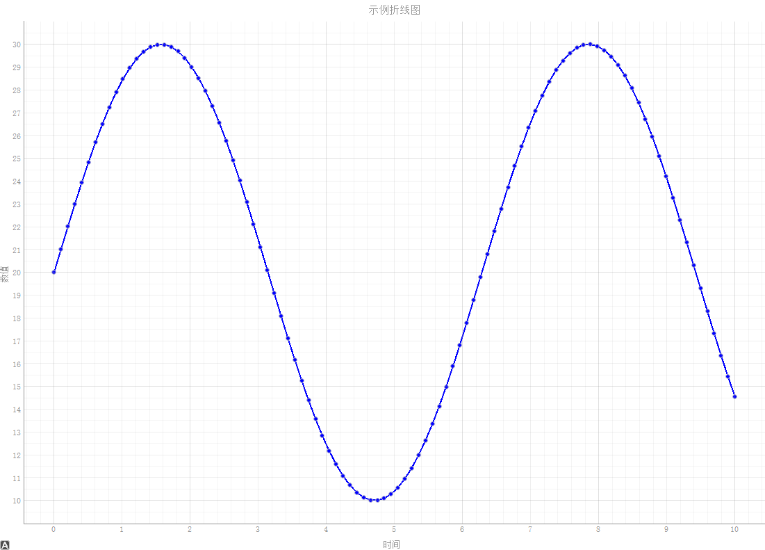
有了上面的图表工厂,这里就可以直接调用接口传入数据即可生成所需折线图。
python
ChartGenerator.create_line_chart(
    self.plot_widget,
    self.x_data,
    self.y_data,
    title="示例折线图",
    x_label="时间",
    y_label="数值",
    color='blue',
    symbol='o',
    name="正弦曲线"
)
效果如图:
散点图
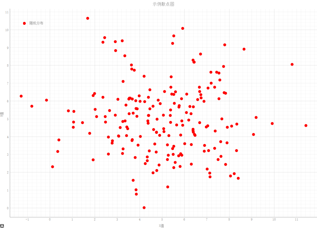
python
ChartGenerator.create_scatter_plot(
    self.plot_widget,
    self.scatter_x,
    self.scatter_y,
    title="示例散点图",
    x_label="X值",
    y_label="Y值",
    color='red',
    symbol='o',
    name="随机分布"
)
效果如图:
柱状图
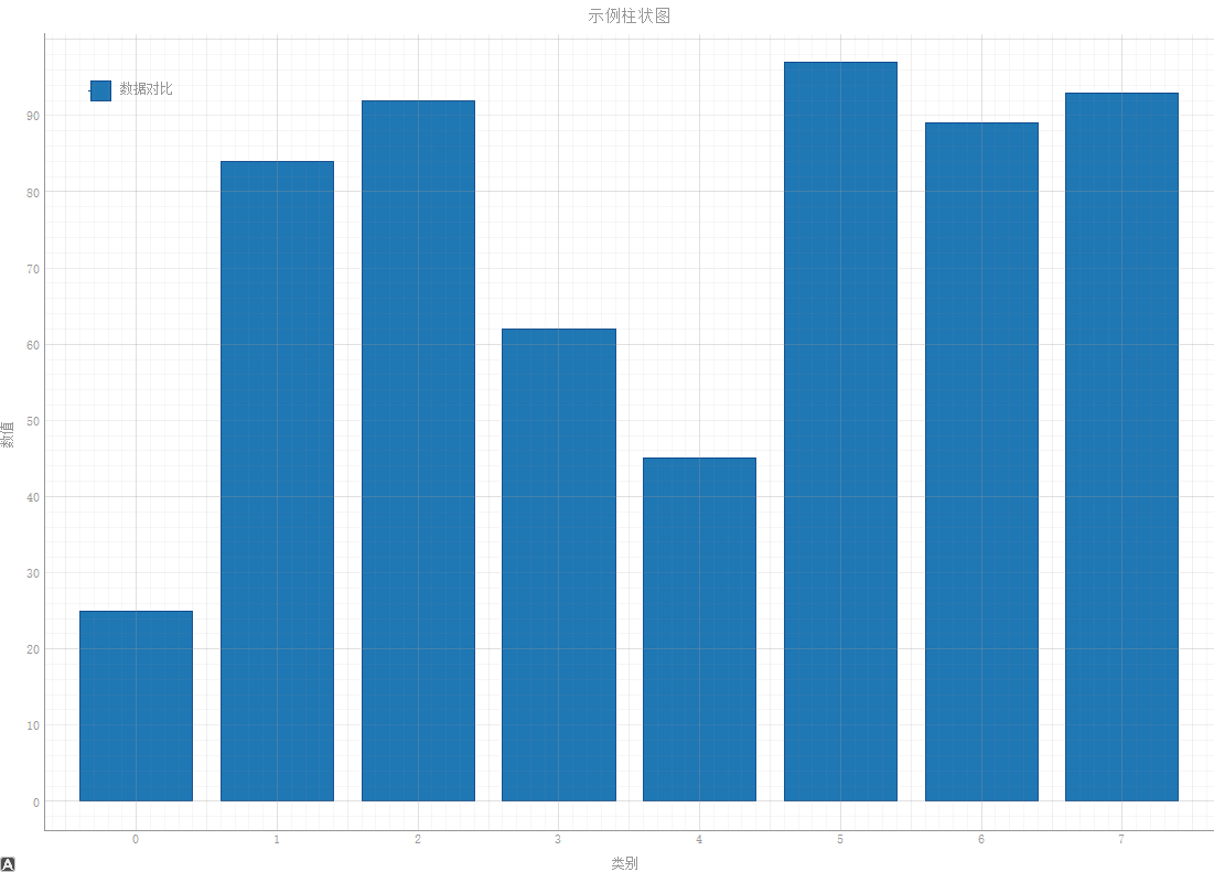
python
ChartGenerator.create_bar_chart(
    self.plot_widget,
    self.bar_x,
    self.bar_y,
    title="示例柱状图",
    x_label="类别",
    y_label="数值",
    name="数据对比"
)
效果如图:
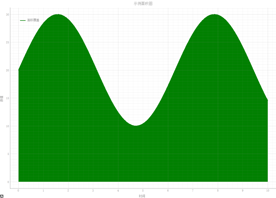
面积图
python
ChartGenerator.create_area_chart(
    self.plot_widget,
    self.x_data,
    self.y_data,
    title="示例面积图",
    x_label="时间",
    y_label="数值",
    color='green',
    name="面积覆盖"
)
效果如图:
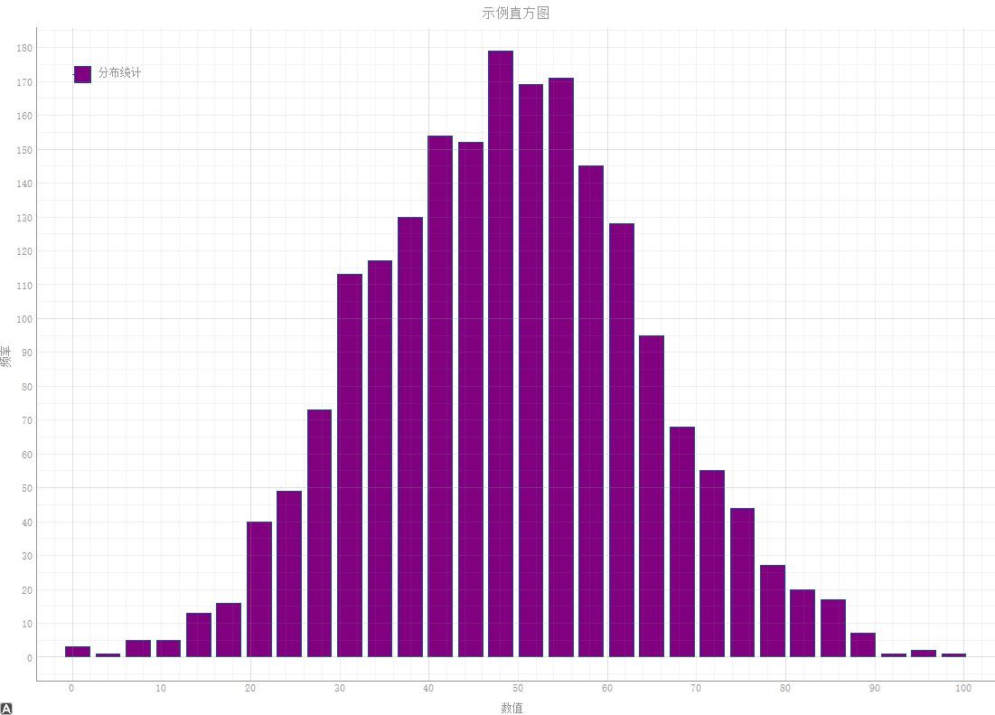
直方图
python
ChartGenerator.create_histogram(
            self.plot_widget,
            self.hist_data,
            bins=30,
            title="示例直方图",
            x_label="数值",
            y_label="频率",
            name="分布统计"
        )
效果如图:
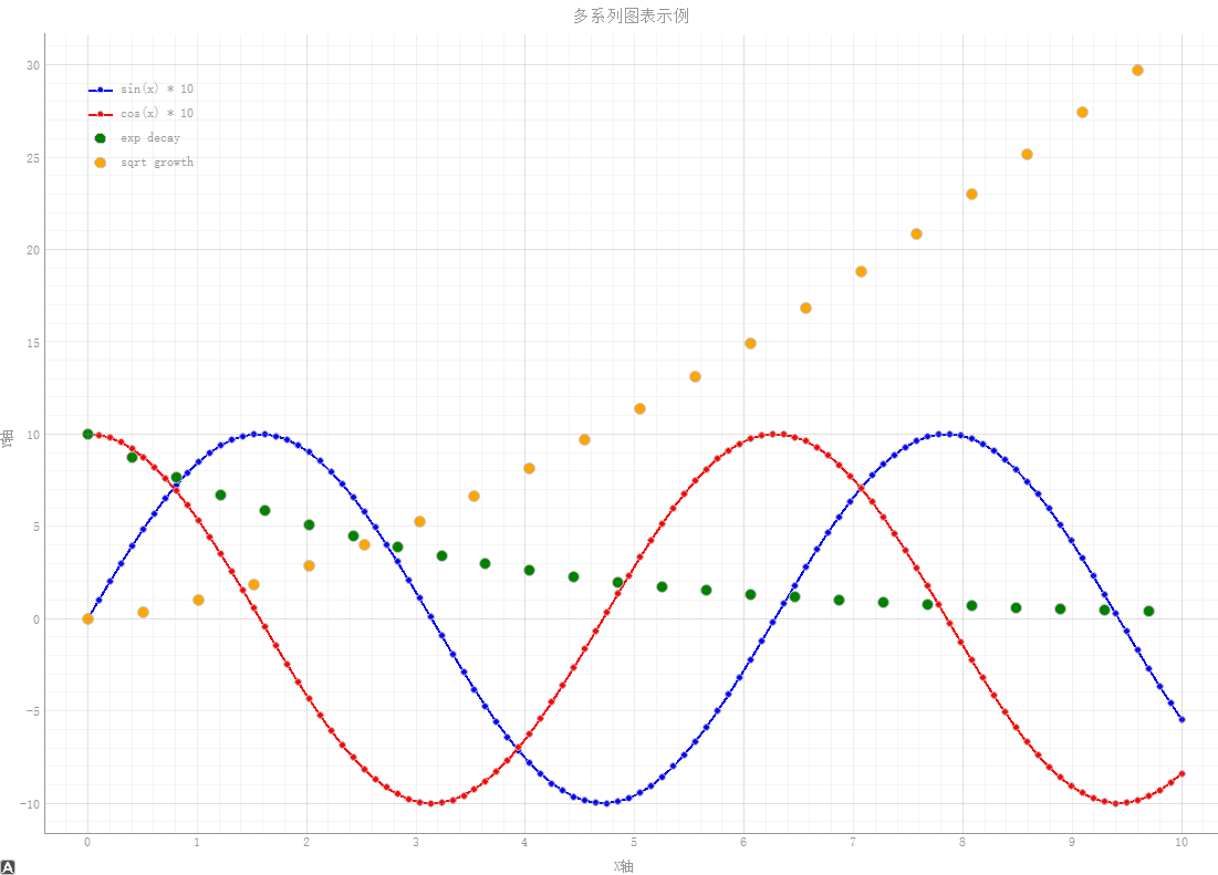
多系列图
python
ChartGenerator.create_multiple_series(
            self.plot_widget,
            self.multi_series_data,
            title="多系列图表示例",
            x_label="X轴",
            y_label="Y轴"
        )
效果如图:
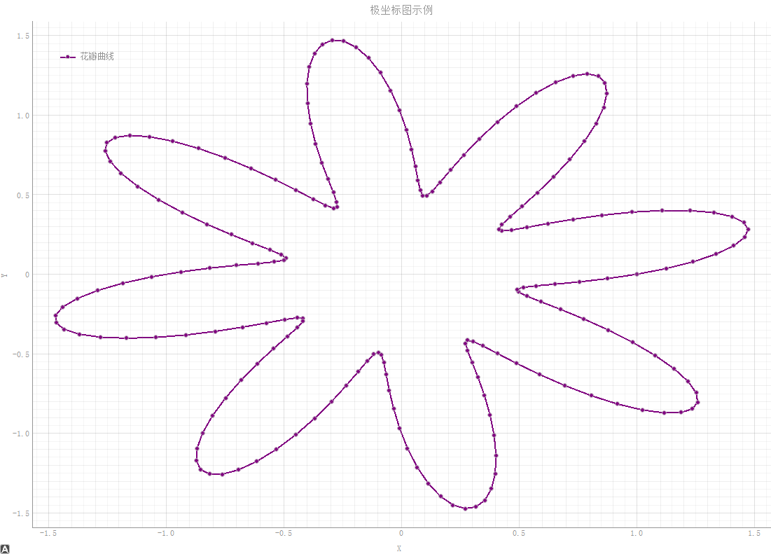
极坐标图
python
ChartGenerator.create_polar_plot(
            self.plot_widget,
            self.angles,
            self.radii,
            title="极坐标图示例",
            color='purple',
            name="花瓣曲线"
        )
效果如图:
完整代码
完整代码如下:
python
import pyqtgraph as pg
from pyqtgraph import DateAxisItem, AxisItem
from PyQt5.QtWidgets import QApplication, QMainWindow, QVBoxLayout, QWidget, QButtonGroup, QHBoxLayout, QPushButton, QLabel
from PyQt5.QtCore import QCoreApplication, QDateTime, Qt
from PyQt5.QtGui import QFont
import numpy as np
from datetime import datetime, timedelta
import sys
class ChartGenerator:
"""基于PyQtGraph的图表生成器,提供多种常见图表类型的绘制功能"""
@staticmethod
def create_line_chart(plot_widget, x_data, y_data, title="折线图", x_label="X轴", y_label="Y轴",
color='b', symbol='o', symbol_size=6, name="折线", pen_width=2):
"""
绘制折线图
Args:
plot_widget: pyqtgraph PlotWidget实例
x_data: X轴数据
y_data: Y轴数据
title: 图表标题
x_label: X轴标签
y_label: Y轴标签
color: 线条颜色
symbol: 数据点标记样式
symbol_size: 数据点大小
name: 图例名称
pen_width: 线条宽度
"""
plot_widget.clear()
plot_widget.setTitle(title)
plot_widget.setLabel('left', y_label)
plot_widget.setLabel('bottom', x_label)
plot_widget.showGrid(x=True, y=True, alpha=0.3)
curve = plot_widget.plot(
x=x_data,
y=y_data,
pen=pg.mkPen(color=color, width=pen_width),
symbol=symbol,
symbolSize=symbol_size,
symbolBrush=color,
name=name
)
plot_widget.addLegend()
return curve
@staticmethod
def create_scatter_plot(plot_widget, x_data, y_data, title="散点图", x_label="X轴", y_label="Y轴",
color='red', symbol='o', symbol_size=10, name="散点"):
"""
绘制散点图
Args:
plot_widget: pyqtgraph PlotWidget实例
x_data: X轴数据
y_data: Y轴数据
title: 图表标题
x_label: X轴标签
y_label: Y轴标签
color: 点的颜色
symbol: 点的形状
symbol_size: 点的大小
name: 图例名称
"""
plot_widget.clear()
plot_widget.setTitle(title)
plot_widget.setLabel('left', y_label)
plot_widget.setLabel('bottom', x_label)
plot_widget.showGrid(x=True, y=True, alpha=0.3)
scatter = pg.ScatterPlotItem(
x=x_data,
y=y_data,
pen=pg.mkPen(None),
brush=pg.mkBrush(color=color),
size=symbol_size,
symbol=symbol,
name=name
)
plot_widget.addItem(scatter)
plot_widget.addLegend()
return scatter
@staticmethod
def create_bar_chart(plot_widget, x_data, y_data, title="柱状图", x_label="X轴", y_label="Y轴",
color='#1f77b4', name="柱状图", bar_width=None):
"""
绘制柱状图
Args:
plot_widget: pyqtgraph PlotWidget实例
x_data: X轴数据(通常是位置)
y_data: Y轴数据(柱子高度)
title: 图表标题
x_label: X轴标签
y_label: Y轴标签
color: 柱子颜色
name: 图例名称
bar_width: 柱子宽度,默认自动计算
"""
plot_widget.clear()
plot_widget.setTitle(title)
plot_widget.setLabel('left', y_label)
plot_widget.setLabel('bottom', x_label)
plot_widget.showGrid(x=True, y=True, alpha=0.3)
if bar_width is None:
bar_width = max(0.5, min(np.diff(x_data)) * 0.8) if len(x_data) > 1 else 0.8
bargraph = pg.BarGraphItem(
x=x_data,
height=y_data,
width=bar_width,
brush=color,
pen={'color': '#0f4d8f', 'width': 1},
name=name
)
plot_widget.addItem(bargraph)
plot_widget.addLegend()
return bargraph
@staticmethod
def create_area_chart(plot_widget, x_data, y_data, title="面积图", x_label="X轴", y_label="Y轴",
color='green', name="面积图"):
"""
绘制面积图
Args:
plot_widget: pyqtgraph PlotWidget实例
x_data: X轴数据
y_data: Y轴数据
title: 图表标题
x_label: X轴标签
y_label: Y轴标签
color: 填充颜色
name: 图例名称
"""
plot_widget.clear()
plot_widget.setTitle(title)
plot_widget.setLabel('left', y_label)
plot_widget.setLabel('bottom', x_label)
plot_widget.showGrid(x=True, y=True, alpha=0.3)
# 创建填充曲线
curve = pg.PlotCurveItem(
x=x_data,
y=y_data,
fillLevel=0,
brush=pg.mkBrush(color=color),
pen=pg.mkPen(color=color, width=2),
name=name
)
plot_widget.addItem(curve)
plot_widget.addLegend()
return curve
@staticmethod
def create_histogram(plot_widget, data, bins=20, title="直方图", x_label="X轴", y_label="频率",
color='purple', name="直方图"):
"""
绘制直方图
Args:
plot_widget: pyqtgraph PlotWidget实例
data: 输入数据
bins: 直方图分箱数量
title: 图表标题
x_label: X轴标签
y_label: Y轴标签
color: 柱子颜色
name: 图例名称
"""
plot_widget.clear()
plot_widget.setTitle(title)
plot_widget.setLabel('left', y_label)
plot_widget.setLabel('bottom', x_label)
plot_widget.showGrid(x=True, y=True, alpha=0.3)
# 计算直方图
hist, edges = np.histogram(data, bins=bins)
# 创建直方图
bargraph = pg.BarGraphItem(
x=edges[:-1],
height=hist,
width=np.diff(edges)[0] * 0.8,
brush=color,
pen={'color': '#0f4d8f', 'width': 1},
name=name
)
plot_widget.addItem(bargraph)
plot_widget.addLegend()
return bargraph
@staticmethod
def create_multiple_series(plot_widget, series_data, title="多系列图表", x_label="X轴", y_label="Y轴"):
"""
绘制多系列图表(支持折线图和散点图混合)
Args:
plot_widget: pyqtgraph PlotWidget实例
series_data: 包含多个系列数据的列表,每个元素是字典,包含'x', 'y', 'type', 'name', 'color'等键
title: 图表标题
x_label: X轴标签
y_label: Y轴标签
"""
plot_widget.clear()
plot_widget.setTitle(title)
plot_widget.setLabel('left', y_label)
plot_widget.setLabel('bottom', x_label)
plot_widget.showGrid(x=True, y=True, alpha=0.3)
for idx, series in enumerate(series_data):
x = series['x']
y = series['y']
chart_type = series.get('type', 'line') # 'line', 'scatter', 'bar'
name = series.get('name', f'系列{idx}')
color = series.get('color', f'C{idx}')
if chart_type == 'line':
symbol = series.get('symbol', 'o')
symbol_size = series.get('symbol_size', 6)
plot_widget.plot(
x=x,
y=y,
pen=pg.mkPen(color=color, width=2),
symbol=symbol,
symbolSize=symbol_size,
symbolBrush=color,
name=name
)
elif chart_type == 'scatter':
plot_widget.plot(
x=x,
y=y,
pen=None,
symbol='o',
symbolSize=series.get('size', 10),
symbolBrush=color,
name=name
)
elif chart_type == 'bar':
bar_width = series.get('width', 0.8)
bargraph = pg.BarGraphItem(
x=x,
height=y,
width=bar_width,
brush=color,
pen={'color': '#0f4d8f', 'width': 1},
name=name
)
plot_widget.addItem(bargraph)
plot_widget.addLegend()
@staticmethod
def create_polar_plot(plot_widget, angles, radii, title="极坐标图", color='blue', name="极坐标"):
"""
创建极坐标图(通过转换为笛卡尔坐标)
Args:
plot_widget: pyqtgraph PlotWidget实例
angles: 角度数据(弧度)
radii: 半径数据
title: 图表标题
color: 线条颜色
name: 图例名称
"""
plot_widget.clear()
plot_widget.setTitle(title)
plot_widget.setLabel('left', 'Y')
plot_widget.setLabel('bottom', 'X')
plot_widget.showGrid(x=True, y=True, alpha=0.3)
# 转换为笛卡尔坐标
x = radii * np.cos(angles)
y = radii * np.sin(angles)
curve = plot_widget.plot(
x=x,
y=y,
pen=pg.mkPen(color=color, width=2),
symbol='o',
symbolSize=6,
symbolBrush=color,
name=name
)
plot_widget.addLegend()
return curve
class ChartDemoWindow(QMainWindow):
"""图表演示窗口,展示各种图表类型"""
def __init__(self):
super().__init__()
self.setWindowTitle("PyQtGraph 图表生成器演示")
self.resize(1200, 800)
# 创建中央部件和布局
central_widget = QWidget()
self.setCentralWidget(central_widget)
main_layout = QHBoxLayout(central_widget)
# 创建按钮面板
button_layout = QVBoxLayout()
# 创建图表显示区域
self.plot_widget = pg.PlotWidget()
self.plot_widget.setBackground('w')
# 添加按钮
btn_line = QPushButton("折线图")
btn_scatter = QPushButton("散点图")
btn_bar = QPushButton("柱状图")
btn_area = QPushButton("面积图")
btn_hist = QPushButton("直方图")
btn_multi = QPushButton("多系列图")
btn_polar = QPushButton("极坐标图")
btn_line.setAutoExclusive(True)
btn_scatter.setAutoExclusive(True)
btn_bar.setAutoExclusive(True)
btn_area.setAutoExclusive(True)
btn_hist.setAutoExclusive(True)
btn_multi.setAutoExclusive(True)
btn_polar.setAutoExclusive(True)
btn_line.setCheckable(True)
btn_scatter.setCheckable(True)
btn_bar.setCheckable(True)
btn_area.setCheckable(True)
btn_hist.setCheckable(True)
btn_multi.setCheckable(True)
btn_polar.setCheckable(True)
self.button_group = QButtonGroup(self)
self.button_group.addButton(btn_line, 0)
self.button_group.addButton(btn_scatter, 1)
self.button_group.addButton(btn_bar, 2)
self.button_group.addButton(btn_area, 3)
self.button_group.addButton(btn_hist, 4)
self.button_group.addButton(btn_multi, 5)
self.button_group.addButton(btn_polar, 6)
# 连接按钮事件
btn_line.clicked.connect(self.show_line_chart)
btn_scatter.clicked.connect(self.show_scatter_plot)
btn_bar.clicked.connect(self.show_bar_chart)
btn_area.clicked.connect(self.show_area_chart)
btn_hist.clicked.connect(self.show_histogram)
btn_multi.clicked.connect(self.show_multiple_series)
btn_polar.clicked.connect(self.show_polar_plot)
# 添加按钮到布局
button_layout.addWidget(QLabel("图表类型:"))
button_layout.addWidget(btn_line)
button_layout.addWidget(btn_scatter)
button_layout.addWidget(btn_bar)
button_layout.addWidget(btn_area)
button_layout.addWidget(btn_hist)
button_layout.addWidget(btn_multi)
button_layout.addWidget(btn_polar)
button_layout.addStretch() # 添加弹性空间
# 添加到主布局
main_layout.addLayout(button_layout)
main_layout.addWidget(self.plot_widget)
# 生成示例数据
self.generate_sample_data()
# 默认显示折线图
btn_line.setChecked(True)
self.show_line_chart()
def reset_zoom(self):
"""恢复到原始缩放状态"""
viewbox = self.plot_widget.getViewBox()
viewbox.autoRange()
def generate_sample_data(self):
"""生成示例数据"""
# 基础数学函数数据
self.x_data = np.linspace(0, 10, 100)
self.y_data = np.sin(self.x_data) * 10 + 20
self.y_data_cos = np.cos(self.x_data) * 10 + 20
self.y_data_tan = np.tan(self.x_data[:50])
# 随机数据
self.scatter_x = np.random.normal(5, 2, 200)
self.scatter_y = np.random.normal(5, 2, 200)
# 分类数据
self.categories = ['A', 'B', 'C', 'D', 'E', 'F', 'G', 'H']
self.category_values = np.random.randint(20, 100, 8)
self.bar_x = np.arange(len(self.categories))
self.bar_y = self.category_values
# 时间序列数据
self.time_x = np.arange(30) # 30天
self.time_sales = np.random.randint(1000, 5000, 30)
self.time_expenses = np.random.randint(500, 3000, 30)
# 正态分布数据(用于直方图)
self.hist_data = np.random.normal(50, 15, 2000)
self.hist_data2 = np.random.normal(60, 10, 1500)
# 股票价格模拟数据
self.stock_days = np.arange(50)
self.stock_prices = 100 + np.cumsum(np.random.randn(50) * 0.5)
self.stock_volume = np.random.randint(1000, 10000, 50)
# 温度数据(一周)
self.temp_days = ['周一', '周二', '周三', '周四', '周五', '周六', '周日']
self.temp_high = [22, 25, 27, 24, 26, 28, 29]
self.temp_low = [15, 16, 18, 17, 19, 21, 22]
self.temp_x = np.arange(len(self.temp_days))
# 销售数据
self.months = ['1月', '2月', '3月', '4月', '5月', '6月',
'7月', '8月', '9月', '10月', '11月', '12月']
self.sales_data = [120, 135, 148, 125, 160, 175, 190, 185, 170, 155, 140, 165]
self.profit_data = [25, 30, 35, 28, 40, 45, 50, 48, 42, 38, 32, 40]
self.monthly_x = np.arange(len(self.months))
# 调查数据
self.survey_options = ['非常满意', '满意', '一般', '不满意', '非常不满意']
self.survey_responses = [120, 250, 180, 60, 30]
self.survey_x = np.arange(len(self.survey_options))
# 多系列数据
x_multi = np.linspace(0, 10, 100)
self.multi_series_data = [
{
'x': x_multi,
'y': np.sin(x_multi) * 10,
'type': 'line',
'name': 'sin(x) * 10',
'color': 'blue'
},
{
'x': x_multi,
'y': np.cos(x_multi) * 10,
'type': 'line',
'name': 'cos(x) * 10',
'color': 'red'
},
{
'x': x_multi[::4], # 每第四个点
'y': np.exp(-x_multi[::4]/3) * 10,
'type': 'scatter',
'name': 'exp decay',
'color': 'green'
},
{
'x': x_multi[::5],
'y': x_multi[::5]**1.5,
'type': 'scatter',
'name': 'sqrt growth',
'color': 'orange'
}
]
# 混合图表数据
self.hybrid_series_data = [
{
'x': self.bar_x,
'y': self.category_values,
'type': 'bar',
'name': '分类数据',
'color': '#1f77b4'
},
{
'x': np.arange(len(self.category_values)),
'y': [v * 0.8 for v in self.category_values],
'type': 'line',
'name': '趋势线',
'color': 'red'
}
]
# 极坐标数据
self.angles = np.linspace(0, 2*np.pi, 200)
self.radii = 1 + 0.5 * np.sin(8 * self.angles) # 更多花瓣
self.radii2 = 0.5 + 0.3 * np.cos(5 * self.angles) # 第二个极坐标曲线
# 饼图数据(使用pyqtgraph的替代方案)
self.pie_labels = ['产品A', '产品B', '产品C', '产品D', '其他']
self.pie_values = [35, 25, 20, 15, 5]
# 统计数据
self.stats_x = np.arange(1, 11)
self.stats_mean = [2.3, 3.1, 2.8, 4.2, 3.9, 4.5, 5.1, 4.8, 5.3, 6.0]
self.stats_std = [0.5, 0.7, 0.4, 0.6, 0.8, 0.5, 0.7, 0.6, 0.8, 0.9]
# 金融数据
self.finance_dates = np.arange(60) # 两个月数据
self.finance_open = 100 + np.cumsum(np.random.randn(60) * 0.3)
self.finance_close = self.finance_open + np.random.uniform(-2, 2, 60)
self.finance_high = np.maximum(self.finance_open, self.finance_close) + np.abs(np.random.uniform(0, 3, 60))
self.finance_low = np.minimum(self.finance_open, self.finance_close) - np.abs(np.random.uniform(0, 3, 60))
def show_line_chart(self):
"""显示折线图"""
ChartGenerator.create_line_chart(
self.plot_widget,
self.x_data,
self.y_data,
title="示例折线图",
x_label="时间",
y_label="数值",
color='blue',
symbol='o',
name="正弦曲线"
)
self.reset_zoom()
def show_scatter_plot(self):
"""显示散点图"""
ChartGenerator.create_scatter_plot(
self.plot_widget,
self.scatter_x,
self.scatter_y,
title="示例散点图",
x_label="X值",
y_label="Y值",
color='red',
symbol='o',
name="随机分布"
)
self.reset_zoom()
def show_bar_chart(self):
"""显示柱状图"""
ChartGenerator.create_bar_chart(
self.plot_widget,
self.bar_x,
self.bar_y,
title="示例柱状图",
x_label="类别",
y_label="数值",
name="数据对比"
)
self.reset_zoom()
def show_area_chart(self):
"""显示面积图"""
ChartGenerator.create_area_chart(
self.plot_widget,
self.x_data,
self.y_data,
title="示例面积图",
x_label="时间",
y_label="数值",
color='green',
name="面积覆盖"
)
self.reset_zoom()
def show_histogram(self):
"""显示直方图"""
ChartGenerator.create_histogram(
self.plot_widget,
self.hist_data,
bins=30,
title="示例直方图",
x_label="数值",
y_label="频率",
name="分布统计"
)
self.reset_zoom()
def show_multiple_series(self):
"""显示多系列图表"""
ChartGenerator.create_multiple_series(
self.plot_widget,
self.multi_series_data,
title="多系列图表示例",
x_label="X轴",
y_label="Y轴"
)
self.reset_zoom()
def show_polar_plot(self):
"""显示极坐标图"""
ChartGenerator.create_polar_plot(
self.plot_widget,
self.angles,
self.radii,
title="极坐标图示例",
color='purple',
name="花瓣曲线"
)
self.reset_zoom()
if __name__ == '__main__':
app = QApplication(sys.argv)
# 创建图表演示窗口
chart_window = ChartDemoWindow()
chart_window.show()
sys.exit(app.exec_())