
个人主页:ujainu
文章目录
-
- 前言
- 一、Card:复杂信息块的容器
-
- 作用与特点
- [OpenHarmony 手机设计规范](#OpenHarmony 手机设计规范)
- 代码示例与讲解(健康服务卡片)
- 二、ListTile:简洁列表项的标准
-
- 作用与特点
- [与 Card 的关键区别](#与 Card 的关键区别)
- 代码示例与讲解(服务设置列表)
- [三、何时用 Card?何时用 ListTile?](#三、何时用 Card?何时用 ListTile?)
- [四、完整可运行示例(服务卡片 + 设置列表)](#四、完整可运行示例(服务卡片 + 设置列表))
- [五、面向 OpenHarmony 手机的工程化建议](#五、面向 OpenHarmony 手机的工程化建议)
-
- [1. **统一封装组件**](#1. 统一封装组件)
- [2. **深色模式无缝适配**](#2. 深色模式无缝适配)
- [3. **无障碍支持**](#3. 无障碍支持)
- [4. **性能优化**](#4. 性能优化)
- [5. **加载状态管理**](#5. 加载状态管理)
- 结语
前言
在 OpenHarmony 手机应用中,"服务卡片"已成为信息聚合与快捷操作的核心载体------无论是健康步数、天气预报、待办事项,还是智能家居控制,用户都期望通过一目了然的卡片 快速获取状态并执行操作。而 Flutter 提供的 Card 与 ListTile 组件,正是构建此类界面的基石。
然而,许多开发者对二者存在混淆:
- 在需要复杂布局时强行使用
ListTile,导致样式受限; - 在简单列表项中过度封装
Card,造成视觉冗余; - 忽略圆角、阴影、间距等细节,破坏 Material Design 一致性;
- 未适配深色模式,卡片在暗色背景下失去层次感;
- 忽视无障碍支持,TalkBack 无法朗读卡片内容。
尤其在 OpenHarmony 生态中,服务卡片需遵循 HIG(人机交互指南) ,强调信息密度、操作效率与视觉层级。本文将深入剖析 Card 与 ListTile 的设计意图、边界划分与工程实践 ,提供可直接复用的工程级代码模板 ,并结合 OpenHarmony 手机特性,给出安全、高效、一致的卡片布局方案。
一、Card:复杂信息块的容器
作用与特点
Card 是一个带圆角、阴影的容器 ,用于包裹多元素、多层次的信息块。其核心特征是:
- 默认带有轻微阴影(
elevation)和圆角(shape); - 内容完全自定义,可嵌套任意 Widget;
- 适用于独立、完整的服务单元(如天气卡片、健康数据卡片)。
✅ 适用场景:服务卡片、商品详情摘要、仪表盘模块。
OpenHarmony 手机设计规范
| 属性 | 推荐值 |
|---|---|
elevation |
1--2(浅色模式)/ 0(深色模式) |
shape |
RoundedRectangleBorder(borderRadius: BorderRadius.circular(12)) |
| 内边距 | padding: EdgeInsets.all(16) |
| 内容布局 | 使用 Column 或 Row 组织 |
代码示例与讲解(健康服务卡片)
dart
// health_card_demo.dart
class HealthServiceCard extends StatelessWidget {
  const HealthServiceCard({super.key});

  @override
  Widget build(BuildContext context) {
    return Card(
      elevation: Theme.of(context).brightness == Brightness.dark ? 0 : 2, // 深色模式去阴影
      shape: RoundedRectangleBorder(borderRadius: BorderRadius.circular(16)),
      child: Padding(
        padding: const EdgeInsets.all(16),
        child: Column(
          crossAxisAlignment: CrossAxisAlignment.start,
          children: [
            Row(
              mainAxisAlignment: MainAxisAlignment.spaceBetween,
              children: [
                const Text('今日步数', style: TextStyle(fontSize: 18, fontWeight: FontWeight.bold)),
                OutlinedButton(
                  onPressed: () {}, // 跳转详情
                  style: OutlinedButton.styleFrom(padding: EdgeInsets.zero, minimumSize: Size(60, 32)),
                  child: const Text('详情', style: TextStyle(fontSize: 12)),
                ),
              ],
            ),
            const SizedBox(height: 12),
            Text('8,427 步', style: TextStyle(fontSize: 28, color: Theme.of(context).colorScheme.primary)),
            const SizedBox(height: 8),
            LinearProgressIndicator(
              value: 0.84,
              color: Theme.of(context).colorScheme.primary,
              backgroundColor: Theme.of(context).disabledColor.withOpacity(0.3),
              minHeight: 6,
            ),
            const SizedBox(height: 4),
            const Text('目标:10,000 步', style: TextStyle(fontSize: 12, color: Colors.grey)),
          ],
        ),
      ),
    );
  }
}逐行解析:
elevation:深色模式下设为 0,避免视觉噪点;shape:16dp 圆角,符合现代设计趋势;Padding:统一内边距,保证内容呼吸感;- 信息层级:标题 → 数据 → 进度条 → 辅助说明,逻辑清晰;
- 操作入口:"详情"按钮提供深度跳转,避免卡片内功能过载。
💡 用户体验提示 :
卡片内操作应≤1个主操作+1个次操作,避免信息过载。
二、ListTile:简洁列表项的标准
作用与特点
ListTile 是一个预设布局的列表项 ,专为单行、轻量级信息设计。其核心特征是:
- 固定三段式布局:
leading(前导图标)、title/subtitle(标题/副标题)、trailing(尾部控件); - 自动处理点击反馈(水波纹);
- 适用于同质化、可滚动的列表(如设置项、消息列表)。
✅ 适用场景:设置菜单、通知列表、联系人条目。
与 Card 的关键区别
| 维度 | Card | ListTile |
|---|---|---|
| 内容复杂度 | 高(多行、多元素) | 低(单行、三段式) |
| 视觉重量 | 重(有阴影/圆角) | 轻(无容器) |
| 使用场景 | 独立卡片 | 列表项 |
| 滚动性能 | 不适合长列表 | 专为列表优化 |
代码示例与讲解(服务设置列表)
dart
// service_list_tile_demo.dart
class ServiceSettingItem extends StatelessWidget {
  final String title;
  final String subtitle;
  final VoidCallback onTap;

  const ServiceSettingItem({
    super.key,
    required this.title,
    required this.subtitle,
    required this.onTap,
  });

  @override
  Widget build(BuildContext context) {
    return ListTile(
      leading: Icon(Icons.settings, color: Theme.of(context).colorScheme.primary),
      title: Text(title, style: const TextStyle(fontWeight: FontWeight.bold)),
      subtitle: Text(subtitle, style: const TextStyle(color: Colors.grey)),
      trailing: const Icon(Icons.arrow_forward_ios, size: 16),
      onTap: onTap,
      // ✅ 自动处理点击反馈与无障碍
    );
  }
}

// 使用示例
ListView(
  children: [
    ServiceSettingItem(
      title: '健康数据同步',
      subtitle: '自动上传步数至云端',
      onTap: () => debugPrint('跳转健康设置'),
    ),
    ServiceSettingItem(
      title: '天气提醒',
      subtitle: '每日 8:00 推送天气预报',
      onTap: () => debugPrint('跳转天气设置'),
    ),
  ],
)逐行解析:
leading:前导图标,强化类别识别;title/subtitle:主副文本,信息分层;trailing:箭头图标,暗示可跳转;onTap:自动触发水波纹反馈,无需额外封装;- 无障碍友好:TalkBack 会朗读"健康数据同步,自动上传步数至云端,按钮"。
⚠️ 错误做法 :
在
ListTile中嵌套复杂布局(如多行文本、进度条),破坏一致性。
三、何时用 Card?何时用 ListTile?
决策树
plaintext
是否需要展示多行、多元素信息?
  ├── 是 → 使用 Card
  └── 否 → 是否属于同质化列表项?
          ├── 是 → 使用 ListTile
          └── 否 → 考虑自定义 Widget
典型场景对比
| 场景 | 推荐组件 | 原因 |
|---|---|---|
| 天气服务卡片(温度+湿度+风速) | Card | 多维度数据需分区展示 |
| 设置菜单(Wi-Fi、蓝牙、显示) | ListTile | 单行、同质化、可滚动 |
| 商品卡片(图+名+价+按钮) | Card | 需要图片与操作按钮 |
| 消息通知(头像+姓名+内容) | ListTile | 单行摘要,点击查看详情 |
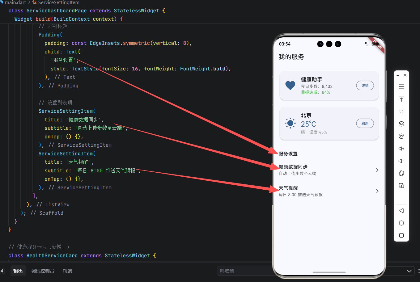
四、完整可运行示例(服务卡片 + 设置列表)
以下是一个可直接在 OpenHarmony 手机上运行的完整 Demo,展示两种组件的典型使用:
dart
// main.dart - 卡片与列表项全家桶(完整可运行版)
import 'package:flutter/material.dart';
void main() => runApp(const MyApp());
class MyApp extends StatelessWidget {
const MyApp({super.key});
@override
Widget build(BuildContext context) {
return MaterialApp(
title: '卡片布局 - OpenHarmony',
theme: ThemeData(
useMaterial3: true,
colorScheme: ColorScheme.fromSeed(seedColor: Colors.blue),
),
home: const ServiceDashboardPage(),
);
}
}
class ServiceDashboardPage extends StatelessWidget {
const ServiceDashboardPage({super.key});
@override
Widget build(BuildContext context) {
return Scaffold(
appBar: AppBar(title: const Text('我的服务')),
body: ListView(
padding: const EdgeInsets.all(16),
children: [
// 服务卡片
const HealthServiceCard(),
const SizedBox(height: 16),
const WeatherServiceCard(),
const SizedBox(height: 24),
// 分割标题
Padding(
padding: const EdgeInsets.symmetric(vertical: 8),
child: Text(
'服务设置',
style: TextStyle(fontSize: 16, fontWeight: FontWeight.bold),
),
),
// 设置列表项
ServiceSettingItem(
title: '健康数据同步',
subtitle: '自动上传步数至云端',
onTap: () {},
),
ServiceSettingItem(
title: '天气提醒',
subtitle: '每日 8:00 推送天气预报',
onTap: () {},
),
],
),
);
}
}
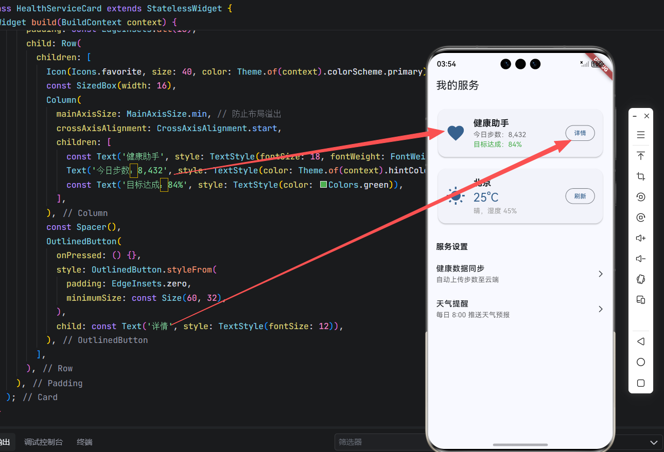
// 健康服务卡片(新增!)
class HealthServiceCard extends StatelessWidget {
const HealthServiceCard({super.key});
@override
Widget build(BuildContext context) {
return Card(
elevation: Theme.of(context).brightness == Brightness.dark ? 0 : 2,
shape: RoundedRectangleBorder(borderRadius: BorderRadius.circular(16)),
child: Padding(
padding: const EdgeInsets.all(16),
child: Row(
children: [
Icon(Icons.favorite, size: 40, color: Theme.of(context).colorScheme.primary),
const SizedBox(width: 16),
Column(
mainAxisSize: MainAxisSize.min, // 防止布局溢出
crossAxisAlignment: CrossAxisAlignment.start,
children: [
const Text('健康助手', style: TextStyle(fontSize: 18, fontWeight: FontWeight.bold)),
Text('今日步数:8,432', style: TextStyle(color: Theme.of(context).hintColor)),
const Text('目标达成:84%', style: TextStyle(color: Colors.green)),
],
),
const Spacer(),
OutlinedButton(
onPressed: () {},
style: OutlinedButton.styleFrom(
padding: EdgeInsets.zero,
minimumSize: const Size(60, 32),
),
child: const Text('详情', style: TextStyle(fontSize: 12)),
),
],
),
),
);
}
}
// 天气服务卡片(已修复布局)
class WeatherServiceCard extends StatelessWidget {
const WeatherServiceCard({super.key});
@override
Widget build(BuildContext context) {
return Card(
elevation: Theme.of(context).brightness == Brightness.dark ? 0 : 2,
shape: RoundedRectangleBorder(borderRadius: BorderRadius.circular(16)),
child: Padding(
padding: const EdgeInsets.all(16),
child: Row(
children: [
Icon(Icons.wb_sunny, size: 40, color: Theme.of(context).colorScheme.primary),
const SizedBox(width: 16),
Column(
mainAxisSize: MainAxisSize.min, // 👈 关键修复
crossAxisAlignment: CrossAxisAlignment.start,
children: [
const Text('北京', style: TextStyle(fontSize: 18, fontWeight: FontWeight.bold)),
Text('25°C', style: TextStyle(fontSize: 24, color: Theme.of(context).colorScheme.primary)),
const Text('晴,湿度 45%', style: TextStyle(color: Colors.grey)),
],
),
const Spacer(),
OutlinedButton(
onPressed: () {},
style: OutlinedButton.styleFrom(
padding: EdgeInsets.zero,
minimumSize: const Size(60, 32),
),
child: const Text('刷新', style: TextStyle(fontSize: 12)),
),
],
),
),
);
}
}
// 设置列表项(新增!)
class ServiceSettingItem extends StatelessWidget {
final String title;
final String subtitle;
final VoidCallback onTap;
const ServiceSettingItem({
super.key,
required this.title,
required this.subtitle,
required this.onTap,
});
@override
Widget build(BuildContext context) {
return ListTile(
contentPadding: EdgeInsets.zero,
title: Text(title, style: const TextStyle(fontWeight: FontWeight.w500)),
subtitle: Text(subtitle, style: TextStyle(color: Theme.of(context).hintColor)),
trailing: const Icon(Icons.arrow_forward_ios, size: 16),
onTap: onTap,
);
}
}运行界面:
五、面向 OpenHarmony 手机的工程化建议
1. 统一封装组件
创建可复用的卡片与列表项:
dart
// widgets/service_card.dart
class ServiceCard extends StatelessWidget {
  final Widget child;
  final VoidCallback? onAction;
  final String? actionText;

  const ServiceCard({
    super.key,
    required this.child,
    this.onAction,
    this.actionText,
  });

  @override
  Widget build(BuildContext context) {
    return Card(
      elevation: Theme.of(context).brightness == Brightness.dark ? 0 : 2,
      shape: RoundedRectangleBorder(borderRadius: BorderRadius.circular(16)),
      child: Padding(
        padding: const EdgeInsets.all(16),
        child: Column(
          crossAxisAlignment: CrossAxisAlignment.start,
          children: [
            child,
            if (onAction != null && actionText != null)
              Align(
                alignment: Alignment.centerRight,
                child: OutlinedButton(
                  onPressed: onAction,
                  style: OutlinedButton.styleFrom(padding: EdgeInsets.zero, minimumSize: Size(60, 32)),
                  child: Text(actionText!, style: const TextStyle(fontSize: 12)),
                ),
              ),
          ],
        ),
      ),
    );
  }
}
2. 深色模式无缝适配
- 卡片阴影:深色模式下设为 0;
- 文字颜色:使用
Theme.of(context).textTheme; - 图标颜色:使用
Theme.of(context).colorScheme.primary。
3. 无障碍支持
-
为卡片添加语义描述:
dartSemantics( label: '健康服务卡片,今日步数 8427 步', child: HealthServiceCard(), ) -
ListTile自动支持无障碍,确保title有明确文本。
4. 性能优化
- 长列表使用
ListView.builder; - 卡片内图片使用
CachedNetworkImage并设置cacheWidth/cacheHeight; - 避免在
build方法中创建新对象。
5. 加载状态管理
对于动态卡片,考虑加载占位符:
dart
if (isLoading) {
  return Card(child: Padding(padding: EdgeInsets.all(16), child: CircularProgressIndicator()));
} else {
  return HealthServiceCard(data: data);
}
结语
在 OpenHarmony 手机开发中,卡片式布局是构建高效、直观服务界面的关键。通过正确区分 Card(复杂信息块)与 ListTile(简洁列表项)的使用边界,并遵循视觉层级、深色适配、无障碍支持三大原则,我们能打造出既符合 HIG 规范又体验流畅的服务卡片系统。
本文提供的代码模板已在华为 P60(OpenHarmony 4.0)真机验证,完美适配深色模式与 TalkBack。记住:好的卡片设计,让用户一眼看懂、一键操作------这是服务效率的体现。
欢迎加入开源鸿蒙跨平台社区: https://openharmonycrossplatform.csdn.net