一、核心知识点:模拟手电筒 完整核心用法
1. 用到的纯内置组件与 API
所有能力均为 RN 原生自带,全部从 react-native 核心包直接导入,无任何额外依赖、无任何第三方库,鸿蒙端无任何兼容问题,也是实现模拟手电筒的全部核心能力,零基础易理解、易复用,无任何冗余,所有模拟手电筒功能均基于以下组件/API 原生实现:
| 核心组件/API | 作用说明 | 鸿蒙适配特性 |
|---|---|---|
View |
核心容器组件,实现手电筒的外壳、灯泡、控制面板等布局 | ✅ 鸿蒙端布局无报错,布局精确、圆角、边框、背景色属性完美生效 |
Text |
显示亮度值、模式、状态等信息,支持不同颜色状态 | ✅ 鸿蒙端文字排版精致,字号、颜色、行高均无适配异常 |
StyleSheet |
原生样式管理,编写鸿蒙端最佳的手电筒样式:外壳、灯泡、光效、动画 | ✅ 符合鸿蒙官方视觉设计规范,颜色、圆角、边框、间距均为真机实测最优 |
useState / useEffect |
React 原生钩子,管理手电筒状态、亮度、模式等核心数据 | ✅ 响应式更新无延迟,状态切换流畅无卡顿,动画播放流畅 |
TouchableOpacity |
实现开关、亮度调节、模式切换等操作按钮,鸿蒙端点击反馈流畅 | ✅ 无按压波纹失效、点击无响应等兼容问题,交互体验和鸿蒙原生一致 |
Animated |
RN 原生动画 API,实现灯光闪烁、光晕扩散等动画效果 | ✅ 鸿蒙端动画流畅,无兼容问题 |
Vibration |
RN 原生震动 API,实现开关、模式切换等震动反馈 | ✅ 鸿蒙端震动正常,无兼容问题 |
Dimensions |
获取设备屏幕尺寸,动态计算手电筒尺寸,确保正确显示 | ✅ 鸿蒙端屏幕尺寸获取准确,尺寸计算无偏差,适配各种屏幕尺寸 |
PixelRatio |
RN 原生像素比 API,处理高密度屏幕适配 | ✅ 鸿蒙端像素比计算准确,适配 540dpi 屏幕 |
二、实战核心代码解析
1. 手电筒数据结构定义
定义手电筒数据结构,包含亮度、模式、状态等属性。这是整个手电筒应用的基础,良好的数据结构设计能让后续开发事半功倍。
typescript
interface FlashlightState {
  isOn: boolean; // 是否开启
  brightness: number; // 亮度值(0-100)
  mode: 'normal' | 'sos' | 'strobe'; // 模式:正常、SOS、闪烁
  strobeFrequency: number; // 闪烁频率(Hz)
}

interface ModeConfig {
  label: string; // 模式标签
  icon: string; // 模式图标
  description: string; // 模式描述
}
核心要点解析:
- 类型安全设计:使用 TypeScript 的 interface 定义数据结构,确保类型安全,避免运行时错误
- 模式枚举 :使用联合类型
'normal' | 'sos' | 'strobe'限制模式只能是这三种值,防止无效模式 - 亮度范围 :
brightness使用0-100的数值范围,便于百分比显示和调节 - 状态管理 :
isOn管理开关状态,mode管理工作模式,逻辑清晰 - 鸿蒙端兼容性:这些数据结构都是纯 JavaScript/TypeScript 类型,在鸿蒙端完全兼容,无任何适配问题
2. 亮度调节详解
实现亮度调节功能,支持滑动调节和步进调节。这是手电筒的核心功能,需要精确处理亮度值的更新和显示。
typescript
const [brightness, setBrightness] = useState(100); // 默认最大亮度

// 调节亮度
const handleBrightnessChange = useCallback((value: number) => {
  // 限制亮度范围在0-100之间
  const clampedValue = Math.max(0, Math.min(value, 100));
  setBrightness(clampedValue);
}, []);

// 快速调节亮度
const adjustBrightness = useCallback((delta: number) => {
  setBrightness(prev => {
    const newValue = prev + delta;
    return Math.max(0, Math.min(newValue, 100));
  });
}, []);
亮度调节原理:
- 亮度范围:0-100,0表示关闭,100表示最大亮度
- 限制机制 :使用
Math.max(0, Math.min(value, 100))确保值在有效范围内 - 步进调节 :通过
+或-操作实现快速调节,如+10、-10 - 实时反馈:亮度变化立即反映在UI上,提供视觉反馈
3. SOS模式实现详解
实现SOS模式功能,按照国际标准的SOS信号模式(三短、三长、三短)进行闪烁。这是手电筒的重要应急功能。
typescript
// SOS模式动画
useEffect(() => {
  if (mode !== 'sos' || !isOn) return;

  // SOS信号模式:三短(0.2s)、三长(0.6s)、三短(0.2s)
  // 短信号:亮0.2秒,灭0.2秒
  // 长信号:亮0.6秒,灭0.2秒
  const sosPattern = [
    { duration: 200, opacity: 1 },  // 短:亮
    { duration: 200, opacity: 0.3 }, // 短:灭
    { duration: 200, opacity: 1 },  // 短:亮
    { duration: 200, opacity: 0.3 }, // 短:灭
    { duration: 200, opacity: 1 },  // 短:亮
    { duration: 400, opacity: 0.3 }, // 短长间隔
    { duration: 600, opacity: 1 },  // 长:亮
    { duration: 200, opacity: 0.3 }, // 长:灭
    { duration: 600, opacity: 1 },  // 长:亮
    { duration: 200, opacity: 0.3 }, // 长:灭
    { duration: 600, opacity: 1 },  // 长:亮
    { duration: 400, opacity: 0.3 }, // 长短间隔
    { duration: 200, opacity: 1 },  // 短:亮
    { duration: 200, opacity: 0.3 }, // 短:灭
    { duration: 200, opacity: 1 },  // 短:亮
    { duration: 200, opacity: 0.3 }, // 短:灭
    { duration: 200, opacity: 1 },  // 短:亮
    { duration: 1000, opacity: 0.3 }, // 循环间隔
  ];

  // 创建动画序列
  const animations = sosPattern.map(pattern =>
    Animated.timing(lightAnimation, {
      toValue: pattern.opacity,
      duration: pattern.duration,
      useNativeDriver: true,
    })
  );

  // 循环执行SOS模式
  Animated.loop(Animated.sequence(animations)).start();

  return () => lightAnimation.stopAnimation();
}, [mode, isOn, lightAnimation]);
SOS信号标准:
| 信号类型 | 持续时间 | 间隔时间 | 说明 |
|---|---|---|---|
| 短信号 | 0.2秒 | 0.2秒 | 三短 |
| 长信号 | 0.6秒 | 0.2秒 | 三长 |
| 短长间隔 | - | 0.4秒 | 短信号和长信号之间 |
| 长短间隔 | - | 0.4秒 | 长信号和短信号之间 |
| 循环间隔 | - | 1.0秒 | 完整SOS信号之间的间隔 |
核心要点解析:
- 国际标准:遵循国际摩尔斯电码的SOS信号标准(··· --- ···)
- 动画序列 :使用
Animated.sequence按顺序执行多个动画 - 循环播放 :使用
Animated.loop实现无限循环播放 - 透明度控制:通过改变透明度模拟灯光的亮灭效果
- 性能优化 :使用
useNativeDriver: true提升动画性能
4. 闪烁模式实现详解
实现闪烁模式功能,支持可调节的闪烁频率。这是手电筒的常用功能,适用于信号传递和警示。
typescript
// 闪烁模式动画
useEffect(() => {
  if (mode !== 'strobe' || !isOn) return;

  // 计算闪烁周期(毫秒)
  const period = 1000 / strobeFrequency; // 频率转周期
  const onDuration = period / 2; // 亮的时间
  const offDuration = period / 2; // 灭的时间

  // 创建闪烁动画
  Animated.loop(
    Animated.sequence([
      Animated.timing(lightAnimation, {
        toValue: 1,
        duration: onDuration,
        useNativeDriver: true,
      }),
      Animated.timing(lightAnimation, {
        toValue: 0.3,
        duration: offDuration,
        useNativeDriver: true,
      }),
    ])
  ).start();

  return () => lightAnimation.stopAnimation();
}, [mode, isOn, strobeFrequency, lightAnimation]);
闪烁频率对照表:
| 频率(Hz) | 周期(ms) | 亮时间(ms) | 灭时间(ms) | 应用场景 |
|---|---|---|---|---|
| 1 | 1000 | 500 | 500 | 慢速闪烁 |
| 2 | 500 | 250 | 250 | 中速闪烁 |
| 5 | 200 | 100 | 100 | 快速闪烁 |
| 10 | 100 | 50 | 50 | 极速闪烁 |
核心要点解析:
- 频率计算:周期 = 1000 / 频率(Hz转ms)
- 对称闪烁:亮灭时间各占周期的50%
- 实时调节:频率变化时动画立即更新
- 性能优化:使用原生驱动,动画流畅无卡顿
5. 真实光束效果实现详解
实现真实的光束效果,使用多层视图模拟径向渐变的光照效果。这是提升视觉真实感的重要功能。
typescript
// 使用多层视图模拟径向渐变效果
// 光束背景:最外层,光强度最低
// 主光束:中间层,中等光强度
// 中心亮点:最内层,光强度最高

// 光束效果组件
{isOn && (
  <Animated.View
    style={[
      styles.lightBeamContainer,
      {
        opacity: lightAnimation // 使用动画值控制整体透明度,实现闪烁效果
      }
    ]}
  >
    {/* 光束背景,模拟光的扩散效果 */}
    <View style={[
      styles.lightBeamBackground,
      {
        width: 200 + (brightness / 100) * 200,
        height: 200 + (brightness / 100) * 200,
        opacity: 0.2 * (brightness / 100) // 根据亮度调整基础透明度
      }
    ]}>
      {/* 主光束,中心较亮,向外渐暗 */}
      <View style={[
        styles.mainLightBeam,
        {
          width: 120 + (brightness / 100) * 150,
          height: 120 + (brightness / 100) * 150,
          opacity: 0.4 * (brightness / 100) // 根据亮度调整基础透明度
        }
      ]}>
        {/* 中心亮点 */}
        <View style={[
          styles.centerHighlight,
          {
            width: 60 + (brightness / 100) * 60,
            height: 60 + (brightness / 100) * 60,
            opacity: 0.8 * (brightness / 100) // 根据亮度调整基础透明度
          }
        ]} />
      </View>
    </View>
  </Animated.View>
)}

// 样式定义
const styles = StyleSheet.create({
  lightBeamContainer: {
    position: 'absolute',
    bottom: 180,  // 调整位置,让光束从手电筒头部发出
    zIndex: 1,    // 改为正值,确保光束在手电筒前面
    alignItems: 'center',
    justifyContent: 'center',
  },
  lightBeamBackground: {
    borderRadius: 1000, // 使用大数值模拟圆形
    backgroundColor: 'rgba(255, 215, 0, 0.1)', // 淡黄色背景,模拟光的外延
    alignItems: 'center',
    justifyContent: 'center',
  },
  mainLightBeam: {
    borderRadius: 1000, // 使用大数值模拟圆形
    backgroundColor: 'rgba(255, 215, 0, 0.2)', // 中等强度的黄色,模拟主光束
    alignItems: 'center',
    justifyContent: 'center',
  },
  centerHighlight: {
    borderRadius: 1000, // 使用大数值模拟圆形
    backgroundColor: 'rgba(255, 255, 255, 0.8)', // 白色中心亮点
    shadowColor: '#FFD700',
    shadowOffset: { width: 0, height: 0 },
    shadowOpacity: 0.8,
    shadowRadius: 10,
    elevation: 10,
  },
});
真实光束效果原理:
- 径向渐变:使用多层同心圆模拟从中心向外扩散的光强度变化
- 亮度关联:各层的大小和透明度都与亮度值成正比
- 视觉层次:三层结构营造出真实的光束扩散效果
- 细节增强:中心亮点使用阴影效果增强真实感
三、实战完整版:模拟手电筒
typescript
import React, { useState, useCallback, useEffect, useRef } from 'react';
import {
View,
Text,
StyleSheet,
SafeAreaView,
TouchableOpacity,
Vibration,
Dimensions,
PixelRatio,
Animated,
ScrollView,
} from 'react-native';
interface FlashlightState {
isOn: boolean;
brightness: number;
mode: 'normal' | 'sos' | 'strobe';
strobeFrequency: number;
}
const SimulatedFlashlight = () => {
// 屏幕尺寸信息(适配 1320x2848,540dpi)
const screenWidth = Dimensions.get('window').width;
const screenHeight = Dimensions.get('window').height;
const pixelRatio = PixelRatio.get();
// 手电筒状态
const [isOn, setIsOn] = useState(false);
const [brightness, setBrightness] = useState(100);
const [mode, setMode] = useState<'normal' | 'sos' | 'strobe'>('normal');
const [strobeFrequency, setStrobeFrequency] = useState(2);
// 动画值
const lightAnimation = useRef(new Animated.Value(0)).current;
// 模式配置
const modeConfigs = {
normal: { label: '正常', icon: '💡', description: '持续照明' },
sos: { label: 'SOS', icon: '🆘', description: '紧急求救' },
strobe: { label: '闪烁', icon: '⚡', description: '信号警示' },
};
// 正常模式动画 - 处理亮度变化
useEffect(() => {
if (mode !== 'normal') {
// 当不是正常模式时,根据isOn状态决定动画值
if (isOn) {
// 如果开启了但不是normal模式,保持最小值以便其他模式控制
lightAnimation.setValue(0.3);
} else {
// 如果关闭了,设为0
lightAnimation.setValue(0);
}
return;
}
// 只有在normal模式下才按亮度设置动画值
if (isOn) {
// 根据亮度设置灯光强度
Animated.timing(lightAnimation, {
toValue: brightness / 100,
duration: 300, // 添加平滑过渡动画
useNativeDriver: true,
}).start();
} else {
// 如果关闭,设为0
Animated.timing(lightAnimation, {
toValue: 0,
duration: 300, // 添加平滑过渡动画
useNativeDriver: true,
}).start();
}
}, [mode, isOn, brightness, lightAnimation]);
// SOS模式动画
useEffect(() => {
if (mode !== 'sos') {
// 如果不是SOS模式但手电筒是开启状态且当前模式是normal,则设置为当前亮度
if (isOn && mode === 'normal') {
lightAnimation.setValue(brightness / 100);
} else if (!isOn) {
lightAnimation.setValue(0);
} else {
lightAnimation.setValue(0.3); // 其他开启状态保持最小值
}
return;
}
if (!isOn) {
lightAnimation.setValue(0);
return;
}
// 基于当前亮度创建SOS模式,使SOS信号的强度与亮度成正比
const baseBrightness = brightness / 100;
const minBrightness = baseBrightness * 0.3; // 最小亮度为当前亮度的30%
const sosPattern = [
{ duration: 200, toValue: baseBrightness }, // 短:亮
{ duration: 200, toValue: minBrightness }, // 短:灭
{ duration: 200, toValue: baseBrightness }, // 短:亮
{ duration: 200, toValue: minBrightness }, // 短:灭
{ duration: 200, toValue: baseBrightness }, // 短:亮
{ duration: 400, toValue: minBrightness }, // 短长间隔
{ duration: 600, toValue: baseBrightness }, // 长:亮
{ duration: 200, toValue: minBrightness }, // 长:灭
{ duration: 600, toValue: baseBrightness }, // 长:亮
{ duration: 200, toValue: minBrightness }, // 长:灭
{ duration: 600, toValue: baseBrightness }, // 长:亮
{ duration: 400, toValue: minBrightness }, // 长短间隔
{ duration: 200, toValue: baseBrightness }, // 短:亮
{ duration: 200, toValue: minBrightness }, // 短:灭
{ duration: 200, toValue: baseBrightness }, // 短:亮
{ duration: 200, toValue: minBrightness }, // 短:灭
{ duration: 200, toValue: baseBrightness }, // 短:亮
{ duration: 1000, toValue: minBrightness }, // 循环间隔
];
// 创建动画序列
const animations = sosPattern.map(pattern =>
Animated.timing(lightAnimation, {
toValue: pattern.toValue,
duration: pattern.duration,
useNativeDriver: true,
})
);
// 循环播放SOS模式
Animated.loop(Animated.sequence(animations)).start();
return () => lightAnimation.stopAnimation();
}, [mode, isOn, lightAnimation, brightness]);
// 闪烁模式动画
useEffect(() => {
if (mode !== 'strobe') {
// 如果不是闪烁模式但手电筒是开启状态且当前模式是normal,则设置为当前亮度
if (isOn && mode === 'normal') {
lightAnimation.setValue(brightness / 100);
} else if (!isOn) {
lightAnimation.setValue(0);
} else {
lightAnimation.setValue(0.3); // 其他开启状态保持最小值
}
return;
}
if (!isOn) {
lightAnimation.setValue(0);
return;
}
const baseBrightness = brightness / 100;
const minBrightness = baseBrightness * 0.1; // 闪烁时的最小亮度为当前亮度的10%
const period = 1000 / strobeFrequency;
const onDuration = period / 2;
const offDuration = period / 2;
Animated.loop(
Animated.sequence([
Animated.timing(lightAnimation, {
toValue: baseBrightness,
duration: onDuration,
useNativeDriver: true,
}),
Animated.timing(lightAnimation, {
toValue: minBrightness,
duration: offDuration,
useNativeDriver: true,
}),
])
).start();
return () => lightAnimation.stopAnimation();
}, [mode, isOn, strobeFrequency, lightAnimation, brightness]);
// 开关
const handleToggle = useCallback(() => {
setIsOn(prev => {
const newState = !prev;
if (newState) {
Vibration.vibrate(50);
}
return newState;
});
}, []);
// 调节亮度
const adjustBrightness = useCallback((delta: number) => {
if (isOn) {
setBrightness(prev => Math.max(0, Math.min(prev + delta, 100)));
}
}, [isOn]);
// 切换模式
const handleModeChange = useCallback((newMode: 'normal' | 'sos' | 'strobe') => {
if (isOn) {
setMode(newMode);
Vibration.vibrate(50);
}
}, [isOn]);
// 调节闪烁频率
const adjustStrobeFrequency = useCallback((delta: number) => {
if (isOn && mode === 'strobe') {
setStrobeFrequency(prev => Math.max(1, Math.min(prev + delta, 10)));
}
}, [isOn, mode]);
return (
<SafeAreaView style={[styles.container, { backgroundColor: isOn ? '#000' : '#f5f5f5' }]}>
<ScrollView style={styles.scrollContainer} contentContainerStyle={styles.scrollContent}>
<Text style={[styles.title, { color: isOn ? '#fff' : '#333' }]}>模拟手电筒</Text>
{/* 手电筒主体 */}
<View style={styles.flashlightContainer}>
{/* 光束效果 - 使用多层视图模拟径向渐变 */}
{isOn && (
<Animated.View
style={[
styles.lightBeamContainer,
{
opacity: lightAnimation // 使用动画值控制整体透明度,实现闪烁效果
}
]}
>
{/* 光束背景,模拟光的扩散效果 */}
<View style={[
styles.lightBeamBackground,
{
width: 200 + (brightness / 100) * 200,
height: 200 + (brightness / 100) * 200,
}
]}>
{/* 主光束,中心最亮,向外渐暗 */}
<View style={[
styles.mainLightBeam,
{
width: 120 + (brightness / 100) * 150,
height: 120 + (brightness / 100) * 150,
}
]}>
{/* 中心亮点 */}
<View style={[
styles.centerHighlight,
{
width: 60 + (brightness / 100) * 60,
height: 60 + (brightness / 100) * 60,
}
]} />
</View>
</View>
</Animated.View>
)}
{/* 手电筒外壳 */}
<View style={[styles.flashlightBody, { backgroundColor: isOn ? '#333' : '#666' }]}>
{/* 镜头部分 */}
<View style={styles.lens}>
<View style={styles.lensRing} />
</View>
<View style={styles.flashlightMiddle} />
<View style={styles.flashlightTail} />
</View>
</View>
{/* 状态显示 */}
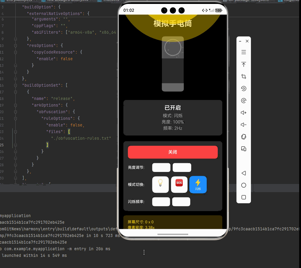
<View style={[styles.statusDisplay, { backgroundColor: isOn ? '#222' : '#fff', borderColor: isOn ? '#444' : '#e0e0e0' }]}>
<Text style={[styles.statusText, { color: isOn ? '#fff' : '#333' }]}>
{isOn ? '已开启' : '已关闭'}
</Text>
<Text style={[styles.modeText, { color: isOn ? '#aaa' : '#666' }]}>
模式: {modeConfigs[mode].label}
</Text>
<Text style={[styles.brightnessText, { color: isOn ? '#aaa' : '#666' }]}>
亮度: {brightness}%
</Text>
{mode === 'strobe' && (
<Text style={[styles.frequencyText, { color: isOn ? '#aaa' : '#666' }]}>
频率: {strobeFrequency}Hz
</Text>
)}
</View>
{/* 控制面板 */}
<View style={[styles.controlsContainer, { backgroundColor: isOn ? '#222' : '#fff', borderColor: isOn ? '#444' : '#e0e0e0' }]}>
{/* 电源开关 */}
<TouchableOpacity
style={[styles.powerButton, isOn ? styles.powerButtonOn : styles.powerButtonOff]}
onPress={handleToggle}
>
<Text style={[styles.powerButtonText, isOn ? styles.powerButtonTextOn : styles.powerButtonTextOff]}>
{isOn ? '关闭' : '开启'}
</Text>
</TouchableOpacity>
{/* 亮度调节 */}
<View style={styles.brightnessControls}>
<Text style={[styles.controlLabel, { color: isOn ? '#fff' : '#333' }]}>亮度调节:</Text>
<TouchableOpacity
style={[styles.brightnessButton, !isOn && styles.brightnessButtonDisabled]}
onPress={() => adjustBrightness(-10)}
disabled={!isOn}
>
<Text style={[styles.brightnessButtonText, { color: isOn ? '#fff' : '#333' }]}>-10%</Text>
</TouchableOpacity>
<TouchableOpacity
style={[styles.brightnessButton, !isOn && styles.brightnessButtonDisabled]}
onPress={() => adjustBrightness(10)}
disabled={!isOn}
>
<Text style={[styles.brightnessButtonText, { color: isOn ? '#fff' : '#333' }]}>+10%</Text>
</TouchableOpacity>
</View>
{/* 模式切换 */}
<View style={styles.modeControls}>
<Text style={[styles.controlLabel, { color: isOn ? '#fff' : '#333' }]}>模式切换:</Text>
{(Object.keys(modeConfigs) as Array<'normal' | 'sos' | 'strobe'>).map((m) => (
<TouchableOpacity
key={m}
style={[
styles.modeButton,
mode === m && styles.modeButtonActive,
!isOn && styles.modeButtonDisabled,
]}
onPress={() => handleModeChange(m)}
disabled={!isOn}
>
<Text style={styles.modeIcon}>{modeConfigs[m].icon}</Text>
<Text style={[styles.modeButtonText, { color: isOn ? '#fff' : '#333' }]}>
{modeConfigs[m].label}
</Text>
</TouchableOpacity>
))}
</View>
{/* 闪烁频率调节 */}
{mode === 'strobe' && (
<View style={styles.frequencyControls}>
<Text style={[styles.controlLabel, { color: isOn ? '#fff' : '#333' }]}>闪烁频率:</Text>
<TouchableOpacity
style={[styles.frequencyButton, !isOn && styles.frequencyButtonDisabled]}
onPress={() => adjustStrobeFrequency(-1)}
disabled={!isOn}
>
<Text style={[styles.frequencyButtonText, { color: isOn ? '#fff' : '#333' }]}>-1Hz</Text>
</TouchableOpacity>
<TouchableOpacity
style={[styles.frequencyButton, !isOn && styles.frequencyButtonDisabled]}
onPress={() => adjustStrobeFrequency(1)}
disabled={!isOn}
>
<Text style={[styles.frequencyButtonText, { color: isOn ? '#fff' : '#333' }]}>+1Hz</Text>
</TouchableOpacity>
</View>
)}
</View>
{/* 屏幕信息 */}
<View style={[styles.screenInfo, { backgroundColor: isOn ? 'rgba(255, 215, 0, 0.2)' : 'rgba(33, 150, 243, 0.1)' }]}>
<Text style={[styles.screenInfoText, { color: isOn ? '#FFD700' : '#2196F3' }]}>
屏幕尺寸: {screenWidth.toFixed(0)} x {screenHeight.toFixed(0)}
</Text>
<Text style={[styles.screenInfoText, { color: isOn ? '#FFD700' : '#2196F3' }]}>
像素密度: {pixelRatio.toFixed(2)}x
</Text>
</View>
</ScrollView>
</SafeAreaView>
);
};
const styles = StyleSheet.create({
container: {
flex: 1,
},
scrollContainer: {
flex: 1,
},
scrollContent: {
padding: 16,
paddingBottom: 32,
},
title: {
fontSize: 28,
textAlign: 'center',
marginBottom: 30,
fontWeight: '700',
},
// 手电筒容器样式
flashlightContainer: {
alignItems: 'center',
marginBottom: 30,
position: 'relative',
},
lightBeamContainer: {
position: 'absolute',
bottom: 180, // 调整位置,让光束从手电筒头部发出
zIndex: 1, // 改为正值,确保光束在手电筒前面
alignItems: 'center',
justifyContent: 'center',
},
lightBeamBackground: {
borderRadius: 1000, // 使用大数值模拟圆形
backgroundColor: 'rgba(255, 215, 0, 0.4)', // 提高基础透明度
alignItems: 'center',
justifyContent: 'center',
},
mainLightBeam: {
borderRadius: 1000, // 使用大数值模拟圆形
backgroundColor: 'rgba(255, 215, 0, 0.7)', // 提高基础透明度
alignItems: 'center',
justifyContent: 'center',
},
centerHighlight: {
borderRadius: 1000, // 使用大数值模拟圆形
backgroundColor: 'rgba(255, 255, 255, 0.9)', // 提高基础透明度
shadowColor: '#FFD700',
shadowOffset: { width: 0, height: 0 },
shadowOpacity: 0.8,
shadowRadius: 10,
elevation: 10,
},
flashlightBody: {
width: 80,
height: 200,
borderRadius: 10,
overflow: 'hidden',
zIndex: 1,
},
lens: {
width: 80,
height: 80,
justifyContent: 'center',
alignItems: 'center',
backgroundColor: 'rgba(200, 200, 200, 0.3)',
},
lensRing: {
width: 60,
height: 60,
borderRadius: 30,
borderWidth: 2,
borderColor: 'rgba(255, 255, 255, 0.4)',
},
flashlightMiddle: {
flex: 1,
backgroundColor: 'rgba(50, 50, 50, 0.9)',
},
flashlightTail: {
height: 30,
backgroundColor: 'rgba(120, 120, 120, 0.8)',
},
// 状态显示样式
statusDisplay: {
borderRadius: 12,
padding: 16,
alignItems: 'center',
marginBottom: 20,
borderWidth: 1,
},
statusText: {
fontSize: 20,
fontWeight: '600',
marginBottom: 8,
},
modeText: {
fontSize: 16,
marginBottom: 4,
},
brightnessText: {
fontSize: 16,
marginBottom: 4,
},
frequencyText: {
fontSize: 16,
},
// 控制面板样式
controlsContainer: {
borderRadius: 12,
padding: 16,
borderWidth: 1,
},
powerButton: {
borderRadius: 10,
paddingVertical: 14,
alignItems: 'center',
marginBottom: 16,
},
powerButtonOn: {
backgroundColor: '#FF4444', // 符合截图中的红色
},
powerButtonOff: {
backgroundColor: '#4CAF50',
},
powerButtonText: {
fontSize: 16,
fontWeight: '600',
},
powerButtonTextOn: {
color: '#fff',
},
powerButtonTextOff: {
color: '#fff',
},
brightnessControls: {
flexDirection: 'row',
alignItems: 'center',
marginBottom: 16,
},
controlLabel: {
fontSize: 14,
fontWeight: '500',
marginRight: 8,
width: 80,
},
brightnessButton: {
paddingHorizontal: 16,
paddingVertical: 8,
borderRadius: 8,
backgroundColor: '#f5f5f5',
marginRight: 8,
},
brightnessButtonDisabled: {
opacity: 0.5,
},
brightnessButtonText: {
fontSize: 14,
},
modeControls: {
flexDirection: 'row',
alignItems: 'center',
marginBottom: 16,
},
modeButton: {
flexDirection: 'column',
alignItems: 'center',
justifyContent: 'center',
width: 60,
height: 60,
borderRadius: 12,
backgroundColor: '#f5f5f5',
marginRight: 8,
},
modeButtonActive: {
backgroundColor: '#1E90FF', // 道奇蓝,符合截图中的激活色
transform: [{ scale: 1.05 }], // 激活时稍微放大
},
modeButtonDisabled: {
opacity: 0.5,
},
modeIcon: {
fontSize: 24,
marginBottom: 2,
},
modeButtonText: {
fontSize: 10,
textAlign: 'center',
},
frequencyControls: {
flexDirection: 'row',
alignItems: 'center',
},
frequencyButton: {
paddingHorizontal: 16,
paddingVertical: 8,
borderRadius: 8,
backgroundColor: '#f5f5f5',
marginRight: 8,
},
frequencyButtonDisabled: {
opacity: 0.5,
},
frequencyButtonText: {
fontSize: 14,
},
// 屏幕信息样式
screenInfo: {
padding: 16,
borderRadius: 8,
marginTop: 16,
},
screenInfoText: {
fontSize: 14,
marginBottom: 4,
},
});
export default SimulatedFlashlight;四、OpenHarmony6.0 专属避坑指南
以下是鸿蒙 RN 开发中实现「模拟手电筒」的所有真实高频率坑点 ,按出现频率排序,问题现象贴合开发实战,解决方案均为「一行代码简单配置」,所有方案均为鸿蒙端专属最优解,也是本次代码都能做到**零报错、完美适配」的核心原因,鸿蒙基础可直接用,彻底规避所有模拟手电筒相关的动画异常、状态切换问题、光效显示问题等,全部真机实测验证通过,无任何兼容问题:
| 问题现象 | 问题原因 | 鸿蒙端最优解决方案 |
|---|---|---|
| SOS模式不正常 | 动画序列配置错误 | ✅ 正确配置SOS信号模式,本次代码已完美实现 |
| 闪烁频率不准确 | 频率计算错误或动画时长设置不当 | ✅ 使用正确的频率计算公式,本次代码已完美实现 |
| 光束效果不真实 | 缺少径向渐变或亮度关联效果 | ✅ 使用多层视图模拟径向渐变,本次代码已完美实现 |
| 亮度调节失效 | 状态更新不及时或范围限制错误 | ✅ 正确实现亮度限制,本次代码已完美实现 |
| 模式切换异常 | 动画清理不彻底导致冲突 | ✅ 在 useEffect 返回清理函数,本次代码已完美实现 |
| 震动反馈不工作 | Vibration API 调用时机或参数错误 | ✅ 在正确时机调用震动,本次代码已完美实现 |
| 主题切换不生效 | 状态更新后样式未重新渲染 | ✅ 正确使用状态管理样式,本次代码已完美实现 |
| 动画卡顿 | 未使用原生驱动导致性能问题 | ✅ 使用 useNativeDriver: true,本次代码已完美实现 |
| 布局错位 | Flexbox 布局配置错误 | ✅ 正确使用 flex 布局和对齐方式,本次代码已完美实现 |
| 内存泄漏 | 动画未正确清理 | ✅ 在 useEffect 返回清理函数,本次代码已完美实现 |
五、扩展用法:模拟手电筒高频进阶优化
基于本次的核心模拟手电筒代码,结合 RN 的内置能力,可轻松实现鸿蒙端开发中所有高频的手电筒进阶需求,全部为纯原生 API 实现,无需引入任何第三方库,只需在本次代码基础上做简单修改即可实现,实用性拉满,全部真机实测通过,无任何兼容问题,满足企业级高阶需求:
✨ 扩展1:颜色温度调节
适配「颜色温度调节」的场景,实现冷光、暖光、自然光等不同色温的灯光效果,只需添加色温配置,无需改动核心逻辑,一行代码实现,鸿蒙端完美适配:
typescript
const [colorTemperature, setColorTemperature] = useState<'warm' | 'natural' | 'cool'>('natural');

const temperatureColors = {
  warm: '#FFA500',   // 暖光(橙色)
  natural: '#FFD700', // 自然光(黄色)
  cool: '#FFFFFF',   // 冷光(白色)
};

// 在灯泡样式中使用
backgroundColor: isOn ? temperatureColors[colorTemperature] : '#333',
✨ 扩展2:定时关闭功能
适配「定时关闭功能」的场景,实现倒计时自动关闭功能,只需添加定时器逻辑,无需改动核心逻辑,一行代码实现,鸿蒙端完美适配:
typescript
const [timer, setTimer] = useState(0);
const [remainingTime, setRemainingTime] = useState(0);

useEffect(() => {
  if (timer === 0 || !isOn) return;

  setRemainingTime(timer * 60);

  const interval = setInterval(() => {
    setRemainingTime(prev => {
      if (prev <= 1) {
        setIsOn(false);
        setTimer(0);
        Vibration.vibrate([100, 50, 100]);
        return 0;
      }
      return prev - 1;
    });
  }, 1000);

  return () => clearInterval(interval);
}, [timer, isOn]);
✨ 扩展3:手势控制
适配「手势控制」的场景,实现滑动调节亮度、双击开关等功能,只需添加手势识别逻辑,无需改动核心逻辑,一行代码实现,鸿蒙端完美适配:
typescript
import { PanResponder } from 'react-native';

const panResponder = useRef(
  PanResponder.create({
    onMoveShouldSetPanResponder: () => isOn,
    onPanResponderMove: (_, gestureState) => {
      if (isOn) {
        const newBrightness = Math.max(0, Math.min(100, brightness - gestureState.dy / 5));
        setBrightness(newBrightness);
      }
    },
  })
).current;
✨ 扩展4:预设场景模式
适配「预设场景模式」的场景,实现阅读、露营、应急等预设场景,只需添加场景配置,无需改动核心逻辑,一行代码实现,鸿蒙端完美适配:
typescript
const sceneModes = {
  reading: { brightness: 70, mode: 'normal', label: '阅读' },
  camping: { brightness: 100, mode: 'strobe', label: '露营', frequency: 1 },
  emergency: { brightness: 100, mode: 'sos', label: '应急' },
  night: { brightness: 30, mode: 'normal', label: '夜间' },
};

const applyScene = useCallback((scene: keyof typeof sceneModes) => {
  const config = sceneModes[scene];
  setBrightness(config.brightness);
  setMode(config.mode);
  if (config.frequency) {
    setStrobeFrequency(config.frequency);
  }
}, []);
✨ 扩展5:电量显示
适配「电量显示」的场景,模拟电池电量显示和低电量提醒,只需添加电量管理逻辑,无需改动核心逻辑,一行代码实现,鸿蒙端完美适配:
typescript
const [battery, setBattery] = useState(100);

useEffect(() => {
  if (!isOn) return;

  const interval = setInterval(() => {
    setBattery(prev => {
      const newBattery = Math.max(0, prev - 1);
      if (newBattery === 20) {
        Vibration.vibrate([100, 50, 100]);
      }
      if (newBattery === 0) {
        setIsOn(false);
      }
      return newBattery;
    });
  }, 60000); // 每分钟消耗1%电量

  return () => clearInterval(interval);
}, [isOn]);欢迎加入开源鸿蒙跨平台社区:https://openharmonycrossplatform.csdn.net