欢迎加入开源鸿蒙跨平台社区:https://openharmonycrossplatform.csdn.net
📋 前言
Switch 开关是移动应用中常见的二选一交互组件,用于开启或关闭某个功能、设置选项等。react-native-switch 是一个简单易用的开关组件库,提供丰富的样式配置和交互效果,完全支持鸿蒙系统。使用 react-native-switch 可以快速构建美观的开关控件,大大提升开发效率。
🎯 库简介
基本信息
- 库名称: react-native-switch
- 当前版本: 1.5.1
- 官方仓库: https://github.com/react-native-community/react-native-switch
- 主要功能 :
- 提供简洁易用的开关组件
- 支持自定义颜色和尺寸
- 支持禁用状态
- 完全兼容 Android、iOS 和 HarmonyOS
为什么需要这个库?
- 零配置: 纯 JavaScript 实现,无需原生配置
- 轻量级: 代码简洁,体积小
- 易用性: API 简单直观,开箱即用
- 跨平台: 在三端提供一致的体验
- 灵活性: 支持自定义样式和颜色
📦 安装步骤
1. 使用 npm 安装
在项目根目录执行以下命令:
bash
npm install react-native-switch@1.5.12. 验证安装
安装完成后,检查 package.json 文件,应该能看到新增的依赖:
json
{
  "dependencies": {
    "react-native-switch": "^1.5.1",
    // ... 其他依赖
  }
}
🔧 HarmonyOS 平台配置
react-native-switch 是纯 JavaScript 组件,无需任何原生配置。
配置说明
- ✅ 无需 Manual Link: 不需要手动链接原生代码
- ✅ 无需 CMakeLists 配置: 不需要修改 CMakeLists.txt
- ✅ 无需 PackageProvider 配置: 不需要修改 PackageProvider.cpp
- ✅ 无需 ArkTs 配置: 不需要修改任何 ArkTs 文件
- ✅ 即装即用: 安装后直接 import 使用
💻 完整代码示例
下面是一个完整的示例,展示了 react-native-switch 的各种使用场景:
typescript
import React, { useState } from 'react';
import {
View,
Text,
StyleSheet,
ScrollView,
SafeAreaView,
} from 'react-native';
import {Switch} from 'react-native-switch';
function SwitchLibraryScreen() {
const [isEnabled1, setIsEnabled1] = useState(false);
const [isEnabled2, setIsEnabled2] = useState(true);
const [isEnabled3, setIsEnabled3] = useState(false);
const [isEnabled4, setIsEnabled4] = useState(false);
const [isDisabled, setIsDisabled] = useState(false);
const toggleSwitch1 = () => setIsEnabled1(previousState => !previousState);
const toggleSwitch2 = () => setIsEnabled2(previousState => !previousState);
const toggleSwitch3 = () => setIsEnabled3(previousState => !previousState);
const toggleSwitch4 = () => setIsEnabled4(previousState => !previousState);
const toggleDisabled = () => setIsDisabled(previousState => !previousState);
return (
<SafeAreaView style={styles.container}>
<ScrollView style={styles.scrollView}>
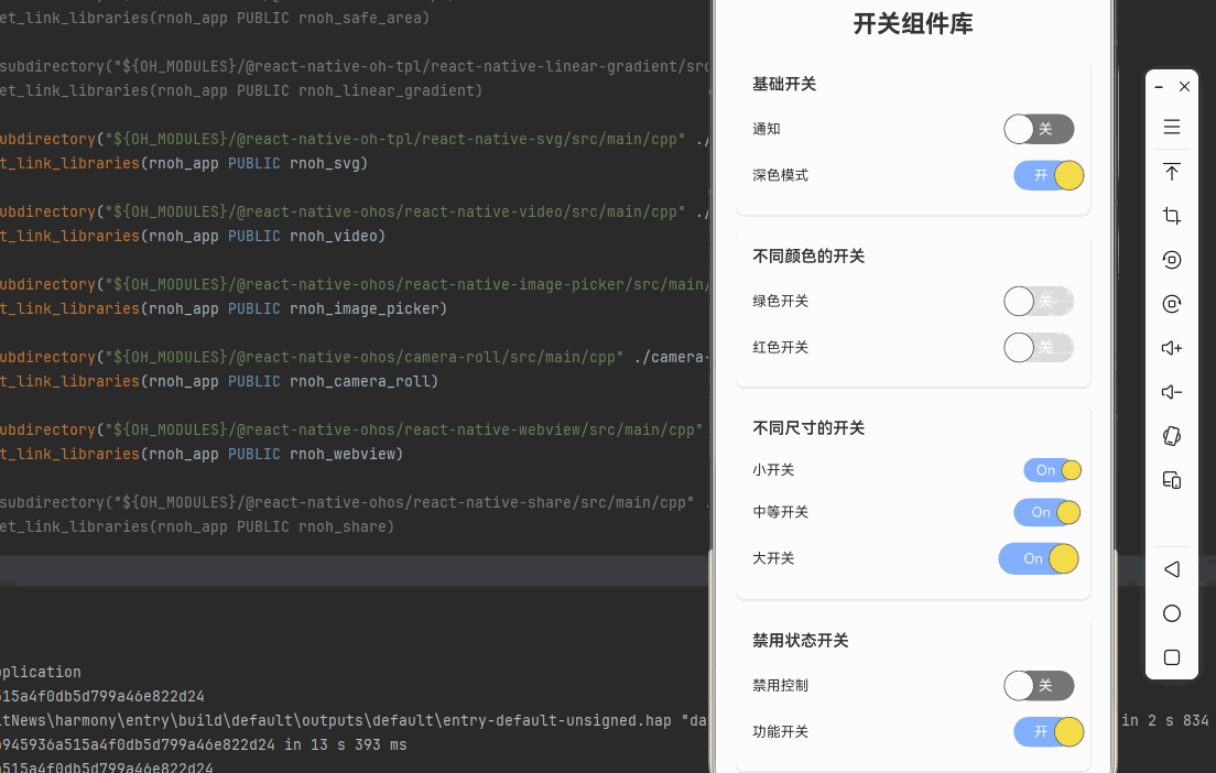
<Text style={styles.pageTitle}>开关组件库</Text>
{/* 基础开关 */}
<View style={styles.section}>
<Text style={styles.sectionTitle}>基础开关</Text>
<View style={styles.row}>
<Text style={styles.label}>通知</Text>
<Switch
value={isEnabled1}
onValueChange={toggleSwitch1}
activeText={'开'}
inActiveText={'关'}
backgroundActive={'#81b0ff'}
backgroundInactive={'#767577'}
circleActiveColor={'#f5dd4b'}
circleInActiveColor={'#f4f3f4'}
renderActiveText={true}
renderInActiveText={true}
/>
</View>
<View style={styles.row}>
<Text style={styles.label}>深色模式</Text>
<Switch
value={isEnabled2}
onValueChange={toggleSwitch2}
activeText={'开'}
inActiveText={'关'}
backgroundActive={'#81b0ff'}
backgroundInactive={'#767577'}
circleActiveColor={'#f5dd4b'}
circleInActiveColor={'#f4f3f4'}
renderActiveText={true}
renderInActiveText={true}
/>
</View>
</View>
{/* 不同颜色的开关 */}
<View style={styles.section}>
<Text style={styles.sectionTitle}>不同颜色的开关</Text>
<View style={styles.row}>
<Text style={styles.label}>绿色开关</Text>
<Switch
value={isEnabled3}
onValueChange={toggleSwitch3}
activeText={'开'}
inActiveText={'关'}
backgroundActive={'#4caf50'}
backgroundInactive={'#e0e0e0'}
circleActiveColor={'#81c784'}
circleInActiveColor={'#f4f3f4'}
renderActiveText={true}
renderInActiveText={true}
/>
</View>
<View style={styles.row}>
<Text style={styles.label}>红色开关</Text>
<Switch
value={isEnabled4}
onValueChange={toggleSwitch4}
activeText={'开'}
inActiveText={'关'}
backgroundActive={'#f44336'}
backgroundInactive={'#e0e0e0'}
circleActiveColor={'#e57373'}
circleInActiveColor={'#f4f3f4'}
renderActiveText={true}
renderInActiveText={true}
/>
</View>
</View>
{/* 不同尺寸的开关 */}
<View style={styles.section}>
<Text style={styles.sectionTitle}>不同尺寸的开关</Text>
<View style={styles.row}>
<Text style={styles.label}>小开关</Text>
<Switch
value={true}
onValueChange={() => {}}
circleSize={20}
barHeight={24}
switchWidthMultiplier={2.5}
backgroundActive={'#81b0ff'}
backgroundInactive={'#767577'}
circleActiveColor={'#f5dd4b'}
circleInActiveColor={'#f4f3f4'}
/>
</View>
<View style={styles.row}>
<Text style={styles.label}>中等开关</Text>
<Switch
value={true}
onValueChange={() => {}}
circleSize={24}
barHeight={28}
switchWidthMultiplier={2.5}
backgroundActive={'#81b0ff'}
backgroundInactive={'#767577'}
circleActiveColor={'#f5dd4b'}
circleInActiveColor={'#f4f3f4'}
/>
</View>
<View style={styles.row}>
<Text style={styles.label}>大开关</Text>
<Switch
value={true}
onValueChange={() => {}}
circleSize={30}
barHeight={32}
switchWidthMultiplier={2.5}
backgroundActive={'#81b0ff'}
backgroundInactive={'#767577'}
circleActiveColor={'#f5dd4b'}
circleInActiveColor={'#f4f3f4'}
/>
</View>
</View>
{/* 禁用状态开关 */}
<View style={styles.section}>
<Text style={styles.sectionTitle}>禁用状态开关</Text>
<View style={styles.row}>
<Text style={styles.label}>禁用控制</Text>
<Switch
value={isDisabled}
onValueChange={toggleDisabled}
activeText={'开'}
inActiveText={'关'}
backgroundActive={'#81b0ff'}
backgroundInactive={'#767577'}
circleActiveColor={'#f5dd4b'}
circleInActiveColor={'#f4f3f4'}
renderActiveText={true}
renderInActiveText={true}
/>
</View>
<View style={styles.row}>
<Text style={styles.label}>功能开关</Text>
<Switch
value={true}
onValueChange={() => {}}
disabled={isDisabled}
activeText={'开'}
inActiveText={'关'}
backgroundActive={'#81b0ff'}
backgroundInactive={'#767577'}
circleActiveColor={'#f5dd4b'}
circleInActiveColor={'#f4f3f4'}
renderActiveText={true}
renderInActiveText={true}
/>
</View>
</View>
{/* 多个开关组合 */}
<View style={styles.section}>
<Text style={styles.sectionTitle}>多个开关组合</Text>
<View style={styles.row}>
<Text style={styles.label}>WiFi</Text>
<Switch
value={true}
onValueChange={() => {}}
activeText={'开'}
inActiveText={'关'}
backgroundActive={'#81b0ff'}
backgroundInactive={'#767577'}
circleActiveColor={'#f5dd4b'}
circleInActiveColor={'#f4f3f4'}
renderActiveText={true}
renderInActiveText={true}
/>
</View>
<View style={styles.row}>
<Text style={styles.label}>蓝牙</Text>
<Switch
value={false}
onValueChange={() => {}}
activeText={'开'}
inActiveText={'关'}
backgroundActive={'#81b0ff'}
backgroundInactive={'#767577'}
circleActiveColor={'#f5dd4b'}
circleInActiveColor={'#f4f3f4'}
renderActiveText={true}
renderInActiveText={true}
/>
</View>
<View style={styles.row}>
<Text style={styles.label}>定位</Text>
<Switch
value={true}
onValueChange={() => {}}
activeText={'开'}
inActiveText={'关'}
backgroundActive={'#81b0ff'}
backgroundInactive={'#767577'}
circleActiveColor={'#f5dd4b'}
circleInActiveColor={'#f4f3f4'}
renderActiveText={true}
renderInActiveText={true}
/>
</View>
<View style={styles.row}>
<Text style={styles.label}>飞行模式</Text>
<Switch
value={false}
onValueChange={() => {}}
activeText={'开'}
inActiveText={'关'}
backgroundActive={'#81b0ff'}
backgroundInactive={'#767577'}
circleActiveColor={'#f5dd4b'}
circleInActiveColor={'#f4f3f4'}
renderActiveText={true}
renderInActiveText={true}
/>
</View>
</View>
{/* 使用说明 */}
<View style={styles.section}>
<Text style={styles.sectionTitle}>使用说明</Text>
<Text style={styles.instructionText}>
1. react-native-switch 是纯 JavaScript 组件,无需原生配置
</Text>
<Text style={styles.instructionText}>
2. 支持 trackColor 属性自定义轨道颜色
</Text>
<Text style={styles.instructionText}>
3. 支持 thumbColor 属性自定义滑块颜色
</Text>
<Text style={styles.instructionText}>
4. 支持 disabled 属性控制开关禁用状态
</Text>
<Text style={styles.instructionText}>
5. 完全兼容鸿蒙系统,跨平台可用
</Text>
</View>
</ScrollView>
</SafeAreaView>
);
}
const styles = StyleSheet.create({
container: {
flex: 1,
backgroundColor: '#f5f5f5',
},
scrollView: {
flex: 1,
padding: 20,
},
pageTitle: {
fontSize: 24,
fontWeight: 'bold',
marginBottom: 20,
textAlign: 'center',
color: '#333',
},
section: {
backgroundColor: '#fff',
borderRadius: 8,
padding: 16,
marginBottom: 16,
shadowColor: '#000',
shadowOffset: { width: 0, height: 1 },
shadowOpacity: 0.1,
shadowRadius: 2,
elevation: 2,
},
sectionTitle: {
fontSize: 16,
fontWeight: '600',
marginBottom: 12,
color: '#333',
},
row: {
flexDirection: 'row',
justifyContent: 'space-between',
alignItems: 'center',
paddingVertical: 8,
},
label: {
fontSize: 14,
color: '#333',
},
instructionText: {
fontSize: 14,
lineHeight: 22,
marginBottom: 6,
color: '#666',
},
});
export default SwitchLibraryScreen;💻 代码讲解
1. 基础开关
typescript
<Switch
  trackColor={{ false: '#767577', true: '#81b0ff' }}
  thumbColor={isEnabled ? '#f5dd4b' : '#f4f3f4'}
  ios_backgroundColor="#3e3e3e"
  onValueChange={toggleSwitch}
  value={isEnabled}
/>
最基础的开关使用方式,通过 value 控制开关状态,onValueChange 处理状态变化。
2. 自定义颜色
typescript
<Switch
  trackColor={{ false: '#e0e0e0', true: '#4caf50' }}
  thumbColor={isEnabled ? '#81c784' : '#f4f3f4'}
/>trackColor: 设置轨道颜色(关闭/开启状态)thumbColor: 设置滑块颜色
3. 不同尺寸
typescript
<Switch
  style={styles.smallSwitch}
  onValueChange={() => {}}
  value={true}
/>
通过 transform 样式实现不同尺寸的开关。
4. 禁用状态
typescript
<Switch
  disabled={isDisabled}
  onValueChange={() => {}}
  value={true}
/>
通过 disabled 属性控制开关禁用状态。
⚠️ 注意事项与最佳实践
1. 颜色配置
- 使用
trackColor设置轨道颜色 - 使用
thumbColor设置滑块颜色 - 使用
ios_backgroundColor设置 iOS 背景色
2. 状态管理
typescript
const [isEnabled, setIsEnabled] = useState(false);
const toggleSwitch = () => setIsEnabled(previousState => !previousState);
推荐使用 useState 管理开关状态。
3. 禁用状态
typescript
<Switch
  disabled={true}
  onValueChange={() => {}}
  value={true}
/>
禁用状态下开关不会响应点击事件。
4. 样式定制
typescript
const styles = StyleSheet.create({
  largeSwitch: {
    transform: [{ scaleX: 1.2 }, { scaleY: 1.2 }],
  },
});
使用 transform 实现尺寸调整。
5. HarmonyOS 兼容性
react-native-switch 是纯 JavaScript 组件,在 HarmonyOS 上完全兼容,无需任何额外配置。
🧪 测试验证
1. Android 平台测试
bash
npm run android测试要点:
- 检查开关点击响应
- 验证颜色显示
- 测试禁用状态
2. iOS 平台测试
bash
npm run ios测试要点:
- 检查开关动画效果
- 验证颜色一致性
- 测试触摸反馈
3. HarmonyOS 平台测试
bash
npm run harmony测试要点:
- 验证开关渲染
- 测试点击响应
- 检查样式应用
📝 总结
通过集成 react-native-switch,我们为项目添加了一个简单易用的开关组件库。这个库提供了丰富的样式配置、禁用状态支持和跨平台的一致性,可以大大提升开发效率。
关键要点回顾
- ✅ 安装依赖 :
npm install react-native-switch@1.5.1 - ✅ 配置平台: 纯 JavaScript 库,无需手动配置
- ✅ 集成代码: 使用 Switch 组件和相关属性
- ✅ 样式定制: 使用 trackColor 和 thumbColor 属性
- ✅ 测试验证: 确保三端表现一致