欢迎加入开源鸿蒙跨平台社区:https://openharmonycrossplatform.csdn.net
📋 前言
FlashMessage 是一个功能强大的消息提示组件,可以显示成功、错误、警告等多种类型的消息。react-native-flash-message 提供了丰富的配置选项、动画效果和图标支持,完全兼容鸿蒙系统。使用 react-native-flash-message 可以快速构建美观的消息提示组件,大大提升开发效率。
🎯 库简介
基本信息
- 库名称: react-native-flash-message
- 当前版本: 0.4.2
- 官方仓库: https://github.com/lucasferreira/react-native-flash-message
- 主要功能 :
- 提供功能丰富的消息组件
- 支持多种消息类型和图标
- 支持自定义样式和动画
- 完全兼容 Android、iOS 和 HarmonyOS
为什么需要这个库?
- 零配置: 纯 JavaScript 实现,无需原生配置
- 功能丰富: 支持多种消息类型和图标
- 易用性: API 简单直观,开箱即用
- 跨平台: 在三端提供一致的体验
- 灵活性: 支持自定义样式和动画
📦 安装步骤
1. 使用 npm 安装
在项目根目录执行以下命令:
bash
npm install react-native-flash-message@0.4.22. 验证安装
安装完成后,检查 package.json 文件,应该能看到新增的依赖:
json
{
  "dependencies": {
    "react-native-flash-message": "^0.4.2",
    // ... 其他依赖
  }
}
🔧 HarmonyOS 平台配置
react-native-flash-message 是纯 JavaScript 组件,无需任何原生配置。
配置说明
- ✅ 无需 Manual Link: 不需要手动链接原生代码
- ✅ 无需 CMakeLists 配置: 不需要修改 CMakeLists.txt
- ✅ 无需 PackageProvider 配置: 不需要修改 PackageProvider.cpp
- ✅ 无需 ArkTs 配置: 不需要修改任何 ArkTs 文件
- ✅ 即装即用: 安装后直接 import 使用
💻 完整代码示例
下面是一个完整的示例,展示了 react-native-flash-message 的各种使用场景:
typescript
import React from 'react';
import {
View,
Text,
StyleSheet,
ScrollView,
SafeAreaView,
TouchableOpacity,
} from 'react-native';
import FlashMessage, { showMessage, hideMessage } from 'react-native-flash-message';
function FlashMessageScreen() {
const showSuccessMessage = () => {
showMessage({
message: '操作成功',
description: '您的操作已完成',
type: 'success',
icon: 'success',
});
};
const showErrorMessage = () => {
showMessage({
message: '操作失败',
description: '请稍后重试',
type: 'danger',
icon: 'danger',
});
};
const showWarningMessage = () => {
showMessage({
message: '警告信息',
description: '请注意操作',
type: 'warning',
icon: 'warning',
});
};
const showInfoMessage = () => {
showMessage({
message: '提示信息',
description: '这是详细信息',
type: 'info',
icon: 'info',
});
};
const showCustomMessage = () => {
showMessage({
message: '自定义消息',
description: '自定义样式的消息',
backgroundColor: '#9c27b0',
color: '#fff',
duration: 3000,
});
};
const showFloatingMessage = () => {
showMessage({
message: '浮动消息',
description: '浮动样式的消息',
floating: true,
position: 'top',
});
};
const hideAllMessages = () => {
hideMessage();
};
return (
<SafeAreaView style={styles.container}>
<ScrollView style={styles.scrollView}>
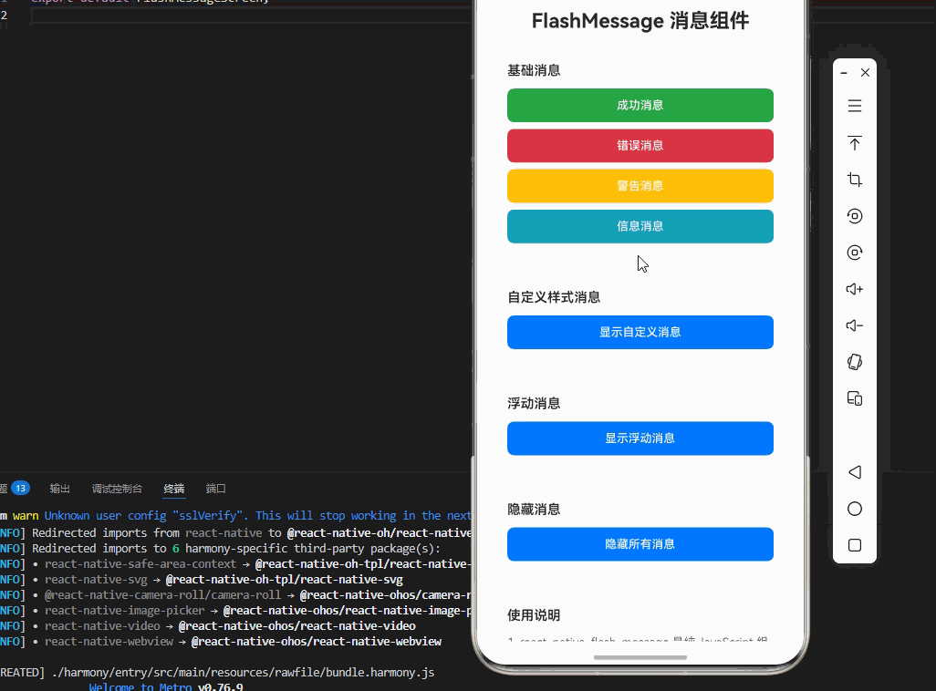
<Text style={styles.pageTitle}>FlashMessage 消息组件</Text>
{/* 基础消息 */}
<View style={styles.section}>
<Text style={styles.sectionTitle}>基础消息</Text>
<TouchableOpacity style={[styles.button, styles.successButton]} onPress={showSuccessMessage}>
<Text style={styles.buttonText}>成功消息</Text>
</TouchableOpacity>
<TouchableOpacity style={[styles.button, styles.errorButton]} onPress={showErrorMessage}>
<Text style={styles.buttonText}>错误消息</Text>
</TouchableOpacity>
<TouchableOpacity style={[styles.button, styles.warningButton]} onPress={showWarningMessage}>
<Text style={styles.buttonText}>警告消息</Text>
</TouchableOpacity>
<TouchableOpacity style={[styles.button, styles.infoButton]} onPress={showInfoMessage}>
<Text style={styles.buttonText}>信息消息</Text>
</TouchableOpacity>
</View>
{/* 自定义样式消息 */}
<View style={styles.section}>
<Text style={styles.sectionTitle}>自定义样式消息</Text>
<TouchableOpacity style={styles.button} onPress={showCustomMessage}>
<Text style={styles.buttonText}>显示自定义消息</Text>
</TouchableOpacity>
</View>
{/* 浮动消息 */}
<View style={styles.section}>
<Text style={styles.sectionTitle}>浮动消息</Text>
<TouchableOpacity style={styles.button} onPress={showFloatingMessage}>
<Text style={styles.buttonText}>显示浮动消息</Text>
</TouchableOpacity>
</View>
{/* 隐藏消息 */}
<View style={styles.section}>
<Text style={styles.sectionTitle}>隐藏消息</Text>
<TouchableOpacity style={styles.button} onPress={hideAllMessages}>
<Text style={styles.buttonText}>隐藏所有消息</Text>
</TouchableOpacity>
</View>
{/* 使用说明 */}
<View style={styles.section}>
<Text style={styles.sectionTitle}>使用说明</Text>
<Text style={styles.instructionText}>
1. react-native-flash-message 是纯 JavaScript 组件,无需原生配置
</Text>
<Text style={styles.instructionText}>
2. 使用 showMessage() 方法显示消息
</Text>
<Text style={styles.instructionText}>
3. 支持多种消息类型:success、danger、warning、info
</Text>
<Text style={styles.instructionText}>
4. 支持自定义样式、图标和动画
</Text>
<Text style={styles.instructionText}>
5. 完全兼容鸿蒙系统,跨平台可用
</Text>
</View>
</ScrollView>
{/* FlashMessage 组件 */}
<FlashMessage position="top" />
</SafeAreaView>
);
}
const styles = StyleSheet.create({
container: {
flex: 1,
backgroundColor: '#f5f5f5',
},
scrollView: {
flex: 1,
padding: 20,
},
pageTitle: {
fontSize: 24,
fontWeight: 'bold',
marginBottom: 20,
textAlign: 'center',
color: '#333',
},
section: {
backgroundColor: '#fff',
borderRadius: 8,
padding: 16,
marginBottom: 16,
shadowColor: '#000',
shadowOffset: { width: 0, height: 1 },
shadowOpacity: 0.1,
shadowRadius: 2,
elevation: 2,
},
sectionTitle: {
fontSize: 16,
fontWeight: '600',
marginBottom: 12,
color: '#333',
},
button: {
backgroundColor: '#007AFF',
borderRadius: 8,
paddingVertical: 12,
paddingHorizontal: 24,
marginBottom: 8,
alignItems: 'center',
},
successButton: {
backgroundColor: '#28a745',
},
errorButton: {
backgroundColor: '#dc3545',
},
warningButton: {
backgroundColor: '#ffc107',
},
infoButton: {
backgroundColor: '#17a2b8',
},
buttonText: {
color: '#fff',
fontSize: 14,
fontWeight: '500',
},
instructionText: {
fontSize: 14,
lineHeight: 22,
marginBottom: 6,
color: '#666',
},
});
export default FlashMessageScreen;💻 代码讲解
1. 基础消息
typescript
showMessage({
  message: '操作成功',
  description: '您的操作已完成',
  type: 'success',
  icon: 'success',
});
使用 showMessage 方法显示消息,支持标题、描述、类型和图标。
2. 不同类型
typescript
showMessage({
  message: '错误信息',
  type: 'danger',
});success: 成功消息(绿色)danger: 错误消息(红色)warning: 警告消息(黄色)info: 信息消息(蓝色)
3. 自定义样式
typescript
showMessage({
  message: '自定义消息',
  backgroundColor: '#9c27b0',
  color: '#fff',
  duration: 3000,
});
可以自定义背景色、文字颜色和显示时长。
4. 浮动消息
typescript
showMessage({
  message: '浮动消息',
  floating: true,
  position: 'top',
});
通过 floating 属性启用浮动样式。
⚠️ 注意事项与最佳实践
1. 组件放置
typescript
<FlashMessage position="top" />将 FlashMessage 组件放在应用的根组件中。
2. 消息类型
- 根据场景选择合适的消息类型
- 保持消息简洁明了
- 避免同时显示多个消息
3. 显示时长
typescript
showMessage({
  message: '提示',
  duration: 3000,
});
合理设置显示时长,默认为 3000ms。
4. 样式定制
typescript
showMessage({
  backgroundColor: '#9c27b0',
  color: '#fff',
});
可以根据品牌颜色自定义样式。
5. HarmonyOS 兼容性
react-native-flash-message 是纯 JavaScript 组件,在 HarmonyOS 上完全兼容,无需任何额外配置。
🧪 测试验证
1. Android 平台测试
bash
npm run android测试要点:
- 检查消息显示和隐藏
- 验证动画效果
- 测试不同类型消息
2. iOS 平台测试
bash
npm run ios测试要点:
- 检查消息样式一致性
- 验证位置显示
- 测试触摸交互
3. HarmonyOS 平台测试
bash
npm run harmony测试要点:
- 验证消息渲染
- 测试显示和隐藏
- 检查样式应用
📝 总结
通过集成 react-native-flash-message,我们为项目添加了一个功能强大的消息提示组件库。这个库提供了丰富的消息类型、图标支持和跨平台的一致性,可以大大提升开发效率。
关键要点回顾
- ✅ 安装依赖 :
npm install react-native-flash-message@0.4.2 - ✅ 配置平台: 纯 JavaScript 库,无需手动配置
- ✅ 集成代码: 使用 showMessage 方法和 FlashMessage 组件
- ✅ 样式定制: 支持自定义样式和图标
- ✅ 测试验证: 确保三端表现一致