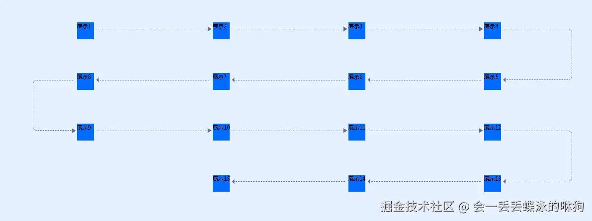
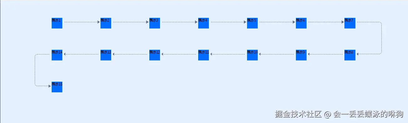
效果展示
使用Sass构建智能流程图式网格布局系统
项目背景
在民宿康养微实训管理平台的学生模块中,我们需要实现一个直观的流程图式界面,用于展示实训任务的执行步骤。传统的CSS布局难以满足这种复杂的连线需求,因此我们设计了一套基于Sass的智能网格布局系统。
核心设计思路
1. 蛇形流动布局
系统采用蛇形流动设计,奇数行从左到右,偶数行从右到左,形成自然的视觉引导路径。
2. 伪元素连线技术
利用CSS伪元素(::before, ::after)动态生成连接线和箭头,避免额外的DOM元素。
3. 数学计算驱动
通过Sass的数学函数和循环,实现布局的自动化计算。
关键技术实现
Sass变量定义
scss
$grid-columns: 4;                    // 网格列数
$max-grid-items: 30;                 // 最大网格项数
$gap-y: 34px;                        // 垂直间距
$line-ab-top: 20px;                  // 连线顶部偏移
智能位置计算
scss
@for $i from 1 through $max-grid-items {
  $row: math.ceil(math.div($i, $grid-columns));           // 计算行号
  $col_in_row: $i - ($row - 1) * $grid-columns;           // 计算列号
  $direction: if($row % 2 == 1, $col_in_row, $grid-columns - $col_in_row + 1); // 蛇形方向
}
四种连线模式处理
1. 单行中间项(水平右向)
scss
// 水平虚线 + 右箭头
&::after { border-top: 1px dashed #626c85; }
&::before { content: $arrow-right-svg; }
2. 双行中间项(水平左向)
scss
// 水平虚线 + 左箭头(反向)
&::after { left: calc((100% - $item-inner-width - $line-gap) * -1); }
&::before { content: $arrow-left-svg; }
3. 单行最右侧(垂直向下转弯)
scss
// 垂直弯曲线 + 下箭头
&::after {
  height: calc(100% + $gap-y);
  border-radius: 0 12px 12px 0;
  border-left: none;
}
4. 双行最左侧(垂直向上转弯)
scss
// 垂直弯曲线 + 上箭头
&::after {
  height: calc(100% + $gap-y);
  border-radius: 12px 0 0 12px;
  border-right: none;
}
技术亮点
1. Data URI图标嵌入
使用Data URI格式嵌入SVG箭头,减少HTTP请求:
scss
$arrow-right-svg: url("data:image/svg+xml;utf8,<svg>...</svg>");2. 响应式计算
所有尺寸都基于变量计算,便于维护和调整:
scss
width: calc(100% - $item-inner-width - ($line-gap * 2));3. 边界条件处理
自动识别首尾项,避免多余的连线:
scss
&:last-of-type::after { content: none; }
&:last-of-type::before { content: none; }
Vue组件集成
模板结构
vue
<template>
  <div class="bg-[#016cff1a] p-20">
    <div class="lk-grid pl-40!">
      <div v-for="item in 15" :key="item" class="grid-item">
        <div class="inner">展示{{ item }}</div>
      </div>
    </div>
  </div>
</template>
样式作用域
使用scoped属性确保样式隔离,避免全局污染。
性能优化考虑
- 伪元素性能:CSS伪元素比额外DOM元素性能更好
- 计算缓存:Sass编译时完成所有计算,运行时无性能开销
- 图标优化:内联SVG避免图标加载延迟
扩展性设计
系统支持通过修改变量轻松调整:
- 修改
$grid-columns改变列数 - 调整
$max-grid-items支持更多步骤 - 更改颜色变量适配不同主题
总结
这套Sass网格布局系统成功解决了复杂流程图的可视化需求,通过数学计算和CSS伪元素的巧妙结合,实现了高度可定制且性能优良的布局方案。该技术方案可以广泛应用于工作流、进度跟踪、步骤引导等场景。
技术栈 :Vue 3 + Sass + CSS Grid + 伪元素技术 适用场景:流程图、工作流、步骤引导、进度展示
完整代码
vue
<style lang="scss" scoped>
@use 'sass:math';
$grid-columns: 7;
$max-grid-items: 30; //线条滚动的个数
$gap-y: 34px;
$line-ab-top: 20px;
// 右箭头:Data URI 格式(直接复制到 content 中使用)
$arrow-right-svg: url("data:image/svg+xml;utf8,<svg viewBox='0 0 24 24' fill='%23626c85' xmlns='http://www.w3.org/2000/svg'><path d='M8 5v14l11-7z'/></svg>");
// 左箭头:Data URI 格式(直接复制到 content 中使用)
$arrow-left-svg: url("data:image/svg+xml;utf8,<svg  viewBox='0 0 24 24' fill='%23626c85' xmlns='http://www.w3.org/2000/svg'><path d='M16 19l-7-7 7-7v14z'/></svg>");
$arrow-width: 24px;
$arrow-height: 24px;

$item-height: 116px;
$item-inner-width: 50px;

// 线段留下的缝隙
$line-gap: 10px;

@mixin grid-container() {
  display: grid;
  grid-template-columns: repeat($grid-columns, 1fr);
  row-gap: $gap-y;
}

@mixin grid-item() {
  height: $item-height;
  width: 100%;
  position: relative;
  // outline: 1px solid #ff0000;
}
@mixin grid-items-layout() {
  // 先线性布局,给每一个item确定位置
  @for $i from 1 through $max-grid-items {
    $row: math.ceil(math.div($i, $grid-columns)); //确定几行
    $col_in_row: $i - ($row - 1) * $grid-columns; //确定在第几行的第几列
    // 使用 % 操作符进行模运算判断奇偶性
    $direction: if($row % 2 == 1, $col_in_row, $grid-columns - $col_in_row + 1); //单数正x,双数反x
    &:nth-child(#{$i}) {
      grid-column: #{$direction};
      grid-row: #{$row};

      // 伪元素,绘制线段箭头
      // 初始化
      &:last-of-type::after {
        content: none;
      }
      &:last-of-type::before {
        content: none;
      }

      // 单行,除了左右侧的
      @if $i % ($grid-columns * 2) > 0 and $i % ($grid-columns * 2) < $grid-columns {
        // 线段
        &::after {
          content: '';
          position: absolute;
          top: $line-ab-top;
          left: calc($item-inner-width + $line-gap);
          display: block;
          width: calc(
            100% - $item-inner-width - ($line-gap * 2)
          ); //占满就是100% - $item-inner-width;但我们左右留个缝隙
          border-top: 1px dashed #626c85;
        }
        // 箭头
        &::before {
          content: $arrow-right-svg;
          position: absolute;
          // top: calc($line-ab-top - ($arrow-height/2));
          // right: calc(10px - ($arrow-width/2));
          top: $line-ab-top;
          right: $line-gap; //留的缝隙
          width: $arrow-width;
          height: $arrow-height;
          transform: translate(50%, -50%);
        }
      }
      // 双行,除了最左侧的
      @if $i % ($grid-columns * 2) > $grid-columns and $i % ($grid-columns * 2) < $grid-columns * 2
      {
        &:after {
          content: '';
          position: absolute;
          top: $line-ab-top;
          left: calc((100% - $item-inner-width - $line-gap) * -1);
          display: block;
          width: calc(
            100% - $item-inner-width - ($line-gap * 2)
          ); //占满就是100% - $item-inner-width;但我们左右留个缝隙
          border-top: 1px dashed #626c85;
        }
        &::before {
          content: $arrow-left-svg;
          position: absolute;
          left: calc(-100% + $line-gap + $item-inner-width);
          top: $line-ab-top;
          width: $arrow-width;
          height: $arrow-height;
          transform: translate(-50%, -50%);
        }
      }
      // 单行最右侧的
      @if $i % ($grid-columns * 2) == $grid-columns {
        &::after {
          content: '';
          position: absolute;
          top: $line-ab-top;
          left: calc($item-inner-width + $line-gap);
          display: block;
          width: 50%; //这个看着改
          height: calc(100% + $gap-y);
          border-radius: 0 12px 12px 0; //弧度看着改
          border: 1px dashed #626c85;
          border-left: none;
        }
        &::before {
          content: $arrow-left-svg;
          position: absolute;
          left: calc($item-inner-width + $line-gap);
          bottom: calc(($gap-y + $line-ab-top) * -1);
          width: $arrow-width;
          height: $arrow-height;
          transform: translate(-50%, 50%);
        }
      }
      // 双行最左侧
      @if $i % ($grid-columns * 2) == 0 {
        $box-width: 30%; //看着改
        &::after {
          content: '';
          position: absolute;
          top: $line-ab-top;
          left: calc(($box-width + $line-gap) * -1);
          display: block;
          width: $box-width; //这个看着改
          height: calc(100% + $gap-y);
          border-radius: 12px 0 0 12px; //弧度看着改
          border: 1px dashed #626c85;
          border-right: none;
        }
        &::before {
          content: $arrow-right-svg;
          position: absolute;
          left: calc($line-gap * -1);
          bottom: calc(($gap-y + $line-ab-top) * -1);
          width: $arrow-width;
          height: $arrow-height;
          transform: translate(-50%, 50%);
        }
      }
    }
  }
}
.lk-grid {
  @include grid-container();
  .grid-item {
    @include grid-item();
    @include grid-items-layout();
    .inner {
      width: $item-inner-width;
      height: 50px;
      background-color: #016cff;
    }
  }
}
</style>
<template>
  <div class="bg-[#016cff1a] p-20">
    <div class="lk-grid pl-40!">
      <div v-for="item in 15" :key="item" class="grid-item">
        <div class="inner">展示{{ item }}</div>
      </div>
    </div>
  </div>
</template>