HarmonyOS实战:React Native实现Popover内容自适应

🌸你好呀!我是 lbb小魔仙
🌟 感谢陪伴~ 小白博主在线求友
🌿 跟着小白学Linux/Java/Python
📖 专栏汇总:
《Linux》专栏 | 《Java》专栏 | 《Python》专栏

- [HarmonyOS实战:React Native实现Popover内容自适应](#HarmonyOS实战:React Native实现Popover内容自适应)
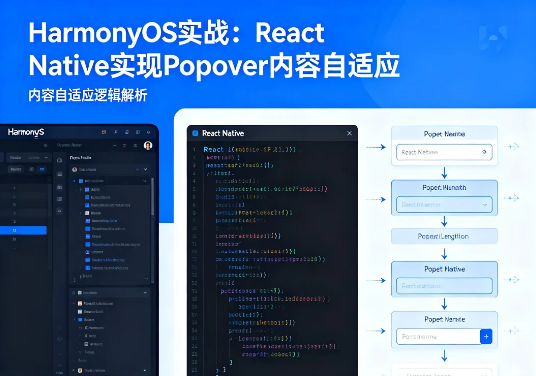
概述
Popover组件的内容大小通常是不固定的,根据展示内容的不同,Popover的尺寸需要动态调整。实现内容自适应能够让Popover更好地适应各种使用场景,提供更好的用户体验。
在OpenHarmony 6.0.0平台上,由于布局计算的差异,Popover内容自适应需要特别处理尺寸测量和边界检测。本文将深入讲解如何实现一个内容自适应的Popover组件。
自适应原理
尺寸计算流程
内容尺寸自适应流程:

初始状态
    │
    ▼
设置固定宽度或最大宽度
    │
    ▼
渲染内容获取实际高度 (onLayout)
    │
    ▼
根据内容高度调整Popover位置
    │
    ▼
边界检测确保不超出屏幕
    │
    ▼
应用最终尺寸和位置
尺寸策略
| 策略 | 宽度 | 高度 | 适用场景 |
|---|---|---|---|
| fixed | 固定值 | 固定值 | 内容固定 |
| width-fixed | 固定值 | 自适应 | 宽度固定内容变化 |
| max-constrained | 最大值 | 自适应 | 防止过宽 |
| full-auto | 自适应 | 自适应 | 完全自定义 |
核心实现
动态尺寸测量
typescript
const [popoverSize, setPopoverSize] = useState({ width: 0, height: 0 });

const handleLayout = (event: LayoutChangeEvent) => {
  const { width, height } = event.nativeEvent.layout;
  setPopoverSize({ width, height });
  // 根据实际尺寸重新计算位置
};
位置重新计算
typescript
useEffect(() => {
  if (popoverSize.width > 0 && popoverSize.height > 0) {
    // 根据实际内容尺寸调整位置
    recalculatePosition(popoverSize);
  }
}, [popoverSize]);
完整实现代码
typescript
/**
 * HarmonyOS实战:Popover内容自适应
 *
 * @platform OpenHarmony 6.0.0 (API 20)
 * @react-native 0.72.5
 * @typescript 4.8.4
 */

import React, { useState, useRef, useEffect } from 'react';
import {
  View,
  Text,
  StyleSheet,
  TouchableOpacity,
  Modal,
  Dimensions,
  TextInput,
} from 'react-native';

interface AdaptivePopoverProps {
  visible: boolean;
  anchor: JSX.Element;
  children: React.ReactNode;
  onClose: () => void;
  maxWidth?: number;
}

interface AdaptivePopoverDemoProps {
  onBack: () => void;
}

// 自适应内容的Popover组件
const AdaptivePopover: React.FC<AdaptivePopoverProps> = ({
  visible,
  anchor,
  children,
  onClose,
  maxWidth = 280,
}) => {
  const [position, setPosition] = useState({ x: 0, y: 0 });
  const [contentSize, setContentSize] = useState({ width: 0, height: 0 });
  const anchorRef = useRef<View>(null);
  const contentRef = useRef<View>(null);

  // 测量内容尺寸
  const handleContentLayout = (event: any) => {
    const { width, height } = event.nativeEvent.layout;
    setContentSize({ width, height });
  };

  // 计算位置
  useEffect(() => {
    if (visible && anchorRef.current) {
      anchorRef.current.measureInWindow((x, y, anchorWidth, anchorHeight) => {
        const { width: screenWidth, height: screenHeight } = Dimensions.get('window');
        const offset = 8;

        // 初始位置(下方居中)
        let posX = x + anchorWidth / 2 - maxWidth / 2;
        let posY = y + anchorHeight + offset;

        // 根据实际内容尺寸调整位置
        if (contentSize.width > 0 && contentSize.height > 0) {
          posX = x + anchorWidth / 2 - contentSize.width / 2;
        }

        // 边界检测
        const actualWidth = contentSize.width || maxWidth;
        const actualHeight = contentSize.height || 150;
        const safeAreaTop = 50;
        const safeAreaBottom = 34;

        posX = Math.max(16, Math.min(posX, screenWidth - actualWidth - 16));
        posY = Math.max(safeAreaTop + 16, Math.min(posY, screenHeight - actualHeight - safeAreaBottom - 16));

        setPosition({ x: posX, y: posY });
      });
    }
  }, [visible, contentSize, maxWidth]);

  return (
    <View style={styles.anchorWrapper}>
      <View ref={anchorRef}>{anchor}</View>
      <Modal
        visible={visible}
        transparent
        animationType="fade"
        onRequestClose={onClose}
      >
        <TouchableOpacity style={styles.modalOverlay} onPress={onClose} activeOpacity={1}>
          <TouchableOpacity
            style={[
              styles.popoverBox,
              {
                left: position.x,
                top: position.y,
                maxWidth: maxWidth,
              },
            ]}
            activeOpacity={1}
          >
            <View ref={contentRef} onLayout={handleContentLayout}>
              {children}
            </View>
          </TouchableOpacity>
        </TouchableOpacity>
      </Modal>
    </View>
  );
};

// 演示页面
const AdaptivePopoverDemoScreen: React.FC<AdaptivePopoverDemoProps> = ({ onBack }) => {
  const [visible1, setVisible1] = useState(false);
  const [visible2, setVisible2] = useState(false);
  const [visible3, setVisible3] = useState(false);
  const [inputText, setInputText] = useState('');

  return (
    <View style={styles.container}>
      {/* 顶部导航栏 */}
      <View style={styles.navigationBar}>
        <TouchableOpacity onPress={onBack} style={styles.backBtn}>
          <Text style={styles.backText}>← 返回</Text>
        </TouchableOpacity>
        <View style={styles.titleWrapper}>
          <Text style={styles.mainTitle}>Popover内容自适应</Text>
          <Text style={styles.subTitle}>动态调整内容尺寸</Text>
        </View>
      </View>

      {/* 平台信息 */}
      <View style={styles.versionBanner}>
        <Text style={styles.versionText}>OpenHarmony 6.0.0 | API 20</Text>
      </View>

      {/* 功能介绍 */}
      <View style={styles.introCard}>
        <Text style={styles.introTitle}>内容自适应Popover</Text>
        <Text style={styles.introDesc}>
          Popover根据内容动态调整尺寸,确保完整显示所有信息
        </Text>
      </View>

      {/* 演示区域 */}
      <View style={styles.demoSection}>
        <Text style={styles.demoTitle}>不同内容长度演示</Text>

        <View style={styles.demoGrid}>
          {/* 短内容 */}
          <AdaptivePopover
            visible={visible1}
            anchor={
              <TouchableOpacity
                style={[styles.demoButton, { backgroundColor: '#3b82f6' }]}
                onPress={() => setVisible1(true)}
              >
                <Text style={styles.demoButtonText}>短内容</Text>
              </TouchableOpacity>
            }
            onClose={() => setVisible1(false)}
          >
            <View style={styles.popoverContent}>
              <Text style={styles.popoverText}>这是一段简短的提示信息</Text>
            </View>
          </AdaptivePopover>

          {/* 中等长度 */}
          <AdaptivePopover
            visible={visible2}
            anchor={
              <TouchableOpacity
                style={[styles.demoButton, { backgroundColor: '#10b981' }]}
                onPress={() => setVisible2(true)}
              >
                <Text style={styles.demoButtonText}>中等内容</Text>
              </TouchableOpacity>
            }
            onClose={() => setVisible2(false)}
          >
            <View style={styles.popoverContent}>
              <Text style={styles.popoverTitle}>操作选项</Text>
              <TouchableOpacity style={styles.popoverItem}>
                <Text style={styles.popoverItemText}>📄 新建文档</Text>
              </TouchableOpacity>
              <TouchableOpacity style={styles.popoverItem}>
                <Text style={styles.popoverItemText}>📁 打开文件夹</Text>
              </TouchableOpacity>
              <TouchableOpacity style={styles.popoverItem}>
                <Text style={styles.popoverItemText}>💾 保存文件</Text>
              </TouchableOpacity>
            </View>
          </AdaptivePopover>
        </View>

        {/* 动态输入内容 */}
        <View style={styles.inputDemo}>
          <Text style={styles.inputLabel}>动态内容演示:</Text>
          <TextInput
            style={styles.textInput}
            placeholder="输入内容..."
            value={inputText}
            onChangeText={setInputText}
            multiline
          />
          <AdaptivePopover
            visible={visible3}
            maxWidth={320}
            anchor={
              <TouchableOpacity
                style={styles.triggerButton}
                onPress={() => setVisible3(true)}
              >
                <Text style={styles.triggerButtonText}>显示Popover</Text>
              </TouchableOpacity>
            }
            onClose={() => setVisible3(false)}
          >
            <View style={styles.popoverContent}>
              <Text style={styles.popoverTitle}>动态内容</Text>
              <Text style={styles.popoverText}>
                {inputText || '请在上方的输入框中输入内容,然后点击按钮查看效果'}
              </Text>
            </View>
          </AdaptivePopover>
        </View>
      </View>

      {/* 技术要点 */}
      <View style={styles.techCard}>
        <Text style={styles.cardTitle}>核心技术</Text>
        <View style={styles.techList}>
          <View style={styles.techItem}>
            <Text style={styles.techIcon}>📏</Text>
            <View style={styles.techContent}>
              <Text style={styles.techTitle}>onLayout监听</Text>
              <Text style={styles.techDesc}>获取内容实际渲染尺寸</Text>
            </View>
          </View>
          <View style={styles.techItem}>
            <Text style={styles.techIcon}>🔄</Text>
            <View style={styles.techContent}>
              <Text style={styles.techTitle}>动态位置计算</Text>
              <Text style={styles.techDesc}>根据尺寸调整弹出位置</Text>
            </View>
          </View>
          <View style={styles.techItem}>
            <Text style={styles.techIcon}>✓</Text>
            <View style={styles.techContent}>
              <Text style={styles.techTitle}>边界约束</Text>
              <Text style={styles.techDesc}>确保不超出可视区域</Text>
            </View>
          </View>
        </View>
      </View>

      {/* 适配要点 */}
      <View style={styles.adaptCard}>
        <Text style={styles.adaptTitle}>OpenHarmony适配要点</Text>
        <View style={styles.adaptList}>
          <Text style={styles.adaptItem}>• 使用onLayout获取实际尺寸</Text>
          <Text style={styles.adaptItem}>• 设置maxWidth防止过宽</Text>
          <Text style={styles.adaptItem}>• 内容变化时重新计算位置</Text>
          <Text style={styles.adaptItem}>• 测试长文本和特殊字符</Text>
        </View>
      </View>
    </View>
  );
};

const styles = StyleSheet.create({
  container: {
    flex: 1,
    backgroundColor: '#f8f9fa',
  },
  navigationBar: {
    flexDirection: 'row',
    alignItems: 'center',
    paddingHorizontal: 16,
    paddingVertical: 12,
    backgroundColor: '#8b5cf6',
    paddingTop: 50,
  },
  backBtn: {
    padding: 8,
  },
  backText: {
    fontSize: 16,
    color: '#fff',
    fontWeight: '600',
  },
  titleWrapper: {
    flex: 1,
    marginLeft: 8,
  },
  mainTitle: {
    fontSize: 20,
    fontWeight: 'bold',
    color: '#fff',
  },
  subTitle: {
    fontSize: 12,
    color: 'rgba(255, 255, 255, 0.85)',
    marginTop: 2,
  },
  versionBanner: {
    backgroundColor: '#ede9fe',
    paddingHorizontal: 16,
    paddingVertical: 8,
  },
  versionText: {
    fontSize: 12,
    color: '#6d28d9',
    textAlign: 'center',
  },
  introCard: {
    margin: 16,
    padding: 16,
    backgroundColor: '#fff',
    borderRadius: 12,
  },
  introTitle: {
    fontSize: 18,
    fontWeight: 'bold',
    color: '#334155',
    marginBottom: 8,
  },
  introDesc: {
    fontSize: 14,
    color: '#64748b',
  },
  demoSection: {
    padding: 16,
  },
  demoTitle: {
    fontSize: 16,
    fontWeight: 'bold',
    color: '#334155',
    marginBottom: 16,
  },
  demoGrid: {
    flexDirection: 'row',
    gap: 12,
    marginBottom: 24,
  },
  demoButton: {
    paddingHorizontal: 20,
    paddingVertical: 14,
    borderRadius: 10,
    minWidth: 110,
    alignItems: 'center',
    shadowColor: '#000',
    shadowOffset: { width: 0, height: 2 },
    shadowOpacity: 0.15,
    shadowRadius: 4,
    elevation: 3,
  },
  demoButtonText: {
    color: '#fff',
    fontSize: 14,
    fontWeight: '600',
  },
  inputDemo: {
    backgroundColor: '#fff',
    padding: 16,
    borderRadius: 12,
  },
  inputLabel: {
    fontSize: 14,
    color: '#64748b',
    marginBottom: 10,
  },
  textInput: {
    backgroundColor: '#f1f5f9',
    borderRadius: 8,
    padding: 12,
    fontSize: 14,
    color: '#334155',
    minHeight: 80,
    marginBottom: 12,
    textAlignVertical: 'top',
  },
  triggerButton: {
    backgroundColor: '#8b5cf6',
    paddingVertical: 12,
    borderRadius: 8,
    alignItems: 'center',
  },
  triggerButtonText: {
    color: '#fff',
    fontSize: 15,
    fontWeight: '600',
  },
  anchorWrapper: {
    position: 'relative',
  },
  modalOverlay: {
    flex: 1,
    backgroundColor: 'rgba(0, 0, 0, 0.3)',
  },
  popoverBox: {
    position: 'absolute',
    backgroundColor: '#fff',
    borderRadius: 12,
    shadowColor: '#000',
    shadowOffset: { width: 0, height: 4 },
    shadowOpacity: 0.2,
    shadowRadius: 8,
    elevation: 8,
  },
  popoverContent: {
    padding: 16,
  },
  popoverTitle: {
    fontSize: 15,
    fontWeight: 'bold',
    color: '#334155',
    marginBottom: 12,
  },
  popoverText: {
    fontSize: 14,
    color: '#64748b',
    lineHeight: 20,
  },
  popoverItem: {
    paddingVertical: 10,
    paddingHorizontal: 12,
    borderRadius: 6,
  },
  popoverItemText: {
    fontSize: 15,
    color: '#334155',
  },
  techCard: {
    backgroundColor: '#fff',
    margin: 16,
    padding: 16,
    borderRadius: 12,
  },
  cardTitle: {
    fontSize: 16,
    fontWeight: 'bold',
    color: '#334155',
    marginBottom: 12,
  },
  techList: {
    gap: 12,
  },
  techItem: {
    flexDirection: 'row',
    alignItems: 'flex-start',
  },
  techIcon: {
    fontSize: 24,
    marginRight: 12,
  },
  techContent: {
    flex: 1,
  },
  techTitle: {
    fontSize: 14,
    fontWeight: '600',
    color: '#334155',
    marginBottom: 4,
  },
  techDesc: {
    fontSize: 12,
    color: '#64748b',
    lineHeight: 18,
  },
  adaptCard: {
    backgroundColor: '#f3e8ff',
    margin: 16,
    marginBottom: 32,
    padding: 16,
    borderRadius: 12,
  },
  adaptTitle: {
    fontSize: 16,
    fontWeight: 'bold',
    color: '#7c3aed',
    marginBottom: 12,
  },
  adaptList: {
    gap: 6,
  },
  adaptItem: {
    fontSize: 13,
    color: '#4b5563',
    lineHeight: 20,
  },
});

export default AdaptivePopoverDemoScreen;
核心实现要点
1. 内容尺寸测量
typescript
const handleContentLayout = (event: LayoutChangeEvent) => {
  const { width, height } = event.nativeEvent.layout;
  setContentSize({ width, height });
};
2. 动态位置调整
typescript
useEffect(() => {
  if (contentSize.width > 0) {
    posX = x + anchorWidth / 2 - contentSize.width / 2;
  }
}, [contentSize]);
3. 宽度约束
typescript
// 设置最大宽度防止过宽
<Popover maxWidth={280}>
  {children}
</Popover>
OpenHarmony适配要点
| 问题 | 解决方案 |
|---|---|
| 尺寸测量延迟 | 使用onLayout而非预估 |
| 位置偏移 | 根据实际尺寸重新计算 |
| 边界溢出 | 动态调整位置 |
| 性能优化 | 缓存测量结果 |
项目源码
完整项目代码:https://atomgit.com/lbbxmx111/AtomGitNewsDemo
开源鸿蒙社区:https://openharmonycrossplatform.csdn.net
欢迎加入开源鸿蒙跨平台社区: https://openharmonycrossplatform.csdn.net
📕个人领域 :Linux/C++/java/AI
🚀 个人主页 :有点流鼻涕 · CSDN
💬 座右铭 : "向光而行,沐光而生。"