欢迎大家加入开源鸿蒙跨平台开发者社区,一起共建开源鸿蒙跨平台生态。
在鸿蒙(HarmonyOS)全场景分布式应用生态下,步骤条作为流程可视化的核心UI组件,其跨端适配的关键在于保证多终端交互逻辑一致性、视觉表现统一性以及性能最优性。本文将深度解读这套 React Native 步骤条组件的实现逻辑,剖析其在 React Native 与鸿蒙跨端场景下的状态管理、交互设计、样式适配等核心技术点,展现如何构建一套适配手机、平板、智慧屏等多终端的标准化步骤流程组件。
组件
这套步骤条组件采用了典型的原子化设计思路,将 Steps 容器组件与 Step 原子组件分离,这种架构设计是 React Native 适配鸿蒙跨端开发的核心实践------容器组件负责数据分发与整体布局,原子组件专注于单个步骤的渲染与交互,既保证了代码的可维护性,也便于针对不同鸿蒙终端进行精细化适配。
tsx
// 原子化Step组件
const Step: React.FC<StepProps> = ({ step, index, totalSteps, currentStep, onClick }) => {
  const isActive = index === currentStep;
  const isCompleted = index < currentStep;
  const isError = step.status === 'error';

  // 状态判断与样式计算逻辑...
};

// 容器Steps组件
const Steps: React.FC<StepsProps> = ({ items, current, onChange }) => {
  return (
    <View style={styles.stepsContainer}>
      {items.map((step, index) => (
        <Step
          key={step.key}
          step={step}
          index={index}
          totalSteps={items.length}
          currentStep={current}
          onClick={onChange}
        />
      ))}
    </View>
  );
};
在鸿蒙跨端场景下,这种拆分方式的优势尤为明显:针对智慧屏等大屏设备,可仅修改 Steps 容器的布局样式(如调整间距、方向),而无需改动 Step 原子组件的核心逻辑;针对手机端的触控交互,可在 Step 组件中单独优化点击响应区域,保证不同终端的交互体验一致性。
状态管理
步骤条的核心价值在于清晰展示流程状态,这套实现通过精细化的状态判断逻辑,保证了 React Native 与鸿蒙多终端下状态计算的一致性:
tsx
const getStepIcon = () => {
  if (step.status === 'finish') {
    return <Text style={styles.stepFinishIcon}>✓</Text>;
  } else if (step.status === 'error') {
    return <Text style={styles.stepErrorIcon}>✕</Text>;
  } else if (isActive) {
    return <Text style={styles.stepProcessIcon}>●</Text>;
  } else {
    return <Text style={styles.stepWaitIcon}>○</Text>;
  }
};

const getStepColor = () => {
  if (isError) return '#ff4d4f';
  if (isCompleted) return '#52c41a';
  if (isActive) return '#1890ff';
  return '#d9d9d9';
};
这里的状态判断逻辑完全基于数据驱动,不依赖任何平台特定API,是 React Native 跨端开发的核心原则。值得注意的是,状态计算采用了"双重判断"机制:既通过 step.status 显式状态控制,也通过 currentStep 与 index 的对比进行隐式状态计算,这种设计能兼容业务层不同的状态管理方式,同时在鸿蒙分布式场景下,即便多设备间的状态同步存在延迟,也能保证UI展示的合理性。
在颜色值的选择上,组件采用了标准化的RGB色值而非平台特定的主题色API,这保证了在鸿蒙系统的不同主题模式(浅色/深色)下,步骤条的状态色值始终能准确传达流程状态,避免因系统主题切换导致的视觉混淆。
交互设计
步骤条的交互设计充分考虑了 React Native 与鸿蒙多终端的触控特性,核心体现在点击响应与禁用逻辑的处理上:
tsx
<TouchableOpacity
  style={styles.stepContainer}
  onPress={() => onClick(index)}
  disabled={index > currentStep}
>
  {/* 步骤内容渲染 */}
</TouchableOpacity>
disabled={index > currentStep} 这一逻辑保证了用户只能回溯已完成的步骤,无法跳转到未进行的步骤,这种交互限制在跨端场景下尤为重要------在智慧屏的遥控器操作、平板的触控操作、手机的点击操作中,都能保持一致的交互规则。同时,TouchableOpacity 作为 React Native 跨平台的基础交互组件,其在鸿蒙系统中会被转换为原生的可点击视图,保证了点击反馈的原生体验,避免了自定义点击组件带来的兼容性问题。
在鸿蒙大屏设备的适配中,还可基于此逻辑扩展"焦点态"样式------当遥控器焦点移动到步骤项上时,通过额外的样式类展示焦点效果,而无需改动核心交互逻辑,这正是原子化组件设计带来的扩展灵活性。
布局
虽然代码中未直接展示完整的样式定义,但从组件架构与尺寸计算逻辑(const { width, height } = Dimensions.get('window');)可以看出,这套步骤条组件具备鸿蒙多终端布局适配的基础能力:
-
基于窗口尺寸的动态计算 :通过
Dimensions.get('window')获取设备窗口尺寸,可根据不同鸿蒙设备的屏幕尺寸动态调整步骤条的间距、字号、图标大小等样式属性。例如在手机端(宽度<720dp)采用紧凑布局,平板端(720dp≤宽度<1280dp)采用标准布局,智慧屏端(宽度≥1280dp)采用宽松布局。 -
弹性布局的应用 :
Steps容器组件采用弹性布局(Flexbox)实现步骤项的水平排列,这是 React Native 与鸿蒙跨端布局的最佳实践------Flexbox 在所有终端都有一致的布局表现,避免了使用百分比或固定像素带来的适配问题。 -
连接线的自适应处理 :步骤项之间的连接线通过
index < totalSteps - 1进行条件渲染,并根据步骤完成状态动态调整颜色,这种设计保证了无论步骤数量多少,连接线都能正确展示,且在不同屏幕尺寸下不会出现布局错乱。
业务集成
在 StepsComponentApp 主组件中,展示了步骤条与业务逻辑的集成方式,这种集成模式同样遵循跨端开发的最佳实践:
tsx
const nextStep = () => {
  if (currentStep < steps.length - 1) {
    setCurrentStep(currentStep + 1);
  }
};

const prevStep = () => {
  if (currentStep > 0) {
    setCurrentStep(currentStep - 1);
  }
};

const resetSteps = () => {
  setCurrentStep(0);
};
流程控制逻辑完全基于 React 状态管理(useState)实现,不依赖任何平台特定的API,这保证了在 React Native 与鸿蒙的不同集成方式下(如基于 ArkTS 的混合开发、纯 React Native 开发),业务逻辑都能无缝迁移。同时,步骤数据的定义采用 TypeScript 接口(StepItem)进行强类型约束,避免了跨端开发中因数据类型不一致导致的运行时错误,提升了代码的健壮性。
这套步骤条组件在 React Native 适配鸿蒙的过程中,体现了以下核心优化思路:
1. 依赖
组件中所有的状态计算、交互逻辑、布局实现均基于 React Native 核心API,未使用任何鸿蒙特定的API(如 @ohos/* 模块),这保证了组件的可移植性,既可以在纯 React Native 项目中使用,也可以在鸿蒙的 React Native 适配层中无缝集成。
2. 样式
所有样式均通过内联样式或 StyleSheet 定义,采用 dp 单位(React Native 原生单位)而非像素单位,这保证了在不同屏幕密度的鸿蒙设备上,组件的视觉大小保持一致。
3. 交互
通过 TouchableOpacity 的透明度变化提供点击反馈,这种反馈在所有终端都有一致的表现,避免了在不同设备上因交互反馈不一致导致的用户体验下降。
4. 状态的单向数据流
步骤条的状态完全由外部 current 属性驱动,组件内部不维护状态,这种单向数据流的设计符合 React 最佳实践,也便于在鸿蒙分布式场景下实现多设备状态同步------只需将 current 属性与分布式数据对象绑定,即可实现多设备间的步骤状态同步。
总结
这套 React Native 步骤条组件不仅实现了流程可视化的核心功能,更重要的是提供了一套完整的鸿蒙跨端适配思路。核心要点可总结为:
- 架构层面:采用原子化组件拆分,容器与原子组件职责分离,便于多终端精细化适配;
- 状态层面:基于数据驱动的状态计算,保证跨端状态展示的一致性;
- 交互层面:使用跨平台基础交互组件,统一多终端的触控响应逻辑;
- 布局层面:基于弹性布局与动态尺寸计算,适配鸿蒙不同屏幕尺寸设备;
- 集成层面:遵循单向数据流原则,便于对接鸿蒙分布式状态管理能力。
在实际的鸿蒙跨端项目中,还可基于这套组件进一步扩展,比如支持垂直布局模式以适配智慧屏的竖屏场景、增加步骤动画以提升大屏设备的视觉体验、对接鸿蒙的原子化服务以实现步骤流程的跨设备流转,真正发挥 React Native "一次开发,多端部署"的技术优势。
本文将深入分析一个功能完整的 React Native 步骤条组件实现,该组件采用了模块化的设计思路,将步骤条拆分为 Step 子组件和 Steps 父组件,实现了清晰的职责分离。
类型定义
组件首先通过 TypeScript 接口定义了核心数据结构:
typescript
interface StepItem {
  key: string;
  title: string;
  description: string;
  status: 'wait' | 'process' | 'finish' | 'error';
}

interface StepProps {
  step: StepItem;
  index: number;
  totalSteps: number;
  currentStep: number;
  onClick: (index: number) => void;
}
这种类型定义方式体现了良好的 TypeScript 实践,通过字面量类型(status 的取值范围)提供了严格的类型约束,确保了数据的一致性和代码的可维护性。
Step 子组件实现
Step 组件是整个步骤条的核心,负责单个步骤的渲染和交互逻辑:
typescript
const Step: React.FC<StepProps> = ({ step, index, totalSteps, currentStep, onClick }) => {
  const isActive = index === currentStep;
  const isCompleted = index < currentStep;
  const isError = step.status === 'error';

  // 图标和颜色逻辑
  // 渲染逻辑
};
Step 组件的技术亮点:
- 状态计算 :通过
isActive、isCompleted、isError三个派生状态,实现了步骤状态的精细化管理 - 动态图标 :通过
getStepIcon函数,根据步骤状态返回不同的图标(✓、✕、●、○) - 动态颜色 :通过
getStepColor函数,根据步骤状态返回不同的颜色 - 交互控制 :通过
disabled={index > currentStep}控制步骤的可点击性,确保用户只能点击已完成或当前步骤 - 连接线处理 :通过
index < totalSteps - 1判断是否显示步骤之间的连接线,并根据完成状态设置不同的颜色
Steps 父组件实现
Steps 组件作为容器组件,负责管理整个步骤条的布局和数据传递:
typescript
const Steps: React.FC<StepsProps> = ({ items, current, onChange }) => {
  return (
    <View style={styles.stepsContainer}>
      {items.map((step, index) => (
        <Step
          key={step.key}
          step={step}
          index={index}
          totalSteps={items.length}
          currentStep={current}
          onClick={onChange}
        />
      ))}
    </View>
  );
};
这种设计体现了组件化开发的思想,将复杂的 UI 拆分为可复用的子组件,提高了代码的可维护性和可读性。
主应用
StepsComponentApp 组件展示了步骤条的完整使用场景,包括状态管理、控制逻辑和 UI 布局:
typescript
const StepsComponentApp = () => {
  const [currentStep, setCurrentStep] = useState(1);

  const steps: StepItem[] = [
    // 步骤数据
  ];

  const nextStep = () => {
    if (currentStep < steps.length - 1) {
      setCurrentStep(currentStep + 1);
    }
  };

  const prevStep = () => {
    if (currentStep > 0) {
      setCurrentStep(currentStep - 1);
    }
  };

  const resetSteps = () => {
    setCurrentStep(0);
  };

  // 渲染逻辑
};
主应用组件的技术亮点:
- 状态管理 :使用
useState管理当前步骤状态,实现了步骤的切换逻辑 - 步骤数据动态生成 :根据
currentStep动态生成步骤的状态,确保 UI 与数据的一致性 - 控制逻辑:实现了上一步、下一步、重置流程等控制逻辑,提供了完整的用户交互
- 响应式布局 :使用
ScrollView确保在小屏幕设备上的良好显示效果 - 状态反馈 :通过
currentStepSection显示当前步骤信息,提供清晰的状态反馈
组件使用了 StyleSheet 进行样式管理,通过模块化的样式定义,实现了清晰的视觉层次:
- 步骤圆圈:根据状态显示不同的颜色和背景
- 连接线:根据完成状态显示不同的颜色
- 步骤内容:包括标题和描述,标题颜色随步骤状态变化
- 控制按钮:实现了上一步、下一步、重置按钮的样式
组件通过精心的样式设计,实现了丰富的视觉效果:
- 状态可视化:通过颜色、图标和背景的组合,清晰展示步骤的不同状态
- 层次感:通过边框、背景色和连接线的设计,创造出视觉层次感
- 交互反馈 :通过按钮的
disabled状态和样式变化,提供清晰的交互反馈 - 一致性:整个组件的样式保持一致,符合现代 UI 设计规范
该步骤条组件在设计时充分考虑了跨端兼容性,主要体现在以下几个方面:
- 组件兼容性 :使用的
View、Text、TouchableOpacity、ScrollView等组件在 React Native 和 HarmonyOS 中都有对应实现 - 样式兼容性 :使用的
StyleSheetAPI 在两个平台上的使用方式基本一致,flexbox 布局在两个平台上都得到了良好支持 - API 兼容性 :使用的
useStateHook、事件处理等 API 在两个平台上都可用 - 交互一致性:通过统一的事件处理和状态管理,确保在两个平台上的交互体验一致
在 React Native 和 HarmonyOS 跨端开发中,步骤条组件需要注意以下实现细节:
- 触摸事件处理:不同平台的触摸事件参数可能略有不同,需要统一处理
- 样式计算:不同平台的样式计算方式可能存在差异,需要确保在各种屏幕尺寸下都能正确显示
- 性能优化 :在 HarmonyOS 上,频繁的状态更新可能会影响性能,需要考虑使用
useMemo等优化手段 - 动画效果:如果需要添加动画效果,需要考虑不同平台的动画 API 差异
组件设计模式
- 模块化设计 :将步骤条拆分为
Step和Steps两个组件,提高了代码的可维护性和可复用性 - 组合式设计 :通过组合多个
Step组件构建完整的步骤条,体现了组合式设计的优势 - 状态驱动渲染:组件的渲染逻辑由状态驱动,通过 props 控制组件的外观和行为
- 可配置性:通过丰富的 props 配置,实现了高度可定制的步骤条组件
状态管理策略
- 派生状态 :通过计算派生状态(如
isActive、isCompleted),减少了冗余状态的管理 - 单一数据源 :使用
currentStep作为单一数据源,通过计算生成所有步骤的状态,确保了数据的一致性 - 状态隔离:每个组件只管理自己需要的状态,避免了状态的混乱和冲突
性能优化策略
- 渲染优化 :通过
key属性和条件渲染,优化了组件的渲染性能 - 事件处理:通过箭头函数和函数引用的方式,优化了事件处理函数的创建
- 样式优化 :使用
StyleSheet.create定义样式,避免了在每次渲染时重新创建样式对象 - 内存管理:组件结构清晰,没有不必要的内存占用
样式动态计算
组件通过动态计算样式,实现了步骤状态的可视化:
- 颜色计算 :通过
getStepColor函数,根据步骤状态返回不同的颜色 - 图标计算 :通过
getStepIcon函数,根据步骤状态返回不同的图标 - 连接线样式:根据步骤的完成状态,设置不同的连接线颜色
交互逻辑
组件实现了完整的交互逻辑:
- 点击处理 :用户可以点击已完成或当前步骤,触发
onClick回调 - 禁用逻辑 :通过
disabled={index > currentStep}禁用未开始步骤的点击 - 流程控制:通过上一步、下一步、重置按钮,实现完整的流程控制
- 状态反馈 :通过
currentStepSection显示当前步骤信息,提供清晰的状态反馈
总结
本文分析的 React Native 步骤条组件展示了如何实现一个功能完整、视觉效果丰富的步骤条组件。该组件采用了模块化的设计思路,通过 TypeScript 类型系统、状态管理和样式设计的结合,实现了清晰的步骤状态展示和完整的交互功能。
组件的技术亮点包括:
- 模块化设计 :将步骤条拆分为
Step和Steps两个组件,提高了代码的可维护性和可复用性 - 状态可视化:通过颜色、图标和背景的组合,清晰展示步骤的不同状态
- 交互控制:实现了完整的交互逻辑,包括步骤点击、流程控制和状态反馈
- 跨端兼容性:在设计时充分考虑了 React Native 和 HarmonyOS 的跨端兼容性
- 性能优化:通过合理的代码结构和优化策略,确保了组件的性能
真实演示案例代码:
js
import React, { useState } from 'react';
import { View, Text, StyleSheet, ScrollView, Dimensions, TouchableOpacity } from 'react-native';

// Base64 Icons for Steps component
const STEPS_ICONS = {
  process: 'data:image/svg+xml;base64,PHN2ZyB3aWR0aD0iMjQiIGhlaWdodD0iMjQiIHZpZXdCb3g9IjAgMCAyNCAyNCIgZmlsbD0ibm9uZSIgeG1sbnM9Imh0dHA6Ly93d3cudzMub3JnLzIwMDAvc3ZnIj4KPHBhdGggZD0iTTEyIDEyTDE3IDcgMTIgMiA3IDcgMTIgMTJaIiBzdHJva2U9IiNGRkZGRkYiIHN0cm9rZS13aWR0aD0iMiIgc3Ryb2tlLWxpbmVjYXA9InJvdW5kIiBzdHJva2UtbGluZWpvaW49InJvdW5kIi8+CjxwYXRoIGQ9Ik0xNyAxMkg3IiBzdHJva2U9IiNGRkZGRkYiIHN0cm9rZS13aWR0aD0iMiIgc3Ryb2tlLWxpbmVjYXA9InJvdW5kIiBzdHJva2UtbGluZWpvaW49InJvdW5kIi8+Cjwvc3ZnPgo=',
  finish: 'data:image/svg+xml;base64,PHN2ZyB3aWR0aD0iMjQiIGhlaWdodD0iMjQiIHZpZXdCb3g9IjAgMCAyNCAyNCIgZmlsbD0ibm9uZSIgeG1sbnM9Imh0dHA6Ly93d3cudzMub3JnLzIwMDAvc3ZnIj4KPGNpcmNsZSBjeD0iMTIiIGN5PSIxMiIgcj0iOCIgc3Ryb2tlPSIjNTJDNDFFIiBzdHJva2Utd2lkdGg9IjIiIGZpbGw9Im5vbmUiLz4KPHBhdGggZD0iTTEwIDE0TDExIDEzTDEzIDE1TDE2IDEyIiBzdHJva2U9IiM1MkM0MUUiIHN0cm9rZS13aWR0aD0iMiIgc3Ryb2tlLWxpbmVjYXA9InJvdW5kIiBzdHJva2UtbGluZWpvaW49InJvdW5kIi8+Cjwvc3ZnPgo=',
  wait: 'data:image/svg+xml;base64,PHN2ZyB3aWR0aD0iMjQiIGhlaWdodD0iMjQiIHZpZXdCb3g9IjAgMCAyNCAyNCIgZmlsbD0ibm9uZSIgeG1sbnM9Imh0dHA6Ly93d3cudzMub3JnLzIwMDAvc3ZnIj4KPGNpcmNsZSBjeD0iMTIiIGN5PSIxMiIgcj0iOCIgc3Ryb2tlPSIjODg4ODg4IiBzdHJva2Utd2lkdGg9IjIiIGZpbGw9Im5vbmUiLz4KPC9zdmc+Cg==',
  error: 'data:image/svg+xml;base64,PHN2ZyB3aWR0aD0iMjQiIGhlaWdodD0iMjQiIHZpZXdCb3g9IjAgMCAyNCAyNCIgZmlsbD0ibm9uZSIgeG1sbnM9Imh0dHA6Ly93d3cudzMub3JnLzIwMDAvc3ZnIj4KPGNpcmNsZSBjeD0iMTIiIGN5PSIxMiIgcj0iOCIgc3Ryb2tlPSIjRkY0RDRCIiBzdHJva2Utd2lkdGg9IjIiIGZpbGw9Im5vbmUiLz4KPHBhdGggZD0iTTE1IDE1TDEyIDEyTDE1IDkiIHN0cm9rZT0iI0ZGNEQ0QiIgc3Ryb2tlLXdpZHRoPSIyIiBzdHJva2UtbGluZWNhcD0icm91bmQiIHN0cm9rZS1saW5lam9pbj0icm91bmQiLz4KPHBhdGggZD0iTTEyIDE1TDEyIDEyIiBzdHJva2U9IiNGRjRENEIiIHN0cm9rZS13aWR0aD0iMiIgc3Ryb2tlLWxpbmVjYXA9InJvdW5kIiBzdHJva2UtbGluZWpvaW49InJvdW5kIi8+Cjwvc3ZnPgo=',
  settings: 'data:image/svg+xml;base64,PHN2ZyB3aWR0aD0iMjQiIGhlaWdodD0iMjQiIHZpZXdCb3g9IjAgMCAyNCAyNCIgZmlsbD0ibm9uZSIgeG1sbnM9Imh0dHA6Ly93d3cudzMub3JnLzIwMDAvc3ZnIj4KPHBhdGggZD0iTTEyIDJDNi40OCAyIDIgNi40OCAyIDEyczQuNDggMTAgMTAgMTAgMTAtNC40OCAxMC0xMFMxNy41MiAyIDEyIDJaIiBzdHJva2U9IiNGRkZGRkYiIHN0cm9rZS13aWR0aD0iMiIvPgo8cGF0aCBkPSJNMTIgNXYxNCIgc3Ryb2tlPSIjRkZGRkZGIiBzdHJva2Utd2lkdGg9IjIiIHN0cm9rZS1saW5lY2FwPSJyb3VuZCIvPgo8cGF0aCBkPSJNNyAxMmgxMCIgc3Ryb2tlPSIjRkZGRkZGIiBzdHJva2Utd2lkdGg9IjIiIHN0cm9rZS1saW5lY2FwPSJyb3VuZCIvPgo8L3N2Zz4K',
  share: 'data:image/svg+xml;base64,PHN2ZyB3aWR0aD0iMjQiIGhlaWdodD0iMjQiIHZpZXdCb3g9IjAgMCAyNCAyNCIgZmlsbD0ibm9uZSIgeG1sbnM9Imh0dHA6Ly93d3cudzMub3JnLzIwMDAvc3ZnIj4KPHBhdGggZD0iTTE2IDE4TDggMTIgMTYgNiIgc3Ryb2tlPSIjRkZGRkZGIiBzdHJva2Utd2lkdGg9IjIiIHN0cm9rZS1saW5lY2FwPSJyb3VuZCIgc3Ryb2tlLWxpbmVqb2luPSJyb3VuZCIvPgo8cGF0aCBkPSJNMjEgMTJIMyIgc3Ryb2tlPSIjRkZGRkZGIiBzdHJva2Utd2lkdGg9IjIiIHN0cm9rZS1saW5lY2FwPSJyb3VuZCIgc3Ryb2tlLWxpbmVqb2luPSJyb3VuZCIvPgo8L3N2Zz4K'
};

// Step Item Component
interface StepItem {
  key: string;
  title: string;
  description: string;
  status: 'wait' | 'process' | 'finish' | 'error';
}

interface StepProps {
  step: StepItem;
  index: number;
  totalSteps: number;
  currentStep: number;
  onClick: (index: number) => void;
}

const Step: React.FC<StepProps> = ({ step, index, totalSteps, currentStep, onClick }) => {
  const isActive = index === currentStep;
  const isCompleted = index < currentStep;
  const isError = step.status === 'error';

  const getStepIcon = () => {
    if (step.status === 'finish') {
      return <Text style={styles.stepFinishIcon}>✓</Text>;
    } else if (step.status === 'error') {
      return <Text style={styles.stepErrorIcon}>✕</Text>;
    } else if (isActive) {
      return <Text style={styles.stepProcessIcon}>●</Text>;
    } else {
      return <Text style={styles.stepWaitIcon}>○</Text>;
    }
  };

  const getStepColor = () => {
    if (isError) return '#ff4d4f';
    if (isCompleted) return '#52c41a';
    if (isActive) return '#1890ff';
    return '#d9d9d9';
  };

  return (
    <TouchableOpacity
      style={styles.stepContainer}
      onPress={() => onClick(index)}
      disabled={index > currentStep}
    >
      <View style={styles.stepNumberContainer}>
        <View style={[styles.stepNumber, { borderColor: getStepColor(), backgroundColor: isActive ? 'rgba(24, 144, 255, 0.1)' : 'transparent' }]}>
          {getStepIcon()}
        </View>

        {index < totalSteps - 1 && (
          <View style={[styles.stepLine, { backgroundColor: isCompleted ? '#52c41a' : '#d9d9d9' }]} />
        )}
      </View>

      <View style={styles.stepContent}>
        <Text style={[styles.stepTitle, { color: getStepColor() }]}>{step.title}</Text>
        <Text style={styles.stepDescription}>{step.description}</Text>
      </View>
    </TouchableOpacity>
  );
};

// Steps Component
interface StepsProps {
  items: StepItem[];
  current: number;
  onChange: (index: number) => void;
}

const Steps: React.FC<StepsProps> = ({ items, current, onChange }) => {
  return (
    <View style={styles.stepsContainer}>
      {items.map((step, index) => (
        <Step
          key={step.key}
          step={step}
          index={index}
          totalSteps={items.length}
          currentStep={current}
          onClick={onChange}
        />
      ))}
    </View>
  );
};

// Main App Component
const StepsComponentApp = () => {
  const [currentStep, setCurrentStep] = useState(1);

  const steps: StepItem[] = [
    {
      key: '1',
      title: '填写信息',
      description: '请填写您的个人信息',
      status: currentStep > 0 ? 'finish' : currentStep === 0 ? 'process' : 'wait'
    },
    {
      key: '2',
      title: '选择服务',
      description: '选择您需要的服务类型',
      status: currentStep > 1 ? 'finish' : currentStep === 1 ? 'process' : 'wait'
    },
    {
      key: '3',
      title: '确认订单',
      description: '核对订单信息并确认',
      status: currentStep > 2 ? 'finish' : currentStep === 2 ? 'process' : 'wait'
    },
    {
      key: '4',
      title: '支付费用',
      description: '完成支付流程',
      status: currentStep > 3 ? 'finish' : currentStep === 3 ? 'process' : 'wait'
    },
    {
      key: '5',
      title: '完成',
      description: '服务已成功提交',
      status: currentStep > 4 ? 'finish' : currentStep === 4 ? 'process' : 'wait'
    }
  ];

  const nextStep = () => {
    if (currentStep < steps.length - 1) {
      setCurrentStep(currentStep + 1);
    }
  };

  const prevStep = () => {
    if (currentStep > 0) {
      setCurrentStep(currentStep - 1);
    }
  };

  const resetSteps = () => {
    setCurrentStep(0);
  };

  return (
    <View style={styles.container}>
      <View style={styles.header}>
        <Text style={styles.headerTitle}>步骤条组件</Text>
        <Text style={styles.headerSubtitle}>展示操作流程的各个环节</Text>
      </View>

      <ScrollView contentContainerStyle={styles.contentContainer}>
        <View style={styles.stepsSection}>
          <Text style={styles.sectionTitle}>订单流程示例</Text>
          <Steps
            items={steps}
            current={currentStep}
            onChange={setCurrentStep}
          />
        </View>

        <View style={styles.controlsSection}>
          <View style={styles.controlsRow}>
            <TouchableOpacity
              style={[styles.controlButton, styles.prevButton]}
              onPress={prevStep}
              disabled={currentStep === 0}
            >
              <Text style={styles.controlButtonText}>上一步</Text>
            </TouchableOpacity>

            <TouchableOpacity
              style={[styles.controlButton, styles.nextButton]}
              onPress={nextStep}
              disabled={currentStep === steps.length - 1}
            >
              <Text style={styles.controlButtonText}>下一步</Text>
            </TouchableOpacity>
          </View>

          <TouchableOpacity
            style={[styles.controlButton, styles.resetButton]}
            onPress={resetSteps}
          >
            <Text style={styles.controlButtonText}>重置流程</Text>
          </TouchableOpacity>
        </View>

        <View style={styles.currentStepSection}>
          <Text style={styles.currentStepTitle}>当前步骤: {currentStep + 1}</Text>
          <Text style={styles.currentStepDescription}>{steps[currentStep]?.description}</Text>
        </View>

        <View style={styles.featuresSection}>
          <Text style={styles.featuresTitle}>功能特性</Text>
          <View style={styles.featureList}>
            <View style={styles.featureItem}>
              <Text style={styles.featureBullet}>•</Text>
              <Text style={styles.featureText}>清晰的步骤状态</Text>
            </View>
            <View style={styles.featureItem}>
              <Text style={styles.featureBullet}>•</Text>
              <Text style={styles.featureText}>可交互的步骤导航</Text>
            </View>
            <View style={styles.featureItem}>
              <Text style={styles.featureBullet}>•</Text>
              <Text style={styles.featureText}>多种状态展示</Text>
            </View>
            <View style={styles.featureItem}>
              <Text style={styles.featureBullet}>•</Text>
              <Text style={styles.featureText}>进度可视化</Text>
            </View>
            <View style={styles.featureItem}>
              <Text style={styles.featureBullet}>•</Text>
              <Text style={styles.featureText}>丰富的Base64图标</Text>
            </View>
          </View>
        </View>

        <View style={styles.usageSection}>
          <Text style={styles.usageTitle}>使用说明</Text>
          <Text style={styles.usageText}>
            步骤条组件用于展示操作流程的各个环节,
            帮助用户了解当前进度和后续步骤。
          </Text>
        </View>
      </ScrollView>

      <View style={styles.footer}>
        <Text style={styles.footerText}>© 2023 步骤条组件 | 现代化UI组件库</Text>
      </View>
    </View>
  );
};

const { width, height } = Dimensions.get('window');

const styles = StyleSheet.create({
  container: {
    flex: 1,
    backgroundColor: '#f8fafc',
  },
  header: {
    backgroundColor: '#1e293b',
    paddingTop: 30,
    paddingBottom: 25,
    paddingHorizontal: 20,
    borderBottomWidth: 1,
    borderBottomColor: '#334155',
  },
  headerTitle: {
    fontSize: 28,
    fontWeight: '700',
    color: '#f1f5f9',
    textAlign: 'center',
    marginBottom: 5,
  },
  headerSubtitle: {
    fontSize: 16,
    color: '#94a3b8',
    textAlign: 'center',
  },
  contentContainer: {
    padding: 20,
  },
  stepsSection: {
    marginBottom: 30,
  },
  sectionTitle: {
    fontSize: 20,
    fontWeight: '600',
    color: '#0f172a',
    marginBottom: 20,
  },
  stepsContainer: {
    backgroundColor: '#ffffff',
    borderRadius: 12,
    padding: 20,
    elevation: 3,
    shadowColor: '#000',
    shadowOffset: { width: 0, height: 2 },
    shadowOpacity: 0.08,
    shadowRadius: 4,
  },
  stepContainer: {
    flexDirection: 'row',
    alignItems: 'flex-start',
    marginBottom: 25,
  },
  stepNumberContainer: {
    alignItems: 'center',
    marginRight: 15,
  },
  stepNumber: {
    width: 32,
    height: 32,
    borderRadius: 16,
    borderWidth: 2,
    borderColor: '#d9d9d9',
    justifyContent: 'center',
    alignItems: 'center',
  },
  stepLine: {
    width: 2,
    height: 30,
    backgroundColor: '#d9d9d9',
    marginTop: 2,
  },
  stepContent: {
    flex: 1,
  },
  stepTitle: {
    fontSize: 16,
    fontWeight: '600',
    marginBottom: 5,
  },
  stepDescription: {
    fontSize: 14,
    color: '#64748b',
  },
  stepProcessIcon: {
    fontSize: 16,
    color: '#1890ff',
  },
  stepFinishIcon: {
    fontSize: 16,
    color: '#52c41a',
  },
  stepWaitIcon: {
    fontSize: 16,
    color: '#d9d9d9',
  },
  stepErrorIcon: {
    fontSize: 16,
    color: '#ff4d4f',
  },
  controlsSection: {
    marginBottom: 30,
  },
  controlsRow: {
    flexDirection: 'row',
    justifyContent: 'space-between',
    marginBottom: 15,
  },
  controlButton: {
    flex: 1,
    paddingVertical: 15,
    borderRadius: 8,
    alignItems: 'center',
    marginHorizontal: 5,
  },
  prevButton: {
    backgroundColor: '#cbd5e1',
  },
  nextButton: {
    backgroundColor: '#3b82f6',
  },
  resetButton: {
    backgroundColor: '#64748b',
  },
  controlButtonText: {
    fontSize: 16,
    fontWeight: '500',
    color: '#ffffff',
  },
  currentStepSection: {
    backgroundColor: '#ffffff',
    borderRadius: 12,
    padding: 20,
    marginBottom: 30,
    elevation: 3,
    shadowColor: '#000',
    shadowOffset: { width: 0, height: 2 },
    shadowOpacity: 0.08,
    shadowRadius: 4,
  },
  currentStepTitle: {
    fontSize: 18,
    fontWeight: '600',
    color: '#0f172a',
    marginBottom: 10,
  },
  currentStepDescription: {
    fontSize: 16,
    color: '#64748b',
  },
  featuresSection: {
    backgroundColor: '#ffffff',
    borderRadius: 12,
    padding: 20,
    marginBottom: 30,
    elevation: 3,
    shadowColor: '#000',
    shadowOffset: { width: 0, height: 2 },
    shadowOpacity: 0.08,
    shadowRadius: 4,
  },
  featuresTitle: {
    fontSize: 18,
    fontWeight: '600',
    color: '#0f172a',
    marginBottom: 15,
  },
  featureList: {
    paddingLeft: 15,
  },
  featureItem: {
    flexDirection: 'row',
    marginBottom: 10,
  },
  featureBullet: {
    fontSize: 16,
    color: '#3b82f6',
    marginRight: 8,
  },
  featureText: {
    fontSize: 16,
    color: '#64748b',
    flex: 1,
  },
  usageSection: {
    backgroundColor: '#ffffff',
    borderRadius: 12,
    padding: 20,
    marginBottom: 30,
    elevation: 3,
    shadowColor: '#000',
    shadowOffset: { width: 0, height: 2 },
    shadowOpacity: 0.08,
    shadowRadius: 4,
  },
  usageTitle: {
    fontSize: 18,
    fontWeight: '600',
    color: '#0f172a',
    marginBottom: 10,
  },
  usageText: {
    fontSize: 16,
    color: '#64748b',
    lineHeight: 24,
  },
  footer: {
    paddingVertical: 20,
    alignItems: 'center',
    backgroundColor: '#1e293b',
  },
  footerText: {
    color: '#94a3b8',
    fontSize: 14,
  },
});

export default StepsComponentApp;
打包
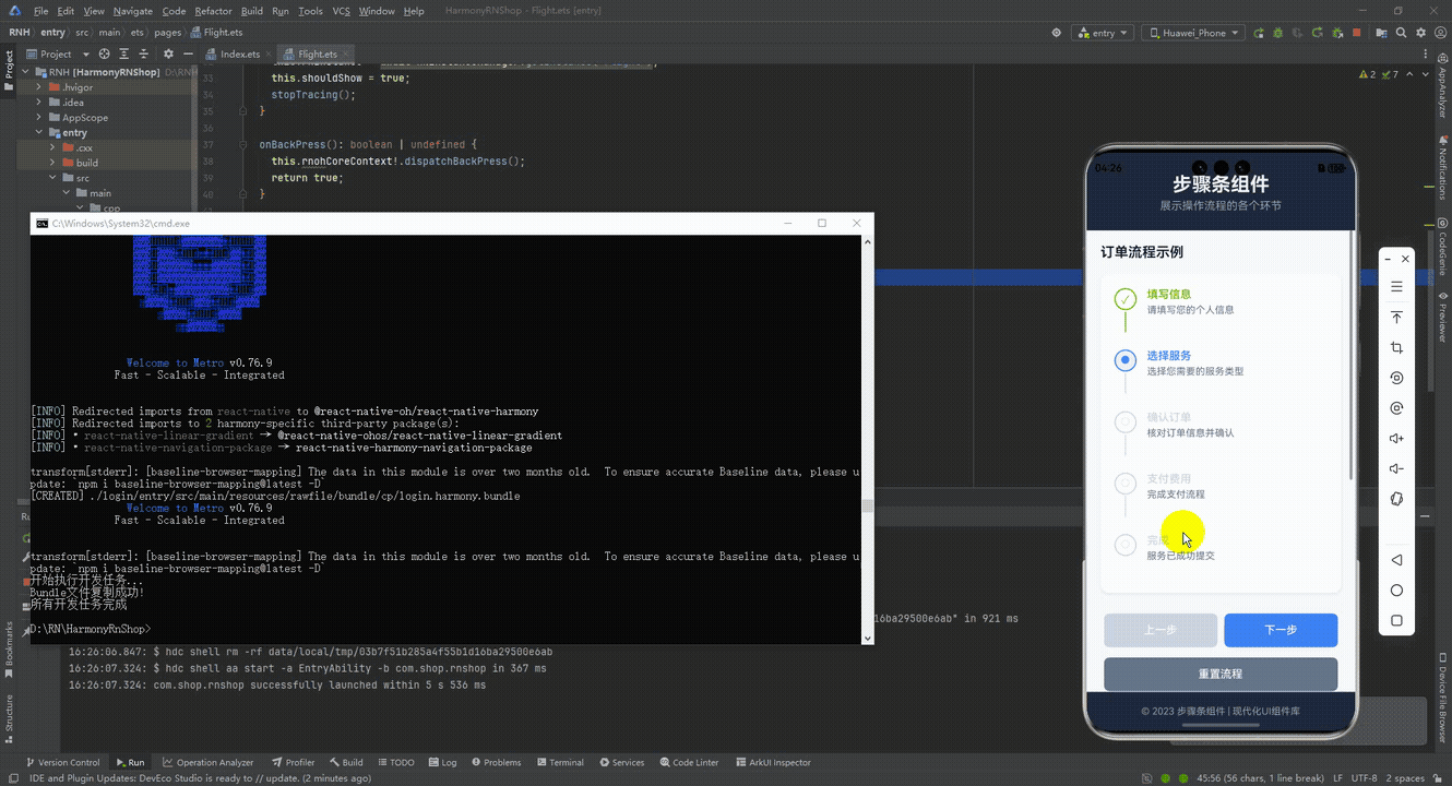
接下来通过打包命令npn run harmony将reactNative的代码打包成为bundle,这样可以进行在开源鸿蒙OpenHarmony中进行使用。

打包之后再将打包后的鸿蒙OpenHarmony文件拷贝到鸿蒙的DevEco-Studio工程目录去:
最后运行效果图如下显示:
本文介绍了一个基于React Native的跨平台步骤条组件,采用原子化设计思路将Steps容器与Step子组件分离,确保代码可维护性和多终端适配性。组件通过数据驱动状态管理实现跨端一致性,使用标准RGB色值保证不同主题下的视觉清晰度。交互设计采用TouchableOpacity基础组件,兼容鸿蒙多终端触控特性。布局基于Flexbox和动态尺寸计算,适配不同屏幕尺寸。业务集成遵循React单向数据流原则,便于状态同步。该组件展现了React Native在鸿蒙生态下的跨端开发优势,包括架构解耦、状态一致性、交互统一和布局自适应等特点。