视差滚动(Parallax Scrolling)是一种网页设计技术,通过让不同层级的元素以不同的速度移动,创造出深度和立体感。这种效果模拟了现实世界中远近物体移动速度不同的视觉现象。
继续向下滚动,你会注意到不同元素以不同速度移动。这种多层次的视觉效果能够增强用户的沉浸感,让网页浏览变得更加生动有趣。
1 视差滚动效果原理
这个页面包含三个主要的视差层:背景层(移动最慢)、中景层(浮动图形)和前景层(发光文字,移动最快)。每一层都有独立的移动速度,创造出丰富的空间感。
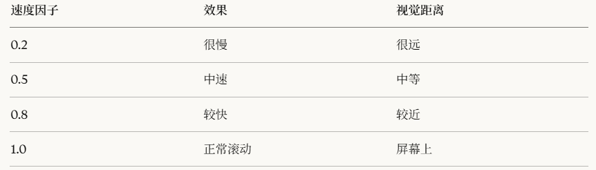
视差效果的核心在于利用 JavaScript 监听滚动事件,根据滚动距离动态调整各层的 transform 属性。速度因子(data-speed)越小,该层移动越慢,视觉上就显得越远。
2 实现步骤
第一步:基础HTML框架
html
<!DOCTYPE html>
<html lang="zh-CN">
<head>
    <meta charset="UTF-8">
    <meta name="viewport" content="width=device-width, initial-scale=1.0">
    <title>视差滚动教程</title>
</head>
<body>
    <h1>开始构建</h1>
</body>
</html>
<!DOCTYPE html>:告诉浏览器这是HTML5文档<meta charset="UTF-8">:设置字符编码为UTF-8<meta name="viewport">:确保移动端正常显示
第二步:重置默认样式
添加CSS重置,消除浏览器默认边距:
html
<style>
    /* 重置所有元素的默认样式 */
    * {
        margin: 0;           /* 去除外边距 */
        padding: 0;          /* 去除内边距 */
        box-sizing: border-box;  /* 边框包含在宽高内 */
    }

    body {
        background-color: #000;  /* 黑色背景 */
        overflow-x: hidden;      /* 隐藏横向滚动条 */
        overflow-y: scroll;      /* 显示纵向滚动条 */
        font-family: Arial, sans-serif;
    }
</style>*选择器:选中所有元素box-sizing: border-box:让宽高计算包含border和paddingoverflow-x: hidden:防止横向滚动
第三步:创建可滚动容器
创建一个高度很大的容器,让页面可以滚动:
html
<body>
    <!-- 视差容器 - 高度是视口的5倍 -->
    <div class="parallax-container">
        <p style="color: white;">滚动测试</p>
    </div>
</body>

<style>
    .parallax-container {
        height: 500vh;  /* 500%视口高度 = 可以滚动很长 */
        position: relative;
        background: linear-gradient(to bottom, #000, #111);
    }
</style>
第四步:创建固定的视差层
添加第一个视差层(背景层):
html
<div class="parallax-container">
    <!-- 背景层 -->
    <div class="parallax-layer layer-bg">
        <p style="color: white; text-align: center;">背景层</p>
    </div>
</div>

<style>
    /* 视差层的基础样式 */
    .parallax-layer {
        position: fixed;   /* 固定定位 - 关键! */
        top: 0;
        left: 0;
        width: 100%;
        height: 100vh;     /* 占满整个视口 */
        display: flex;
        justify-content: center;
        align-items: center;
    }

    /* 背景层样式 */
    .layer-bg {
        z-index: 1;        /* 最底层 */
        background: url('https://images.unsplash.com/photo-1419242902214-272b3f66ee7a?w=1200') center/cover;
        opacity: 0.3;      /* 半透明 */
    }
</style>
第五步:添加更多视差层
添加中景层和前景层:
html
<div class="parallax-container">
    <!-- 背景层 -->
    <div class="parallax-layer layer-bg" data-speed="0.3"></div>

    <!-- 中景层 -->
    <div class="parallax-layer layer-middle" data-speed="0.5">
        <div style="width: 100px; height: 100px; background: rgba(255,0,255,0.5); border-radius: 50%;"></div>
    </div>

    <!-- 前景层 - 文字 -->
    <div class="parallax-layer layer-text" data-speed="0.8">
        <h1 style="color: white; font-size: 80px;">NATURE</h1>
    </div>
</div>

<style>
    .layer-middle {
        z-index: 2;  /* 中间层 */
    }

    .layer-text {
        z-index: 3;  /* 最上层 */
    }
</style>data-speed="0.3":自定义数据属性,用于JavaScript读取速度- 三层结构:背景(z-index:1) < 中景(2) < 前景(3)
第六步:JavaScript实现视差移动
这是核心部分!添加JavaScript让层随滚动移动:
html
<script>
    // 1. 获取所有视差层
    const parallaxLayers = document.querySelectorAll('.parallax-layer');

    // 2. 定义更新函数
    function updateParallax() {
        // 获取页面滚动的距离
        const scrolled = window.pageYOffset;

        console.log('滚动距离:', scrolled);  // 调试用

        // 遍历每一层
        parallaxLayers.forEach(layer => {
            // 获取该层的速度因子
            const speed = layer.dataset.speed || 0.5;

            // 计算该层应该移动的距离
            // 负号表示向上移动
            const yPos = -(scrolled * speed);

            // 应用变换
            layer.style.transform = `translateY(${yPos}px)`;

            console.log(`层级速度${speed}, 移动${yPos}px`);
        });
    }

    // 3. 监听滚动事件
    window.addEventListener('scroll', updateParallax);
</script>
步骤1:获取所有层次的元素
javascript
const parallaxLayers = document.querySelectorAll('.parallax-layer');步骤2:计算各个层次的元素的偏移两量
javascript
const scrolled = window.pageYOffset;  // 例如:滚动了100px
const speed = 0.3;                     // 速度因子
const yPos = -(100 * 0.3);            // = -30px
步骤3:应用偏移量到 transform 变换
javascript
layer.style.transform = `translateY(-30px)`;第七步:性能优化
使用 requestAnimationFrame 优化滚动性能:
javascript
window.addEventListener('scroll', () => {
    // requestAnimationFrame 确保动画流畅
    requestAnimationFrame(updateParallax);
});- 滚动事件触发非常频繁(每秒可能几十次)
requestAnimationFrame让浏览器在合适的时机执行- 避免掉帧,保持60fps
第八步:添加发光文字效果
把之前的发光文字代码整合进来:
html
<div class="parallax-layer layer-text" data-speed="0.8">
    <div class="text-container">
        <h1>NATURE</h1>
    </div>
</div>

<style>
    .text-container {
        font-size: 7vw;
        font-weight: bold;
    }

    .text-container h1 {
        margin: 0;
        /* 镂空效果 */
        background: url('https://images.unsplash.com/photo-1506905925346-21bda4d32df4?w=1200') center/cover;
        -webkit-background-clip: text;
        background-clip: text;
        -webkit-text-fill-color: transparent;

        /* 发光效果 */
        filter: drop-shadow(0 0 1vw #ff00ff)
                drop-shadow(0 0 2vw #00ffff)
                drop-shadow(0 0 3vw #ffff00);

        /* 动画 */
        animation: glow 3s ease-in-out infinite;
    }

    @keyframes glow {
        0%, 100% {
            filter: drop-shadow(0 0 1vw #ff00ff)
                    drop-shadow(0 0 2vw #00ffff)
                    drop-shadow(0 0 3vw #ffff00);
        }
        50% {
            filter: drop-shadow(0 0 2vw #ff00ff)
                    drop-shadow(0 0 3vw #00ffff)
                    drop-shadow(0 0 4vw #ffff00);
        }
    }
</style>
第九步:添加滚动提示
引导用户向下滚动:
html
<div class="scroll-hint">向下滚动探索更多</div>

<style>
    .scroll-hint {
        position: fixed;
        bottom: 30px;
        left: 50%;
        transform: translateX(-50%);  /* 水平居中技巧 */
        z-index: 4;
        color: rgba(255, 255, 255, 0.6);
        font-size: 14px;
        animation: bounce 2s infinite;
    }

    /* 向下箭头 */
    .scroll-hint::after {
        content: '↓';
        display: block;
        font-size: 24px;
    }

    /* 弹跳动画 */
    @keyframes bounce {
        0%, 100% { transform: translateX(-50%) translateY(0); }
        50% { transform: translateX(-50%) translateY(10px); }
    }
</style>

<script>
    // 滚动后隐藏提示
    function updateParallax() {
        const scrolled = window.pageYOffset;

        // ... 之前的视差代码 ...

        // 隐藏提示
        const scrollHint = document.querySelector('.scroll-hint');
        if (scrolled > 100) {
            scrollHint.style.opacity = '0';
        } else {
            scrollHint.style.opacity = '1';
        }
    }
</script>::after:伪元素,在元素后面添加内容content: '↓':插入箭头符号translateX(-50%):配合 left: 50% 实现完美居中
第十步:添加内容卡片
在视差区域后添加可滚动的内容:
html
<!-- 在 parallax-container 后面 -->
<div class="content-section">
    <div class="content-card">
        <h2>标题1</h2>
        <p>这是第一段内容...</p>
    </div>

    <div class="content-card">
        <h2>标题2</h2>
        <p>这是第二段内容...</p>
    </div>
</div>

<style>
    .content-section {
        position: relative;
        z-index: 5;           /* 在视差层之上 */
        margin-top: 100vh;    /* 从视口底部开始 */
        padding: 100px 20px;
        background: linear-gradient(to bottom, transparent, #000 20%, #000);
    }

    .content-card {
        max-width: 800px;
        margin: 0 auto 80px;
        padding: 40px;
        background: rgba(255, 255, 255, 0.05);  /* 半透明背景 */
        border: 1px solid rgba(255, 255, 255, 0.1);
        border-radius: 15px;
        backdrop-filter: blur(10px);  /* 毛玻璃效果 */
        color: #fff;

        /* 初始状态:不可见 */
        opacity: 0;
        transform: translateY(50px);
        transition: all 0.8s ease;
    }

    /* 可见状态 */
    .content-card.visible {
        opacity: 1;
        transform: translateY(0);
    }
</style>
backdrop-filter: blur(10px):毛玻璃效果(需要半透明背景)transition:平滑过渡动画- 初始 opacity: 0 + JavaScript动态添加 visible 类
第十一步:卡片淡入动画
当卡片滚动到视口内时,让它淡入:
javascript
function checkCardVisibility() {
    // 获取所有卡片
    const cards = document.querySelectorAll('.content-card');
    // 获取视口高度
    const windowHeight = window.innerHeight;

    cards.forEach(card => {
        // 获取卡片相对视口的位置
        const cardTop = card.getBoundingClientRect().top;

        // 如果卡片进入视口80%的位置
        if (cardTop < windowHeight * 0.8) {
            card.classList.add('visible');  // 添加可见类
        }
    });
}

// 在滚动时检查
window.addEventListener('scroll', () => {
    requestAnimationFrame(() => {
        updateParallax();
        checkCardVisibility();  // 新增
    });
});

// 页面加载时也检查一次
checkCardVisibility();
html
card.getBoundingClientRect().top- 返回元素相对于视口顶部的距离
- 如果元素在视口下方,值为正
- 如果元素在视口上方,值为负
html
if (cardTop < windowHeight * 0.8)- windowHeight * 0.8 = 视口高度的80%位置
- 当卡片到达这个位置时触发动画
- 提前触发让动画更自然
第十二步:添加浮动图形
在中景层添加浮动的彩色圆圈:
html
<div class="parallax-layer layer-middle" data-speed="0.5">
    <div class="floating-shapes">
        <div class="shape"></div>
        <div class="shape"></div>
        <div class="shape"></div>
    </div>
</div>

<style>
    .floating-shapes {
        width: 100%;
        height: 100%;
        position: relative;
        overflow: hidden;
    }

    .shape {
        position: absolute;
        border-radius: 50%;  /* 圆形 */
        opacity: 0.2;
        animation: float 20s infinite ease-in-out;
    }

    /* 第一个圆 */
    .shape:nth-child(1) {
        width: 100px;
        height: 100px;
        background: radial-gradient(circle, #ff00ff, transparent);
        top: 20%;
        left: 10%;
        animation-delay: 0s;
    }

    /* 第二个圆 */
    .shape:nth-child(2) {
        width: 150px;
        height: 150px;
        background: radial-gradient(circle, #00ffff, transparent);
        top: 60%;
        right: 15%;
        animation-delay: -5s;  /* 负延迟 = 动画从中间开始 */
    }

    /* 第三个圆 */
    .shape:nth-child(3) {
        width: 80px;
        height: 80px;
        background: radial-gradient(circle, #ffff00, transparent);
        top: 40%;
        right: 30%;
        animation-delay: -10s;
    }

    /* 浮动动画 */
    @keyframes float {
        0%, 100% {
            transform: translateY(0) scale(1);
        }
        50% {
            transform: translateY(-50px) scale(1.2);
        }
    }
</style>nth-child(1):选择第1个子元素radial-gradient:径向渐变(从中心向外)animation-delay: -5s:负延迟让动画错开
现在把所有步骤组合起来,你就得到了完整的视差滚动页面!
3 核心原理总结
视差公式 :元素移动距离 = 滚动距离 × 速度因子
关键技术点:
- position: fixed - 让层固定在视口
- window.pageYOffset - 获取滚动距离
- transform: translateY() - 移动元素
- data-speed - 存储速度因子
- requestAnimationFrame - 优化性能