前言
在移动应用开发中,数据可视化是提升用户体验的重要手段。用户需要直观地了解自己的进度、完成度和目标达成情况。ArkTS 提供了强大的 Progress 组件,支持多种样式和丰富的自定义选项,让开发者能够轻松打造精美的进度展示效果。
本文将通过一个实际案例------健康管理应用的进度展示系统,带你深入理解 Progress 组件的使用方法和设计技巧。
本文适合已经了解 ArkTS 基础语法的初学者阅读。通过学习本文,你将掌握:
- Progress 组件的其中两种类型(Ring 和 Linear)
- 如何实现双层环形进度条
- 线性进度条的布局与样式设计
- 进度数据的动态计算与更新
- 自定义进度组件的封装技巧
- 响应式进度展示
什么是 Progress 组件
Progress 组件是 HarmonyOS 提供的进度指示器,用于显示任务的完成进度。
Progress有5种可选类型,通过ProgressType可以设置进度条样式。ProgressType类型包括:
- ProgressType.Linear(线性样式)
- ProgressType.Ring(环形无刻度样式)
- ProgressType.ScaleRing(环形有刻度样式)
- ProgressType.Eclipse(圆形样式)
- ProgressType.Capsule(胶囊样式)
今天我们主要讲解 Progress 组件的其中两种类型(Ring 和 Linear)
常见应用场景:
- 健康评分:显示综合健康得分(Ring)
- 任务完成度:显示打卡完成百分比(Ring)
- 目标达成:显示饮水、运动等目标完成情况(Linear)
- 加载状态:显示文件下载、数据加载进度(Linear)
- 等级系统:显示用户等级进度(Ring或Linear)
案例背景
我们要实现一个健康管理应用的进度展示,包含以下功能:
-
首页健康评分卡片
- 左侧:双层环形进度条,显示总评分
- 右侧:4 个线性进度条,显示打卡、饮水、运动、睡眠分项得分
-
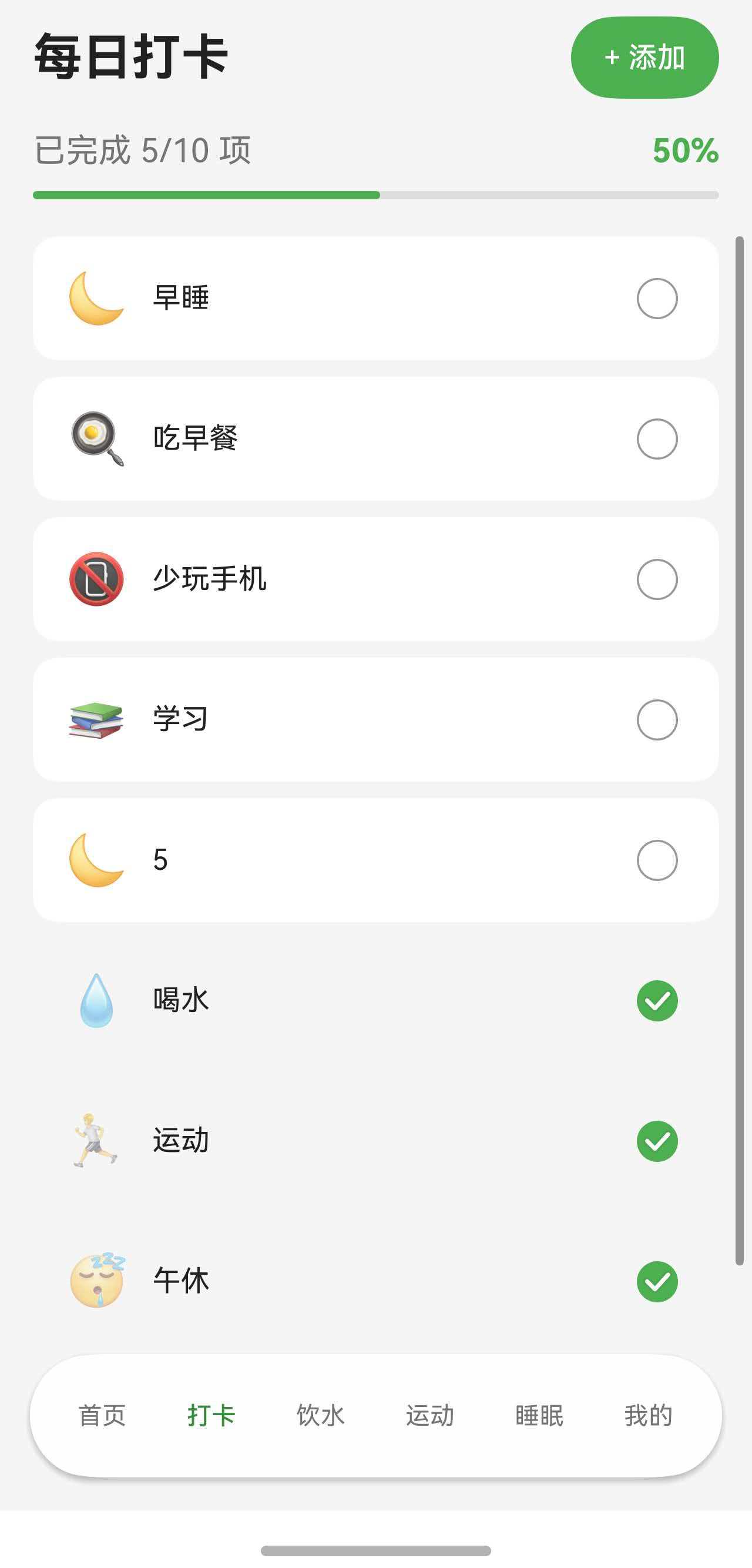
打卡页面进度条
- 顶部:线性进度条,显示今日打卡完成度
- 实时更新:勾选打卡项时进度自动增长
-
自定义进度组件
- ProgressRing:通用环形进度组件
- ScoreRing:带颜色分级的评分环组件
- ProgressCard:带进度条的卡片组件
最终效果如下图所示:
首页健康评分卡片:
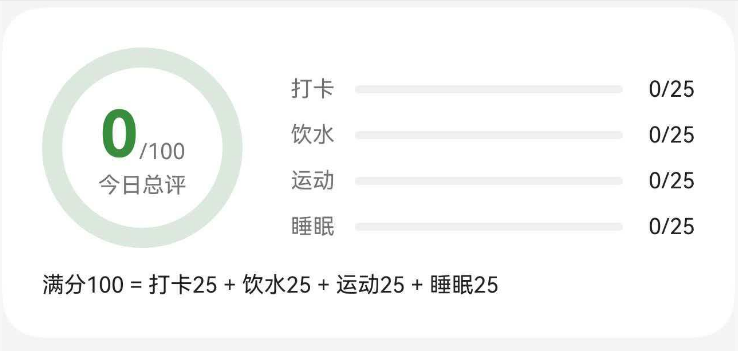
一、首页健康评分卡片完整代码
让我们先看首页健康评分卡片的完整实现代码。这个卡片展示了双层环形进度条和4个线性进度条,是本文的核心案例。
typescript
// 健康评分卡片
Column() {
  Row() {
    // 左侧评分圆环
    Stack() {
      // 背景圆环(灰色底层)
      Progress({ value: 100, total: 100, type: ProgressType.Ring })
        .width(this.getRingSize())
        .height(this.getRingSize())
        .color($r('app.color.primary_surface'))
        .style({ strokeWidth: this.getRingStrokeWidth() })

      // 进度圆环(彩色进度)
      Progress({ value: this.healthScore.totalScore, total: 100, type: ProgressType.Ring })
        .width(this.getRingSize())
        .height(this.getRingSize())
        .color($r('app.color.primary_color'))
        .style({ strokeWidth: this.getRingStrokeWidth() })

      // 中心文字
      Column() {
        Row() {
          Text(this.healthScore.totalScore.toString())
            .fontSize(36)
            .fontWeight(FontWeight.Bold)
            .fontColor($r('app.color.primary_dark'))
          Text('/100')
            .fontSize(12)
            .fontColor($r('app.color.text_secondary'))
            .margin({ bottom: 4 })
        }
        .alignItems(VerticalAlign.Bottom)

        Text('今日总评')
          .fontSize(12)
          .fontColor($r('app.color.text_secondary'))
      }
    }

    // 右侧分项进度条
    Column() {
      // 打卡进度
      Row() {
        Text('打卡')
          .fontSize(12)
          .fontColor($r('app.color.text_secondary'))
          .width(32)

        Progress({ value: this.healthScore.checkInScore, total: 100, type: ProgressType.Linear })
          .height(8)
          .color($r('app.color.primary_color'))
          .backgroundColor($r('app.color.input_background'))
          .layoutWeight(1)
          .borderRadius(4)

        Text(`${Math.round(this.healthScore.checkInScore * 0.25)}/25`)
          .fontSize(12)
          .fontColor($r('app.color.text_primary'))
          .width(36)
          .textAlign(TextAlign.End)
      }
      .width('100%')
      .margin({ top: 10 })

      // 饮水进度
      Row() {
        Text('饮水')
          .fontSize(12)
          .fontColor($r('app.color.text_secondary'))
          .width(32)

        Progress({ value: this.healthScore.waterScore, total: 100, type: ProgressType.Linear })
          .height(8)
          .color($r('app.color.progress_water'))
          .backgroundColor($r('app.color.input_background'))
          .layoutWeight(1)
          .borderRadius(4)

        Text(`${Math.round(this.healthScore.waterScore * 0.25)}/25`)
          .fontSize(12)
          .fontColor($r('app.color.text_primary'))
          .width(36)
          .textAlign(TextAlign.End)
      }
      .width('100%')
      .margin({ top: 10 })

      // 运动进度
      Row() {
        Text('运动')
          .fontSize(12)
          .fontColor($r('app.color.text_secondary'))
          .width(32)

        Progress({ value: this.healthScore.exerciseScore, total: 100, type: ProgressType.Linear })
          .height(8)
          .color($r('app.color.progress_exercise'))
          .backgroundColor($r('app.color.input_background'))
          .layoutWeight(1)
          .borderRadius(4)

        Text(`${Math.round(this.healthScore.exerciseScore * 0.25)}/25`)
          .fontSize(12)
          .fontColor($r('app.color.text_primary'))
          .width(36)
          .textAlign(TextAlign.End)
      }
      .width('100%')
      .margin({ top: 10 })

      // 睡眠进度
      Row() {
        Text('睡眠')
          .fontSize(12)
          .fontColor($r('app.color.text_secondary'))
          .width(32)

        Progress({ value: this.healthScore.sleepScore, total: 100, type: ProgressType.Linear })
          .height(8)
          .color($r('app.color.progress_sleep'))
          .backgroundColor($r('app.color.input_background'))
          .layoutWeight(1)
          .borderRadius(4)

        Text(`${Math.round(this.healthScore.sleepScore * 0.25)}/25`)
          .fontSize(12)
          .fontColor($r('app.color.text_primary'))
          .width(36)
          .textAlign(TextAlign.End)
      }
      .width('100%')
      .margin({ top: 10 })
    }
    .layoutWeight(1)
    .padding({ left: 24 })
  }
  .width('100%')

  // 评分说明
  Text('满分100 = 打卡25 + 饮水25 + 运动25 + 睡眠25')
    .fontSize(12)
    .fontColor($r('app.color.text_primary'))
    .width('100%')
    .margin({ top: 12 })
}
.width('100%')
.padding(20)
.backgroundColor($r('app.color.card_background'))
.borderRadius(20)
二、打卡页面进度条完整代码
打卡页面顶部的线性进度条展示了今日打卡完成度,随着用户勾选打卡项实时更新。
typescript
// 打卡页面进度展示
Column() {
  // 进度文字
  Row() {
    Text(`已完成 ${this.completedCount}/${this.checkInItems.length} 项`)
      .fontSize(16)
      .fontColor($r('app.color.text_secondary'))
    Blank()
    Text(`${Math.round((this.completedCount / Math.max(this.checkInItems.length, 1)) * 100)}%`)
      .fontSize(16)
      .fontWeight(FontWeight.Bold)
      .fontColor($r('app.color.primary_color'))
  }
  .width('100%')
  .padding({ left: 16, right: 16, bottom: 8 })

  // 进度条
  Progress({
    value: this.completedCount,
    total: Math.max(this.checkInItems.length, 1),
    type: ProgressType.Linear
  })
    .color($r('app.color.primary_color'))
    .height(8)
    .borderRadius(4)
    .margin({ left: 16, right: 16, bottom: 16 })
}
数据更新逻辑:
typescript
// 切换打卡状态
toggleCheckInById(itemId: string): void {
  // 找到目标项
  let targetIndex = -1;
  for (let i = 0; i < this.checkInItems.length; i++) {
    if (this.checkInItems[i].id === itemId) {
      targetIndex = i;
      break;
    }
  }
  if (targetIndex === -1) return;

  // 创建新数组以触发UI更新
  const newItems: CheckInItemData[] = [];
  for (let i = 0; i < this.checkInItems.length; i++) {
    const item = this.checkInItems[i];
    newItems.push({
      id: item.id,
      name: item.name,
      icon: item.icon,
      isChecked: i === targetIndex ? !item.isChecked : item.isChecked
    });
  }

  // 更新状态
  this.checkInItems = newItems;
  this.completedCount = this.checkInItems.filter(item => item.isChecked).length;

  // 保存到持久化存储
  this.prefService.saveCheckInData({
    date: getTodayDateString(),
    items: this.checkInItems,
    completedCount: this.completedCount
  });
}
三、Progress 组件基础知识
3.1 Progress 组件的两种类型
Progress 组件支持多种类型,本文重点介绍最常用的两种:
1. Ring(环形进度条)
typescript
Progress({ value: 75, total: 100, type: ProgressType.Ring })
  .width(120)
  .height(120)
  .color('#4CAF50')
  .style({ strokeWidth: 12 })
参数说明:
value:当前进度值total:总进度值type:进度条类型,这里是ProgressType.Ringwidth/height:圆环的尺寸(必须相等)color:进度条颜色style.strokeWidth:圆环线条宽度
2. Linear(线性进度条)
typescript
Progress({ value: 60, total: 100, type: ProgressType.Linear })
  .width('100%')
  .height(8)
  .color('#2196F3')
  .backgroundColor('#E0E0E0')
  .borderRadius(4)
参数说明:
value:当前进度值total:总进度值type:进度条类型,这里是ProgressType.Linearwidth:进度条宽度(通常设置为 '100%' 或具体数值)height:进度条高度color:进度条颜色backgroundColor:背景颜色borderRadius:圆角半径
3.2 Progress 组件的核心属性
通用属性:
| 属性 | 类型 | 说明 | 示例 |
|---|---|---|---|
| value | number | 当前进度值 | value: 75 |
| total | number | 总进度值 | total: 100 |
| type | ProgressType | 进度条类型 | type: ProgressType.Ring |
| color | ResourceColor | 进度条颜色 | color: '#4CAF50' |
Ring 类型专属属性:
| 属性 | 类型 | 说明 | 示例 |
|---|---|---|---|
| style.strokeWidth | number | 圆环线条宽度 | style: { strokeWidth: 12 } |
Linear 类型专属属性:
| 属性 | 类型 | 说明 | 示例 |
|---|---|---|---|
| backgroundColor | ResourceColor | 背景颜色 | backgroundColor: '#E0E0E0' |
3.3 进度值的计算
Progress 组件的进度显示基于 value 和 total 的比例:
typescript
// 进度百分比 = (value / total) * 100%

// 示例1:显示 75%
Progress({ value: 75, total: 100, type: ProgressType.Ring })

// 示例2:显示 60%(3/5 = 0.6 = 60%)
Progress({ value: 3, total: 5, type: ProgressType.Linear })

// 示例3:显示 80%(800/1000 = 0.8 = 80%)
Progress({ value: 800, total: 1000, type: ProgressType.Linear })
注意事项:
✅ 正确做法:
typescript
// 确保 total 不为 0
Progress({
  value: this.completedCount,
  total: Math.max(this.checkInItems.length, 1),
  type: ProgressType.Linear
})
四、双层环形进度条实现详解
双层环形进度条是健康评分卡片的核心视觉元素。它由两个 Progress 组件叠加而成,通过 Stack 容器实现层叠效果。
4.1 实现原理
双层环形进度条的实现思路:
- 底层圆环:显示 100% 的灰色背景圆环,作为进度条的轨道
- 顶层圆环:显示实际进度的彩色圆环,覆盖在底层之上
- 中心内容:在圆环中心显示分数和文字说明
typescript
Stack() {
  // 第1层:背景圆环(灰色,100%)
  Progress({ value: 100, total: 100, type: ProgressType.Ring })
    .width(120)
    .height(120)
    .color('#E0E0E0')  // 灰色背景
    .style({ strokeWidth: 12 })

  // 第2层:进度圆环(彩色,实际进度)
  Progress({ value: 85, total: 100, type: ProgressType.Ring })
    .width(120)
    .height(120)
    .color('#4CAF50')  // 绿色进度
    .style({ strokeWidth: 12 })

  // 第3层:中心文字
  Column() {
    Text('85')
      .fontSize(36)
      .fontWeight(FontWeight.Bold)
    Text('今日总评')
      .fontSize(12)
      .fontColor('#999999')
  }
}
4.2 中心内容的布局设计
圆环中心的内容需要精心设计,确保信息清晰易读。
基础布局:
typescript
Column() {
  // 分数行:大数字 + 小文字
  Row() {
    Text('85')
      .fontSize(36)
      .fontWeight(FontWeight.Bold)
      .fontColor('#333333')
    Text('/100')
      .fontSize(12)
      .fontColor('#999999')
      .margin({ bottom: 4 })  // 向下偏移,与大数字底部对齐
  }
  .alignItems(VerticalAlign.Bottom)  // 底部对齐

  // 说明文字
  Text('今日总评')
    .fontSize(12)
    .fontColor('#999999')
}
对齐技巧:
- 数字与单位的对齐 :使用
VerticalAlign.Bottom让大数字和小单位底部对齐 - 单位的微调 :给单位添加
margin({ bottom: 4 })让它稍微向下偏移 - 整体居中:Stack 容器默认居中对齐,无需额外设置
字体大小的选择:
typescript
// 主数字:36-40px(醒目)
Text('85')
  .fontSize(36)
  .fontWeight(FontWeight.Bold)

// 单位:11-13px(辅助)
Text('/100')
  .fontSize(12)

// 说明:11-13px(辅助)
Text('今日总评')
  .fontSize(12)
五、线性进度条的布局设计
线性进度条是最常用的进度展示方式,适合显示任务完成度、目标达成率等。
5.1 基础线性进度条
最简单的实现:
typescript
Progress({ value: 60, total: 100, type: ProgressType.Linear })
  .width('100%')
  .height(8)
  .color('#2196F3')
  .backgroundColor('#E0E0E0')
  .borderRadius(4)
关键属性说明:
width: '100%':占满父容器宽度,适应不同屏幕height: 8:进度条高度,通常 6-12pxborderRadius: 4:圆角半径,让进度条更圆润
5.2 带标签的进度条
在实际应用中,进度条通常需要配合文字标签使用。
方案1:上下布局
typescript
Column() {
  // 标题行
  Row() {
    Text('打卡进度')
      .fontSize(16)
      .fontColor('#333333')
    Blank()
    Text('5/8')
      .fontSize(14)
      .fontColor('#999999')
  }
  .width('100%')

  // 进度条
  Progress({ value: 5, total: 8, type: ProgressType.Linear })
    .width('100%')
    .height(8)
    .color('#4CAF50')
    .backgroundColor('#E0E0E0')
    .borderRadius(4)
    .margin({ top: 8 })

  // 百分比
  Text('62%')
    .fontSize(12)
    .fontColor('#4CAF50')
    .margin({ top: 4 })
    .alignSelf(ItemAlign.End)
}
.width('100%')
方案2:左右布局
typescript
Row() {
  // 左侧标签
  Text('打卡')
    .fontSize(12)
    .fontColor('#999999')
    .width(32)

  // 中间进度条
  Progress({ value: 20, total: 25, type: ProgressType.Linear })
    .height(8)
    .color('#4CAF50')
    .backgroundColor('#E0E0E0')
    .layoutWeight(1)  // 占据剩余空间
    .borderRadius(4)

  // 右侧数值
  Text('20/25')
    .fontSize(12)
    .fontColor('#333333')
    .width(36)
    .textAlign(TextAlign.End)
}
.width('100%')
布局选择原则:
- 上下布局:适合单个进度条,信息展示更详细
- 左右布局:适合多个进度条并列,节省垂直空间
5.3 多进度条并列展示
健康评分卡片中,右侧有 4 个进度条并列展示,这是一个常见的设计模式。
实现代码:
typescript
Column() {
  // 打卡进度
  Row() {
    Text('打卡')
      .fontSize(12)
      .fontColor('#999999')
      .width(32)

    Progress({ value: this.checkInScore, total: 100, type: ProgressType.Linear })
      .height(8)
      .color('#4CAF50')
      .backgroundColor('#E0E0E0')
      .layoutWeight(1)
      .borderRadius(4)

    Text(`${Math.round(this.checkInScore * 0.25)}/25`)
      .fontSize(12)
      .fontColor('#333333')
      .width(36)
      .textAlign(TextAlign.End)
  }
  .width('100%')
  .margin({ top: 10 })

  // 饮水进度
  Row() {
    Text('饮水')
      .fontSize(12)
      .fontColor('#999999')
      .width(32)

    Progress({ value: this.waterScore, total: 100, type: ProgressType.Linear })
      .height(8)
      .color('#2196F3')
      .backgroundColor('#E0E0E0')
      .layoutWeight(1)
      .borderRadius(4)

    Text(`${Math.round(this.waterScore * 0.25)}/25`)
      .fontSize(12)
      .fontColor('#333333')
      .width(36)
      .textAlign(TextAlign.End)
  }
  .width('100%')
  .margin({ top: 10 })

  // 运动进度
  Row() {
    Text('运动')
      .fontSize(12)
      .fontColor('#999999')
      .width(32)

    Progress({ value: this.exerciseScore, total: 100, type: ProgressType.Linear })
      .height(8)
      .color('#FF9800')
      .backgroundColor('#E0E0E0')
      .layoutWeight(1)
      .borderRadius(4)

    Text(`${Math.round(this.exerciseScore * 0.25)}/25`)
      .fontSize(12)
      .fontColor('#333333')
      .width(36)
      .textAlign(TextAlign.End)
  }
  .width('100%')
  .margin({ top: 10 })

  // 睡眠进度
  Row() {
    Text('睡眠')
      .fontSize(12)
      .fontColor('#999999')
      .width(32)

    Progress({ value: this.sleepScore, total: 100, type: ProgressType.Linear })
      .height(8)
      .color('#9C27B0')
      .backgroundColor('#E0E0E0')
      .layoutWeight(1)
      .borderRadius(4)

    Text(`${Math.round(this.sleepScore * 0.25)}/25`)
      .fontSize(12)
      .fontColor('#333333')
      .width(36)
      .textAlign(TextAlign.End)
  }
  .width('100%')
  .margin({ top: 10 })
}
.layoutWeight(1)
.padding({ left: 24 })
设计要点:
- 固定宽度的标签 :
width(32)确保所有标签对齐 - 弹性宽度的进度条 :
layoutWeight(1)让进度条占据剩余空间 - 固定宽度的数值 :
width(36)确保数值右对齐 - 统一的间距 :
margin({ top: 10 })保持一致的视觉节奏 - 不同的颜色:每个进度条用不同颜色区分类别
5.4 进度条的高度和圆角设计
进度条的高度和圆角影响视觉效果和用户体验。
高度选择:
typescript
// 细进度条(6px):适合密集排列
Progress({ value: 60, total: 100, type: ProgressType.Linear })
  .height(6)

// 标准进度条(8px):最常用
Progress({ value: 60, total: 100, type: ProgressType.Linear })
  .height(8)

// 粗进度条(10-12px):适合强调重点
Progress({ value: 60, total: 100, type: ProgressType.Linear })
  .height(12)
圆角选择:
typescript
// 圆角半径通常是高度的一半,形成完全圆润的端点

// 高度 6px → 圆角 3px
.height(6)
.borderRadius(3)

// 高度 8px → 圆角 4px
.height(8)
.borderRadius(4)

// 高度 12px → 圆角 6px
.height(12)
.borderRadius(6)
六、自定义进度组件封装
为了提高代码复用性和可维护性,我们可以将常用的进度展示封装成自定义组件。
6.1 通用环形进度组件(ProgressRing)
组件代码:
typescript
@Component
export struct ProgressRing {
  @Prop progress: number = 0;        // 进度值(0-100)
  ringSize: number = 120;             // 圆环尺寸
  strokeWidth: number = 12;           // 线条宽度
  ringColor: ResourceColor = '#4CAF50';  // 进度颜色
  bgColor: ResourceColor = '#E0E0E0';    // 背景颜色
  @BuilderParam centerContent: () => void = this.defaultCenter;  // 中心内容

  @Builder
  defaultCenter() {
    Text(`${this.progress}%`)
      .fontSize(24)
      .fontWeight(FontWeight.Bold)
      .fontColor('#333333')
  }

  build() {
    Stack() {
      // 背景圆环
      Progress({ value: 100, total: 100, type: ProgressType.Ring })
        .width(this.ringSize)
        .height(this.ringSize)
        .color(this.bgColor)
        .style({ strokeWidth: this.strokeWidth })

      // 进度圆环
      Progress({ value: this.progress, total: 100, type: ProgressType.Ring })
        .width(this.ringSize)
        .height(this.ringSize)
        .color(this.ringColor)
        .style({ strokeWidth: this.strokeWidth })

      // 中心内容
      this.centerContent()
    }
    .width(this.ringSize)
    .height(this.ringSize)
  }
}
使用示例:
typescript
// 示例1:使用默认中心内容
ProgressRing({
  progress: 75,
  ringSize: 120,
  strokeWidth: 12,
  ringColor: '#4CAF50'
})

// 示例2:自定义中心内容
ProgressRing({
  progress: 85,
  ringSize: 150,
  strokeWidth: 14,
  ringColor: '#2196F3'
}) {
  Column() {
    Text('85')
      .fontSize(36)
      .fontWeight(FontWeight.Bold)
      .fontColor('#2196F3')
    Text('健康评分')
      .fontSize(12)
      .fontColor('#999999')
      .margin({ top: 4 })
  }
}
组件特点:
- @Prop 装饰器:接收外部传入的进度值,支持响应式更新
- 可配置参数:尺寸、线宽、颜色都可以自定义
- @BuilderParam:支持自定义中心内容,灵活性高
- 默认实现:提供默认的中心内容,简化使用
6.2 评分环形组件(ScoreRing)
ScoreRing 是 ProgressRing 的特化版本,专门用于显示评分,支持颜色分级。
组件代码:
typescript
@Component
export struct ScoreRing {
  @Prop score: number = 0;           // 评分(0-100)
  ringSize: number = 150;             // 圆环尺寸
  @Prop level: string = '';           // 评级文字

  // 根据分数返回颜色
  private getScoreColor(): ResourceColor {
    if (this.score >= 90) return '#4CAF50';  // 优秀:绿色
    if (this.score >= 75) return '#8BC34A';  // 良好:浅绿
    if (this.score >= 60) return '#FFC107';  // 及格:黄色
    if (this.score >= 40) return '#FF9800';  // 较差:橙色
    return '#F44336';                         // 很差:红色
  }

  build() {
    Column() {
      Stack() {
        // 背景圆环
        Progress({ value: 100, total: 100, type: ProgressType.Ring })
          .width(this.ringSize)
          .height(this.ringSize)
          .color('#E0E0E0')
          .style({ strokeWidth: 14 })

        // 进度圆环(颜色根据分数动态变化)
        Progress({ value: this.score, total: 100, type: ProgressType.Ring })
          .width(this.ringSize)
          .height(this.ringSize)
          .color(this.getScoreColor())
          .style({ strokeWidth: 14 })

        // 中心内容
        Column() {
          Text(this.score.toString())
            .fontSize(36)
            .fontWeight(FontWeight.Bold)
            .fontColor(this.getScoreColor())

          Text(this.level)
            .fontSize(14)
            .fontColor('#999999')
            .margin({ top: 4 })
        }
      }
      .width(this.ringSize)
      .height(this.ringSize)
    }
  }
}
使用示例:
typescript
// 显示健康评分
ScoreRing({
  score: 85,
  ringSize: 150,
  level: '良好'
})

// 分数变化时,颜色自动更新
ScoreRing({
  score: this.healthScore.totalScore,  // 响应式数据
  ringSize: 150,
  level: this.getScoreLevel()
})
组件特点:
- 自动颜色分级:根据分数自动选择颜色,无需手动指定
- 语义化设计:颜色与评级对应,符合用户认知
- 响应式更新:分数变化时,颜色和文字自动更新
6.3 进度卡片组件(ProgressCard)
ProgressCard 将线性进度条与卡片样式结合,形成一个完整的进度展示单元。
组件代码:
typescript
@Component
export struct ProgressCard {
  title: string = '';                 // 标题
  current: number = 0;                // 当前值
  target: number = 100;               // 目标值
  unit: string = '';                  // 单位
  color: ResourceColor = '#4CAF50';   // 进度条颜色

  build() {
    Column() {
      // 标题行
      Row() {
        Text(this.title)
          .fontSize(16)
          .fontWeight(FontWeight.Medium)
          .fontColor('#333333')

        Blank()

        Text(`${this.current}/${this.target}${this.unit}`)
          .fontSize(14)
          .fontColor('#999999')
      }
      .width('100%')

      // 进度条
      Progress({
        value: this.current,
        total: this.target,
        type: ProgressType.Linear
      })
        .color(this.color)
        .backgroundColor('#E0E0E0')
        .height(8)
        .borderRadius(4)
        .margin({ top: 12 })

      // 百分比
      Text(`${Math.round((this.current / this.target) * 100)}%`)
        .fontSize(12)
        .fontColor(this.color)
        .margin({ top: 4 })
        .alignSelf(ItemAlign.End)
    }
    .width('100%')
    .padding(16)
    .backgroundColor('#FFFFFF')
    .borderRadius(12)
    .shadow({
      radius: 4,
      color: 'rgba(0, 0, 0, 0.1)',
      offsetX: 0,
      offsetY: 2
    })
  }
}
使用示例:
typescript
// 饮水进度卡片
ProgressCard({
  title: '今日饮水',
  current: 1500,
  target: 2000,
  unit: 'ml',
  color: '#2196F3'
})

// 运动进度卡片
ProgressCard({
  title: '运动时长',
  current: 30,
  target: 60,
  unit: '分钟',
  color: '#FF9800'
})

// 打卡进度卡片
ProgressCard({
  title: '每日打卡',
  current: this.completedCount,
  target: this.totalCount,
  unit: '项',
  color: '#4CAF50'
})
组件特点:
- 完整的卡片样式:包含阴影、圆角、内边距
- 自动计算百分比:无需手动计算进度百分比
- 灵活的单位:支持任意单位(ml、分钟、项等)
- 响应式数据:current 和 target 变化时自动更新
七、动态数据更新与状态管理
进度组件的核心价值在于实时反映数据变化。本节介绍如何实现动态数据更新。
7.1 使用 @State 管理进度数据
基础示例:
typescript
@Component
struct ProgressDemo {
  @State progress: number = 0;  // 使用 @State 装饰器

  build() {
    Column() {
      Progress({ value: this.progress, total: 100, type: ProgressType.Ring })
        .width(120)
        .height(120)

      Button('增加进度')
        .onClick(() => {
          this.progress += 10;  // 修改状态,UI 自动更新
        })
    }
  }
}
关键点:
- @State 装饰器:让变量成为响应式状态
- 自动更新:状态变化时,UI 自动重新渲染
- 直接赋值 :通过
this.progress = newValue触发更新
7.2 健康评分的数据计算
健康评分卡片的数据来自多个维度的计算。
数据模型:
typescript
interface HealthStatistics {
  date: string;
  checkInScore: number;    // 打卡得分(0-100)
  waterScore: number;      // 饮水得分(0-100)
  exerciseScore: number;   // 运动得分(0-100)
  sleepScore: number;      // 睡眠得分(0-100)
  totalScore: number;      // 总分(0-100)
}
状态定义:
typescript
@Component
struct Index {
  @State healthScore: HealthStatistics = {
    date: '',
    checkInScore: 0,
    waterScore: 0,
    exerciseScore: 0,
    sleepScore: 0,
    totalScore: 0
  };

  // ...
}
数据加载:
typescript
async refreshHomeData(): Promise<void> {
  if (!this.healthService) return;

  try {
    // 从服务层获取计算好的健康评分
    const healthScore: HealthStatistics = await this.healthService.calculateTodayScore();

    // 更新状态,触发 UI 更新
    this.healthScore = healthScore;

  } catch (error) {
    console.error('Failed to refresh home data');
  }
}
评分计算逻辑(服务层):
typescript
export class HealthScoreService {
  // 计算今日健康评分
  async calculateTodayScore(): Promise<HealthStatistics> {
    const today = getTodayDateString();

    // 1. 计算打卡得分(满分25分)
    const checkInData = await this.prefService.getCheckInData(today);
    const checkInScore = (checkInData.completedCount / checkInData.items.length) * 100;

    // 2. 计算饮水得分(满分25分)
    const waterData = await this.prefService.getWaterData(today);
    const waterScore = Math.min((waterData.totalAmount / waterData.targetAmount) * 100, 100);

    // 3. 计算运动得分(满分25分)
    const exerciseRecords = await this.prefService.getExerciseRecords(today);
    const totalMinutes = exerciseRecords.reduce((sum, r) => sum + r.duration, 0);
    const exerciseScore = Math.min((totalMinutes / 60) * 100, 100);

    // 4. 计算睡眠得分(满分25分)
    const sleepData = await this.prefService.getSleepData(today);
    const sleepScore = this.calculateSleepScore(sleepData);

    // 5. 计算总分(每项占25%)
    const totalScore = Math.round(
      (checkInScore * 0.25) +
      (waterScore * 0.25) +
      (exerciseScore * 0.25) +
      (sleepScore * 0.25)
    );

    return {
      date: today,
      checkInScore,
      waterScore,
      exerciseScore,
      sleepScore,
      totalScore
    };
  }
}
7.3 打卡进度的实时更新
打卡页面的进度条需要在用户勾选打卡项时实时更新。
状态定义:
typescript
@Component
export struct CheckInTabContent {
  @State checkInItems: CheckInItemData[] = [];  // 打卡项列表
  @State completedCount: number = 0;            // 已完成数量

  // ...
}
切换打卡状态:
typescript
toggleCheckInById(itemId: string): void {
  // 1. 找到目标项
  let targetIndex = -1;
  for (let i = 0; i < this.checkInItems.length; i++) {
    if (this.checkInItems[i].id === itemId) {
      targetIndex = i;
      break;
    }
  }
  if (targetIndex === -1) return;

  // 2. 创建新数组(触发 UI 更新)
  const newItems: CheckInItemData[] = [];
  for (let i = 0; i < this.checkInItems.length; i++) {
    const item = this.checkInItems[i];
    newItems.push({
      id: item.id,
      name: item.name,
      icon: item.icon,
      isChecked: i === targetIndex ? !item.isChecked : item.isChecked
    });
  }

  // 3. 更新状态
  this.checkInItems = newItems;
  this.completedCount = newItems.filter(item => item.isChecked).length;

  // 4. 保存到持久化存储
  this.prefService.saveCheckInData({
    date: getTodayDateString(),
    items: this.checkInItems,
    completedCount: this.completedCount
  });
}
进度条绑定:
typescript
Progress({
  value: this.completedCount,                      // 当前完成数
  total: Math.max(this.checkInItems.length, 1),   // 总数(避免除以0)
  type: ProgressType.Linear
})
关键点:
- 创建新数组:ArkTS 的响应式系统需要新对象才能触发更新
- 同步更新计数:completedCount 与 checkInItems 保持一致
- 持久化存储:数据变化后立即保存,防止丢失
总结
Progress 组件虽然简单,但在实际应用中却非常重要。通过合理的设计和优化,可以为用户提供清晰、直观的进度反馈,提升应用的用户体验。
希望本文能帮助你掌握 Progress 组件的使用方法,并在实际项目中灵活运用。如果你有任何问题或建议,欢迎交流讨论。