欢迎加入开源鸿蒙跨平台社区:https://openharmonycrossplatform.csdn.net
一、ShaderMask 系统架构深度解析
在现代移动应用中,视觉效果是提升用户体验的关键因素。ShaderMask 作为 Flutter 中强大的着色工具,能够为任意组件添加渐变、纹理和混合效果,创造出丰富多彩的视觉呈现。
📱 1.1 ShaderMask 核心概念
ShaderMask 是一个能够使用着色器(Shader)来修改子组件绘制效果的 Widget。它通过将着色器应用到子组件的像素上,实现各种视觉效果。
ShaderMask 工作原理:
┌─────────────────────────────────────────────────────────────────┐
│                    ShaderMask 工作流程                           │
├─────────────────────────────────────────────────────────────────┤
│                                                                 │
│  ┌─────────────┐    ┌─────────────┐    ┌─────────────┐         │
│  │  子组件绘制  │ -> │  着色器应用  │ -> │  混合模式   │         │
│  │  (Child)    │    │  (Shader)   │    │  (BlendMode)│         │
│  └─────────────┘    └─────────────┘    └─────────────┘         │
│         │                  │                  │                 │
│         ▼                  ▼                  ▼                 │
│  ┌─────────────────────────────────────────────────────┐       │
│  │              原始像素 + 着色器颜色 = 最终效果         │       │
│  └─────────────────────────────────────────────────────┘       │
│                                                                 │
└─────────────────────────────────────────────────────────────────┘
核心属性详解:
| 属性 | 类型 | 说明 | 应用场景 |
|---|---|---|---|
| shaderCallback | ShaderCallback | 着色器回调函数 | 定义渐变、纹理等着色效果 |
| blendMode | BlendMode | 混合模式 | 控制着色器与原图的混合方式 |
| child | Widget | 子组件 | 需要应用着色效果的组件 |
🔬 1.2 着色器类型详解
Flutter 提供了多种着色器类型,每种都有其独特的视觉效果:
1. LinearGradient(线性渐变)
线性渐变沿直线方向进行颜色过渡,是最常用的渐变类型。
dart
LinearGradient(
  begin: Alignment.topLeft,      // 起始位置
  end: Alignment.bottomRight,    // 结束位置
  colors: [Colors.red, Colors.blue],  // 颜色列表
  stops: [0.0, 1.0],             // 颜色停止点
  tileMode: TileMode.clamp,      // 平铺模式
)
2. RadialGradient(径向渐变)
径向渐变从中心点向外辐射,产生圆形或椭圆形的颜色过渡效果。
dart
RadialGradient(
  center: Alignment.center,      // 中心点
  radius: 0.5,                   // 半径
  colors: [Colors.yellow, Colors.orange, Colors.red],
  stops: [0.0, 0.5, 1.0],
)
3. SweepGradient(扫描渐变)
扫描渐变沿圆周方向进行颜色过渡,常用于创建进度环、指南针等效果。
dart
SweepGradient(
  center: Alignment.center,      // 中心点
  startAngle: 0.0,               // 起始角度
  endAngle: math.pi * 2,         // 结束角度
  colors: [Colors.red, Colors.yellow, Colors.green, Colors.blue],
)
🎯 1.3 混合模式详解
混合模式决定了着色器颜色如何与原始像素进行混合。Flutter 提供了丰富的混合模式选项:
常用混合模式分类:
┌─────────────────────────────────────────────────────────────────┐
│                       混合模式分类                               │
├─────────────────────────────────────────────────────────────────┤
│                                                                 │
│  基础混合模式:                                                  │
│  ├── srcIn        - 仅显示着色器颜色(遮罩效果)                  │
│  ├── srcATop      - 着色器覆盖在原图上方                         │
│  ├── dstIn        - 仅显示原图(受着色器形状限制)               │
│  └── dstATop      - 原图覆盖在着色器上方                         │
│                                                                 │
│  颜色混合模式:                                                  │
│  ├── modulate     - 颜色相乘(变暗效果)                         │
│  ├── screen       - 屏幕混合(变亮效果)                         │
│  ├── overlay      - 叠加混合(增强对比)                         │
│  └── hardlight    - 强光效果                                    │
│                                                                 │
│  特殊效果模式:                                                  │
│  ├── difference   - 差值混合(反色效果)                         │
│  ├── exclusion    - 排除混合                                    │
│  ├── hue          - 色相混合                                    │
│  └── saturation   - 饱和度混合                                  │
│                                                                 │
└─────────────────────────────────────────────────────────────────┘
二、基础着色效果实现
👆 2.1 文字渐变效果
文字渐变是最常见的着色效果之一,通过 ShaderMask 可以为文字添加丰富的渐变色彩。
文字渐变实现原理:
原始文字(纯色)          ShaderMask应用后(渐变)
    ┌─────────┐              ┌─────────┐
    │  Hello  │    ──────>   │  Hello  │
    │  World  │              │  World  │
    └─────────┘              └─────────┘
    单一颜色                  红→橙→黄→绿→蓝
dart
/// 渐变文字组件
class GradientText extends StatelessWidget {
  final String text;
  final TextStyle? style;
  final List<Color> colors;
  final Alignment begin;
  final Alignment end;

  const GradientText({
    super.key,
    required this.text,
    this.style,
    required this.colors,
    this.begin = Alignment.topLeft,
    this.end = Alignment.bottomRight,
  });

  @override
  Widget build(BuildContext context) {
    return ShaderMask(
      shaderCallback: (bounds) => LinearGradient(
        begin: begin,
        end: end,
        colors: colors,
      ).createShader(bounds),
      blendMode: BlendMode.srcIn,
      child: Text(
        text,
        style: (style ?? const TextStyle()).copyWith(color: Colors.white),
      ),
    );
  }
}

/// 使用示例
class GradientTextDemo extends StatelessWidget {
  const GradientTextDemo({super.key});

  @override
  Widget build(BuildContext context) {
    return Scaffold(
      appBar: AppBar(title: const Text('渐变文字效果')),
      body: Center(
        child: Column(
          mainAxisAlignment: MainAxisAlignment.center,
          children: [
            GradientText(
              text: 'Flutter',
              style: const TextStyle(fontSize: 48, fontWeight: FontWeight.bold),
              colors: [Colors.purple, Colors.blue, Colors.cyan],
            ),
            const SizedBox(height: 20),
            GradientText(
              text: 'OpenHarmony',
              style: const TextStyle(fontSize: 36, fontWeight: FontWeight.w300),
              colors: [Colors.orange, Colors.red, Colors.pink],
              begin: Alignment.centerLeft,
              end: Alignment.centerRight,
            ),
            const SizedBox(height: 20),
            GradientText(
              text: '跨平台开发',
              style: const TextStyle(fontSize: 32),
              colors: [Colors.green, Colors.teal, Colors.blue],
              begin: Alignment.topCenter,
              end: Alignment.bottomCenter,
            ),
          ],
        ),
      ),
    );
  }
}
🔧 2.2 图标渐变效果
图标渐变可以为应用图标、按钮图标等添加视觉吸引力。
dart
/// 渐变图标组件
class GradientIcon extends StatelessWidget {
  final IconData icon;
  final double size;
  final List<Color> colors;

  const GradientIcon({
    super.key,
    required this.icon,
    this.size = 24,
    required this.colors,
  });

  @override
  Widget build(BuildContext context) {
    return ShaderMask(
      shaderCallback: (bounds) => LinearGradient(
        colors: colors,
      ).createShader(bounds),
      blendMode: BlendMode.srcIn,
      child: Icon(icon, size: size, color: Colors.white),
    );
  }
}

/// 图标渐变演示
class GradientIconDemo extends StatelessWidget {
  const GradientIconDemo({super.key});

  @override
  Widget build(BuildContext context) {
    return Scaffold(
      appBar: AppBar(title: const Text('渐变图标效果')),
      body: GridView.count(
        padding: const EdgeInsets.all(16),
        crossAxisCount: 4,
        mainAxisSpacing: 20,
        crossAxisSpacing: 20,
        children: [
          _buildIconCard(Icons.home, [Colors.blue, Colors.purple]),
          _buildIconCard(Icons.favorite, [Colors.pink, Colors.red]),
          _buildIconCard(Icons.star, [Colors.orange, Colors.yellow]),
          _buildIconCard(Icons.settings, [Colors.teal, Colors.green]),
          _buildIconCard(Icons.person, [Colors.indigo, Colors.blue]),
          _buildIconCard(Icons.shopping_cart, [Colors.amber, Colors.orange]),
          _buildIconCard(Icons.notifications, [Colors.red, Colors.pink]),
          _buildIconCard(Icons.search, [Colors.cyan, Colors.blue]),
        ],
      ),
    );
  }

  Widget _buildIconCard(IconData icon, List<Color> colors) {
    return Container(
      decoration: BoxDecoration(
        color: Colors.grey.shade100,
        borderRadius: BorderRadius.circular(16),
      ),
      child: Center(
        child: GradientIcon(icon: icon, size: 40, colors: colors),
      ),
    );
  }
}
🎨 2.3 图片着色效果
ShaderMask 可以为图片添加各种滤镜效果,如渐变遮罩、颜色叠加等。
dart
/// 图片着色效果演示
class ImageShaderDemo extends StatelessWidget {
  const ImageShaderDemo({super.key});

  @override
  Widget build(BuildContext context) {
    return Scaffold(
      appBar: AppBar(title: const Text('图片着色效果')),
      body: ListView(
        padding: const EdgeInsets.all(16),
        children: [
          _buildShaderImage(
            '原图',
            null,
            BlendMode.clear,
          ),
          _buildShaderImage(
            '渐变叠加',
            LinearGradient(
              colors: [Colors.purple.withOpacity(0.5), Colors.blue.withOpacity(0.5)],
            ),
            BlendMode.srcATop,
          ),
          _buildShaderImage(
            '径向渐变',
            RadialGradient(
              colors: [Colors.transparent, Colors.black.withOpacity(0.7)],
            ),
            BlendMode.srcOver,
          ),
          _buildShaderImage(
            '颜色滤镜',
            const LinearGradient(
              colors: [Colors.orange, Colors.deepOrange],
            ),
            BlendMode.modulate,
          ),
        ],
      ),
    );
  }

  Widget _buildShaderImage(String title, Shader? shader, BlendMode blendMode) {
    return Column(
      crossAxisAlignment: CrossAxisAlignment.start,
      children: [
        Text(title, style: const TextStyle(fontSize: 16, fontWeight: FontWeight.bold)),
        const SizedBox(height: 8),
        ClipRRect(
          borderRadius: BorderRadius.circular(12),
          child: ShaderMask(
            shaderCallback: shader != null
                ? (bounds) => shader.createShader(bounds)
                : (bounds) => Paint().shader!,
            blendMode: blendMode,
            child: Container(
              height: 150,
              decoration: BoxDecoration(
                gradient: LinearGradient(
                  colors: [Colors.blue.shade300, Colors.purple.shade300],
                ),
              ),
              child: const Center(
                child: Icon(Icons.image, size: 60, color: Colors.white54),
              ),
            ),
          ),
        ),
        const SizedBox(height: 16),
      ],
    );
  }
}
三、高级着色效果实现
✨ 3.1 动态渐变效果
动态渐变通过动画控制器驱动渐变颜色的变化,产生流动的视觉效果。
动态渐变实现原理:
时间轴动画:
┌─────────────────────────────────────────────────────────────────┐
│                                                                 │
│  t=0.0     t=0.25    t=0.5     t=0.75    t=1.0                  │
│    │         │         │         │         │                    │
│    ▼         ▼         ▼         ▼         ▼                    │
│  ┌───┐    ┌───┐    ┌───┐    ┌───┐    ┌───┐                    │
│  │红 │ -> │橙 │ -> │黄 │ -> │绿 │ -> │蓝 │                    │
│  │   │    │   │    │   │    │   │    │   │                    │
│  │蓝 │    │紫 │    │红 │    │橙 │    │绿 │                    │
│  └───┘    └───┘    └───┘    └───┘    └───┘                    │
│                                                                 │
│  颜色随时间平滑过渡,产生流动效果                                 │
│                                                                 │
└─────────────────────────────────────────────────────────────────┘
dart
/// 动态渐变文字
class AnimatedGradientText extends StatefulWidget {
  final String text;
  final TextStyle? style;
  final List<List<Color>> colorSets;
  final Duration duration;

  const AnimatedGradientText({
    super.key,
    required this.text,
    this.style,
    required this.colorSets,
    this.duration = const Duration(seconds: 3),
  });

  @override
  State<AnimatedGradientText> createState() => _AnimatedGradientTextState();
}

class _AnimatedGradientTextState extends State<AnimatedGradientText>
    with SingleTickerProviderStateMixin {
  late AnimationController _controller;
  late Animation<double> _animation;

  @override
  void initState() {
    super.initState();
    _controller = AnimationController(
      duration: widget.duration,
      vsync: this,
    )..repeat();
    _animation = Tween<double>(begin: 0, end: 1).animate(_controller);
  }

  @override
  void dispose() {
    _controller.dispose();
    super.dispose();
  }

  List<Color> _lerpColors(List<Color> start, List<Color> end, double t) {
    return List.generate(
      start.length,
      (i) => Color.lerp(start[i], end[i], t) ?? start[i],
    );
  }

  @override
  Widget build(BuildContext context) {
    return AnimatedBuilder(
      animation: _animation,
      builder: (context, child) {
        final progress = _animation.value * (widget.colorSets.length - 1);
        final index = progress.floor();
        final nextIndex = (index + 1) % widget.colorSets.length;
        final t = progress - index;

        final colors = _lerpColors(
          widget.colorSets[index],
          widget.colorSets[nextIndex],
          t,
        );

        return ShaderMask(
          shaderCallback: (bounds) => LinearGradient(
            begin: Alignment.topLeft,
            end: Alignment.bottomRight,
            colors: colors,
          ).createShader(bounds),
          blendMode: BlendMode.srcIn,
          child: Text(
            widget.text,
            style: (widget.style ?? const TextStyle()).copyWith(color: Colors.white),
          ),
        );
      },
    );
  }
}

/// 动态渐变演示页面
class AnimatedGradientDemo extends StatelessWidget {
  const AnimatedGradientDemo({super.key});

  @override
  Widget build(BuildContext context) {
    return Scaffold(
      appBar: AppBar(title: const Text('动态渐变效果')),
      body: Center(
        child: Column(
          mainAxisAlignment: MainAxisAlignment.center,
          children: [
            AnimatedGradientText(
              text: 'Flutter',
              style: const TextStyle(fontSize: 48, fontWeight: FontWeight.bold),
              colorSets: [
                [Colors.purple, Colors.blue],
                [Colors.blue, Colors.cyan],
                [Colors.cyan, Colors.green],
                [Colors.green, Colors.yellow],
                [Colors.yellow, Colors.orange],
                [Colors.orange, Colors.red],
                [Colors.red, Colors.purple],
              ],
            ),
            const SizedBox(height: 40),
            AnimatedGradientText(
              text: 'OpenHarmony',
              style: const TextStyle(fontSize: 32),
              colorSets: [
                [Colors.pink, Colors.red],
                [Colors.red, Colors.orange],
                [Colors.orange, Colors.amber],
                [Colors.amber, Colors.pink],
              ],
              duration: const Duration(seconds: 2),
            ),
          ],
        ),
      ),
    );
  }
}
🌊 3.2 扫描渐变进度环
扫描渐变非常适合用于创建进度指示器、仪表盘等圆形视觉效果。
dart
/// 扫描渐变进度环
class SweepGradientProgress extends StatefulWidget {
  final double progress;
  final double size;
  final double strokeWidth;
  final List<Color> colors;

  const SweepGradientProgress({
    super.key,
    required this.progress,
    this.size = 200,
    this.strokeWidth = 15,
    this.colors = const [Colors.blue, Colors.purple, Colors.pink, Colors.red],
  });

  @override
  State<SweepGradientProgress> createState() => _SweepGradientProgressState();
}

class _SweepGradientProgressState extends State<SweepGradientProgress>
    with SingleTickerProviderStateMixin {
  late AnimationController _controller;

  @override
  void initState() {
    super.initState();
    _controller = AnimationController(
      duration: const Duration(seconds: 3),
      vsync: this,
    )..repeat();
  }

  @override
  void dispose() {
    _controller.dispose();
    super.dispose();
  }

  @override
  Widget build(BuildContext context) {
    return AnimatedBuilder(
      animation: _controller,
      builder: (context, child) {
        return Transform.rotate(
          angle: _controller.value * 2 * math.pi,
          child: SizedBox(
            width: widget.size,
            height: widget.size,
            child: CustomPaint(
              painter: SweepProgressPainter(
                progress: widget.progress,
                strokeWidth: widget.strokeWidth,
                colors: widget.colors,
              ),
            ),
          ),
        );
      },
    );
  }
}

/// 扫描进度绘制器
class SweepProgressPainter extends CustomPainter {
  final double progress;
  final double strokeWidth;
  final List<Color> colors;

  SweepProgressPainter({
    required this.progress,
    required this.strokeWidth,
    required this.colors,
  });

  @override
  void paint(Canvas canvas, Size size) {
    final center = Offset(size.width / 2, size.height / 2);
    final radius = (size.width - strokeWidth) / 2;

    // 绘制背景圆环
    final bgPaint = Paint()
      ..color = Colors.grey.shade200
      ..style = PaintingStyle.stroke
      ..strokeWidth = strokeWidth
      ..strokeCap = StrokeCap.round;
    canvas.drawCircle(center, radius, bgPaint);

    // 绘制渐变进度弧
    final rect = Rect.fromCircle(center: center, radius: radius);
    final gradient = SweepGradient(
      center: Alignment.center,
      colors: colors,
      stops: List.generate(colors.length, (i) => i / (colors.length - 1)),
    );

    final progressPaint = Paint()
      ..shader = gradient.createShader(rect)
      ..style = PaintingStyle.stroke
      ..strokeWidth = strokeWidth
      ..strokeCap = StrokeCap.round;

    final sweepAngle = 2 * math.pi * progress;
    canvas.drawArc(
      rect,
      -math.pi / 2,
      sweepAngle,
      false,
      progressPaint,
    );

    // 绘制中心文字
    final textPainter = TextPainter(
      text: TextSpan(
        text: '${(progress * 100).toInt()}%',
        style: TextStyle(
          fontSize: strokeWidth * 2,
          fontWeight: FontWeight.bold,
          color: colors.first,
        ),
      ),
      textDirection: TextDirection.ltr,
    );
    textPainter.layout();
    textPainter.paint(
      canvas,
      Offset(
        center.dx - textPainter.width / 2,
        center.dy - textPainter.height / 2,
      ),
    );
  }

  @override
  bool shouldRepaint(SweepProgressPainter oldDelegate) {
    return progress != oldDelegate.progress;
  }
}

/// 扫描渐变演示
class SweepGradientDemo extends StatefulWidget {
  const SweepGradientDemo({super.key});

  @override
  State<SweepGradientDemo> createState() => _SweepGradientDemoState();
}

class _SweepGradientDemoState extends State<SweepGradientDemo> {
  double _progress = 0.75;

  @override
  Widget build(BuildContext context) {
    return Scaffold(
      appBar: AppBar(title: const Text('扫描渐变进度环')),
      body: Center(
        child: Column(
          mainAxisAlignment: MainAxisAlignment.center,
          children: [
            SweepGradientProgress(progress: _progress),
            const SizedBox(height: 40),
            Slider(
              value: _progress,
              onChanged: (value) => setState(() => _progress = value),
            ),
          ],
        ),
      ),
    );
  }
}
四、混合模式高级应用
🎪 4.1 混合模式效果展示
不同的混合模式会产生截然不同的视觉效果,理解每种模式的特点对于创建高级视觉效果至关重要。
dart
/// 混合模式展示
class BlendModeShowcase extends StatelessWidget {
  const BlendModeShowcase({super.key});

  static const List<Map<String, dynamic>> blendModes = [
    {'name': 'srcIn', 'mode': BlendMode.srcIn, 'desc': '遮罩效果'},
    {'name': 'modulate', 'mode': BlendMode.modulate, 'desc': '颜色相乘'},
    {'name': 'screen', 'mode': BlendMode.screen, 'desc': '屏幕混合'},
    {'name': 'overlay', 'mode': BlendMode.overlay, 'desc': '叠加效果'},
    {'name': 'difference', 'mode': BlendMode.difference, 'desc': '差值混合'},
    {'name': 'hardLight', 'mode': BlendMode.hardLight, 'desc': '强光效果'},
  ];

  @override
  Widget build(BuildContext context) {
    return Scaffold(
      appBar: AppBar(title: const Text('混合模式展示')),
      body: GridView.builder(
        padding: const EdgeInsets.all(16),
        gridDelegate: const SliverGridDelegateWithFixedCrossAxisCount(
          crossAxisCount: 2,
          mainAxisSpacing: 16,
          crossAxisSpacing: 16,
          childAspectRatio: 0.85,
        ),
        itemCount: blendModes.length,
        itemBuilder: (context, index) {
          final item = blendModes[index];
          return _buildBlendModeCard(
            item['name'],
            item['mode'],
            item['desc'],
          );
        },
      ),
    );
  }

  Widget _buildBlendModeCard(String name, BlendMode mode, String desc) {
    return Card(
      clipBehavior: Clip.antiAlias,
      child: Column(
        children: [
          Expanded(
            child: ShaderMask(
              shaderCallback: (bounds) => const LinearGradient(
                colors: [Colors.purple, Colors.pink, Colors.orange],
              ).createShader(bounds),
              blendMode: mode,
              child: Container(
                width: double.infinity,
                color: Colors.blue,
                child: const Center(
                  child: Text(
                    'Flutter',
                    style: TextStyle(
                      fontSize: 28,
                      fontWeight: FontWeight.bold,
                      color: Colors.white,
                    ),
                  ),
                ),
              ),
            ),
          ),
          Padding(
            padding: const EdgeInsets.all(8),
            child: Column(
              children: [
                Text(name, style: const TextStyle(fontWeight: FontWeight.bold)),
                Text(desc, style: TextStyle(fontSize: 12, color: Colors.grey[600])),
              ],
            ),
          ),
        ],
      ),
    );
  }
}
🎭 4.2 文字遮罩效果
使用 BlendMode.srcIn 可以创建文字遮罩效果,让图片或渐变透过文字显示。
dart
/// 文字遮罩效果
class TextMaskEffect extends StatelessWidget {
  const TextMaskEffect({super.key});

  @override
  Widget build(BuildContext context) {
    return Scaffold(
      appBar: AppBar(title: const Text('文字遮罩效果')),
      body: Center(
        child: Column(
          mainAxisAlignment: MainAxisAlignment.center,
          children: [
            ShaderMask(
              shaderCallback: (bounds) => ImageShader(
                NetworkImage('https://picsum.photos/400/200'),
                tileMode: TileMode.mirror,
              ).createShader(bounds),
              blendMode: BlendMode.srcIn,
              child: const Text(
                'FLUTTER',
                style: TextStyle(
                  fontSize: 64,
                  fontWeight: FontWeight.bold,
                  color: Colors.white,
                  letterSpacing: 8,
                ),
              ),
            ),
            const SizedBox(height: 40),
            ShaderMask(
              shaderCallback: (bounds) => const LinearGradient(
                colors: [Colors.red, Colors.orange, Colors.yellow, Colors.green, Colors.blue, Colors.purple],
              ).createShader(bounds),
              blendMode: BlendMode.srcIn,
              child: const Text(
                '彩虹文字',
                style: TextStyle(
                  fontSize: 48,
                  fontWeight: FontWeight.bold,
                  color: Colors.white,
                ),
              ),
            ),
            const SizedBox(height: 40),
            ShaderMask(
              shaderCallback: (bounds) => RadialGradient(
                center: Alignment.center,
                colors: [Colors.white, Colors.black],
              ).createShader(bounds),
              blendMode: BlendMode.srcIn,
              child: const Text(
                '径向渐变',
                style: TextStyle(
                  fontSize: 48,
                  fontWeight: FontWeight.bold,
                  color: Colors.white,
                ),
              ),
            ),
          ],
        ),
      ),
    );
  }
}
五、综合应用案例
🎨 5.1 渐变按钮组件
结合 ShaderMask 创建具有渐变效果的按钮组件。
dart
/// 渐变按钮组件
class GradientButton extends StatefulWidget {
  final String text;
  final VoidCallback onPressed;
  final List<Color> colors;
  final double borderRadius;

  const GradientButton({
    super.key,
    required this.text,
    required this.onPressed,
    required this.colors,
    this.borderRadius = 25,
  });

  @override
  State<GradientButton> createState() => _GradientButtonState();
}

class _GradientButtonState extends State<GradientButton>
    with SingleTickerProviderStateMixin {
  late AnimationController _controller;
  late Animation<double> _animation;
  bool _isPressed = false;

  @override
  void initState() {
    super.initState();
    _controller = AnimationController(
      duration: const Duration(milliseconds: 1500),
      vsync: this,
    )..repeat();
    _animation = Tween<double>(begin: 0, end: 1).animate(_controller);
  }

  @override
  void dispose() {
    _controller.dispose();
    super.dispose();
  }

  @override
  Widget build(BuildContext context) {
    return GestureDetector(
      onTapDown: (_) => setState(() => _isPressed = true),
      onTapUp: (_) {
        setState(() => _isPressed = false);
        widget.onPressed();
      },
      onTapCancel: () => setState(() => _isPressed = false),
      child: AnimatedScale(
        scale: _isPressed ? 0.95 : 1,
        duration: const Duration(milliseconds: 100),
        child: AnimatedBuilder(
          animation: _animation,
          builder: (context, child) {
            return Container(
              padding: const EdgeInsets.symmetric(horizontal: 32, vertical: 16),
              decoration: BoxDecoration(
                gradient: LinearGradient(
                  begin: Alignment(-1 + _animation.value * 2, 0),
                  end: Alignment(1 - _animation.value * 2, 0),
                  colors: widget.colors,
                ),
                borderRadius: BorderRadius.circular(widget.borderRadius),
                boxShadow: [
                  BoxShadow(
                    color: widget.colors.first.withOpacity(0.4),
                    blurRadius: 15,
                    offset: const Offset(0, 5),
                  ),
                ],
              ),
              child: Text(
                widget.text,
                style: const TextStyle(
                  color: Colors.white,
                  fontSize: 16,
                  fontWeight: FontWeight.bold,
                ),
              ),
            );
          },
        ),
      ),
    );
  }
}

/// 渐变按钮演示
class GradientButtonDemo extends StatelessWidget {
  const GradientButtonDemo({super.key});

  @override
  Widget build(BuildContext context) {
    return Scaffold(
      appBar: AppBar(title: const Text('渐变按钮')),
      body: Center(
        child: Column(
          mainAxisAlignment: MainAxisAlignment.center,
          children: [
            GradientButton(
              text: '开始体验',
              onPressed: () => ScaffoldMessenger.of(context).showSnackBar(
                const SnackBar(content: Text('按钮被点击')),
              ),
              colors: [Colors.purple, Colors.blue],
            ),
            const SizedBox(height: 20),
            GradientButton(
              text: '立即登录',
              onPressed: () {},
              colors: [Colors.orange, Colors.red],
            ),
            const SizedBox(height: 20),
            GradientButton(
              text: '了解更多',
              onPressed: () {},
              colors: [Colors.teal, Colors.green],
            ),
          ],
        ),
      ),
    );
  }
}
⭐ 5.2 闪光效果组件
创建类似闪光扫过的视觉效果,常用于强调重要内容。
dart
/// 闪光效果组件
class ShimmerEffect extends StatefulWidget {
  final Widget child;
  final Duration duration;
  final Color baseColor;
  final Color highlightColor;

  const ShimmerEffect({
    super.key,
    required this.child,
    this.duration = const Duration(milliseconds: 1500),
    this.baseColor = const Color(0xFFE0E0E0),
    this.highlightColor = const Color(0xFFF5F5F5),
  });

  @override
  State<ShimmerEffect> createState() => _ShimmerEffectState();
}

class _ShimmerEffectState extends State<ShimmerEffect>
    with SingleTickerProviderStateMixin {
  late AnimationController _controller;
  late Animation<double> _animation;

  @override
  void initState() {
    super.initState();
    _controller = AnimationController(
      duration: widget.duration,
      vsync: this,
    )..repeat();
    _animation = Tween<double>(begin: -2, end: 2).animate(
      CurvedAnimation(parent: _controller, curve: Curves.easeInOutSine),
    );
  }

  @override
  void dispose() {
    _controller.dispose();
    super.dispose();
  }

  @override
  Widget build(BuildContext context) {
    return AnimatedBuilder(
      animation: _animation,
      builder: (context, child) {
        return ShaderMask(
          shaderCallback: (bounds) => LinearGradient(
            begin: Alignment(_animation.value - 1, 0),
            end: Alignment(_animation.value + 1, 0),
            colors: [
              widget.baseColor,
              widget.highlightColor,
              widget.baseColor,
            ],
            stops: const [0.0, 0.5, 1.0],
          ).createShader(bounds),
          blendMode: BlendMode.srcATop,
          child: widget.child,
        );
      },
    );
  }
}

/// 闪光效果演示
class ShimmerDemo extends StatelessWidget {
  const ShimmerDemo({super.key});

  @override
  Widget build(BuildContext context) {
    return Scaffold(
      appBar: AppBar(title: const Text('闪光效果')),
      body: ListView(
        padding: const EdgeInsets.all(16),
        children: [
          _buildShimmerCard(),
          const SizedBox(height: 16),
          _buildShimmerCard(),
          const SizedBox(height: 16),
          _buildShimmerCard(),
        ],
      ),
    );
  }

  Widget _buildShimmerCard() {
    return ShimmerEffect(
      baseColor: Colors.grey.shade300,
      highlightColor: Colors.grey.shade100,
      child: Container(
        height: 100,
        decoration: BoxDecoration(
          color: Colors.grey.shade300,
          borderRadius: BorderRadius.circular(12),
        ),
      ),
    );
  }
}
六、完整代码示例
下面是一个整合了所有 ShaderMask 效果的完整示例:
dart
import 'dart:math' as math;
import 'package:flutter/material.dart';
void main() {
runApp(const MyApp());
}
class MyApp extends StatelessWidget {
const MyApp({super.key});
@override
Widget build(BuildContext context) {
return MaterialApp(
debugShowCheckedModeBanner: false,
theme: ThemeData(
colorScheme: ColorScheme.fromSeed(seedColor: Colors.purple),
useMaterial3: true,
),
home: const ShaderMaskHomePage(),
);
}
}
/// ShaderMask 主页
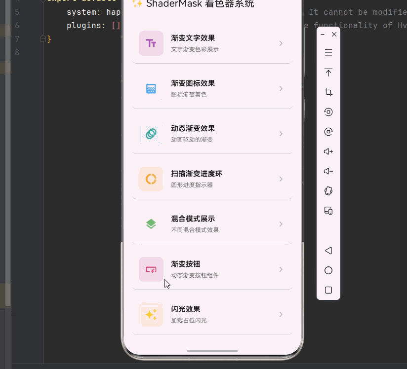
class ShaderMaskHomePage extends StatelessWidget {
const ShaderMaskHomePage({super.key});
@override
Widget build(BuildContext context) {
return Scaffold(
appBar: AppBar(
title: const Text('✨ ShaderMask 着色器系统'),
),
body: ListView(
padding: const EdgeInsets.all(16),
children: [
_buildSectionCard(
context,
title: '渐变文字效果',
description: '文字渐变色彩展示',
icon: Icons.text_fields,
color: Colors.purple,
onTap: () => Navigator.push(
context,
MaterialPageRoute(builder: (_) => const GradientTextDemo()),
),
),
_buildSectionCard(
context,
title: '渐变图标效果',
description: '图标渐变着色',
icon: Icons.gradient,
color: Colors.blue,
onTap: () => Navigator.push(
context,
MaterialPageRoute(builder: (_) => const GradientIconDemo()),
),
),
_buildSectionCard(
context,
title: '动态渐变效果',
description: '动画驱动的渐变',
icon: Icons.animation,
color: Colors.teal,
onTap: () => Navigator.push(
context,
MaterialPageRoute(builder: (_) => const AnimatedGradientDemo()),
),
),
_buildSectionCard(
context,
title: '扫描渐变进度环',
description: '圆形进度指示器',
icon: Icons.donut_large,
color: Colors.orange,
onTap: () => Navigator.push(
context,
MaterialPageRoute(builder: (_) => const SweepGradientDemo()),
),
),
_buildSectionCard(
context,
title: '混合模式展示',
description: '不同混合模式效果',
icon: Icons.layers,
color: Colors.green,
onTap: () => Navigator.push(
context,
MaterialPageRoute(builder: (_) => const BlendModeShowcase()),
),
),
_buildSectionCard(
context,
title: '渐变按钮',
description: '动态渐变按钮组件',
icon: Icons.smart_button,
color: Colors.pink,
onTap: () => Navigator.push(
context,
MaterialPageRoute(builder: (_) => const GradientButtonDemo()),
),
),
_buildSectionCard(
context,
title: '闪光效果',
description: '加载占位闪光',
icon: Icons.auto_awesome,
color: Colors.amber,
onTap: () => Navigator.push(
context,
MaterialPageRoute(builder: (_) => const ShimmerDemo()),
),
),
],
),
);
}
Widget _buildSectionCard(
BuildContext context, {
required String title,
required String description,
required IconData icon,
required Color color,
required VoidCallback onTap,
}) {
return Card(
margin: const EdgeInsets.only(bottom: 12),
child: InkWell(
onTap: onTap,
borderRadius: BorderRadius.circular(12),
child: Padding(
padding: const EdgeInsets.all(16),
child: Row(
children: [
Container(
width: 56,
height: 56,
decoration: BoxDecoration(
color: color.withOpacity(0.1),
borderRadius: BorderRadius.circular(12),
),
child: ShaderMask(
shaderCallback: (bounds) => LinearGradient(
colors: [color, color.withOpacity(0.5)],
).createShader(bounds),
blendMode: BlendMode.srcIn,
child: Icon(icon, color: Colors.white, size: 28),
),
),
const SizedBox(width: 16),
Expanded(
child: Column(
crossAxisAlignment: CrossAxisAlignment.start,
children: [
Text(
title,
style: const TextStyle(
fontSize: 16,
fontWeight: FontWeight.bold,
),
),
const SizedBox(height: 4),
Text(
description,
style: TextStyle(
fontSize: 13,
color: Colors.grey[600],
),
),
],
),
),
Icon(Icons.chevron_right, color: Colors.grey[400]),
],
),
),
),
);
}
}
/// 渐变文字组件
class GradientText extends StatelessWidget {
final String text;
final TextStyle? style;
final List<Color> colors;
final Alignment begin;
final Alignment end;
const GradientText({
super.key,
required this.text,
this.style,
required this.colors,
this.begin = Alignment.topLeft,
this.end = Alignment.bottomRight,
});
@override
Widget build(BuildContext context) {
return ShaderMask(
shaderCallback: (bounds) => LinearGradient(
begin: begin,
end: end,
colors: colors,
).createShader(bounds),
blendMode: BlendMode.srcIn,
child: Text(
text,
style: (style ?? const TextStyle()).copyWith(color: Colors.white),
),
);
}
}
/// 渐变文字演示
class GradientTextDemo extends StatelessWidget {
const GradientTextDemo({super.key});
@override
Widget build(BuildContext context) {
return Scaffold(
appBar: AppBar(title: const Text('渐变文字效果')),
body: Center(
child: Column(
mainAxisAlignment: MainAxisAlignment.center,
children: [
GradientText(
text: 'Flutter',
style: const TextStyle(fontSize: 48, fontWeight: FontWeight.bold),
colors: [Colors.purple, Colors.blue, Colors.cyan],
),
const SizedBox(height: 20),
GradientText(
text: 'OpenHarmony',
style: const TextStyle(fontSize: 36, fontWeight: FontWeight.w300),
colors: [Colors.orange, Colors.red, Colors.pink],
begin: Alignment.centerLeft,
end: Alignment.centerRight,
),
const SizedBox(height: 20),
GradientText(
text: '跨平台开发',
style: const TextStyle(fontSize: 32),
colors: [Colors.green, Colors.teal, Colors.blue],
begin: Alignment.topCenter,
end: Alignment.bottomCenter,
),
],
),
),
);
}
}
/// 渐变图标组件
class GradientIcon extends StatelessWidget {
final IconData icon;
final double size;
final List<Color> colors;
const GradientIcon({
super.key,
required this.icon,
this.size = 24,
required this.colors,
});
@override
Widget build(BuildContext context) {
return ShaderMask(
shaderCallback: (bounds) => LinearGradient(
colors: colors,
).createShader(bounds),
blendMode: BlendMode.srcIn,
child: Icon(icon, size: size, color: Colors.white),
);
}
}
/// 图标渐变演示
class GradientIconDemo extends StatelessWidget {
const GradientIconDemo({super.key});
@override
Widget build(BuildContext context) {
return Scaffold(
appBar: AppBar(title: const Text('渐变图标效果')),
body: GridView.count(
padding: const EdgeInsets.all(16),
crossAxisCount: 4,
mainAxisSpacing: 20,
crossAxisSpacing: 20,
children: [
_buildIconCard(Icons.home, [Colors.blue, Colors.purple]),
_buildIconCard(Icons.favorite, [Colors.pink, Colors.red]),
_buildIconCard(Icons.star, [Colors.orange, Colors.yellow]),
_buildIconCard(Icons.settings, [Colors.teal, Colors.green]),
_buildIconCard(Icons.person, [Colors.indigo, Colors.blue]),
_buildIconCard(Icons.shopping_cart, [Colors.amber, Colors.orange]),
_buildIconCard(Icons.notifications, [Colors.red, Colors.pink]),
_buildIconCard(Icons.search, [Colors.cyan, Colors.blue]),
],
),
);
}
Widget _buildIconCard(IconData icon, List<Color> colors) {
return Container(
decoration: BoxDecoration(
color: Colors.grey.shade100,
borderRadius: BorderRadius.circular(16),
),
child: Center(
child: GradientIcon(icon: icon, size: 40, colors: colors),
),
);
}
}
/// 动态渐变文字
class AnimatedGradientText extends StatefulWidget {
final String text;
final TextStyle? style;
final List<List<Color>> colorSets;
final Duration duration;
const AnimatedGradientText({
super.key,
required this.text,
this.style,
required this.colorSets,
this.duration = const Duration(seconds: 3),
});
@override
State<AnimatedGradientText> createState() => _AnimatedGradientTextState();
}
class _AnimatedGradientTextState extends State<AnimatedGradientText>
with SingleTickerProviderStateMixin {
late AnimationController _controller;
late Animation<double> _animation;
@override
void initState() {
super.initState();
_controller = AnimationController(
duration: widget.duration,
vsync: this,
)..repeat();
_animation = Tween<double>(begin: 0, end: 1).animate(_controller);
}
@override
void dispose() {
_controller.dispose();
super.dispose();
}
List<Color> _lerpColors(List<Color> start, List<Color> end, double t) {
return List.generate(
start.length,
(i) => Color.lerp(start[i], end[i], t) ?? start[i],
);
}
@override
Widget build(BuildContext context) {
return AnimatedBuilder(
animation: _animation,
builder: (context, child) {
final progress = _animation.value * (widget.colorSets.length - 1);
final index = progress.floor();
final nextIndex = (index + 1) % widget.colorSets.length;
final t = progress - index;
final colors = _lerpColors(
widget.colorSets[index],
widget.colorSets[nextIndex],
t,
);
return ShaderMask(
shaderCallback: (bounds) => LinearGradient(
begin: Alignment.topLeft,
end: Alignment.bottomRight,
colors: colors,
).createShader(bounds),
blendMode: BlendMode.srcIn,
child: Text(
widget.text,
style: (widget.style ?? const TextStyle()).copyWith(color: Colors.white),
),
);
},
);
}
}
/// 动态渐变演示页面
class AnimatedGradientDemo extends StatelessWidget {
const AnimatedGradientDemo({super.key});
@override
Widget build(BuildContext context) {
return Scaffold(
appBar: AppBar(title: const Text('动态渐变效果')),
body: Center(
child: Column(
mainAxisAlignment: MainAxisAlignment.center,
children: [
AnimatedGradientText(
text: 'Flutter',
style: const TextStyle(fontSize: 48, fontWeight: FontWeight.bold),
colorSets: [
[Colors.purple, Colors.blue],
[Colors.blue, Colors.cyan],
[Colors.cyan, Colors.green],
[Colors.green, Colors.yellow],
[Colors.yellow, Colors.orange],
[Colors.orange, Colors.red],
[Colors.red, Colors.purple],
],
),
const SizedBox(height: 40),
AnimatedGradientText(
text: 'OpenHarmony',
style: const TextStyle(fontSize: 32),
colorSets: [
[Colors.pink, Colors.red],
[Colors.red, Colors.orange],
[Colors.orange, Colors.amber],
[Colors.amber, Colors.pink],
],
duration: const Duration(seconds: 2),
),
],
),
),
);
}
}
/// 扫描渐变进度环
class SweepGradientProgress extends StatefulWidget {
final double progress;
final double size;
final double strokeWidth;
final List<Color> colors;
const SweepGradientProgress({
super.key,
required this.progress,
this.size = 200,
this.strokeWidth = 15,
this.colors = const [Colors.blue, Colors.purple, Colors.pink, Colors.red],
});
@override
State<SweepGradientProgress> createState() => _SweepGradientProgressState();
}
class _SweepGradientProgressState extends State<SweepGradientProgress>
with SingleTickerProviderStateMixin {
late AnimationController _controller;
@override
void initState() {
super.initState();
_controller = AnimationController(
duration: const Duration(seconds: 3),
vsync: this,
)..repeat();
}
@override
void dispose() {
_controller.dispose();
super.dispose();
}
@override
Widget build(BuildContext context) {
return AnimatedBuilder(
animation: _controller,
builder: (context, child) {
return Transform.rotate(
angle: _controller.value * 2 * math.pi,
child: SizedBox(
width: widget.size,
height: widget.size,
child: CustomPaint(
painter: SweepProgressPainter(
progress: widget.progress,
strokeWidth: widget.strokeWidth,
colors: widget.colors,
),
),
),
);
},
);
}
}
/// 扫描进度绘制器
class SweepProgressPainter extends CustomPainter {
final double progress;
final double strokeWidth;
final List<Color> colors;
SweepProgressPainter({
required this.progress,
required this.strokeWidth,
required this.colors,
});
@override
void paint(Canvas canvas, Size size) {
final center = Offset(size.width / 2, size.height / 2);
final radius = (size.width - strokeWidth) / 2;
final bgPaint = Paint()
..color = Colors.grey.shade200
..style = PaintingStyle.stroke
..strokeWidth = strokeWidth
..strokeCap = StrokeCap.round;
canvas.drawCircle(center, radius, bgPaint);
final rect = Rect.fromCircle(center: center, radius: radius);
final gradient = SweepGradient(
center: Alignment.center,
colors: colors,
stops: List.generate(colors.length, (i) => i / (colors.length - 1)),
);
final progressPaint = Paint()
..shader = gradient.createShader(rect)
..style = PaintingStyle.stroke
..strokeWidth = strokeWidth
..strokeCap = StrokeCap.round;
final sweepAngle = 2 * math.pi * progress;
canvas.drawArc(rect, -math.pi / 2, sweepAngle, false, progressPaint);
final textPainter = TextPainter(
text: TextSpan(
text: '${(progress * 100).toInt()}%',
style: TextStyle(
fontSize: strokeWidth * 2,
fontWeight: FontWeight.bold,
color: colors.first,
),
),
textDirection: TextDirection.ltr,
);
textPainter.layout();
textPainter.paint(
canvas,
Offset(
center.dx - textPainter.width / 2,
center.dy - textPainter.height / 2,
),
);
}
@override
bool shouldRepaint(SweepProgressPainter oldDelegate) {
return progress != oldDelegate.progress;
}
}
/// 扫描渐变演示
class SweepGradientDemo extends StatefulWidget {
const SweepGradientDemo({super.key});
@override
State<SweepGradientDemo> createState() => _SweepGradientDemoState();
}
class _SweepGradientDemoState extends State<SweepGradientDemo> {
double _progress = 0.75;
@override
Widget build(BuildContext context) {
return Scaffold(
appBar: AppBar(title: const Text('扫描渐变进度环')),
body: Center(
child: Column(
mainAxisAlignment: MainAxisAlignment.center,
children: [
SweepGradientProgress(progress: _progress),
const SizedBox(height: 40),
Slider(
value: _progress,
onChanged: (value) => setState(() => _progress = value),
),
],
),
),
);
}
}
/// 混合模式展示
class BlendModeShowcase extends StatelessWidget {
const BlendModeShowcase({super.key});
static const List<Map<String, dynamic>> blendModes = [
{'name': 'srcIn', 'mode': BlendMode.srcIn, 'desc': '遮罩效果'},
{'name': 'modulate', 'mode': BlendMode.modulate, 'desc': '颜色相乘'},
{'name': 'screen', 'mode': BlendMode.screen, 'desc': '屏幕混合'},
{'name': 'overlay', 'mode': BlendMode.overlay, 'desc': '叠加效果'},
{'name': 'difference', 'mode': BlendMode.difference, 'desc': '差值混合'},
{'name': 'hardLight', 'mode': BlendMode.hardLight, 'desc': '强光效果'},
];
@override
Widget build(BuildContext context) {
return Scaffold(
appBar: AppBar(title: const Text('混合模式展示')),
body: GridView.builder(
padding: const EdgeInsets.all(16),
gridDelegate: const SliverGridDelegateWithFixedCrossAxisCount(
crossAxisCount: 2,
mainAxisSpacing: 16,
crossAxisSpacing: 16,
childAspectRatio: 0.85,
),
itemCount: blendModes.length,
itemBuilder: (context, index) {
final item = blendModes[index];
return _buildBlendModeCard(item['name'], item['mode'], item['desc']);
},
),
);
}
Widget _buildBlendModeCard(String name, BlendMode mode, String desc) {
return Card(
clipBehavior: Clip.antiAlias,
child: Column(
children: [
Expanded(
child: ShaderMask(
shaderCallback: (bounds) => const LinearGradient(
colors: [Colors.purple, Colors.pink, Colors.orange],
).createShader(bounds),
blendMode: mode,
child: Container(
width: double.infinity,
color: Colors.blue,
child: const Center(
child: Text(
'Flutter',
style: TextStyle(
fontSize: 28,
fontWeight: FontWeight.bold,
color: Colors.white,
),
),
),
),
),
),
Padding(
padding: const EdgeInsets.all(8),
child: Column(
children: [
Text(name, style: const TextStyle(fontWeight: FontWeight.bold)),
Text(desc, style: TextStyle(fontSize: 12, color: Colors.grey[600])),
],
),
),
],
),
);
}
}
/// 渐变按钮组件
class GradientButton extends StatefulWidget {
final String text;
final VoidCallback onPressed;
final List<Color> colors;
final double borderRadius;
const GradientButton({
super.key,
required this.text,
required this.onPressed,
required this.colors,
this.borderRadius = 25,
});
@override
State<GradientButton> createState() => _GradientButtonState();
}
class _GradientButtonState extends State<GradientButton>
with SingleTickerProviderStateMixin {
late AnimationController _controller;
late Animation<double> _animation;
bool _isPressed = false;
@override
void initState() {
super.initState();
_controller = AnimationController(
duration: const Duration(milliseconds: 1500),
vsync: this,
)..repeat();
_animation = Tween<double>(begin: 0, end: 1).animate(_controller);
}
@override
void dispose() {
_controller.dispose();
super.dispose();
}
@override
Widget build(BuildContext context) {
return GestureDetector(
onTapDown: (_) => setState(() => _isPressed = true),
onTapUp: (_) {
setState(() => _isPressed = false);
widget.onPressed();
},
onTapCancel: () => setState(() => _isPressed = false),
child: AnimatedScale(
scale: _isPressed ? 0.95 : 1,
duration: const Duration(milliseconds: 100),
child: AnimatedBuilder(
animation: _animation,
builder: (context, child) {
return Container(
padding: const EdgeInsets.symmetric(horizontal: 32, vertical: 16),
decoration: BoxDecoration(
gradient: LinearGradient(
begin: Alignment(-1 + _animation.value * 2, 0),
end: Alignment(1 - _animation.value * 2, 0),
colors: widget.colors,
),
borderRadius: BorderRadius.circular(widget.borderRadius),
boxShadow: [
BoxShadow(
color: widget.colors.first.withOpacity(0.4),
blurRadius: 15,
offset: const Offset(0, 5),
),
],
),
child: Text(
widget.text,
style: const TextStyle(
color: Colors.white,
fontSize: 16,
fontWeight: FontWeight.bold,
),
),
);
},
),
),
);
}
}
/// 渐变按钮演示
class GradientButtonDemo extends StatelessWidget {
const GradientButtonDemo({super.key});
@override
Widget build(BuildContext context) {
return Scaffold(
appBar: AppBar(title: const Text('渐变按钮')),
body: Center(
child: Column(
mainAxisAlignment: MainAxisAlignment.center,
children: [
GradientButton(
text: '开始体验',
onPressed: () => ScaffoldMessenger.of(context).showSnackBar(
const SnackBar(content: Text('按钮被点击')),
),
colors: [Colors.purple, Colors.blue],
),
const SizedBox(height: 20),
GradientButton(
text: '立即登录',
onPressed: () {},
colors: [Colors.orange, Colors.red],
),
const SizedBox(height: 20),
GradientButton(
text: '了解更多',
onPressed: () {},
colors: [Colors.teal, Colors.green],
),
],
),
),
);
}
}
/// 闪光效果组件
class ShimmerEffect extends StatefulWidget {
final Widget child;
final Duration duration;
final Color baseColor;
final Color highlightColor;
const ShimmerEffect({
super.key,
required this.child,
this.duration = const Duration(milliseconds: 1500),
this.baseColor = const Color(0xFFE0E0E0),
this.highlightColor = const Color(0xFFF5F5F5),
});
@override
State<ShimmerEffect> createState() => _ShimmerEffectState();
}
class _ShimmerEffectState extends State<ShimmerEffect>
with SingleTickerProviderStateMixin {
late AnimationController _controller;
late Animation<double> _animation;
@override
void initState() {
super.initState();
_controller = AnimationController(
duration: widget.duration,
vsync: this,
)..repeat();
_animation = Tween<double>(begin: -2, end: 2).animate(
CurvedAnimation(parent: _controller, curve: Curves.easeInOutSine),
);
}
@override
void dispose() {
_controller.dispose();
super.dispose();
}
@override
Widget build(BuildContext context) {
return AnimatedBuilder(
animation: _animation,
builder: (context, child) {
return ShaderMask(
shaderCallback: (bounds) => LinearGradient(
begin: Alignment(_animation.value - 1, 0),
end: Alignment(_animation.value + 1, 0),
colors: [
widget.baseColor,
widget.highlightColor,
widget.baseColor,
],
stops: const [0.0, 0.5, 1.0],
).createShader(bounds),
blendMode: BlendMode.srcATop,
child: widget.child,
);
},
);
}
}
/// 闪光效果演示
class ShimmerDemo extends StatelessWidget {
const ShimmerDemo({super.key});
@override
Widget build(BuildContext context) {
return Scaffold(
appBar: AppBar(title: const Text('闪光效果')),
body: ListView(
padding: const EdgeInsets.all(16),
children: [
_buildShimmerCard(),
const SizedBox(height: 16),
_buildShimmerCard(),
const SizedBox(height: 16),
_buildShimmerCard(),
],
),
);
}
Widget _buildShimmerCard() {
return ShimmerEffect(
baseColor: Colors.grey.shade300,
highlightColor: Colors.grey.shade100,
child: Container(
height: 100,
decoration: BoxDecoration(
color: Colors.grey.shade300,
borderRadius: BorderRadius.circular(12),
),
),
);
}
}七、最佳实践与注意事项
✅ 7.1 性能优化建议
在使用 ShaderMask 时,性能优化至关重要:
1. 避免过度使用
ShaderMask 会增加 GPU 渲染负担,应避免在大量组件上同时使用:
dart
// 不推荐:在列表项中使用 ShaderMask
ListView.builder(
  itemBuilder: (context, index) => ShaderMask(...), // 性能问题
);

// 推荐:仅在关键视觉元素上使用
ListView.builder(
  itemBuilder: (context, index) => index == 0 ? ShaderMask(...) : NormalWidget(),
);
2. 缓存 Shader
对于静态渐变,可以缓存 Shader 对象避免重复创建:
dart
class CachedShaderWidget extends StatefulWidget {
  const CachedShaderWidget({super.key});

  @override
  State<CachedShaderWidget> createState() => _CachedShaderWidgetState();
}

class _CachedShaderWidgetState extends State<CachedShaderWidget> {
  Shader? _cachedShader;

  @override
  void didChangeDependencies() {
    super.didChangeDependencies();
    final gradient = const LinearGradient(colors: [Colors.blue, Colors.purple]);
    _cachedShader = gradient.createShader(const Rect.fromLTWH(0, 0, 200, 50));
  }

  @override
  Widget build(BuildContext context) {
    return ShaderMask(
      shaderCallback: (_) => _cachedShader!,
      child: const Text('缓存Shader'),
    );
  }
}
3. 合理使用混合模式
某些混合模式(如 difference)计算复杂度较高,应谨慎使用。
⚠️ 7.2 常见问题与解决方案
| 问题 | 原因 | 解决方案 |
|---|---|---|
| 渐变不显示 | 子组件颜色设置错误 | 子组件需设置非透明颜色 |
| 性能卡顿 | 过多 ShaderMask | 减少使用数量,优化渐变复杂度 |
| 颜色异常 | 混合模式选择错误 | 根据需求选择正确的 BlendMode |
| 动画闪烁 | 每帧创建新 Shader | 缓存 Shader 或使用 AnimatedBuilder |
| 边界溢出 | Shader 边界计算错误 | 使用 bounds 参数正确计算 |
📝 7.3 代码规范建议
- 封装常用效果:将常用的着色效果封装为独立组件
- 提供配置选项:允许自定义颜色、方向、混合模式等参数
- 添加注释说明:对于复杂的着色逻辑添加清晰的注释
- 考虑无障碍:确保着色效果不影响文字的可读性
八、总结
本文深入探讨了 Flutter 的 ShaderMask 着色器系统,从基础概念到高级实现,帮助你构建专业级的视觉效果。
核心要点回顾:
📌 ShaderMask 原理:理解着色器如何与子组件像素进行混合
📌 渐变类型:掌握线性渐变、径向渐变、扫描渐变的特点和应用场景
📌 混合模式:了解不同 BlendMode 的效果差异,选择合适的混合方式
📌 动态效果:使用动画控制器驱动渐变变化,创建流动的视觉效果
📌 性能优化:合理使用 ShaderMask,避免过度渲染
通过本文的学习,你应该能够灵活运用 ShaderMask 创建各种视觉效果,为应用增添独特的视觉魅力。在实际开发中,请根据具体需求选择合适的着色方案,并注意性能优化。