组件
一、概述
组件是视图层基本的组成单元,具备UI风格样式以及特定的功能效果。当打开某款小程序后,界面中的图片、文字等元素都需要使用组件,小程序组件使用灵活,组件之间通过相互嵌套进行界面设计,开发者可以通过组件的选择和样式属性设计出不同的界面效果。一个组件包括开始标签和结束标签,属性用来装饰这个组件的样式。
语法格式如下:
html
<标签名称 属性="值">
内容
</标签名称>

<button class="btn">我是按钮组件</button>
小程序组件通用属性:
| 属性名 | 类型 | 说明 | 备注 |
|---|---|---|---|
id |
string | 组件的唯一标识 | 在当前界面中用id值标识唯一的组件,并且不能有两个及以上id值同名 |
class |
string | 组件的样式类 | 为一个或多个组件设置样式类 |
style |
string | 组件的内联样式 | 动态设置内联样式 |
hidden |
boolean | 组件的显示/隐藏 | 组件均默认为显示状态 |
data-* |
any | 自定义属性 | 当组件触发事件时会附带将该属性和值发送给对应的事件处理函数 |
bind*/catch* |
event Handler | 组件的事件 | 为组件绑定/捕获事件 |
二、视图容器组件
视图容器(View Container)组件用于排版页面为其他组件提供载体。
2.1、view
view容器是页面中最基本的容器组件,通过高度和宽度来定义容器大小。<view>相当于HTML中的
标签,是一个页面中最外层的容器,能够接受其他组件的嵌入,例如,多个view容器的嵌套。view容器可以通过flex布局定义内部项目的排列方式。其属性如表所示。
| 属性 | 类型 | 默认值 | 必填 | 说明 |
|---|---|---|---|---|
hover-class |
string | none | 否 | 指定按下去的样式类。当 hover-class="none" 时,没有点击态效果 |
hover-stop-propagation |
boolean | false | 否 | 指定是否阻止本节点的祖先节点出现点击态 |
hover-start-time |
number | 50 | 否 | 按住后多久出现点击态,单位毫秒 |
hover-stay-time |
number | 400 | 否 | 手指松开后点击态保留时间,单位毫秒 |
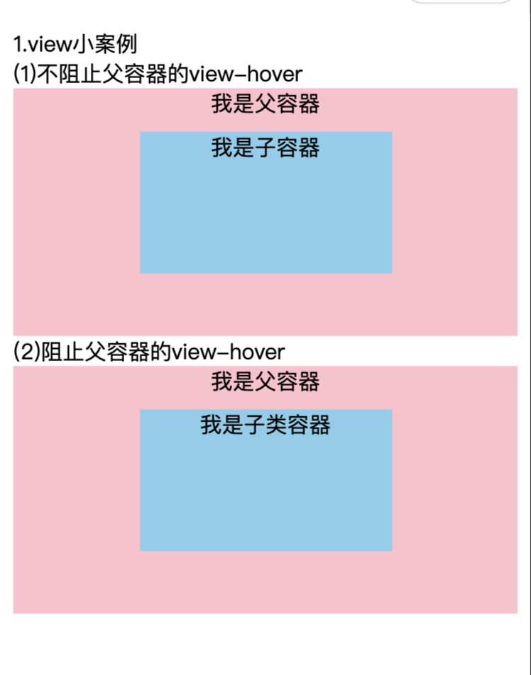
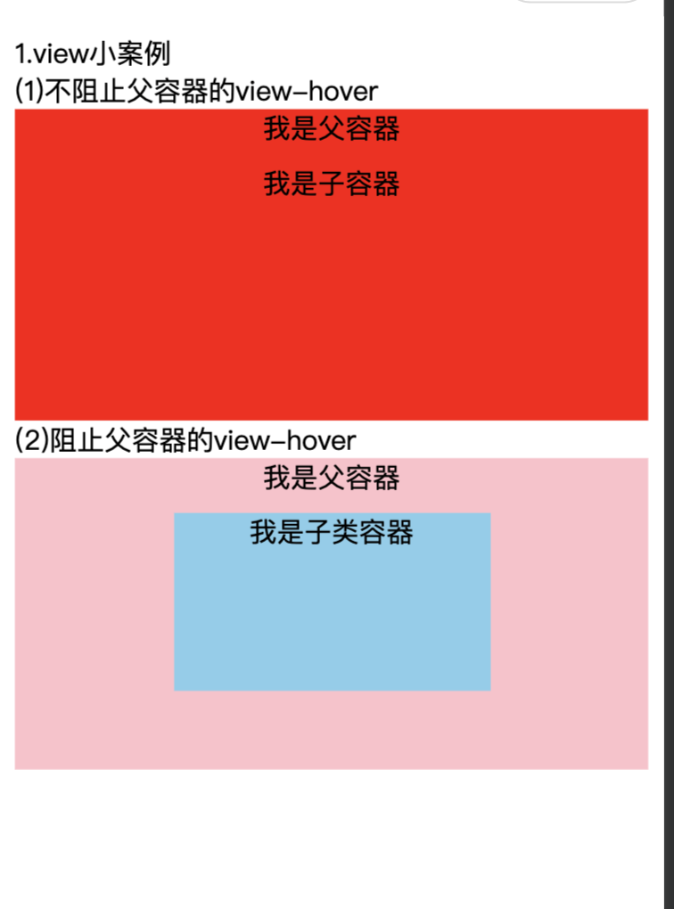
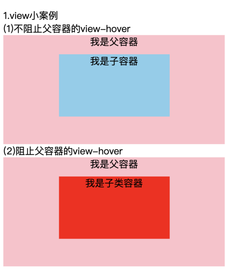
示例:父子容器
view.wxml
html
<view class="demo-box">
  <view class="title">1.view小案例</view>
  <view vlass="title">(1)不阻止父容器的view-hover</view>
  <view class="view-parent" hover-class="view-hover">
    我是父容器
    <view class="view-son" hover-class="view-hover">我是子容器</view>
  </view>
  <view class="title">(2)阻止父容器的view-hover</view>
  <view class="view-parent" hover-class="view-hover">
    我是父容器
    <view class="view-son" hover-class="view-hover" hover-stop-propagation hover-start-time="3000" hover-stay-time="4000">我是子类容器</view>
  </view>
</view>
view.wxss
js
.view-parent {
  width: 100%;
  height: 350rpx;
  background-color: pink;
  text-align: center;
}

.view-son{
  width: 50%;
  height: 200rpx;
  background-color: skyblue;
  margin: 20rpx auto;
  text-align: center;
}

.view-hover {
  background-color: red;
}
页面初始效果:
点击第一组子容器:
点击第二组子容器3S后:
2.2、scroll-view
可滚动视图区域。使用竖向滚动时,需要给scroll-view一个固定高度,通过 WXSS 设置 height。组件属性的长度单位默认为px,2.4.0起支持传入单位(rpx/px)。
- 横向滚动需打开 enable-flex 以兼容 WebView,如
- 滚动条的长度是预估的,若直接子节点的高度差别较大,则滚动条长度可能会不准确
- 使用 worklet 函数需要开启开发者工具 "将 JS 编译成 ES5" 或 "编译 worklet 函数" 选项。
| 属性 | 类型 | 默认值 | 必填 | 说明 |
|---|---|---|---|---|
scroll-x |
boolean | false | 否 | 允许横向滚动 |
scroll-y |
boolean | false | 否 | 允许纵向滚动 |
upper-threshold |
number/string | 50 | 否 距顶部/左边多远时,触发 scrolltoupper 事件 | |
lower-threshold |
number/string | 50 | 否 距底部/右边多远时,触发 scrolltolower 事件 | |
scroll-top |
number/string | 否 | 设置竖向滚动条位置 | |
scroll-left |
number/string | 否 | 设置横向滚动条位置 | |
scroll-into-view |
string | 否 值应为某子元素id(id不能以数字开头)。设置哪个方向可滚动,则在哪个方向滚动到该元素 | ||
scroll-with-animation |
boolean | false | 否 | 在设置滚动条位置时使用动画过渡 |
enable-back-to-top |
boolean | false | 否 | iOS点击顶部状态栏、安卓双击标题栏时,滚动条返回顶部,只支持竖向。自 2.27.3 版本开始,若非显式设置为 false,则在显示尺寸大于屏幕 90% 时自动开启。鸿蒙 OS 暂不支持 |
bindscrolltoupper |
eventhandle | 否 | 滚动到顶部/左边时触发 | |
bindscrolltolower |
eventhandle | 否 | 滚动到底部/右边时触发 | |
bindscroll |
eventhandle | 否 | 滚动时触发,event.detail = { scrollLeft, scrollTop, scrollHeight, scrollWidth, deltaX, deltaY }。skyline 从 3.6.6开始,额外具有 boundaryVelocity 字段:如果该次滚动会触碰到边界,从该次滚动触发起到下一个滚动事件发生或者当次滚动事件结束为止 boundaryVelocity 将被置为触碰边界时的速度,否则置为 NAN。 |
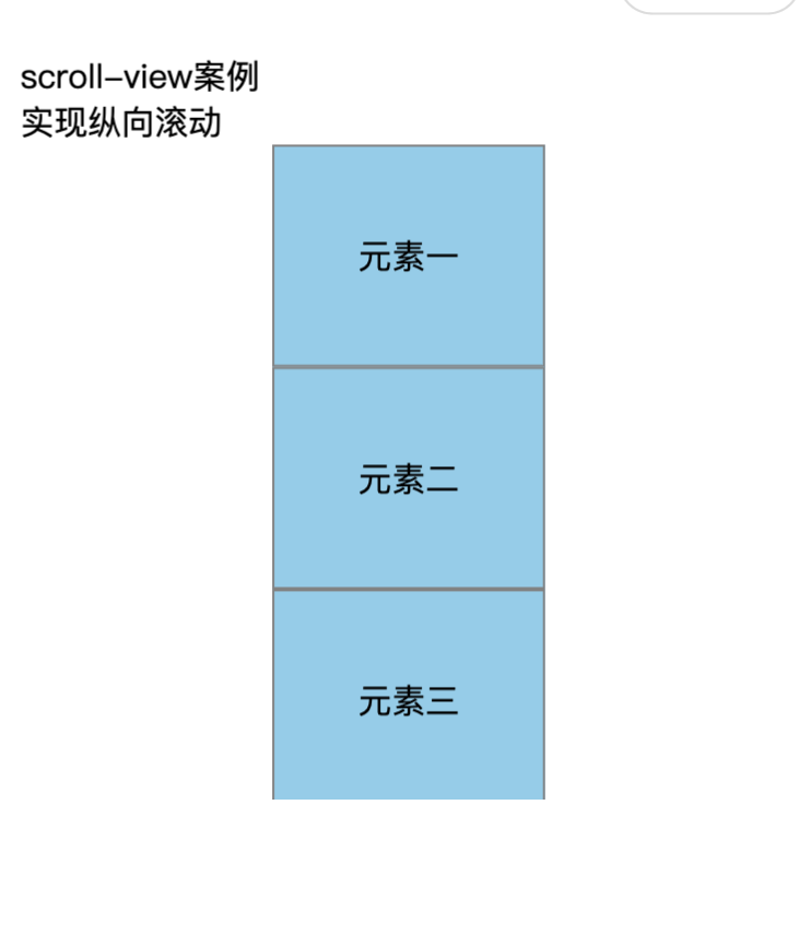
示例:纵向滚动
scroll-view.wxml
html
<view class="demo-box">
  <view class="title">scroll-view案例</view>
  <view class="title">实现纵向滚动</view>
  <scroll-view scroll-y>
    <view class="scroll-item-y">元素一</view>
    <view class="scroll-item-y">元素二</view>
    <view class="scroll-item-y">元素三</view>
    <view class="scroll-item-y">元素四</view>
    <view class="scroll-item-y">元素五</view>
    <view class="scroll-item-y">元素六</view>
    <view class="scroll-item-y">元素七</view>
  </scroll-view>
</view>
scroll-view.wxss
css
scroll-view{
  height: 600rpx;
  width: 250rpx;
  margin: 0 auto;
}

.scroll-item-y{
  height: 200rpx;
  line-height: 200rpx;
  text-align: center;
  background-color: skyblue;
  border: 1px solid gray;
}
2.3、swiper
<swiper>组件为滑块视图容器,通常用于图片之间的切换播放,被形象地称为轮播图。其属性如表所示。
| 属性 | 类型 | 默认值 | 必填 | 说明 |
|---|---|---|---|---|
indicator-dots |
boolean | false | 否 | 是否显示面板指示点 |
indicator-color |
color | rgba(0, 0, 0, .3) | 否 | 指示点颜色 |
indicator-active-color |
color | #000000 | 否 | 当前选中的指示点颜色 |
autoplay |
boolean | false | 否 | 是否自动切换 |
current |
number | 0 | 否 | 当前所在滑块的 index |
interval |
number | 5000 | 否 | 自动切换时间间隔 |
duration |
number | 500 | 否 | 滑动动画时长 |
circular |
boolean | false | 否 | 是否采用衔接滑动 |
vertical |
boolean | false | 否 | 滑动方向是否为纵向 |
display-multiple-items |
number | 1 | 否 | 同时显示的滑块数量 |
previous-margin |
string | "0px" | 否 | 前边距,可用于露出前一项的一小部分,接受 px 和 rpx 值 |
next-margin |
string | "0px" | 否 | 后边距,可用于露出后一项的一小部分,接受 px 和 rpx 值。skyline 于 3.5.1 版本支持 |
easing-function |
string | "default" | 否 | 指定 swiper 切换缓动动画类型 default:默认缓动函数 linear:线性动画 easeInCubic:缓入动画 easeOutCubic:缓出动画 easeInOutCubic:缓入缓出动画 |
direction |
string | "all" | 否 | 指定 swiper 滑动方向 all:默认 positive:如 vertical 为 true 时,允许用户下滑(swiper 内容向上滚动),为 false 时,允许用户右滑(swiper 内容向左滚动) negative:如 vertical 为 true 时,允许用户上滑(swiper 内容向下滚动),为 false 时,允许用户左滑(swiper 内容向右滚动) |
bindchange |
eventhandle | 否 | current 改变时会触发 change 事件,event.detail = {current, source} | |
bindtransition |
eventhandle | 否 | swiper-item 的位置发生改变时会触发 transition 事件,event.detail = {dx: dx, dy: dy}。Skyline 仅支持非 worklet 的组件方法作为回调。 | |
bindanimationfinish |
eventhandle | 否 | 动画结束时会触发 animationfinish 事件,event.detail 同 bindchange。Skyline 仅支持非 worklet 的组件方法作为回调。 |
html
<view class="demo-box">
  <view class="title">swiper案例</view>
  <view class="title">图片金鑫翻页切换</view>
  <swiper indicator-dots autoplay interval="3000">
    <swiper-item>
      <image src="/images/1.png"></image>
    </swiper-item>

    <swiper-item>
      <image src="/images/2.png"></image>
    </swiper-item>

    <swiper-item>
      <image src="/images/1.png"></image>
    </swiper-item>

  </swiper>
</view>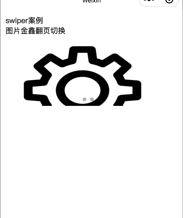
三、基础内容组件
3.1、icon
图标组件,常用于页面装饰,开发者可以自定义其类型、大小和颜色。
| 属性 | 类型 | 默认值 | 必填 | 说明 |
|---|---|---|---|---|
type |
string | 是 | icon的类型,有效值:success, success_no_circle, info, warn, waiting, cancel, download, search, clear | |
size |
number/string | 23 | 否 | icon的大小,单位默认为px,2.4.0起支持传入单位(rpx/px),2.21.3起支持传入其余单位(rem 等)。 |
color |
string | 否 | icon的颜色,同css的color |
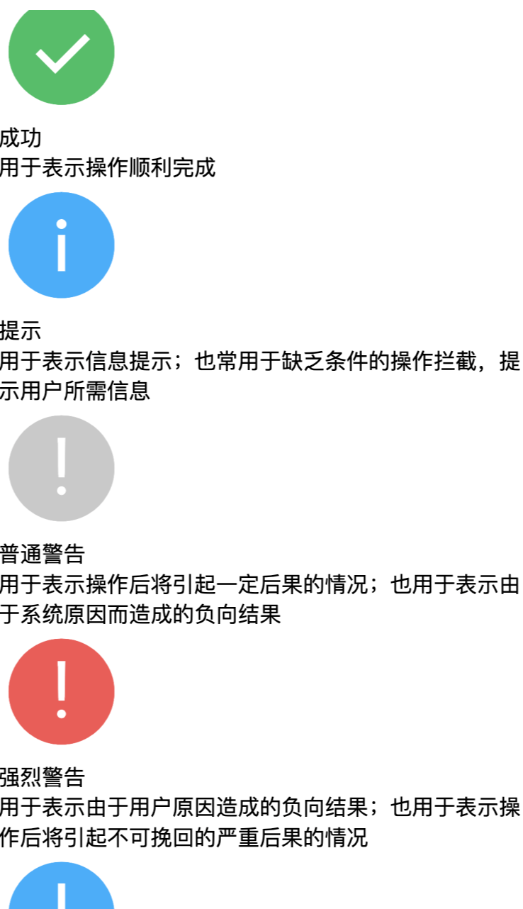
html
<view class="container">
<view class="icon-box">
<icon class="icon-box-img" type="success" size="93"></icon>
<view class="icon-box-ctn">
<view class="icon-box-title">成功</view>
<view class="icon-box-desc">用于表示操作顺利完成</view>
</view>
</view>
<view class="icon-box">
<icon class="icon-box-img" type="info" size="93"></icon>
<view class="icon-box-ctn">
<view class="icon-box-title">提示</view>
<view class="icon-box-desc">用于表示信息提示;也常用于缺乏条件的操作拦截,提示用户所需信息</view>
</view>
</view>
<view class="icon-box">
<icon class="icon-box-img" type="warn" size="93" color="#C9C9C9"></icon>
<view class="icon-box-ctn">
<view class="icon-box-title">普通警告</view>
<view class="icon-box-desc">用于表示操作后将引起一定后果的情况;也用于表示由于系统原因而造成的负向结果</view>
</view>
</view>
<view class="icon-box">
<icon class="icon-box-img" type="warn" size="93"></icon>
<view class="icon-box-ctn">
<view class="icon-box-title">强烈警告</view>
<view class="icon-box-desc">用于表示由于用户原因造成的负向结果;也用于表示操作后将引起不可挽回的严重后果的情况</view>
</view>
</view>
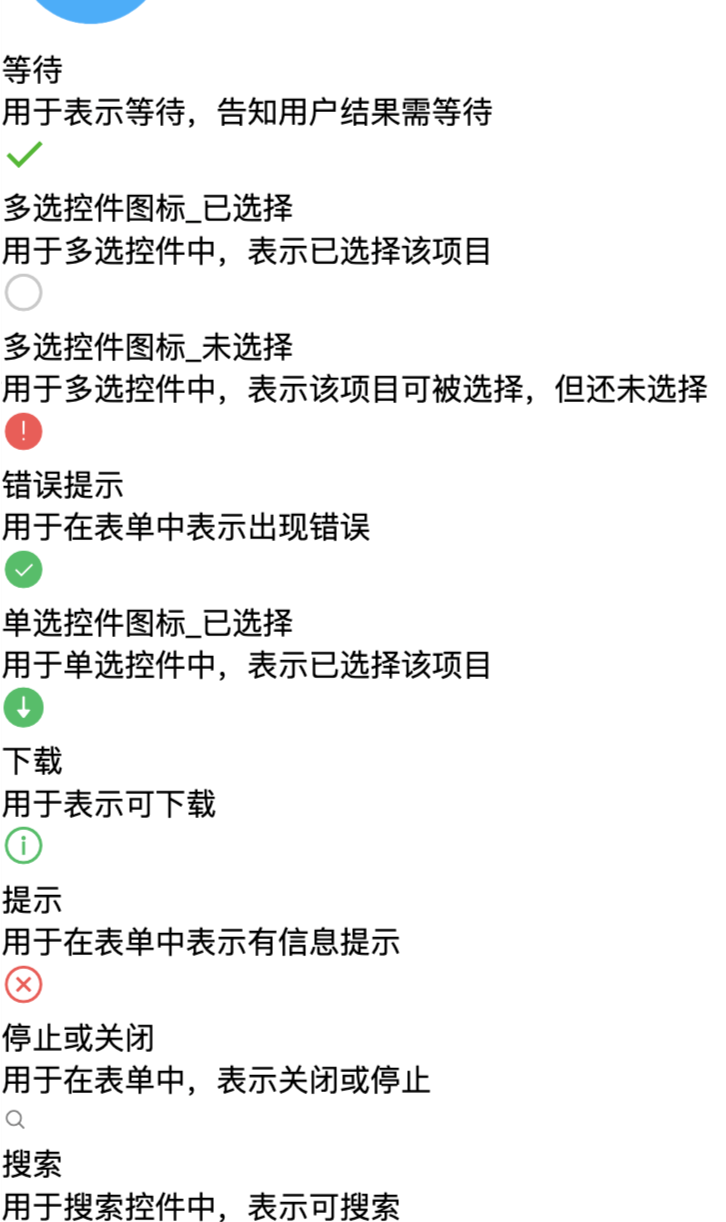
<view class="icon-box">
<icon class="icon-box-img" type="waiting" size="93"></icon>
<view class="icon-box-ctn">
<view class="icon-box-title">等待</view>
<view class="icon-box-desc">用于表示等待,告知用户结果需等待</view>
</view>
</view>
<view class="icon-box">
<view class="icon-small-wrp">
<icon class="icon-small" type="success_no_circle" size="23"></icon>
</view>
<view class="icon-box-ctn">
<view class="icon-box-title">多选控件图标_已选择</view>
<view class="icon-box-desc">用于多选控件中,表示已选择该项目</view>
</view>
</view>
<view class="icon-box">
<view class="icon-small-wrp">
<icon class="icon-small" type="circle" size="23"></icon>
</view>
<view class="icon-box-ctn">
<view class="icon-box-title">多选控件图标_未选择</view>
<view class="icon-box-desc">用于多选控件中,表示该项目可被选择,但还未选择</view>
</view>
</view>
<view class="icon-box">
<view class="icon-small-wrp">
<icon class="icon-small" type="warn" size="23"></icon>
</view>
<view class="icon-box-ctn">
<view class="icon-box-title">错误提示</view>
<view class="icon-box-desc">用于在表单中表示出现错误</view>
</view>
</view>
<view class="icon-box">
<view class="icon-small-wrp">
<icon class="icon-small" type="success" size="23"></icon>
</view>
<view class="icon-box-ctn">
<view class="icon-box-title">单选控件图标_已选择</view>
<view class="icon-box-desc">用于单选控件中,表示已选择该项目</view>
</view>
</view>
<view class="icon-box">
<view class="icon-small-wrp">
<icon class="icon-small" type="download" size="23"></icon>
</view>
<view class="icon-box-ctn">
<view class="icon-box-title">下载</view>
<view class="icon-box-desc">用于表示可下载</view>
</view>
</view>
<view class="icon-box">
<view class="icon-small-wrp">
<icon class="icon-small" type="info_circle" size="23"></icon>
</view>
<view class="icon-box-ctn">
<view class="icon-box-title">提示</view>
<view class="icon-box-desc">用于在表单中表示有信息提示</view>
</view>
</view>
<view class="icon-box">
<view class="icon-small-wrp">
<icon class="icon-small" type="cancel" size="23"></icon>
</view>
<view class="icon-box-ctn">
<view class="icon-box-title">停止或关闭</view>
<view class="icon-box-desc">用于在表单中,表示关闭或停止</view>
</view>
</view>
<view class="icon-box">
<view class="icon-small-wrp">
<icon class="icon-small" type="search" size="14"></icon>
</view>
<view class="icon-box-ctn">
<view class="icon-box-title">搜索</view>
<view class="icon-box-desc">用于搜索控件中,表示可搜索</view>
</view>
</view>
</view>
js
Page({
  data: {
    iconSize: [20, 30, 40, 50, 60, 70],
    iconColor: [
      'red', 'orange', 'yellow', 'green', 'rgb(0,255,255)', 'blue', 'purple'
    ],
    iconType: [
      'success', 'success_no_circle', 'info', 'warn', 'waiting', 'cancel', 'download', 'search', 'clear'
    ]
  }
})
3.2、text
<text>为文本组件,用于文字的显示,小程序的文本组件支持转义字符。
- 内联文本只能用 text 组件,不能用 view,如 <text> foo <text>bar</text> </text>
- 新增 span 组件用于内联文本和图片,如 <span> <image> </image> <text>bar</text> </span>
| 属性 | 类型 | 默认值 | 必填 | 说明 |
|---|---|---|---|---|
selectable |
boolean | false | 否 | 文本是否可选 (已废弃) |
user-select |
boolean | false | 否 | 文本是否可选,该属性会使文本节点显示为 inline-block |
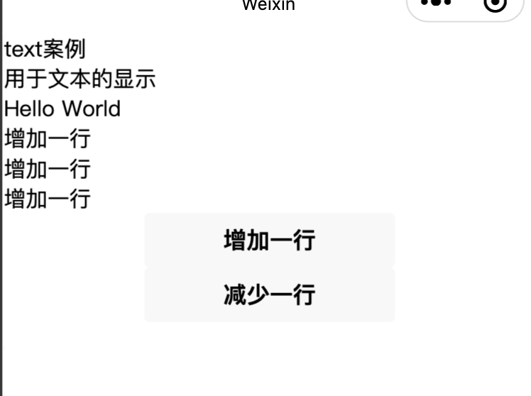
html
<view class="demo-box">
  <view class="title">text案例</view>
  <view class="title">用于文本的显示</view>
  <text>{{text}}</text>
  <button bindtap="add">增加一行</button>
  <button bindtap="reduce">减少一行</button>
</view>
js
var extraLine = [];
var initData = "Hello World";
Page({
  data: {
    text: initData
  },
  add(e) {
    extraLine.push("增加一行")
    this.setData({
      text: initData + '\n' + extraLine.join('\n')
    })
  },
  reduce(e) {
    if(extraLine.length > 0) {
      extraLine.pop()
      this.setData({
        text: initData + '\n' + extraLine.join('\n')
      })
    }
  }
})
3.3、progress
进度条。组件属性的长度单位默认为px,2.4.0起支持传入单位(rpx/px)。
| 属性 | 类型 | 默认值 | 必填 | 说明 |
|---|---|---|---|---|
percent |
number | 否 | 百分比0~100 | |
show-info |
boolean | false | 否 | 在进度条右侧显示百分比 |
border-radius |
number/string | 0 | 否 | 圆角大小 |
font-size |
number/string | 16 | 否 | 右侧百分比字体大小 |
stroke-width |
number/string | 6 | 否 | 进度条线的宽度 |
color |
string | #09BB07 | 否 | 进度条颜色(请使用activeColor) |
activeColor |
string | #09BB07 | 否 | 已选择的进度条的颜色 |
backgroundColor |
string | #EBEBEB | 否 | 未选择的进度条的颜色 |
active |
boolean | false | 否 | 进度条从左往右的动画 |
active-mode |
string | backwards | 否 | backwards: 动画从头播;forwards:动画从上次结束点接着播 |
duration |
number | 30 | 否 | 进度增加1%所需毫秒数 |
bindactiveend |
eventhandle | 否 | 动画完成事件 |
html
<view class="progress-box">
  <progress percent="20" show-info stroke-width="3"/>
</view>

<view class="progress-box">
  <progress percent="40" active stroke-width="3" />
  <icon class="progress-cancel" type="cancel"></icon>
</view>

<view class="progress-box">
  <progress percent="60" active stroke-width="3" />
</view>

<view class="progress-box">
  <progress percent="80" color="#10AEFF" active stroke-width="3" />
</view>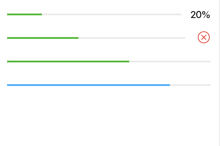
四、表单组件
4.1、button
按钮组件,是常用的表单组件之一,用于事件的触发以及表单的提交。
| 属性名 | 类型 | 默认值 | 说明 |
|---|---|---|---|
size |
string | default | 按钮的大小 |
type |
string | default | 按钮的样式类型 |
plain |
boolean | false | 按钮是否镂空,背景色透明 |
disabled |
boolean | false | 是否禁用 |
loading |
boolean | false | 名称前是否带loading图标 |
form-type |
string | 用于<form>组件,点击分别会触发<form>组件的submit/,reset事件 | |
open-type |
string | button-hover | 微信开放能力 |
hover-class |
string | button-hover | 指定按钮按下去的样式类。当hover-class="none"时,没有点击态效果 |
hover-stop-propagation |
boolean | false | 指定是否阻止本节点的祖先节点出现点击态 |
hover-start-time |
number | 20 | 按住后多久出现点击态,单位:ms |
hover-stay-time |
number | 70 | 手指松开后点击态保留时间,单位:ms |
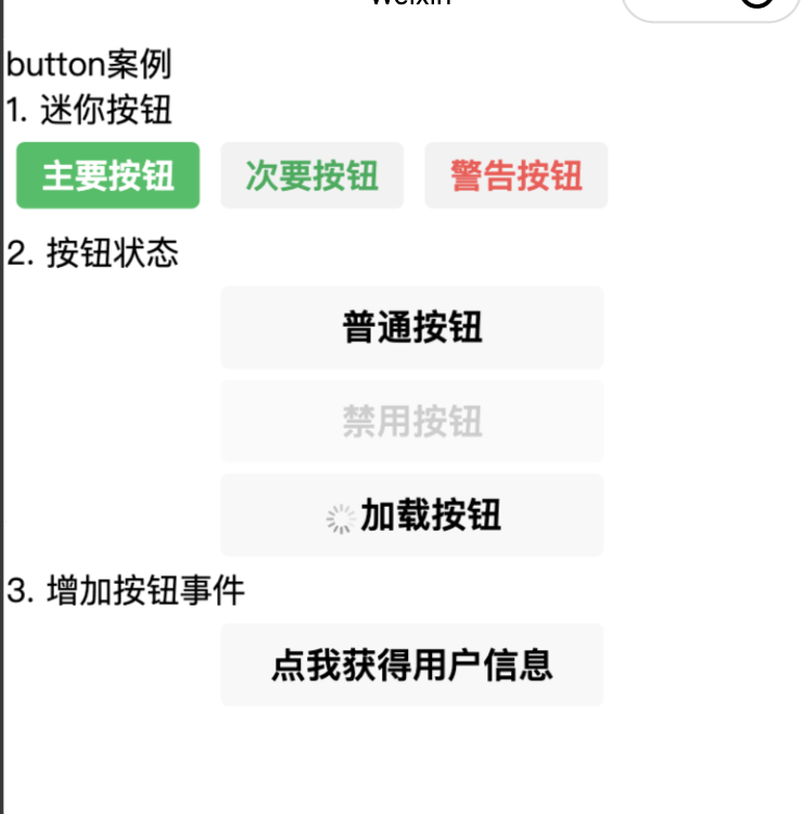
size属性值如下。
- default:默认按钮,宽度与手机屏幕宽度保持一致。
- mini:迷你按钮,尺寸小于默认按钮。
type属性值如下。
- primary:主要按钮,颜色为绿色。
- default:默认按钮,颜色为灰白色。
- warn:警告按钮,颜色为红色。
form-type属性值如下。
- submit:提交表单。
- reset:重置表单。
html
<view class="demo-box">
  <view class="title">button案例</view>
  <view class="title">1. 迷你按钮</view>
  <button size="mini" type="primary">主要按钮</button>
  <button size="mini" type="default">次要按钮</button>
  <button size="mini" type="warn">警告按钮</button>

  <view class="title">2. 按钮状态</view>
  <button>普通按钮</button>
  <button disabled>禁用按钮</button>
  <button loading>加载按钮</button>

  <view class="title">3. 增加按钮事件</view>
  <button bindgetuserinfo="getUserDetail" open-type="getUserInfo">点我获得用户信息</button>
</view>
js
Page({
  getUserDetail(e) {
    console.log(e.detail.userInfo)
  }
})
css
button {
  margin: 10rpx;
}
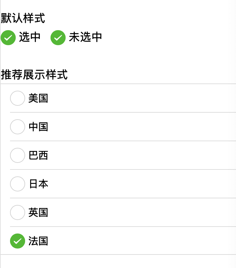
4.2、checkbox
复选框组件,常用于在表单中进行多项数据的选择。
| 属性名 | 类型 | 默认值 | 说明 |
|---|---|---|---|
value |
string | 否 | |
disabled |
boolean | false | 否 |
checked |
boolean | false | 否 |
color |
string | #09BB07 | 否 |
html
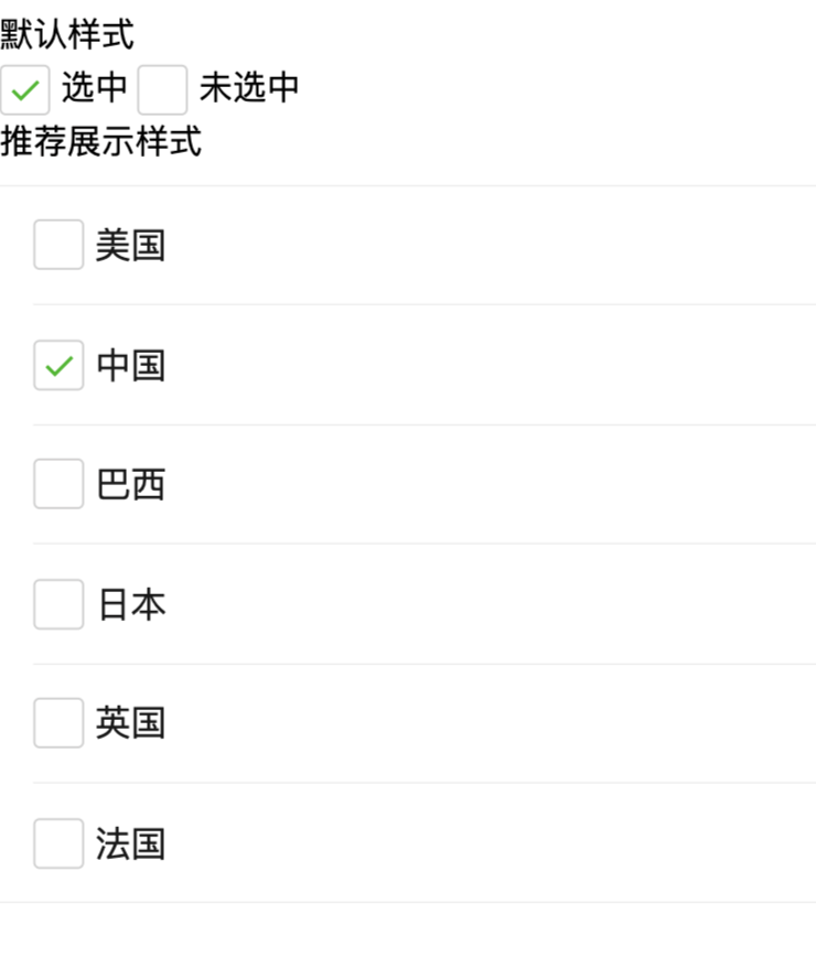
<view class="container">
  <view class="page-body">
    <view class="page-section page-section-gap">
      <view class="page-section-title">默认样式</view>
      <label class="checkbox">
        <checkbox value="cb" checked="true"/>选中
      </label>
      <label class="checkbox">
        <checkbox value="cb" />未选中
      </label>
    </view>

    <view class="page-section">
      <view class="page-section-title">推荐展示样式</view>
      <view class="weui-cells weui-cells_after-title">
        <checkbox-group bindchange="checkboxChange">
          <label class="weui-cell weui-check__label" wx:for="{{items}}" wx:key="{{item.value}}">
            <view class="weui-cell__hd">
              <checkbox value="{{item.value}}" checked="{{item.checked}}"/>
            </view>
            <view class="weui-cell__bd">{{item.name}}</view>
          </label>
        </checkbox-group>
      </view>
    </view>
  </view>

</view>
js
Page({
  onShareAppMessage() {
    return {
      title: 'checkbox',
      path: 'page/component/pages/checkbox/checkbox'
    }
  },

  data: {
    items: [
      {value: 'USA', name: '美国'},
      {value: 'CHN', name: '中国', checked: 'true'},
      {value: 'BRA', name: '巴西'},
      {value: 'JPN', name: '日本'},
      {value: 'ENG', name: '英国'},
      {value: 'FRA', name: '法国'}
    ]
  },

  checkboxChange(e) {
    console.log('checkbox发生change事件,携带value值为:', e.detail.value)

    const items = this.data.items
    const values = e.detail.value
    for (let i = 0, lenI = items.length; i < lenI; ++i) {
      items[i].checked = false

      for (let j = 0, lenJ = values.length; j < lenJ; ++j) {
        if (items[i].value === values[j]) {
          items[i].checked = true
          break
        }
      }
    }

    this.setData({
      items
    })
  }
})
4.3、checkbox-group
多项选择器,内部由多个checkbox组成。
| 属性名 | 类型 | 默认值 | 说明 |
|---|---|---|---|
bindchange |
EventHandle | 否 | checkbox-group中选中项发生改变时触发 change 事件,detail = {value:选中的checkbox的value的数组} |
4.4、input
输入框组件,常用于文本(如姓名、年龄等信息)的输入。
| 属性名 | 类型 | 默认值 | 必填 | 说明 |
|---|---|---|---|---|
value |
string | 是 | 输入框的初始内容 | |
type |
string | text | 否 | input 的类型 |
password |
boolean | false | 否 | 是否是密码类型 |
placeholder |
string | 是 | 输入框为空时占位符 | |
placeholder-style |
string | 是 | 指定 placeholder 的样式 | |
disabled |
boolean | false | 否 | 是否禁用 |
maxlength |
number | 140 | 否 | 最大输入长度,设置为 -1 的时候不限制最大长度 |
cursor-spacing |
number | 0 | 否 | 指定光标与键盘的距离,取 input 距离底部的距离和 cursor-spacing 指定的距离的最小值作为光标与键盘的距离 |
auto-focus |
boolean | false | 否 | (即将废弃,请直接使用 focus )自动聚焦,拉起键盘 |
focus |
boolean | false | 否 | 获取焦点 |
confirm-type |
string | done | 否 | 设置键盘右下角按钮的文字,仅在type='text'时生效 |
confirm-hold |
boolean | false | 否 | 点击键盘右下角按钮时是否保持键盘不收起 |
cursor |
number | 是 | 指定focus时的光标位置 | |
cursor-color |
string | 是 | 光标颜色。iOS 下的格式为十六进制颜色值 #000000,安卓下的只支持 default 和 green,Skyline 下无限制 | |
selection-start |
number | -1 | 否 | 光标起始位置,自动聚集时有效,需与selection-end搭配使用 |
selection-end |
number | -1 | 否 | 光标结束位置,自动聚集时有效,需与selection-start搭配使用 |
adjust-position |
boolean | true | 否 | 键盘弹起时,是否自动上推页面 |
bindinput |
eventhandle | 是 | 键盘输入时或内容改变时触发。event.detail = { value: string, cursor?: number, keyCode?: number },cursor 为光标位置,keyCode 为键值。2.1.0 起支持,处理函数可以直接 return 一个字符串,将替换输入框的内容。 | |
bindchange |
eventhandle | 是 | 键盘非聚焦状态内容改变时触发。event.detail = { value: string } | |
bindfocus |
eventhandle | 是 | 输入框聚焦时触发,event.detail = { value: string, height: number },height 为键盘高度,在基础库 1.9.90 起支持 | |
bindblur |
eventhandle | 是 | 输入框失去焦点时触发,event.detail = { value: string, encryptedValue?: string, encryptError?: string } | |
bindconfirm |
eventhandle | 是 | 点击完成按钮时触发,event.detail = { value: string, encryptedValue?: string, encryptError?: string } | |
bindkeyboardheightchange |
eventhandle | 是 | 键盘高度发生变化的时候触发此事件,event.detail = {height: number, duration: number} | |
bindnicknamereview |
eventhandle | 是 | 用户昵称审核完毕后触发,仅在 type 为 "nickname" 时有效,event.detail = { pass: boolean, timeout: boolean } |
type属性值如下:
- text 文本输入键盘
- number 数字输入键盘
- idcard 身份证输入键盘
- digit 带小数点的数字键盘
- safe-password 密码安全输入键盘 指引。仅 Webview 支持。 2.18.0
- nickname 昵称输入键盘。
confirm-type属性值如下:
- send 右下角按钮为"发送"
- search 右下角按钮为"搜索"
- next 右下角按钮为"下一个"
- go 右下角按钮为"前往"
- done 右下角按钮为"完成"
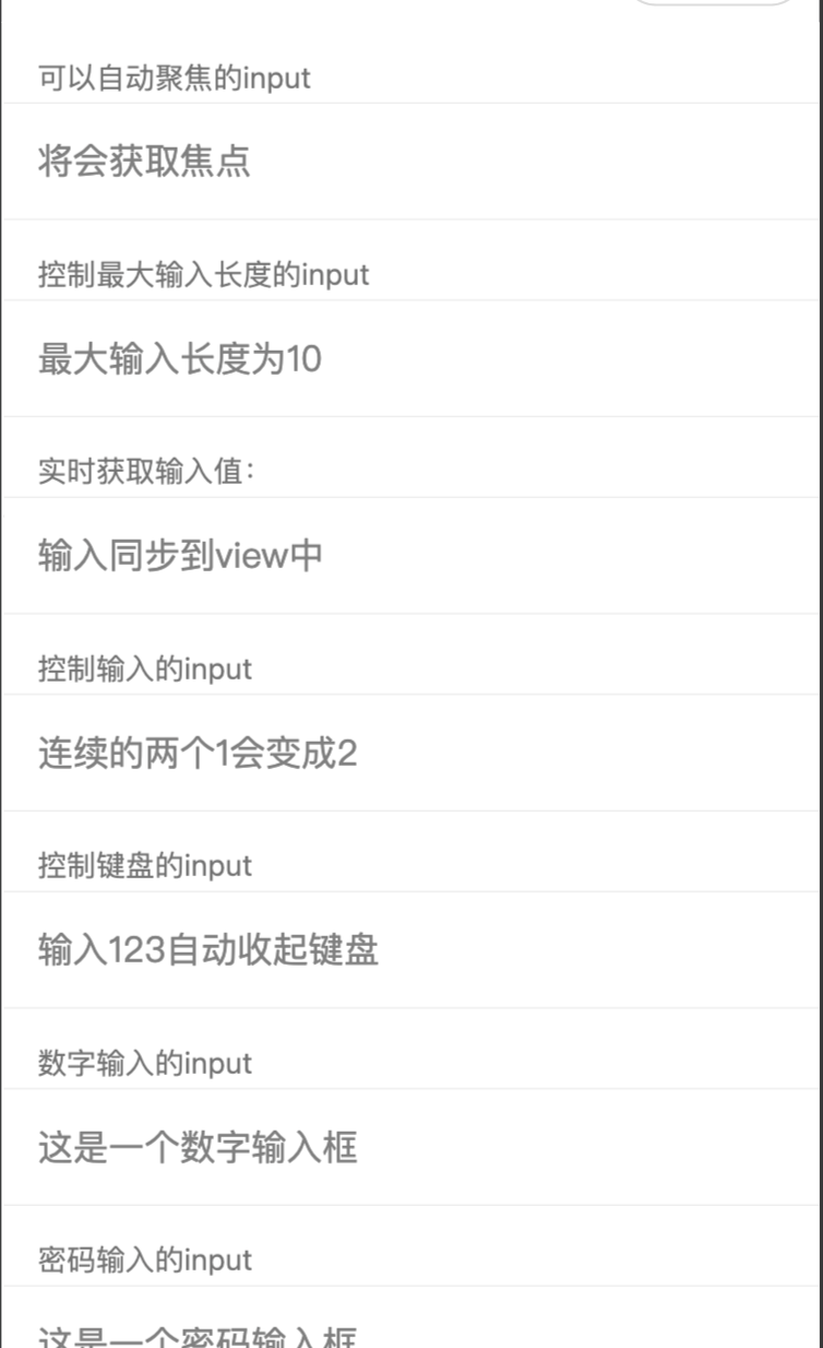
html
<view class="page-body">
  <view class="page-section">
    <view class="weui-cells__title">可以自动聚焦的input</view>
    <view class="weui-cells weui-cells_after-title">
      <view class="weui-cell weui-cell_input">
        <input class="weui-input" auto-focus placeholder="将会获取焦点"/>
      </view>
    </view>
  </view>
  <view class="page-section">
    <view class="weui-cells__title">控制最大输入长度的input</view>
    <view class="weui-cells weui-cells_after-title">
      <view class="weui-cell weui-cell_input">
        <input class="weui-input" maxlength="10" placeholder="最大输入长度为10" />
      </view>
    </view>
  </view>
  <view class="page-section">
    <view class="weui-cells__title">实时获取输入值:{{inputValue}}</view>
    <view class="weui-cells weui-cells_after-title">
      <view class="weui-cell weui-cell_input">
        <input class="weui-input"  maxlength="10" bindinput="bindKeyInput" placeholder="输入同步到view中"/>
      </view>
    </view>
  </view>
  <view class="page-section">
    <view class="weui-cells__title">控制输入的input</view>
    <view class="weui-cells weui-cells_after-title">
      <view class="weui-cell weui-cell_input">
        <input class="weui-input"  bindinput="bindReplaceInput" placeholder="连续的两个1会变成2" />
      </view>
    </view>
  </view>
  <view class="page-section">
    <view class="weui-cells__title">控制键盘的input</view>
    <view class="weui-cells weui-cells_after-title">
      <view class="weui-cell weui-cell_input">
        <input class="weui-input"  bindinput="bindHideKeyboard" placeholder="输入123自动收起键盘" />
      </view>
    </view>
  </view>
  <view class="page-section">
    <view class="weui-cells__title">数字输入的input</view>
    <view class="weui-cells weui-cells_after-title">
      <view class="weui-cell weui-cell_input">
        <input class="weui-input" type="number" placeholder="这是一个数字输入框" />
      </view>
    </view>
  </view>
  <view class="page-section">
    <view class="weui-cells__title">密码输入的input</view>
    <view class="weui-cells weui-cells_after-title">
      <view class="weui-cell weui-cell_input">
        <input class="weui-input" password type="text" placeholder="这是一个密码输入框" />
      </view>
    </view>
  </view>
  <view class="page-section">
    <view class="weui-cells__title">带小数点的input</view>
    <view class="weui-cells weui-cells_after-title">
      <view class="weui-cell weui-cell_input">
        <input class="weui-input" type="digit" placeholder="带小数点的数字键盘"/>
      </view>
    </view>
  </view>
  <view class="page-section">
    <view class="weui-cells__title">身份证输入的input</view>
    <view class="weui-cells weui-cells_after-title">
      <view class="weui-cell weui-cell_input">
        <input class="weui-input" type="idcard" placeholder="身份证输入键盘" />
      </view>
    </view>
  </view>
  <view class="page-section">
    <view class="weui-cells__title">控制占位符颜色的input</view>
    <view class="weui-cells weui-cells_after-title">
      <view class="weui-cell weui-cell_input">
        <input class="weui-input" placeholder-style="color:#F76260" placeholder="占位符字体是红色的" />
      </view>
    </view>
  </view>
</view>
js
Page({
  data: {
    focus: false,
    inputValue: ''
  },
  bindKeyInput: function (e) {
    this.setData({
      inputValue: e.detail.value
    })
  },
  bindReplaceInput: function (e) {
    var value = e.detail.value
    var pos = e.detail.cursor
    var left
    if (pos !== -1) {
      // 光标在中间
      left = e.detail.value.slice(0, pos)
      // 计算光标的位置
      pos = left.replace(/11/g, '2').length
    }

    // 直接返回对象,可以对输入进行过滤处理,同时可以控制光标的位置
    return {
      value: value.replace(/11/g, '2'),
      cursor: pos
    }

    // 或者直接返回字符串,光标在最后边
    // return value.replace(/11/g,'2'),
  },
  bindHideKeyboard: function (e) {
    if (e.detail.value === '123') {
      // 收起键盘
      wx.hideKeyboard()
    }
  }
})
4.5、label
<label>是标签组件,label组件不会呈现任何效果,但是可以用来改进表单组件的可用性。当用户在label元素内点击文本时,就会触发此控件,即当用户选择该标签时,事件会传
递到和标签相关的表单控件上,可以使用for属性绑定id,也可以将控件放在该标签内部。该组件对应的属性如表所示。
| 属性名 | 类型 | 说明 |
|---|---|---|
| for | String | 绑定控件的id |
html
<view class="demo-box">
  <view class="title">label案例</view>
  <view class="title">利用for属性</view>
  <checkbox-group>
    <checkbox id="tiger" checked=""/>
    <label for="tiger">老虎</label>

    <checkbox id="elephant" checked=""/>
    <label for="elephant">大象</label>

    <checkbox id="lion" checked=""/>
    <label for="lion">狮子</label>

  </checkbox-group>

  <view class="title">label包裹组件</view>
  <checkbox-group>
    <label>
      <checkbox checked />老虎
    </label>
    <label>
      <checkbox/>大象
    </label>
    <label>
      <checkbox/>狮子
    </label>
  </checkbox-group>
</view>
css
checkbox-group {
  margin: 0 80rpx;
}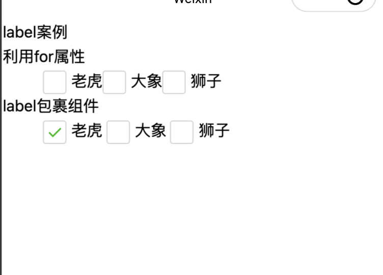
本例在wxml文件中放置两组标签组件,第一组使用for属性绑定id,第二组让label包裹<checkbox>组件。
如图所示,两种方法效果相同,当分别单击每个文字内容后,如果左边复选框是选中状态,就会变成未选中状态;如果左边复选框是未选中状态,就会变成选中状态。
4.6、form
表单。将组件内的用户输入的switch input checkbox slider radio picker 提交。
当点击 form 表单中 form-type 为 submit 的 button 组件时,会将表单组件中的 value 值进行提交,需要在表单组件中加上 name 来作为 key。
| 属性 | 类型 | 默认值 | 必填 | 说明 |
|---|---|---|---|---|
report-submit |
boolean | false | 否 | 是否返回 formId 用于发送模板消息 |
report-submit-timeout |
number | 0 | 否 | 等待一段时间(毫秒数)以确认 formId 是否生效。如果未指定这个参数,formId 有很小的概率是无效的(如遇到网络失败的情况)。指定这个参数将可以检测 formId 是否有效,以这个参数的时间作为这项检测的超时时间。如果失败,将返回 requestFormId:fail 开头的 formId |
bindsubmit |
eventhandle | 否 | 携带 form 中的数据触发 submit 事件,event.detail = {value : {'name': 'value'} , formId: ''} | |
bindreset |
eventhandle | 否 | 表单重置时会触发 reset 事件 | |
bindsubmitToGroup |
eventhandle | 否 | 用户发送文本到聊天后触发,但不代表最终发送成功 |
html
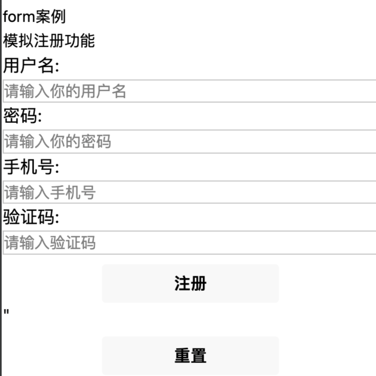
<view class="demo-box">
  <view class="title">form案例</view>
  <view class="title">模拟注册功能</view>
  <form bindsubmit="onSubmit" bindreset="onReset">
    <text>用户名:</text>
    <input name="username" type="text" placeholder="请输入你的用户名"/>
    <text>密码:</text>
    <input name="password" type="password" placeholder="请输入你的密码"/>
    <text>手机号:</text>
    <input name="phonenumber" type="password" placeholder="请输入手机号"/>
    <text>验证码:</text>
    <input name="code" type="password" placeholder="请输入验证码"/>
    <button form-type="submit">注册</button>"
    <button form-type="reset">重置</button>
  </form>
</view>
js
Page({
  onSubmit(e) {
    console.log("表单被注册")
    console.log("form发生了submit事件,携带数据为:", e.detail.value)
  },
  onReset() {
    console.log("form发生了reset事件,表单已被重置")
  }
})
css
input {
  border: 1px solid silver;
}
button {
  margin-top: 20rpx;
}

text {
  font-size: 36rpx;
}
4.7、picker
<picker>为滚动选择器,从页面底部弹出供用户选择。根据mode属性值的不同共有5种选择器,分别为普通选择器、多列选择器、时间选择器、日期选择器和省市区选择器。
通用属性:
| 属性 | 类型 | 默认值 | 必填 | 说明 |
|---|---|---|---|---|
header-text |
string | 否 | 选择器的标题,仅安卓可用 | |
mode |
string | selector | 否 | 选择器类型 selector:普通选择器 multiSelector:多列选择器 time:时间选择器 date:日期选择器 region:省市区选择器 |
disabled |
boolean | false | 否 | 是否禁用 |
bindcancel |
eventhandle | 否 | 取消选择时触发 |
1. 普通选择器:mode = selector
| 属性名 | 类型 | 默认值 | 说明 |
|---|---|---|---|
range |
array/object array | \[\] | mode 为 selector 或 multiSelector 时,range 有效 |
range-key |
string | 当 range 是一个 Object Array 时,通过 range-key 来指定 Object 中 key 的值作为选择器显示内容 | |
value |
number | 0 | 表示选择了 range 中的第几个(下标从 0 开始) |
bindchange |
eventhandle | value 改变时触发 change 事件,event.detail = {value} |
2. 多列选择器:mode = multiSelector
| 属性名 | 类型 | 默认值 | 说明 |
|---|---|---|---|
range |
array/object array | \[\] | mode 为 selector 或 multiSelector 时,range 有效 |
range-key |
string | 当 range 是一个 Object Array 时,通过 range-key 来指定 Object 中 key 的值作为选择器显示内容 | |
value |
array | \[\] | 表示选择了 range 中的第几个(下标从 0 开始) |
bindchange |
eventhandle | value 改变时触发 change 事件,event.detail = {value} | |
bindcolumnchange |
eventhandle | 列改变时触发 |
3. 时间选择器:mode = time
| 属性名 | 类型 | 默认值 | 说明 |
|---|---|---|---|
value |
string | 表示选中的时间,格式为"hh:mm" | |
start |
string | 表示有效时间范围的开始,字符串格式为"hh:mm" | |
end |
string | 表示有效时间范围的结束,字符串格式为"hh:mm" | |
bindchange |
eventhandle | value 改变时触发 change 事件,event.detail = {value} |
4. 日期选择器:mode = date
| 属性名 | 类型 | 默认值 | 说明 |
|---|---|---|---|
value |
string | 当天 | 表示选中的日期,格式为"YYYY-MM-DD" |
start |
string | 表示有效日期范围的开始,字符串格式为"YYYY-MM-DD" | |
end |
string | 表示有效日期范围的结束,字符串格式为"YYYY-MM-DD" | |
fields |
string | day | 有效值 year,month,day,表示选择器的粒度 year:选择器粒度为年 month:选择器粒度为月份 day:选择器粒度为天 |
bindchange |
eventhandle | value 改变时触发 change 事件,event.detail = {value} |
5. 省市区选择器:mode = region
| 属性名 | 类型 | 默认值 | 说明 |
|---|---|---|---|
value |
array | \[\] | 表示选中的省市区,默认选中每一列的第一个值 |
custom-item |
string | 可为每一列的顶部添加一个自定义的项 | |
level |
string | region | 选择器层级 province:省级选择器 city:市级选择器 region:区级选择器 sub-district:街道选择器 |
bindchange |
eventhandle | value 改变时触发 change 事件,event.detail = {value, code, postcode},其中字段 code 是统计用区划代码,postcode 是邮政编码 |
html
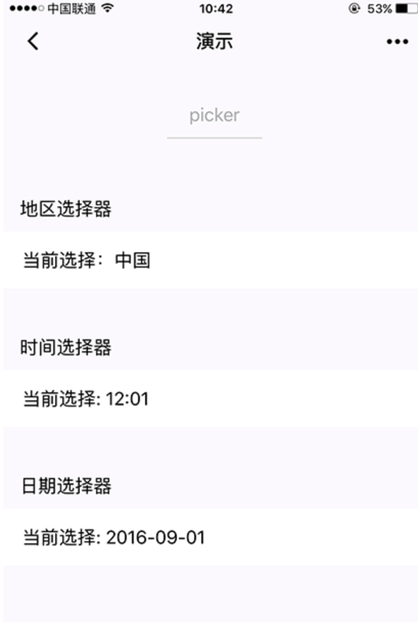
<view class="section">
  <view class="section__title">普通选择器</view>
  <picker bindchange="bindPickerChange" value="{{index}}" range="{{array}}">
    <view class="picker">
      当前选择:{{array[index]}}
    </view>
  </picker>
</view>
<view class="section">
  <view class="section__title">多列选择器</view>
  <picker mode="multiSelector" bindchange="bindMultiPickerChange" bindcolumnchange="bindMultiPickerColumnChange" value="{{multiIndex}}" range="{{multiArray}}">
    <view class="picker">
      当前选择:{{multiArray[0][multiIndex[0]]}},{{multiArray[1][multiIndex[1]]}},{{multiArray[2][multiIndex[2]]}}
    </view>
  </picker>
</view>
<view class="section">
  <view class="section__title">时间选择器</view>
  <picker mode="time" value="{{time}}" start="09:01" end="21:01" bindchange="bindTimeChange">
    <view class="picker">
      当前选择: {{time}}
    </view>
  </picker>
</view>

<view class="section">
  <view class="section__title">日期选择器</view>
  <picker mode="date" value="{{date}}" start="2015-09-01" end="2017-09-01" bindchange="bindDateChange">
    <view class="picker">
      当前选择: {{date}}
    </view>
  </picker>
</view>
<view class="section">
  <view class="section__title">省市区选择器</view>
  <picker mode="region" bindchange="bindRegionChange" value="{{region}}" custom-item="{{customItem}}">
    <view class="picker">
      当前选择:{{region[0]}},{{region[1]}},{{region[2]}}
    </view>
  </picker>
</view>
js
Page({
  data: {
    array: ['美国', '中国', '巴西', '日本'],
    objectArray: [
      {
        id: 0,
        name: '美国'
      },
      {
        id: 1,
        name: '中国'
      },
      {
        id: 2,
        name: '巴西'
      },
      {
        id: 3,
        name: '日本'
      }
    ],
    index: 0,
    multiArray: [['无脊柱动物', '脊柱动物'], ['扁性动物', '线形动物', '环节动物', '软体动物', '节肢动物'], ['猪肉绦虫', '吸血虫']],
    objectMultiArray: [
      [
        {
          id: 0,
          name: '无脊柱动物'
        },
        {
          id: 1,
          name: '脊柱动物'
        }
      ], [
        {
          id: 0,
          name: '扁性动物'
        },
        {
          id: 1,
          name: '线形动物'
        },
        {
          id: 2,
          name: '环节动物'
        },
        {
          id: 3,
          name: '软体动物'
        },
        {
          id: 4,
          name: '节肢动物'
        }
      ], [
        {
          id: 0,
          name: '猪肉绦虫'
        },
        {
          id: 1,
          name: '吸血虫'
        }
      ]
    ],
    multiIndex: [0, 0, 0],
    date: '2016-09-01',
    time: '12:01',
    region: ['广东省', '广州市', '海珠区'],
    customItem: '全部'
  },
  bindPickerChange: function(e) {
    console.log('picker发送选择改变,携带值为', e.detail.value)
    this.setData({
      index: e.detail.value
    })
  },
  bindMultiPickerChange: function (e) {
    console.log('picker发送选择改变,携带值为', e.detail.value)
    this.setData({
      multiIndex: e.detail.value
    })
  },
  bindMultiPickerColumnChange: function (e) {
    console.log('修改的列为', e.detail.column, ',值为', e.detail.value);
    var data = {
      multiArray: this.data.multiArray,
      multiIndex: this.data.multiIndex
    };
    data.multiIndex[e.detail.column] = e.detail.value;
    switch (e.detail.column) {
      case 0:
        switch (data.multiIndex[0]) {
          case 0:
            data.multiArray[1] = ['扁性动物', '线形动物', '环节动物', '软体动物', '节肢动物'];
            data.multiArray[2] = ['猪肉绦虫', '吸血虫'];
            break;
          case 1:
            data.multiArray[1] = ['鱼', '两栖动物', '爬行动物'];
            data.multiArray[2] = ['鲫鱼', '带鱼'];
            break;
        }
        data.multiIndex[1] = 0;
        data.multiIndex[2] = 0;
        break;
      case 1:
        switch (data.multiIndex[0]) {
          case 0:
            switch (data.multiIndex[1]) {
              case 0:
                data.multiArray[2] = ['猪肉绦虫', '吸血虫'];
                break;
              case 1:
                data.multiArray[2] = ['蛔虫'];
                break;
              case 2:
                data.multiArray[2] = ['蚂蚁', '蚂蟥'];
                break;
              case 3:
                data.multiArray[2] = ['河蚌', '蜗牛', '蛞蝓'];
                break;
              case 4:
                data.multiArray[2] = ['昆虫', '甲壳动物', '蛛形动物', '多足动物'];
                break;
            }
            break;
          case 1:
            switch (data.multiIndex[1]) {
              case 0:
                data.multiArray[2] = ['鲫鱼', '带鱼'];
                break;
              case 1:
                data.multiArray[2] = ['青蛙', '娃娃鱼'];
                break;
              case 2:
                data.multiArray[2] = ['蜥蜴', '龟', '壁虎'];
                break;
            }
            break;
        }
        data.multiIndex[2] = 0;
        break;
    }
    console.log(data.multiIndex);
    this.setData(data);
  },
  bindDateChange: function(e) {
    console.log('picker发送选择改变,携带值为', e.detail.value)
    this.setData({
      date: e.detail.value
    })
  },
  bindTimeChange: function(e) {
    console.log('picker发送选择改变,携带值为', e.detail.value)
    this.setData({
      time: e.detail.value
    })
  },
  bindRegionChange: function (e) {
    console.log('picker发送选择改变,携带值为', e.detail.value)
    this.setData({
      region: e.detail.value
    })
  }
})
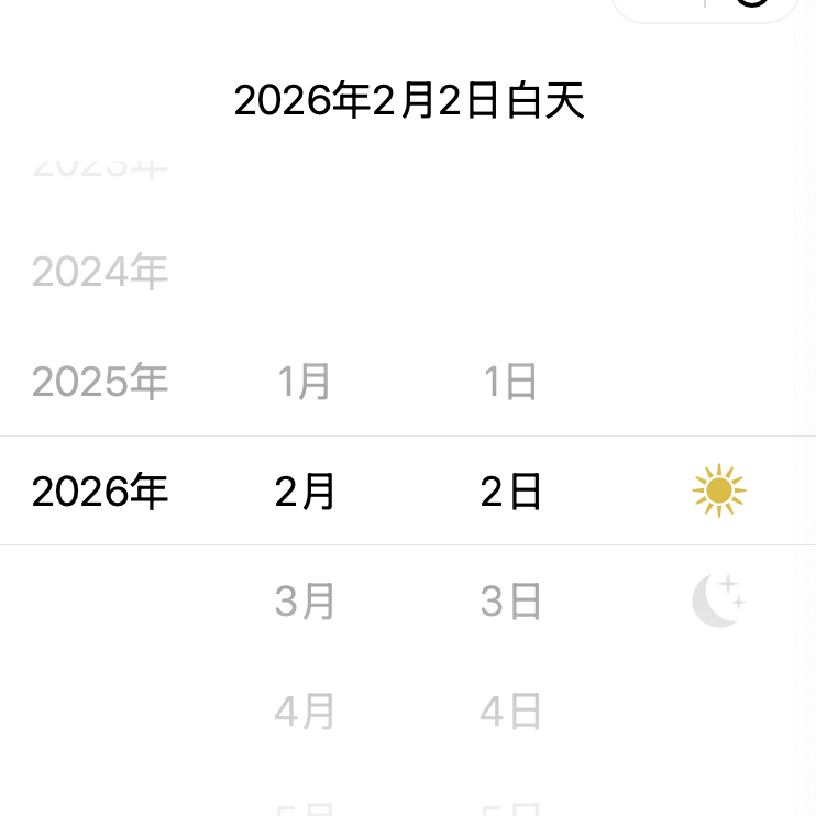
4.8、picker-view
嵌入页面的滚动选择器。其中只可放置 picker-view-column组件,其它节点不会显示。
目前滚动过程中 bindpickstart、bindpickend 会被触发多次,后续 skyline 升级会修复该问题 skyline支持在 picker-view-column 上设置 indicator-style。
| 属性 | 类型 | 默认值 | 必填 | 说明 |
|---|---|---|---|---|
value |
Array.<number> | 否 | 数组中的数字依次表示 picker-view 内的 picker-view-column 选择的第几项(下标从 0 开始),数字大于 picker-view-column 可选项长度时,选择最后一项。 | |
mask-class |
string | 否 | 设置蒙层的类名 | |
indicator-style |
string | 否 | 设置选择器中间选中框的样式 | |
bindchange |
eventhandle | 否 | 滚动选择时触发change事件,event.detail = {value};value为数组,表示 picker-view 内的 picker-view-column 当前选择的是第几项(下标从 0 开始) | |
bindpickstart |
eventhandle | 否 | 当滚动选择开始时候触发事件 | |
bindpickend |
eventhandle | 否 | 当滚动选择结束时候触发事件 |
html
<view class="container">
  <view class="page-body">
    <view class="selected-date">{{year}}年{{month}}月{{day}}日{{isDaytime ? "白天" : "夜晚"}}</view>
    <picker-view indicator-style="height: 50px;" style="width: 100%; height: 300px;" value="{{value}}" bindchange="bindChange">
      <picker-view-column>
        <view wx:for="{{years}}" wx:key="{{years}}" style="line-height: 50px; text-align: center;">{{item}}年</view>
      </picker-view-column>
      <picker-view-column>
        <view wx:for="{{months}}" wx:key="{{months}}" style="line-height: 50px; text-align: center;">{{item}}月</view>
      </picker-view-column>
      <picker-view-column>
        <view wx:for="{{days}}" wx:key="{{days}}" style="line-height: 50px; text-align: center;">{{item}}日</view>
      </picker-view-column>
      <picker-view-column>
        <view class="icon-container">
          <image class="picker-icon" src="../lib/daytime.png" />
        </view>
        <view class="icon-container">
          <image class="picker-icon" src="../lib/night.png" />
        </view>
      </picker-view-column>
    </picker-view>
  </view>

</view>
js
const date = new Date()
const years = []
const months = []
const days = []

for (let i = 1990; i <= date.getFullYear(); i++) {
  years.push(i)
}

for (let i = 1; i <= 12; i++) {
  months.push(i)
}

for (let i = 1; i <= 31; i++) {
  days.push(i)
}

Page({
  onShareAppMessage() {
    return {
      title: 'picker-view',
      path: 'page/component/pages/picker-view/picker-view'
    }
  },

  data: {
    years,
    year: date.getFullYear(),
    months,
    month: 2,
    days,
    day: 2,
    value: [9999, 1, 1],
    isDaytime: true,
  },

  bindChange(e) {
    const val = e.detail.value
    this.setData({
      year: this.data.years[val[0]],
      month: this.data.months[val[1]],
      day: this.data.days[val[2]],
      isDaytime: !val[3]
    })
  }
})
4.9、radio
<radio>为单选框组件,往往需要配合<radio-group>组件来使用,<radio>标签嵌套在<radio-group>当中。
| 属性 | 类型 | 默认值 | 必填 | 说明 |
|---|---|---|---|---|
value |
string | 否 | radio 标识。当该radio 选中时,radio-group 的 change 事件会携带radio的value | |
checked |
boolean | false | 否 | 当前是否选中 |
disabled |
boolean | false | 否 | 是否禁用 |
color |
string | #09BB07 | 否 | radio的颜色,同css的color |
html
<view class="page-body">
  <view class="page-section">
    <view class="page-section-title">默认样式</view>
    <label class="radio">
      <radio value="r1" checked="true"/>选中
    </label>
    <label class="radio">
      <radio value="r2" />未选中
    </label>
  </view>


  <view class="page-section">
    <view class="page-section-title">推荐展示样式</view>
    <view class="weui-cells weui-cells_after-title">
      <radio-group bindchange="radioChange">
        <label class="weui-cell weui-check__label" wx:for="{{items}}" wx:key="{{item.value}}">

          <view class="weui-cell__hd">
            <radio value="{{item.value}}" checked="true"/>
          </view>
          <view class="weui-cell__bd">{{item.name}}</view>
        </label>
      </radio-group>
    </view>
  </view>
</view>
js
Page({
  onShareAppMessage() {
    return {
      title: 'radio',
      path: 'page/component/pages/radio/radio'
    }
  },

  data: {
    items: [
      {value: 'USA', name: '美国'},
      {value: 'CHN', name: '中国', checked: 'true'},
      {value: 'BRA', name: '巴西'},
      {value: 'JPN', name: '日本'},
      {value: 'ENG', name: '英国'},
      {value: 'FRA', name: '法国'},
    ]
  },

  radioChange(e) {
    console.log('radio发生change事件,携带value值为:', e.detail.value)

    const items = this.data.items
    for (let i = 0, len = items.length; i < len; ++i) {
      items[i].checked = items[i].value === e.detail.value
    }

    this.setData({
      items
    })
  }
})
4.10、radio-group
单项选择器,内部由多个 radio 组成。
| 属性 | 类型 | 默认值 | 必填 | 说明 |
|---|---|---|---|---|
bindchange |
EventHandle | 否 | radio-group中选中项发生改变时触发 change 事件,detail = {value:选中的radio的value的数组} |
4.11、slider
<slider>为滑动选择器,用于可视化地动态改变某变量的取值。
| 属性 | 类型 | 默认值 | 必填 | 说明 |
|---|---|---|---|---|
min |
number | 0 | 否 | 最小值 |
max |
number | 100 | 否 | 最大值 |
step |
number | 1 | 否 | 步长,取值必须大于 0,并且可被(max - min)整除 |
disabled |
boolean | false | 否 | 是否禁用 |
value |
number | 0 | 否 | 当前取值 |
color |
color | #e9e9e9 | 否 | 背景条的颜色(请使用 backgroundColor) |
selected-color |
color | #1aad19 | 否 | 已选择的颜色(请使用 activeColor) |
activeColor |
color | #1aad19 | 否 | 已选择的颜色 |
backgroundColor |
color | #e9e9e9 | 否 | 背景条的颜色 |
block-size |
number | 28 | 否 滑块的大小,取值范围为 12 - 28 | |
block-color |
color | #ffffff | 否 | 滑块的颜色 |
show-value |
boolean | false | 否 | 是否显示当前 value |
bindchange |
eventhandle | 否 | 完成一次拖动后触发的事件,event.detail = {value} | |
bindchanging |
eventhandle | 否 | 拖动过程中触发的事件,event.detail = {value} |
html
<view class="page">
    <view class="page__hd">
        <text class="page__title">slider</text>
        <text class="page__desc">滑块</text>
    </view>
    <view class="page__bd">
        <view class="section section_gap">
            <text class="section__title">设置left/right icon</text>
            <view class="body-view">
                <slider bindchange="slider1change" left-icon="cancel" right-icon="success_no_circle"/>
            </view>
        </view>

        <view class="section section_gap">
            <text class="section__title">设置step</text>
            <view class="body-view">
                <slider bindchange="slider2change" step="5"/>
            </view>
        </view>

        <view class="section section_gap">
            <text class="section__title">显示当前value</text>
            <view class="body-view">
                <slider bindchange="slider3change" show-value/>
            </view>
        </view>

        <view class="section section_gap">
            <text class="section__title">设置最小/最大值</text>
            <view class="body-view">
                <slider bindchange="slider4change" min="50" max="200" show-value/>
            </view>
        </view>
    </view>
</view>
js
var pageData = {}
for (var i = 1; i < 5; ++i) {
  (function (index) {
    pageData[`slider${index}change`] = function (e) {
      console.log(`slider${index}发生change事件,携带值为`, e.detail.value)
    }
  })(i);
}
Page(pageData)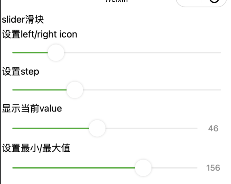
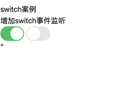
4.12、switch
开关选择器。
| 属性 | 类型 | 默认值 | 必填 | 说明 |
|---|---|---|---|---|
checked |
boolean | false | 否 | 是否选中 |
disabled |
boolean | false | 否 | 是否禁用 |
type |
string | switch | 否 | 样式,有效值:switch, checkbox |
color |
string | #04BE02 | 否 | switch 的颜色,同 css 的 color |
bindchange |
eventhandle | 否 | 点击导致 checked 改变时会触发 change 事件,event.detail={ value} |
html
<view class="demo-box">
  <view class="title">switch案例</view>
  <view class="title">增加switch事件监听</view>
  <switch checked bindchange="switch1Change"></switch>
  <switch bindchange="switch2Change"></switch>
</view>"
js
Page({
  switch1Change(e) {
    console.log("switch1触发,携带value值为:" + e.detail.value)
  },
  switch2Change(e) {
    console.log("switch2触发,携带value值为:" + e.detail.value)
  }
})
4.13、textarea
多行输入框。该组件是原生组件,使用时请注意相关限制。
| 属性 | 类型 | 默认值 | 必填 | 说明 |
|---|---|---|---|---|
value |
string | 否 | 输入框的内容 | |
placeholder |
string | 否 | 输入框为空时占位符 | |
placeholder-style |
string | 否 | 指定 placeholder 的样式,目前仅支持color,font-size,font-weight,line-height | |
disabled |
boolean | false | 否 | 是否禁用 |
maxlength |
number | 140 | 否 | 最大输入长度,设置为 -1 的时候不限制最大长度 |
auto-focus |
boolean | false | 否 | 自动聚焦,拉起键盘。 |
focus |
boolean | false | 否 | 获取焦点 |
auto-height |
boolean | false | 否 | 是否自动增高,设置auto-height时,style.height不生效 |
cursor-spacing |
number | 0 | 否 | 指定光标与键盘的距离。取textarea距离底部的距离和cursor-spacing指定的距离的最小值作为光标与键盘的距离 |
cursor |
number | -1 | 否 | 指定focus时的光标位置 |
selection-start |
number | -1 | 否 | 光标起始位置,自动聚集时有效,需与selection-end搭配使用 |
selection-end |
number | -1 | 否 | 光标结束位置,自动聚集时有效,需与selection-start搭配使用 |
adjust-position |
boolean | true | 否 | 键盘弹起时,是否自动上推页面 |
hold-keyboard |
boolean | false | 否 | focus时,点击页面的时候不收起键盘 |
disable-default-padding |
boolean | false | 否 | 是否去掉 iOS 下的默认内边距 |
confirm-type |
string | return | 否 | 设置键盘右下角按钮的文字 send:右下角按钮为"发送" search:右下角按钮为"搜索" next:右下角按钮为"下一个" go:右下角按钮为"前往" done:右下角按钮为"完成" return:右下角按钮为"换行" |
confirm-hold |
boolean | false | 否 | 点击键盘右下角按钮时是否保持键盘不收起 |
adjust-keyboard-to |
boolean | cursor | 否 | 键盘对齐位置。 cursor:对齐光标位置 bottom:对齐输入框底部 |
bindfocus |
eventhandle | 否 | 输入框聚焦时触发,event.detail = { value, height },height 为键盘高度,在基础库 1.9.90 起支持 | |
bindblur |
eventhandle | 否 | 输入框失去焦点时触发,event.detail = {value, cursor} | |
bindlinechange |
eventhandle | 否 | 输入框行数变化时调用,event.detail = {height: 0, heightRpx: 0, lineCount: 0} | |
bindinput |
eventhandle | 否 | 当键盘输入时,触发 input 事件,event.detail = {value, cursor, keyCode},keyCode 为键值,目前工具还不支持返回keyCode参数。bindinput 处理函数的返回值并不会反映到 textarea 上 | |
bindconfirm |
eventhandle | 否 | 点击完成时, 触发 confirm 事件,event.detail = {value: value} | |
bindkeyboardheightchange |
eventhandle | 否 | 键盘高度发生变化的时候触发此事件,event.detail = {height: height, duration: duration} |
html
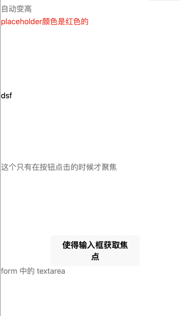
<view class="section">
  <textarea bindblur="bindTextAreaBlur" auto-height placeholder="自动变高" />
</view>
<view class="section">
  <textarea placeholder="placeholder颜色是红色的" placeholder-style="color:red;"  />
</view>
<view class="section">
  <textarea placeholder="这是一个可以自动聚焦的textarea" auto-focus />
</view>
<view class="section">
  <textarea placeholder="这个只有在按钮点击的时候才聚焦" focus="{{focus}}" />
  <view class="btn-area">
    <button bindtap="bindButtonTap">使得输入框获取焦点</button>
  </view>
</view>
<view class="section">
  <form bindsubmit="bindFormSubmit">
    <textarea placeholder="form 中的 textarea" name="textarea"/>
    <button form-type="submit"> 提交 </button>
  </form>
</view>
js
Page({
  data: {
    height: 20,
    focus: false
  },
  bindButtonTap: function() {
    this.setData({
      focus: true
    })
  },
  bindTextAreaBlur: function(e) {
    console.log(e.detail.value)
  },
  bindFormSubmit: function(e) {
    console.log(e.detail.value.textarea)
  }
})