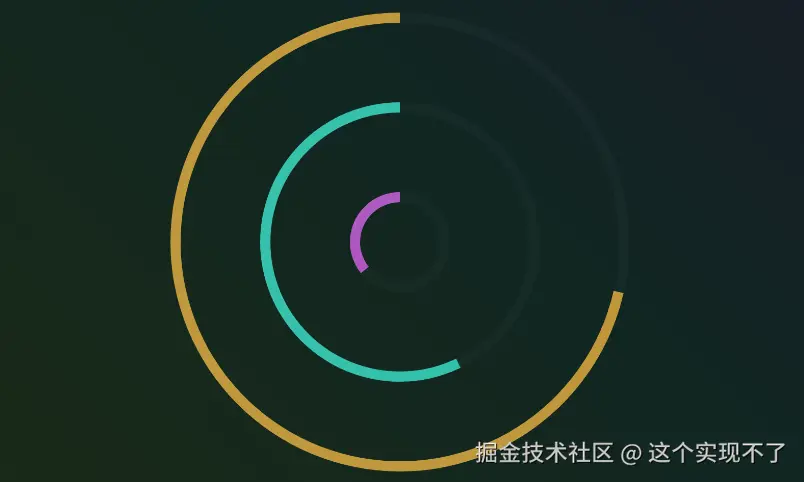
记录下工作中使用echarts做出的特殊组件
js
import { defineComponent } from 'vue'

import { COLOR_LIGHT_ORG,} from './createChart'


let props = {
  propData: {
    type: Array,
    default: () => [100, 80, 50],
  },
  legendData: {
    type: Array,
    default: () => [
      { name: '0%-60%', desc: '20天22小时25分钟' },
      { name: '60%-80%', desc: '10天15小时35分钟' },
      { name: '80%以上', desc: '5天15小时35分钟' },
    ],
  },
  barWidth: {
    type: Number,
    default: 20,
  },
  barColorArray: {
    type: Array,
    default: () => ['#FDC13C', '#32FFE1', '#E365FF', COLOR_LIGHT_ORG],
  },
  chartExtraOption: {
    type: Object,
    default() {
      return {}
    },
  },
}


export default defineComponent({
  props,
  data() {
    return {}
  },
  created() {},
  mounted() {
    this.init()
    this.$watch(
      () => this.$props, // 监听整个 props 对象
      () => {
        this.init()
      },
      { deep: true, immediate: false },
    )
  },
  beforeDestroy() {
    this.chart?.dispose?.()
  },
  methods: {
    init() {
      const option = this.getChartOption()
      const dom = this.$refs.chart
      if (!this.chart) {
        this.chart = echarts.init(dom, null, {
          renderer: 'canvas',
        })
      }
      this.chart.setOption(option, true)
    },
    getChartOption() {
      const filtered = this.legendData.map((item, index) => {
        return [item.name, this.propData[index]]
      })
      const maxValue = Math.max(...this.propData)
      return {
        color: this.barColorArray,
        angleAxis: {
          clockwise: false,
          axisLine: {
            show: false,
          },
          splitLine: {
            show: false,
          },
          axisLabel: {
            show: false,
          },
          axisTick: {
            show: false,
          },
          min: 0,
          max: maxValue * 1.4,
        },
        radiusAxis: {
          type: 'category',
          data: _.map(this.legendData, 'name'),
          z: 10,
          inverse: true,
          axisLine: {
            show: false,
          },
          axisLabel: {
            show: false,
          },
          axisTick: {
            show: false,
          },
        },
        polar: {
          radius: '100%',
        },
        series: [
          {
            type: 'bar',
            barWidth: this.barWidth,
            stack: 'base',
            data: filtered,
            coordinateSystem: 'polar',
            name: '1',
            colorBy: 'data',
          },
          {
            type: 'bar',
            stack: 'base',
            barWidth: this.barWidth,
            data: this.legendData.map((row) => [row.name, maxValue * 1.25]),
            coordinateSystem: 'polar',
            name: '半透衬底',
            itemStyle: {
              color: '#ffffff08',
            },
          },
        ],
      }
    },
  },
})