第8次:主题系统实现
主题系统是现代应用的标配功能,让用户可以根据喜好或环境选择合适的显示模式。本次课程将实现完整的深色/浅色主题切换功能,包括跟随系统、手动切换和持久化保存。
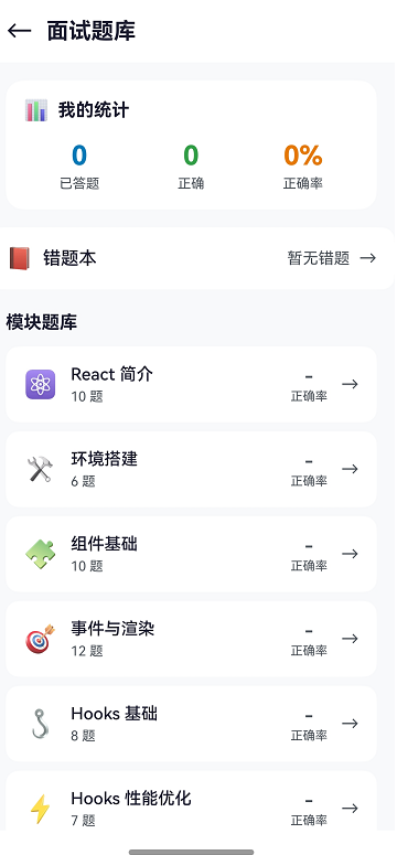
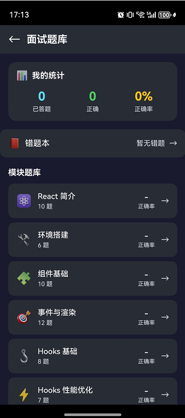
效果
深浅色主题对比
学习目标
- 设计完整的主题模式(AUTO/LIGHT/DARK)
- 配置主题颜色体系
- 实现系统颜色模式检测
- 完成主题切换与持久化
- 学会组件主题适配
8.1 主题模式设计
三种主题模式
| 模式 | 说明 | 使用场景 |
|---|---|---|
| AUTO | 跟随系统 | 默认模式,自动适应 |
| LIGHT | 强制浅色 | 用户偏好浅色 |
| DARK | 强制深色 | 用户偏好深色/夜间 |
主题状态管理
typescript
// 主题相关的全局状态
AppStorage.setOrCreate('isDarkMode', false);      // 当前是否深色
AppStorage.setOrCreate('themeMode', 'auto');      // 主题模式
状态流转
用户选择 AUTO → 检测系统模式 → 设置 isDarkMode
用户选择 LIGHT → isDarkMode = false
用户选择 DARK → isDarkMode = true
8.2 主题颜色配置
颜色体系设计
一个完整的主题需要定义以下颜色:
typescript
export interface ThemeColors {
  // 背景色
  background: string;           // 页面背景
  cardBackground: string;       // 卡片背景
  modalBackground: string;      // 弹窗背景

  // 文字色
  textPrimary: string;          // 主要文字
  textSecondary: string;        // 次要文字
  textDisabled: string;         // 禁用文字
  textInverse: string;          // 反色文字

  // 品牌色
  primary: string;              // 主色调
  primaryLight: string;         // 主色调浅
  primaryDark: string;          // 主色调深

  // 功能色
  success: string;              // 成功
  warning: string;              // 警告
  error: string;                // 错误
  info: string;                 // 信息

  // 边框和分隔
  border: string;               // 边框
  divider: string;              // 分隔线

  // 阴影
  shadowColor: string;          // 阴影颜色
}
浅色主题配置
typescript
export const LightThemeColors: ThemeColors = {
  // 背景
  background: '#f8f9fa',
  cardBackground: '#ffffff',
  modalBackground: '#ffffff',

  // 文字
  textPrimary: '#1a1a2e',
  textSecondary: '#495057',
  textDisabled: '#adb5bd',
  textInverse: '#ffffff',

  // 品牌色
  primary: '#61DAFB',
  primaryLight: '#8ae4fc',
  primaryDark: '#21a0c4',

  // 功能色
  success: '#28a745',
  warning: '#ffc107',
  error: '#dc3545',
  info: '#17a2b8',

  // 边框
  border: '#dee2e6',
  divider: '#e9ecef',

  // 阴影
  shadowColor: 'rgba(0, 0, 0, 0.1)'
};
深色主题配置
typescript
export const DarkThemeColors: ThemeColors = {
  // 背景
  background: '#1a1a2e',
  cardBackground: '#282c34',
  modalBackground: '#2d3748',

  // 文字
  textPrimary: '#ffffff',
  textSecondary: '#d1d5db',
  textDisabled: '#6b7280',
  textInverse: '#1a1a2e',

  // 品牌色
  primary: '#61DAFB',
  primaryLight: '#8ae4fc',
  primaryDark: '#21a0c4',

  // 功能色
  success: '#51cf66',
  warning: '#fcc419',
  error: '#ff6b6b',
  info: '#339af0',

  // 边框
  border: '#3d3d5c',
  divider: '#3d3d5c',

  // 阴影
  shadowColor: 'rgba(0, 0, 0, 0.3)'
};
8.3 系统颜色模式检测
获取系统颜色模式
typescript
import { resourceManager } from '@kit.LocalizationKit';

/**
 * 检测系统是否为深色模式
 */
function getSystemIsDarkMode(context: Context): boolean {
  try {
    const resMgr = context.resourceManager;
    const config = resMgr.getConfigurationSync();

    // ColorMode.DARK = 0, ColorMode.LIGHT = 1
    return config.colorMode === resourceManager.ColorMode.DARK;
  } catch (error) {
    console.error('[ThemeUtil] Failed to get system color mode:', error);
    return false;
  }
}
监听系统主题变化
typescript
// 在 Ability 中监听配置变化
onConfigurationUpdate(newConfig: Configuration): void {
  const isDark = newConfig.colorMode === resourceManager.ColorMode.DARK;
  const themeMode = AppStorage.get<string>('themeMode');

  // 只有 AUTO 模式才跟随系统
  if (themeMode === 'auto') {
    AppStorage.set('isDarkMode', isDark);
  }
}
8.4 完整的 ThemeUtil 实现
更新 entry/src/main/ets/common/ThemeUtil.ets:
typescript
/**
 * 主题工具类
 * 管理应用深浅主题切换
 */
import { resourceManager } from '@kit.LocalizationKit';
import { StorageUtil } from './StorageUtil';
import { StorageKeys } from './Constants';

/**
 * 主题模式枚举
 */
export enum ThemeMode {
  AUTO = 'auto',
  LIGHT = 'light',
  DARK = 'dark'
}

/**
 * 主题颜色接口
 */
export interface ThemeColors {
  background: string;
  cardBackground: string;
  textPrimary: string;
  textSecondary: string;
  textDisabled: string;
  primary: string;
  success: string;
  warning: string;
  error: string;
  border: string;
  divider: string;
  shadowColor: string;
}

/**
 * 浅色主题
 */
export const LightTheme: ThemeColors = {
  background: '#f8f9fa',
  cardBackground: '#ffffff',
  textPrimary: '#1a1a2e',
  textSecondary: '#495057',
  textDisabled: '#adb5bd',
  primary: '#61DAFB',
  success: '#28a745',
  warning: '#ffc107',
  error: '#dc3545',
  border: '#dee2e6',
  divider: '#e9ecef',
  shadowColor: 'rgba(0,0,0,0.1)'
};

/**
 * 深色主题
 */
export const DarkTheme: ThemeColors = {
  background: '#1a1a2e',
  cardBackground: '#282c34',
  textPrimary: '#ffffff',
  textSecondary: '#d1d5db',
  textDisabled: '#6b7280',
  primary: '#61DAFB',
  success: '#51cf66',
  warning: '#fcc419',
  error: '#ff6b6b',
  border: '#3d3d5c',
  divider: '#3d3d5c',
  shadowColor: 'rgba(0,0,0,0.3)'
};

/**
 * 获取系统颜色模式
 */
function getSystemIsDarkMode(context: Context): boolean {
  try {
    const resMgr = context.resourceManager;
    const config = resMgr.getConfigurationSync();
    return config.colorMode === resourceManager.ColorMode.DARK;
  } catch (error) {
    console.error('[ThemeUtil] Failed to get system color mode');
    return false;
  }
}

/**
 * 初始化主题
 */
export async function initTheme(context: Context): Promise<void> {
  try {
    // 从存储加载主题模式
    const savedMode = await StorageUtil.getString(
      StorageKeys.THEME_MODE,
      ThemeMode.AUTO
    );

    const themeMode = savedMode as ThemeMode;
    let isDark: boolean;

    switch (themeMode) {
      case ThemeMode.LIGHT:
        isDark = false;
        break;
      case ThemeMode.DARK:
        isDark = true;
        break;
      case ThemeMode.AUTO:
      default:
        isDark = getSystemIsDarkMode(context);
        break;
    }

    // 设置全局状态
    AppStorage.setOrCreate('isDarkMode', isDark);
    AppStorage.setOrCreate('themeMode', themeMode);

    console.info(`[ThemeUtil] Initialized: mode=${themeMode}, isDark=${isDark}`);
  } catch (error) {
    console.error('[ThemeUtil] Init failed:', error);
    AppStorage.setOrCreate('isDarkMode', false);
    AppStorage.setOrCreate('themeMode', ThemeMode.AUTO);
  }
}

/**
 * 切换主题(浅色/深色切换)
 */
export async function toggleTheme(): Promise<void> {
  const currentIsDark = AppStorage.get<boolean>('isDarkMode') ?? false;
  const newIsDark = !currentIsDark;
  const newMode = newIsDark ? ThemeMode.DARK : ThemeMode.LIGHT;

  AppStorage.set('isDarkMode', newIsDark);
  AppStorage.set('themeMode', newMode);

  // 持久化保存
  await StorageUtil.setString(StorageKeys.THEME_MODE, newMode);

  console.info(`[ThemeUtil] Toggled: mode=${newMode}, isDark=${newIsDark}`);
}

/**
 * 设置主题模式
 */
export async function setThemeMode(mode: ThemeMode, context: Context): Promise<void> {
  let isDark: boolean;

  switch (mode) {
    case ThemeMode.LIGHT:
      isDark = false;
      break;
    case ThemeMode.DARK:
      isDark = true;
      break;
    case ThemeMode.AUTO:
    default:
      isDark = getSystemIsDarkMode(context);
      break;
  }

  AppStorage.set('isDarkMode', isDark);
  AppStorage.set('themeMode', mode);

  // 持久化保存
  await StorageUtil.setString(StorageKeys.THEME_MODE, mode);

  console.info(`[ThemeUtil] Set mode: ${mode}, isDark=${isDark}`);
}

/**
 * 获取当前主题模式
 */
export function getThemeMode(): ThemeMode {
  const mode = AppStorage.get<string>('themeMode');
  if (mode === ThemeMode.LIGHT || mode === ThemeMode.DARK || mode === ThemeMode.AUTO) {
    return mode as ThemeMode;
  }
  return ThemeMode.AUTO;
}

/**
 * 获取当前主题颜色
 */
export function getThemeColors(isDarkMode: boolean): ThemeColors {
  return isDarkMode ? DarkTheme : LightTheme;
}

/**
 * 处理系统主题变化
 */
export function handleSystemThemeChange(isDark: boolean): void {
  const themeMode = getThemeMode();

  // 只有 AUTO 模式才响应系统变化
  if (themeMode === ThemeMode.AUTO) {
    AppStorage.set('isDarkMode', isDark);
    console.info(`[ThemeUtil] System theme changed: isDark=${isDark}`);
  }
}
8.5 组件主题适配
基础适配模式
typescript
@Component
struct ThemedCard {
  @StorageLink('isDarkMode') isDarkMode: boolean = false;

  // 计算属性获取主题色
  get theme(): ThemeColors {
    return this.isDarkMode ? DarkTheme : LightTheme;
  }

  build() {
    Column() {
      Text('标题')
        .fontColor(this.theme.textPrimary)

      Text('描述')
        .fontColor(this.theme.textSecondary)
    }
    .backgroundColor(this.theme.cardBackground)
    .border({ width: 1, color: this.theme.border })
  }
}
封装主题感知组件
typescript
/**
 * 主题感知文本组件
 */
@Component
struct ThemedText {
  @Prop text: string = '';
  @Prop type: 'primary' | 'secondary' | 'disabled' = 'primary';
  @Prop size: number = 14;
  @StorageLink('isDarkMode') isDarkMode: boolean = false;

  get color(): string {
    const theme = this.isDarkMode ? DarkTheme : LightTheme;
    switch (this.type) {
      case 'secondary': return theme.textSecondary;
      case 'disabled': return theme.textDisabled;
      default: return theme.textPrimary;
    }
  }

  build() {
    Text(this.text)
      .fontSize(this.size)
      .fontColor(this.color)
  }
}

// 使用
ThemedText({ text: '主要文字', type: 'primary' })
ThemedText({ text: '次要文字', type: 'secondary' })
封装主题感知容器
typescript
/**
 * 主题感知卡片容器
 */
@Component
struct ThemedCard {
  @StorageLink('isDarkMode') isDarkMode: boolean = false;
  @BuilderParam content: () => void;

  get theme(): ThemeColors {
    return this.isDarkMode ? DarkTheme : LightTheme;
  }

  build() {
    Column() {
      this.content()
    }
    .padding(16)
    .backgroundColor(this.theme.cardBackground)
    .borderRadius(12)
    .shadow({
      radius: 8,
      color: this.theme.shadowColor,
      offsetY: 4
    })
  }
}

// 使用
ThemedCard() {
  Column() {
    Text('卡片内容')
  }
}
8.6 实操:完成主题系统集成
步骤 1:更新 EntryAbility
typescript
import { UIAbility, AbilityConstant, Want, Configuration } from '@kit.AbilityKit';
import { window } from '@kit.ArkUI';
import { resourceManager } from '@kit.LocalizationKit';
import { StorageUtil } from '../common/StorageUtil';
import { initTheme, handleSystemThemeChange } from '../common/ThemeUtil';

export default class EntryAbility extends UIAbility {
  async onCreate(want: Want, launchParam: AbilityConstant.LaunchParam): Promise<void> {
    // 初始化存储
    await StorageUtil.init(this.context);

    // 初始化主题
    await initTheme(this.context);
  }

  onConfigurationUpdate(newConfig: Configuration): void {
    // 监听系统主题变化
    const isDark = newConfig.colorMode === resourceManager.ColorMode.DARK;
    handleSystemThemeChange(isDark);
  }

  async onWindowStageCreate(windowStage: window.WindowStage): Promise<void> {
    windowStage.loadContent('pages/Index');
  }
}
步骤 2:创建设置页面
创建 pages/SettingsPage.ets:
typescript
import { router } from '@kit.ArkUI';
import { ThemeMode, setThemeMode, getThemeMode, LightTheme, DarkTheme } from '../common/ThemeUtil';

@Entry
@Component
struct SettingsPage {
  @StorageLink('isDarkMode') isDarkMode: boolean = false;
  @State currentMode: ThemeMode = ThemeMode.AUTO;

  get theme() {
    return this.isDarkMode ? DarkTheme : LightTheme;
  }

  aboutToAppear(): void {
    this.currentMode = getThemeMode();
  }

  build() {
    Column() {
      // 顶部导航
      Row() {
        Text('←')
          .fontSize(24)
          .fontColor(this.theme.textPrimary)
          .onClick(() => router.back())

        Text('设置')
          .fontSize(20)
          .fontWeight(FontWeight.Bold)
          .fontColor(this.theme.textPrimary)
          .margin({ left: 16 })
      }
      .width('100%')
      .height(56)
      .padding({ left: 16, right: 16 })
      .backgroundColor(this.theme.cardBackground)

      // 主题设置
      Column() {
        Text('主题设置')
          .fontSize(16)
          .fontWeight(FontWeight.Bold)
          .fontColor(this.theme.textPrimary)
          .width('100%')
          .margin({ bottom: 16 })

        // 跟随系统
        this.ThemeOption('跟随系统', '自动适应系统主题', ThemeMode.AUTO)

        // 浅色模式
        this.ThemeOption('浅色模式', '始终使用浅色主题', ThemeMode.LIGHT)

        // 深色模式
        this.ThemeOption('深色模式', '始终使用深色主题', ThemeMode.DARK)
      }
      .width('100%')
      .padding(16)
      .margin({ top: 16 })
      .backgroundColor(this.theme.cardBackground)
      .borderRadius(12)
    }
    .width('100%')
    .height('100%')
    .padding({ left: 16, right: 16 })
    .backgroundColor(this.theme.background)
  }

  @Builder
  ThemeOption(title: string, desc: string, mode: ThemeMode) {
    Row() {
      Column() {
        Text(title)
          .fontSize(16)
          .fontColor(this.theme.textPrimary)
        Text(desc)
          .fontSize(12)
          .fontColor(this.theme.textSecondary)
          .margin({ top: 4 })
      }
      .alignItems(HorizontalAlign.Start)
      .layoutWeight(1)

      Radio({ value: mode, group: 'theme' })
        .checked(this.currentMode === mode)
        .onChange((isChecked: boolean) => {
          if (isChecked) {
            this.currentMode = mode;
            setThemeMode(mode, getContext(this));
          }
        })
    }
    .width('100%')
    .padding({ top: 12, bottom: 12 })
    .border({
      width: { bottom: 1 },
      color: this.theme.divider
    })
  }
}
步骤 3:在首页添加设置入口
typescript
// 在 HeaderBar 中添加设置按钮
@Builder
HeaderBar() {
  Row() {
    // ... 其他内容

    Text('⚙️')
      .fontSize(24)
      .onClick(() => {
        router.pushUrl({ url: 'pages/SettingsPage' });
      })
  }
}
步骤 4:更新路由配置
在 main_pages.json 中添加:
json
{
  "src": [
    "pages/Index",
    "pages/SettingsPage"
  ]
}
本次课程小结
通过本次课程,你已经:
✅ 设计了完整的主题模式(AUTO/LIGHT/DARK)
✅ 配置了浅色和深色主题颜色体系
✅ 实现了系统颜色模式检测
✅ 完成了主题切换与持久化保存
✅ 学会了组件的主题适配方法
✅ 创建了主题设置页面
课后练习
-
添加更多主题:实现蓝色主题、绿色主题等
-
主题预览:在设置页面添加主题预览效果
-
过渡动画:为主题切换添加平滑过渡动画
下次预告
第9次:首页 Tab 导航实现
我们将实现应用的核心导航结构:
- Tabs 组件详解
- 自定义 TabBar 样式
- Tab 切换事件处理
- 底部导航栏设计
构建专业的应用导航体验!