第9次:首页 Tab 导航实现
Tab 导航是移动应用最常见的导航模式,让用户可以快速切换不同功能模块。本次课程将实现应用的 5 Tab 底部导航,包括首页、课程、源码、项目和我的。
效果
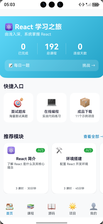
底部的首页 课程 源码 项目 我的 就是导航效果
学习目标
- 掌握 Tabs 组件的使用
- 学会 TabContent 与 TabBar 配置
- 实现自定义 TabBuilder
- 处理 Tab 切换事件
- 完成底部导航栏样式设计
9.1 Tabs 组件详解
基本结构
typescript
Tabs({ barPosition: BarPosition.End }) {
  TabContent() {
    // 第一个 Tab 的内容
  }
  .tabBar('首页')

  TabContent() {
    // 第二个 Tab 的内容
  }
  .tabBar('我的')
}
Tabs 属性
| 属性 | 类型 | 说明 |
|---|---|---|
| barPosition | BarPosition | 导航栏位置 |
| index | number | 当前选中索引 |
| vertical | boolean | 是否垂直布局 |
| scrollable | boolean | 是否可滚动 |
| barMode | BarMode | 导航栏模式 |
BarPosition 位置
typescript
// 顶部导航
Tabs({ barPosition: BarPosition.Start })

// 底部导航
Tabs({ barPosition: BarPosition.End })
控制当前 Tab
typescript
@Entry
@Component
struct TabsDemo {
  @State currentIndex: number = 0;

  build() {
    Tabs({ barPosition: BarPosition.End, index: this.currentIndex }) {
      // TabContent...
    }
    .onChange((index: number) => {
      this.currentIndex = index;
    })
  }
}
9.2 TabContent 与 TabBar
TabContent 内容区
typescript
TabContent() {
  // 可以放置任何组件
  Column() {
    Text('Tab 内容')
    List() {
      // 列表内容
    }
  }
}
.tabBar('标签名')  // 简单文字标签
tabBar 配置方式
typescript
// 方式一:简单文字
.tabBar('首页')

// 方式二:自定义 Builder
.tabBar(this.TabBuilder('首页', 0))

// 方式三:SubTabBarStyle(子标签样式)
.tabBar(new SubTabBarStyle('首页'))

// 方式四:BottomTabBarStyle(底部标签样式)
.tabBar(new BottomTabBarStyle($r('app.media.icon'), '首页'))
9.3 自定义 TabBuilder
基础自定义
typescript
@Builder
TabBuilder(title: string, index: number) {
  Column() {
    Text(title)
      .fontSize(14)
      .fontColor(this.currentIndex === index ? '#61DAFB' : '#999999')
  }
}
带图标的 TabBuilder
typescript
@Builder
TabBuilder(icon: string, title: string, index: number) {
  Column() {
    Text(icon)
      .fontSize(24)

    Text(title)
      .fontSize(12)
      .fontColor(this.currentIndex === index ? '#61DAFB' : '#999999')
      .margin({ top: 4 })
  }
  .width('100%')
  .height('100%')
  .justifyContent(FlexAlign.Center)
}
带角标的 TabBuilder
typescript
@Builder
TabBuilder(icon: string, title: string, index: number, badge?: number) {
  Column() {
    Stack() {
      Text(icon)
        .fontSize(24)

      // 角标
      if (badge && badge > 0) {
        Text(badge > 99 ? '99+' : `${badge}`)
          .fontSize(10)
          .fontColor('#ffffff')
          .backgroundColor('#ff4d4f')
          .borderRadius(8)
          .padding({ left: 4, right: 4, top: 1, bottom: 1 })
          .position({ x: '60%', y: 0 })
      }
    }

    Text(title)
      .fontSize(12)
      .fontColor(this.currentIndex === index ? '#61DAFB' : '#999999')
      .margin({ top: 4 })
  }
  .width('100%')
  .height('100%')
  .justifyContent(FlexAlign.Center)
}
9.4 Tab 切换事件处理
onChange 事件
typescript
Tabs({ barPosition: BarPosition.End, index: this.currentIndex }) {
  // TabContent...
}
.onChange((index: number) => {
  console.info(`Tab 切换到: ${index}`);
  this.currentIndex = index;

  // 可以在这里执行其他逻辑
  this.onTabChange(index);
})

private onTabChange(index: number): void {
  switch (index) {
    case 0:
      // 首页逻辑
      break;
    case 1:
      // 课程逻辑
      break;
    // ...
  }
}
编程式切换
typescript
@State currentIndex: number = 0;

// 切换到指定 Tab
switchToTab(index: number): void {
  this.currentIndex = index;
}

// 使用
Button('去课程')
  .onClick(() => {
    this.switchToTab(1);
  })
9.5 底部导航栏样式设计
设计规范
- 图标大小:24-28px
- 文字大小:10-12px
- 导航栏高度:50-60px
- 选中态:品牌色高亮
- 未选中态:灰色
样式配置
typescript
Tabs({ barPosition: BarPosition.End, index: this.currentIndex }) {
  // TabContent...
}
.barHeight(60)                    // 导航栏高度
.barBackgroundColor('#ffffff')    // 导航栏背景色
.onChange((index: number) => {
  this.currentIndex = index;
})
9.6 实操:实现 5 Tab 底部导航
完整代码实现
更新 entry/src/main/ets/pages/Index.ets:
typescript
/**
 * 首页 - 5 Tab 底部导航
 * 第9次课程实操代码
 */
import { initTheme, LightTheme, DarkTheme, ThemeColors } from '../common/ThemeUtil';
import { StorageUtil } from '../common/StorageUtil';

@Entry
@Component
struct Index {
  @State currentTab: number = 0;
  @State isLoading: boolean = true;
  @StorageLink('isDarkMode') isDarkMode: boolean = false;

  get theme(): ThemeColors {
    return this.isDarkMode ? DarkTheme : LightTheme;
  }

  async aboutToAppear(): Promise<void> {
    await StorageUtil.init(getContext(this));
    await initTheme(getContext(this));
    this.isLoading = false;
  }

  build() {
    Column() {
      if (this.isLoading) {
        this.LoadingView()
      } else {
        Tabs({ barPosition: BarPosition.End, index: this.currentTab }) {
          // 首页 Tab
          TabContent() {
            this.HomeContent()
          }
          .tabBar(this.TabBuilder('🏠', '首页', 0))

          // 课程 Tab
          TabContent() {
            this.CourseContent()
          }
          .tabBar(this.TabBuilder('📚', '课程', 1))

          // 源码 Tab
          TabContent() {
            this.SourceCodeContent()
          }
          .tabBar(this.TabBuilder('📖', '源码', 2))

          // 项目 Tab
          TabContent() {
            this.ProjectContent()
          }
          .tabBar(this.TabBuilder('🌟', '项目', 3))

          // 我的 Tab
          TabContent() {
            this.ProfileContent()
          }
          .tabBar(this.TabBuilder('👤', '我的', 4))
        }
        .barHeight(60)
        .barBackgroundColor(this.theme.cardBackground)
        .onChange((index: number) => {
          this.currentTab = index;
          this.onTabChange(index);
        })
      }
    }
    .width('100%')
    .height('100%')
    .backgroundColor(this.theme.background)
  }

  // Tab 切换回调
  private onTabChange(index: number): void {
    console.info(`[Index] Tab changed to: ${index}`);
  }

  // 加载视图
  @Builder
  LoadingView() {
    Column() {
      LoadingProgress()
        .width(48)
        .height(48)
        .color(this.theme.primary)

      Text('加载中...')
        .fontSize(14)
        .fontColor(this.theme.textSecondary)
        .margin({ top: 16 })
    }
    .width('100%')
    .height('100%')
    .justifyContent(FlexAlign.Center)
  }

  // 自定义 Tab 标签
  @Builder
  TabBuilder(icon: string, title: string, index: number) {
    Column() {
      Text(icon)
        .fontSize(24)

      Text(title)
        .fontSize(12)
        .fontColor(this.currentTab === index
          ? this.theme.primary
          : this.theme.textSecondary)
        .margin({ top: 4 })
    }
    .width('100%')
    .height('100%')
    .justifyContent(FlexAlign.Center)
  }

  // ==================== 首页内容 ====================
  @Builder
  HomeContent() {
    Scroll() {
      Column() {
        // Hero Banner
        this.HeroBanner()

        // 快捷入口
        this.QuickAccess()

        // 推荐模块
        this.RecommendedModules()
      }
    }
    .width('100%')
    .height('100%')
    .scrollBar(BarState.Off)
  }

  @Builder
  HeroBanner() {
    Column() {
      Text('⚛️ React 学习之旅')
        .fontSize(24)
        .fontWeight(FontWeight.Bold)
        .fontColor('#ffffff')

      Text('由浅入深,系统掌握 React')
        .fontSize(14)
        .fontColor('rgba(255,255,255,0.9)')
        .margin({ top: 8 })

      // 统计
      Row() {
        this.StatItem('0', '已完成')
        Column().width(1).height(40).backgroundColor('rgba(255,255,255,0.3)')
        this.StatItem('35', '总课程')
        Column().width(1).height(40).backgroundColor('rgba(255,255,255,0.3)')
        this.StatItem('0', '连续天数')
      }
      .width('100%')
      .margin({ top: 24 })

      // 每日一题
      Row() {
        Text('📝 每日一题')
          .fontSize(14)
          .fontColor('#ffffff')
        Blank()
        Text('挑战 →')
          .fontSize(14)
          .fontColor('rgba(255,255,255,0.9)')
      }
      .width('100%')
      .padding(12)
      .margin({ top: 16 })
      .backgroundColor('rgba(255,255,255,0.15)')
      .borderRadius(12)
    }
    .width('100%')
    .padding(20)
    .linearGradient({
      angle: 135,
      colors: [['#61DAFB', 0], ['#21a0c4', 1]]
    })
    .borderRadius({ bottomLeft: 24, bottomRight: 24 })
  }

  @Builder
  StatItem(value: string, label: string) {
    Column() {
      Text(value)
        .fontSize(28)
        .fontWeight(FontWeight.Bold)
        .fontColor('#ffffff')
      Text(label)
        .fontSize(12)
        .fontColor('rgba(255,255,255,0.9)')
        .margin({ top: 4 })
    }
    .layoutWeight(1)
  }

  @Builder
  QuickAccess() {
    Column() {
      Text('快捷入口')
        .fontSize(18)
        .fontWeight(FontWeight.Bold)
        .fontColor(this.theme.textPrimary)
        .width('100%')

      Row({ space: 12 }) {
        this.QuickAccessItem('🎯', '面试题库')
        this.QuickAccessItem('💻', '在线编程')
        this.QuickAccessItem('📦', '成品下载')
      }
      .width('100%')
      .margin({ top: 12 })
    }
    .width('100%')
    .padding(16)
  }

  @Builder
  QuickAccessItem(icon: string, title: string) {
    Column() {
      Text(icon).fontSize(32)
      Text(title)
        .fontSize(13)
        .fontColor(this.theme.textPrimary)
        .margin({ top: 6 })
    }
    .layoutWeight(1)
    .padding(16)
    .backgroundColor(this.theme.cardBackground)
    .borderRadius(16)
    .shadow({ radius: 8, color: this.theme.shadowColor, offsetY: 2 })
  }

  @Builder
  RecommendedModules() {
    Column() {
      Row() {
        Text('推荐模块')
          .fontSize(18)
          .fontWeight(FontWeight.Bold)
          .fontColor(this.theme.textPrimary)
        Blank()
        Text('查看全部 →')
          .fontSize(14)
          .fontColor(this.theme.primary)
          .onClick(() => this.currentTab = 1)
      }
      .width('100%')

      Scroll() {
        Row({ space: 12 }) {
          this.ModuleCard('⚛️', 'React 简介', '入门')
          this.ModuleCard('🛠️', '环境搭建', '入门')
          this.ModuleCard('🧩', '组件基础', '基础')
          this.ModuleCard('🪝', 'Hooks', '进阶')
        }
        .padding({ right: 16 })
      }
      .scrollable(ScrollDirection.Horizontal)
      .scrollBar(BarState.Off)
      .margin({ top: 12 })
    }
    .width('100%')
    .padding({ left: 16, top: 8, bottom: 20 })
  }

  @Builder
  ModuleCard(icon: string, title: string, level: string) {
    Column() {
      Row() {
        Text(icon).fontSize(24)
        Blank()
        Text(level)
          .fontSize(10)
          .fontColor('#ffffff')
          .backgroundColor('#51cf66')
          .padding({ left: 6, right: 6, top: 2, bottom: 2 })
          .borderRadius(8)
      }
      .width('100%')

      Text(title)
        .fontSize(14)
        .fontWeight(FontWeight.Bold)
        .fontColor(this.theme.textPrimary)
        .margin({ top: 8 })

      Text('3 课时')
        .fontSize(11)
        .fontColor(this.theme.textSecondary)
        .margin({ top: 4 })
    }
    .width(140)
    .padding(12)
    .backgroundColor(this.theme.cardBackground)
    .borderRadius(16)
    .shadow({ radius: 8, color: this.theme.shadowColor, offsetY: 4 })
  }

  // ==================== 课程内容 ====================
  @Builder
  CourseContent() {
    Column() {
      Text('📚 全部课程')
        .fontSize(20)
        .fontWeight(FontWeight.Bold)
        .fontColor(this.theme.textPrimary)
        .padding(16)
        .width('100%')

      Text('课程列表将在后续课程中实现')
        .fontSize(14)
        .fontColor(this.theme.textSecondary)
        .padding(16)
    }
    .width('100%')
    .height('100%')
  }

  // ==================== 源码内容 ====================
  @Builder
  SourceCodeContent() {
    Column() {
      Text('📖 源码学习')
        .fontSize(20)
        .fontWeight(FontWeight.Bold)
        .fontColor(this.theme.textPrimary)
        .padding(16)
        .width('100%')

      Text('源码学习内容将在后续课程中实现')
        .fontSize(14)
        .fontColor(this.theme.textSecondary)
        .padding(16)
    }
    .width('100%')
    .height('100%')
  }

  // ==================== 项目内容 ====================
  @Builder
  ProjectContent() {
    Column() {
      Text('🌟 开源项目')
        .fontSize(20)
        .fontWeight(FontWeight.Bold)
        .fontColor(this.theme.textPrimary)
        .padding(16)
        .width('100%')

      Text('开源项目内容将在后续课程中实现')
        .fontSize(14)
        .fontColor(this.theme.textSecondary)
        .padding(16)
    }
    .width('100%')
    .height('100%')
  }

  // ==================== 我的内容 ====================
  @Builder
  ProfileContent() {
    Column() {
      // 用户信息卡片
      Column() {
        Text('👤')
          .fontSize(48)

        Text('学习者')
          .fontSize(18)
          .fontWeight(FontWeight.Bold)
          .fontColor(this.theme.textPrimary)
          .margin({ top: 12 })

        Text('开始你的 React 学习之旅')
          .fontSize(14)
          .fontColor(this.theme.textSecondary)
          .margin({ top: 4 })
      }
      .width('100%')
      .padding(24)
      .backgroundColor(this.theme.cardBackground)
      .borderRadius({ bottomLeft: 24, bottomRight: 24 })

      // 功能列表
      Column() {
        this.ProfileMenuItem('📚', '我的收藏')
        this.ProfileMenuItem('📊', '学习统计')
        this.ProfileMenuItem('🏆', '我的徽章')
        this.ProfileMenuItem('⚙️', '设置')
      }
      .width('100%')
      .padding(16)
      .margin({ top: 16 })
      .backgroundColor(this.theme.cardBackground)
      .borderRadius(16)
    }
    .width('100%')
    .height('100%')
    .padding({ left: 16, right: 16 })
  }

  @Builder
  ProfileMenuItem(icon: string, title: string) {
    Row() {
      Text(icon).fontSize(20)
      Text(title)
        .fontSize(16)
        .fontColor(this.theme.textPrimary)
        .margin({ left: 12 })
      Blank()
      Text('›')
        .fontSize(20)
        .fontColor(this.theme.textSecondary)
    }
    .width('100%')
    .padding({ top: 16, bottom: 16 })
    .border({ width: { bottom: 1 }, color: this.theme.divider })
  }
}
本次课程小结
通过本次课程,你已经:
✅ 掌握了 Tabs 组件的基本使用
✅ 学会了 TabContent 与 TabBar 的配置
✅ 实现了自定义 TabBuilder
✅ 处理了 Tab 切换事件
✅ 完成了 5 Tab 底部导航的完整实现
课后练习
-
添加角标:为"我的"Tab 添加未读消息角标
-
切换动画:为 Tab 切换添加过渡动画效果
-
手势支持:实现左右滑动切换 Tab
下次预告
第10次:HeroBanner 组件开发
我们将把 HeroBanner 抽取为独立组件:
- 组件设计与 Props 定义
- 渐变背景实现
- 学习统计展示
- 响应式布局适配
开始组件化开发之旅!