欢迎加入开源鸿蒙跨平台社区 :https://openharmonycrossplatform.csdn.net
📋 前言
遮罩效果是实现复杂 UI 视觉效果的重要技术手段。无论是渐变文字、镂空效果、还是创意动画,遮罩视图都能帮助开发者实现独特的视觉体验。@react-native-oh-tpl/masked-view 是 React Native 社区广泛使用的遮罩视图组件,支持自定义遮罩元素,是实现复杂 UI 效果的基础组件。
🎯 库简介
基本信息
- 库名称 :
@react-native-oh-tpl/masked-view - 版本信息 :
0.2.9: 支持 RN 0.72 版本
- 官方仓库: https://github.com/react-native-oh-library/masked-view
- 主要功能 :
- 🎭 遮罩视图效果
- 🎨 支持自定义遮罩元素
- 📐 灵活的布局控制
- 📱 跨平台一致性表现
- 🔗 可与其他组件组合使用
为什么需要 Masked View?
| 特性 | 手动实现 | Masked View |
|---|---|---|
| 遮罩效果 | ❌ 需原生代码 | ✅ 组件化实现 |
| 跨平台一致性 | ❌ 表现差异 | ✅ 统一效果 |
| 动态控制 | ⚠️ 复杂实现 | ✅ Props 控制 |
| 渐变文字 | ⚠️ 需额外处理 | ✅ 配合渐变组件 |
| HarmonyOS支持 | ❌ 不支持 | ✅ 完整支持 |
典型应用场景
- 渐变文字效果 - 配合 LinearGradient 实现文字渐变
- 镂空效果 - 创建镂空的视觉元素
- 创意动画 - 实现复杂的遮罩动画
- 图片遮罩 - 为图片添加特殊形状
兼容性验证
在以下环境验证通过:
- RNOH : 0.72.90; SDK : HarmonyOS 6.0.0 Release SDK; IDE : DevEco Studio 6.0.0.858; ROM: 6.0.0.112
📦 安装步骤
前置教程:在开始适配之前,如果您是新手,可以先阅读这篇文章了解ReactNative和OpenHarmony的搭建方式https://bxming.blog.csdn.net/article/details/156641198?spm=1001.2014.3001.5502
本文的完整代码运行需要适配另一个库:https://blog.csdn.net/2402_83107102/article/details/159163022
1. 使用 npm 安装
在项目根目录执行以下命令,本文基于 RN 0.72.90 版本开发:
bash
# RN 0.72 版本推荐使用
npm install @react-native-oh-tpl/masked-view@0.2.9-0.2.2

# 或者使用 yarn
yarn add @react-native-oh-tpl/masked-view@0.2.9-0.2.2
2. 验证安装
安装完成后,检查 package.json 文件,应该能看到新增的依赖:
json
{
  "dependencies": {
    "@react-native-oh-tpl/masked-view": "0.2.9-0.2.2",
    // ... 其他依赖
  }
}
🔧 HarmonyOS 平台配置 ⭐
由于 HarmonyOS 暂不支持 AutoLink,需要手动配置原生端代码。本文提供 HAR 包引入 和 源码引入 两种方式,可根据实际需求选择。
1. 在工程根目录的 oh-package.json5 添加 overrides 字段
打开 harmony/oh-package.json5,添加以下配置:
json5
{
  // ... 其他配置
  "overrides": {
    "@rnoh/react-native-openharmony": "0.72.90"
  }
}
方式一:HAR 包引入(推荐)📦
HAR 包引入方式简单快捷,适合大多数场景。
💡 提示 :HAR 包位于三方库安装路径的
harmony文件夹下。
2.1 在 entry/oh-package.json5 添加依赖
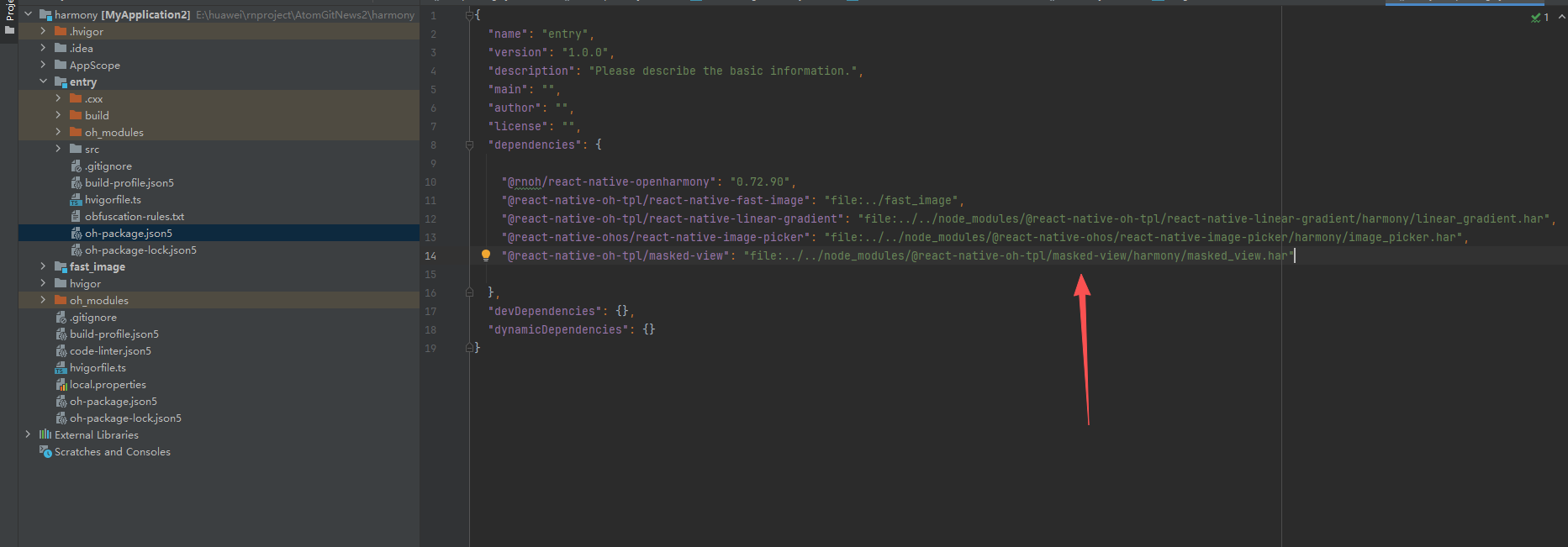
打开 harmony/entry/oh-package.json5,添加以下依赖:
json5
"dependencies": {
  "@rnoh/react-native-openharmony": "0.72.90",
  + "@react-native-oh-tpl/masked-view": "file:../../node_modules/@react-native-oh-tpl/masked-view/harmony/masked_view.har"
}
2.2 同步依赖
点击 DevEco Studio 右上角的 sync 按钮,或者在终端执行:
bash
cd harmony/entry
ohpm install
2.3 配置 CMakeLists.txt
打开 harmony/entry/src/main/cpp/CMakeLists.txt,添加以下配置:
cmake
project(rnapp)
cmake_minimum_required(VERSION 3.4.1)
set(CMAKE_SKIP_BUILD_RPATH TRUE)
set(RNOH_APP_DIR "${CMAKE_CURRENT_SOURCE_DIR}")
set(NODE_MODULES "${CMAKE_CURRENT_SOURCE_DIR}/../../../../../node_modules")
+ set(OH_MODULES "${CMAKE_CURRENT_SOURCE_DIR}/../../../oh_modules")
set(RNOH_CPP_DIR "${CMAKE_CURRENT_SOURCE_DIR}/../../../../../../react-native-harmony/harmony/cpp")
set(LOG_VERBOSITY_LEVEL 1)
set(CMAKE_ASM_FLAGS "-Wno-error- unused-command-line-argument -Qunused-arguments")
set(CMAKE_CXX_FLAGS "-fstack-protector-strong -Wl,-z,relro,-z,now,-z,noexecstack -s -fPIE -pie")
set(WITH_HITRACE_SYSTRACE 1)
add_compile_definitions(WITH_HITRACE_SYSTRACE)

add_subdirectory("${RNOH_CPP_DIR}" ./rn)

# 添加 MaskedView 模块(HAR方式)
+ add_subdirectory("${OH_MODULES}/@react-native-oh-tpl/masked-view/src/main/cpp" ./masked-view)

file(GLOB GENERATED_CPP_FILES "./generated/*.cpp")

add_library(rnoh_app SHARED
    ${GENERATED_CPP_FILES}
    "./PackageProvider.cpp"
    "${RNOH_CPP_DIR}/RNOHAppNapiBridge.cpp"
)
target_link_libraries(rnoh_app PUBLIC rnoh)

# 链接 MaskedView 库
+ target_link_libraries(rnoh_app PUBLIC rnoh_masked_view)
2.4 修改 PackageProvider.cpp
打开 harmony/entry/src/main/cpp/PackageProvider.cpp,添加:
cpp
#include "RNOH/PackageProvider.h"
#include "generated/RNOHGeneratedPackage.h"
+ #include "MaskedPackage.h"

using namespace rnoh;

std::vector<std::shared_ptr<Package>> PackageProvider::getPackages(Package::Context ctx) {
    return {
        std::make_shared<RNOHGeneratedPackage>(ctx),
        + std::make_shared<MaskedPackage>(ctx),
    };
}
方式二:源码引入 📁
源码引入方式适合需要调试或修改原生代码的场景。
2.1 复制源码到 harmony 工程根目录
把 <RN工程>/node_modules/@react-native-oh-tpl/masked-view/harmony 目录下的源码 masked_view 复制到 harmony(鸿蒙壳工程)工程根目录下。
2.2 在 build-profile.json5 添加模块
打开 harmony/build-profile.json5,添加以下模块:
json5
modules: [
  // ... 其他模块
  + {
  +   name: 'masked_view',
  +   srcPath: './masked_view',
  + }
]
💡 提示 :如果存在
build-profile.template.json5文件,也需要同步添加上述模块配置。
2.3 修改 masked_view/oh-package.json5
打开 harmony/masked_view/oh-package.json5,修改 react-native-openharmony 版本与项目版本一致:
json5
{
  "dependencies": {
    "@rnoh/react-native-openharmony": "0.72.90"
  }
}
2.4 在 entry/oh-package.json5 添加依赖
打开 harmony/entry/oh-package.json5,添加以下依赖:
json5
"dependencies": {
  "@rnoh/react-native-openharmony": "0.72.90",
  + "@react-native-oh-tpl/masked-view": "file:../masked_view"
}
2.5 同步依赖
点击 DevEco Studio 右上角的 sync 按钮,或者在终端执行:
bash
cd harmony/entry
ohpm install
2.6 配置 CMakeLists.txt
打开 harmony/entry/src/main/cpp/CMakeLists.txt,添加以下配置:
cmake
project(rnapp)
cmake_minimum_required(VERSION 3.4.1)
set(CMAKE_SKIP_BUILD_RPATH TRUE)
set(RNOH_APP_DIR "${CMAKE_CURRENT_SOURCE_DIR}")
set(NODE_MODULES "${CMAKE_CURRENT_SOURCE_DIR}/../../../../../node_modules")
+ set(OH_MODULES "${CMAKE_CURRENT_SOURCE_DIR}/../../../oh_modules")
set(RNOH_CPP_DIR "${CMAKE_CURRENT_SOURCE_DIR}/../../../../../../react-native-harmony/harmony/cpp")
set(LOG_VERBOSITY_LEVEL 1)
set(CMAKE_ASM_FLAGS "-Wno-error- unused-command-line-argument -Qunused-arguments")
set(CMAKE_CXX_FLAGS "-fstack-protector-strong -Wl,-z,relro,-z,now,-z,noexecstack -s -fPIE -pie")
set(WITH_HITRACE_SYSTRACE 1)
add_compile_definitions(WITH_HITRACE_SYSTRACE)

add_subdirectory("${RNOH_CPP_DIR}" ./rn)

# 添加 MaskedView 模块(源码方式)
+ add_subdirectory("${OH_MODULES}/@react-native-oh-tpl/masked-view/src/main/cpp" ./masked-view)

file(GLOB GENERATED_CPP_FILES "./generated/*.cpp")

add_library(rnoh_app SHARED
    ${GENERATED_CPP_FILES}
    "./PackageProvider.cpp"
    "${RNOH_CPP_DIR}/RNOHAppNapiBridge.cpp"
)
target_link_libraries(rnoh_app PUBLIC rnoh)

# 链接 MaskedView 库
+ target_link_libraries(rnoh_app PUBLIC rnoh_masked_view)
2.7 修改 PackageProvider.cpp
打开 harmony/entry/src/main/cpp/PackageProvider.cpp,添加:
cpp
#include "RNOH/PackageProvider.h"
#include "generated/RNOHGeneratedPackage.h"
+ #include "MaskedPackage.h"

using namespace rnoh;

std::vector<std::shared_ptr<Package>> PackageProvider::getPackages(Package::Context ctx) {
    return {
        std::make_shared<RNOHGeneratedPackage>(ctx),
        + std::make_shared<MaskedPackage>(ctx),
    };
}
同步并运行 🚀
3. 同步依赖
点击 DevEco Studio 右上角的 sync 按钮,或者在终端执行:
bash
cd harmony/entry
ohpm install
然后编译、运行即可。
📖 API 详解
🔷 核心概念
MaskedView 的工作原理是:遮罩元素定义可见区域,子元素只在该区域内显示。
┌─────────────────────────────┐
│      MaskedView 容器        │
│  ┌─────────────────────┐    │
│  │   maskElement       │    │  ← 遮罩元素(定义可见区域)
│  │   (Text: "ABC")     │    │
│  └─────────────────────┘    │
│                             │
│  ┌─────────────────────┐    │
│  │   子元素            │    │  ← 子元素(只在遮罩区域内显示)
│  │   (渐变背景)        │    │
│  └─────────────────────┘    │
└─────────────────────────────┘
🔷 核心属性(Props)
1. maskElement - 遮罩元素 ⭐
maskElement 是 MaskedView 最核心的属性,用于定义遮罩的形状和内容。
typescript
maskElement: React.ReactElement;| 类型 | 必填 | 说明 |
|---|---|---|
ReactElement |
✅ | 定义遮罩形状的 React 元素 |
工作原理:
- 遮罩元素中的不透明区域将成为可见区域
- 遮罩元素中的透明区域将被隐藏
- 子元素只会在遮罩定义的区域内显示
使用示例:
typescript
import MaskedView from '@react-native-masked-view/masked-view';
import { Text, View } from 'react-native';

// 文字遮罩
<MaskedView
  style={{ flex: 1 }}
  maskElement={
    <View style={{ backgroundColor: 'transparent', alignItems: 'center' }}>
      <Text style={{ fontSize: 50, fontWeight: 'bold', color: 'black' }}>
        MASK
      </Text>
    </View>
  }
>
  {/* 子元素 - 只会在文字区域内显示 */}
  <View style={{ backgroundColor: '#FF6B6B', flex: 1 }} />
</MaskedView>
2. style - 容器样式 📐
style 用于定义 MaskedView 容器的样式。
typescript
style?: StyleProp<ViewStyle>;常用样式属性:
| 属性 | 类型 | 说明 |
|---|---|---|
width |
number/string | 容器宽度 |
height |
number/string | 容器高度 |
flex |
number | 弹性布局 |
使用示例:
typescript
<MaskedView
  style={{ width: 200, height: 100 }}
  maskElement={
    <View style={{ backgroundColor: 'transparent' }}>
      <Text style={{ fontSize: 40, color: 'black' }}>Hello</Text>
    </View>
  }
>
  <View style={{ backgroundColor: '#4ECDC4', flex: 1 }} />
</MaskedView>
3. androidRenderingMode - 安卓渲染模式 ⚠️
⚠️ HarmonyOS 不支持: 此属性仅在 Android 平台有效
typescript
androidRenderingMode?: 'software' | 'hardware';| 值 | 说明 | HarmonyOS 支持 |
|---|---|---|
software |
软件渲染 | ❌ |
hardware |
硬件渲染 | ❌ |
💻 完整代码示例
下面是一个完整的示例,展示了 MaskedView 的各种应用场景:
typescript
import React from 'react';
import {
View,
Text,
StyleSheet,
ScrollView,
SafeAreaView,
} from 'react-native';
import MaskedView from '@react-native-masked-view/masked-view';
import LinearGradient from 'react-native-linear-gradient';
function MaskedViewDemo() {
return (
<SafeAreaView style={styles.container}>
<ScrollView style={styles.scrollView} contentContainerStyle={styles.scrollContent}>
<Text style={styles.title}>🎭 MaskedView 演示</Text>
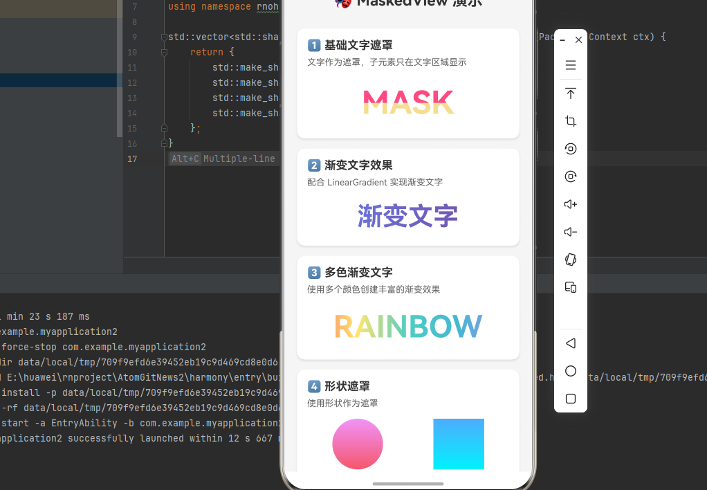
{/* 1. 基础文字遮罩 */}
<View style={styles.section}>
<Text style={styles.sectionTitle}>1️⃣ 基础文字遮罩</Text>
<Text style={styles.description}>文字作为遮罩,子元素只在文字区域显示</Text>
<MaskedView
style={styles.maskedView}
maskElement={
<View style={styles.maskElementContainer}>
<Text style={styles.maskText}>MASK</Text>
</View>
}
>
<View style={styles.redBackground} />
<View style={styles.yellowBackground} />
</MaskedView>
</View>
{/* 2. 渐变文字效果 */}
<View style={styles.section}>
<Text style={styles.sectionTitle}>2️⃣ 渐变文字效果</Text>
<Text style={styles.description}>配合 LinearGradient 实现渐变文字</Text>
<MaskedView
style={styles.gradientMaskedView}
maskElement={
<View style={styles.maskElementContainer}>
<Text style={styles.gradientMaskText}>渐变文字</Text>
</View>
}
>
<LinearGradient
colors={['#667eea', '#764ba2']}
start={{ x: 0, y: 0.5 }}
end={{ x: 1, y: 0.5 }}
style={styles.gradient}
/>
</MaskedView>
</View>
{/* 3. 多色渐变文字 */}
<View style={styles.section}>
<Text style={styles.sectionTitle}>3️⃣ 多色渐变文字</Text>
<Text style={styles.description}>使用多个颜色创建丰富的渐变效果</Text>
<MaskedView
style={styles.multiColorMaskedView}
maskElement={
<View style={styles.maskElementContainer}>
<Text style={styles.multiColorMaskText}>RAINBOW</Text>
</View>
}
>
<LinearGradient
colors={['#FF6B6B', '#FFE66D', '#4ECDC4', '#45B7D1', '#A78BFA']}
start={{ x: 0, y: 0.5 }}
end={{ x: 1, y: 0.5 }}
style={styles.gradient}
/>
</MaskedView>
</View>
{/* 4. 形状遮罩 */}
<View style={styles.section}>
<Text style={styles.sectionTitle}>4️⃣ 形状遮罩</Text>
<Text style={styles.description}>使用形状作为遮罩</Text>
<View style={styles.shapeContainer}>
{/* 圆形遮罩 */}
<MaskedView
style={styles.circleMask}
maskElement={
<View style={styles.circleShape} />
}
>
<LinearGradient
colors={['#f093fb', '#f5576c']}
style={styles.gradient}
/>
</MaskedView>
{/* 矩形遮罩 */}
<MaskedView
style={styles.rectMask}
maskElement={
<View style={styles.rectShape} />
}
>
<LinearGradient
colors={['#4facfe', '#00f2fe']}
style={styles.gradient}
/>
</MaskedView>
</View>
</View>
{/* 5. 实际应用场景 */}
<View style={styles.section}>
<Text style={styles.sectionTitle}>5️⃣ 实际应用场景</Text>
{/* 启动页标题 */}
<View style={styles.applicationCard}>
<MaskedView
style={styles.appTitleMask}
maskElement={
<View style={styles.maskElementContainer}>
<Text style={styles.appTitleText}>欢迎使用</Text>
</View>
}
>
<LinearGradient
colors={['#667eea', '#764ba2']}
start={{ x: 0, y: 0.5 }}
end={{ x: 1, y: 0.5 }}
style={styles.gradient}
/>
</MaskedView>
<Text style={styles.applicationLabel}>启动页标题</Text>
</View>
{/* 营销活动 */}
<View style={styles.applicationCard}>
<MaskedView
style={styles.appTitleMask}
maskElement={
<View style={styles.maskElementContainer}>
<Text style={styles.marketingText}>限时特惠</Text>
</View>
}
>
<LinearGradient
colors={['#FF6B6B', '#FFE66D']}
start={{ x: 0, y: 0.5 }}
end={{ x: 1, y: 0.5 }}
style={styles.gradient}
/>
</MaskedView>
<Text style={styles.applicationLabel}>营销活动标题</Text>
</View>
</View>
{/* 6. 组合效果 */}
<View style={styles.section}>
<Text style={styles.sectionTitle}>6️⃣ 组合效果</Text>
<Text style={styles.description}>多层遮罩叠加效果</Text>
<MaskedView
style={styles.combinedMask}
maskElement={
<View style={styles.maskElementContainer}>
<Text style={styles.combinedMaskText}>COMBO</Text>
</View>
}
>
<View style={styles.layer1} />
<View style={styles.layer2} />
<View style={styles.layer3} />
</MaskedView>
</View>
</ScrollView>
</SafeAreaView>
);
}
const styles = StyleSheet.create({
container: {
flex: 1,
backgroundColor: '#f5f5f5',
},
scrollView: {
flex: 1,
},
scrollContent: {
padding: 20,
},
title: {
fontSize: 24,
fontWeight: 'bold',
color: '#333',
textAlign: 'center',
marginBottom: 30,
},
section: {
backgroundColor: '#fff',
borderRadius: 12,
padding: 16,
marginBottom: 16,
shadowColor: '#000',
shadowOffset: { width: 0, height: 2 },
shadowOpacity: 0.1,
shadowRadius: 4,
elevation: 3,
},
sectionTitle: {
fontSize: 18,
fontWeight: 'bold',
color: '#333',
marginBottom: 8,
},
description: {
fontSize: 14,
color: '#666',
marginBottom: 16,
},
maskedView: {
width: '100%',
height: 80,
},
maskElementContainer: {
backgroundColor: 'transparent',
flex: 1,
alignItems: 'center',
justifyContent: 'center',
},
maskText: {
fontSize: 50,
fontWeight: 'bold',
color: 'black',
},
redBackground: {
width: '100%',
height: 40,
backgroundColor: '#fe4b83',
},
yellowBackground: {
width: '100%',
height: 40,
backgroundColor: '#F5DD90',
},
gradientMaskedView: {
width: '100%',
height: 60,
},
gradientMaskText: {
fontSize: 40,
fontWeight: 'bold',
color: 'black',
},
gradient: {
flex: 1,
},
multiColorMaskedView: {
width: '100%',
height: 70,
},
multiColorMaskText: {
fontSize: 48,
fontWeight: 'bold',
color: 'black',
},
shapeContainer: {
flexDirection: 'row',
justifyContent: 'space-around',
},
circleMask: {
width: 80,
height: 80,
},
circleShape: {
width: 80,
height: 80,
borderRadius: 40,
backgroundColor: 'black',
},
rectMask: {
width: 80,
height: 80,
},
rectShape: {
width: 80,
height: 80,
backgroundColor: 'black',
},
applicationCard: {
alignItems: 'center',
paddingVertical: 16,
marginBottom: 12,
backgroundColor: '#fafafa',
borderRadius: 8,
},
appTitleMask: {
width: '100%',
height: 50,
},
appTitleText: {
fontSize: 36,
fontWeight: 'bold',
color: 'black',
},
marketingText: {
fontSize: 32,
fontWeight: '800',
color: 'black',
},
applicationLabel: {
fontSize: 12,
color: '#999',
marginTop: 8,
},
combinedMask: {
width: '100%',
height: 80,
},
combinedMaskText: {
fontSize: 48,
fontWeight: 'bold',
color: 'black',
},
layer1: {
width: '100%',
height: 30,
backgroundColor: '#FF6B6B',
},
layer2: {
width: '100%',
height: 25,
backgroundColor: '#4ECDC4',
},
layer3: {
width: '100%',
height: 25,
backgroundColor: '#45B7D1',
},
});
export default MaskedViewDemo;⚠️ 注意事项与最佳实践
1. 遮罩元素设置
typescript
// ✅ 推荐:遮罩元素使用透明背景
<MaskedView
  maskElement={
    <View style={{ backgroundColor: 'transparent' }}>
      <Text style={{ color: 'black' }}>遮罩文字</Text>
    </View>
  }
>
  {/* 子元素 */}
</MaskedView>

// ❌ 不推荐:遮罩元素使用不透明背景
<MaskedView
  maskElement={
    <View style={{ backgroundColor: 'white' }}>
      <Text>遮罩文字</Text>
    </View>
  }
>
  {/* 子元素 */}
</MaskedView>
2. 配合 LinearGradient 使用
MaskedView 最常见的用法是与 LinearGradient 配合实现渐变文字:
typescript
<MaskedView
  style={{ height: 60 }}
  maskElement={
    <View style={{ backgroundColor: 'transparent', alignItems: 'center' }}>
      <Text style={{ fontSize: 40, fontWeight: 'bold', color: 'black' }}>
        渐变文字
      </Text>
    </View>
  }
>
  <LinearGradient
    colors={['#667eea', '#764ba2']}
    start={{ x: 0, y: 0.5 }}
    end={{ x: 1, y: 0.5 }}
    style={{ flex: 1 }}
  />
</MaskedView>
3. 性能优化建议
- 避免复杂遮罩: 遮罩元素尽量简单,避免嵌套过多组件
- 合理设置尺寸: 避免过大的遮罩区域
- 复用组件: 对于重复使用的遮罩效果,封装为独立组件
4. 常见问题排查
问题 1: 遮罩不显示
- 检查
maskElement是否正确设置 - 确认遮罩元素的颜色设置正确(不透明区域应为遮罩区域)
- 检查子元素是否有内容
问题 2: 渐变效果不正确
- 确认 LinearGradient 的方向设置
- 检查 colors 数组是否正确
问题 3: 文字边缘模糊
- 检查遮罩元素的字体大小
- 确认容器的尺寸设置合理
📊 API 支持情况总览
属性支持
| 属性 | 说明 | HarmonyOS 支持 |
|---|---|---|
maskElement |
遮罩元素 | ✅ |
style |
容器样式 | ✅ |
androidRenderingMode |
安卓渲染模式 | ❌ |
📝 总结
通过集成 @react-native-oh-tpl/masked-view,我们为项目添加了强大的遮罩视图能力。该组件是实现渐变文字、镂空效果等复杂 UI 的基础组件,配合 LinearGradient 可以创建精美的视觉效果。