目录
[2.4 二级分类 + 详情](#2.4 二级分类 + 详情)
[2.4.1 二级分类](#2.4.1 二级分类)
[1. 整体认识和路由配置](#1. 整体认识和路由配置)
[2. 面包屑导航实现](#2. 面包屑导航实现)
[3. 商品列表实现](#3. 商品列表实现)
[4. 定制路由scrollBehavior](#4. 定制路由scrollBehavior)
[2.4.2 详情页](#2.4.2 详情页)
[1. 整体认识和路由配置](#1. 整体认识和路由配置)
[2. 基础数据渲染](#2. 基础数据渲染)
[3. 热榜区域实现](#3. 热榜区域实现)
[4. 图片预览组件封装](#4. 图片预览组件封装)
[5. 认识SKU组件](#5. 认识SKU组件)
[6. 通用组件统一注册全局](#6. 通用组件统一注册全局)
[2.5 登录](#2.5 登录)
[2.5.1 登录](#2.5.1 登录)
[1. 整体认识和路由配置](#1. 整体认识和路由配置)
[2. 表单校验实现](#2. 表单校验实现)
[3. Pinia管理用户数据](#3. Pinia管理用户数据)
[4. Pinia用户数据持久化](#4. Pinia用户数据持久化)
[5. 登录和非登录状态的模版适配](#5. 登录和非登录状态的模版适配)
[6. 请求拦截器携带Token](#6. 请求拦截器携带Token)
[7. 退出登录功能实现](#7. 退出登录功能实现)
[8. Token失效401拦截](#8. Token失效401拦截)
二、项目实现
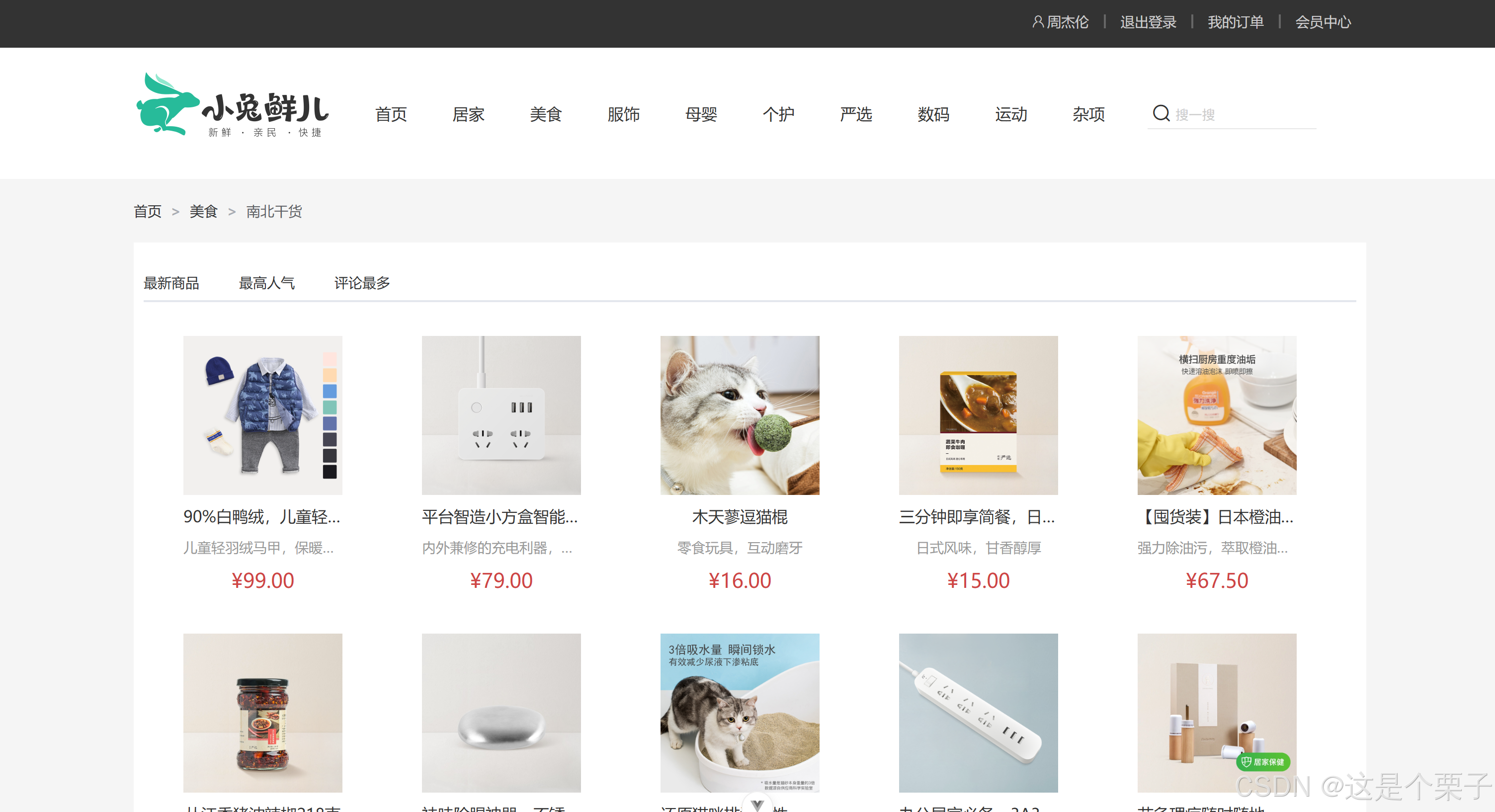
2.4 二级分类 + 详情
2.4.1 二级分类
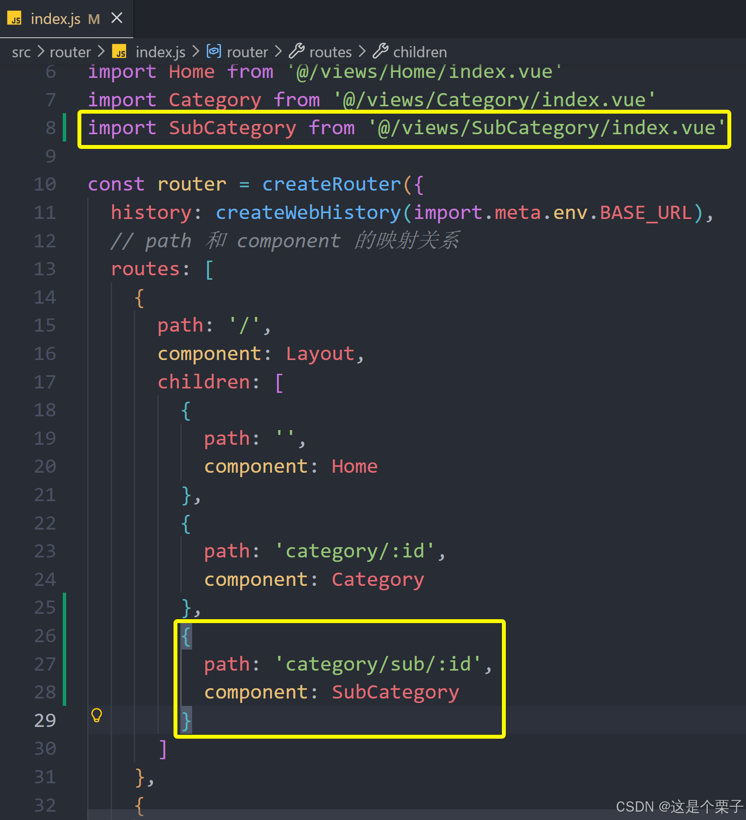
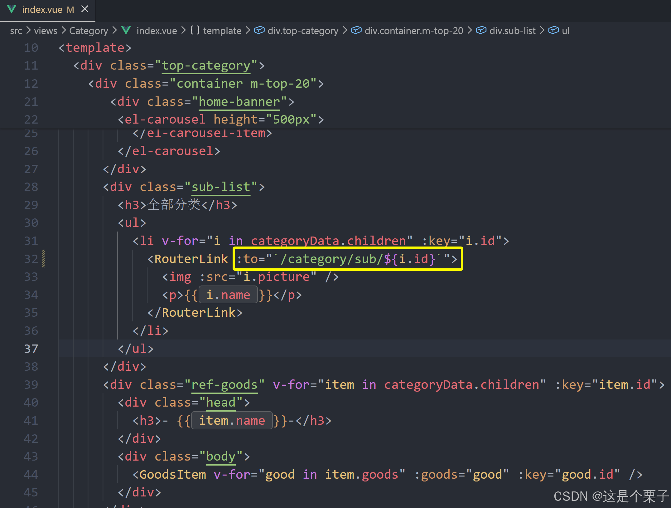
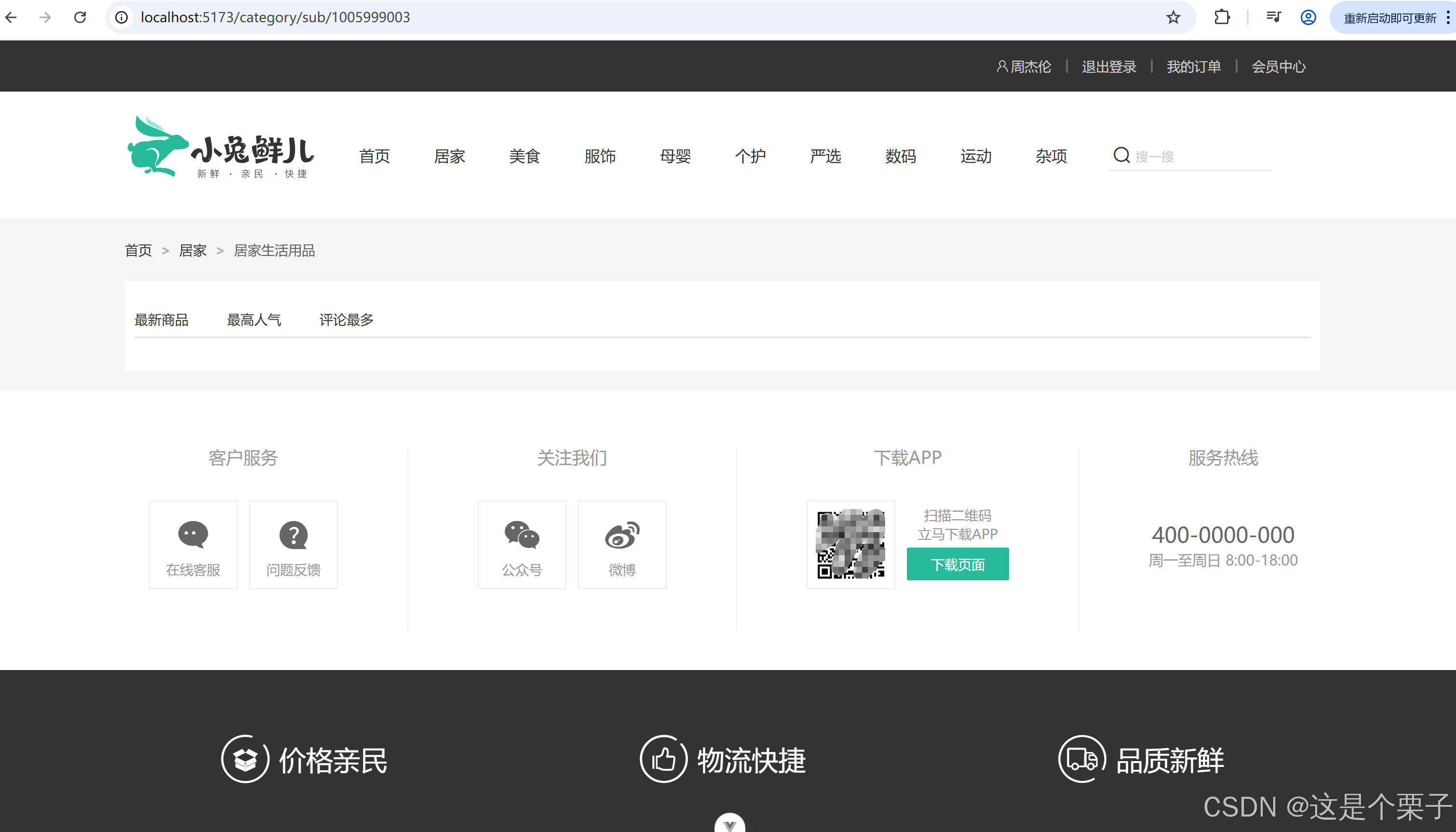
1. 整体认识和路由配置
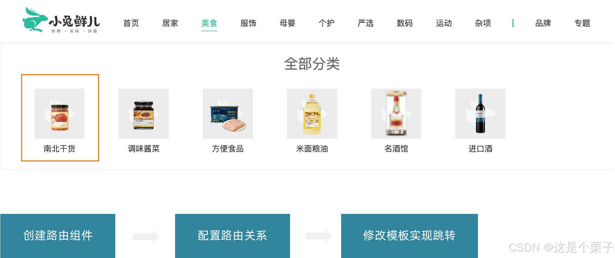
二级分类功能描述
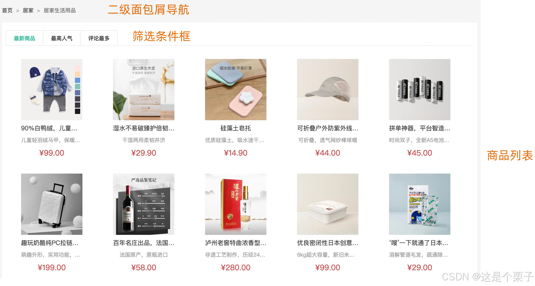
配置二级路由
准备组件模版:
html
<script setup>
</script>
<template>
<div class="container ">
<!-- 面包屑 -->
<div class="bread-container">
<el-breadcrumb separator=">">
<el-breadcrumb-item :to="{ path: '/' }">首页</el-breadcrumb-item>
<el-breadcrumb-item :to="{ path: '/' }">居家
</el-breadcrumb-item>
<el-breadcrumb-item>居家生活用品</el-breadcrumb-item>
</el-breadcrumb>
</div>
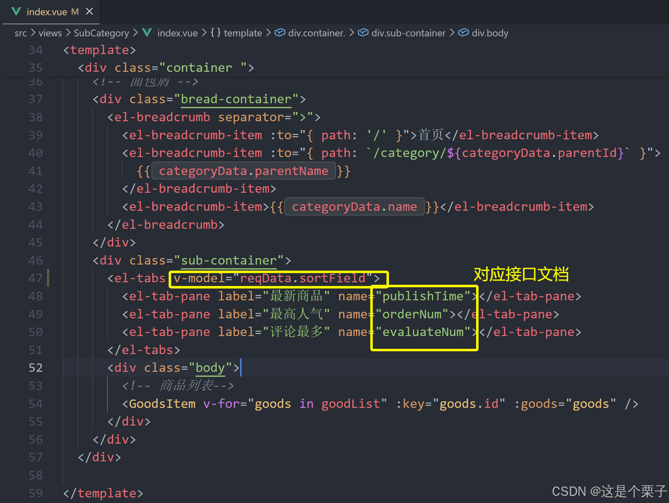
<div class="sub-container">
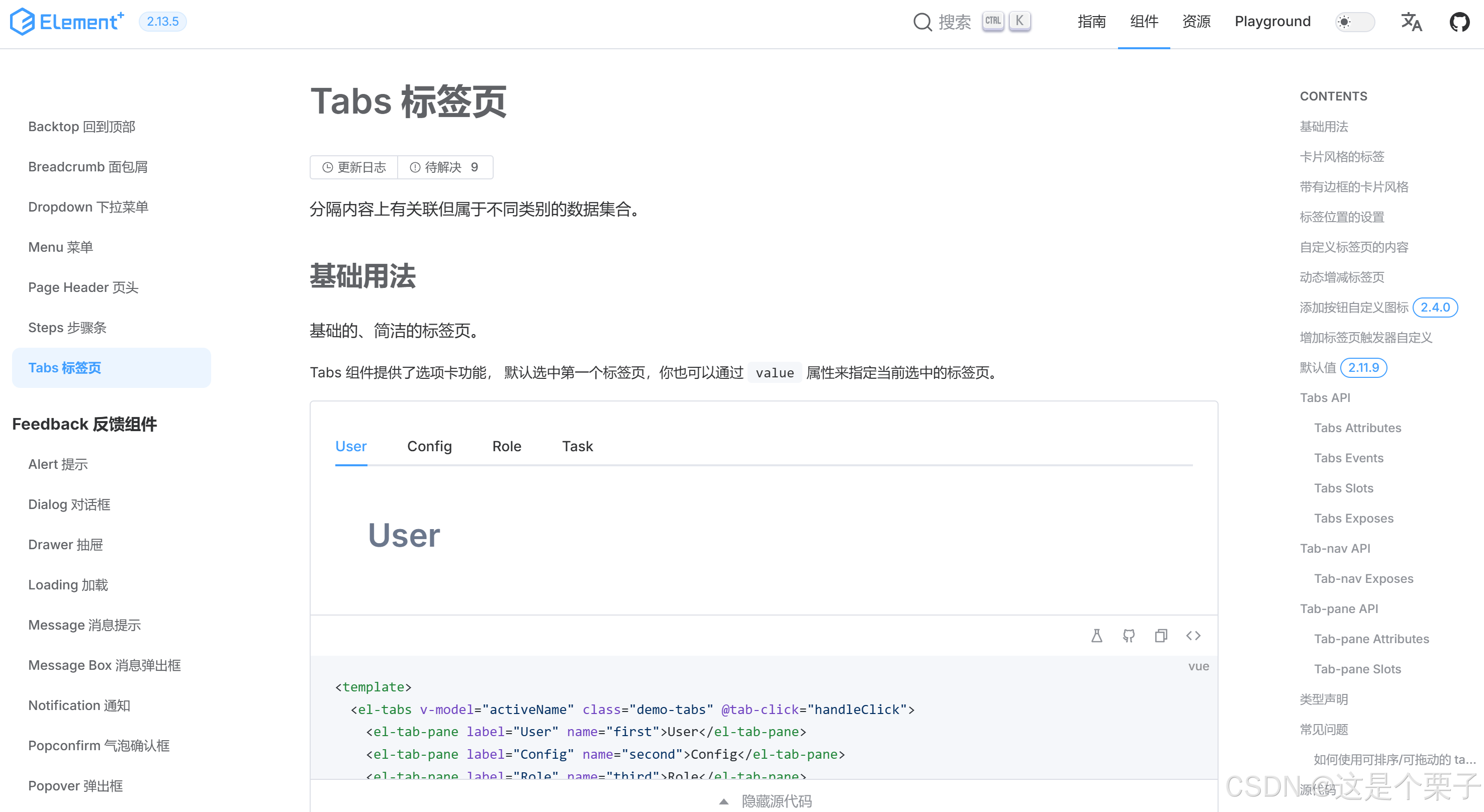
<el-tabs>
<el-tab-pane label="最新商品" name="publishTime"></el-tab-pane>
<el-tab-pane label="最高人气" name="orderNum"></el-tab-pane>
<el-tab-pane label="评论最多" name="evaluateNum"></el-tab-pane>
</el-tabs>
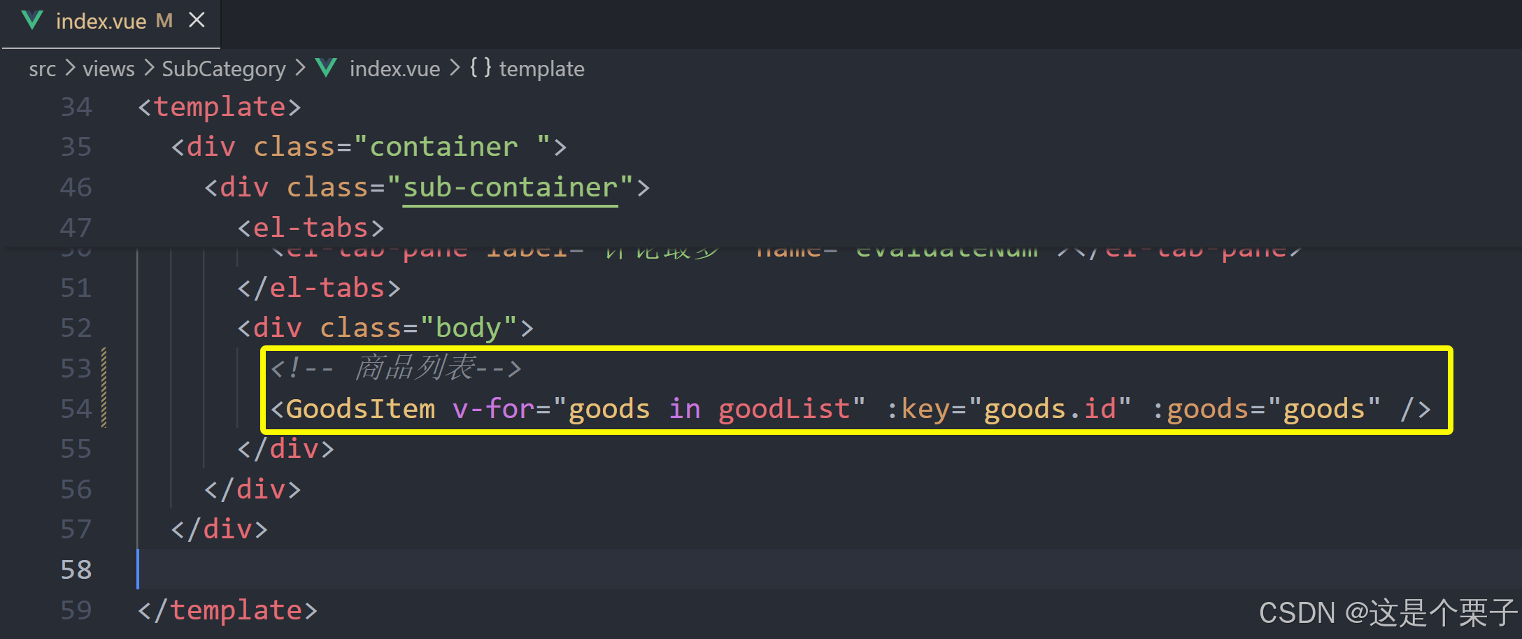
<div class="body">
<!-- 商品列表-->
</div>
</div>
</div>
</template>
<style lang="scss" scoped>
.bread-container {
padding: 25px 0;
color: #666;
}
.sub-container {
padding: 20px 10px;
background-color: #fff;
.body {
display: flex;
flex-wrap: wrap;
padding: 0 10px;
}
.goods-item {
display: block;
width: 220px;
margin-right: 20px;
padding: 20px 30px;
text-align: center;
img {
width: 160px;
height: 160px;
}
p {
padding-top: 10px;
}
.name {
font-size: 16px;
}
.desc {
color: #999;
height: 29px;
}
.price {
color: $priceColor;
font-size: 20px;
}
}
.pagination-container {
margin-top: 20px;
display: flex;
justify-content: center;
}
}
</style>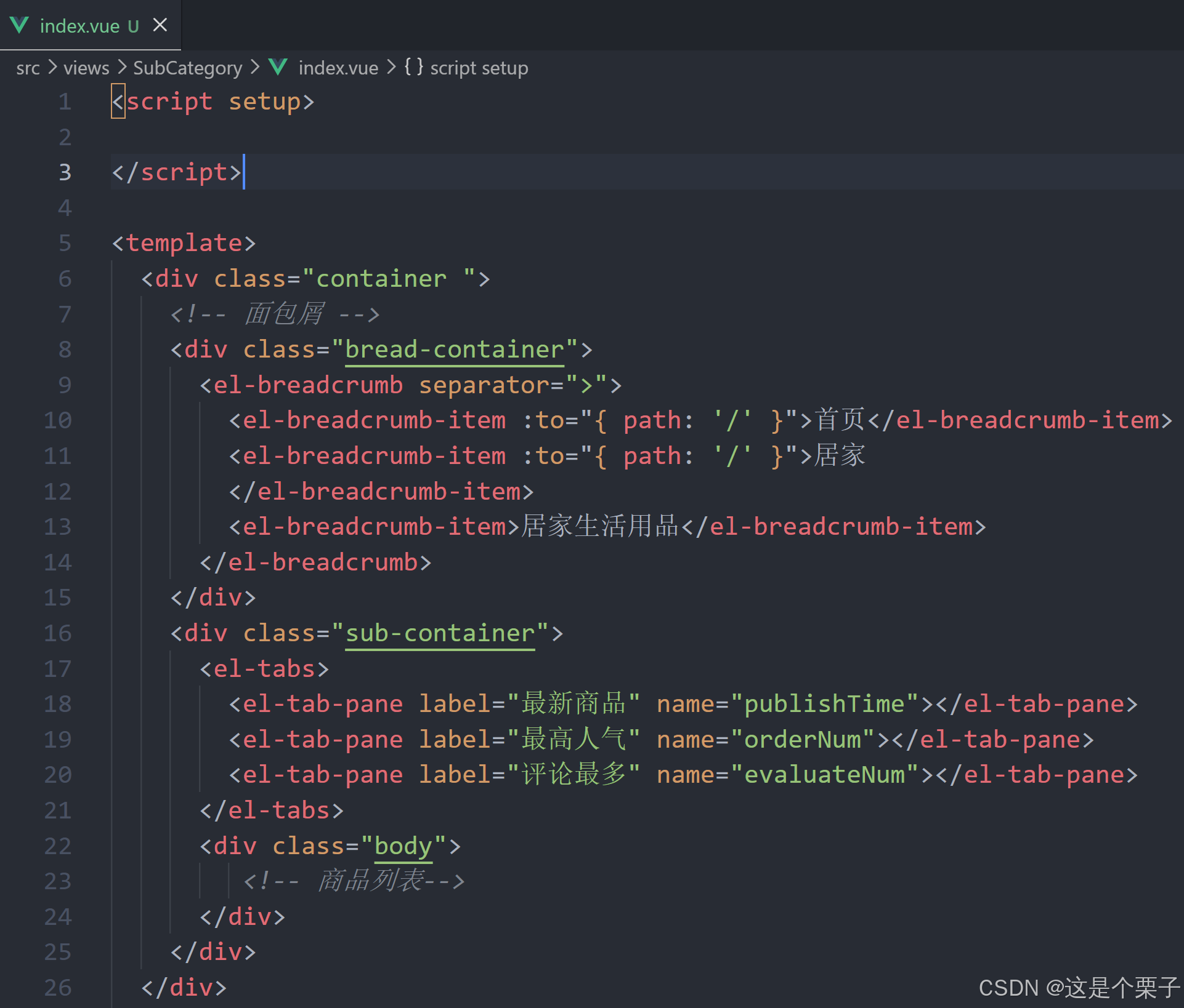
配置路由关系:
跳转配置:
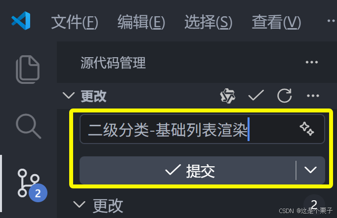
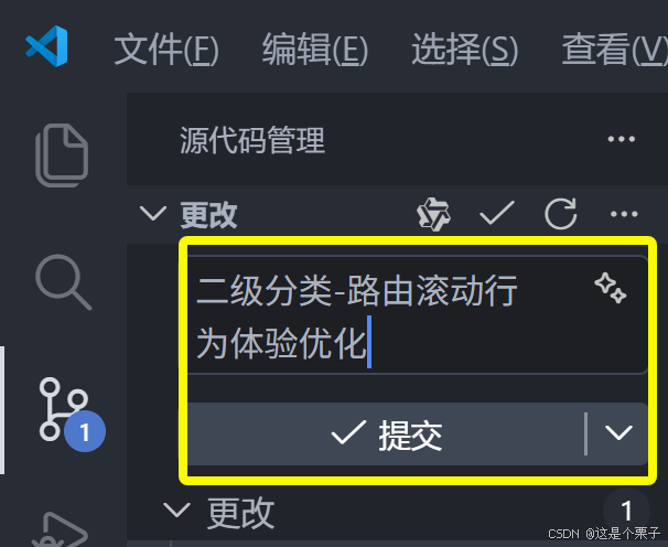
提交代码:
2. 面包屑导航实现
实现步骤:
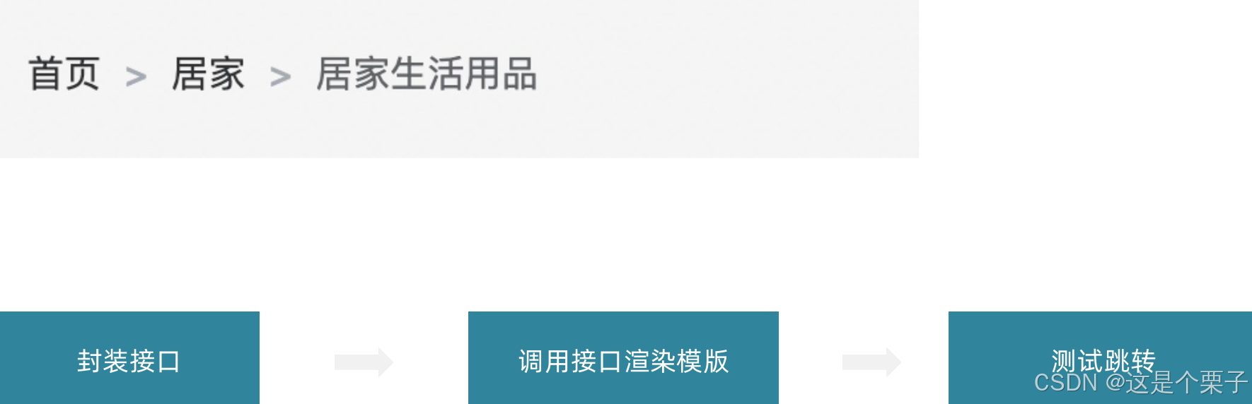
准备接口:
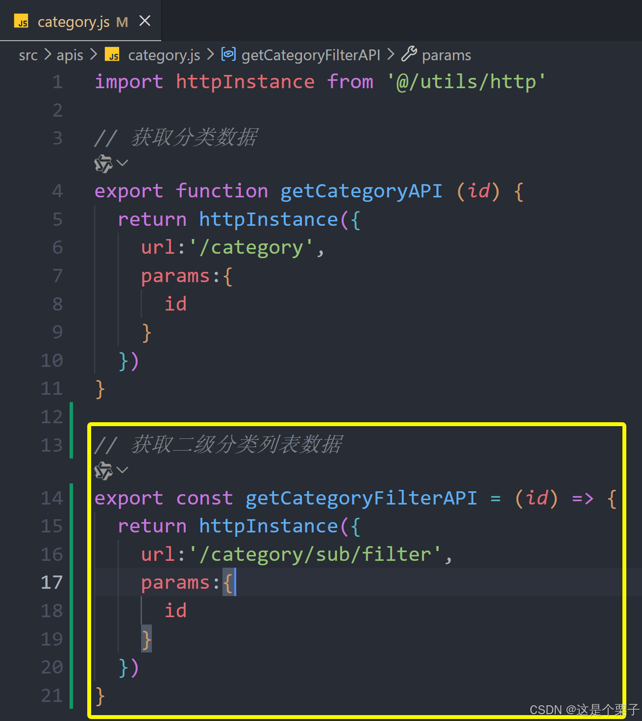
获取数据渲染模版:
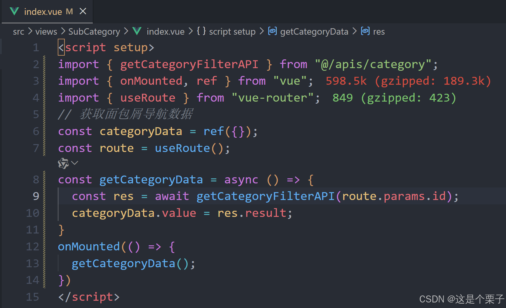
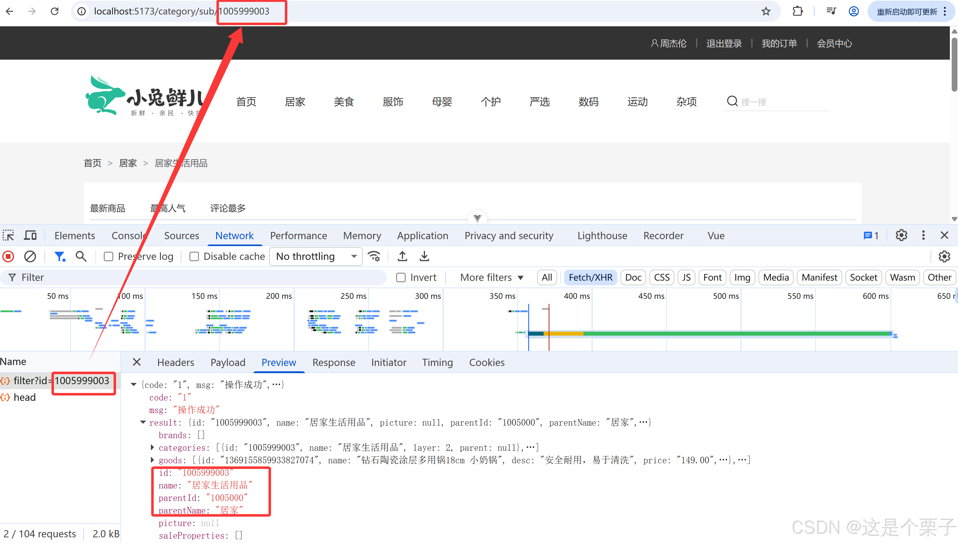
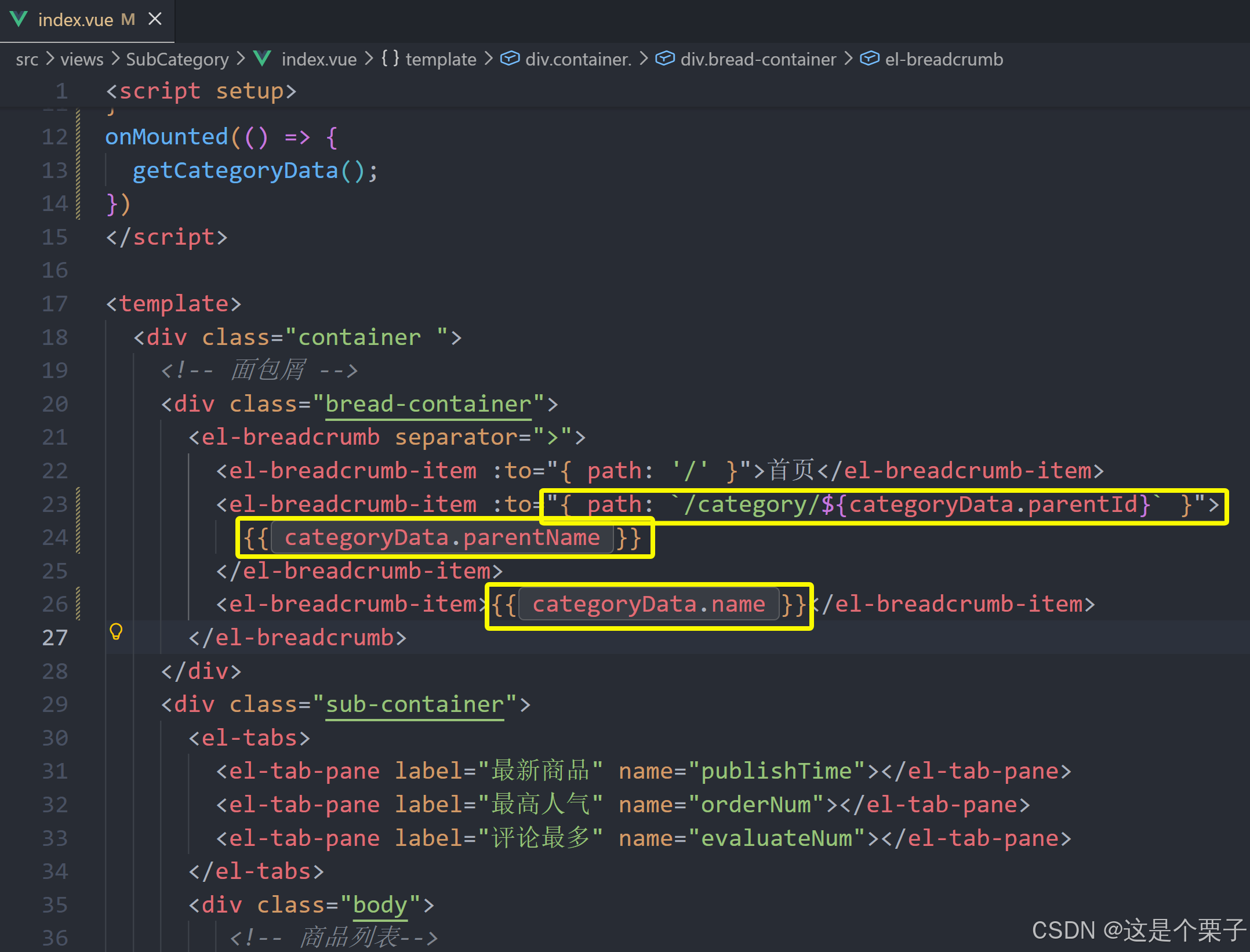
提交代码:
3. 商品列表实现
(1) 整体流程梳理
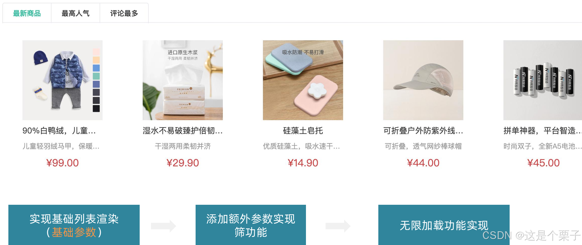
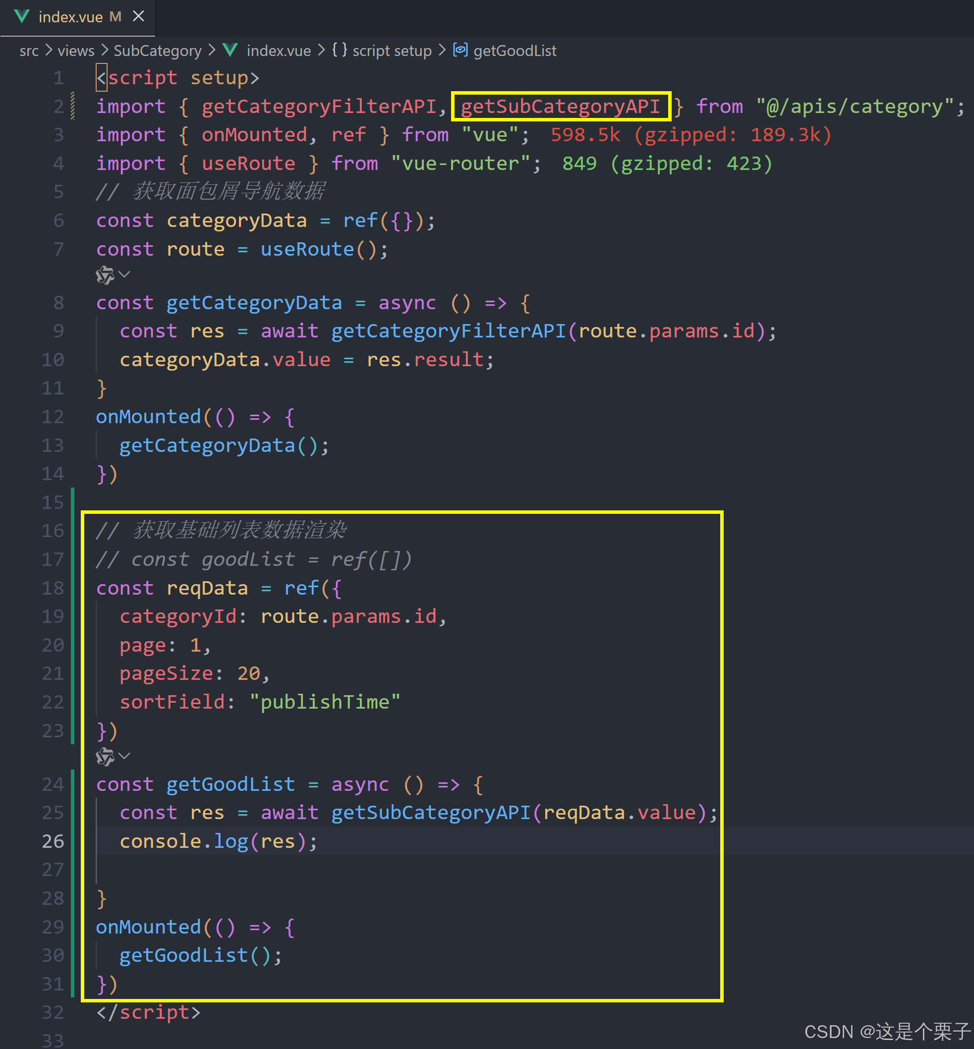
(2) 基础参数获取基础列表
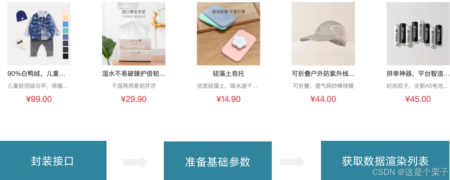
准备接口:
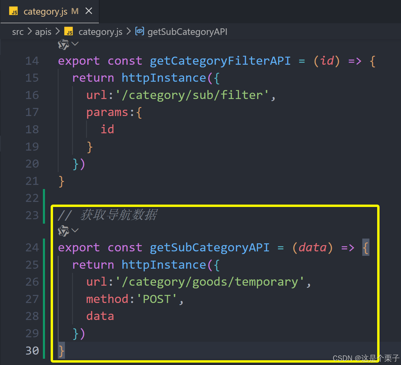
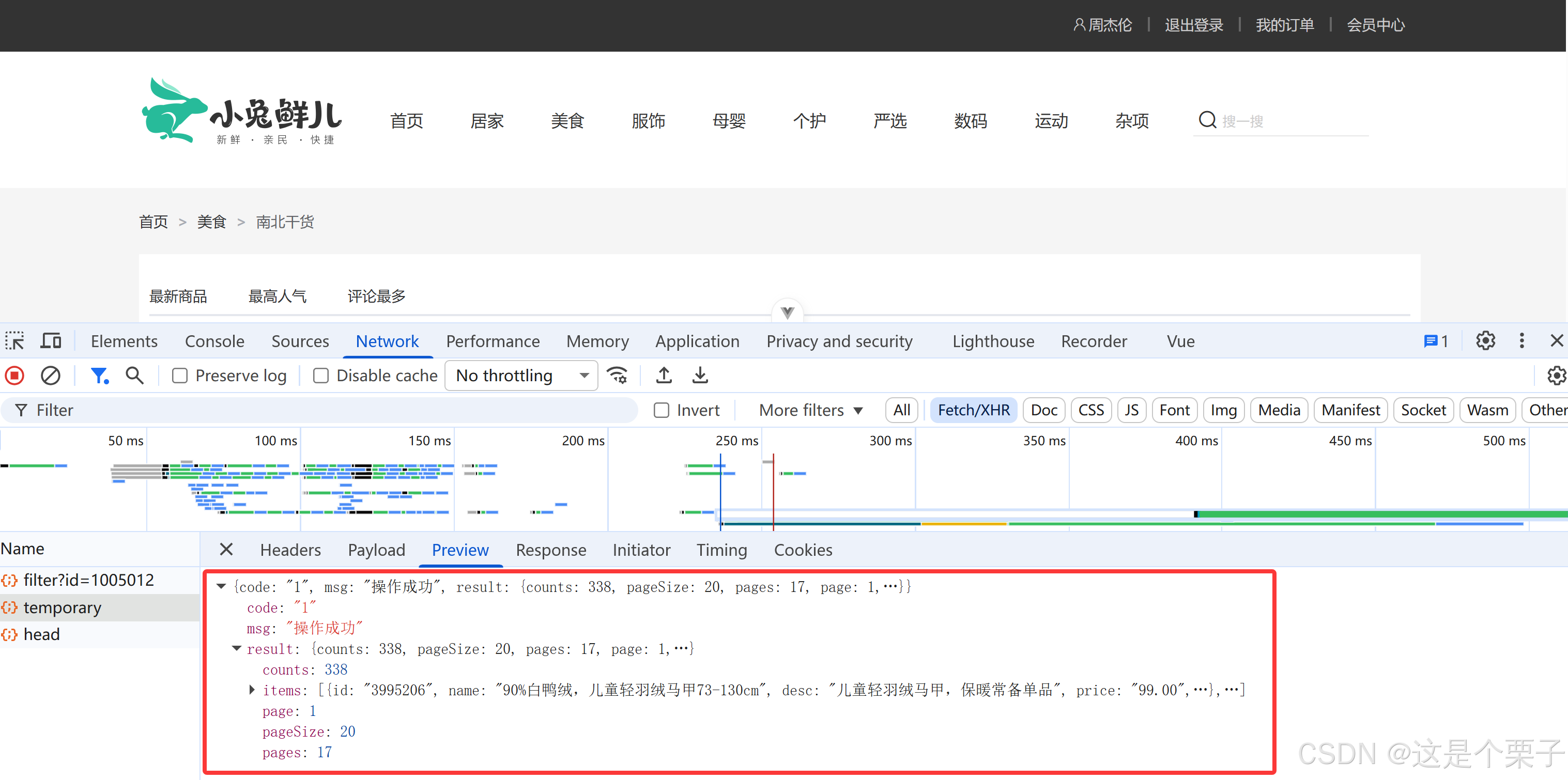
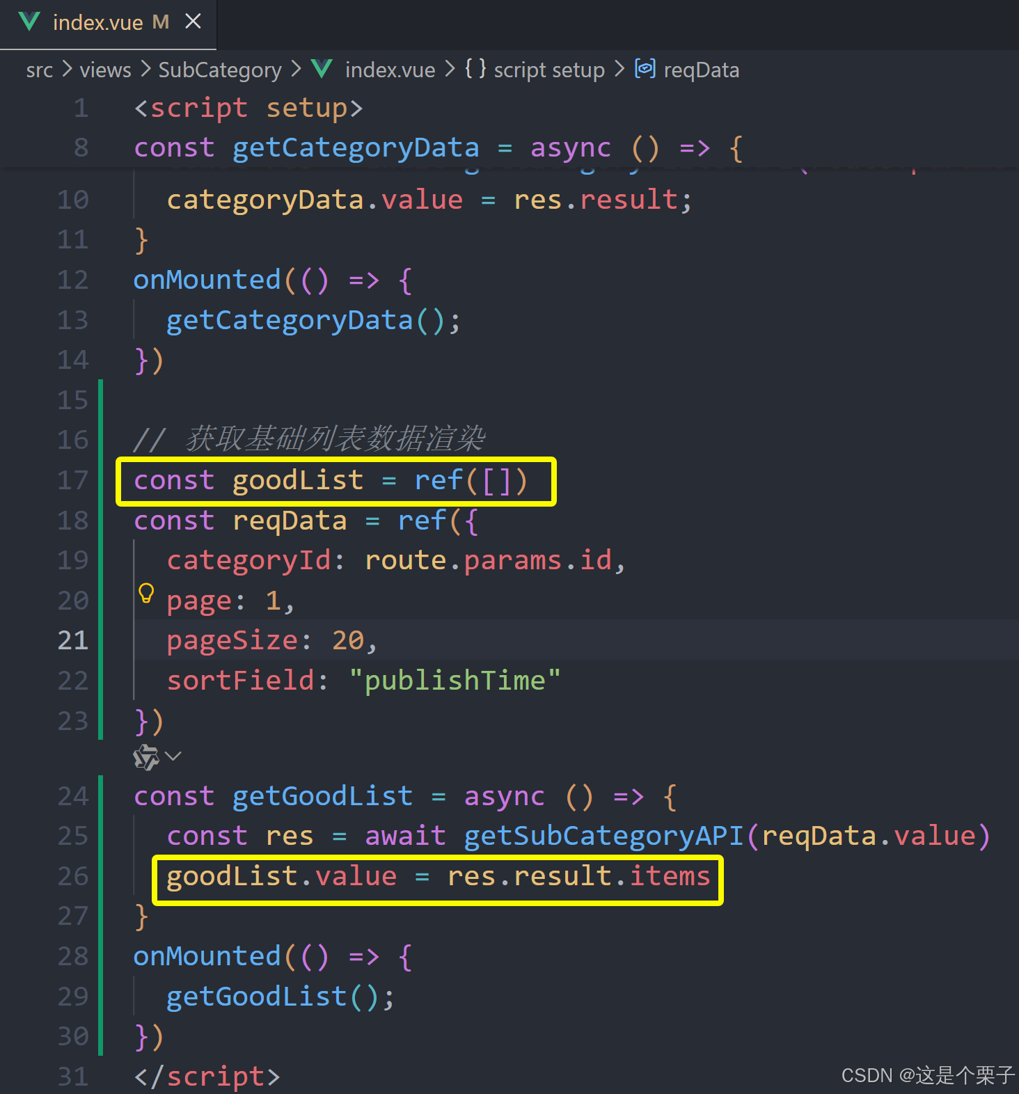
获取数据列表:
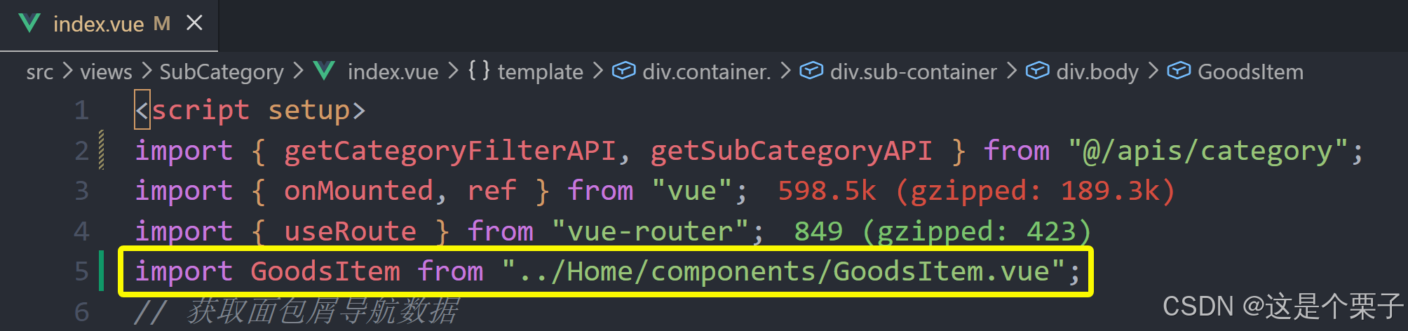
提交代码:
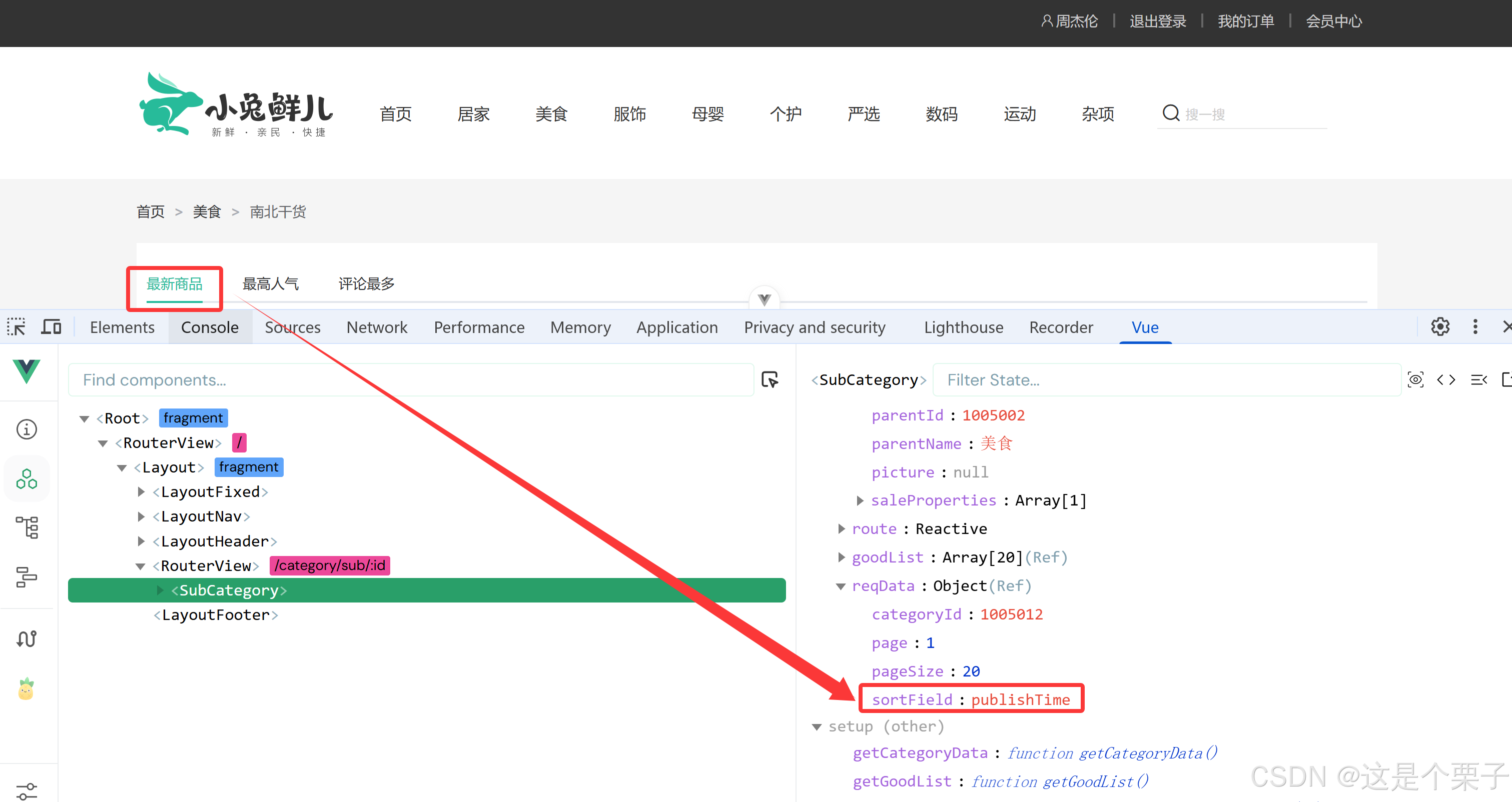
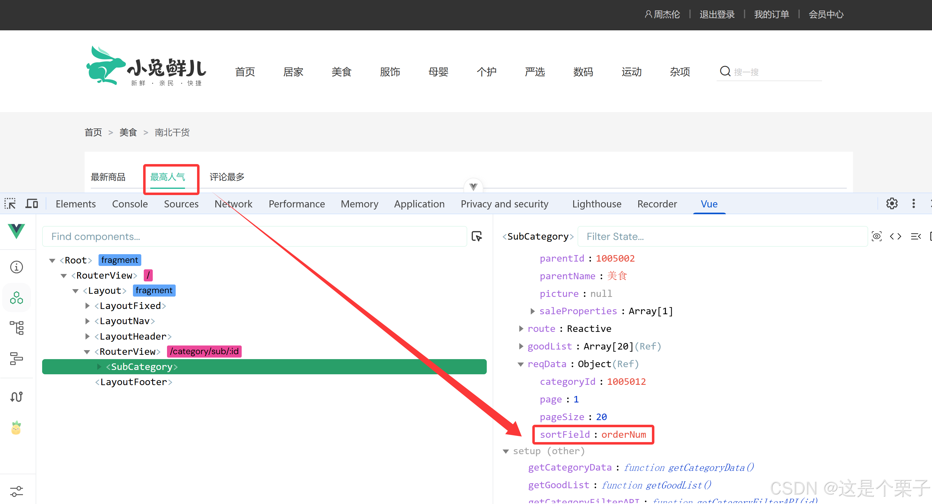
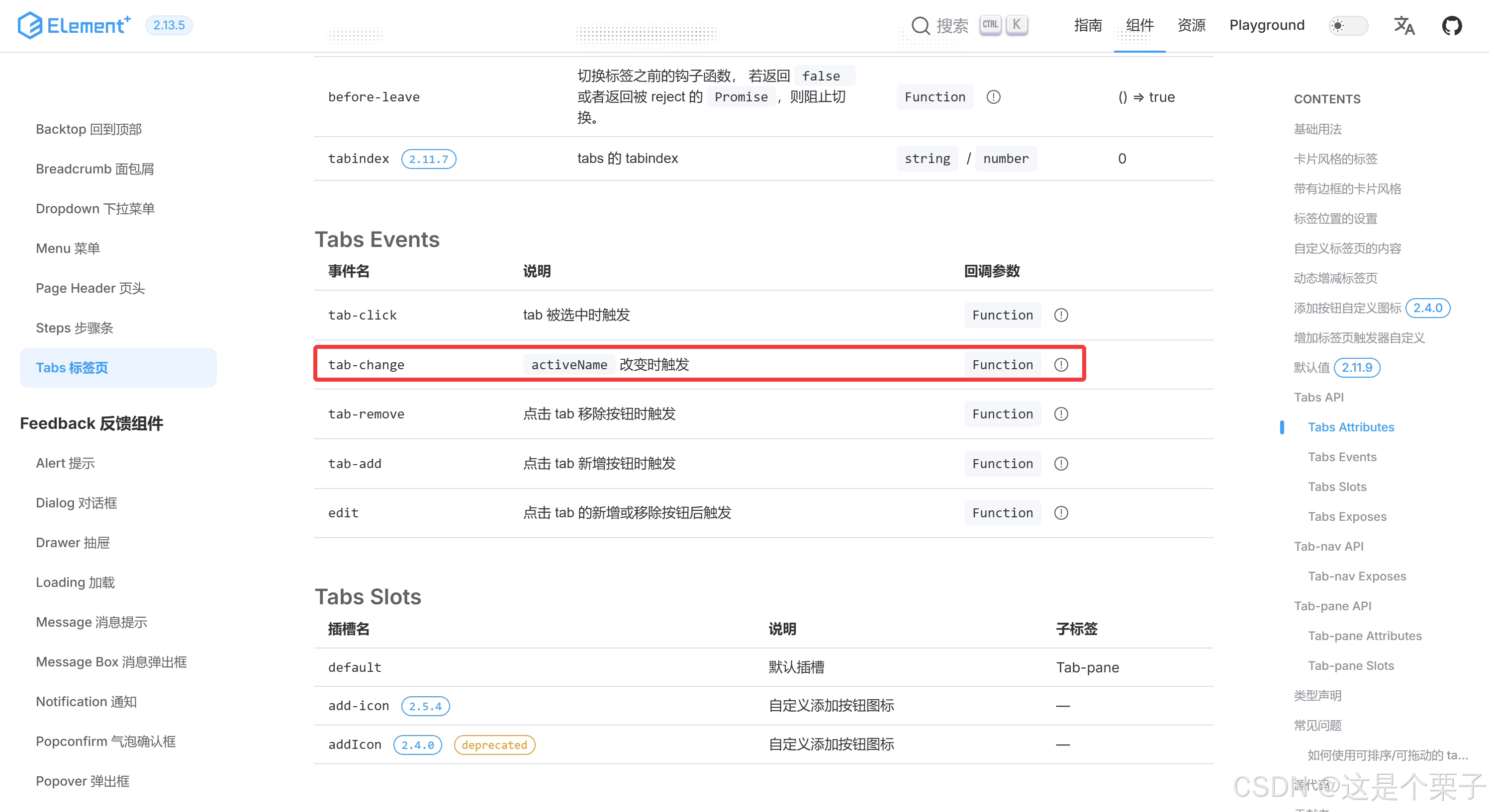
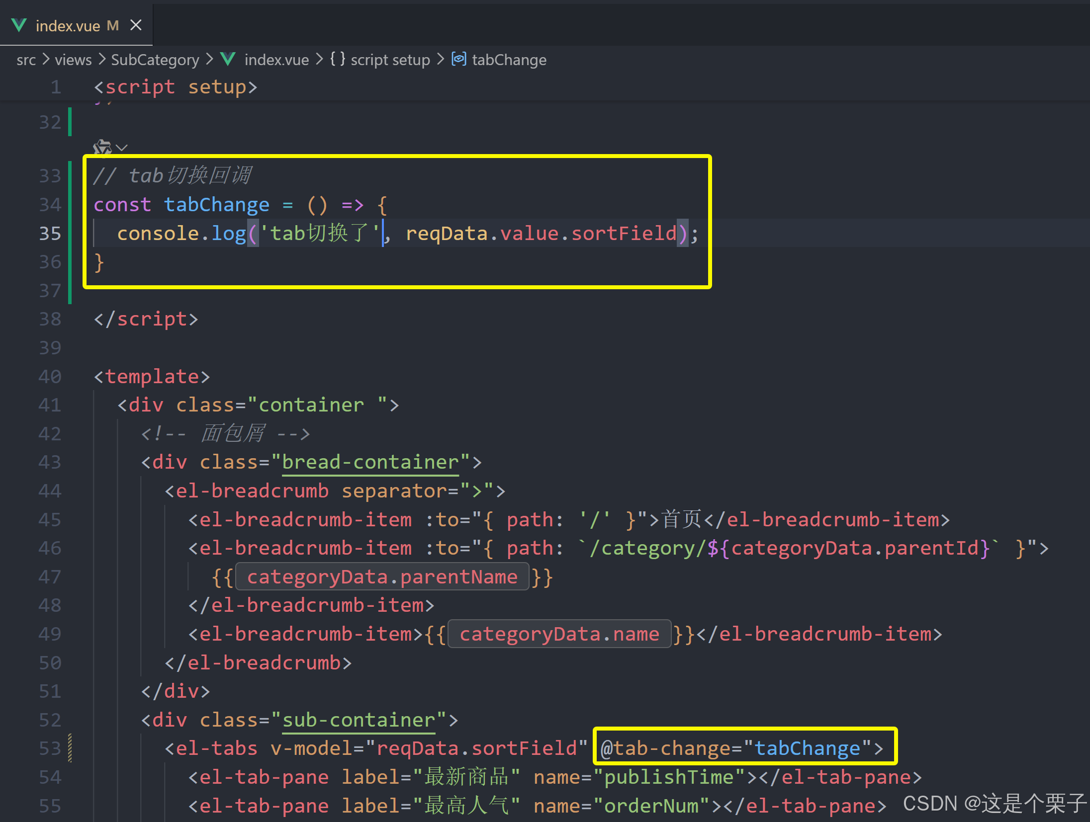
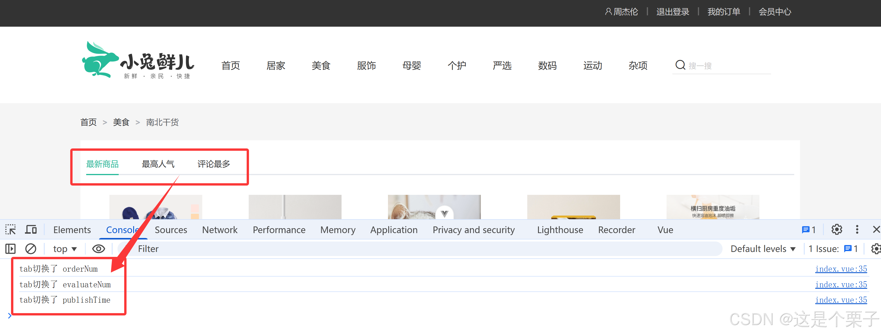
(3) 添加筛选参数实现筛选功能
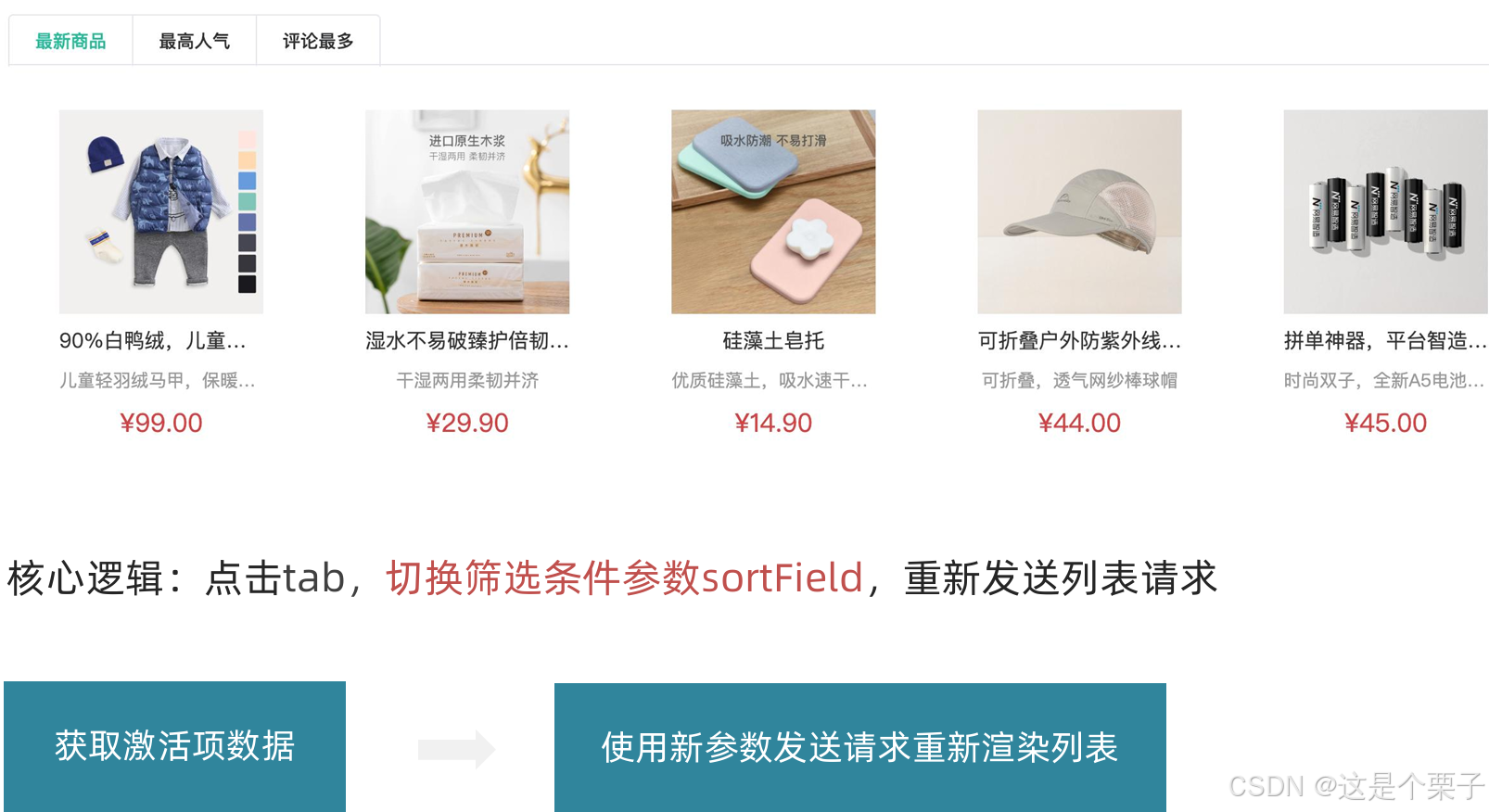
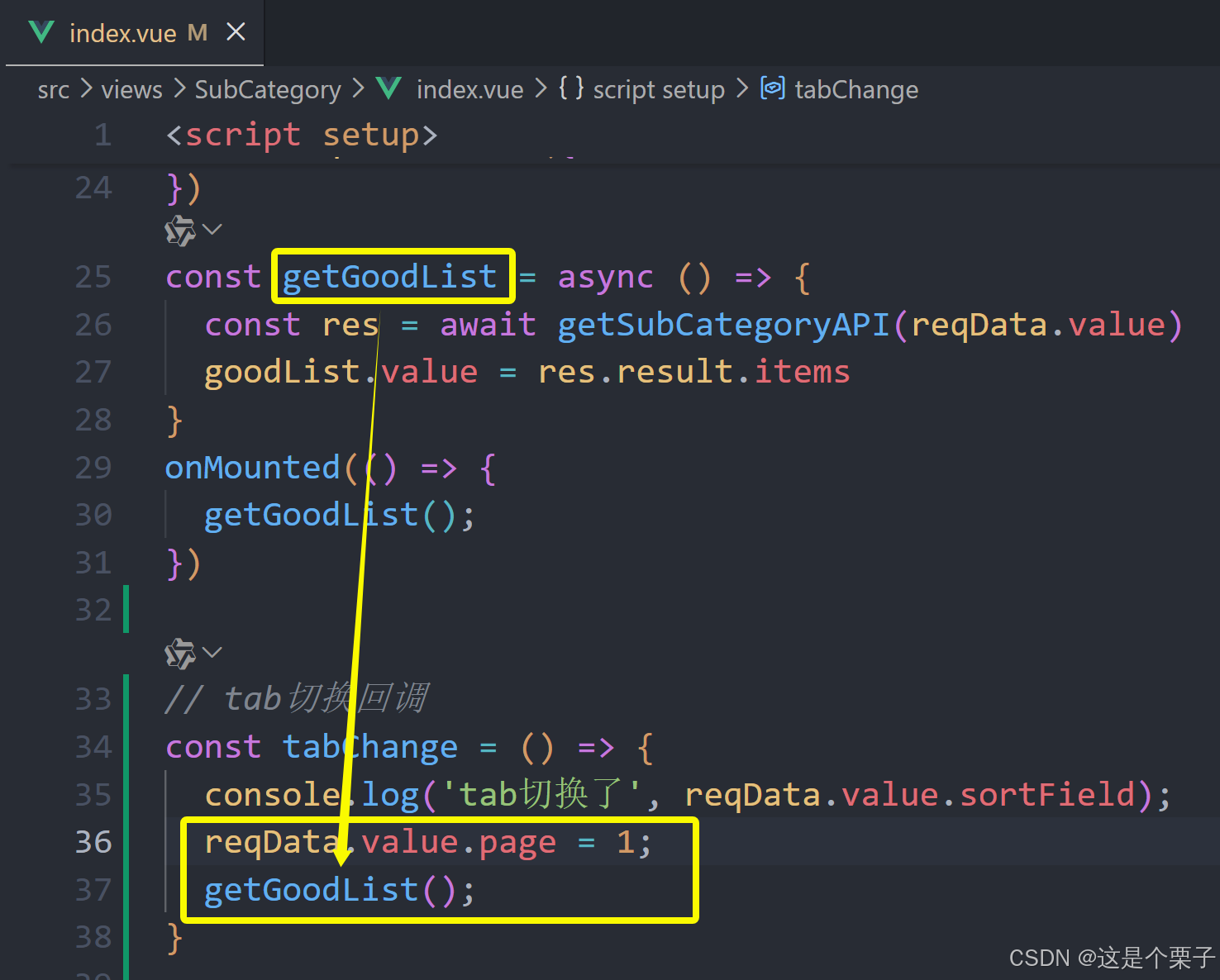
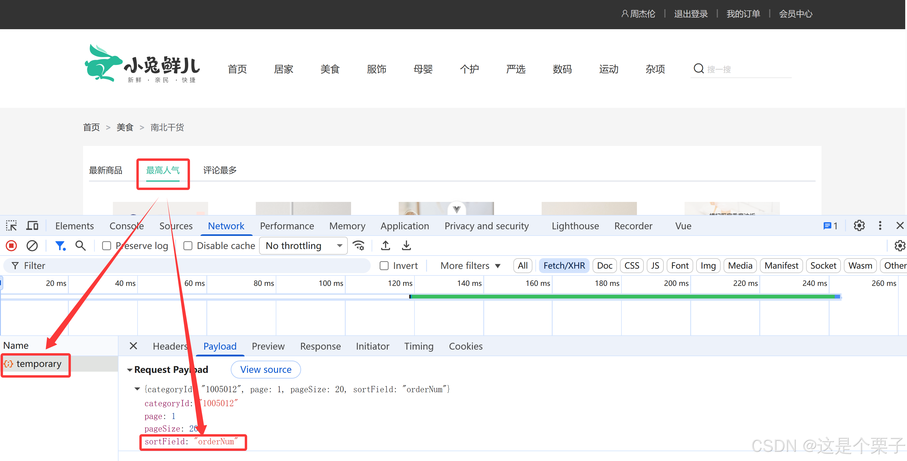
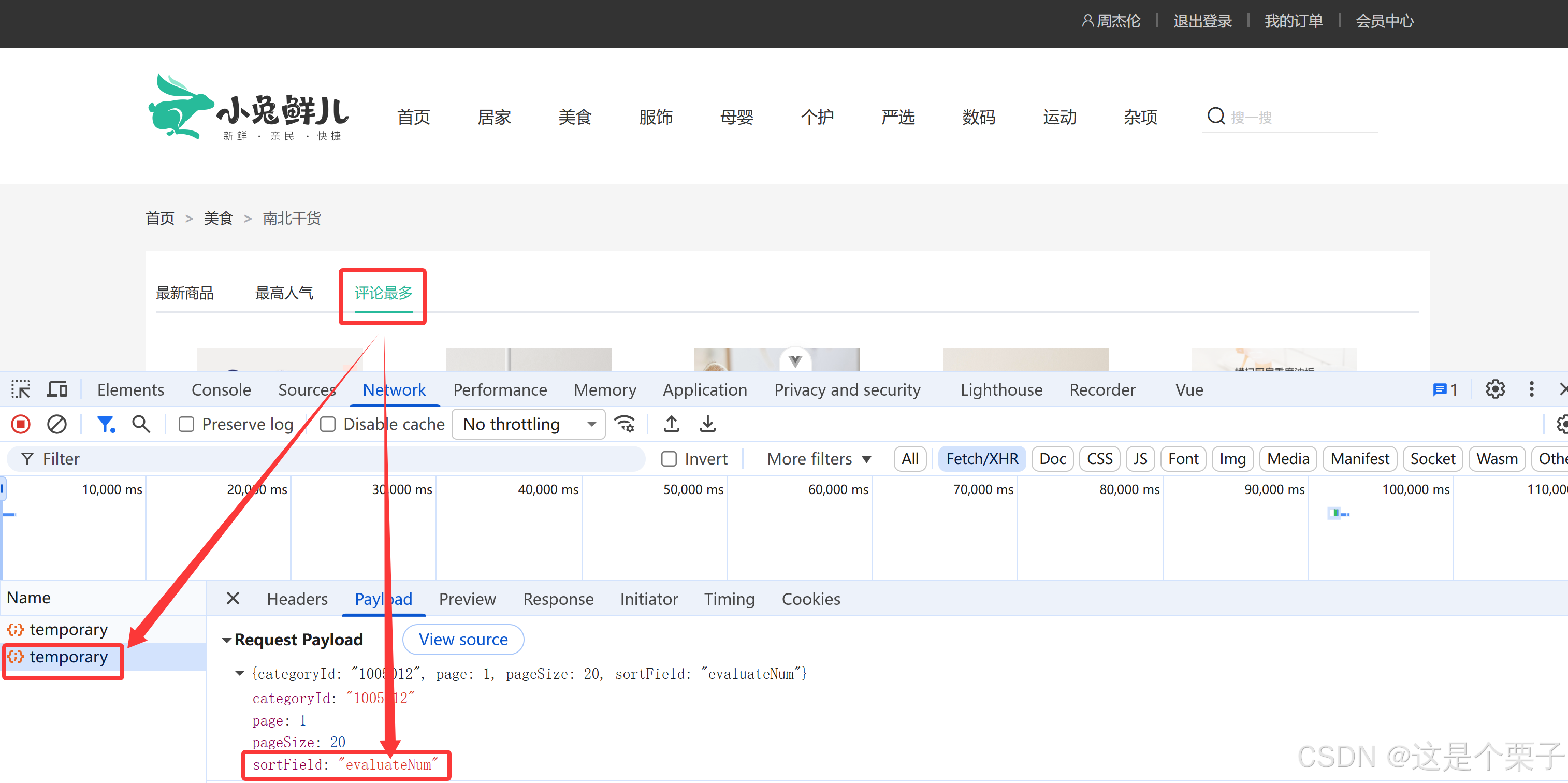
思路:tab组件切换时修改reqData中的sortField字段,重新拉取接口列表。
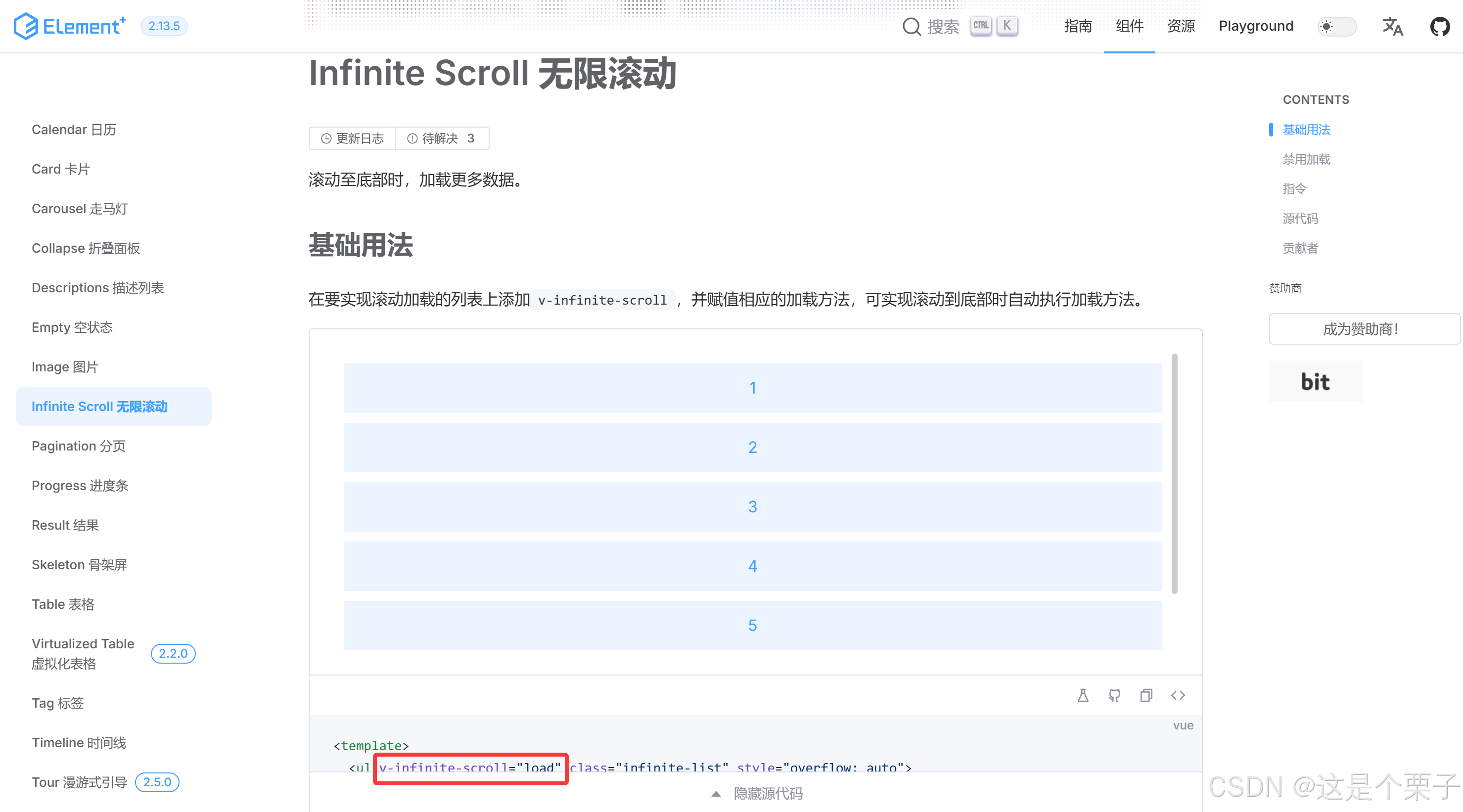
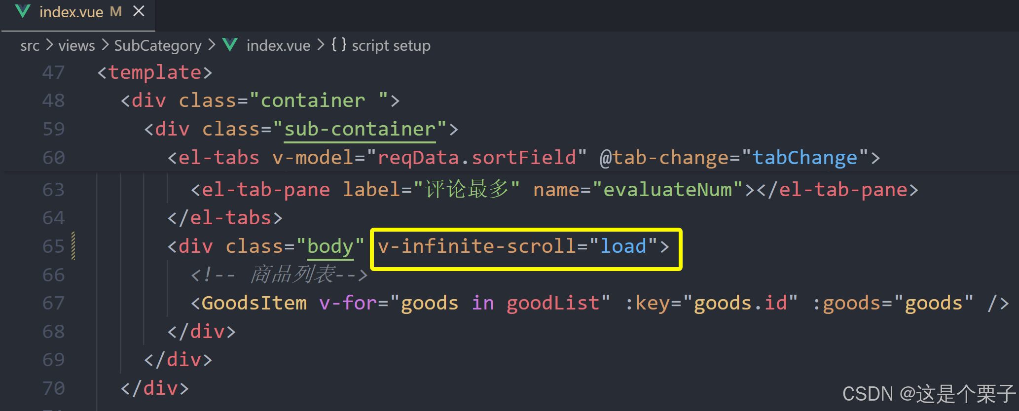
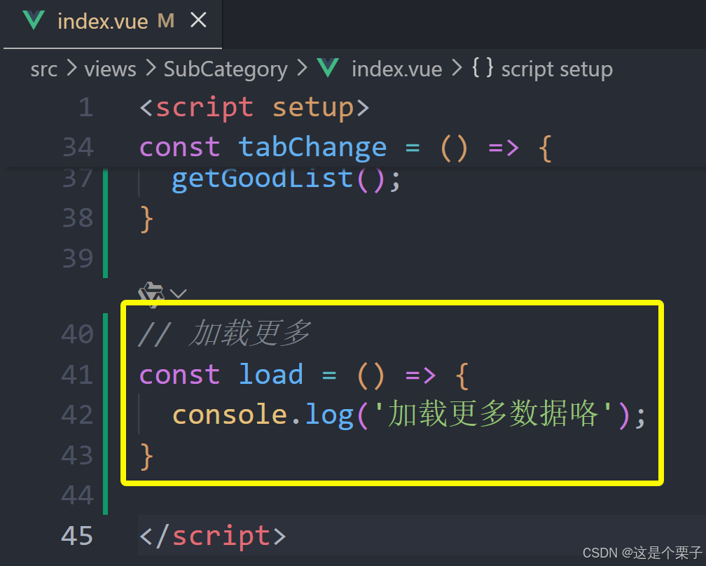
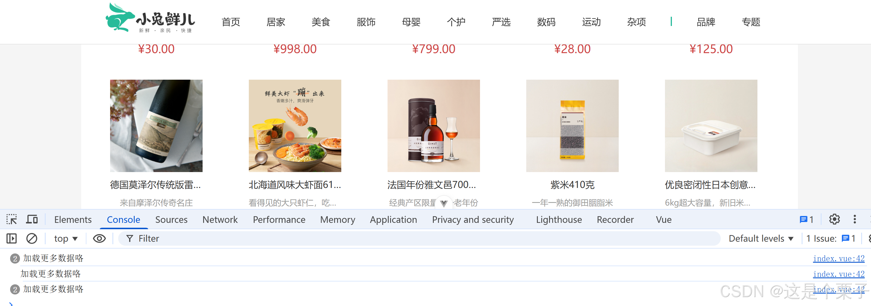
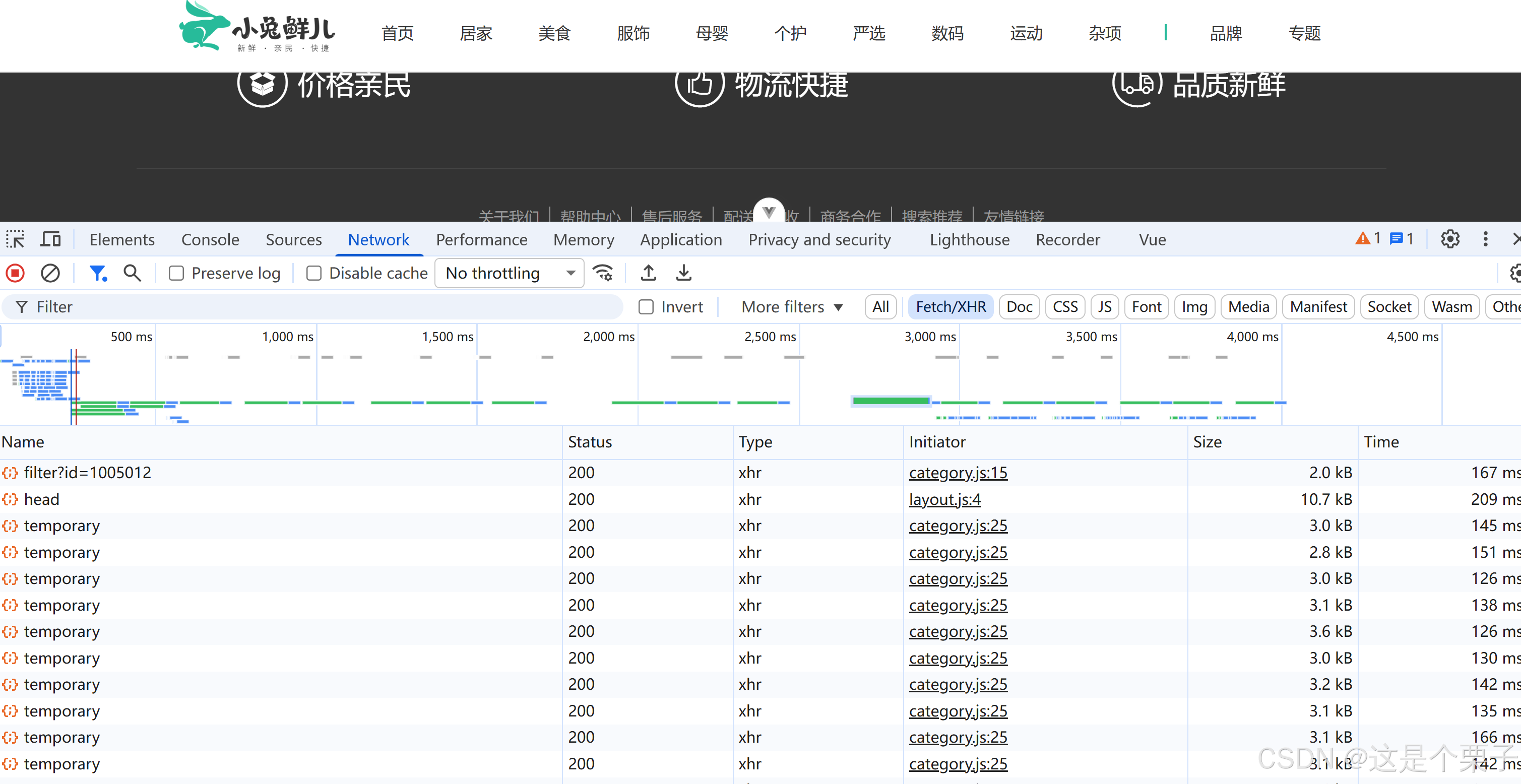
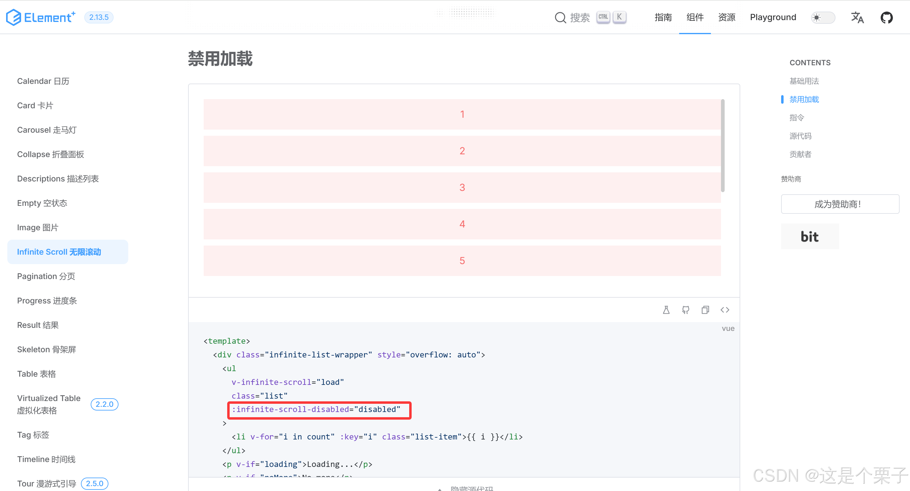
(4) 列表无限加载功能实现
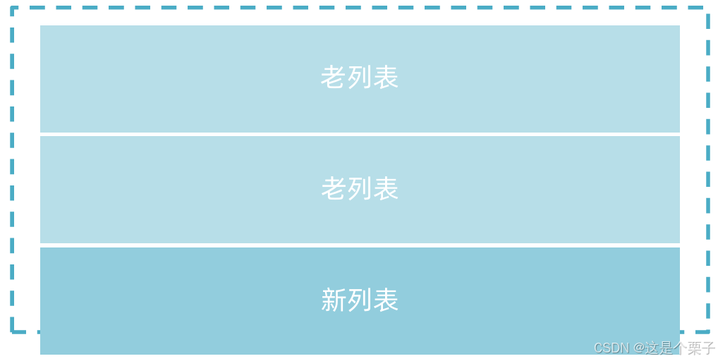
核心实现逻辑:使用elementPlus提供的v-infinite-scroll指令监听是否满足触底条件,满足加载条件时让页数参数加一获取下一页数据,做新老数据拼接渲染。

基础思路
-
触底条件满足之后 page++,拉取下一页数据
-
新老数据做数组拼接
-
判断是否已经全部加载完毕,停止监听
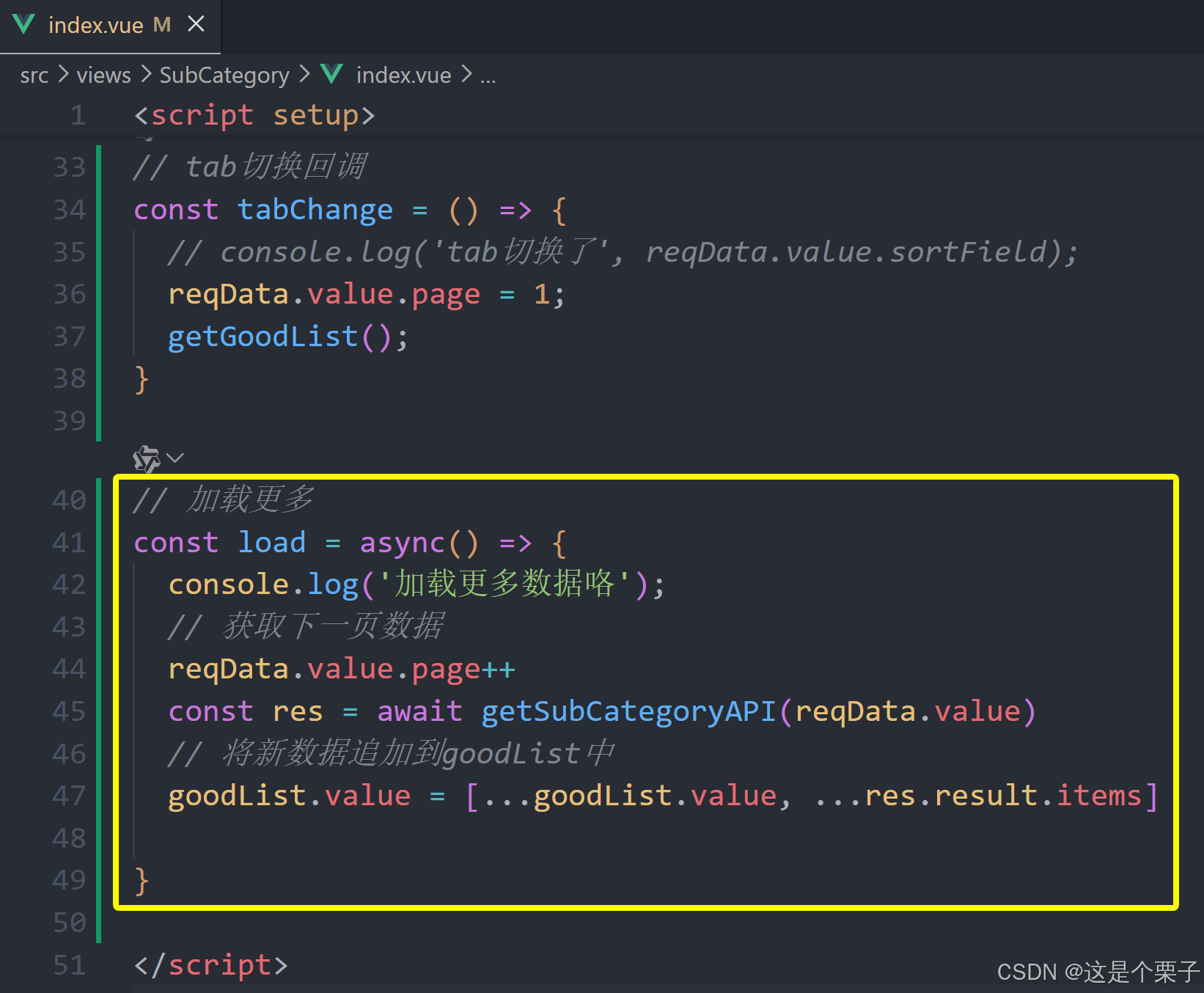
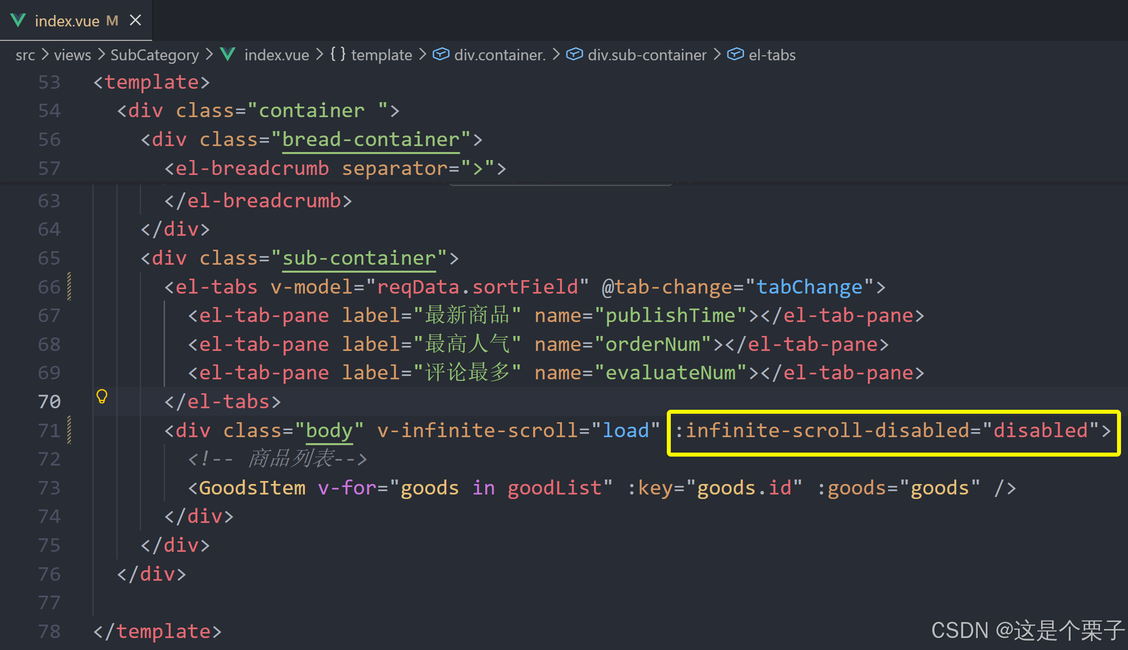
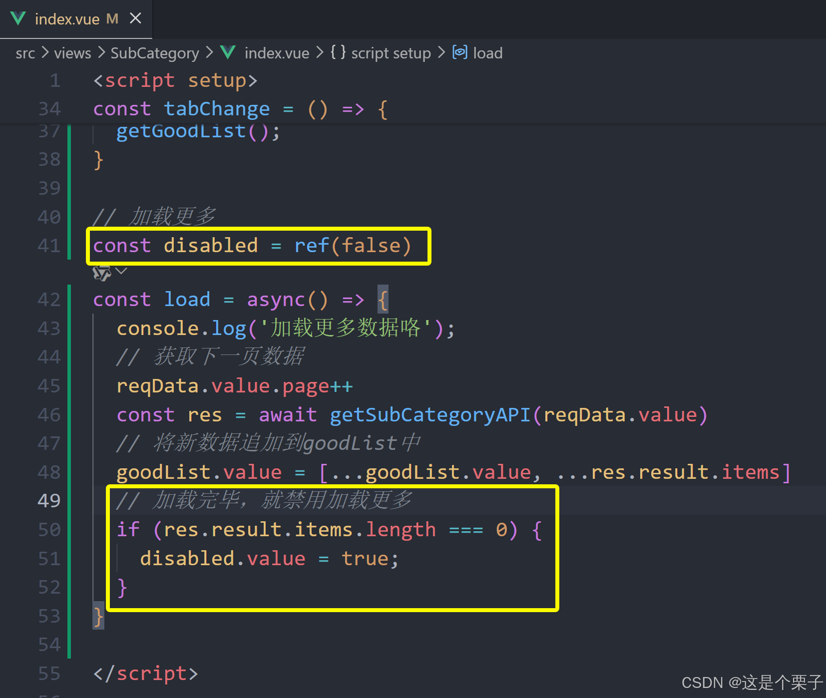
提交代码:
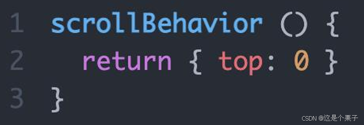
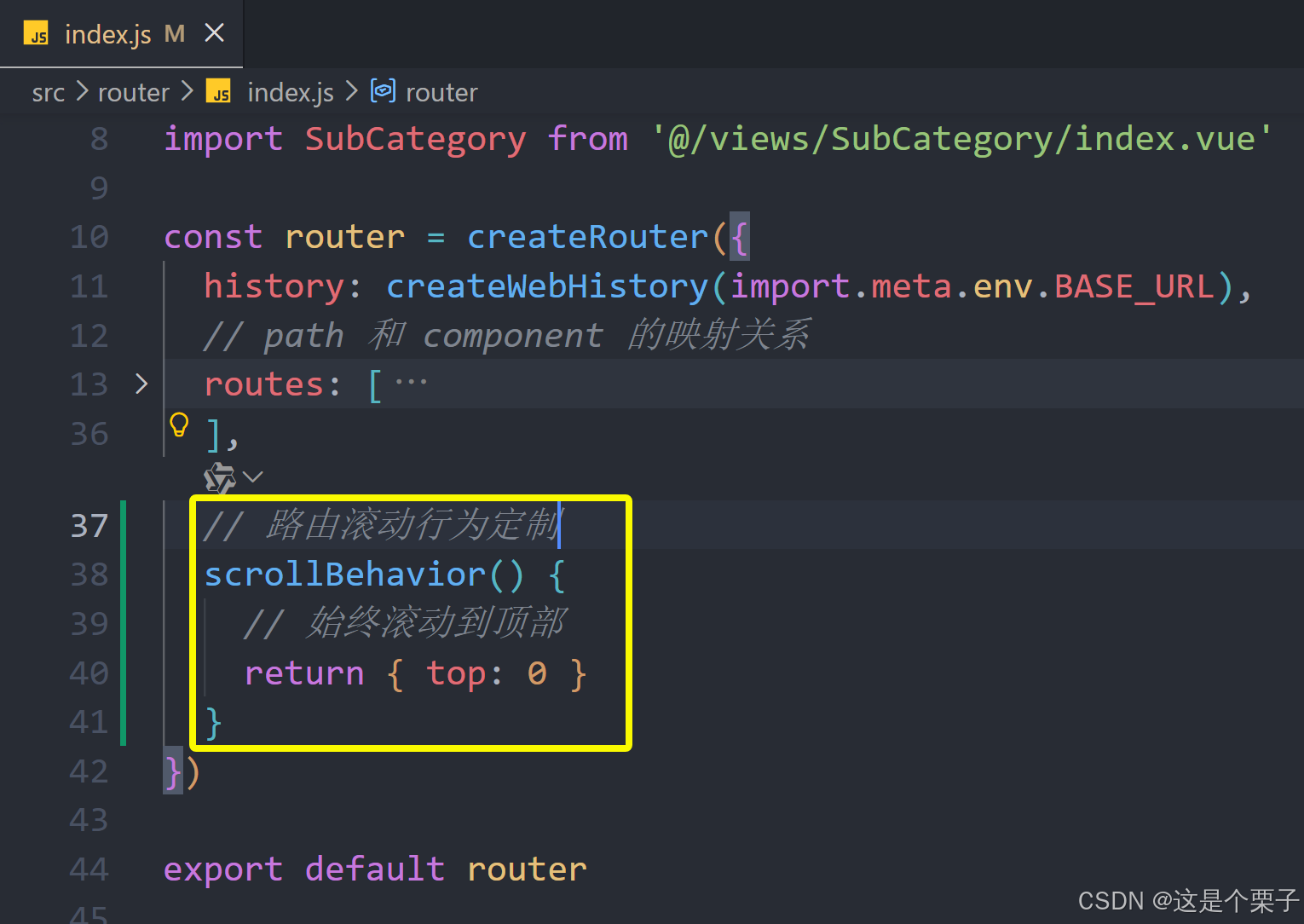
4. 定制路由scrollBehavior
定制路由行为解决什么问题
在不同路由切换的时候,可以自动滚动到页面的顶部,而不是停留在原先的位置。
如何配置:vue-router支持scrollBehavior配置项,可以指定路由切换时的滚动位置。
提交代码:
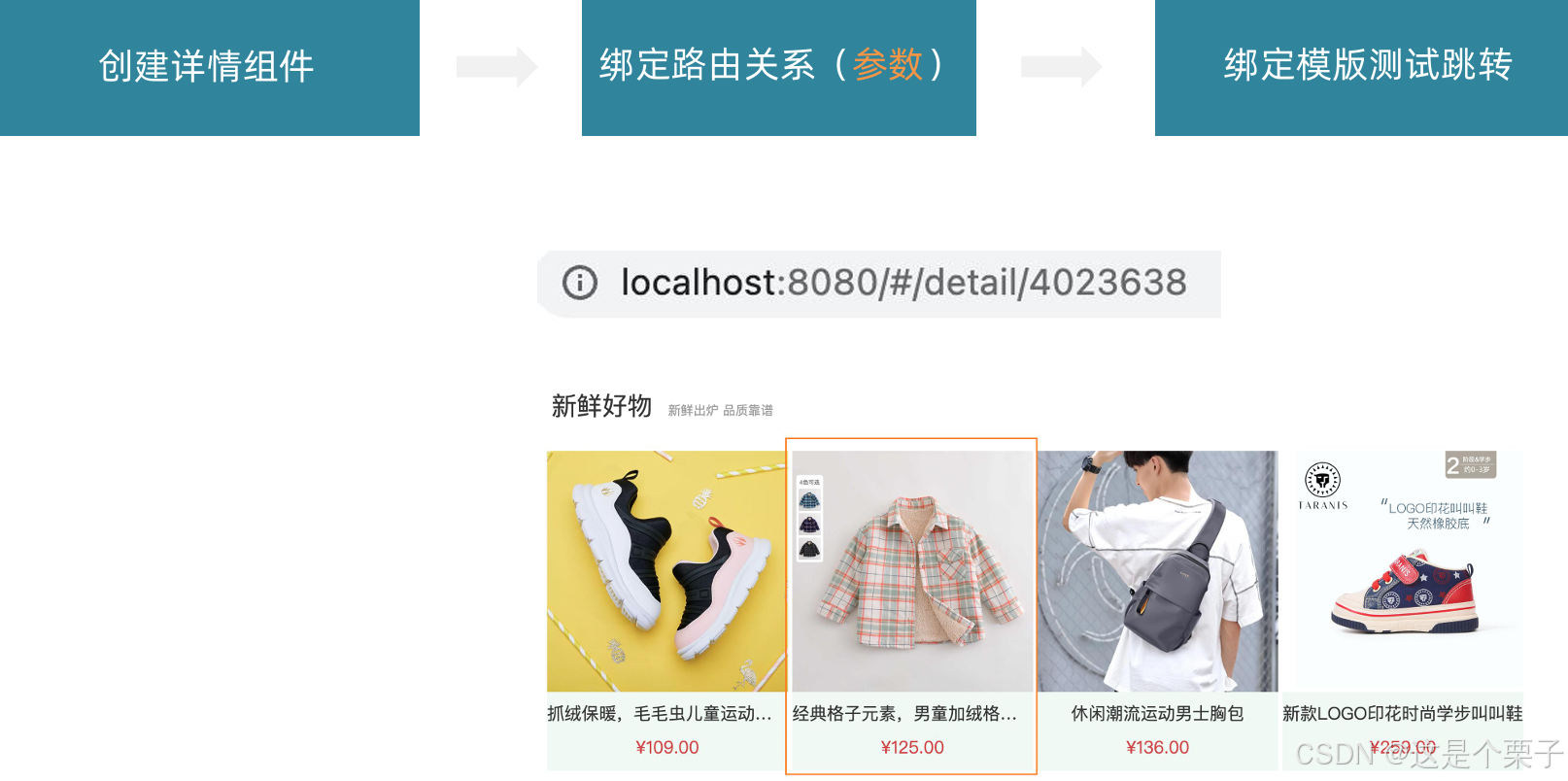
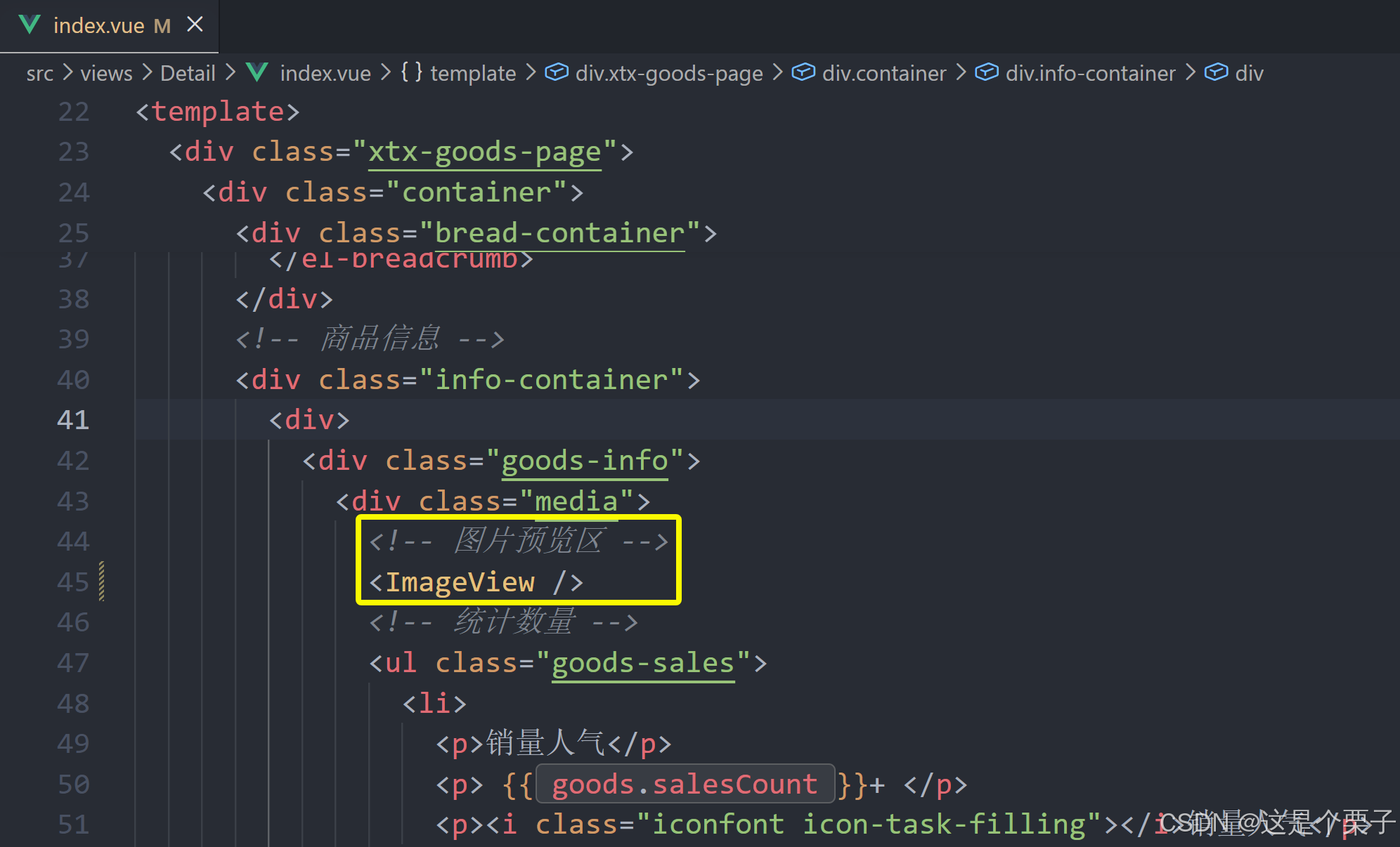
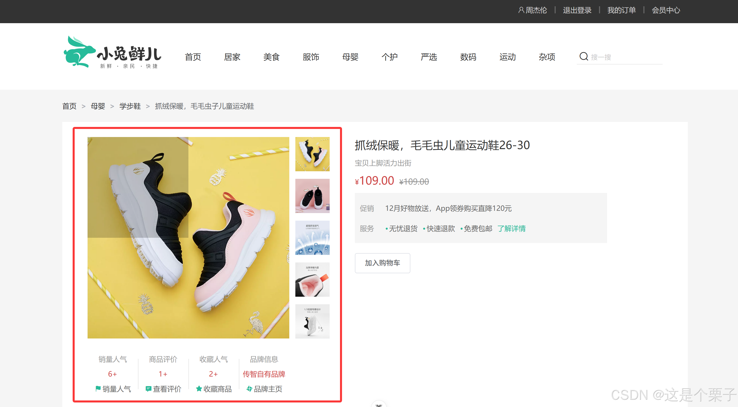
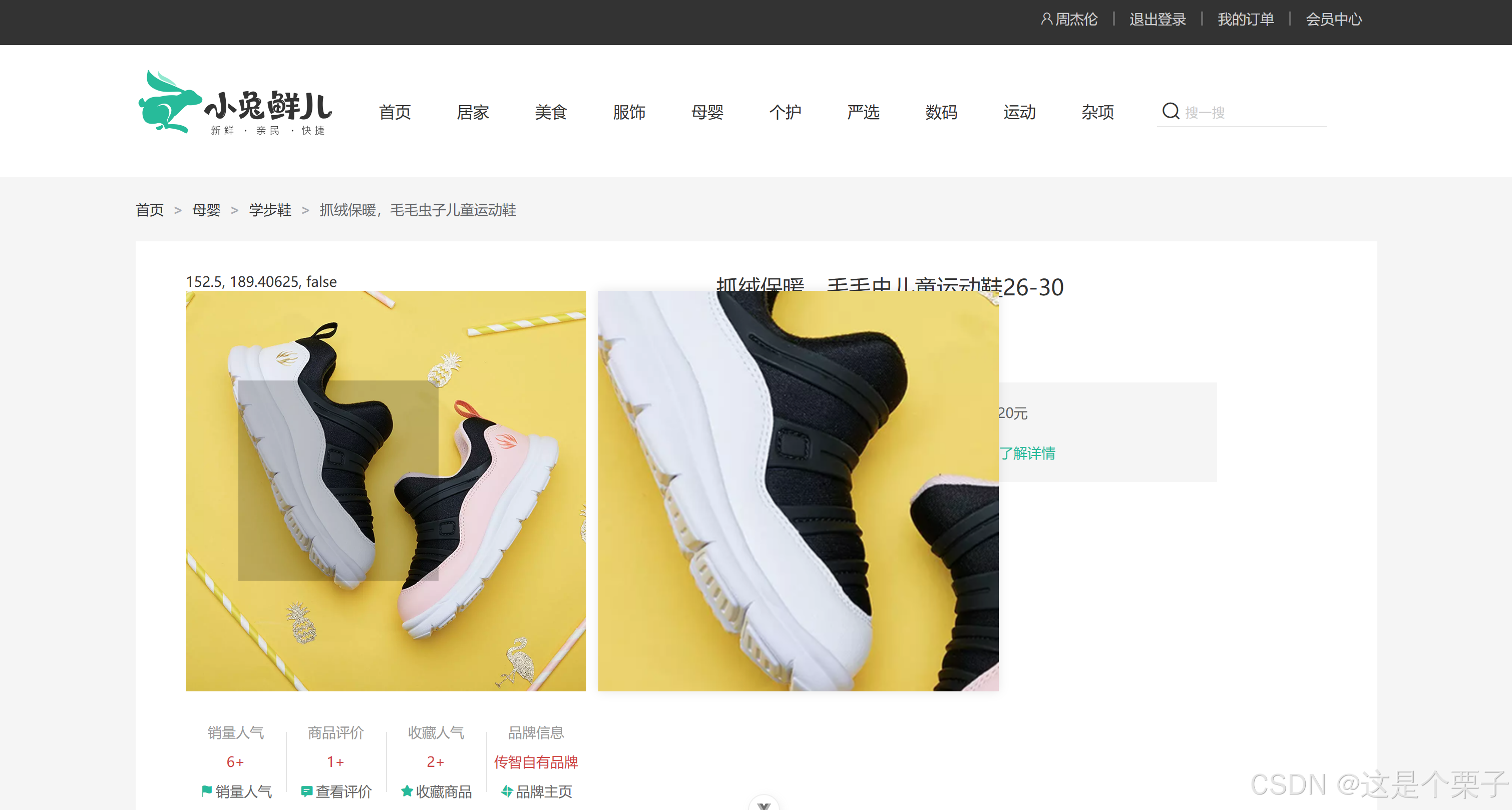
2.4.2 详情页
1. 整体认识和路由配置
整体业务认识
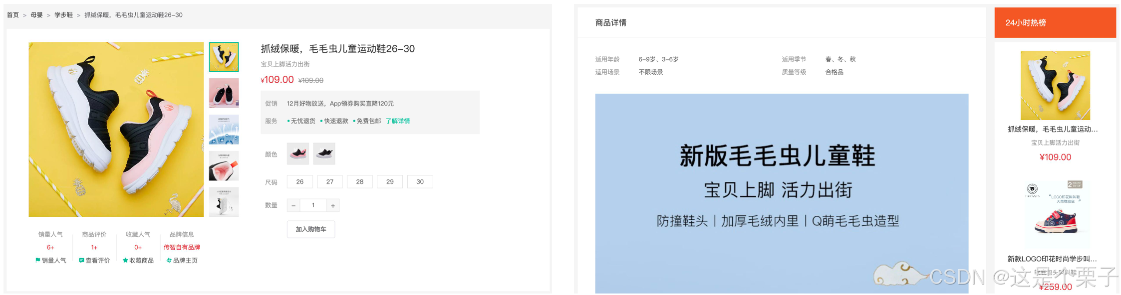
路由配置
准备组件模版:
html
<script setup>
</script>
<template>
<div class="xtx-goods-page">
<div class="container">
<div class="bread-container">
<el-breadcrumb separator=">">
<el-breadcrumb-item :to="{ path: '/' }">首页</el-breadcrumb-item>
<el-breadcrumb-item :to="{ path: '/' }">母婴
</el-breadcrumb-item>
<el-breadcrumb-item :to="{ path: '/' }">跑步鞋
</el-breadcrumb-item>
<el-breadcrumb-item>抓绒保暖,毛毛虫子儿童运动鞋</el-breadcrumb-item>
</el-breadcrumb>
</div>
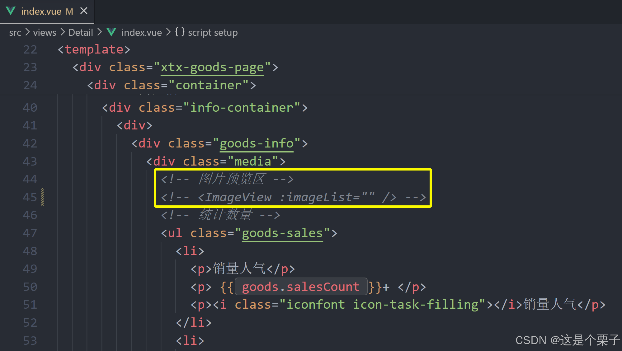
<!-- 商品信息 -->
<div class="info-container">
<div>
<div class="goods-info">
<div class="media">
<!-- 图片预览区 -->
<!-- 统计数量 -->
<ul class="goods-sales">
<li>
<p>销量人气</p>
<p> 100+ </p>
<p><i class="iconfont icon-task-filling"></i>销量人气</p>
</li>
<li>
<p>商品评价</p>
<p>200+</p>
<p><i class="iconfont icon-comment-filling"></i>查看评价</p>
</li>
<li>
<p>收藏人气</p>
<p>300+</p>
<p><i class="iconfont icon-favorite-filling"></i>收藏商品</p>
</li>
<li>
<p>品牌信息</p>
<p>400+</p>
<p><i class="iconfont icon-dynamic-filling"></i>品牌主页</p>
</li>
</ul>
</div>
<div class="spec">
<!-- 商品信息区 -->
<p class="g-name"> 抓绒保暖,毛毛虫儿童鞋 </p>
<p class="g-desc">好穿 </p>
<p class="g-price">
<span>200</span>
<span> 100</span>
</p>
<div class="g-service">
<dl>
<dt>促销</dt>
<dd>12月好物放送,App领券购买直降120元</dd>
</dl>
<dl>
<dt>服务</dt>
<dd>
<span>无忧退货</span>
<span>快速退款</span>
<span>免费包邮</span>
<a href="javascript:;">了解详情</a>
</dd>
</dl>
</div>
<!-- sku组件 -->
<!-- 数据组件 -->
<!-- 按钮组件 -->
<div>
<el-button size="large" class="btn">
加入购物车
</el-button>
</div>
</div>
</div>
<div class="goods-footer">
<div class="goods-article">
<!-- 商品详情 -->
<div class="goods-tabs">
<nav>
<a>商品详情</a>
</nav>
<div class="goods-detail">
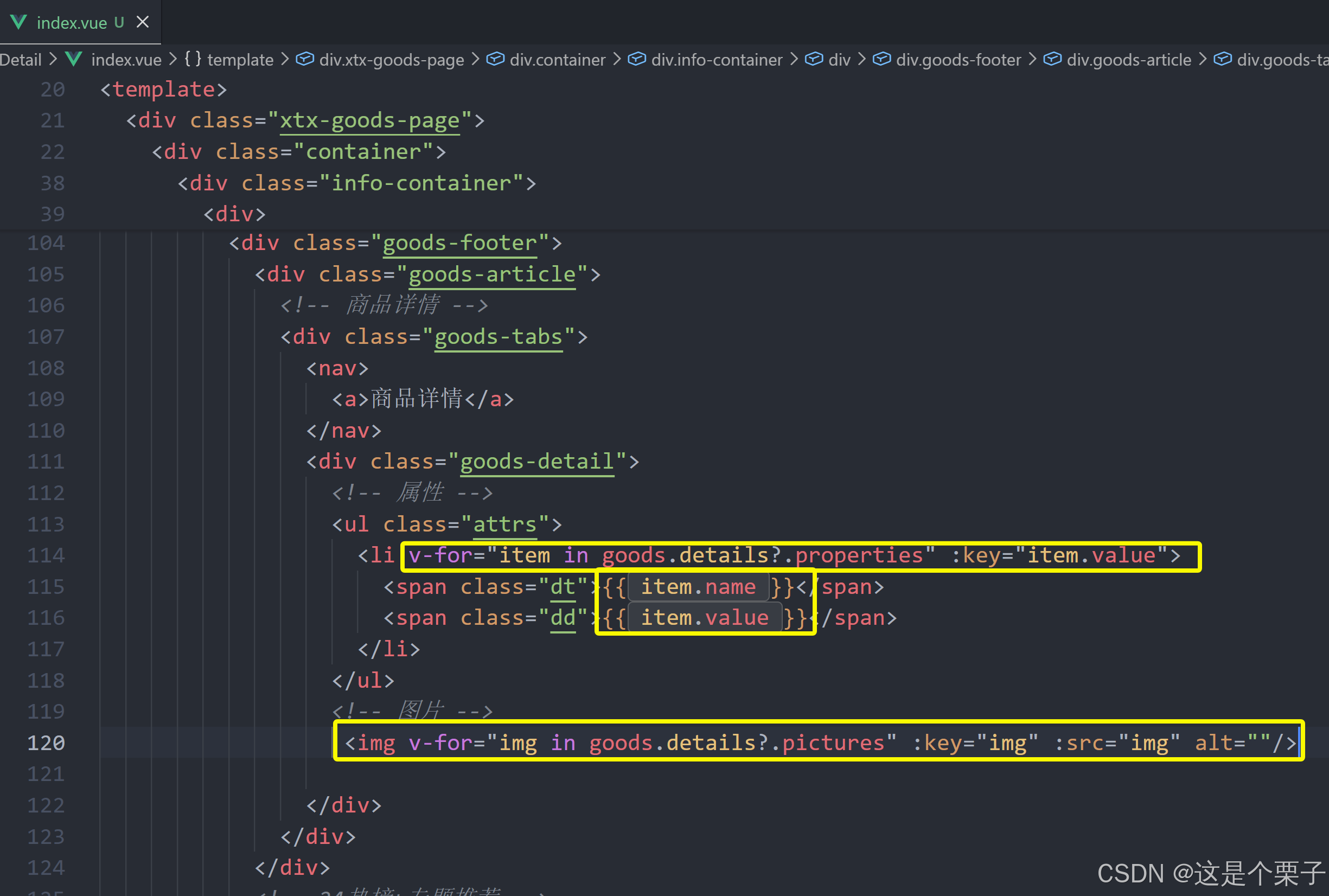
<!-- 属性 -->
<ul class="attrs">
<li v-for="item in 3" :key="item.value">
<span class="dt">白色</span>
<span class="dd">纯棉</span>
</li>
</ul>
<!-- 图片 -->
</div>
</div>
</div>
<!-- 24热榜+专题推荐 -->
<div class="goods-aside">
</div>
</div>
</div>
</div>
</div>
</div>
</template>
<style scoped lang='scss'>
.xtx-goods-page {
.goods-info {
min-height: 600px;
background: #fff;
display: flex;
.media {
width: 580px;
height: 600px;
padding: 30px 50px;
}
.spec {
flex: 1;
padding: 30px 30px 30px 0;
}
}
.goods-footer {
display: flex;
margin-top: 20px;
.goods-article {
width: 940px;
margin-right: 20px;
}
.goods-aside {
width: 280px;
min-height: 1000px;
}
}
.goods-tabs {
min-height: 600px;
background: #fff;
}
.goods-warn {
min-height: 600px;
background: #fff;
margin-top: 20px;
}
.number-box {
display: flex;
align-items: center;
.label {
width: 60px;
color: #999;
padding-left: 10px;
}
}
.g-name {
font-size: 22px;
}
.g-desc {
color: #999;
margin-top: 10px;
}
.g-price {
margin-top: 10px;
span {
&::before {
content: "¥";
font-size: 14px;
}
&:first-child {
color: $priceColor;
margin-right: 10px;
font-size: 22px;
}
&:last-child {
color: #999;
text-decoration: line-through;
font-size: 16px;
}
}
}
.g-service {
background: #f5f5f5;
width: 500px;
padding: 20px 10px 0 10px;
margin-top: 10px;
dl {
padding-bottom: 20px;
display: flex;
align-items: center;
dt {
width: 50px;
color: #999;
}
dd {
color: #666;
&:last-child {
span {
margin-right: 10px;
&::before {
content: "•";
color: $xtxColor;
margin-right: 2px;
}
}
a {
color: $xtxColor;
}
}
}
}
}
.goods-sales {
display: flex;
width: 400px;
align-items: center;
text-align: center;
height: 140px;
li {
flex: 1;
position: relative;
~li::after {
position: absolute;
top: 10px;
left: 0;
height: 60px;
border-left: 1px solid #e4e4e4;
content: "";
}
p {
&:first-child {
color: #999;
}
&:nth-child(2) {
color: $priceColor;
margin-top: 10px;
}
&:last-child {
color: #666;
margin-top: 10px;
i {
color: $xtxColor;
font-size: 14px;
margin-right: 2px;
}
&:hover {
color: $xtxColor;
cursor: pointer;
}
}
}
}
}
}
.goods-tabs {
min-height: 600px;
background: #fff;
nav {
height: 70px;
line-height: 70px;
display: flex;
border-bottom: 1px solid #f5f5f5;
a {
padding: 0 40px;
font-size: 18px;
position: relative;
>span {
color: $priceColor;
font-size: 16px;
margin-left: 10px;
}
}
}
}
.goods-detail {
padding: 40px;
.attrs {
display: flex;
flex-wrap: wrap;
margin-bottom: 30px;
li {
display: flex;
margin-bottom: 10px;
width: 50%;
.dt {
width: 100px;
color: #999;
}
.dd {
flex: 1;
color: #666;
}
}
}
>img {
width: 100%;
}
}
.btn {
margin-top: 20px;
}
.bread-container {
padding: 25px 0;
}
</style>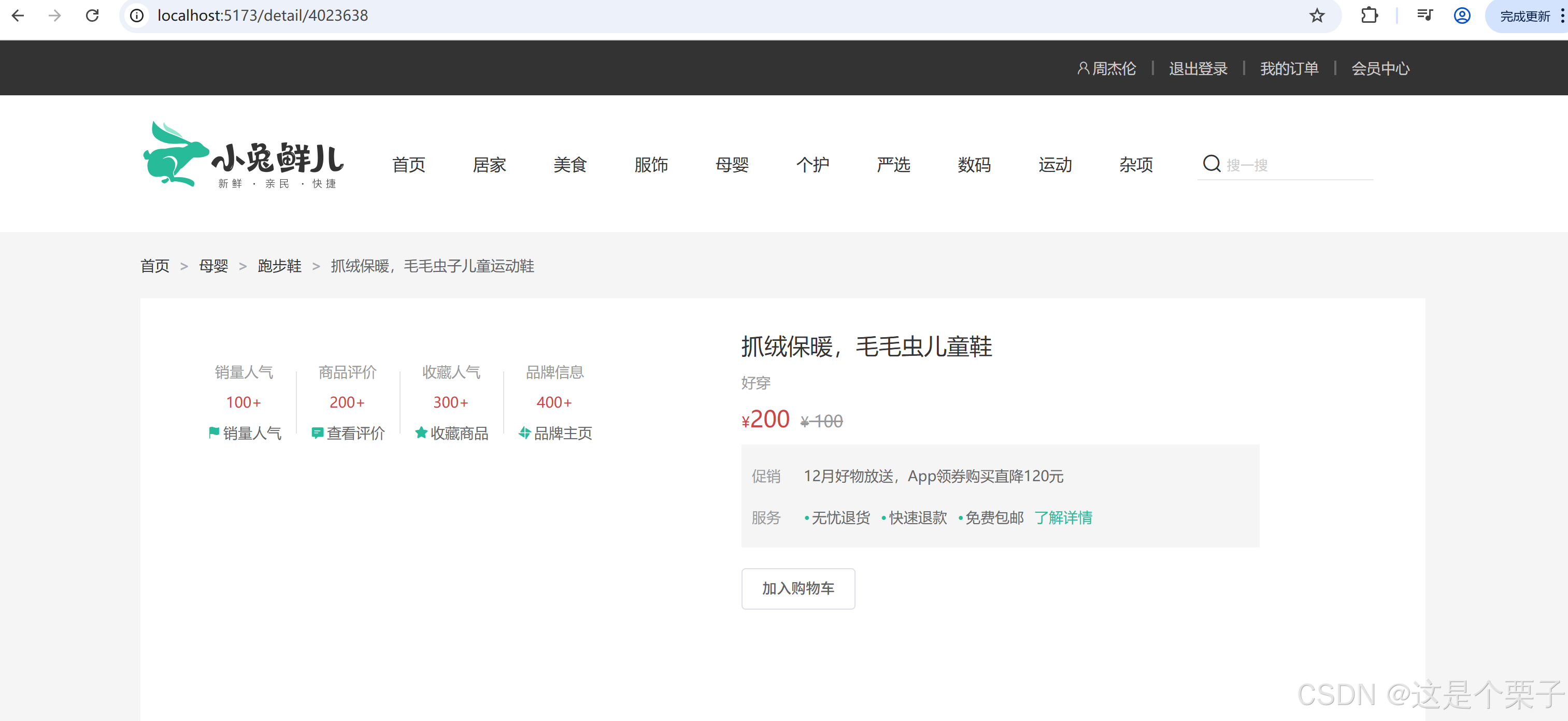
配置路由:
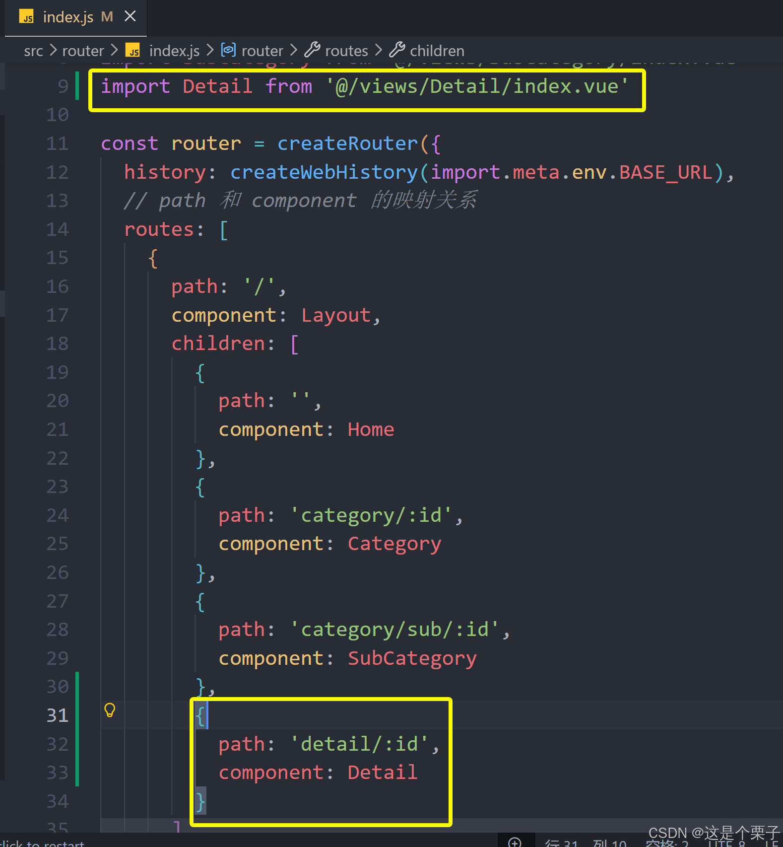
绑定模版测试跳转:
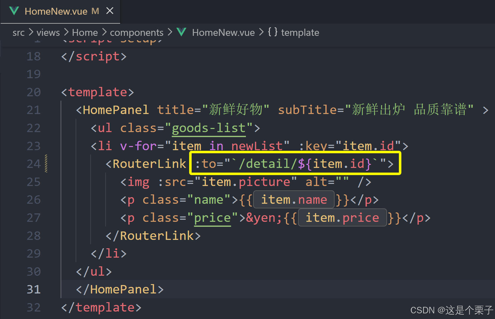
提交代码:
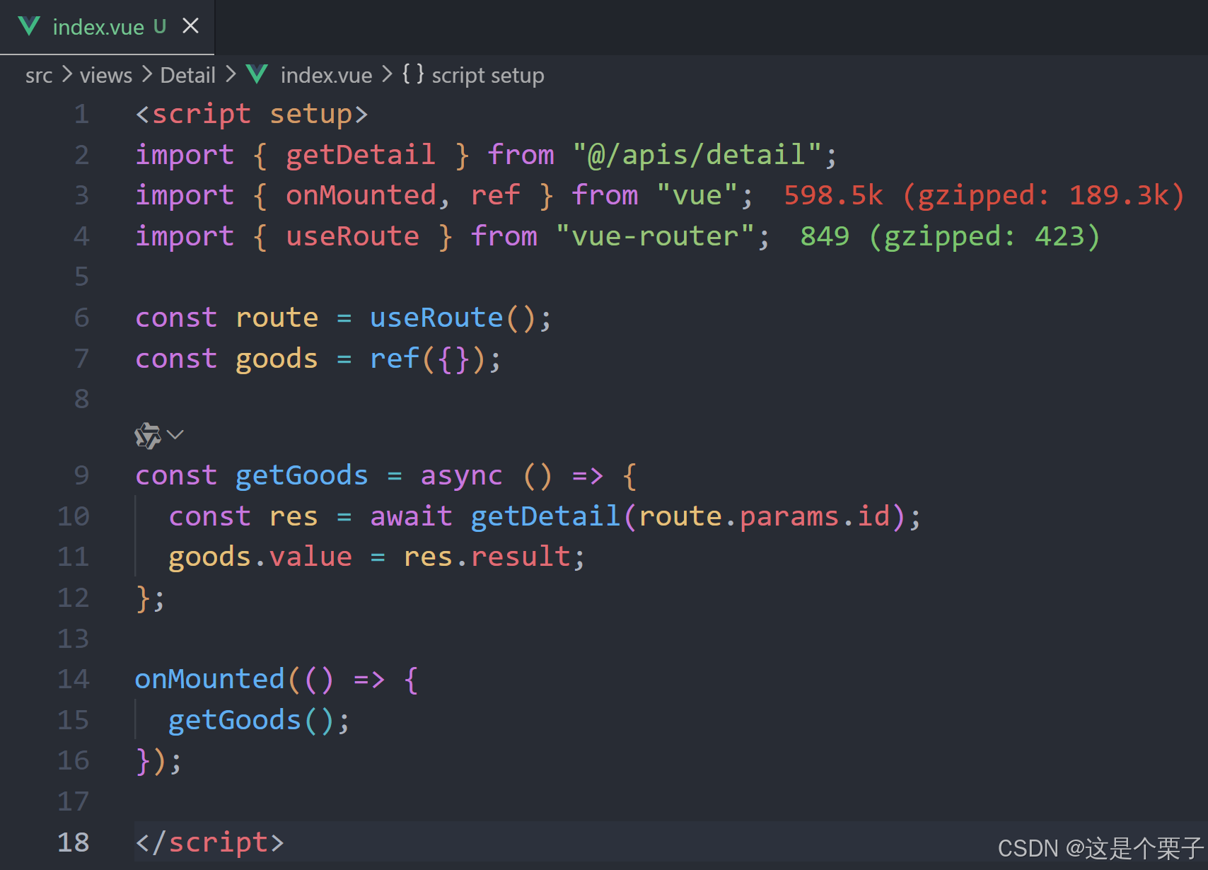
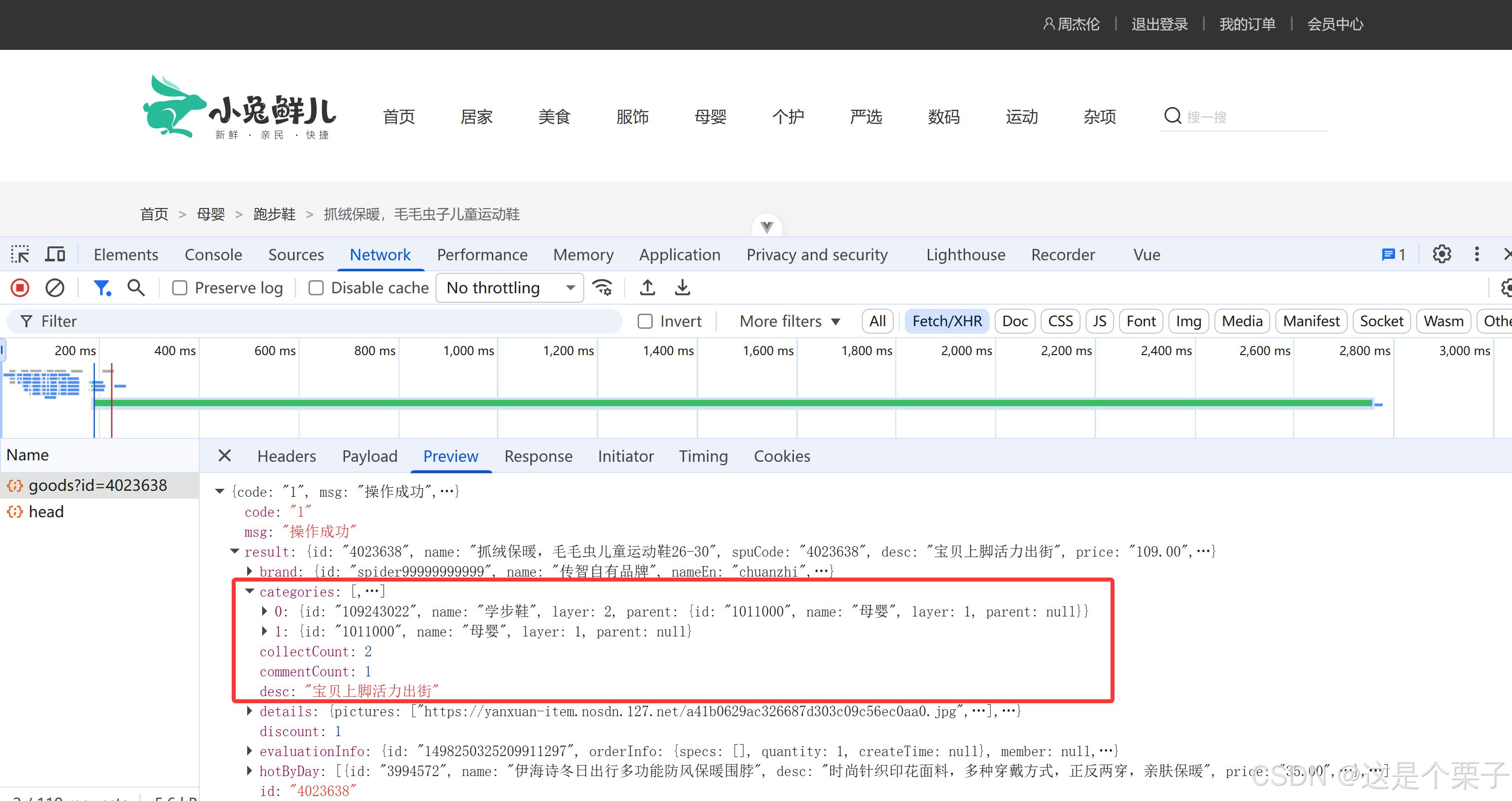
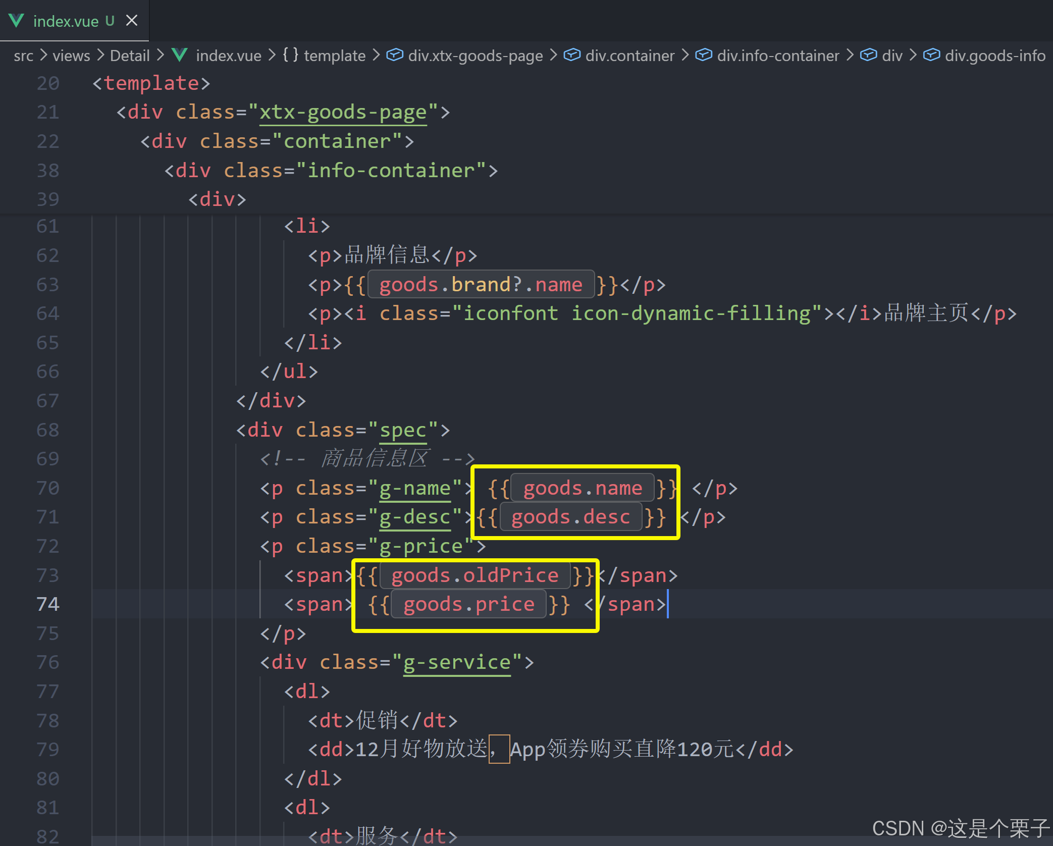
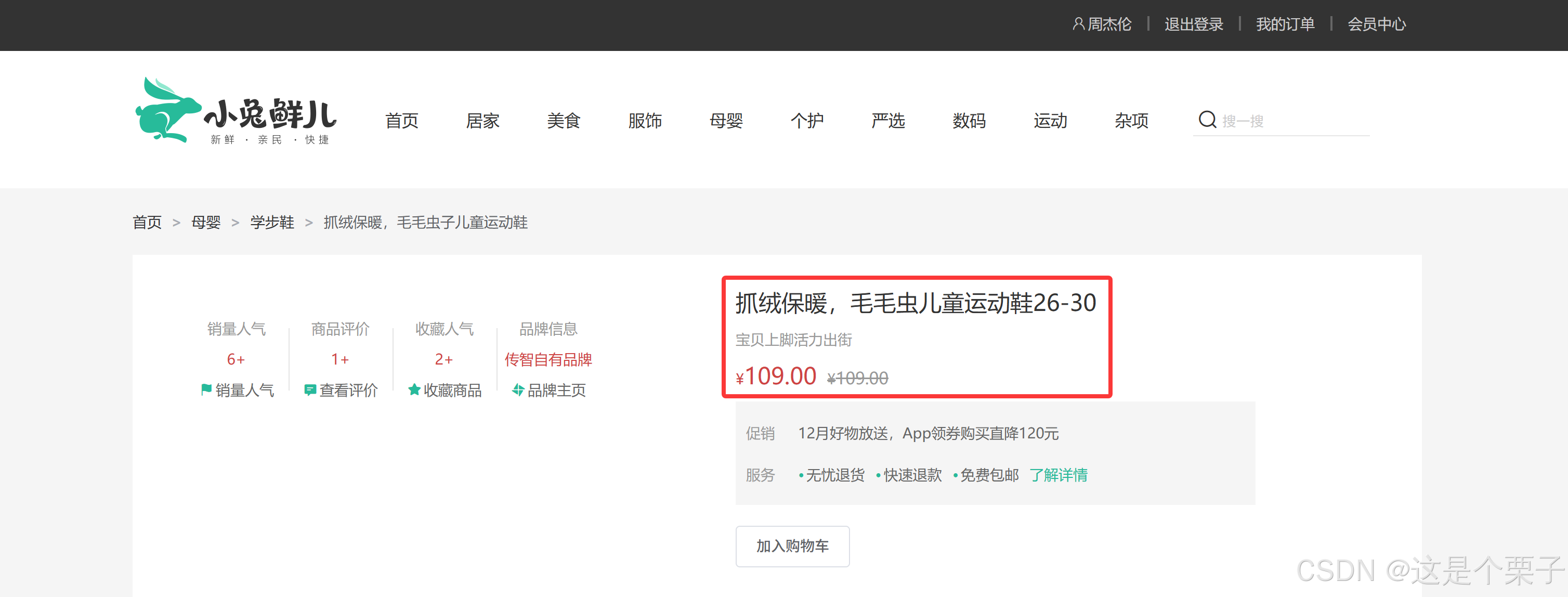
2. 基础数据渲染
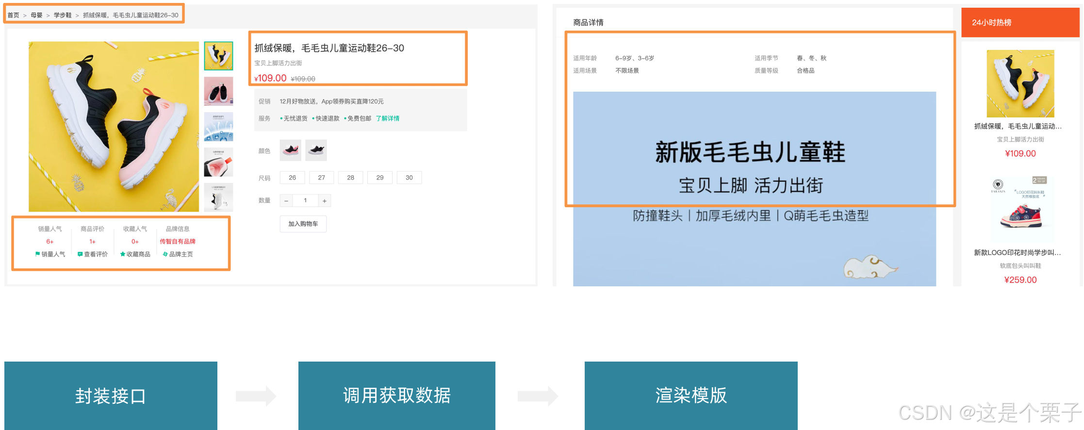
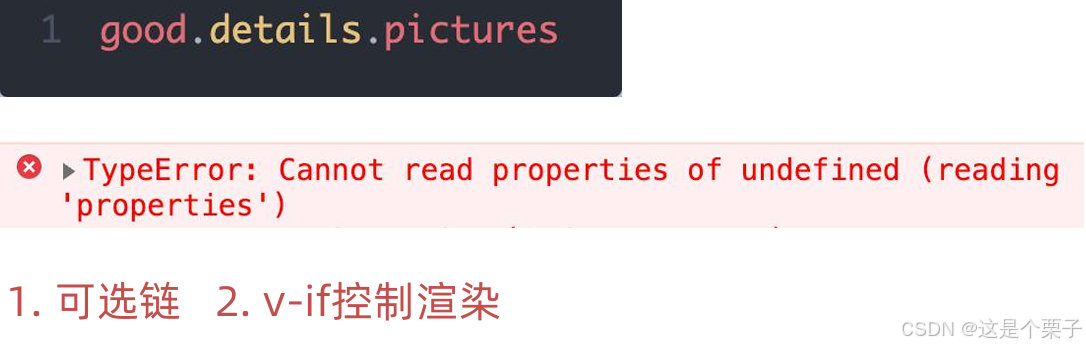
思考:渲染模版时遇到对象的多层属性访问可能出现什么问题?
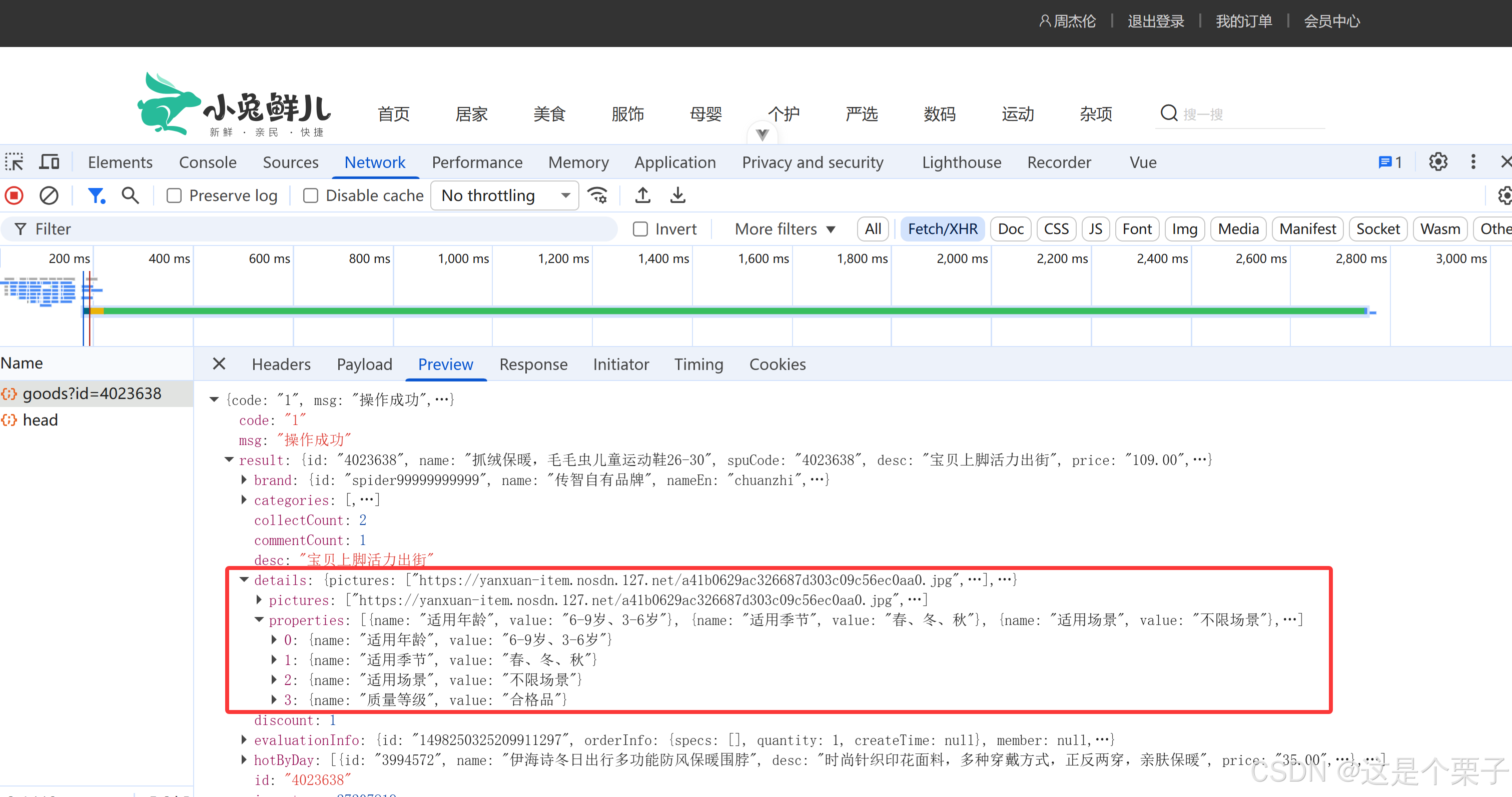
封装接口:
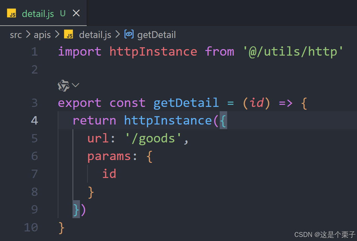
获取数据渲染模版:
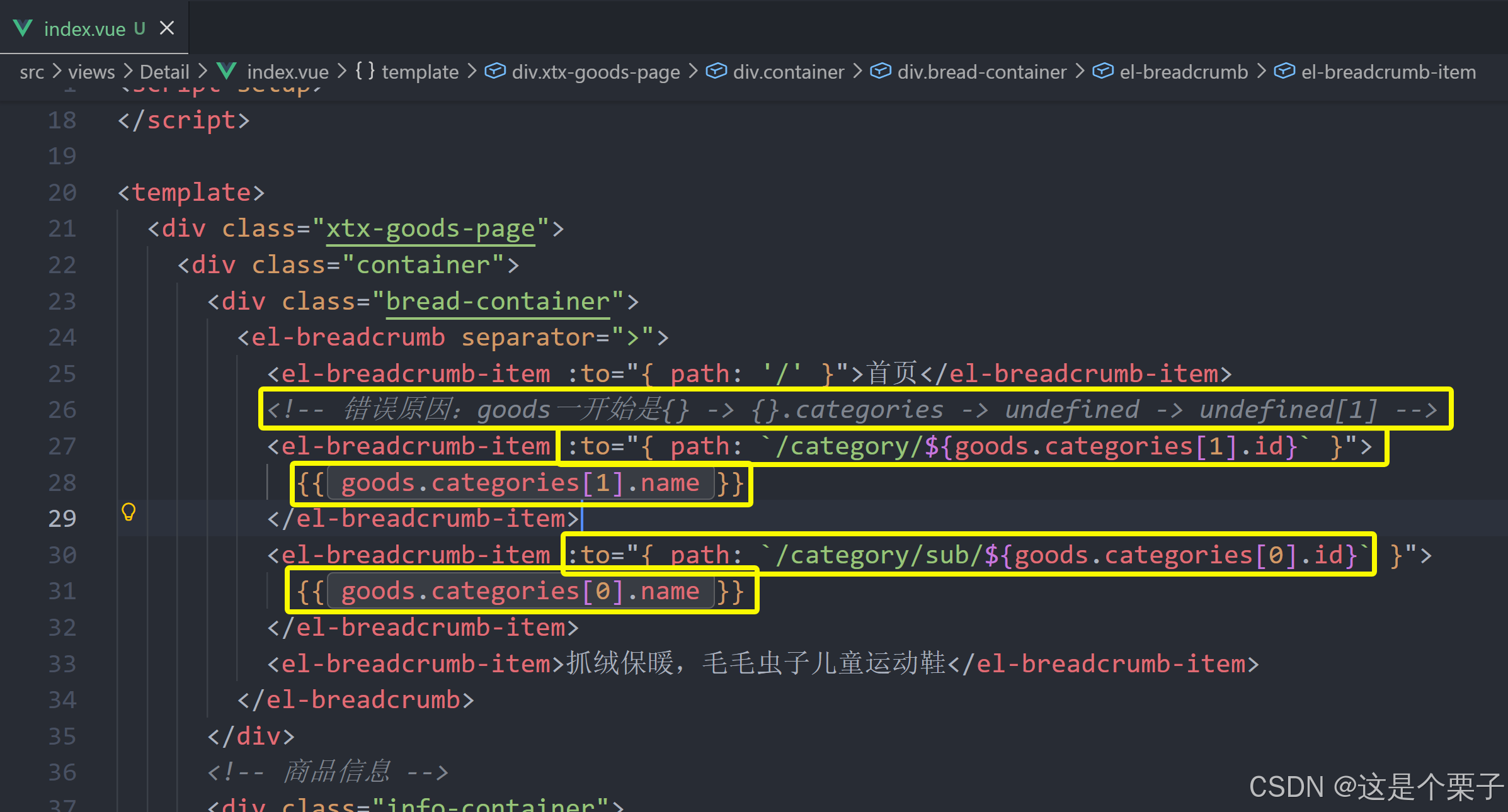
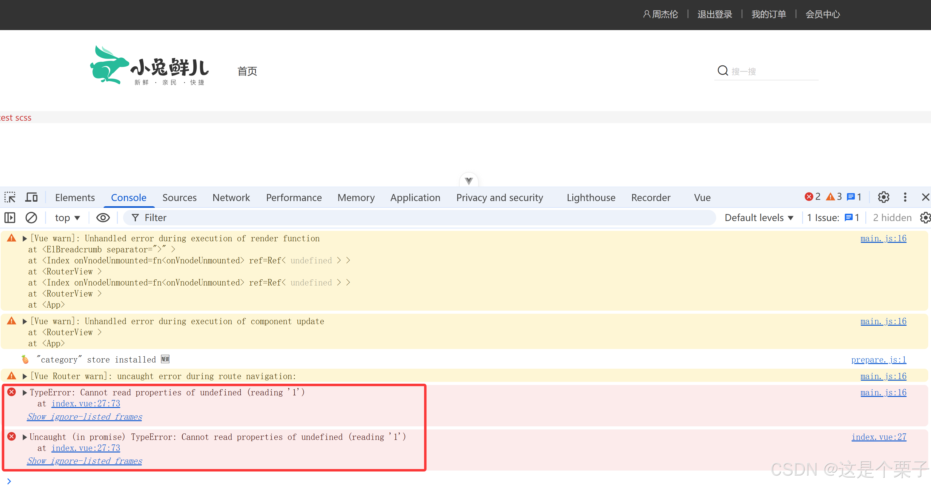
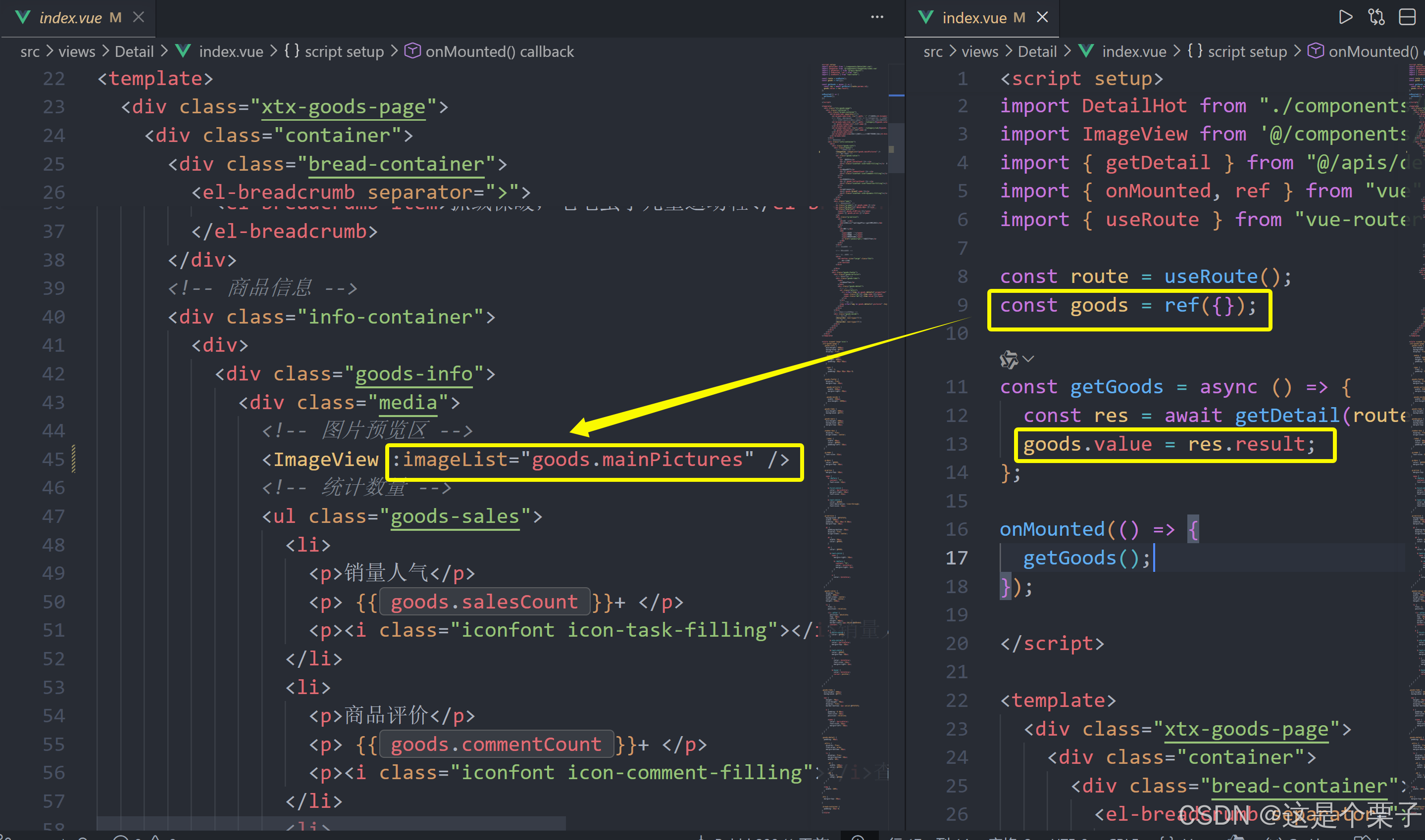
浏览器控制台报错原因:数据未初始化导致的空值访问错误。
javascript
const goods = ref({}); // 初始化为空对象在 onMounted 触发到 getGoods 异步请求完成之前,goods.value 是一个空对象 {},此时:
goods.categories是undefined- 访问
goods.categories[1].id会抛出错误: Cannot read properties of undefined (reading '1')
解决方案一:可选链语法(推荐)
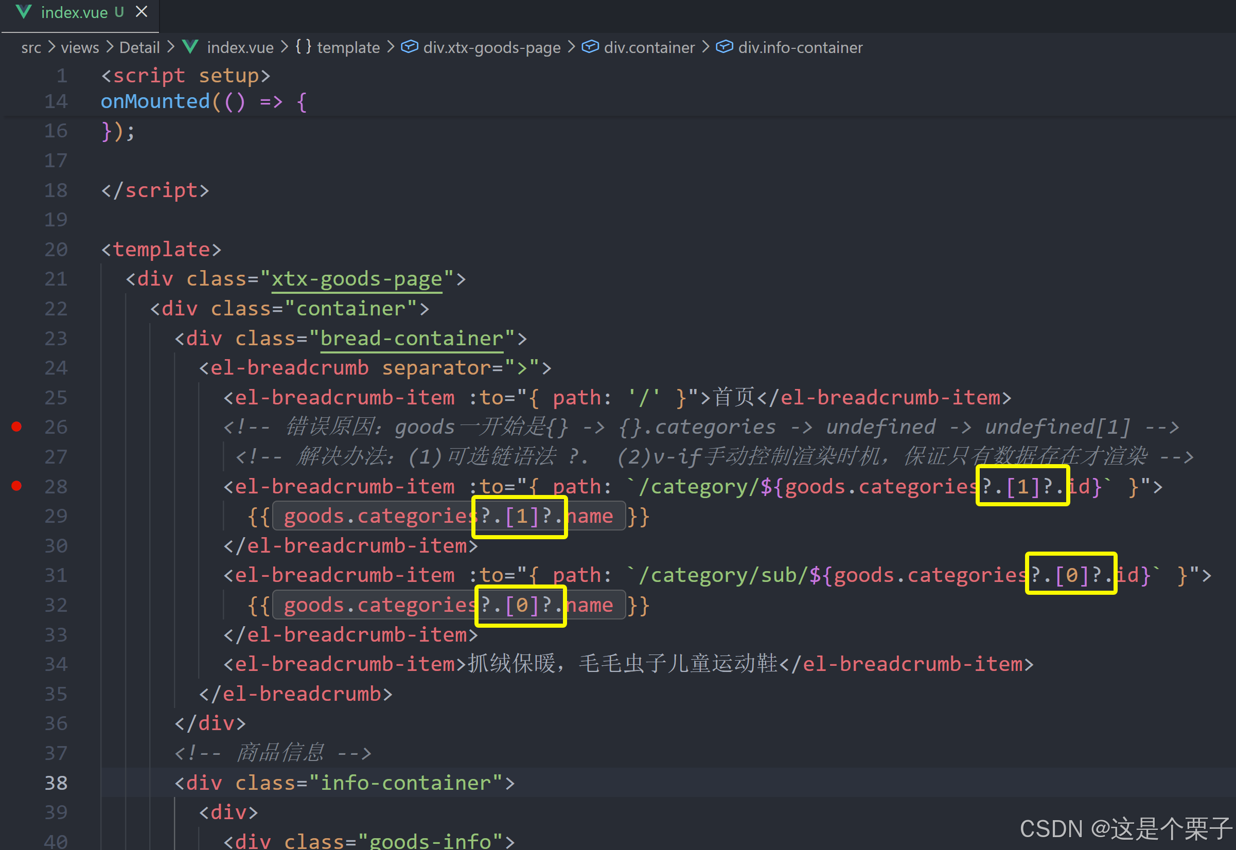
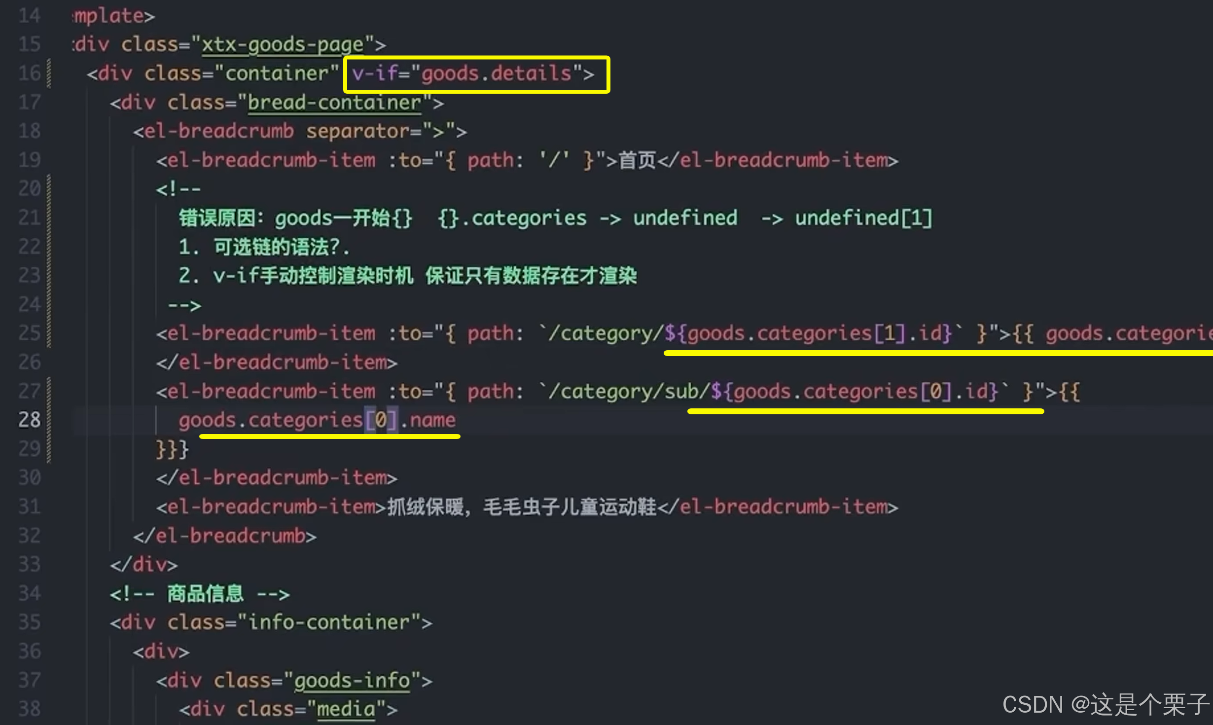
解决方案二:v-if 手动控制渲染时机
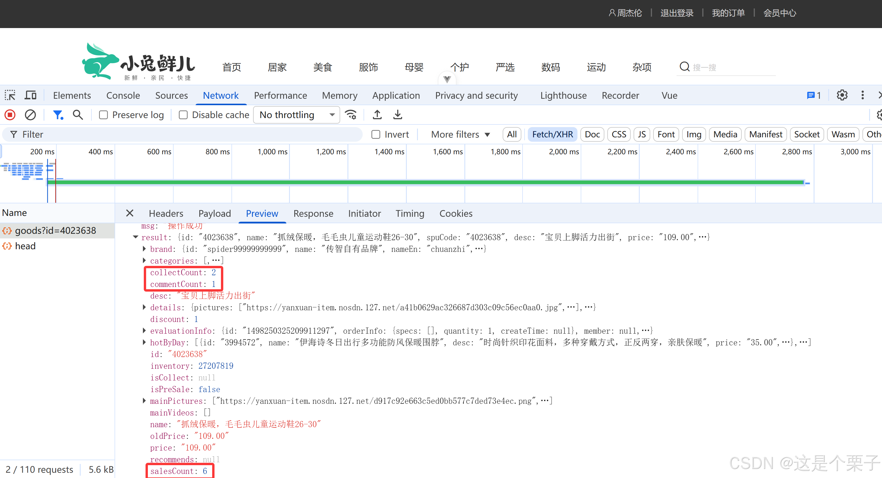
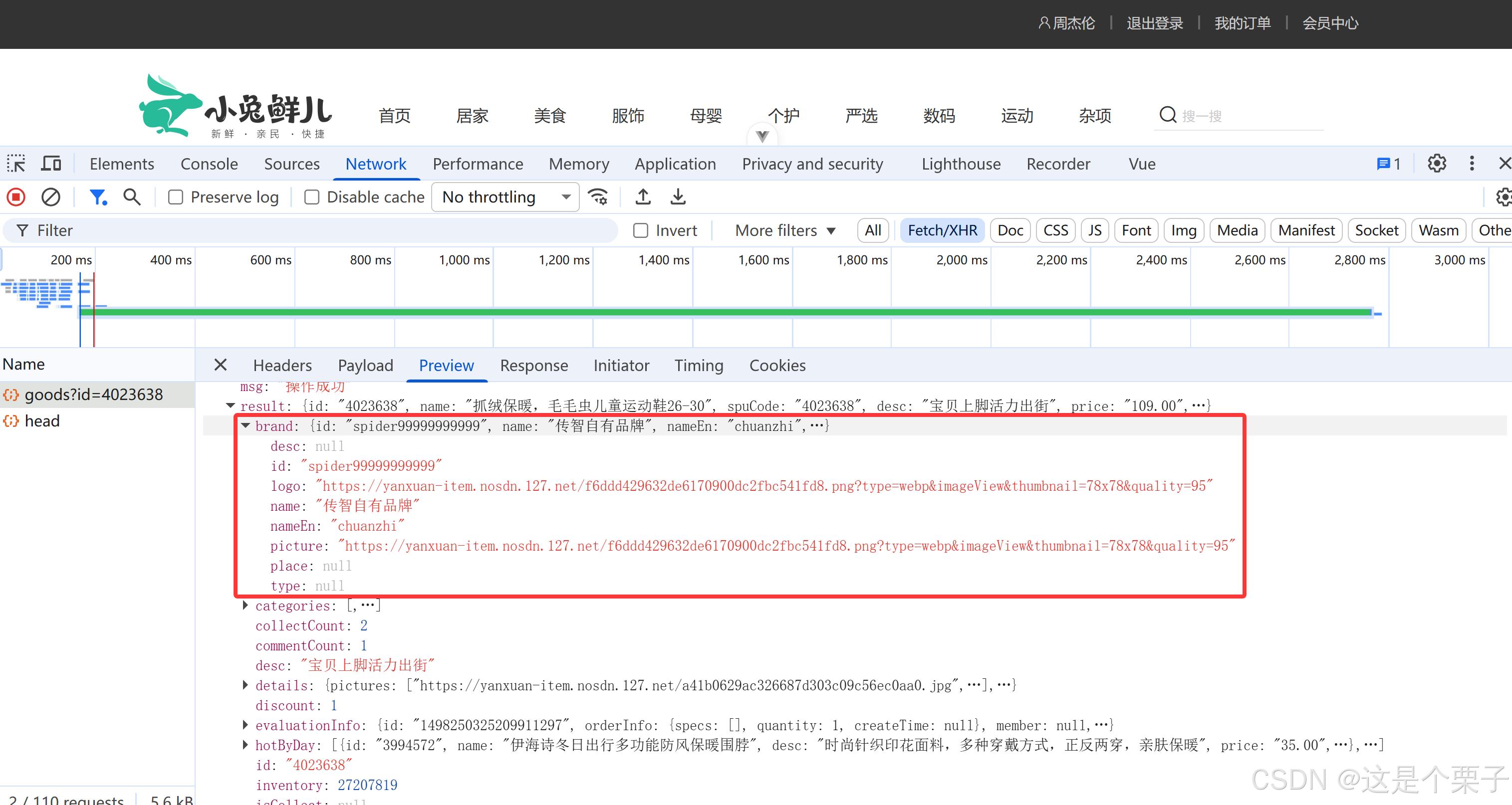
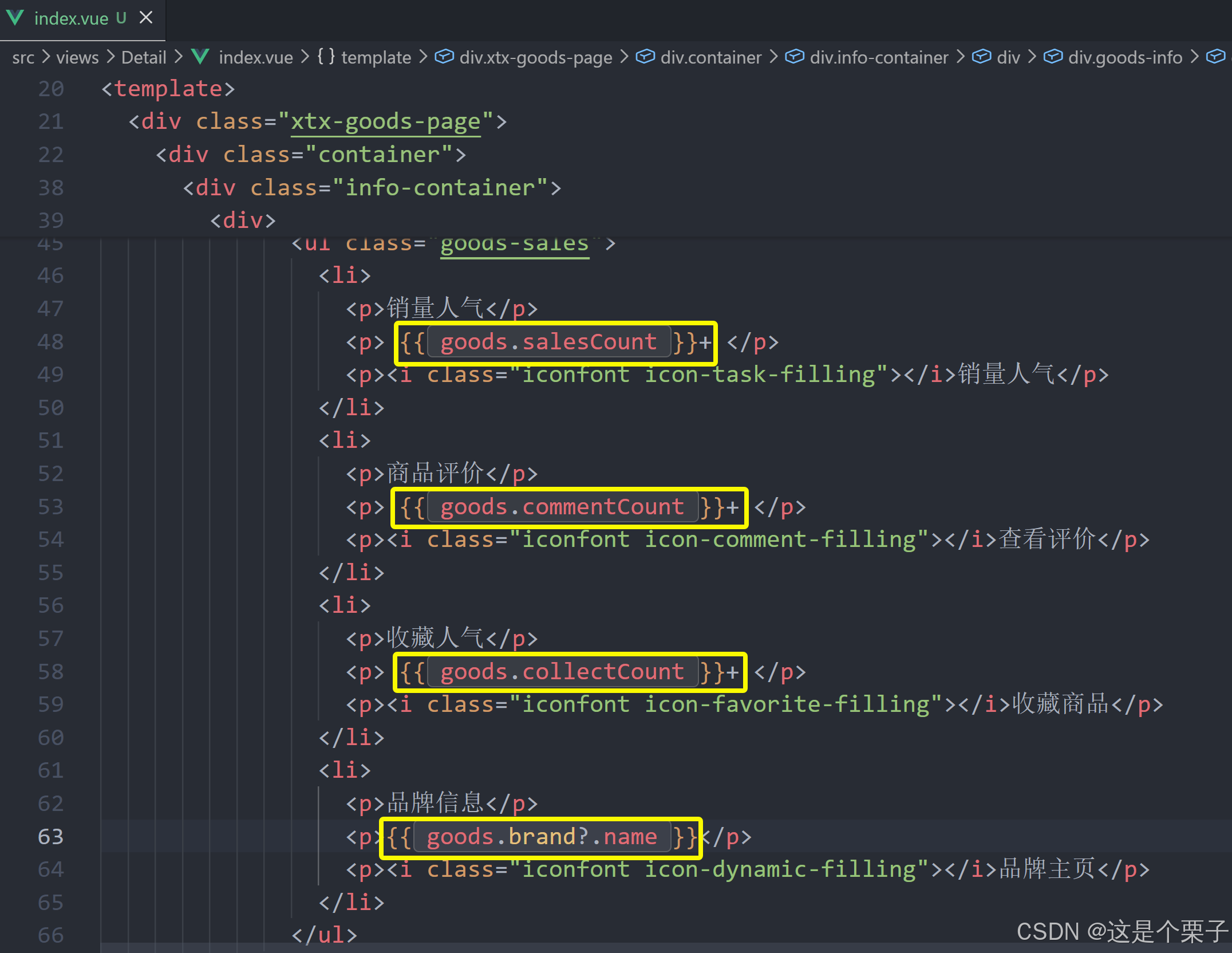
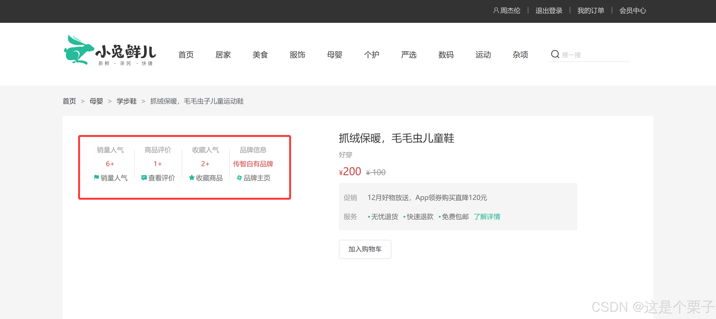
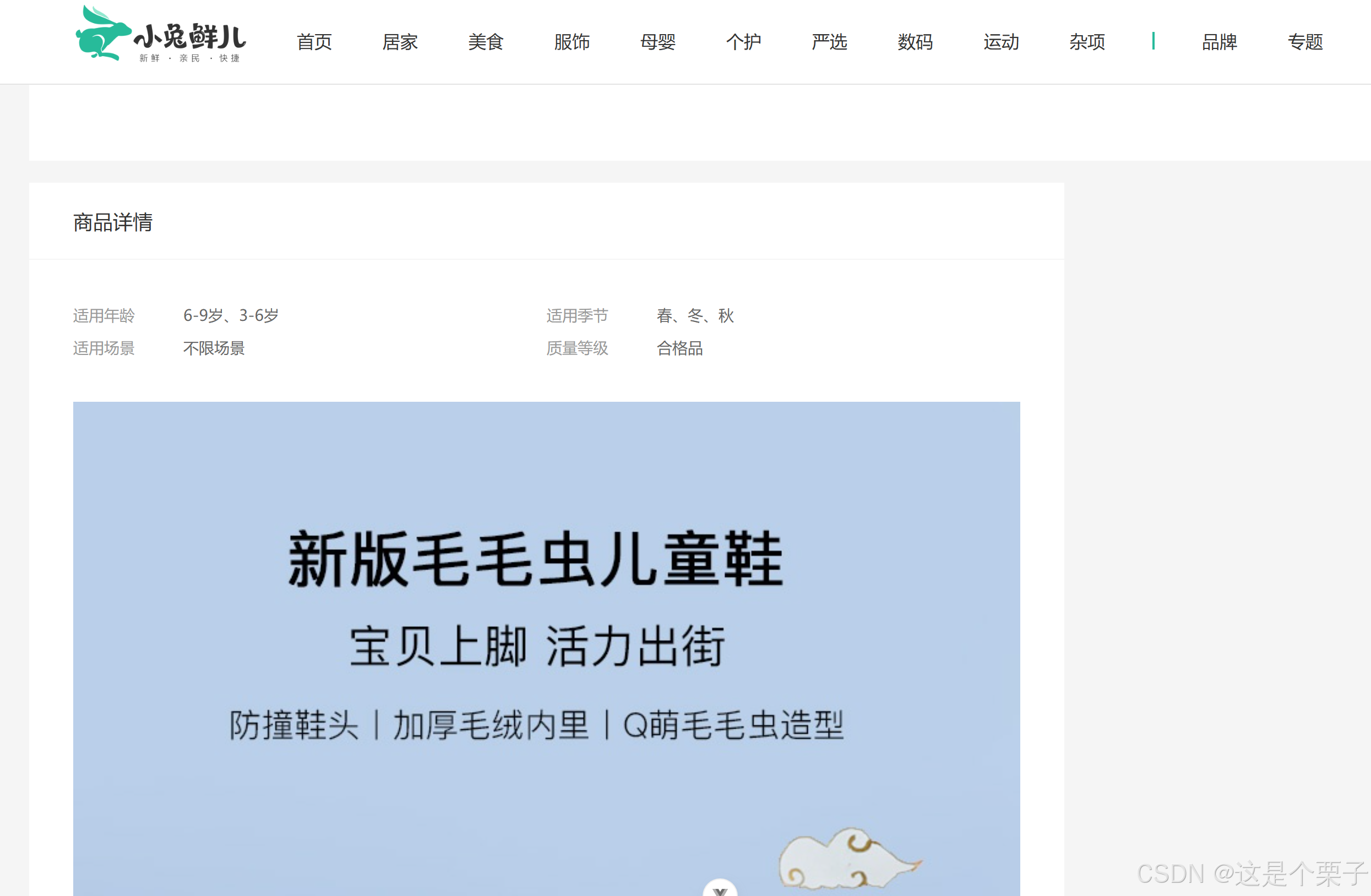
提交代码:
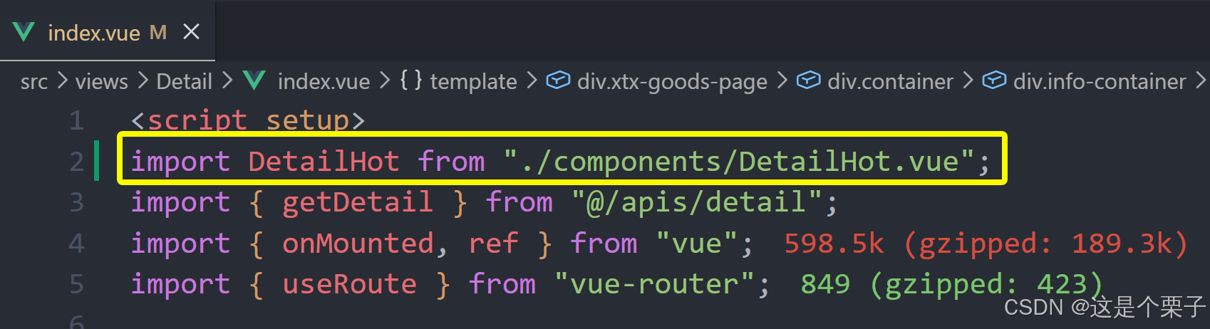
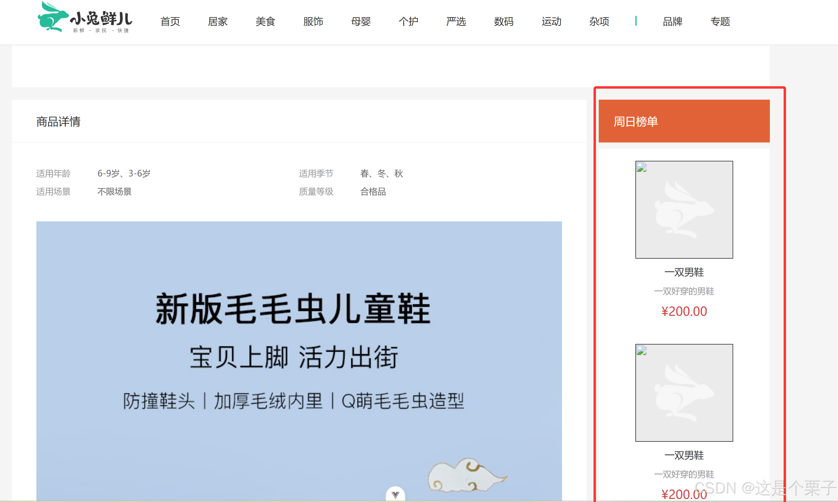
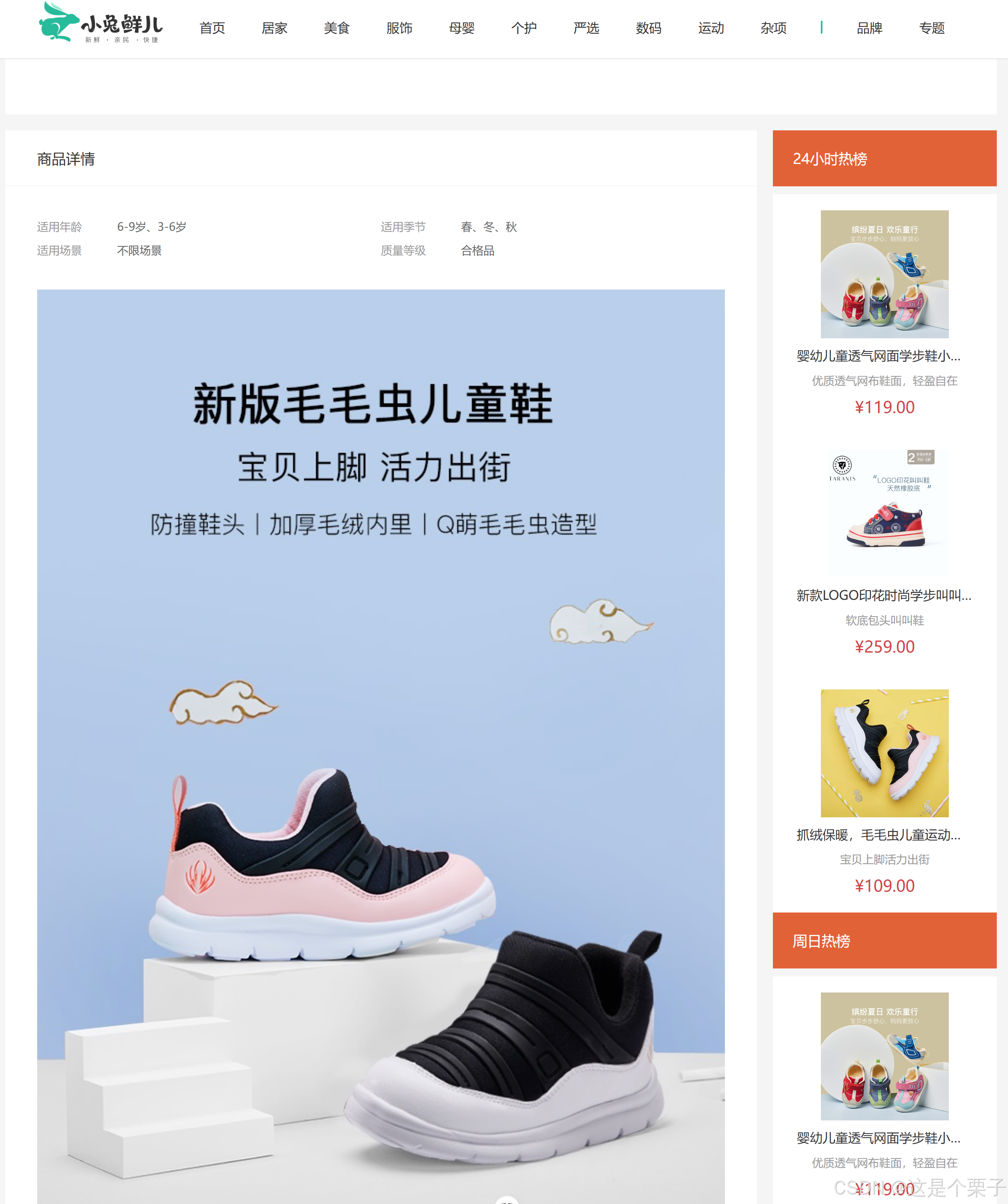
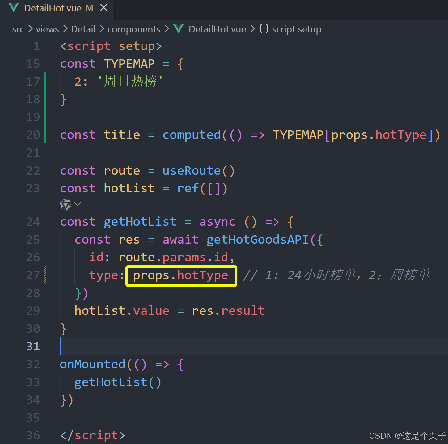
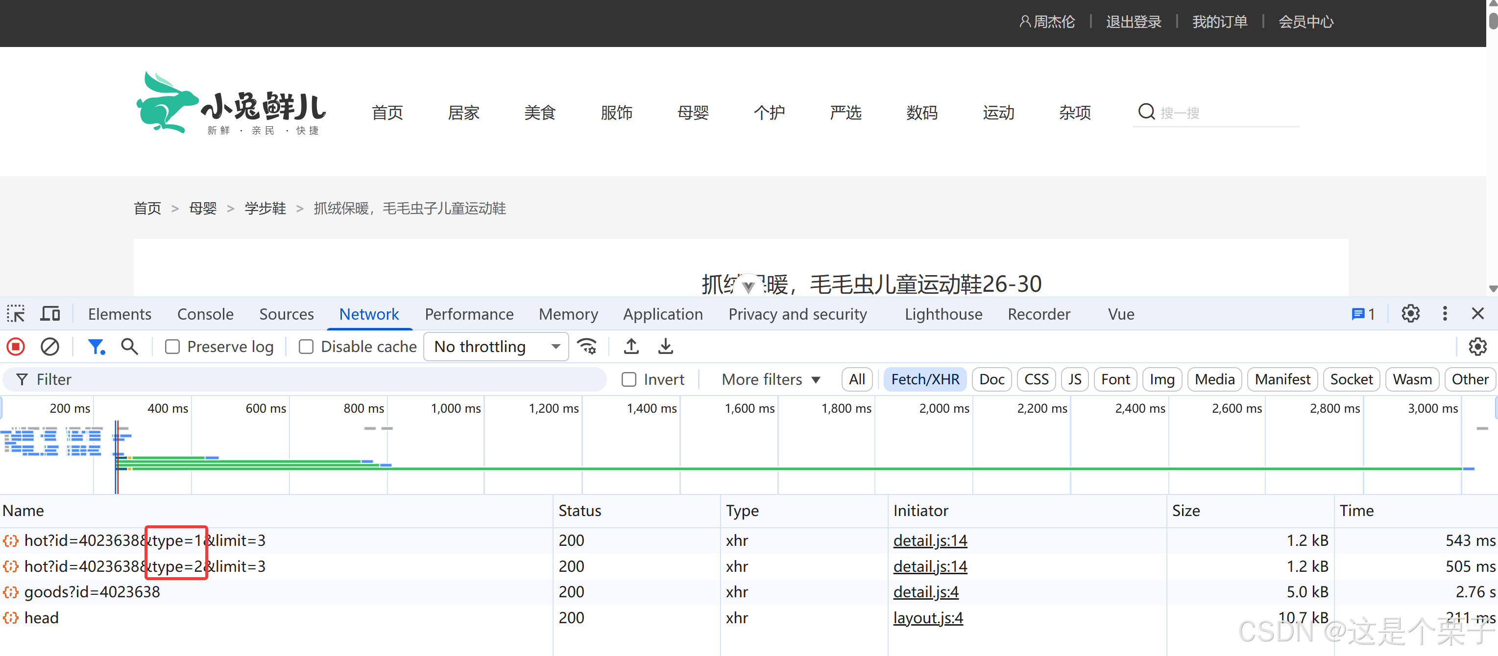
3. 热榜区域实现
模块实现整体分析:
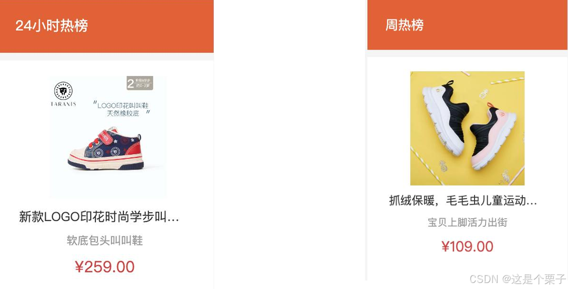
结论:两块热榜相比,结构一致,标题title和列表内容不同。

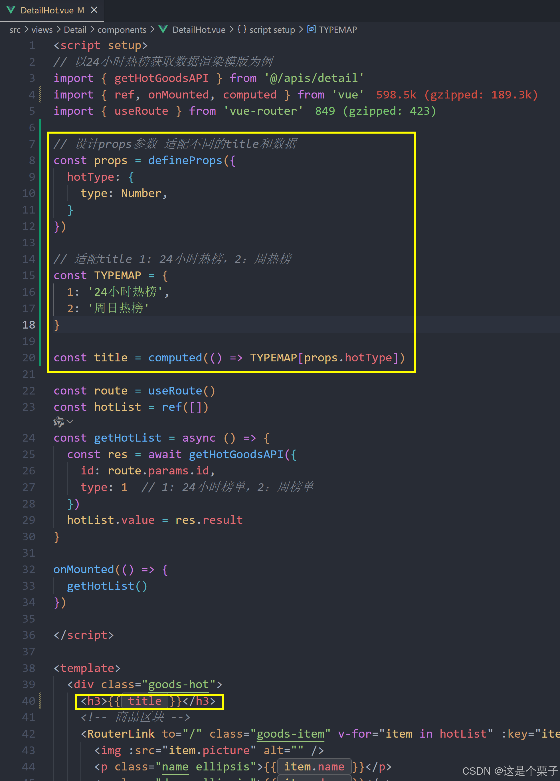
(1) 渲染基础热榜数据
1- 准备模版:
html
<script setup>
</script>
<template>
<div class="goods-hot">
<h3>周日榜单</h3>
<!-- 商品区块 -->
<RouterLink to="/" class="goods-item" v-for="item in 3" :key="item.id">
<img :src="item.picture" alt="" />
<p class="name ellipsis">一双男鞋</p>
<p class="desc ellipsis">一双好穿的男鞋</p>
<p class="price">¥200.00</p>
</RouterLink>
</div>
</template>
<style scoped lang="scss">
.goods-hot {
h3 {
height: 70px;
background: $helpColor;
color: #fff;
font-size: 18px;
line-height: 70px;
padding-left: 25px;
margin-bottom: 10px;
font-weight: normal;
}
.goods-item {
display: block;
padding: 20px 30px;
text-align: center;
background: #fff;
img {
width: 160px;
height: 160px;
}
p {
padding-top: 10px;
}
.name {
font-size: 16px;
}
.desc {
color: #999;
height: 29px;
}
.price {
color: $priceColor;
font-size: 20px;
}
}
}
</style>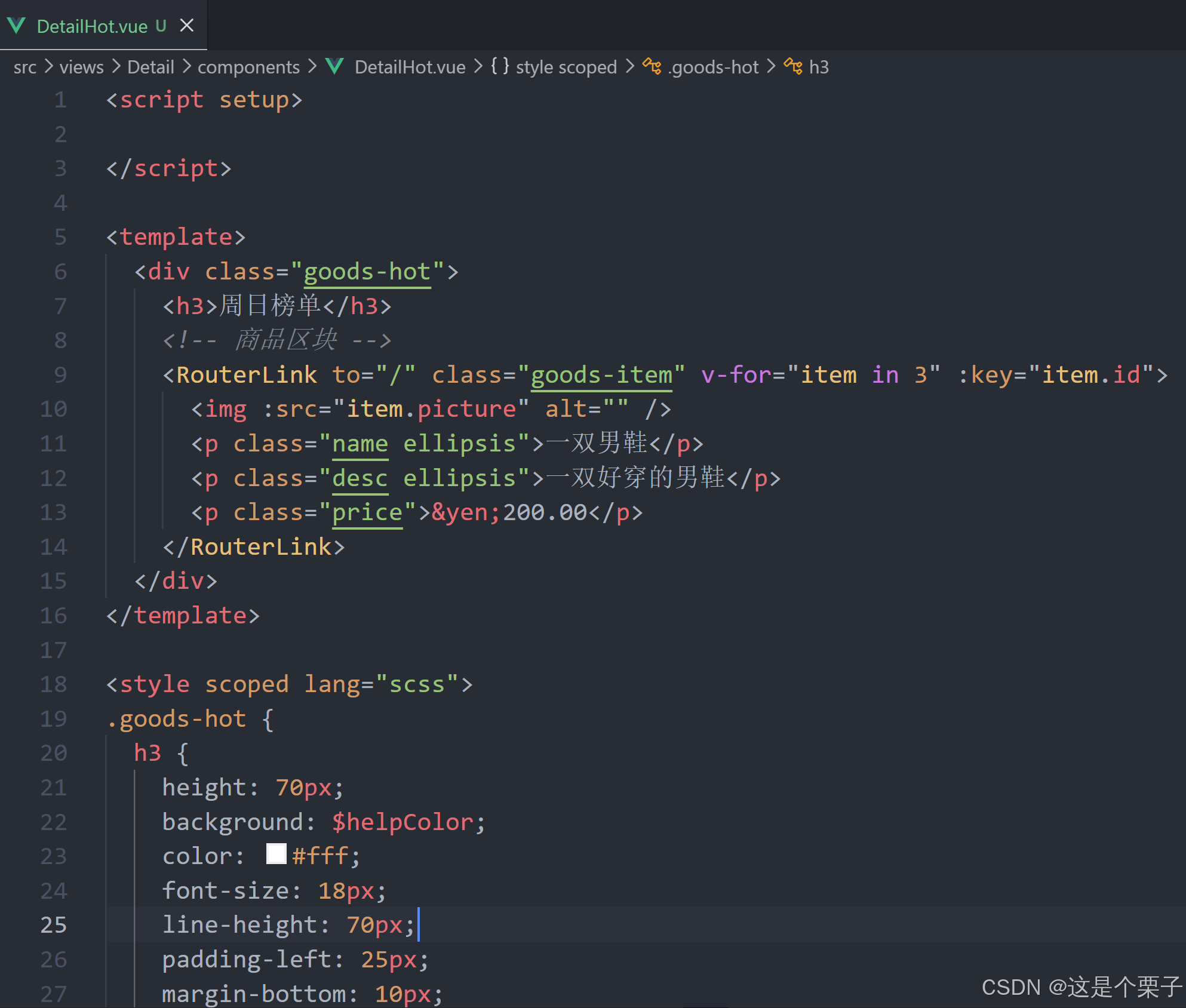
2- 封装接口:
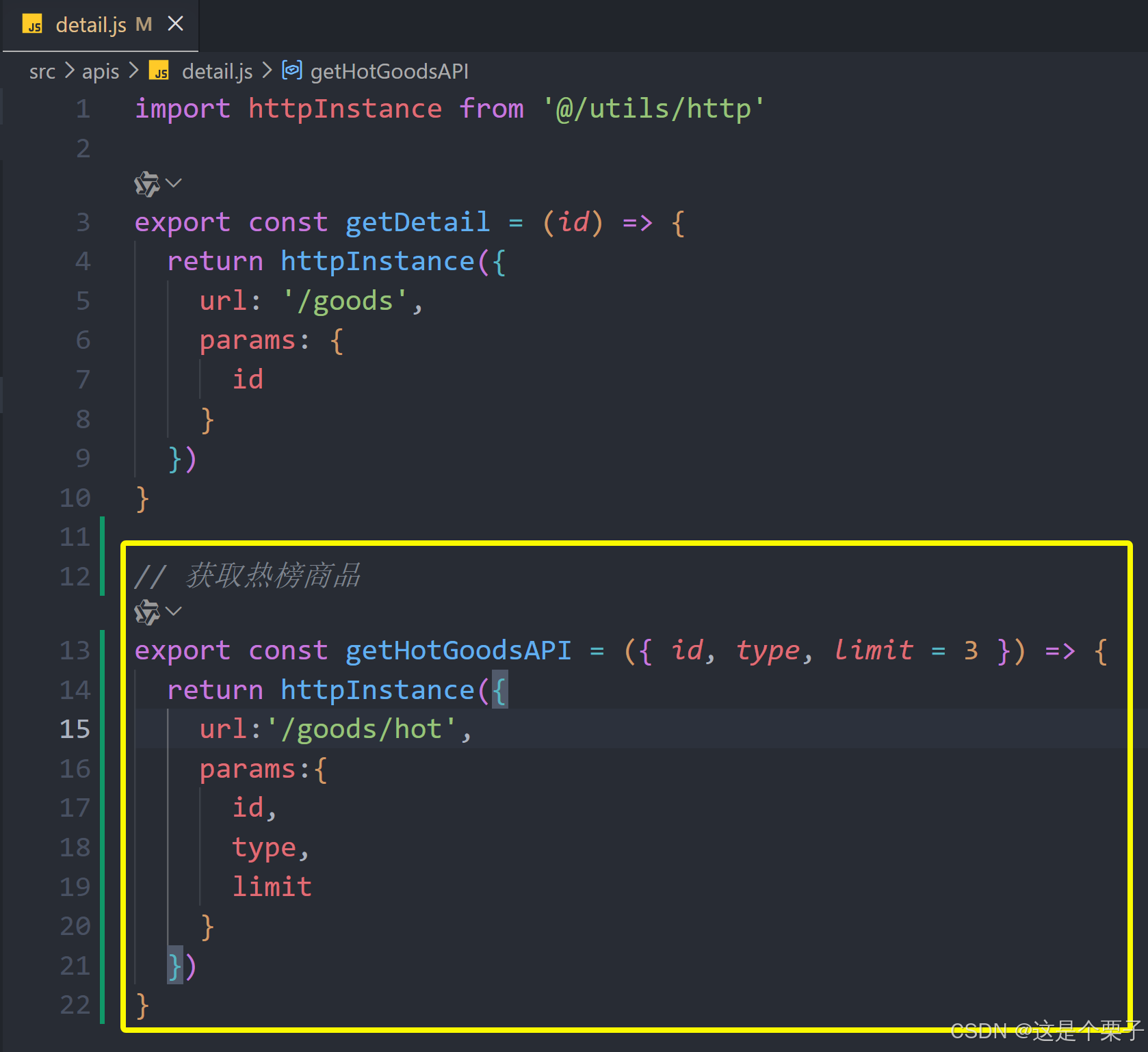
3- 获取基础数据渲染模版:
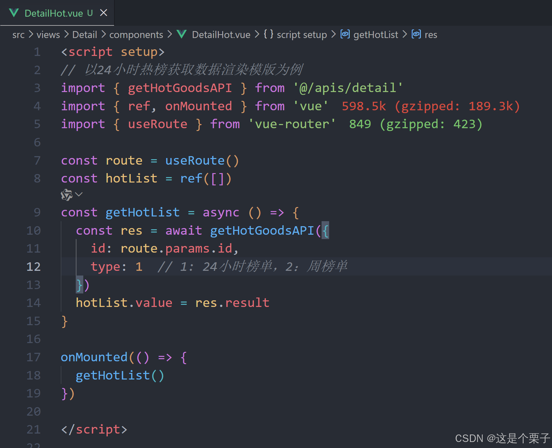
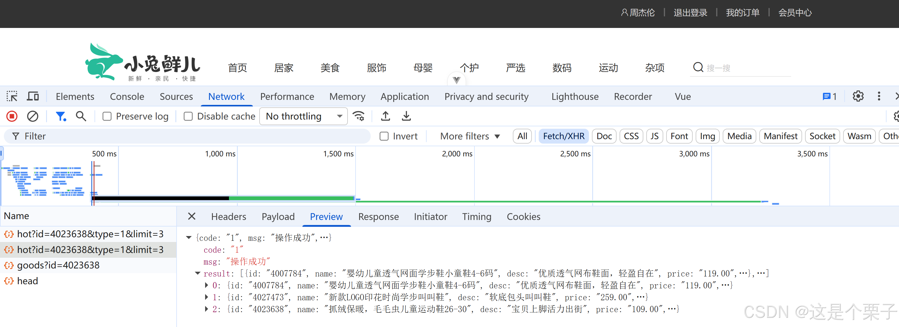
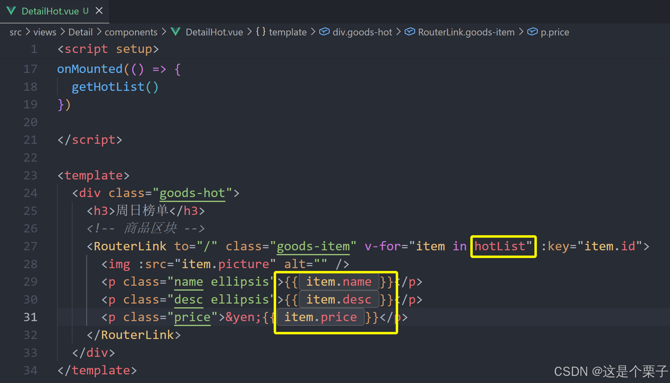
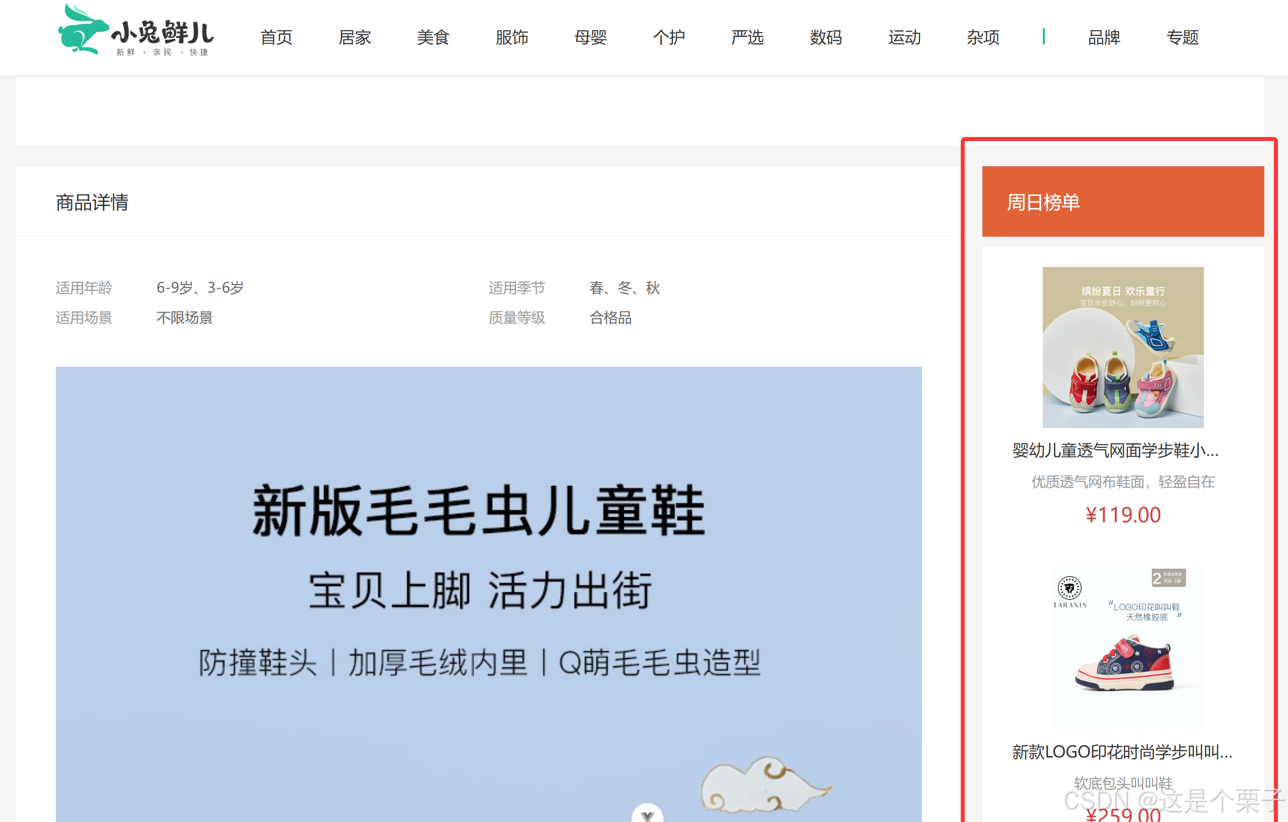
提交代码:
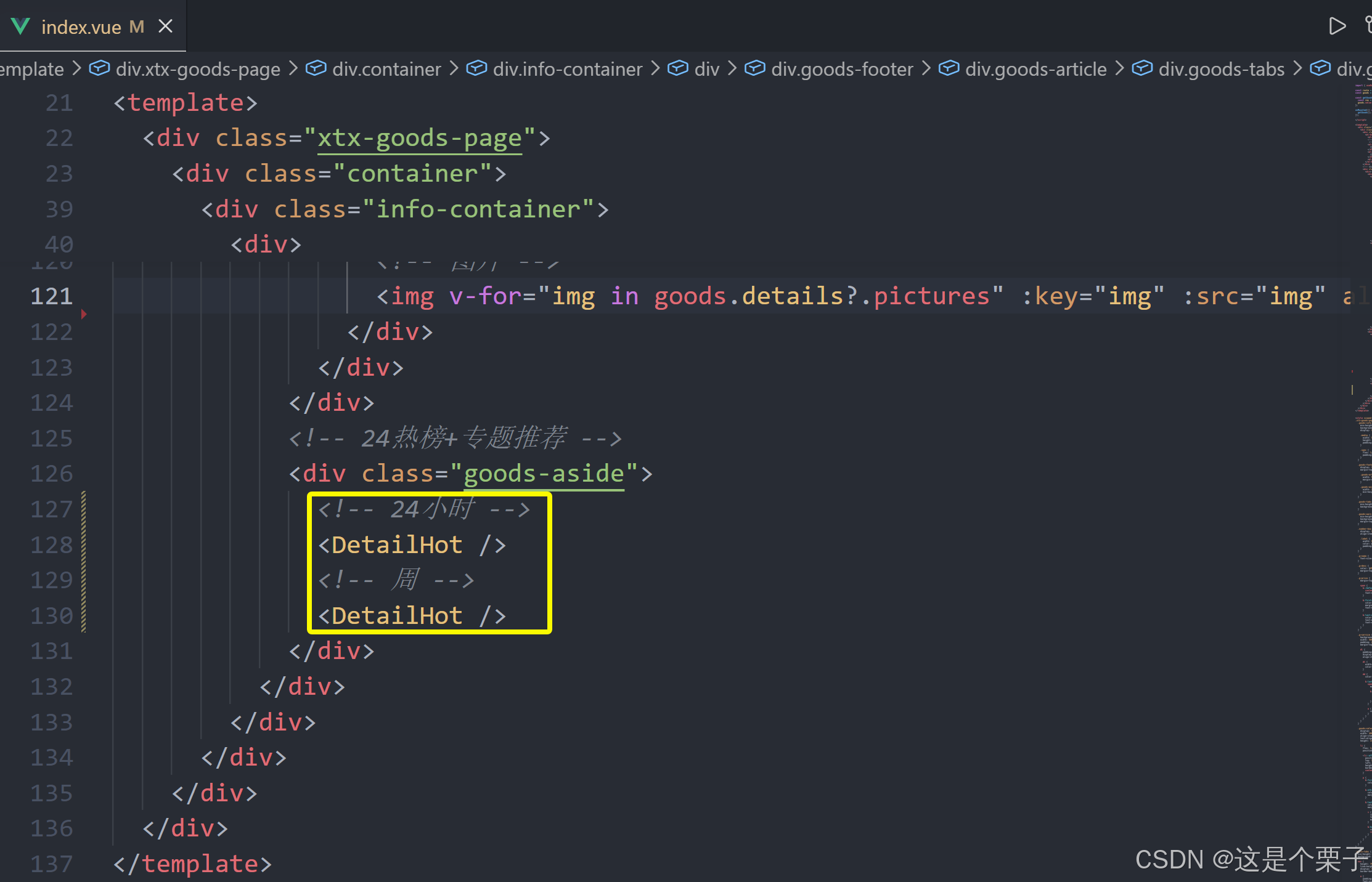
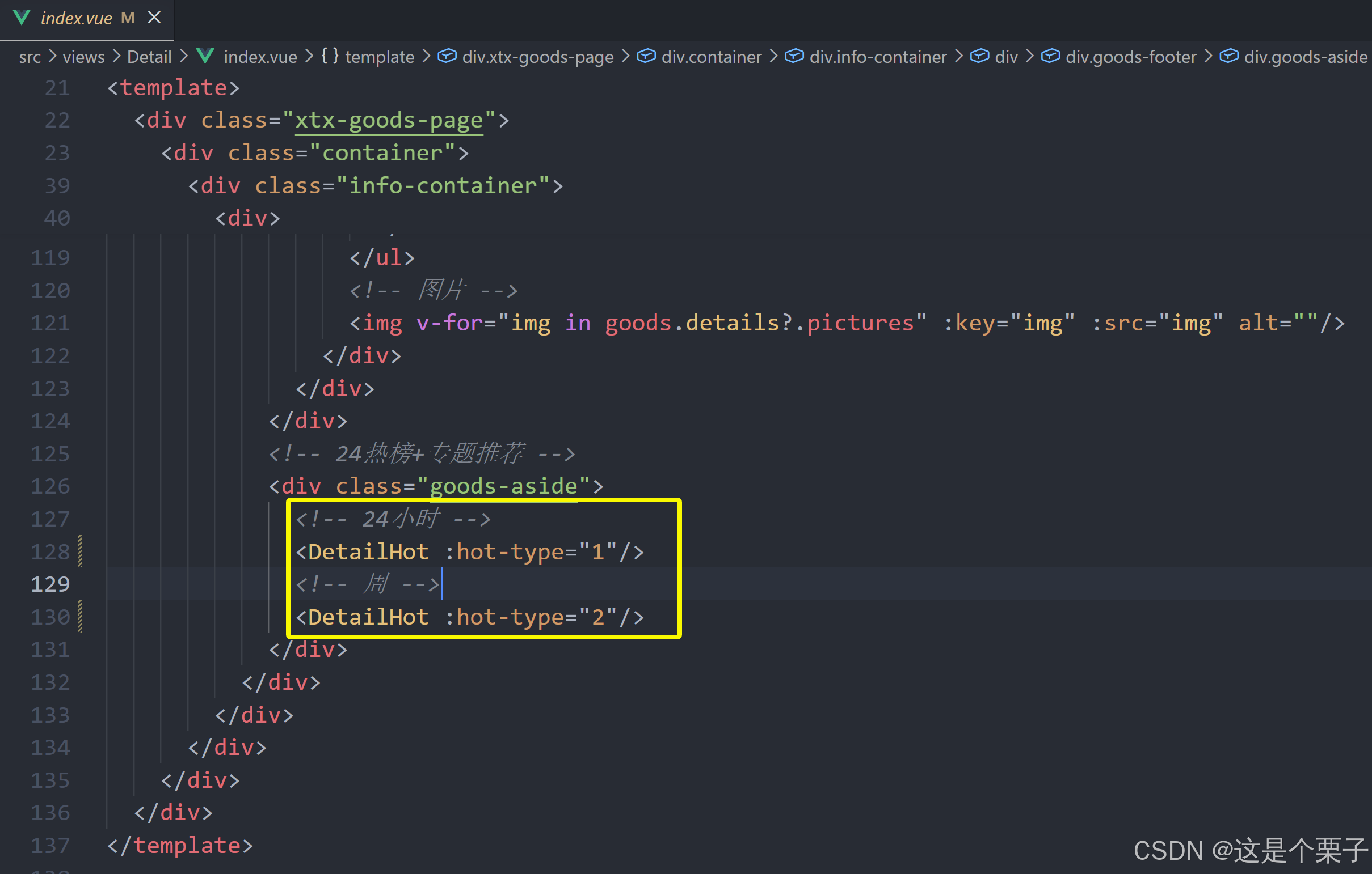
(2) 适配热榜类型
1- 设计props参数type
2- 使用组件传入不同的type
提交代码:
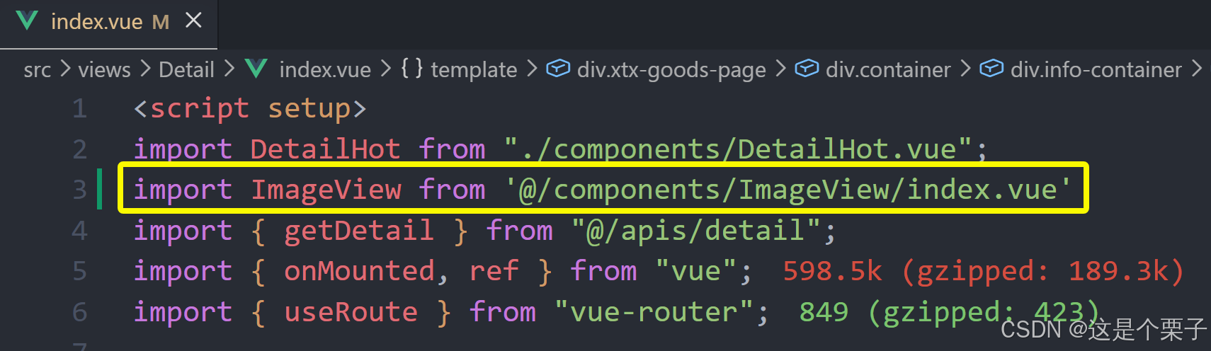
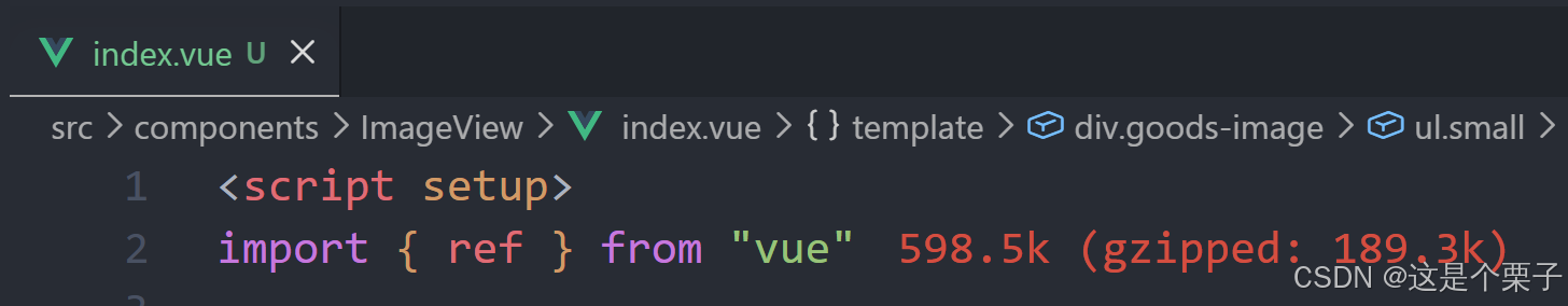
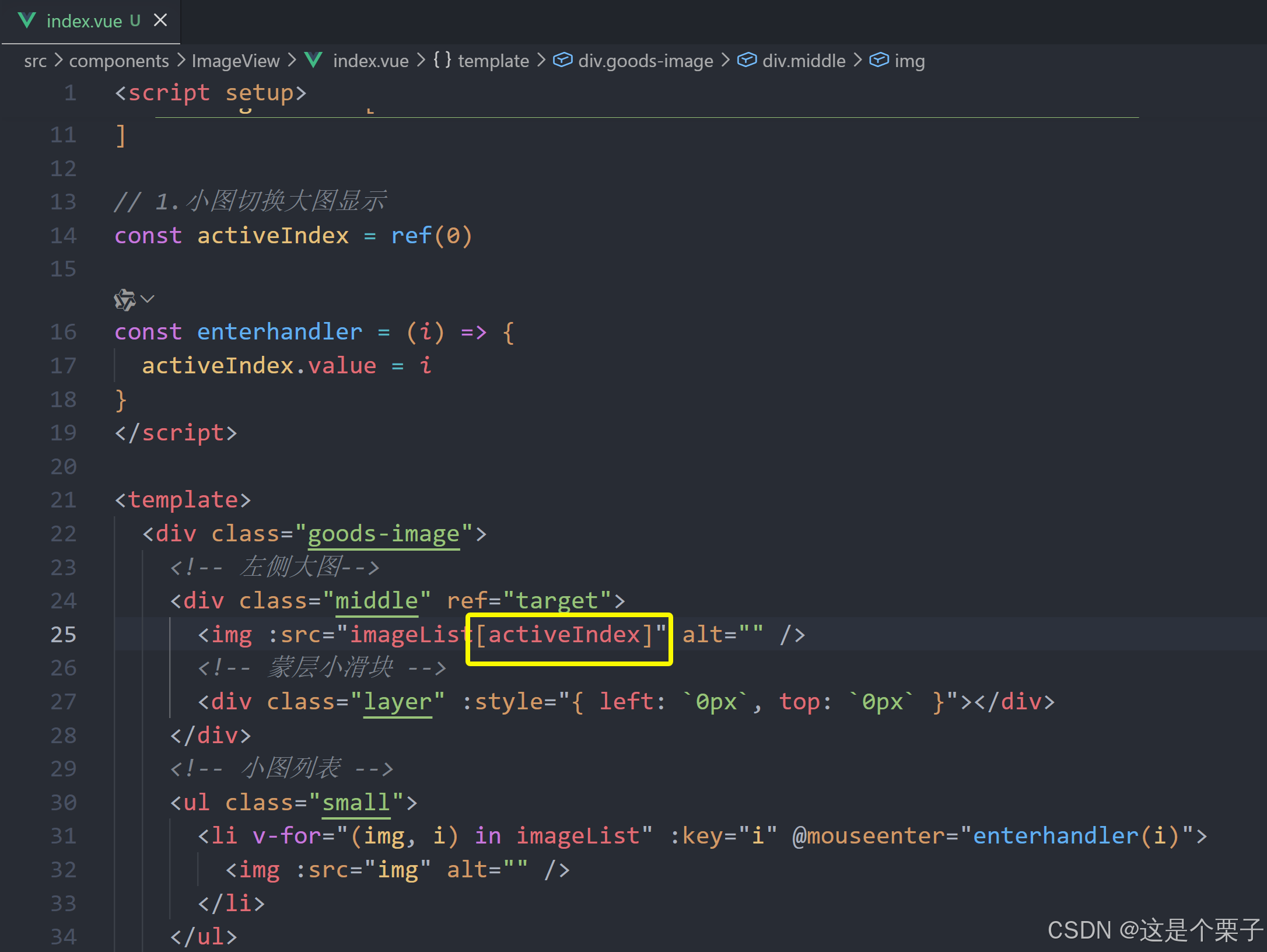
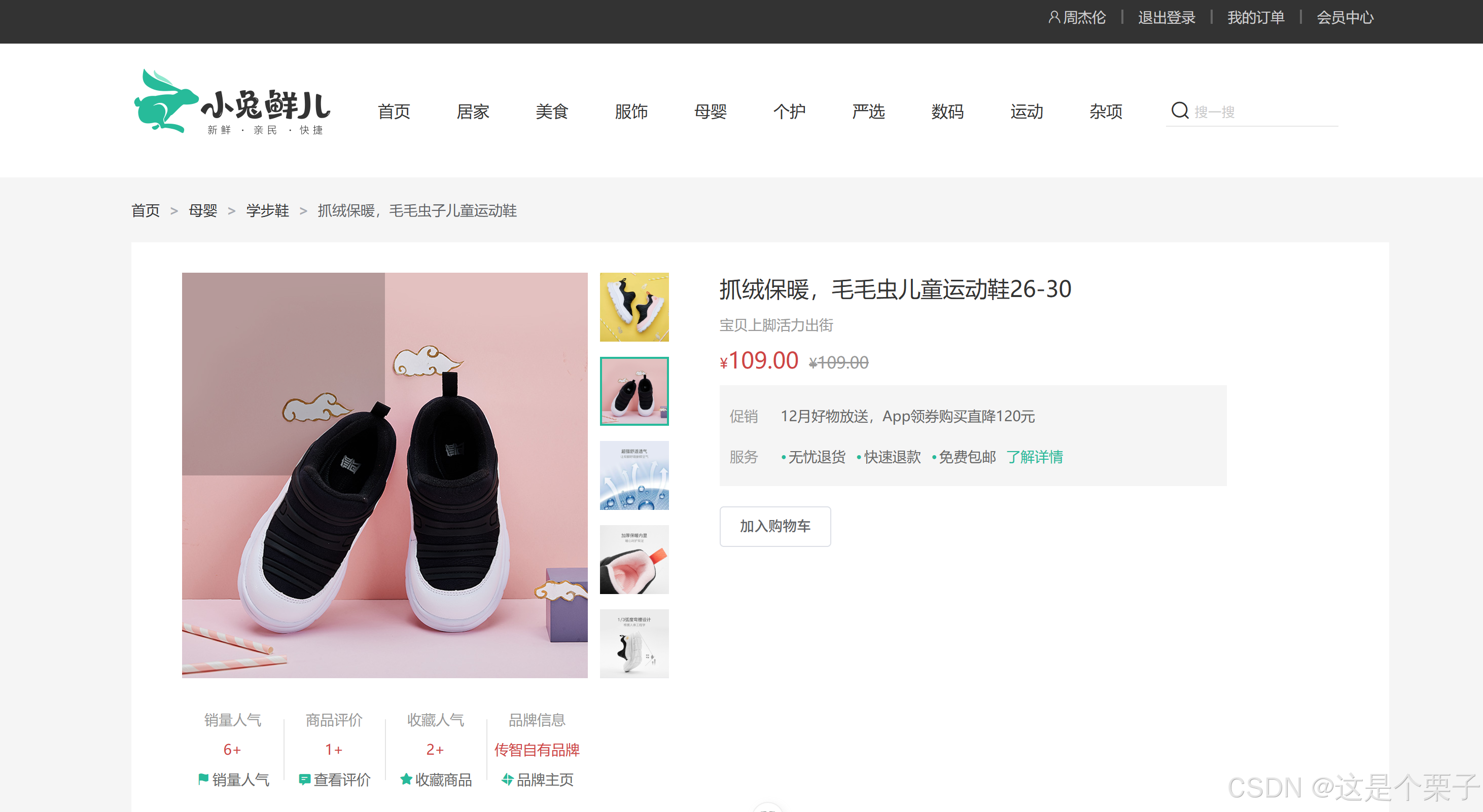
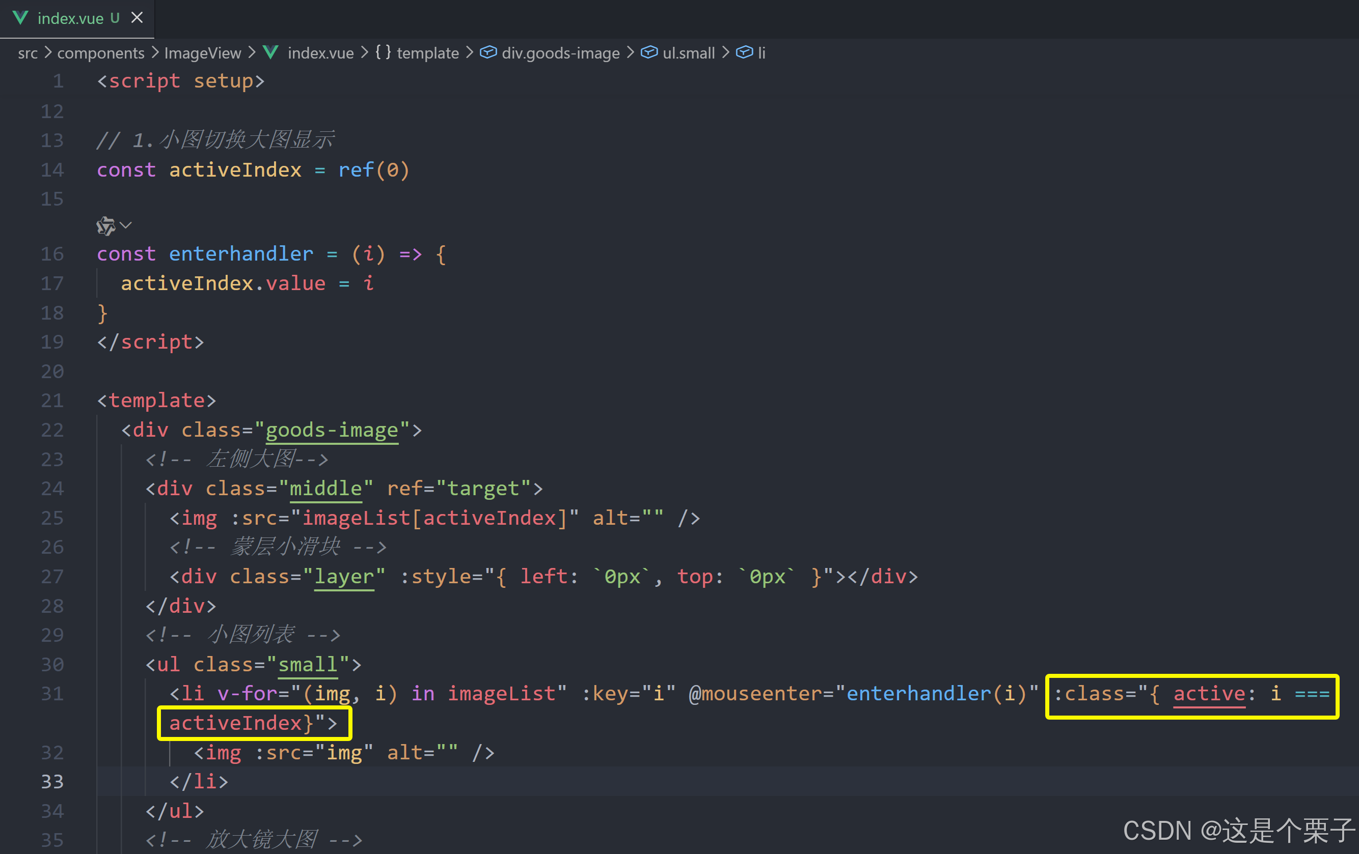
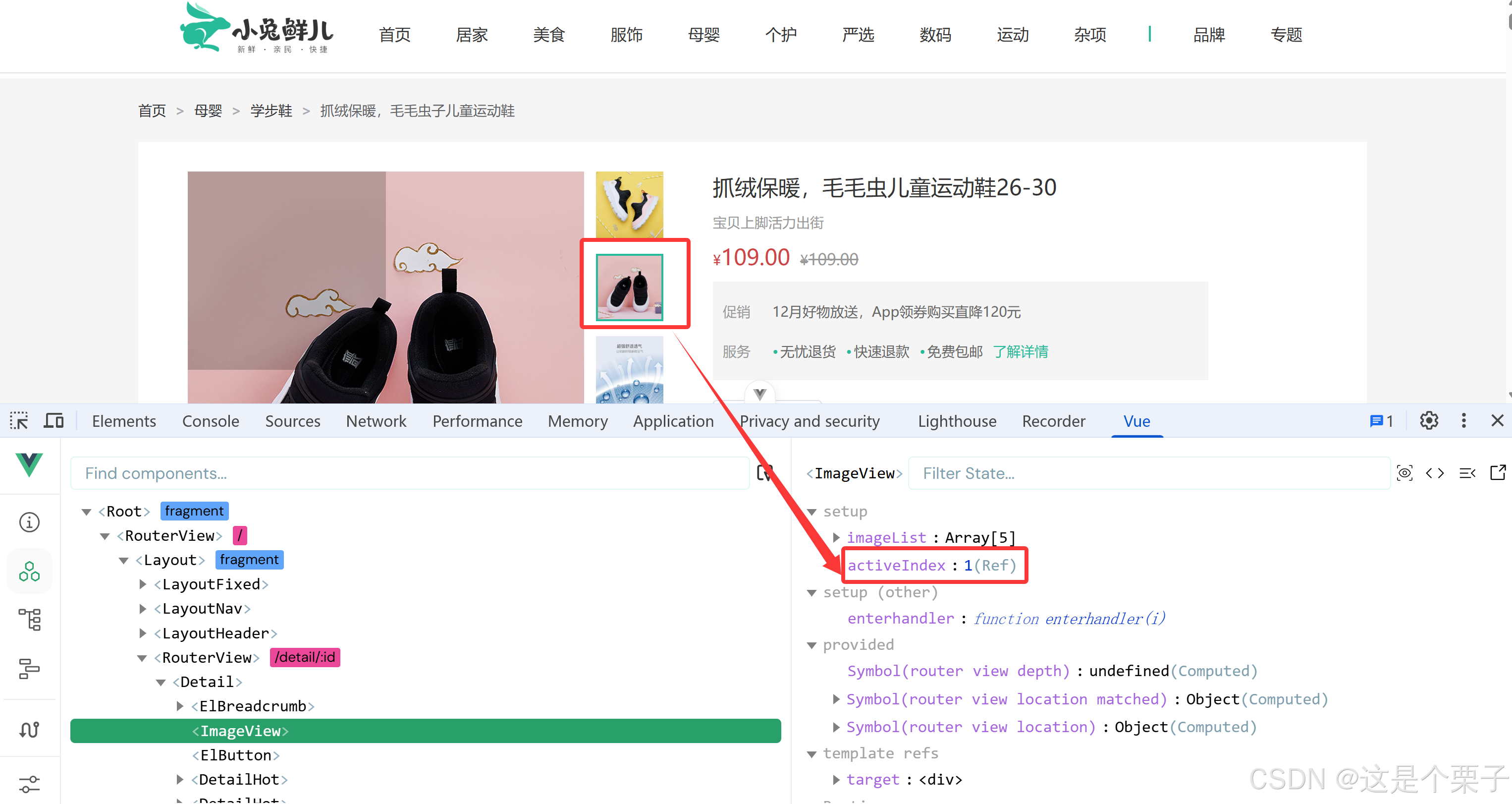
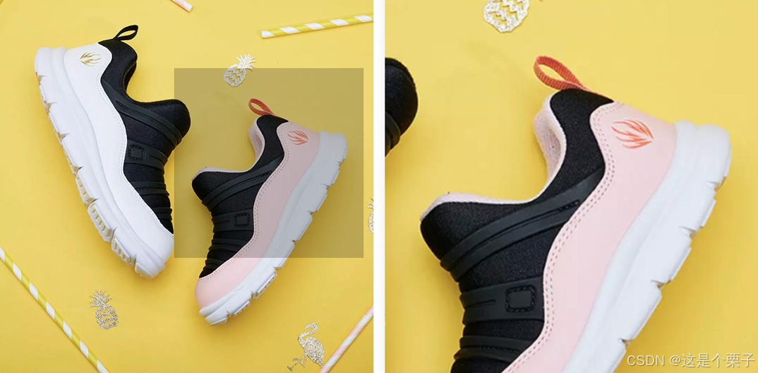
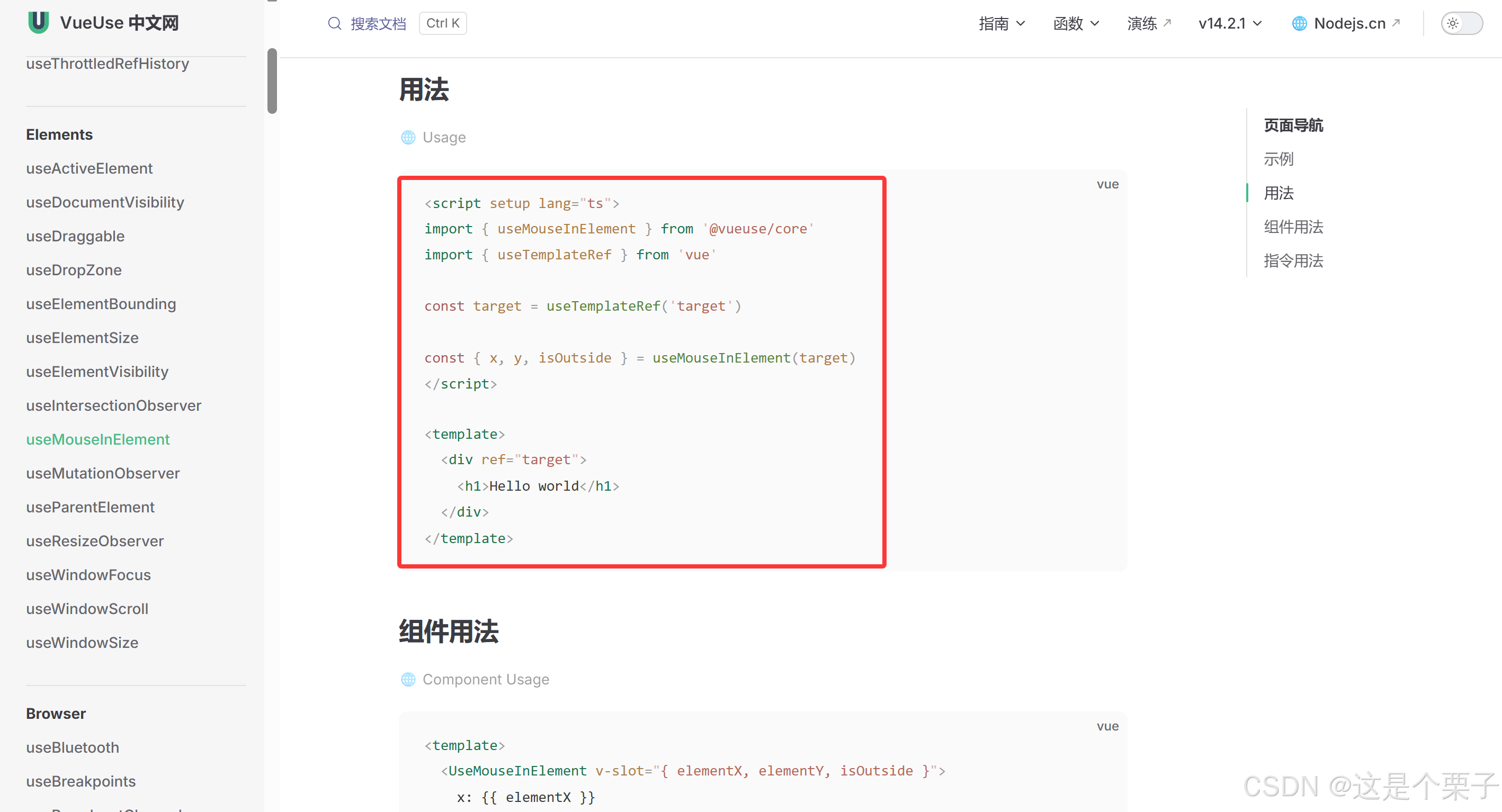
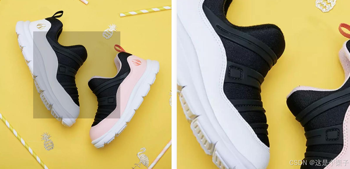
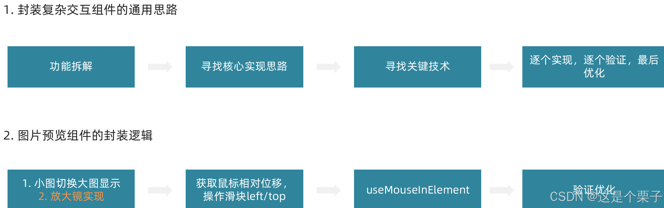
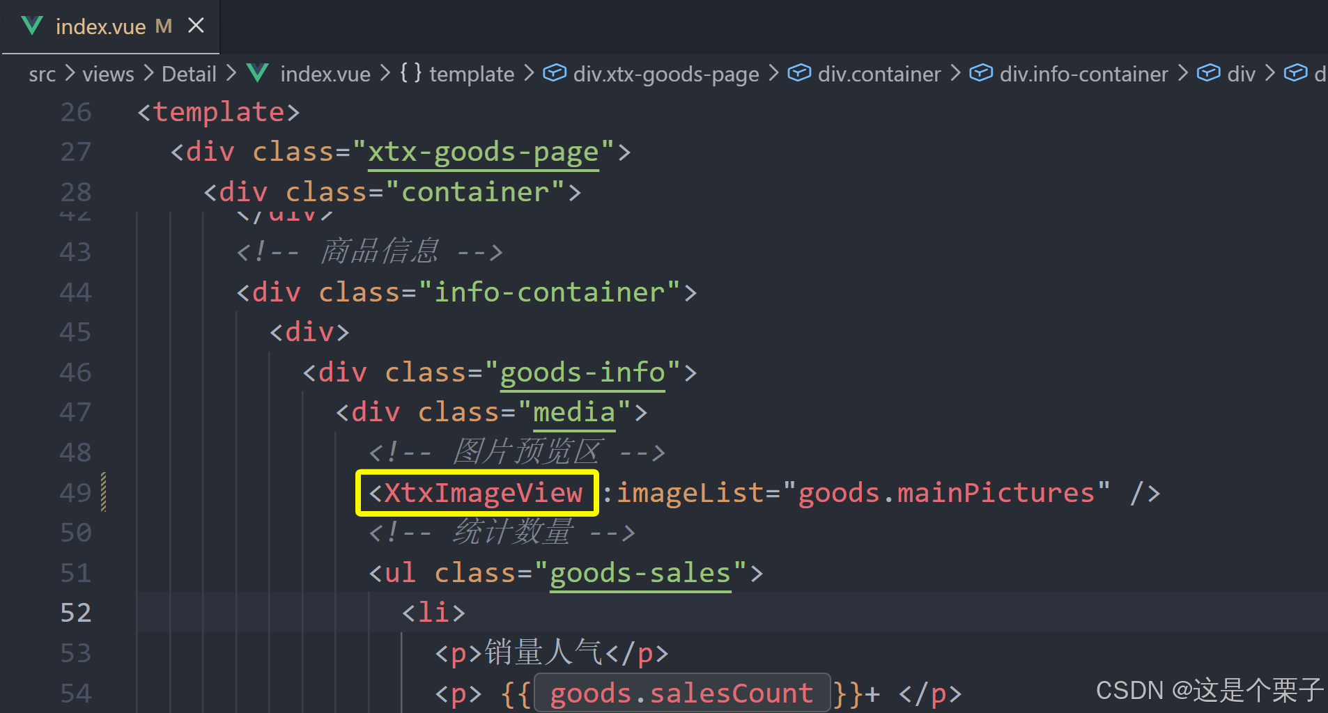
4. 图片预览组件封装
组件功能分析
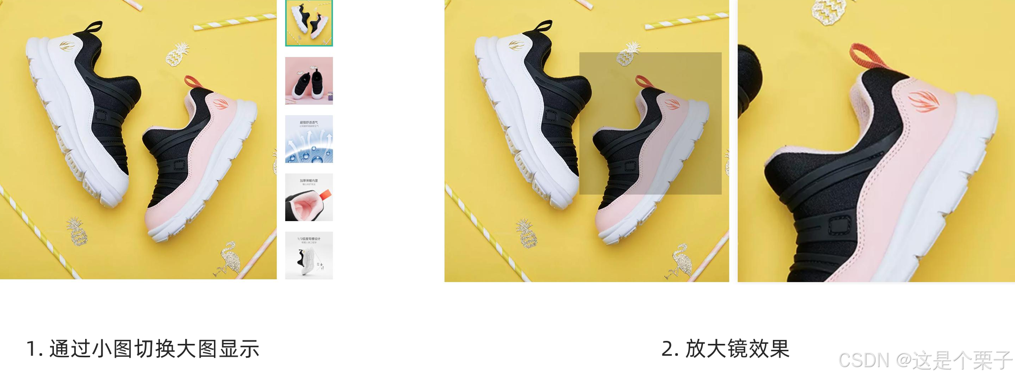
通过小图切换大图实现
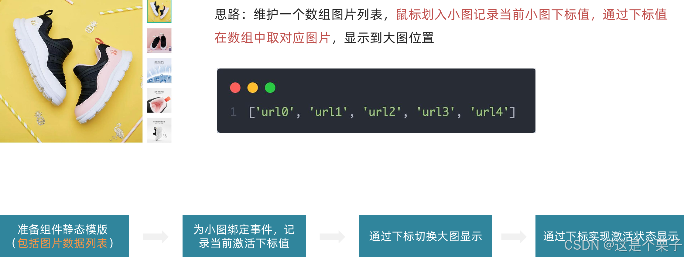
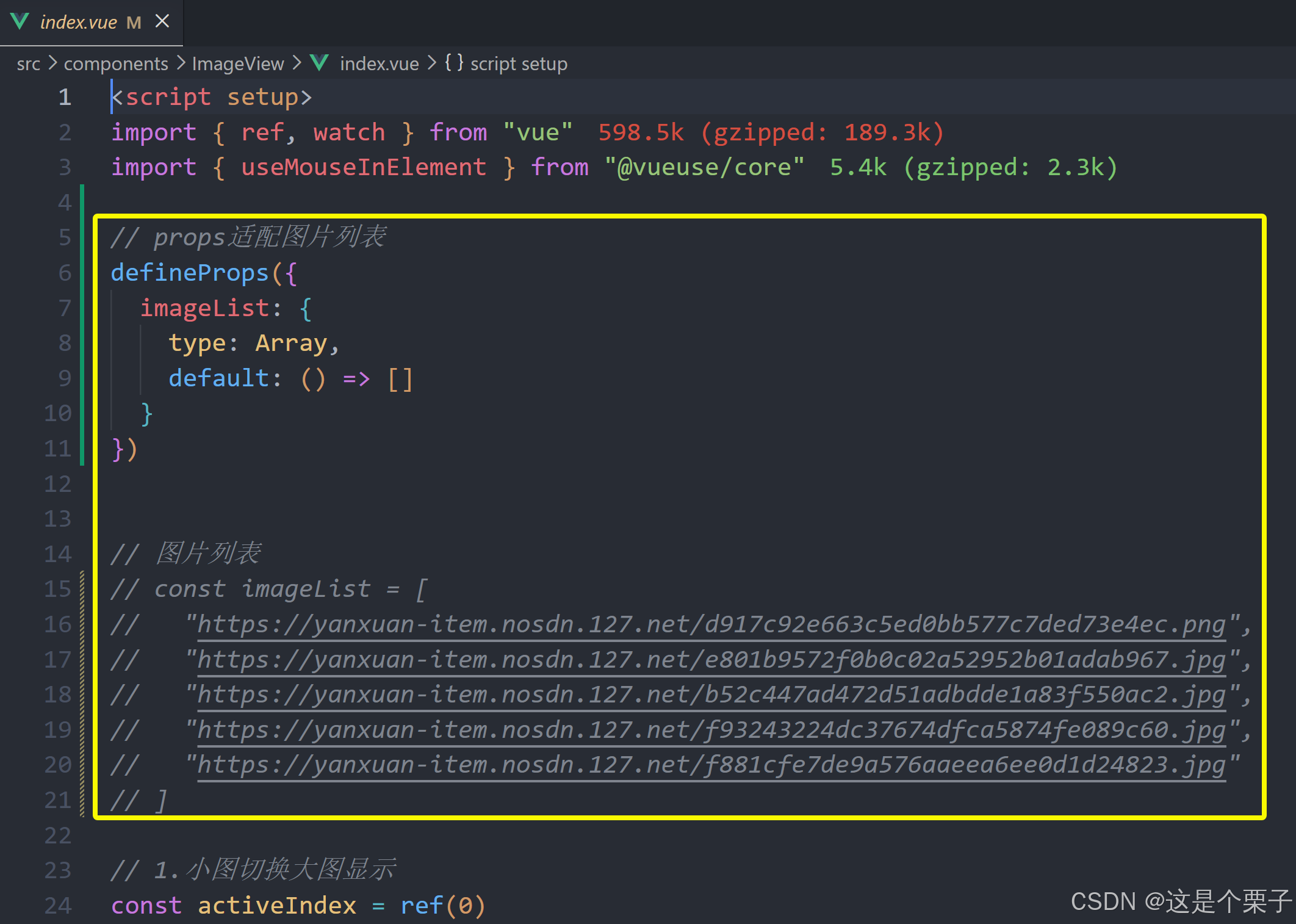
准备模版:
html
<script setup>
// 图片列表
const imageList = [
"https://yanxuan-item.nosdn.127.net/d917c92e663c5ed0bb577c7ded73e4ec.png",
"https://yanxuan-item.nosdn.127.net/e801b9572f0b0c02a52952b01adab967.jpg",
"https://yanxuan-item.nosdn.127.net/b52c447ad472d51adbdde1a83f550ac2.jpg",
"https://yanxuan-item.nosdn.127.net/f93243224dc37674dfca5874fe089c60.jpg",
"https://yanxuan-item.nosdn.127.net/f881cfe7de9a576aaeea6ee0d1d24823.jpg"
]
</script>
<template>
<div class="goods-image">
<!-- 左侧大图-->
<div class="middle" ref="target">
<img :src="imageList[0]" alt="" />
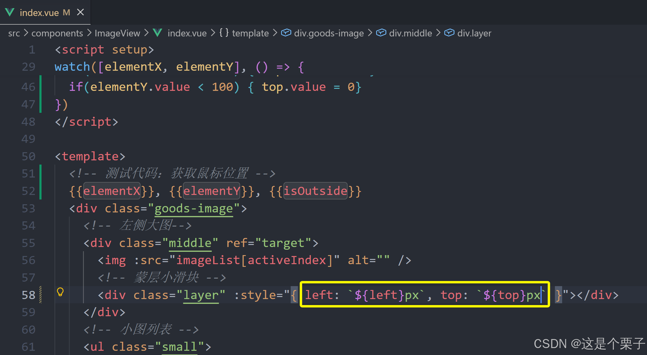
<!-- 蒙层小滑块 -->
<div class="layer" :style="{ left: `0px`, top: `0px` }"></div>
</div>
<!-- 小图列表 -->
<ul class="small">
<li v-for="(img, i) in imageList" :key="i">
<img :src="img" alt="" />
</li>
</ul>
<!-- 放大镜大图 -->
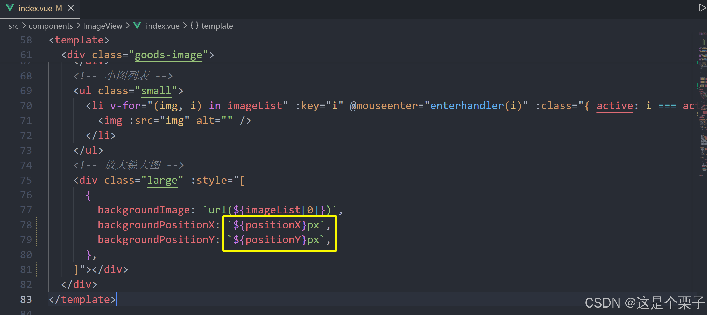
<div class="large" :style="[
{
backgroundImage: `url(${imageList[0]})`,
backgroundPositionX: `0px`,
backgroundPositionY: `0px`,
},
]" v-show="false"></div>
</div>
</template>
<style scoped lang="scss">
.goods-image {
width: 480px;
height: 400px;
position: relative;
display: flex;
.middle {
width: 400px;
height: 400px;
background: #f5f5f5;
}
.large {
position: absolute;
top: 0;
left: 412px;
width: 400px;
height: 400px;
z-index: 500;
box-shadow: 0 0 10px rgba(0, 0, 0, 0.1);
background-repeat: no-repeat;
// 背景图:盒子的大小 = 2:1 将来控制背景图的移动来实现放大的效果查看 background-position
background-size: 800px 800px;
background-color: #f8f8f8;
}
.layer {
width: 200px;
height: 200px;
background: rgba(0, 0, 0, 0.2);
// 绝对定位 然后跟随咱们鼠标控制left和top属性就可以让滑块移动起来
left: 0;
top: 0;
position: absolute;
}
.small {
width: 80px;
li {
width: 68px;
height: 68px;
margin-left: 12px;
margin-bottom: 15px;
cursor: pointer;
&:hover,
&.active {
border: 2px solid $xtxColor;
}
}
}
}
</style>
实现逻辑:
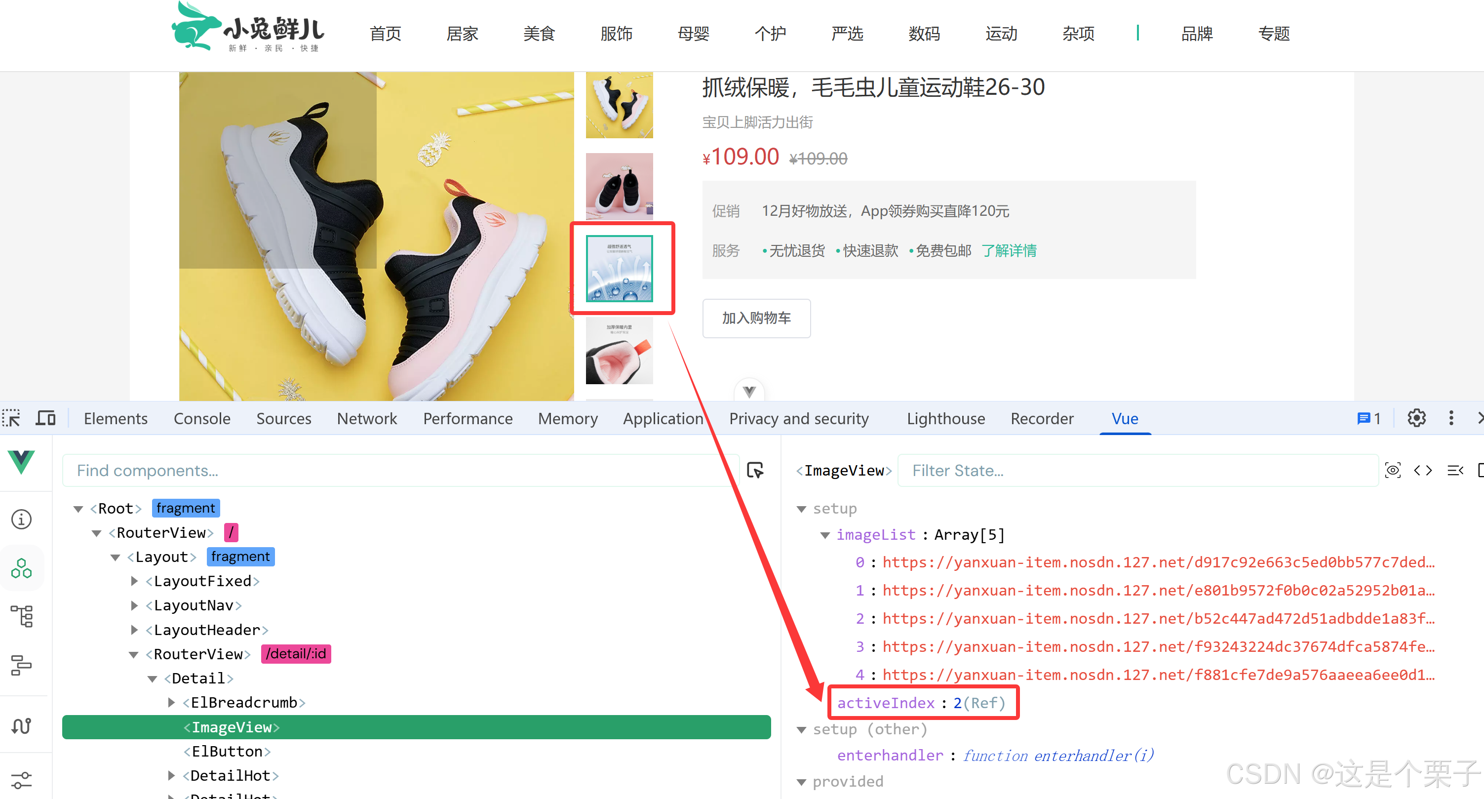
提交代码:
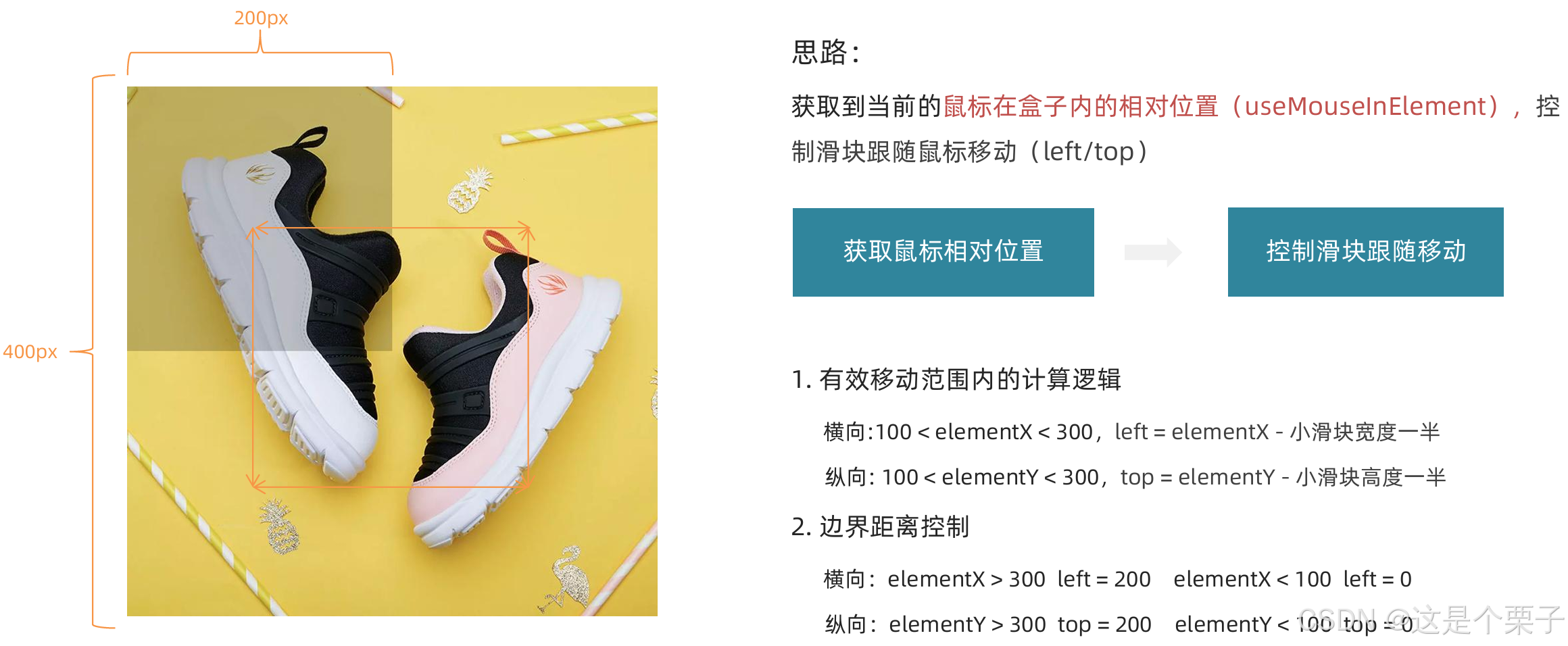
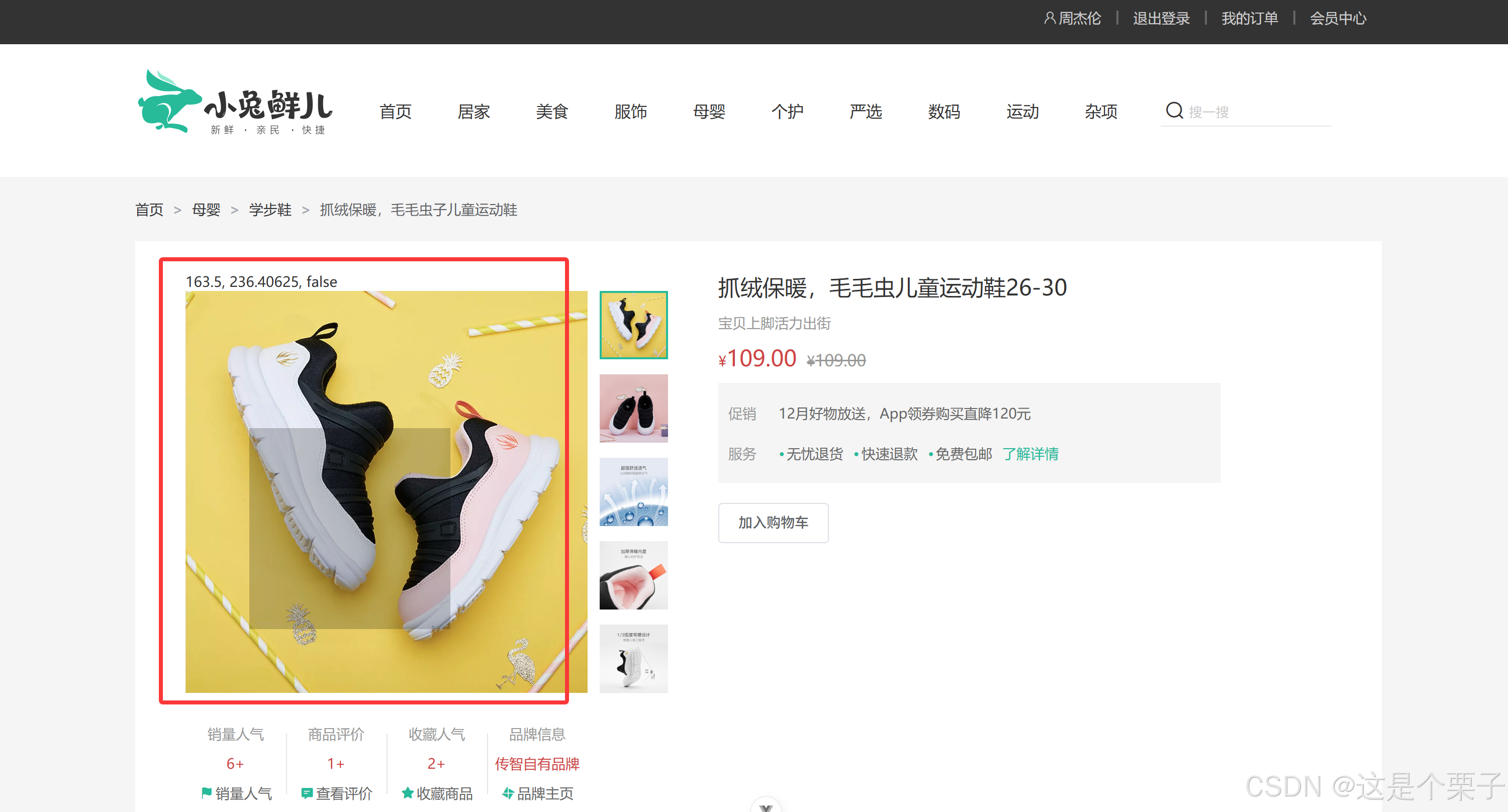
放大镜效果实现
功能拆解
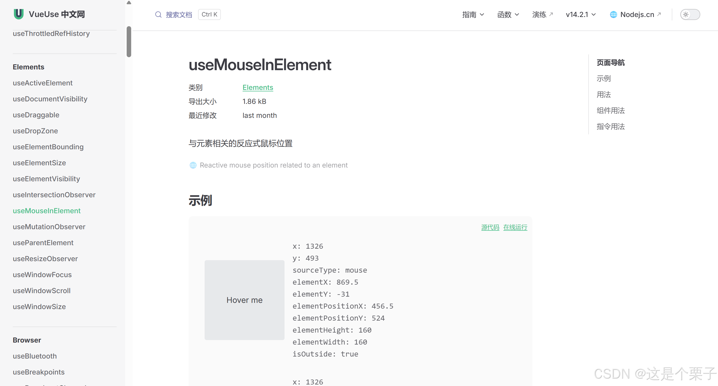
- 左侧滑块跟随鼠标移动
- 右侧大图放大效果实现
- 鼠标移入控制滑块和大图显示隐藏
放大镜效果实现-滑块跟随鼠标移动
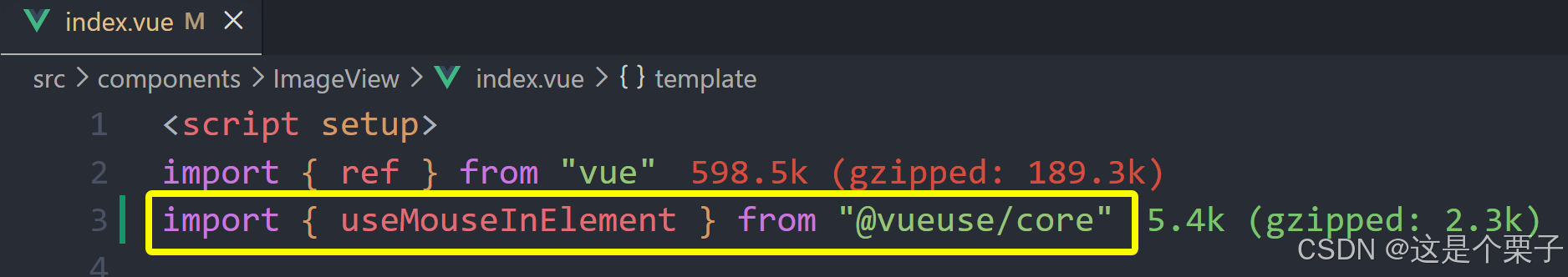
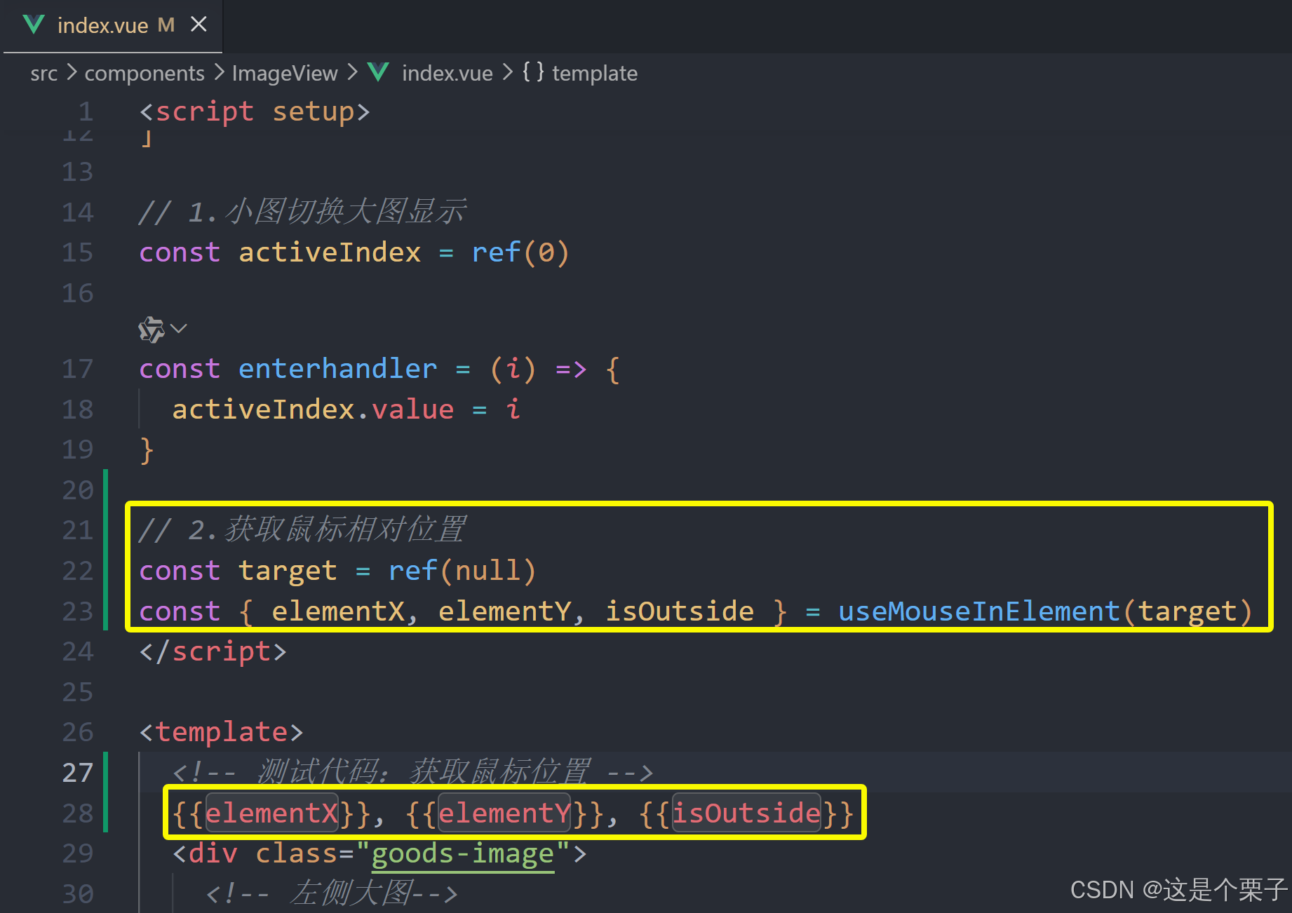
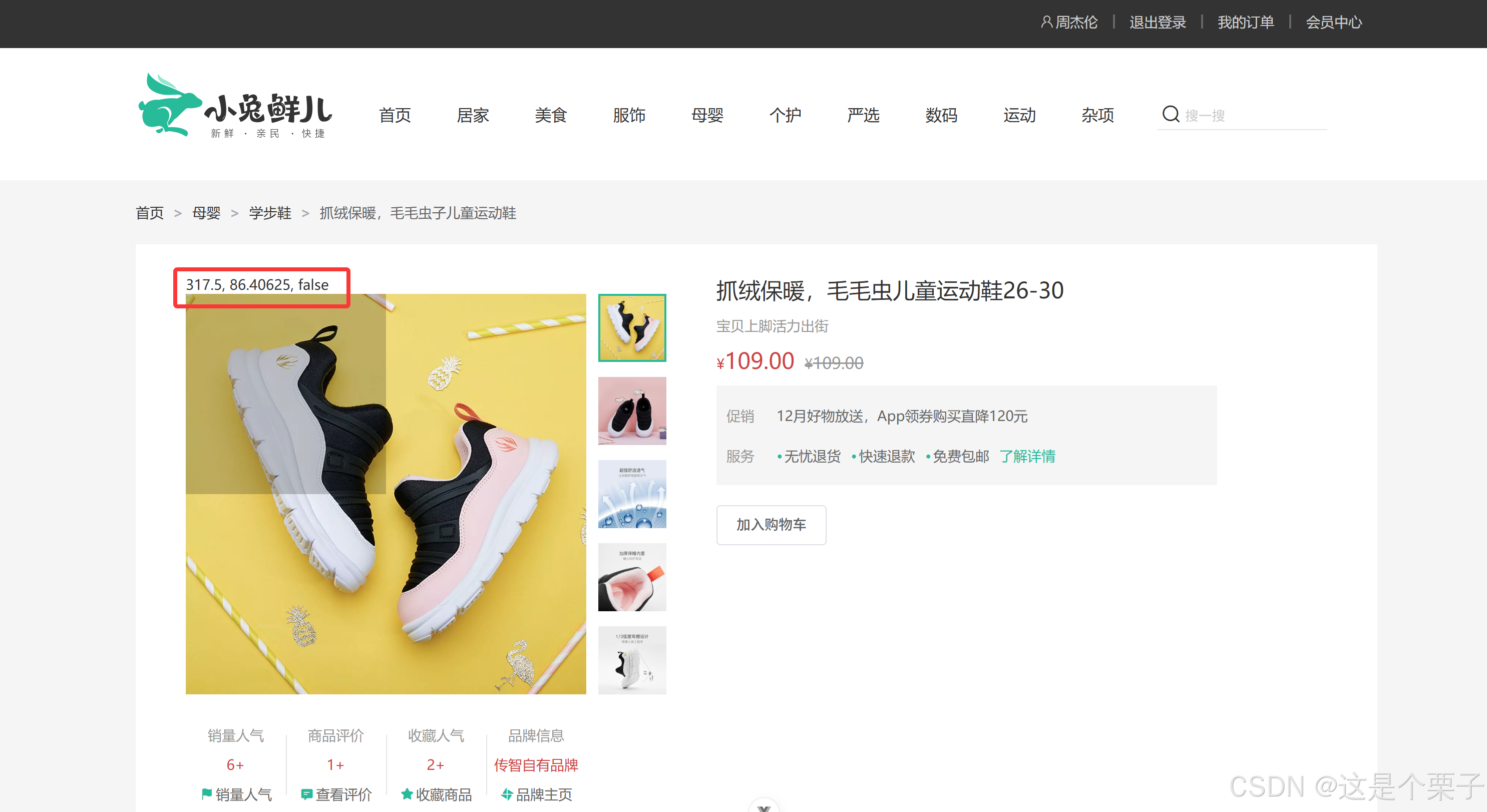
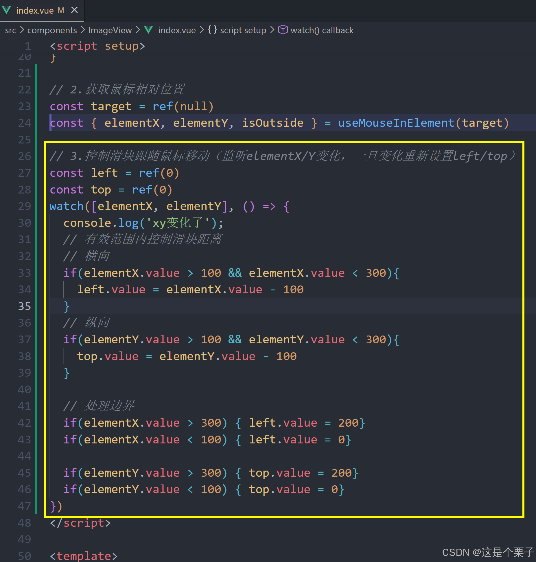
提交代码:
放大镜效果实现-大图效果实现
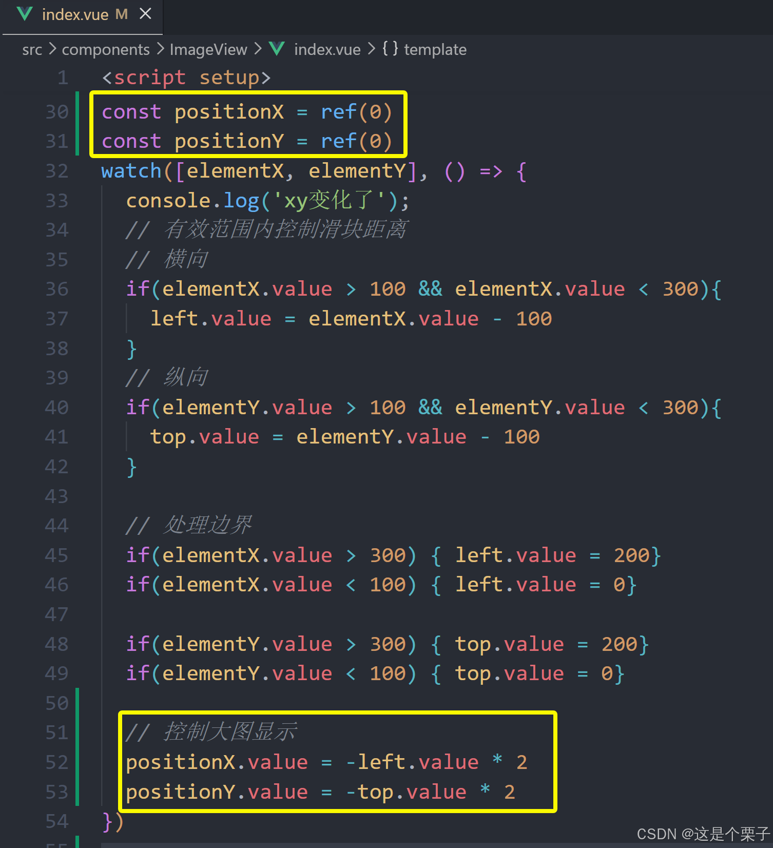
效果:为实现放大效果,大图的宽高是小图的俩倍。
思路:大图的移动方向和滑块移动方向相反,且数值为2倍。
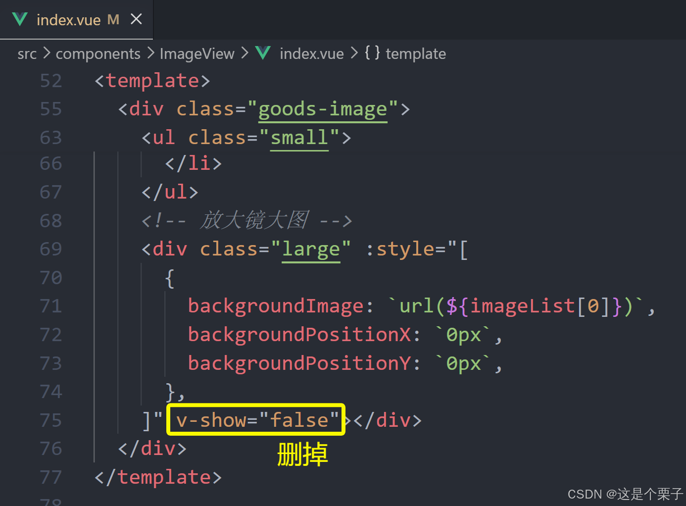
放大镜效果实现-鼠标移入控制显隐
思路:鼠标移入盒子(isOutside),滑块和大图才显示(v-show)。
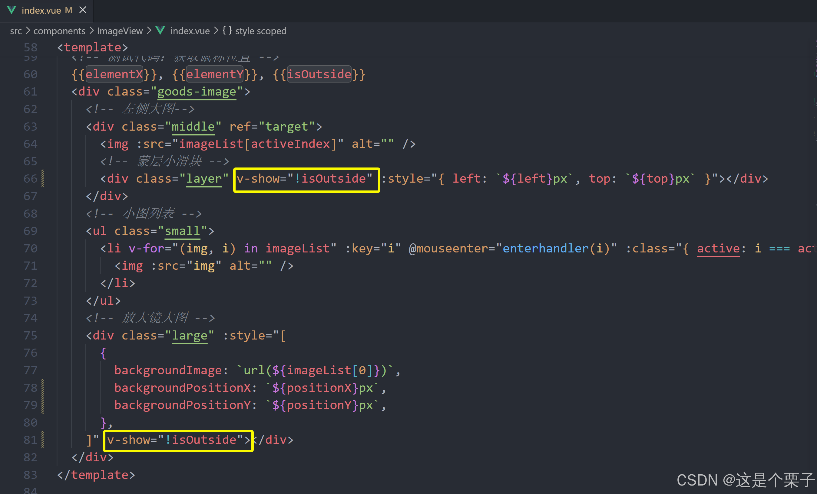
小优化:如果鼠标没有移入到盒子里,则不执行图片放大等后面的逻辑。
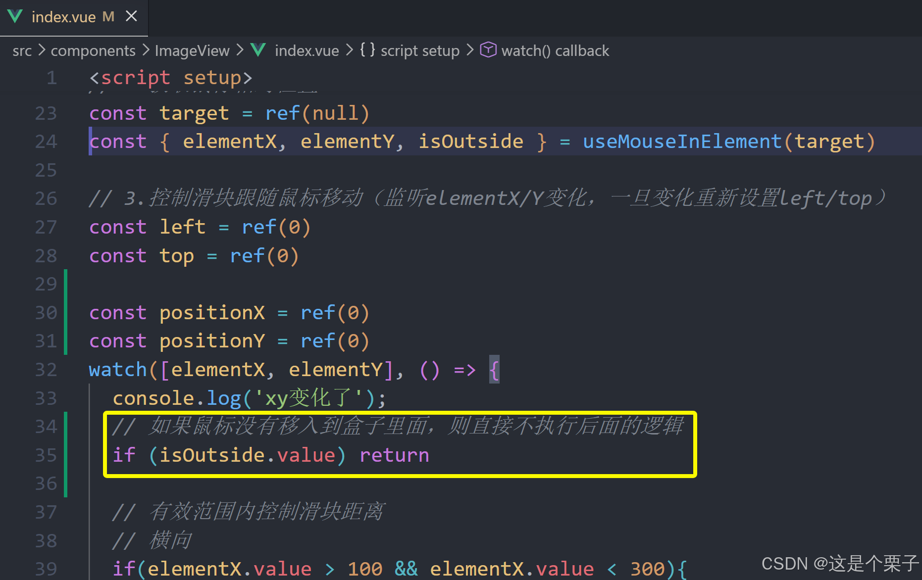
提交代码:

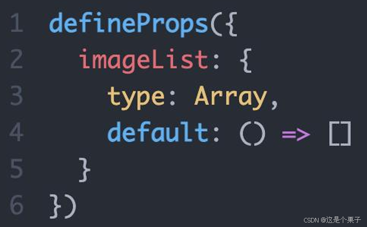
组件props适配
组件中的图片列表不能写死,需要通过props参数把接口数据传入。
总结:
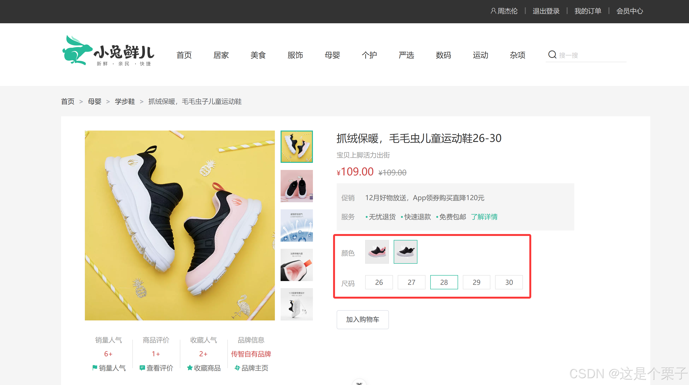
提交代码:
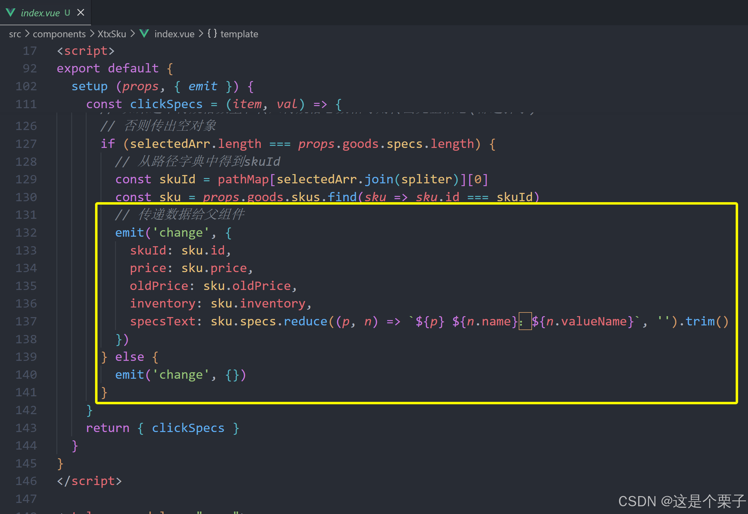
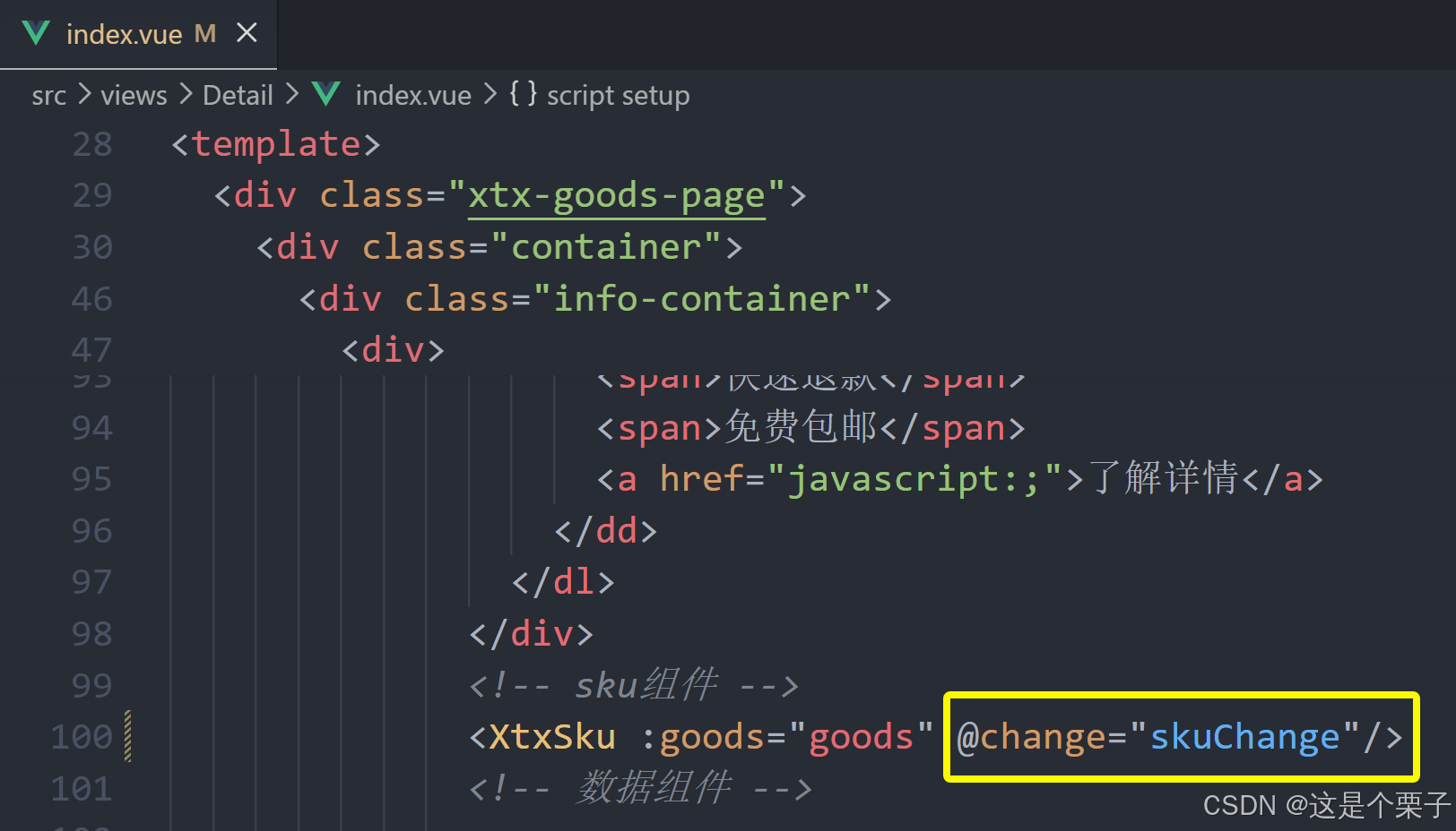
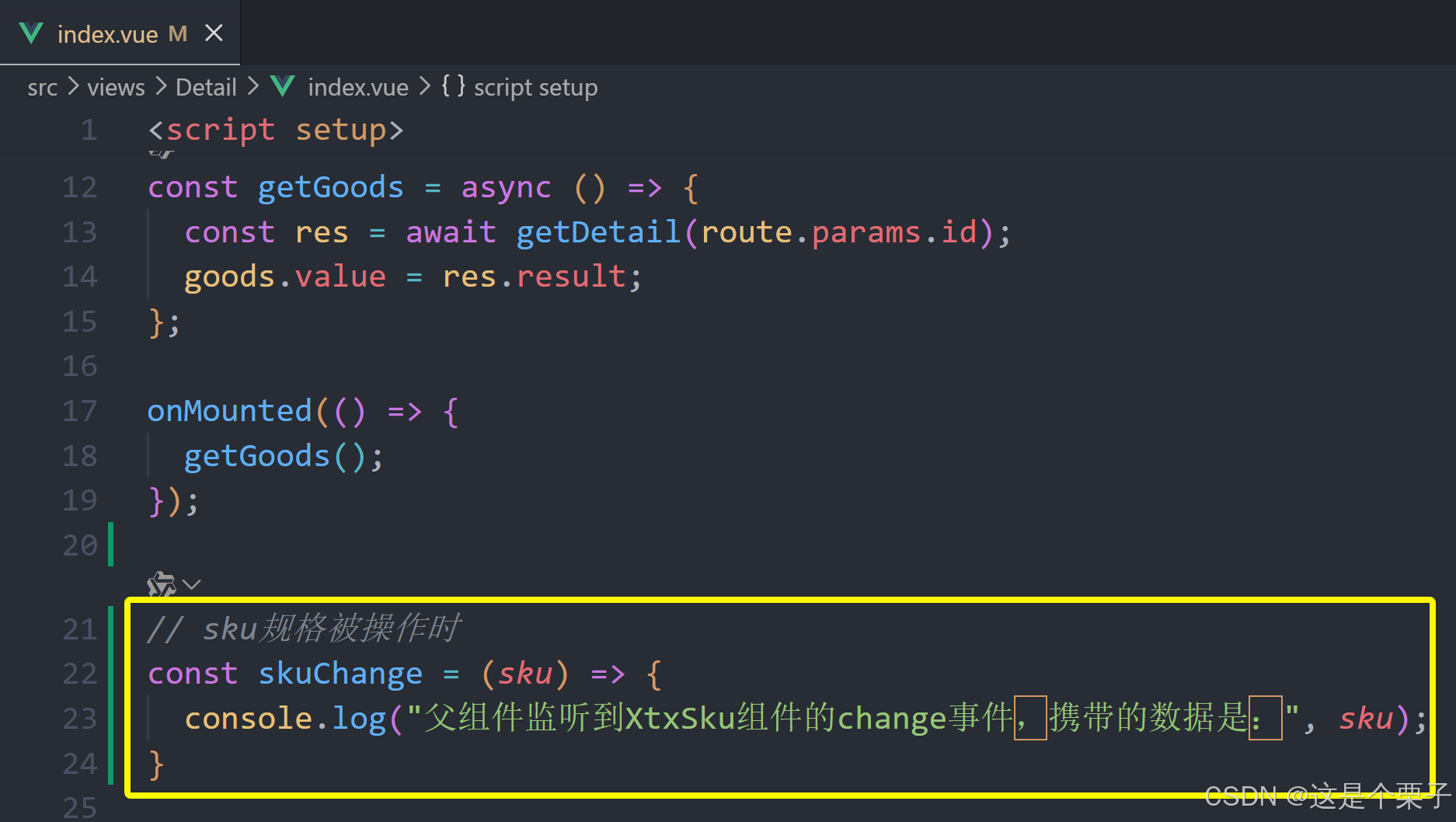
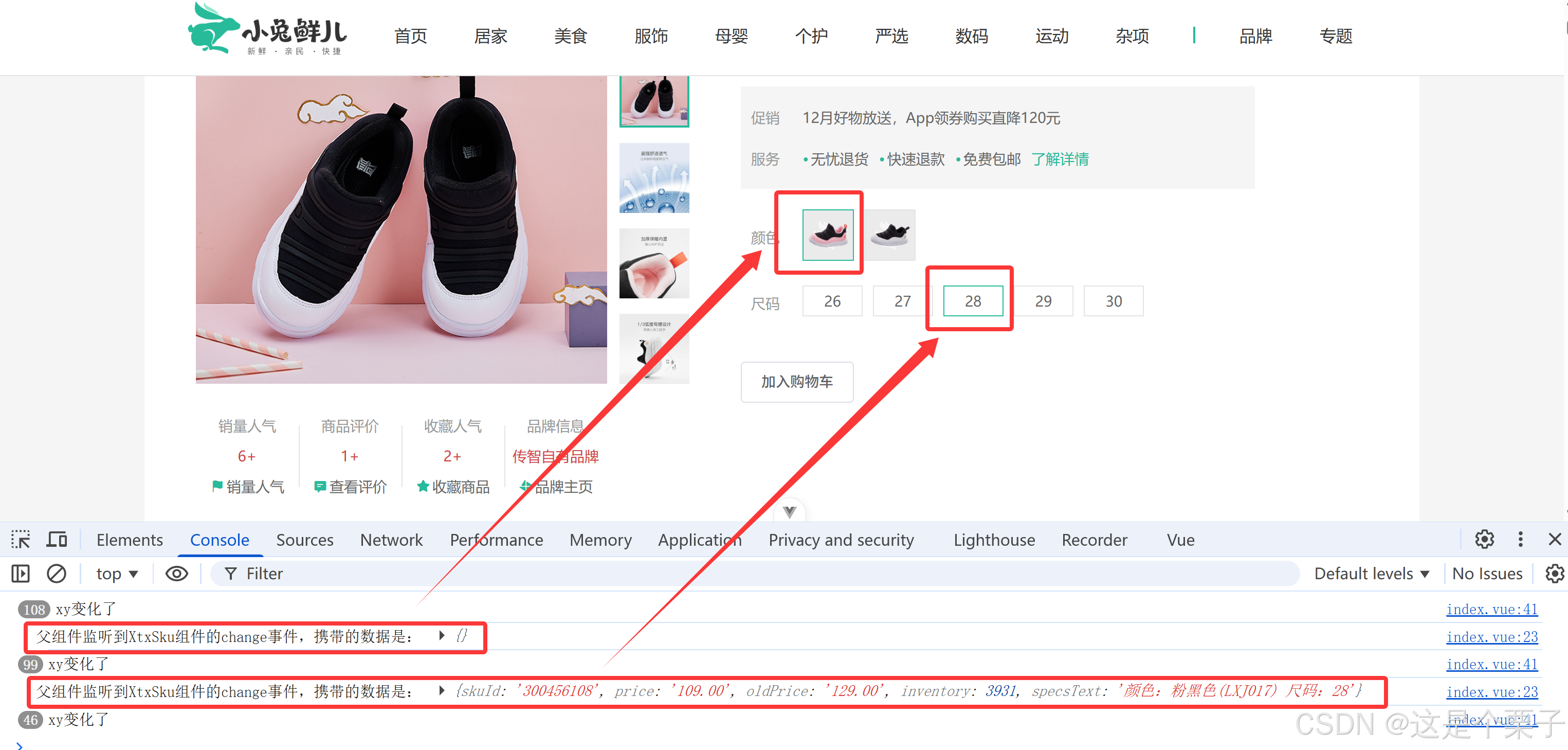
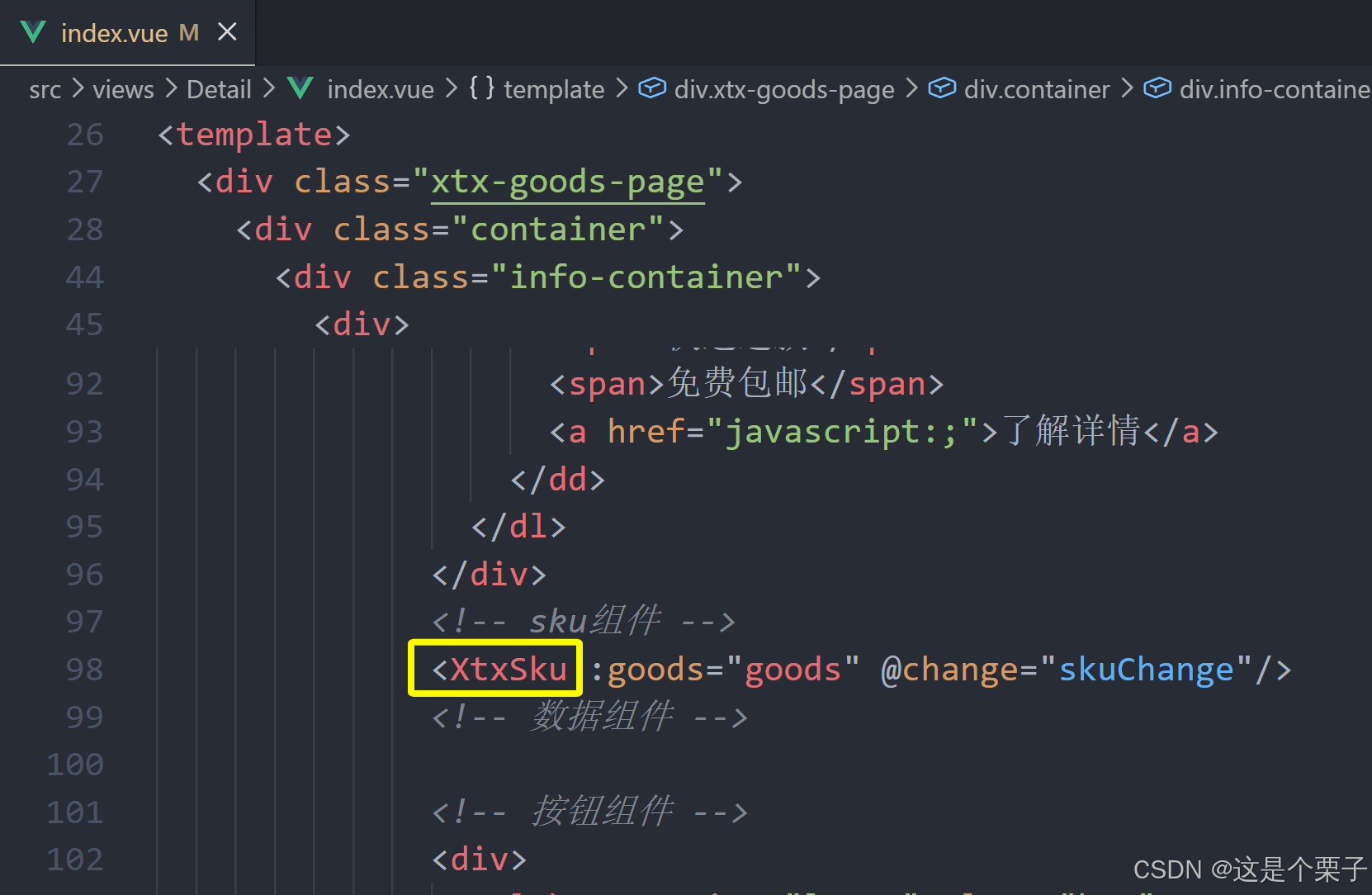
5. 认识SKU组件
SKU的概念
存货单位(英语:stock keeping unit,SKU),也翻译为库存单元,是一个会计学名词,定义为库存管理中的最小可用单元,例如纺织品中一个SKU通常表示规格、颜色、款式,而在连锁零售门店中有时称单品为一个SKU。
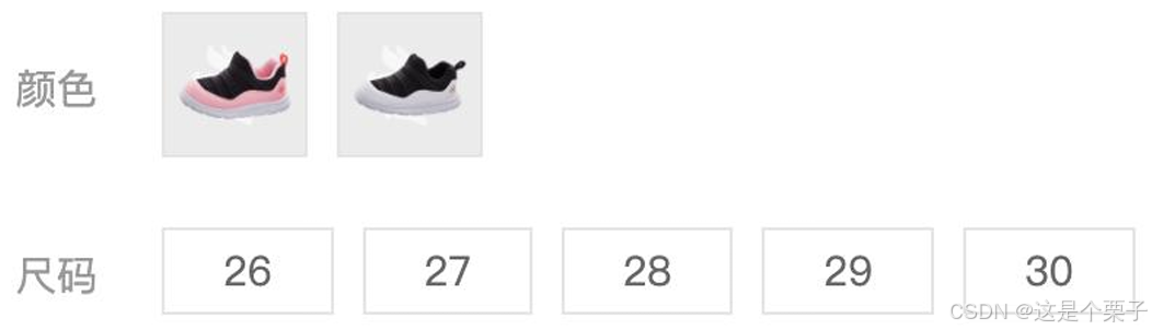
SKU组件的作用:产出当前用户选择的商品规格,为加入购物车操作提供数据信息。
SKU组件使用
问:在实际工作中,经常会遇到别人写好的组件,熟悉一个三方组件,首先重点看什么?
答:props和emit,props决定了当前组件接收什么数据,emit决定了会产出什么数据。
验证组件是否成功使用:

观察组件的props和emit:
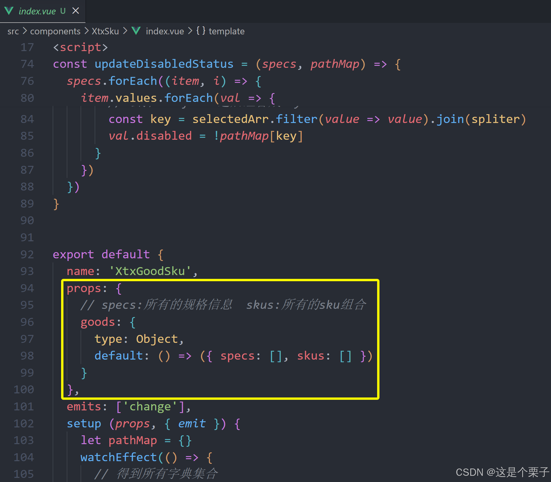
验证组件是否成功使用:
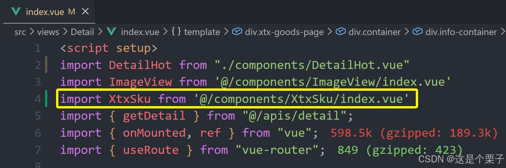
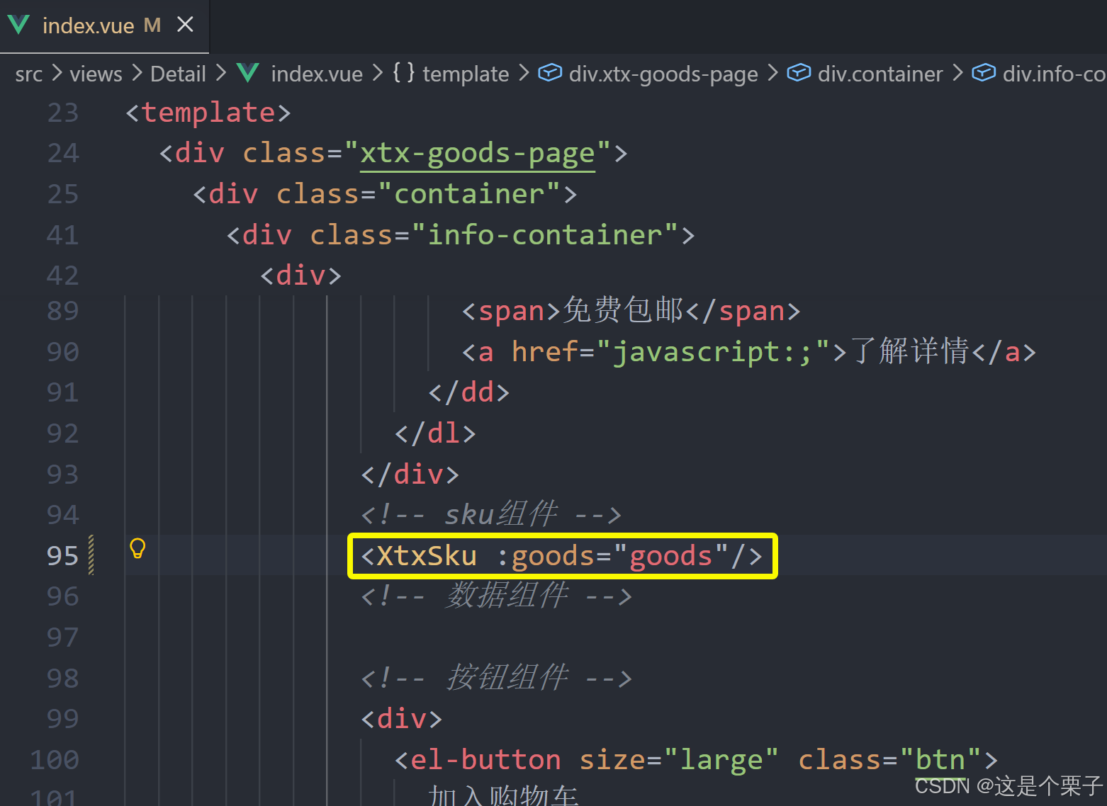
提交代码:
6. 通用组件统一注册全局
为什么要优化
背景:components目录下有可能还会有很多其他通用型组件,有可能在多个业务模块中共享,所有统一进行全局组件注册比较好。
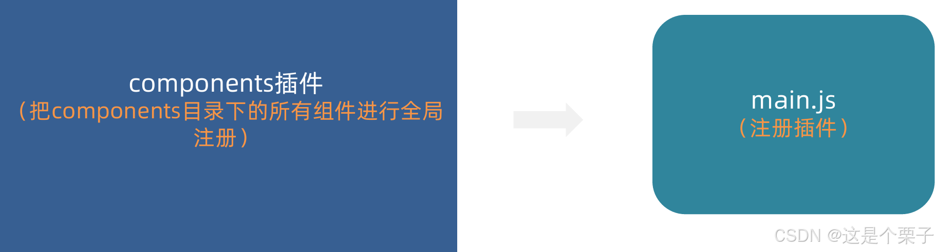
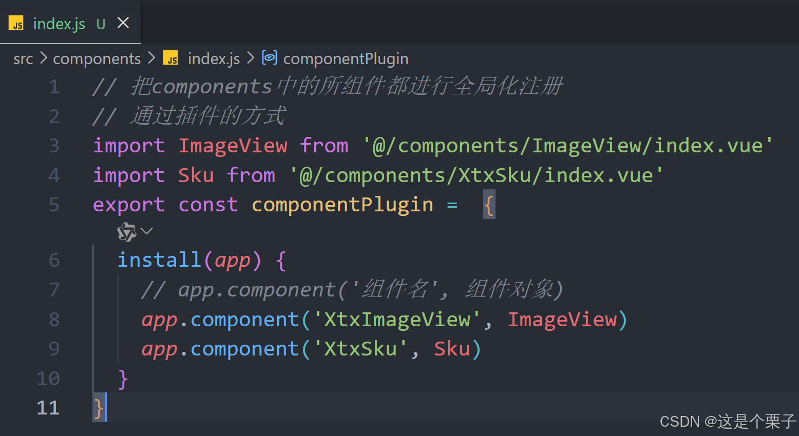
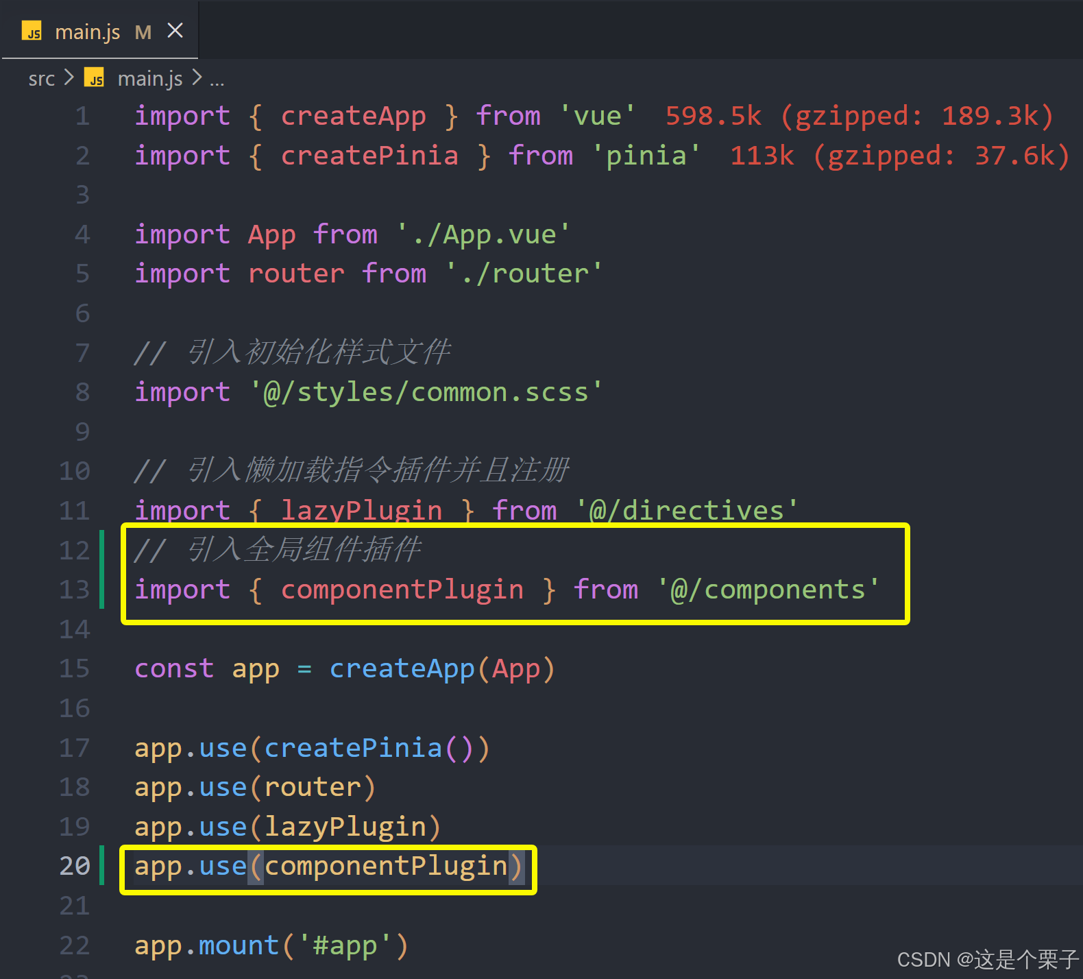
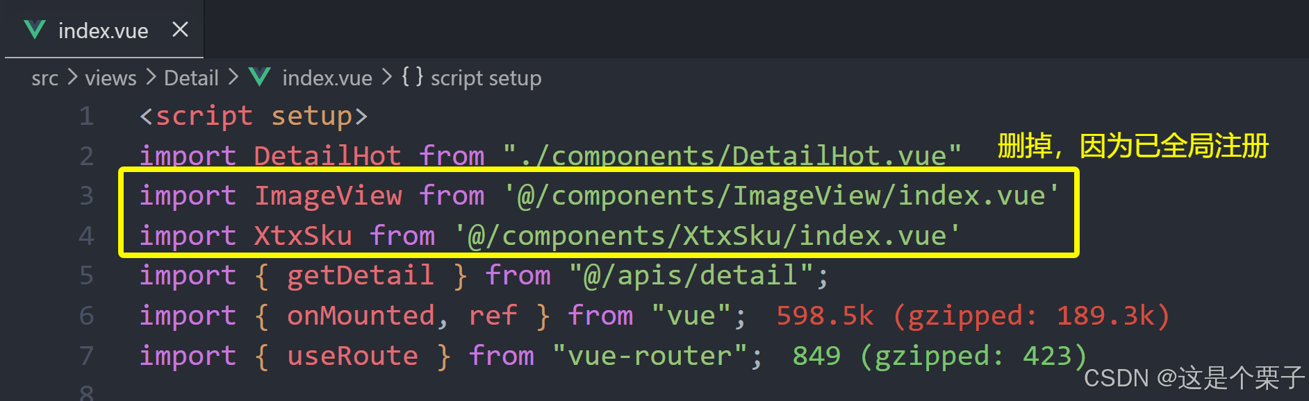
提交代码:
2.5 登录
2.5.1 登录
1. 整体认识和路由配置
登录页面的主要功能就是表单校验和登录登出业务。
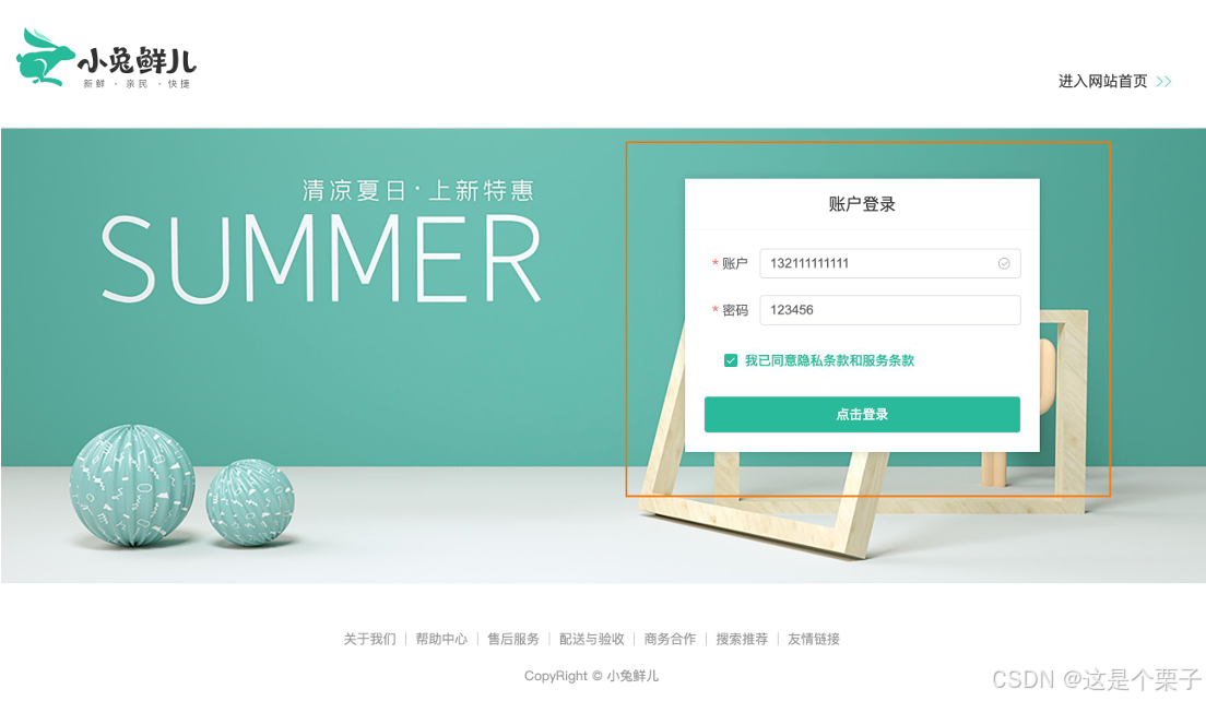
准备模版:
html
<script setup>
</script>
<template>
<div>
<header class="login-header">
<div class="container m-top-20">
<h1 class="logo">
<RouterLink to="/">小兔鲜</RouterLink>
</h1>
<RouterLink class="entry" to="/">
进入网站首页
<i class="iconfont icon-angle-right"></i>
<i class="iconfont icon-angle-right"></i>
</RouterLink>
</div>
</header>
<section class="login-section">
<div class="wrapper">
<nav>
<a href="javascript:;">账户登录</a>
</nav>
<div class="account-box">
<div class="form">
<el-form label-position="right" label-width="60px"
status-icon>
<el-form-item label="账户">
<el-input/>
</el-form-item>
<el-form-item label="密码">
<el-input/>
</el-form-item>
<el-form-item label-width="22px">
<el-checkbox size="large">
我已同意隐私条款和服务条款
</el-checkbox>
</el-form-item>
<el-button size="large" class="subBtn">点击登录</el-button>
</el-form>
</div>
</div>
</div>
</section>
<footer class="login-footer">
<div class="container">
<p>
<a href="javascript:;">关于我们</a>
<a href="javascript:;">帮助中心</a>
<a href="javascript:;">售后服务</a>
<a href="javascript:;">配送与验收</a>
<a href="javascript:;">商务合作</a>
<a href="javascript:;">搜索推荐</a>
<a href="javascript:;">友情链接</a>
</p>
<p>CopyRight © 小兔鲜儿</p>
</div>
</footer>
</div>
</template>
<style scoped lang='scss'>
.login-header {
background: #fff;
border-bottom: 1px solid #e4e4e4;
.container {
display: flex;
align-items: flex-end;
justify-content: space-between;
}
.logo {
width: 200px;
a {
display: block;
height: 132px;
width: 100%;
text-indent: -9999px;
background: url("@/assets/images/logo.png") no-repeat center 18px / contain;
}
}
.sub {
flex: 1;
font-size: 24px;
font-weight: normal;
margin-bottom: 38px;
margin-left: 20px;
color: #666;
}
.entry {
width: 120px;
margin-bottom: 38px;
font-size: 16px;
i {
font-size: 14px;
color: $xtxColor;
letter-spacing: -5px;
}
}
}
.login-section {
background: url('@/assets/images/login-bg.png') no-repeat center / cover;
height: 488px;
position: relative;
.wrapper {
width: 380px;
background: #fff;
position: absolute;
left: 50%;
top: 54px;
transform: translate3d(100px, 0, 0);
box-shadow: 0 0 10px rgba(0, 0, 0, 0.15);
nav {
font-size: 14px;
height: 55px;
margin-bottom: 20px;
border-bottom: 1px solid #f5f5f5;
display: flex;
padding: 0 40px;
text-align: right;
align-items: center;
a {
flex: 1;
line-height: 1;
display: inline-block;
font-size: 18px;
position: relative;
text-align: center;
}
}
}
}
.login-footer {
padding: 30px 0 50px;
background: #fff;
p {
text-align: center;
color: #999;
padding-top: 20px;
a {
line-height: 1;
padding: 0 10px;
color: #999;
display: inline-block;
~a {
border-left: 1px solid #ccc;
}
}
}
}
.account-box {
.toggle {
padding: 15px 40px;
text-align: right;
a {
color: $xtxColor;
i {
font-size: 14px;
}
}
}
.form {
padding: 0 20px 20px 20px;
&-item {
margin-bottom: 28px;
.input {
position: relative;
height: 36px;
>i {
width: 34px;
height: 34px;
background: #cfcdcd;
color: #fff;
position: absolute;
left: 1px;
top: 1px;
text-align: center;
line-height: 34px;
font-size: 18px;
}
input {
padding-left: 44px;
border: 1px solid #cfcdcd;
height: 36px;
line-height: 36px;
width: 100%;
&.error {
border-color: $priceColor;
}
&.active,
&:focus {
border-color: $xtxColor;
}
}
.code {
position: absolute;
right: 1px;
top: 1px;
text-align: center;
line-height: 34px;
font-size: 14px;
background: #f5f5f5;
color: #666;
width: 90px;
height: 34px;
cursor: pointer;
}
}
>.error {
position: absolute;
font-size: 12px;
line-height: 28px;
color: $priceColor;
i {
font-size: 14px;
margin-right: 2px;
}
}
}
.agree {
a {
color: #069;
}
}
.btn {
display: block;
width: 100%;
height: 40px;
color: #fff;
text-align: center;
line-height: 40px;
background: $xtxColor;
&.disabled {
background: #cfcdcd;
}
}
}
.action {
padding: 20px 40px;
display: flex;
justify-content: space-between;
align-items: center;
.url {
a {
color: #999;
margin-left: 10px;
}
}
}
}
.subBtn {
background: $xtxColor;
width: 100%;
color: #fff;
}
</style>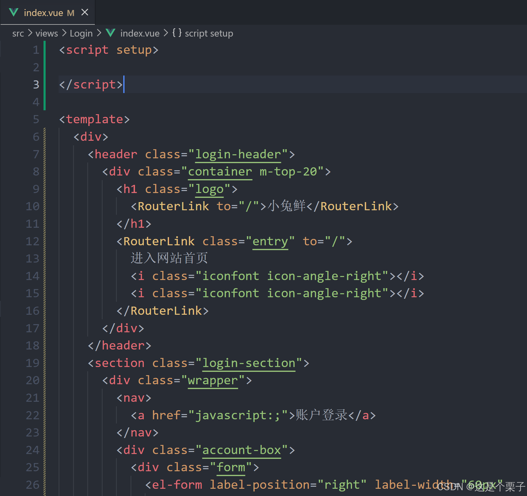
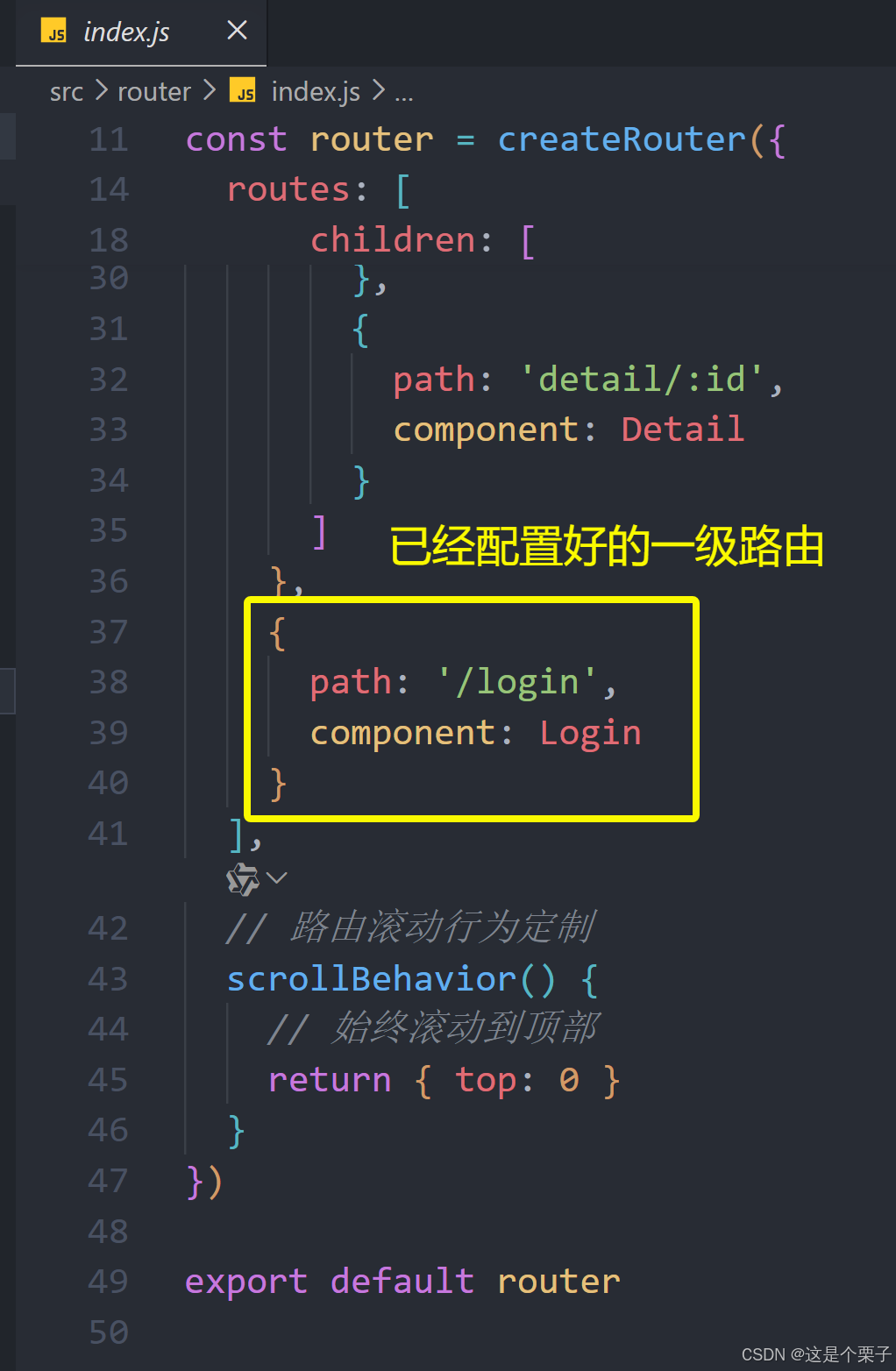
配置路由跳转:
提交代码:
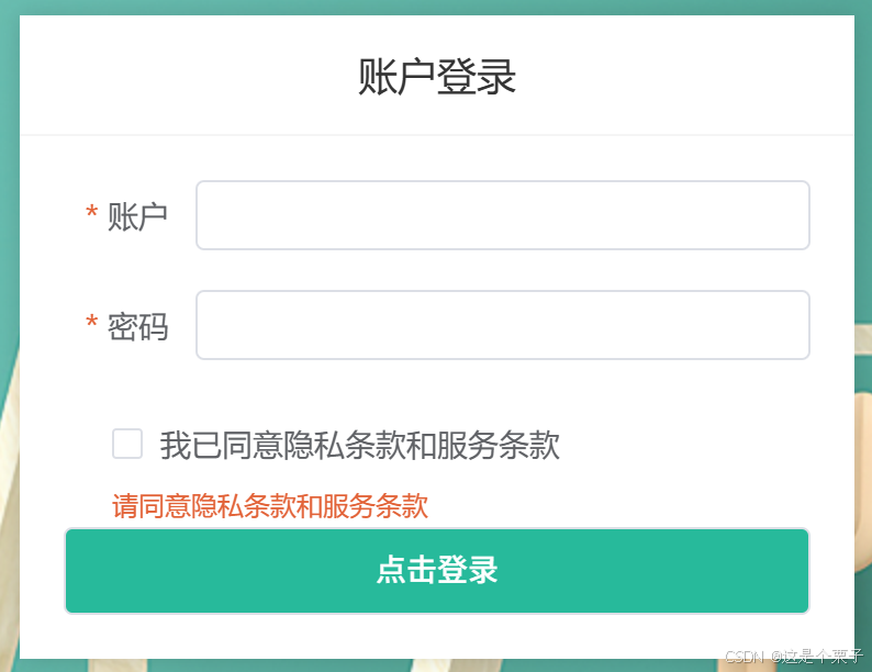
2. 表单校验实现
为什么需要校验
作用:前端提前校验可以省去一些错误的请求提交,为后端节省接口压力。
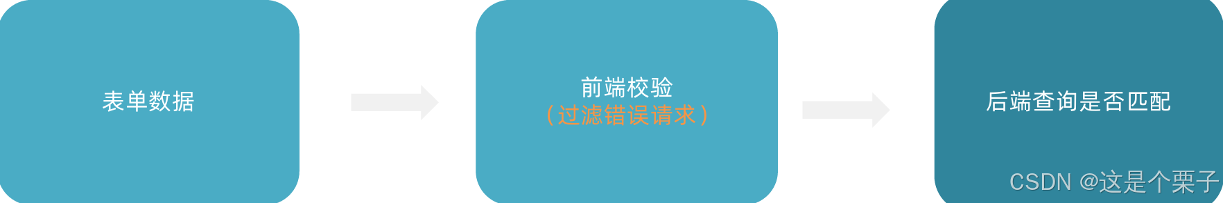
表单如何进行校验
ElementPlus表单组件内置了表单校验功能,只需要按照组件要求配置必要参数即可(直接看文档)。
思想:当功能很复杂时,通过多个组件各自负责某个小功能,再组合成一个大功能是组件设计中的常用方法。
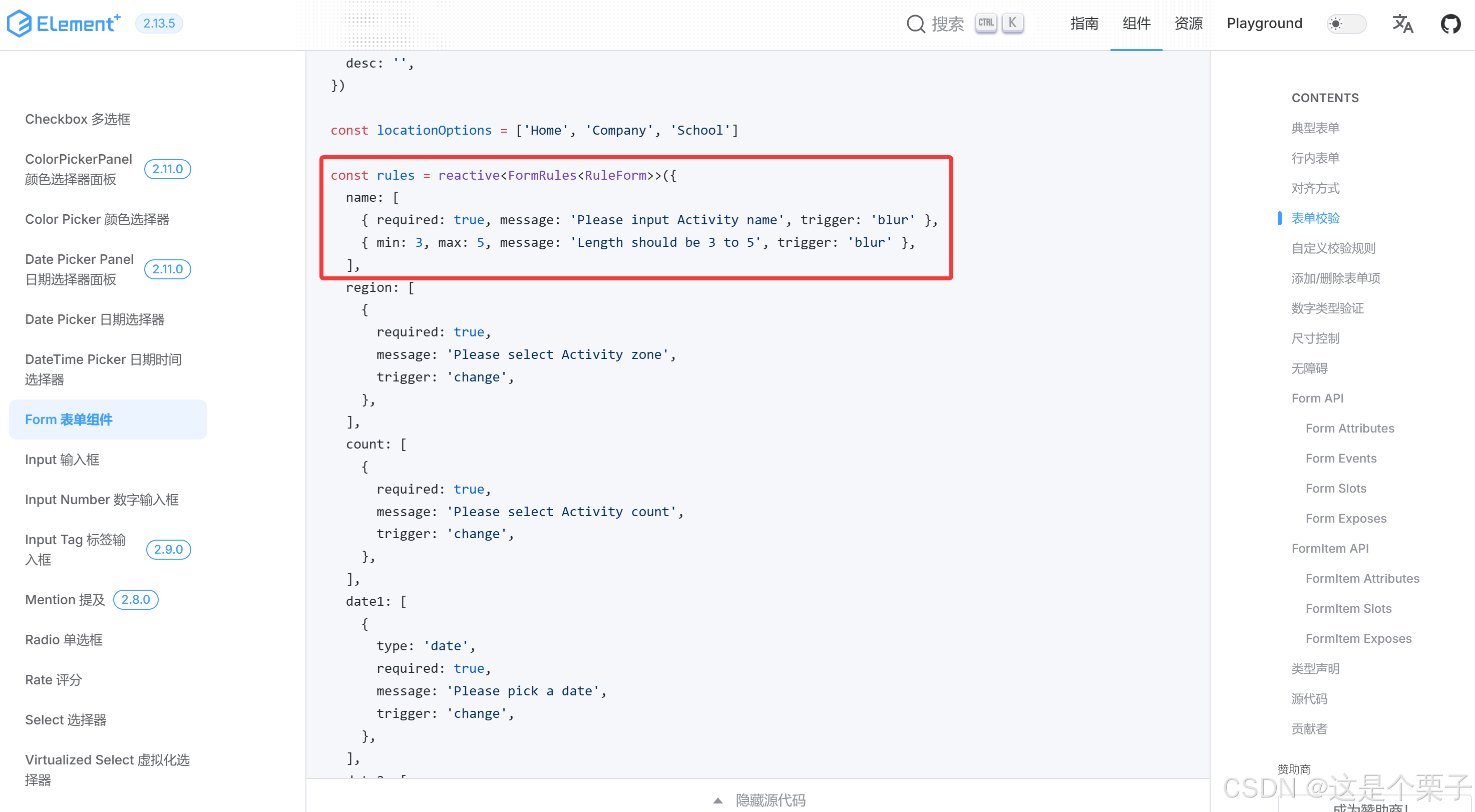
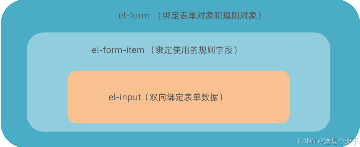
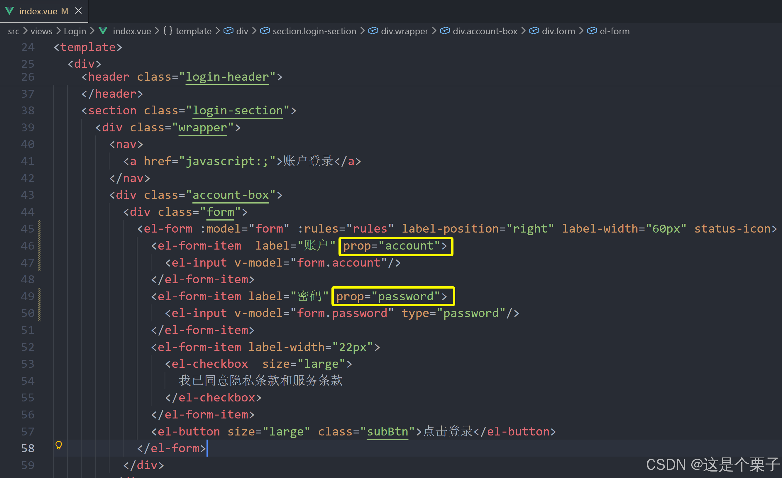
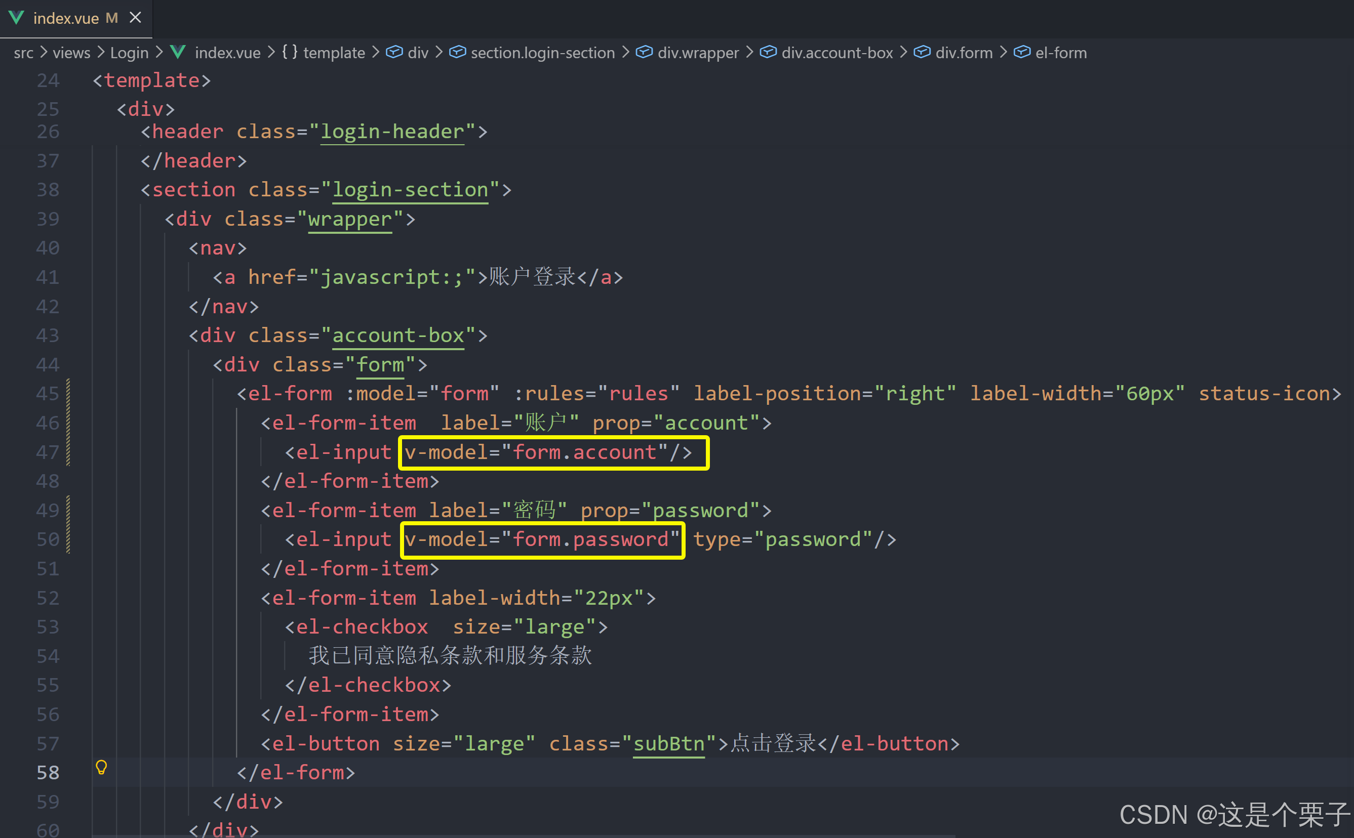
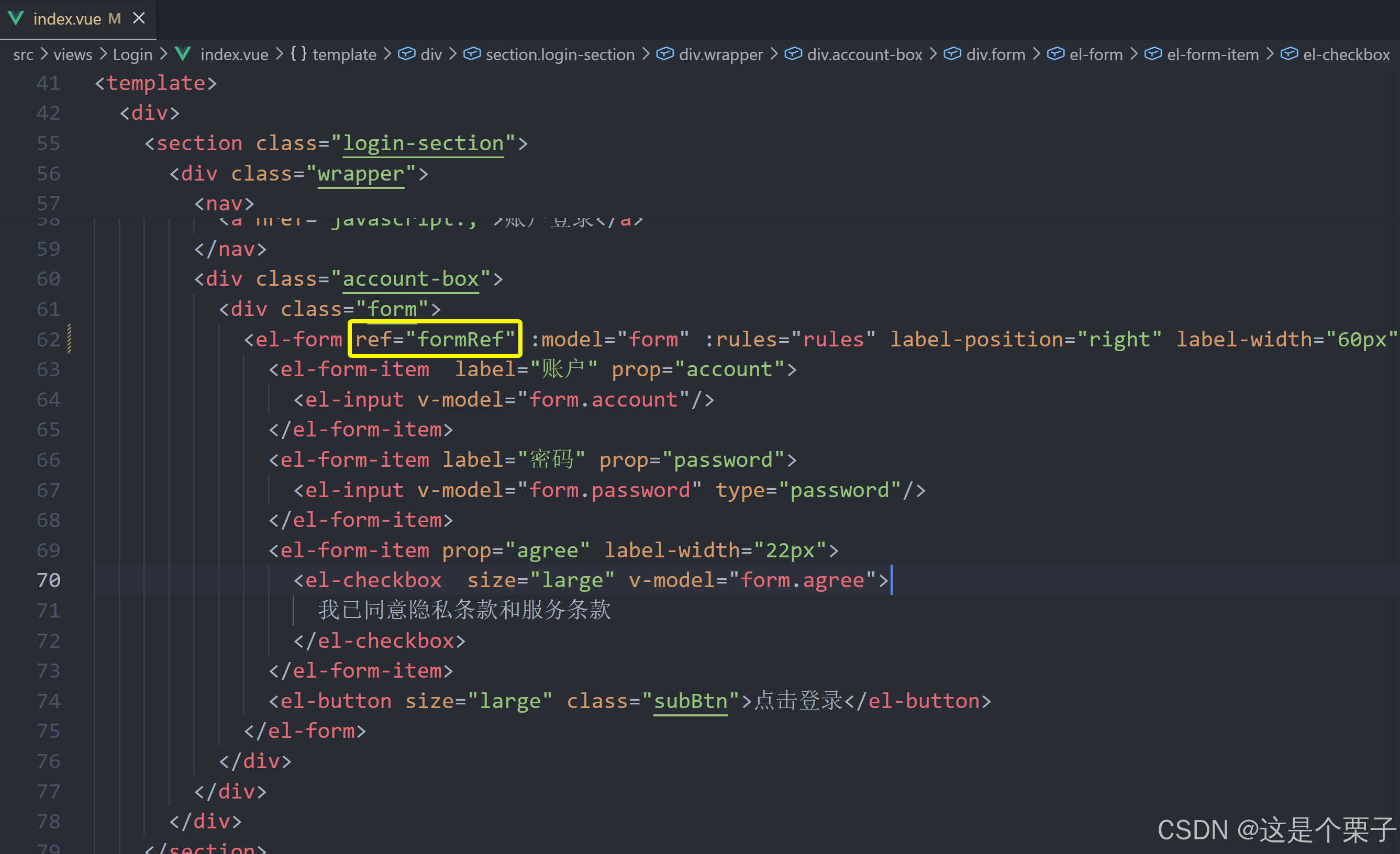
表单校验步骤
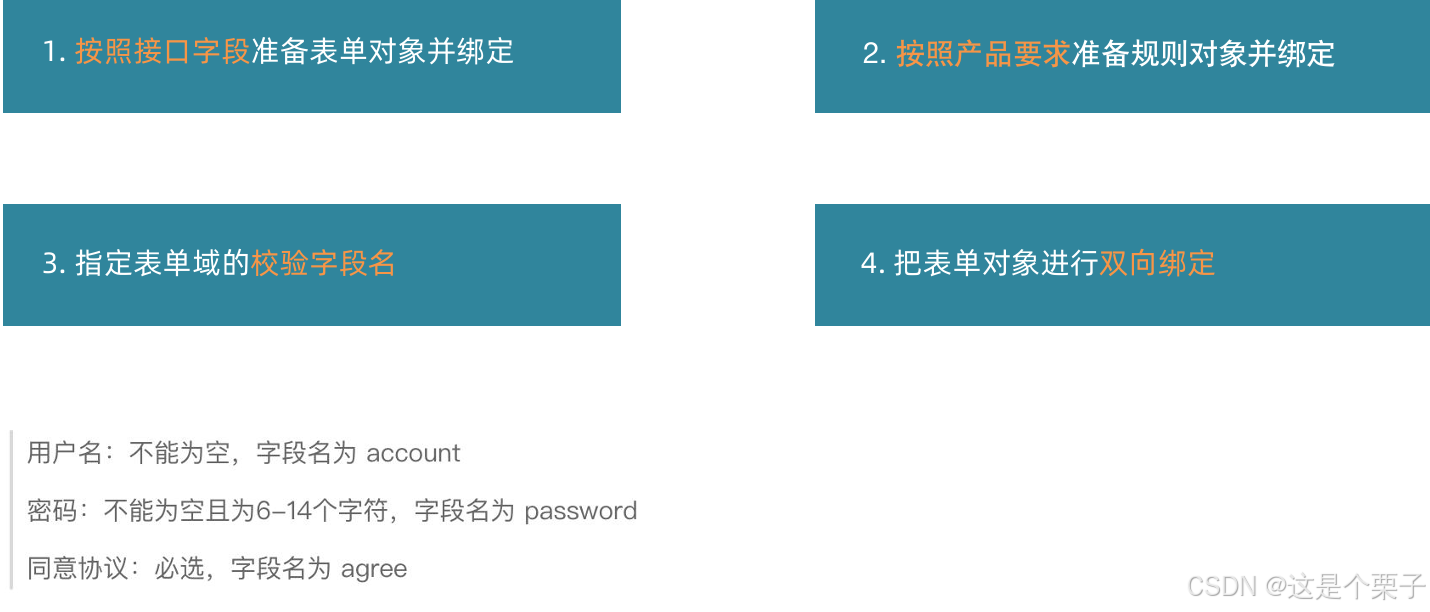
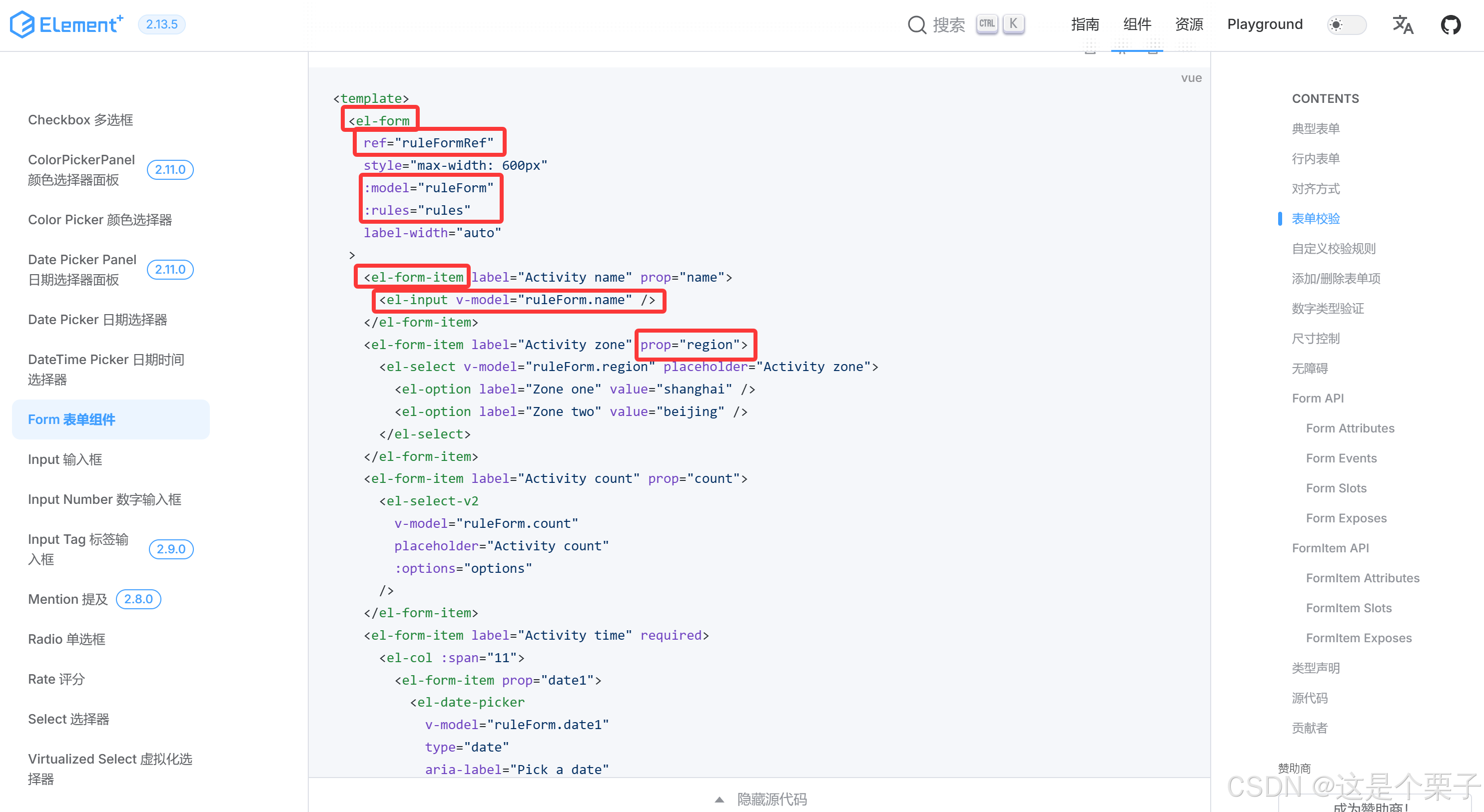
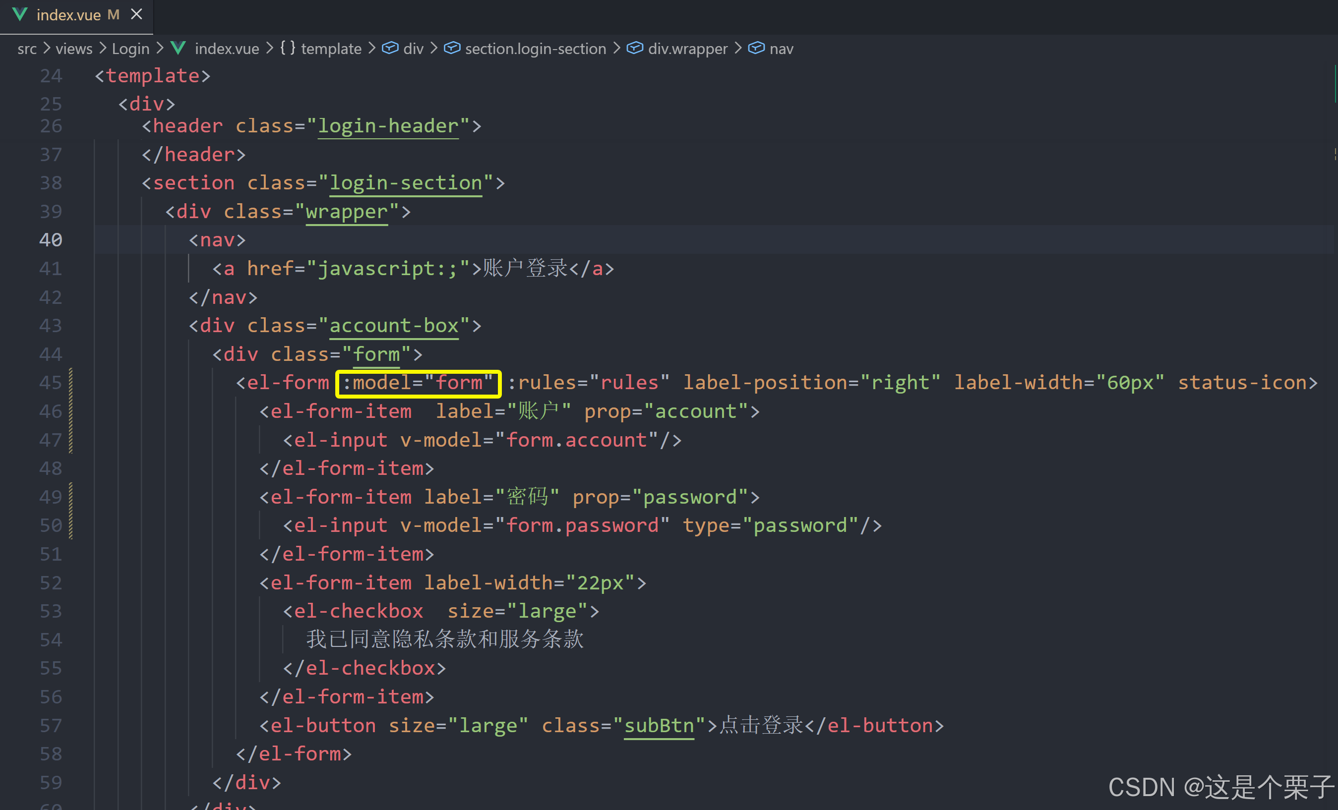
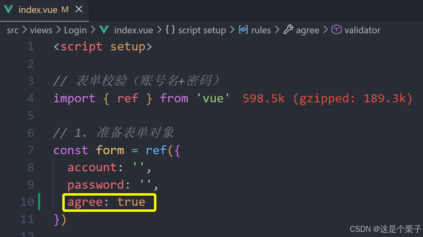
(1) 按照接口字段准备表单对象并绑定
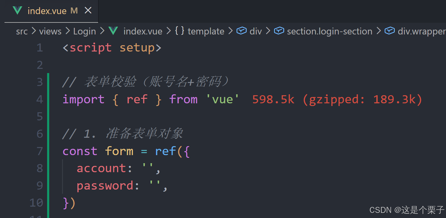
(2) 按照产品要求准备规则对象并绑定
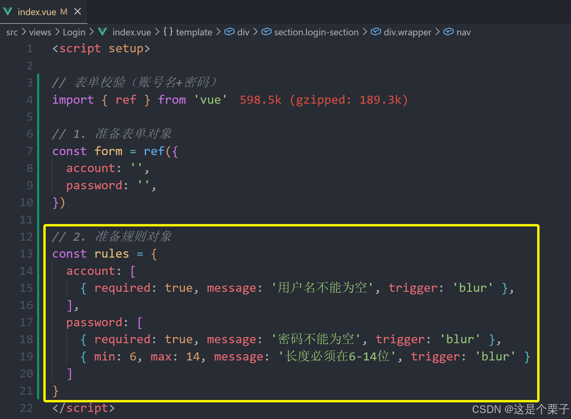
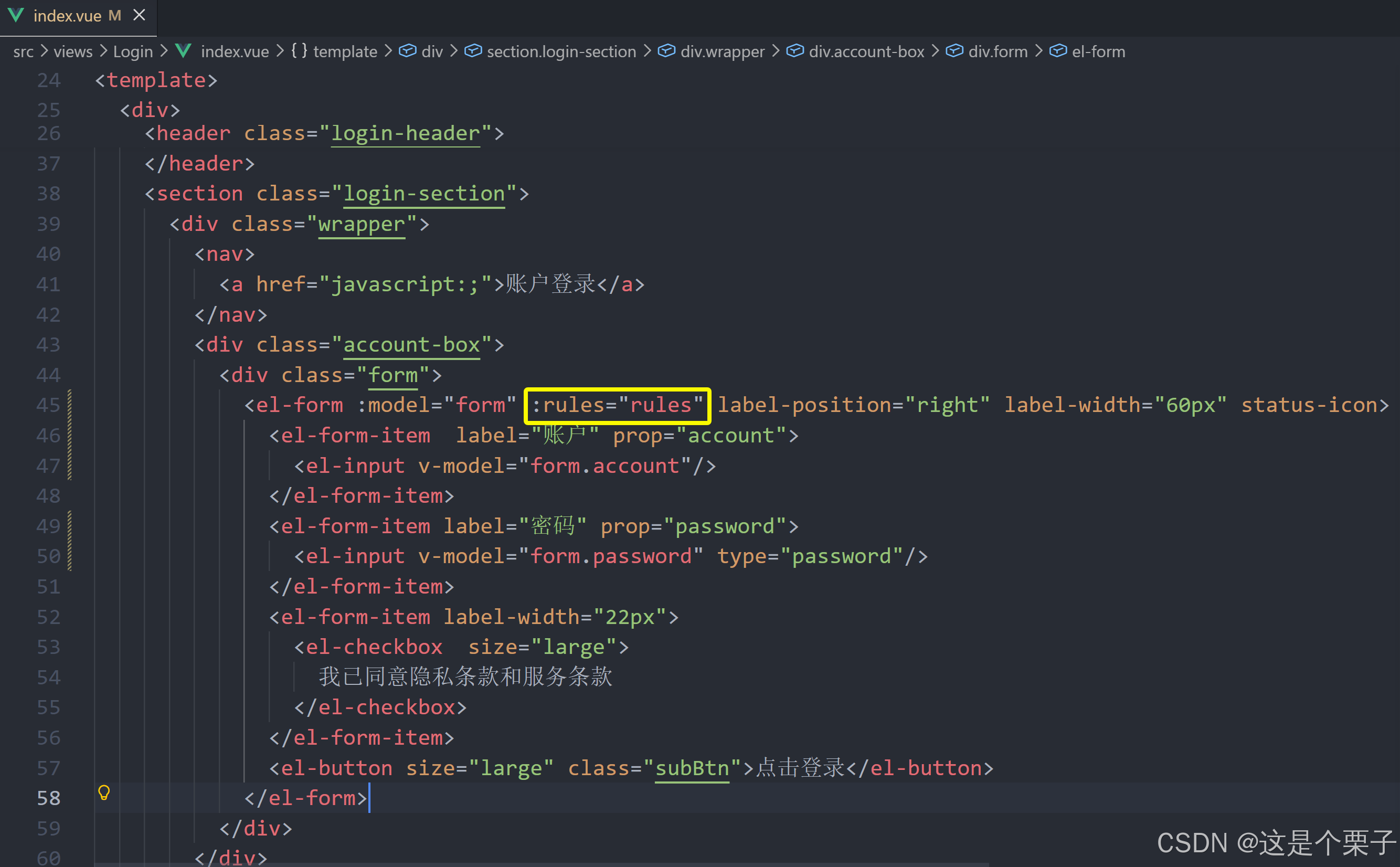
(3) 指定表单域的校验字段名
(4) 把表单对象进行双向绑定
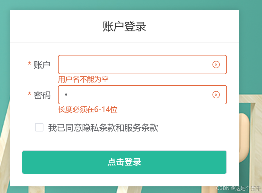
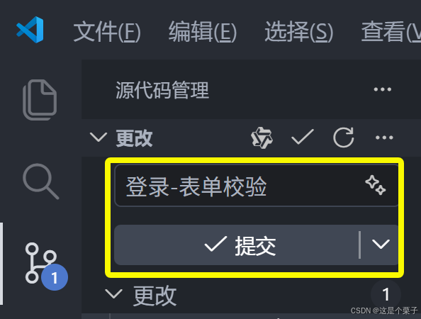
提交代码:
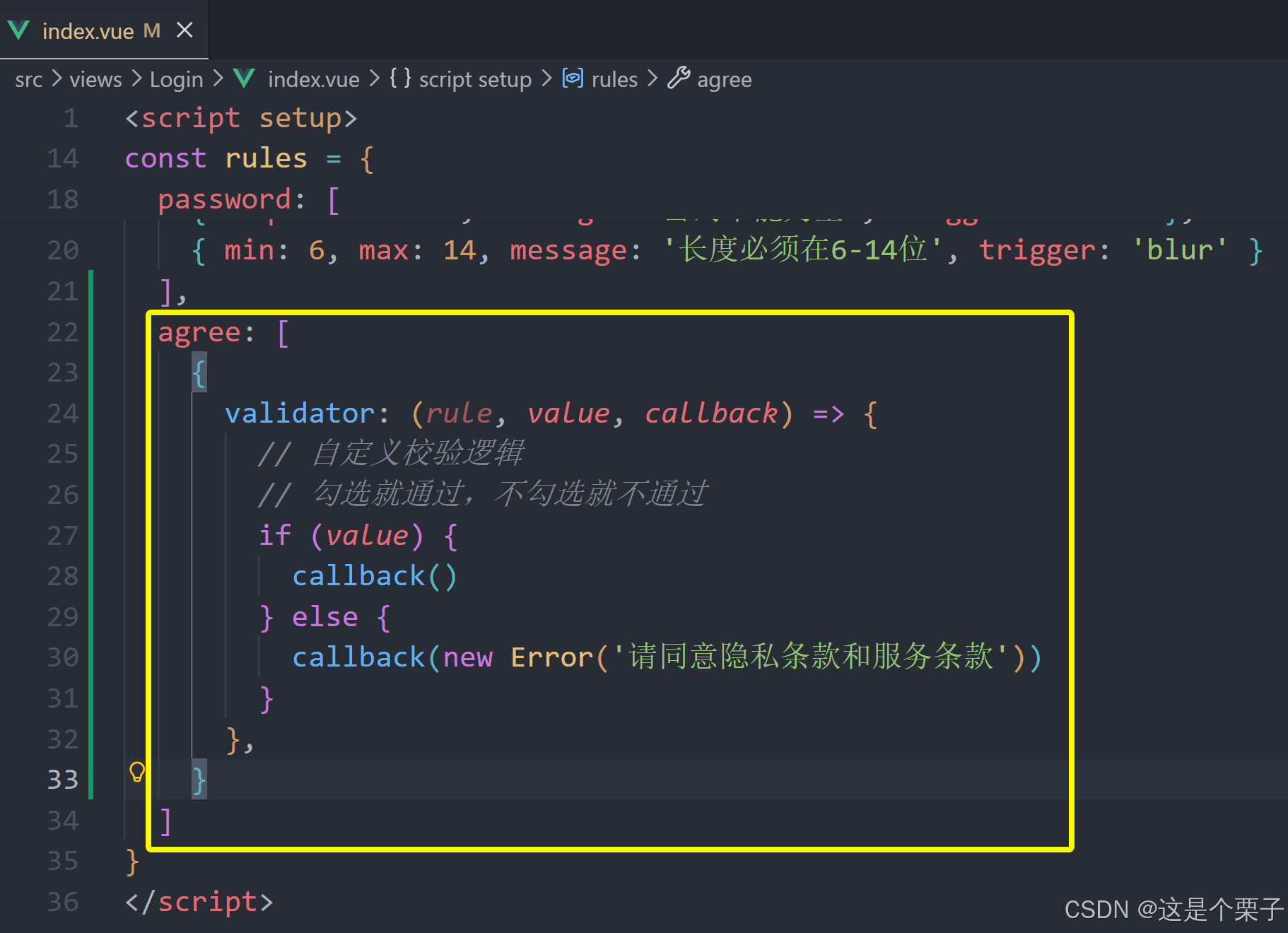
自定义校验规则
ElementPlus表单组件内置了初始的校验配置,应付简单的校验只需要通过配置即可,如果想要定制一些特殊的校验需求,可以使用自定义校验规则,格式如下:
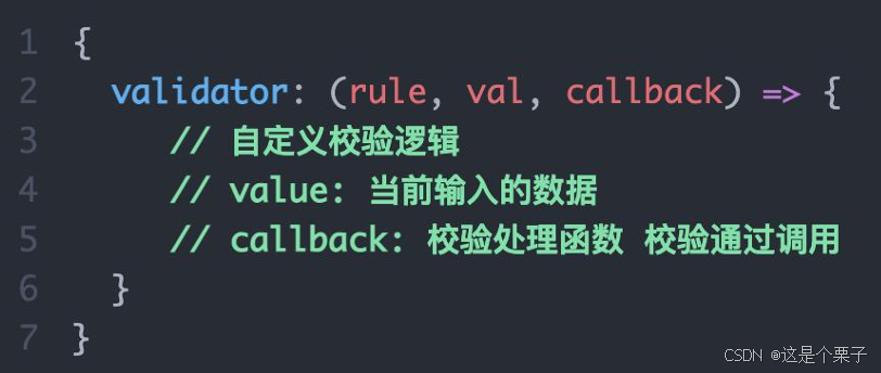
校验逻辑:如果勾选了协议框,通过校验,如果没有勾选,不通过校验。
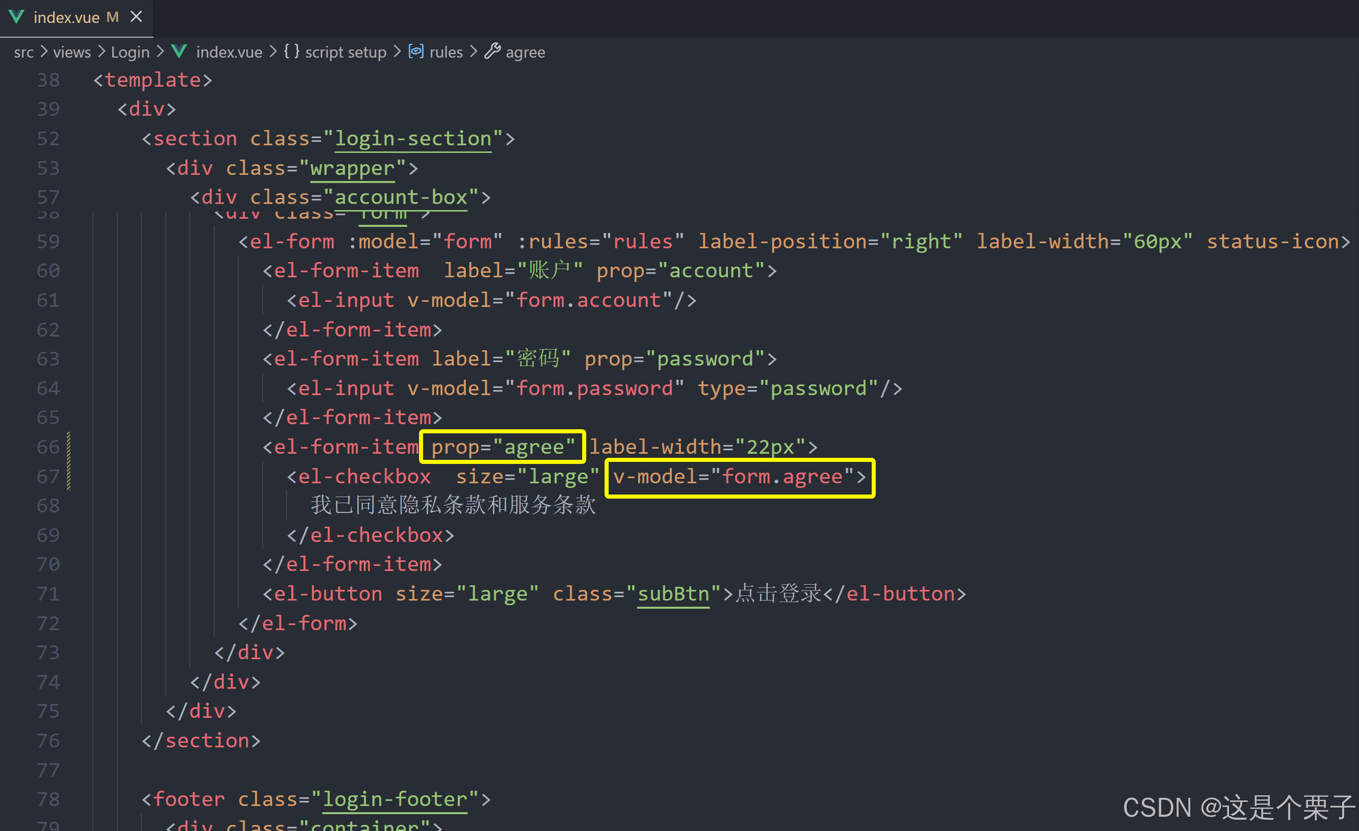
提交代码:
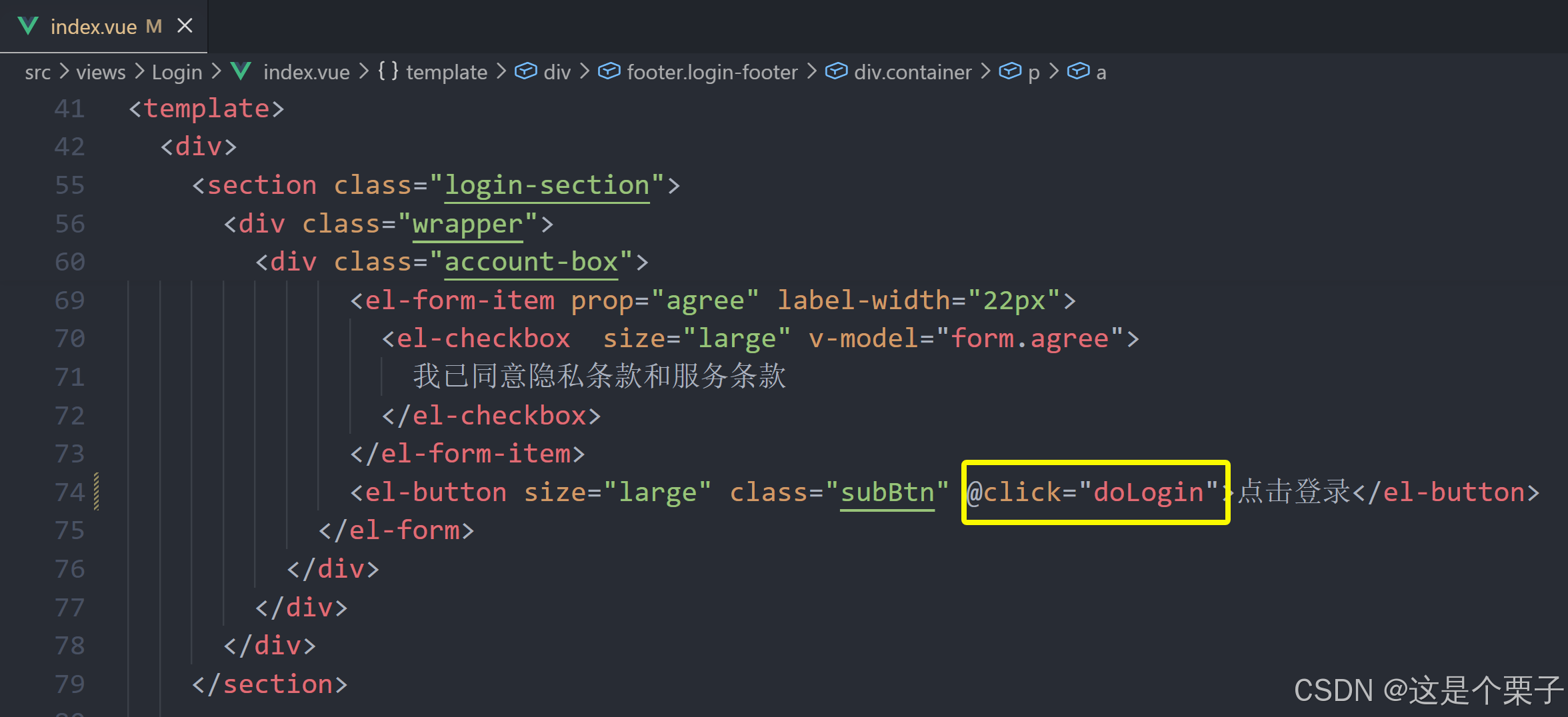
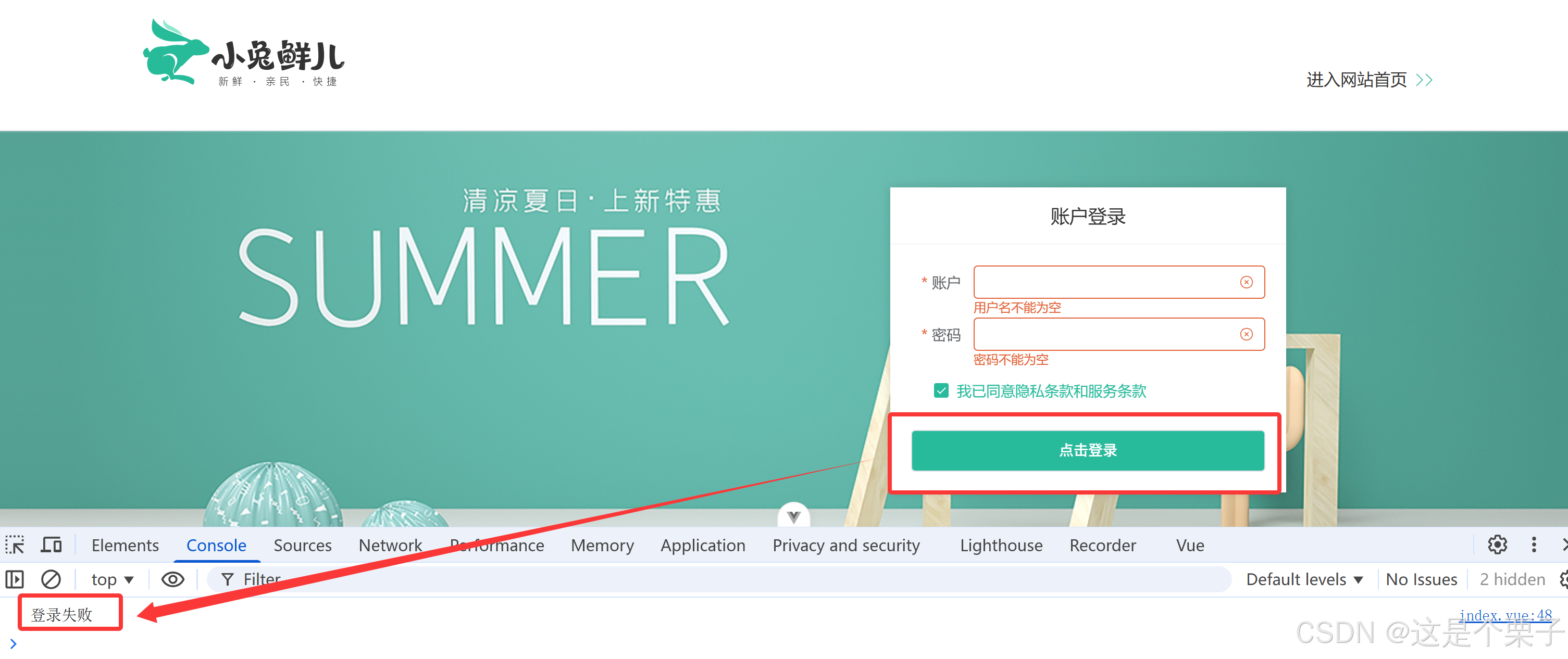
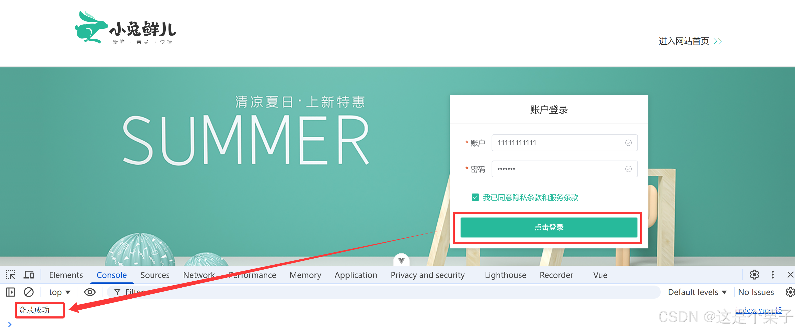
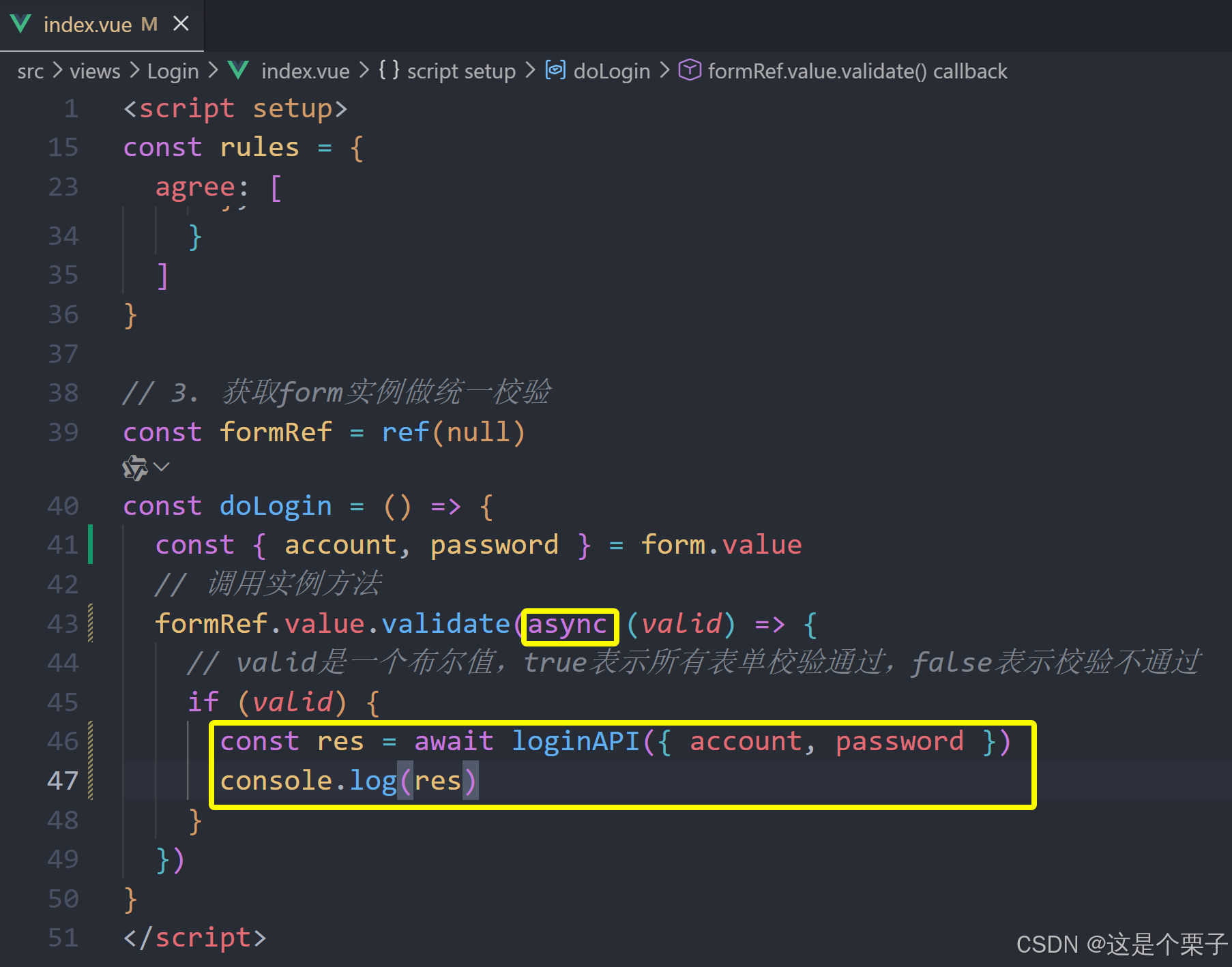
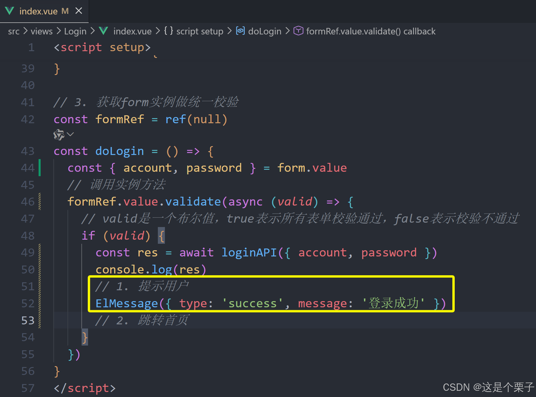
整个表单的内容验证
思考:每个表单域都有自己的校验触发事件,如果用户一上来就点击登录怎么办呢?
答:在点击登录时需要对所有需要校验的表单进行统一校验。
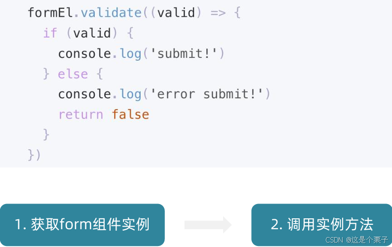
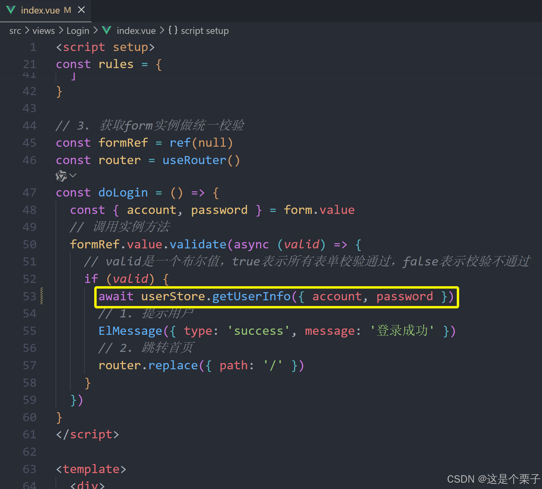
(1) 获取form组件实例
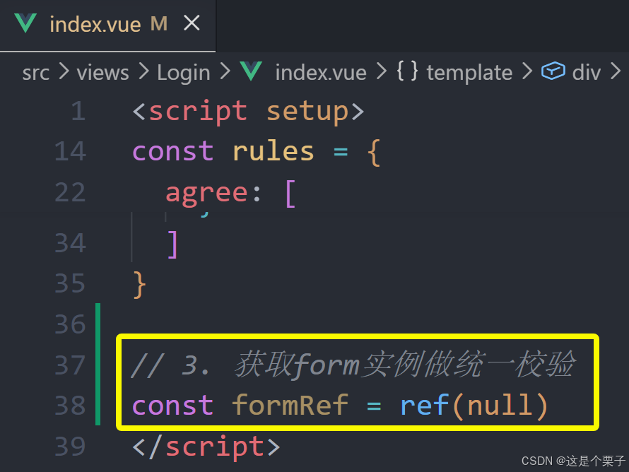
(2) 调用实例方法
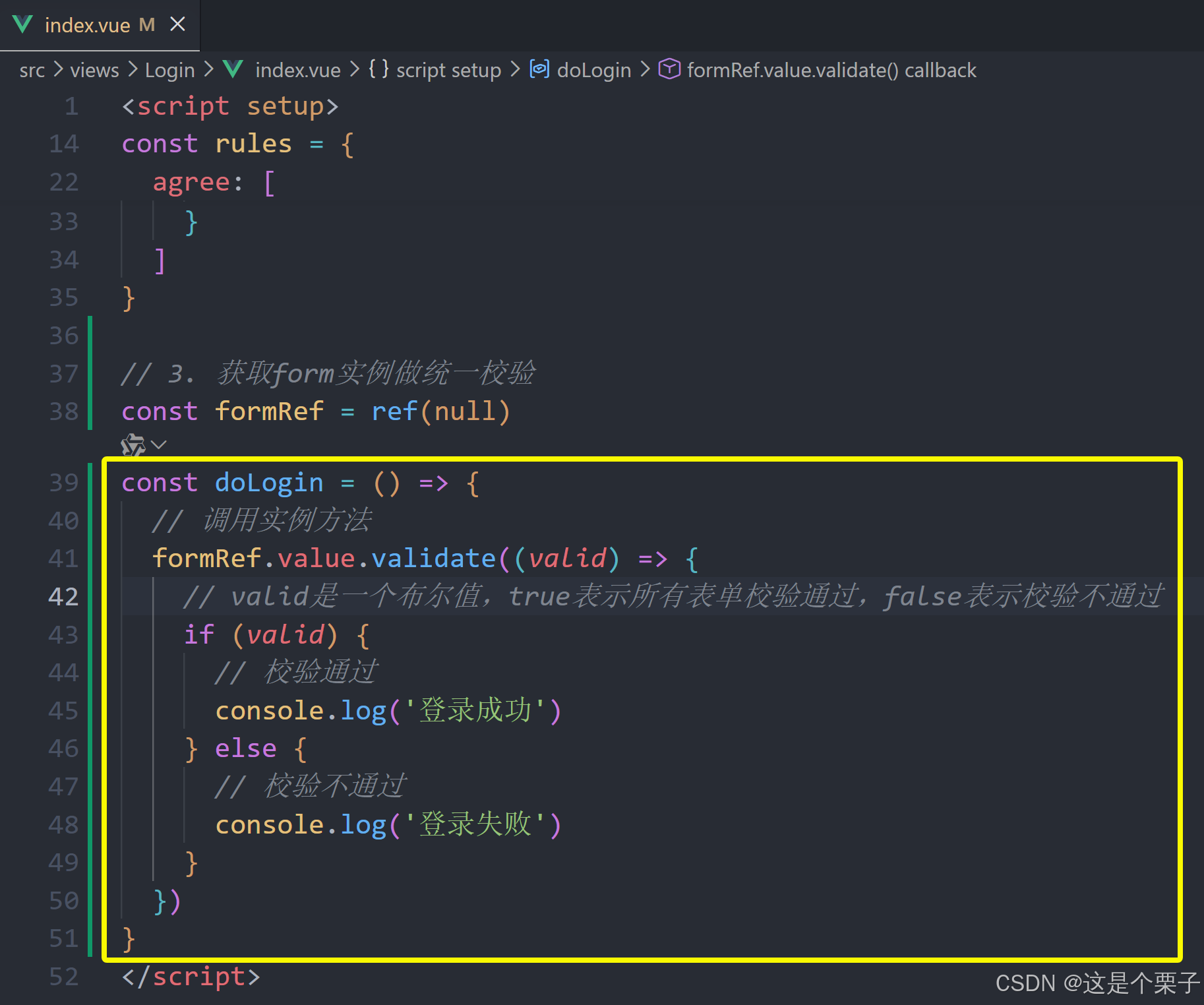
提交代码:
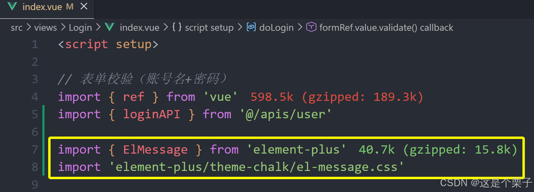
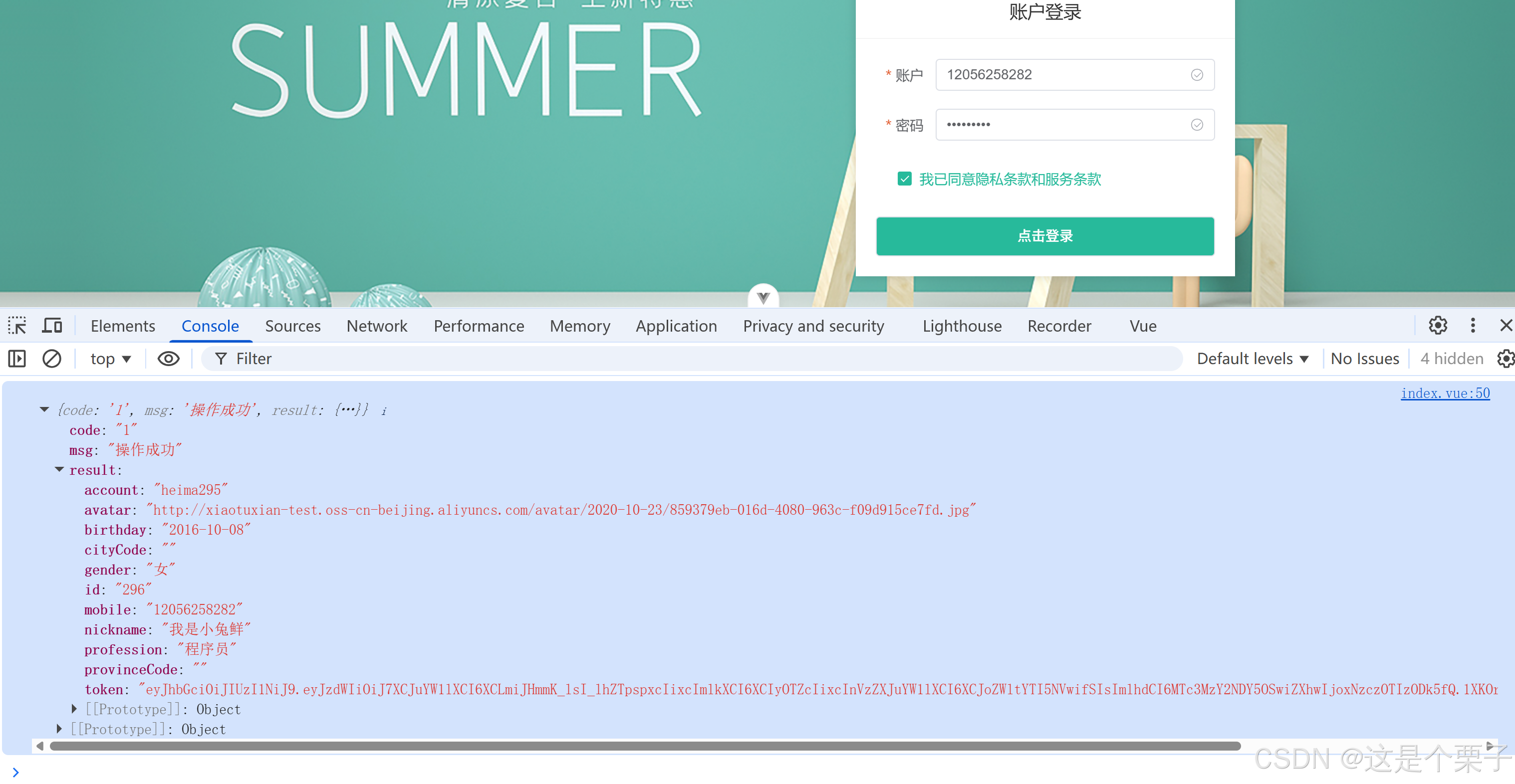
基础登录业务实现
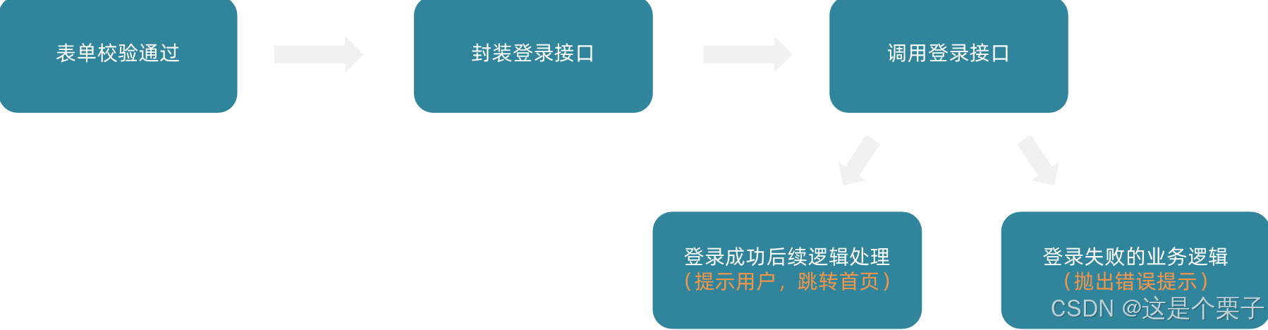
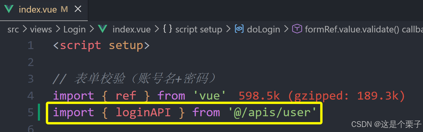
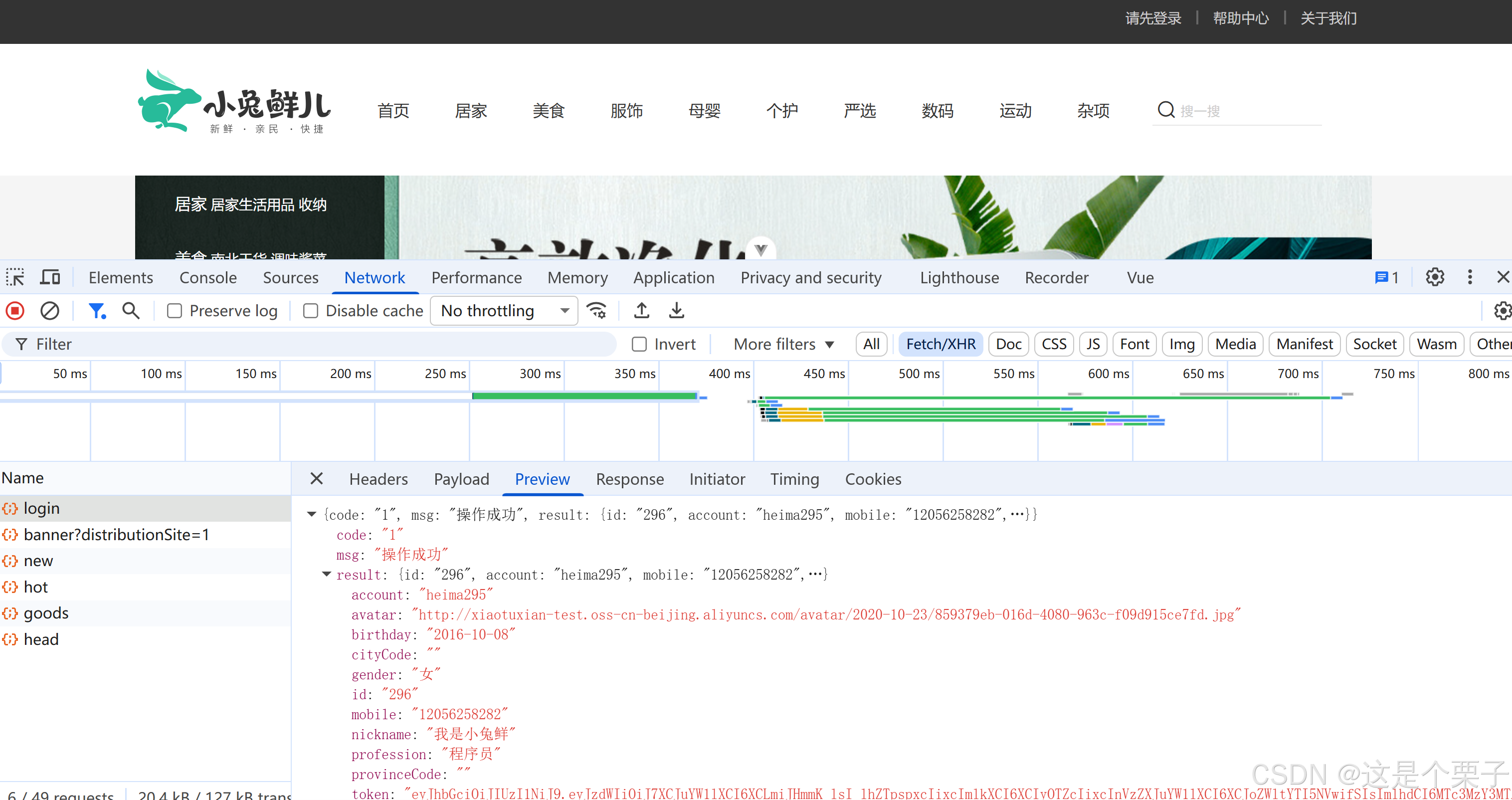
(1) 封装接口
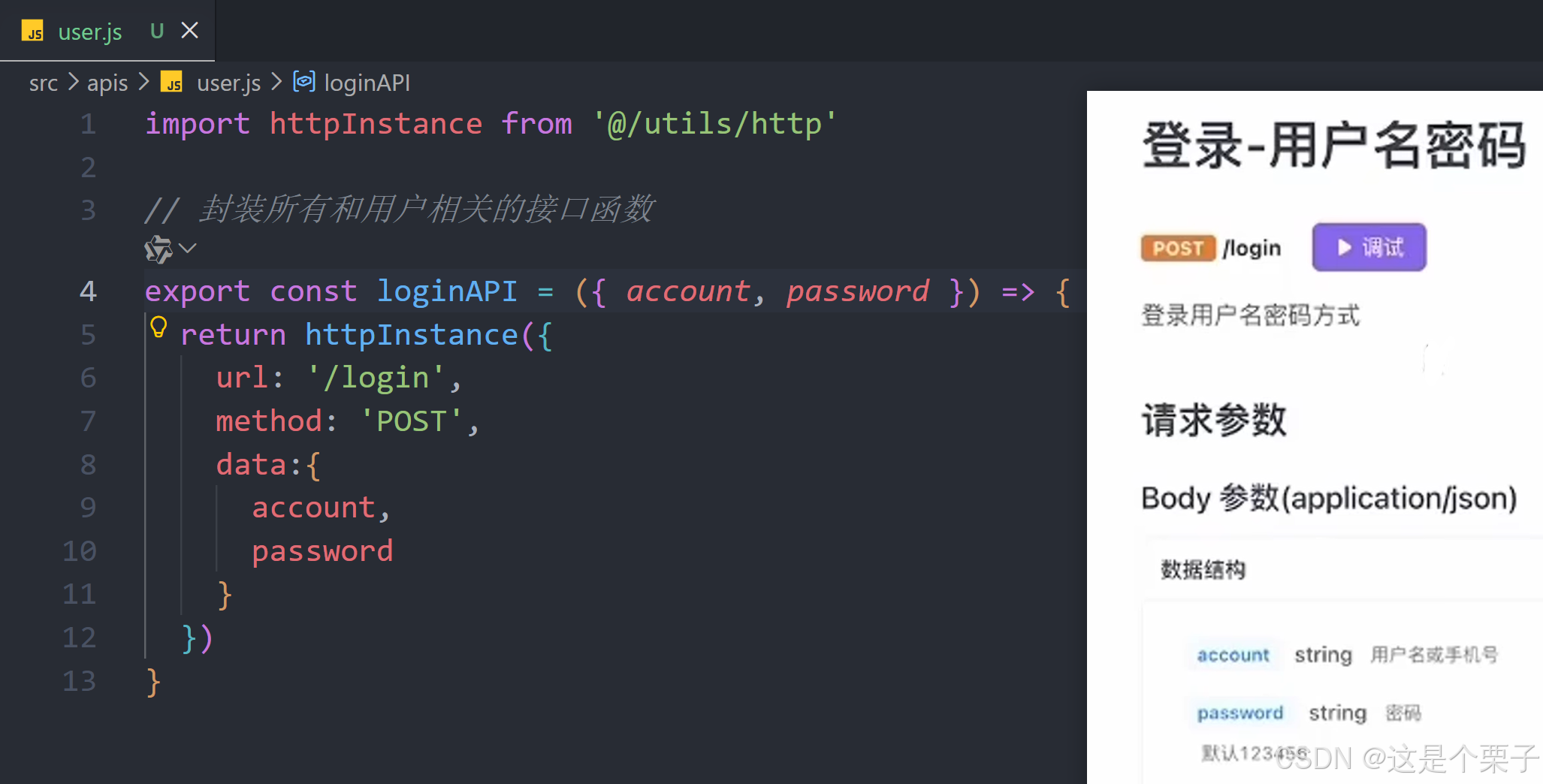
(2) 调用登录接口
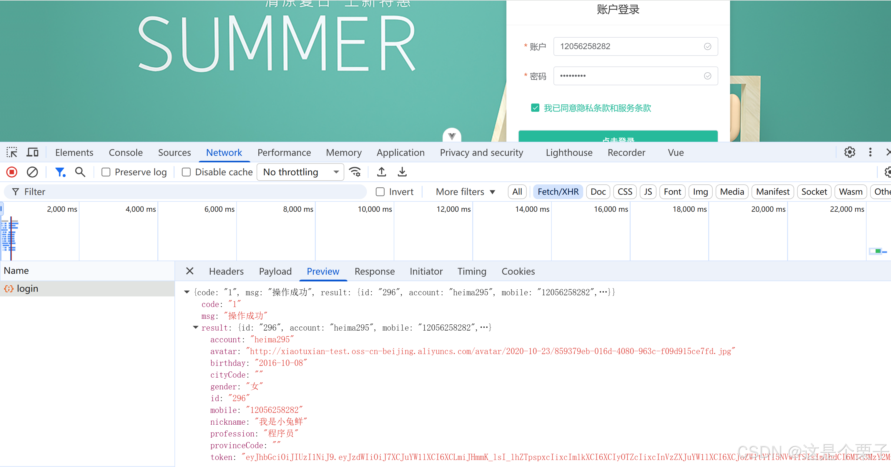
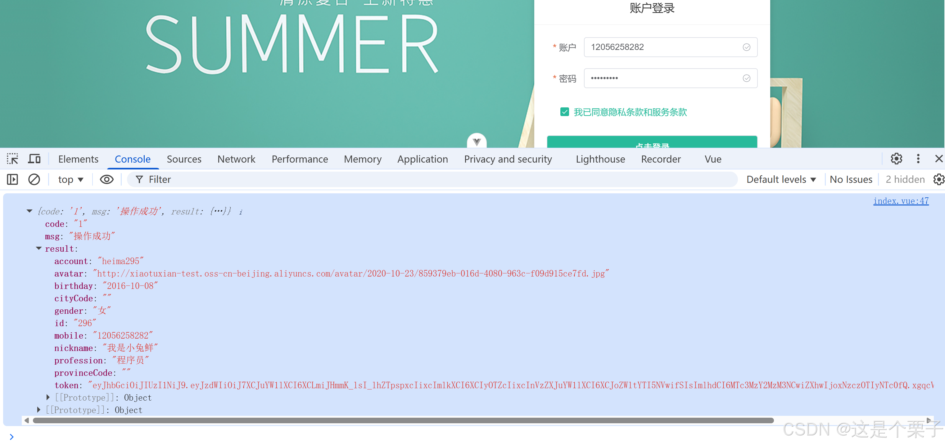
(3) 登录成功后续逻辑处理
(4) 登录失败的业务逻辑
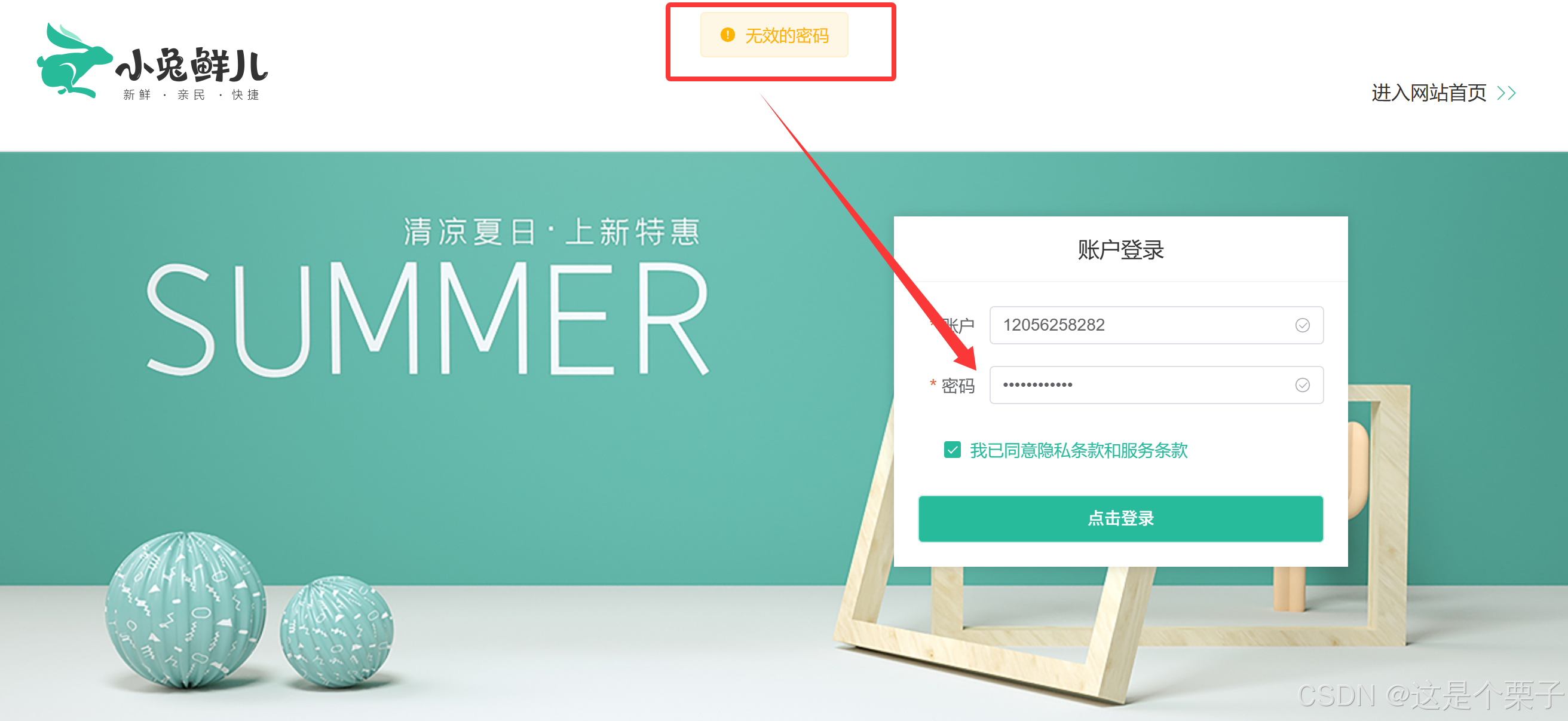
提交代码:
3. Pinia管理用户数据
为什么要用Pinia管理数据
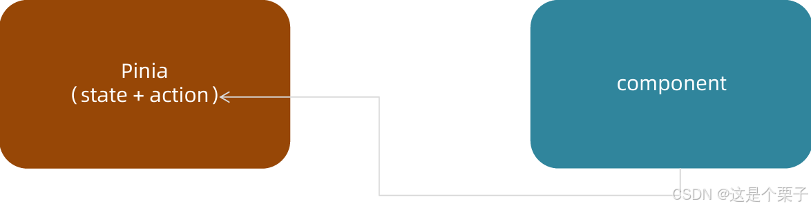
由于用户数据的特殊性,在很多组件中都有可能进行共享,共享的数据使用Pinia管理会更加方便。
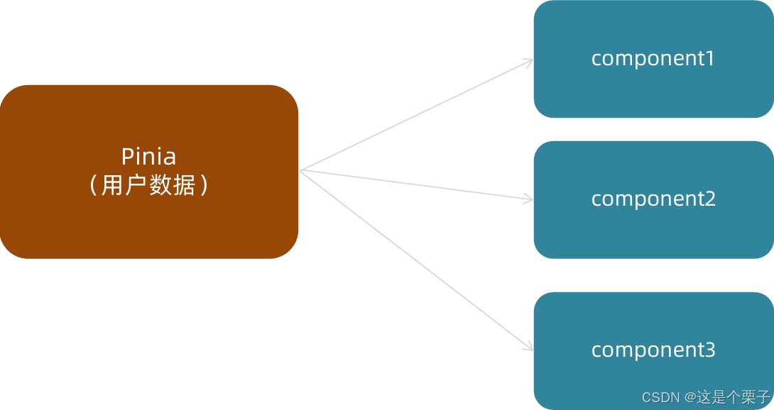
如何使用Pinia管理数据
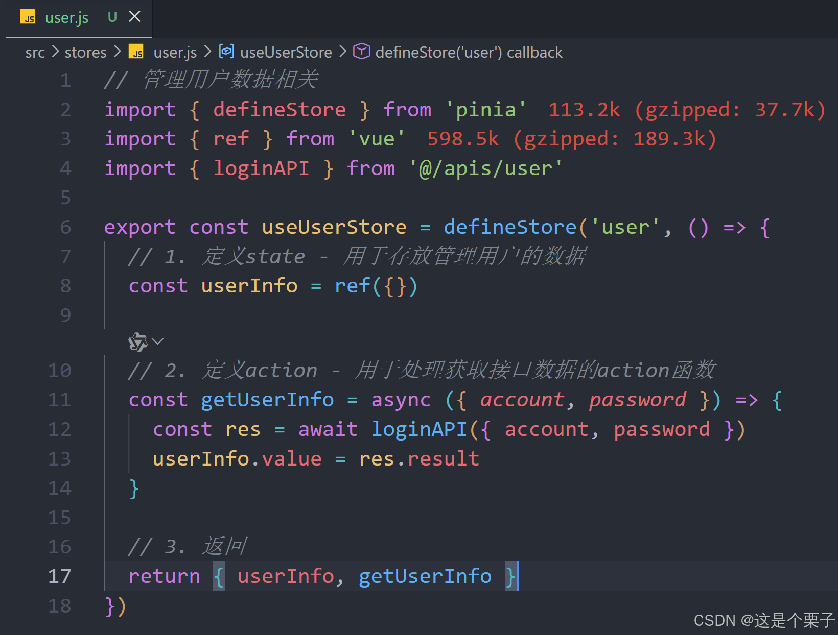
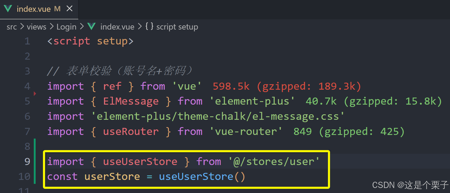
遵循理念:和数据相关的所有操作(state+action)都放到Pinia中,组件只负责触发action函数。
关键代码总结
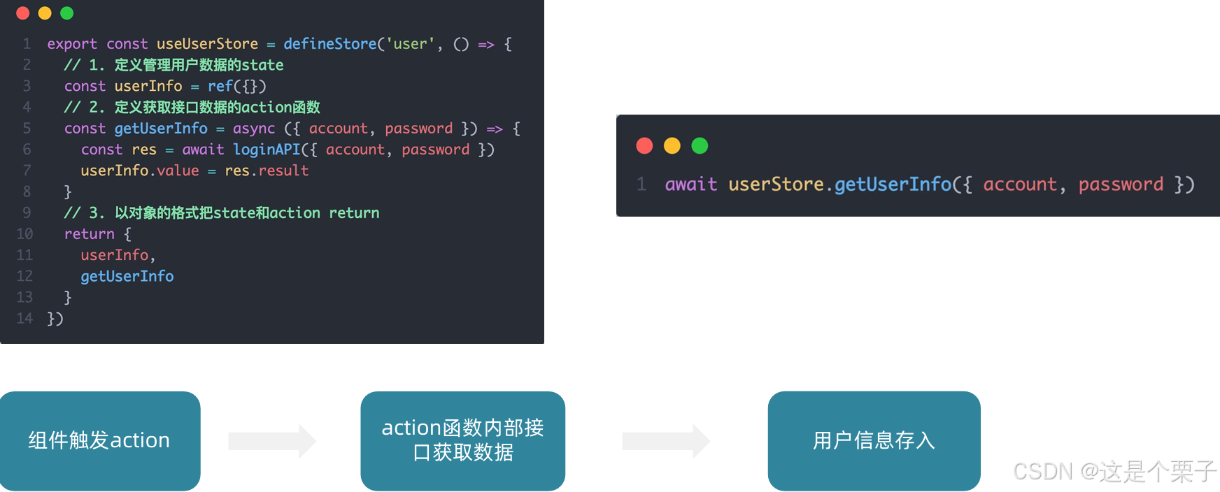
基本思想:Pinia负责用户数据相关的state和action,组件中只负责触发action函数并传递参数。
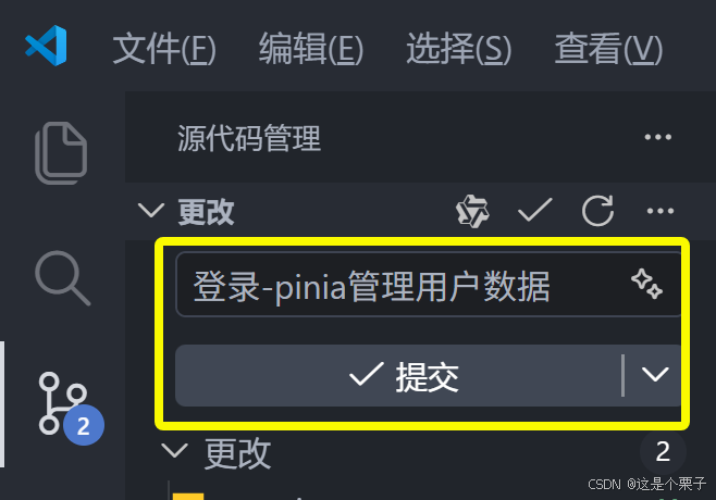
提交代码:
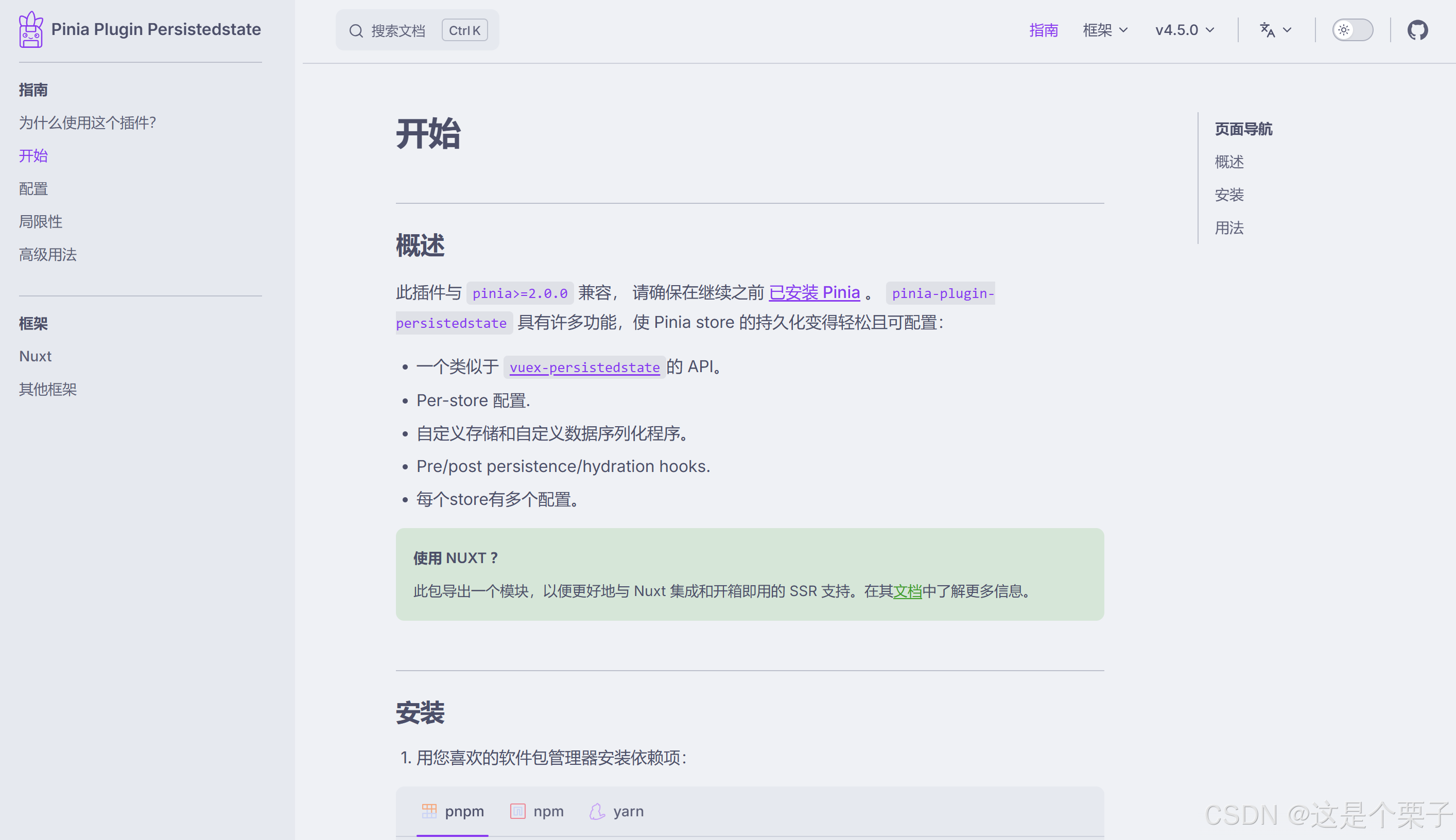
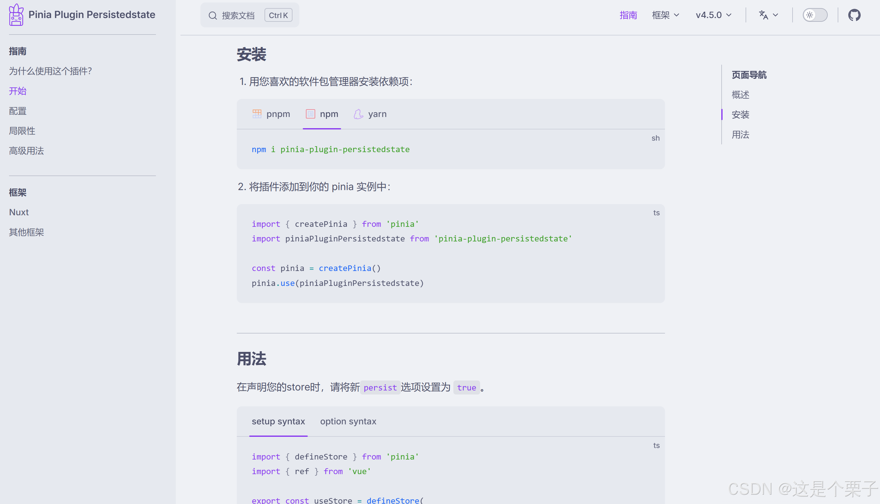
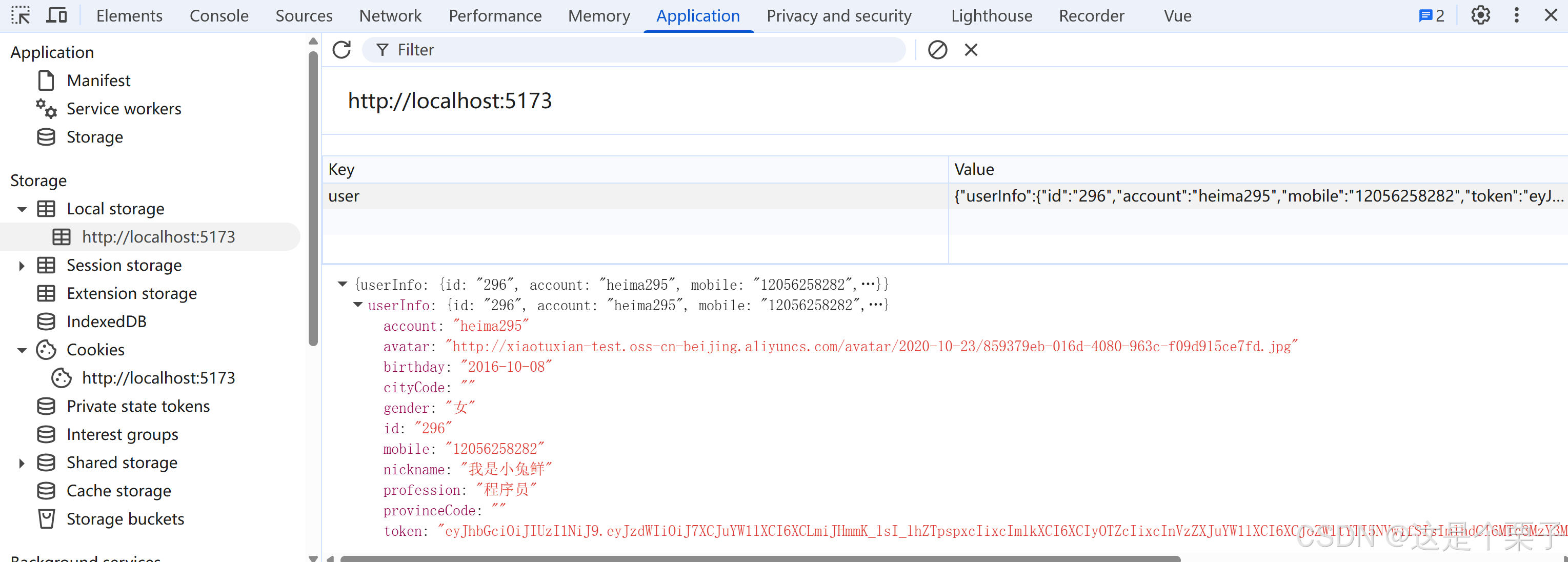
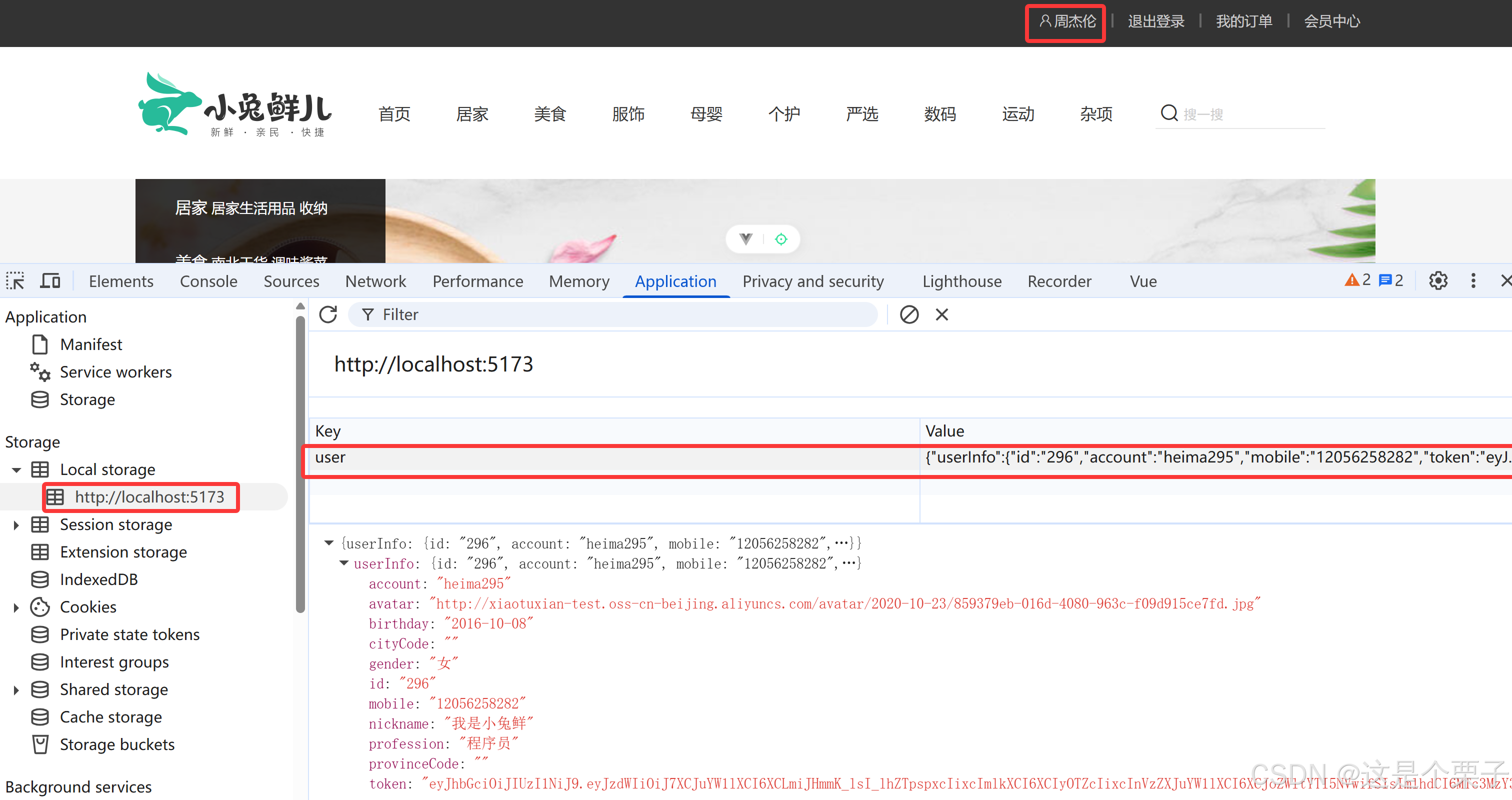
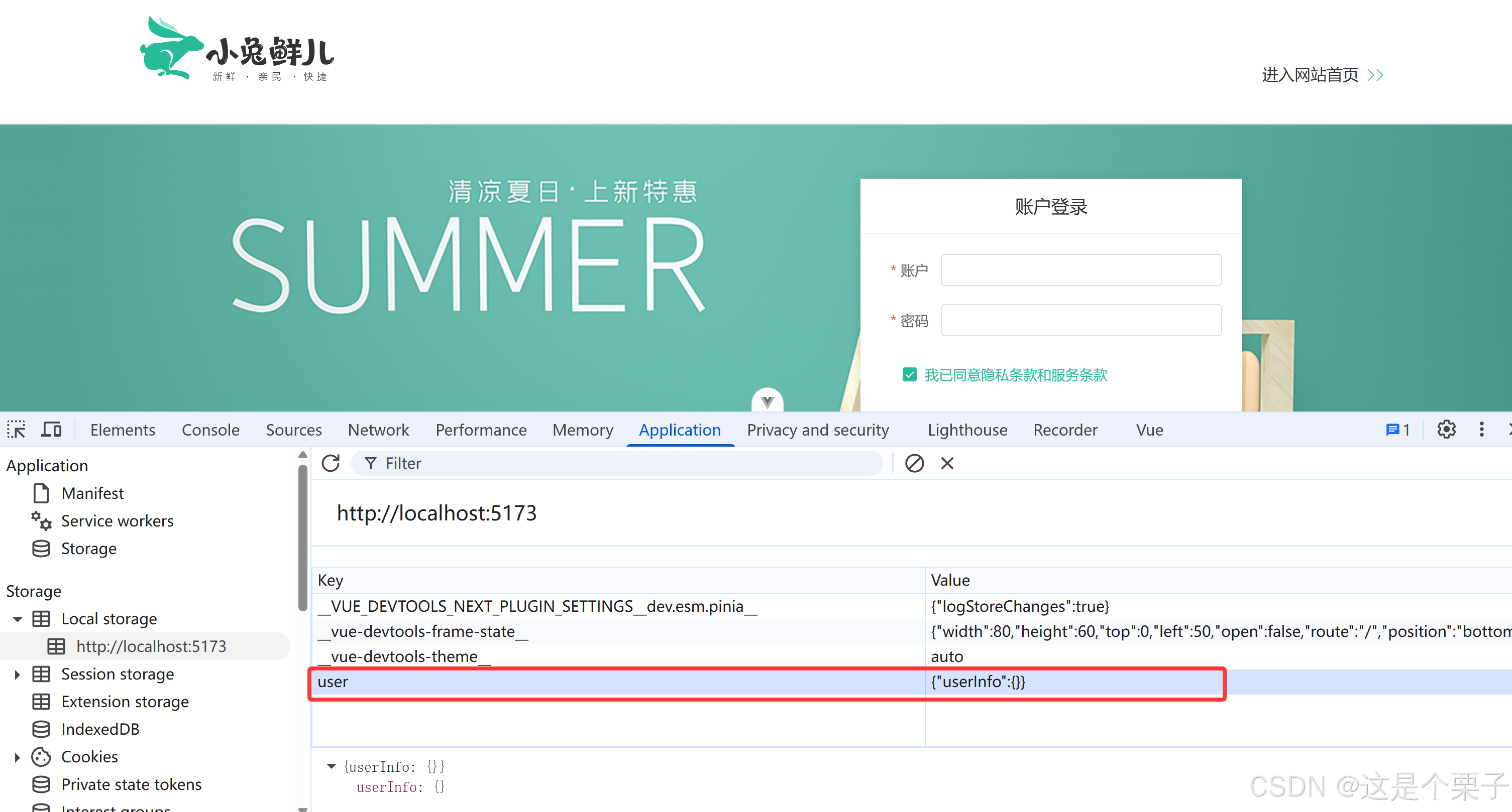
4. Pinia用户数据持久化
持久化用户数据说明
- 用户数据中有一个关键的数据叫做Token(用来标识当前用户是否登录),而Token持续一段时间才会过期。
- Pinia的存储是基于内存的,刷新就丢失,为了保持登录状态就要做到刷新不丢失,需要配合持久化进行存储。
目的:保持token不丢失,保持登录状态。
最终效果:操作state时会自动把用户数据在本地的localstorage也存一份,刷新的时候会从localstorage中先取。

关键步骤总结和插件运行机制
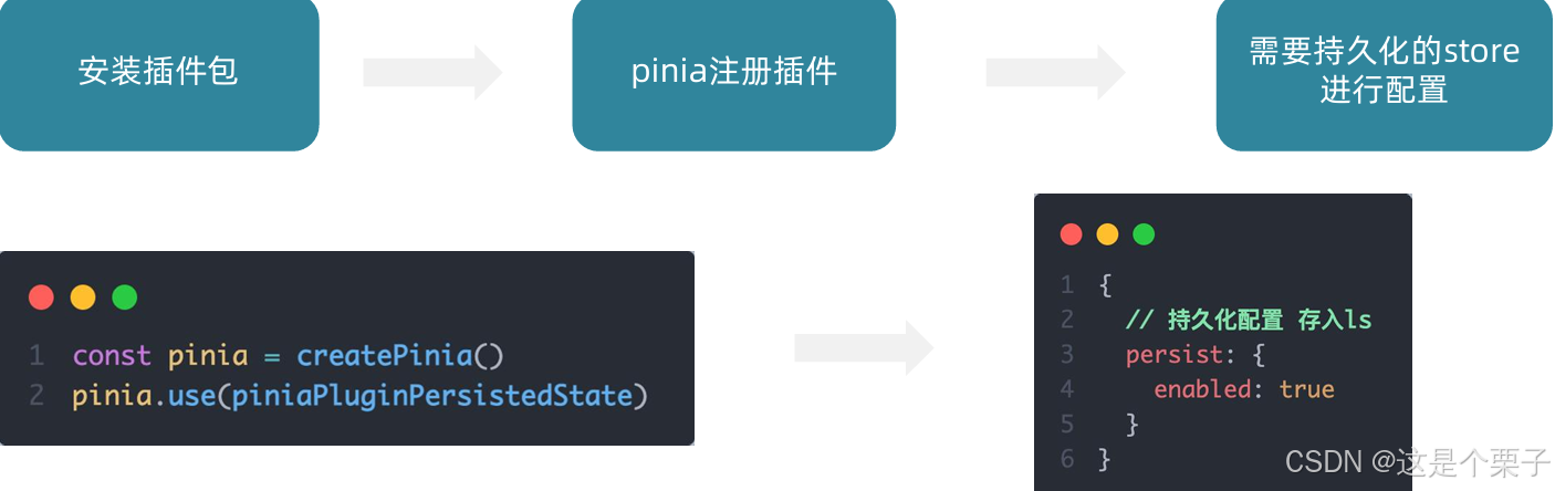
运行机制:在设置state的时候会自动把数据同步给localStorage,在获取state数据的时候会优先从localStorage中取。
(1) 安装插件包
bash
npm i pinia-plugin-persistedstate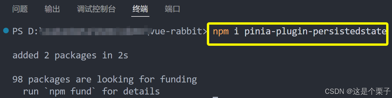
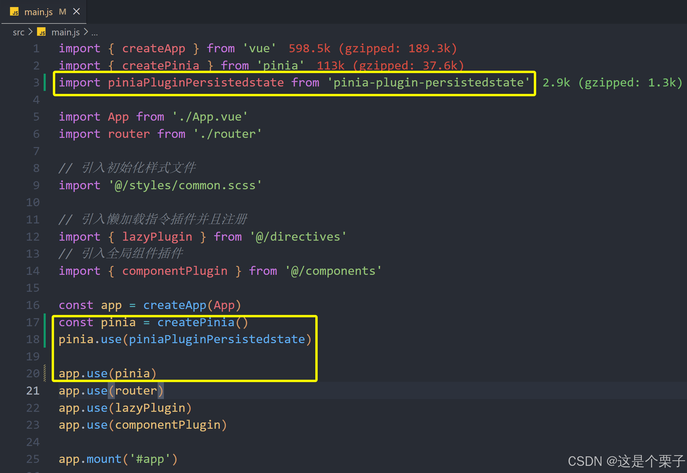
(2) pinia注册插件
(3) 需要持久化的store进行配置
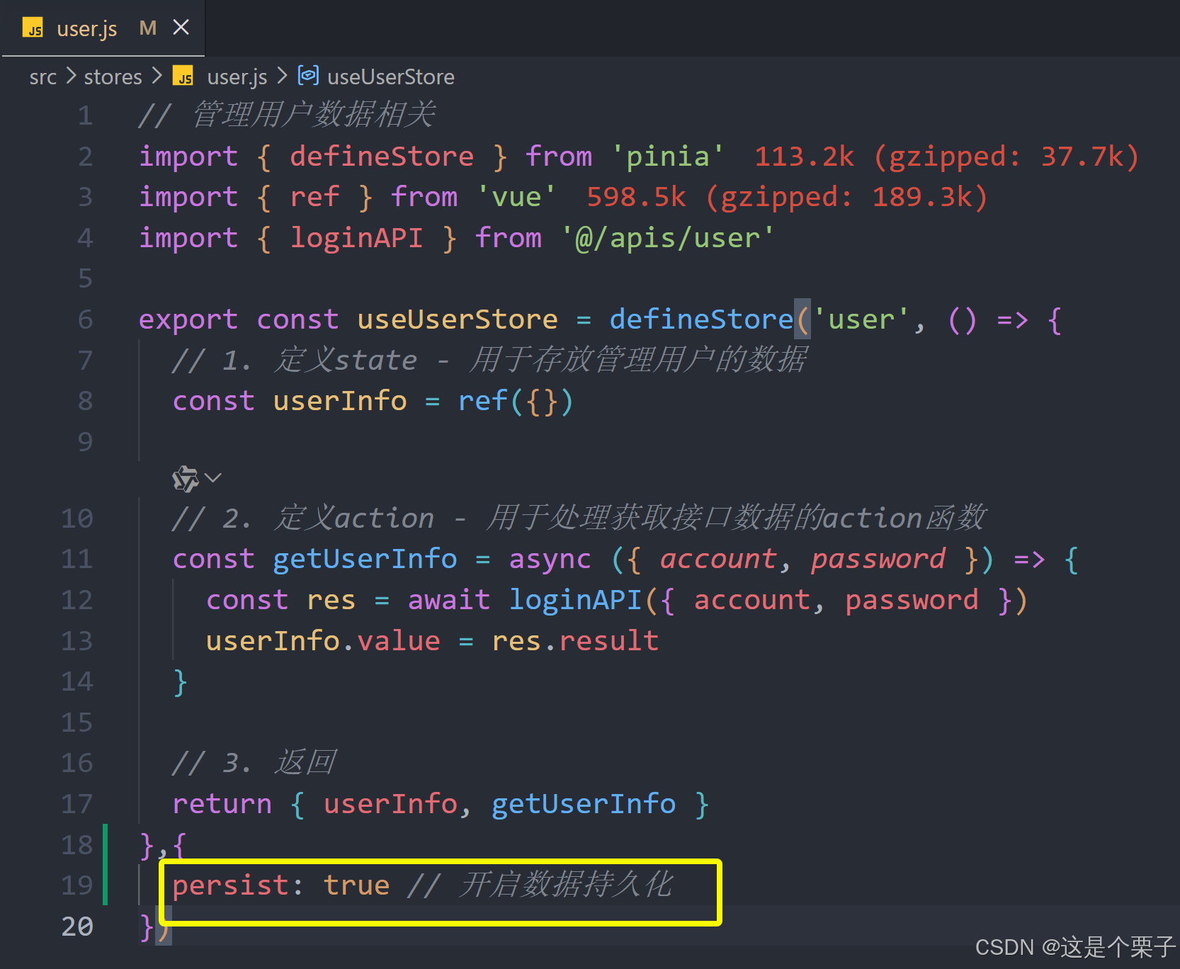
提交代码:
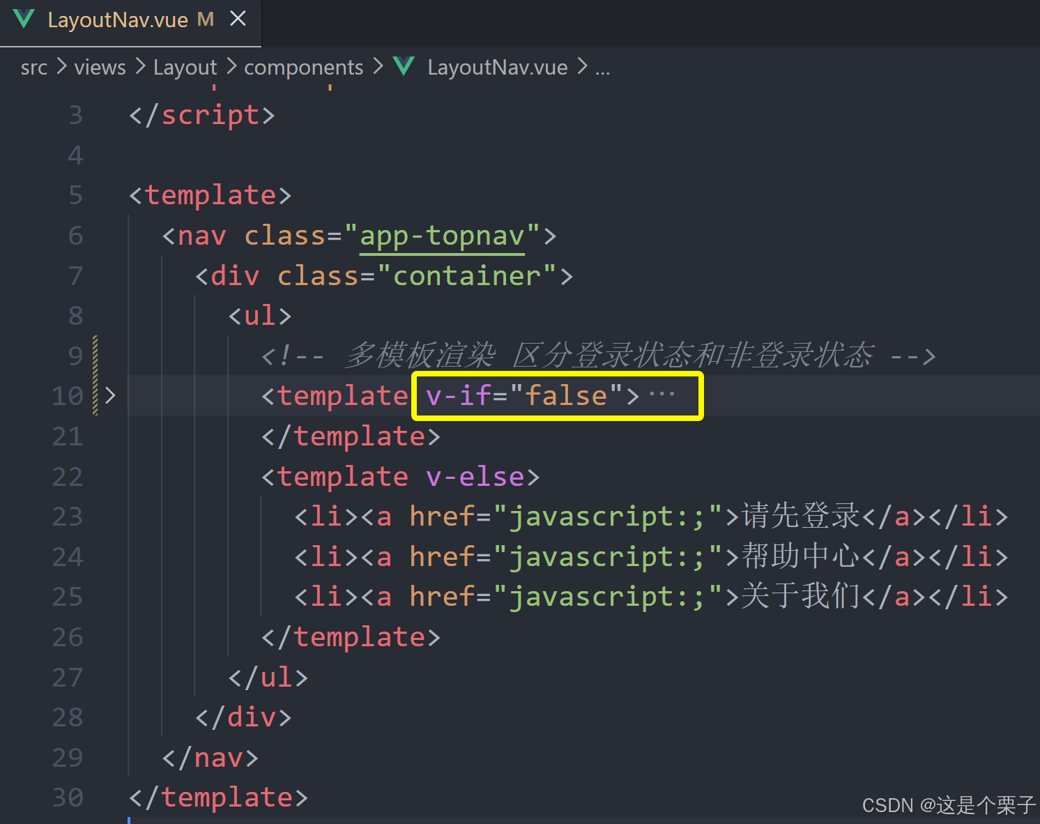
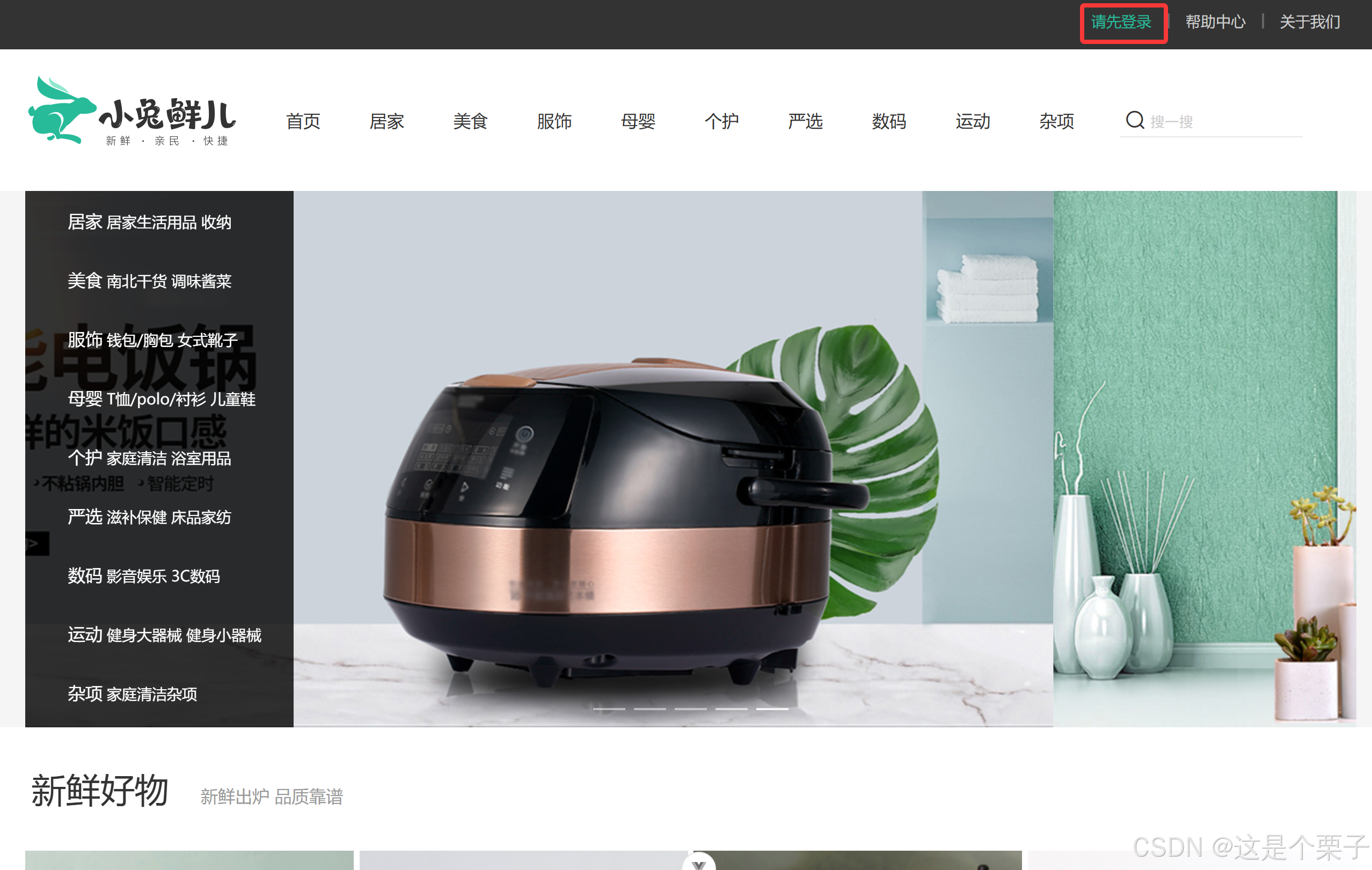
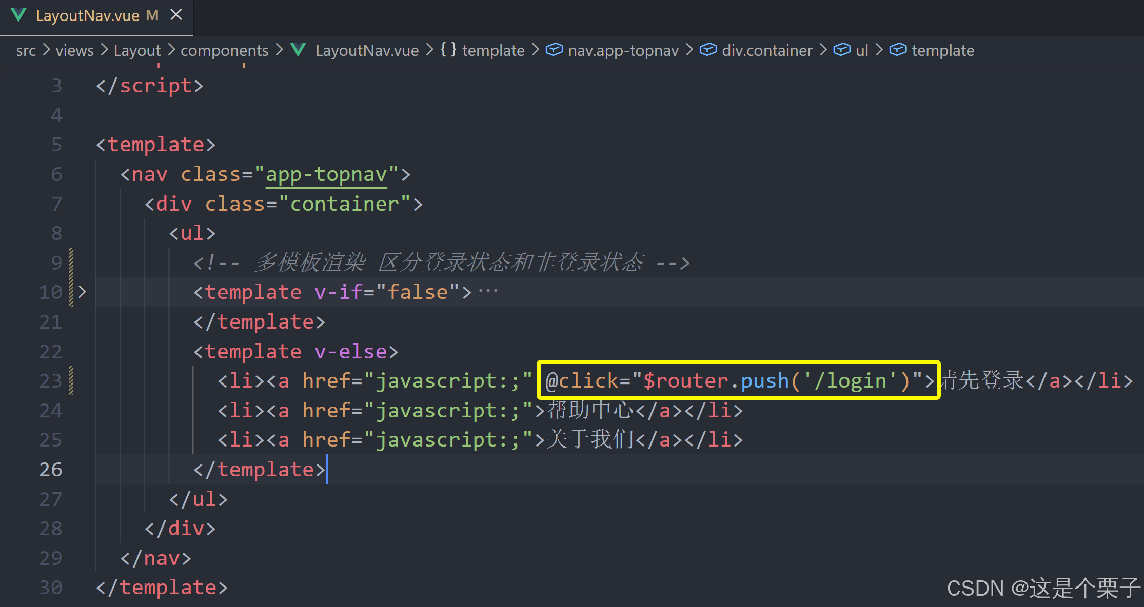
5. 登录和非登录状态的模版适配
需求理解
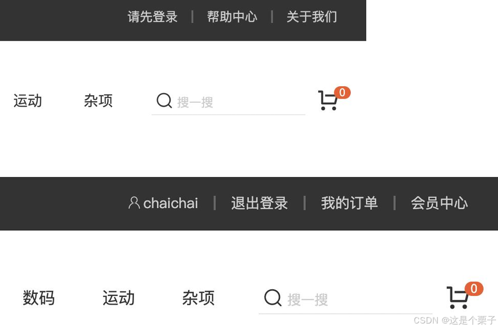
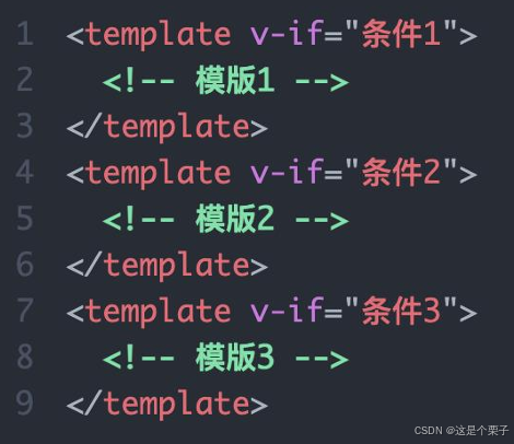
多模版适配的通用思路
思路:有几个需要适配的模版就准备几个template片段,通过条件渲染控制显示即可。
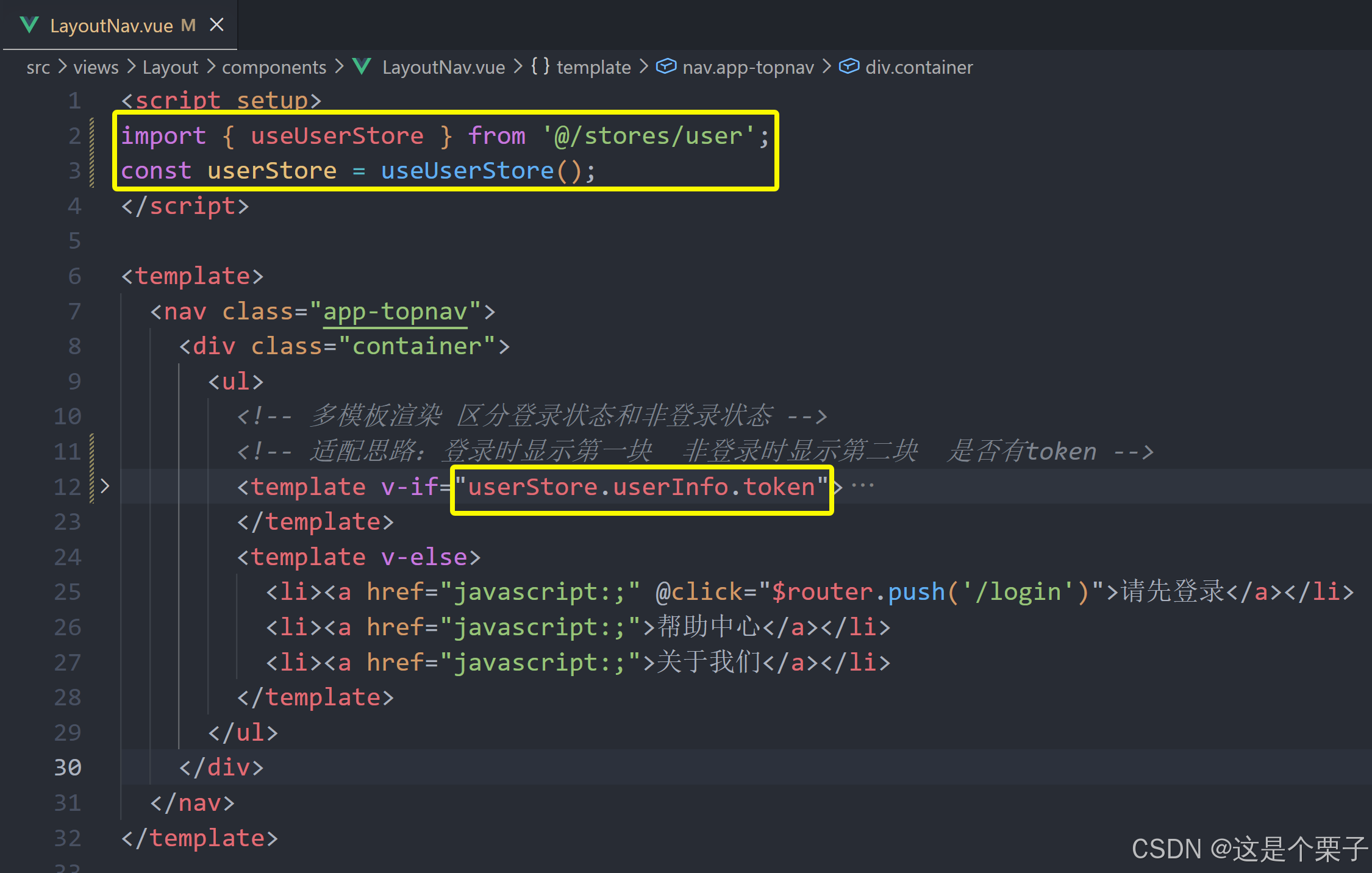
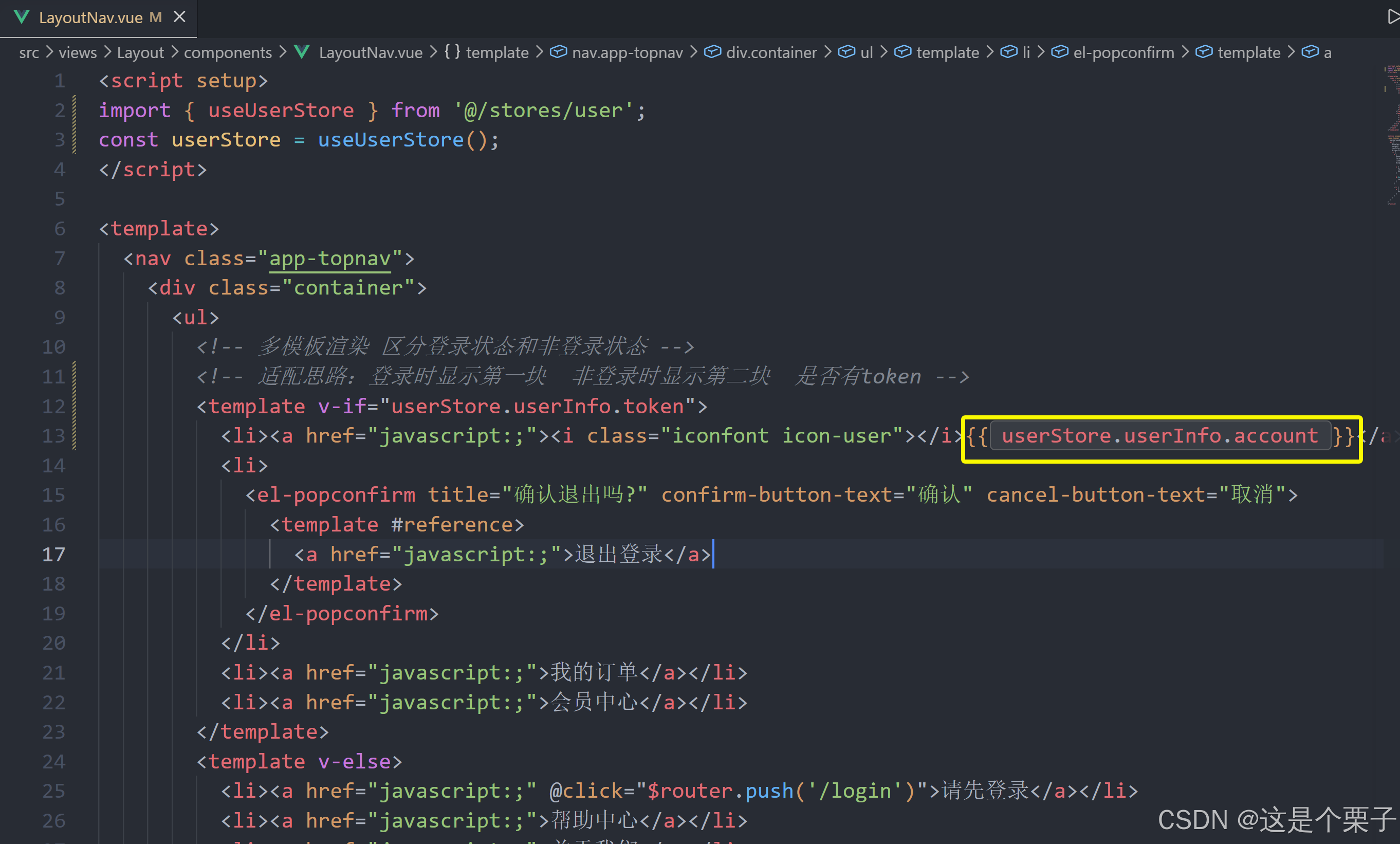
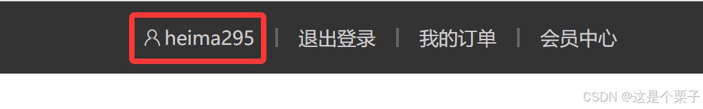
提交代码:
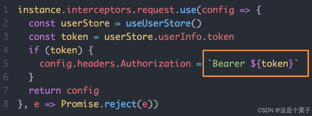
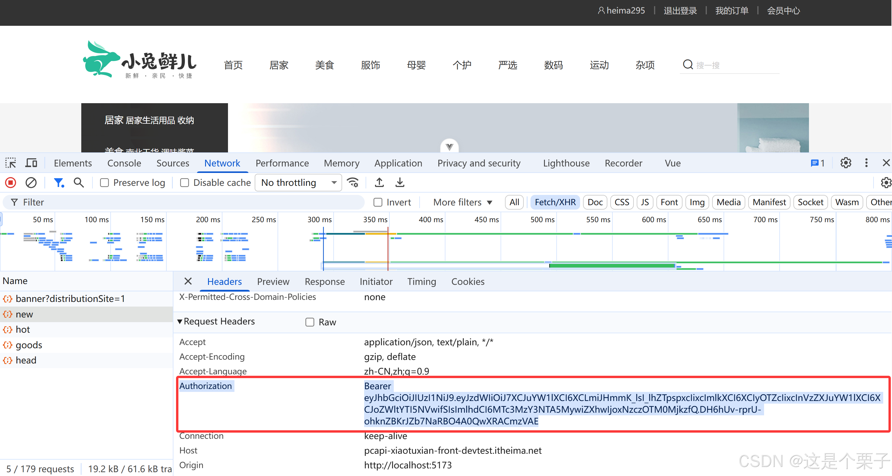
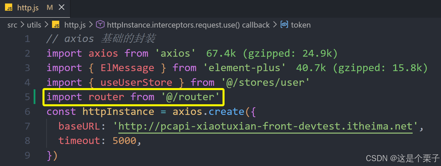
6. 请求拦截器携带Token
为什么要在请求拦截器携带Token
Token作为用户标识,在很多个接口中都需要携带Token才可以正确获取数据,所以需要在接口调用时携带Token。另外,为了统一控制采取请求拦截器携带的方案。
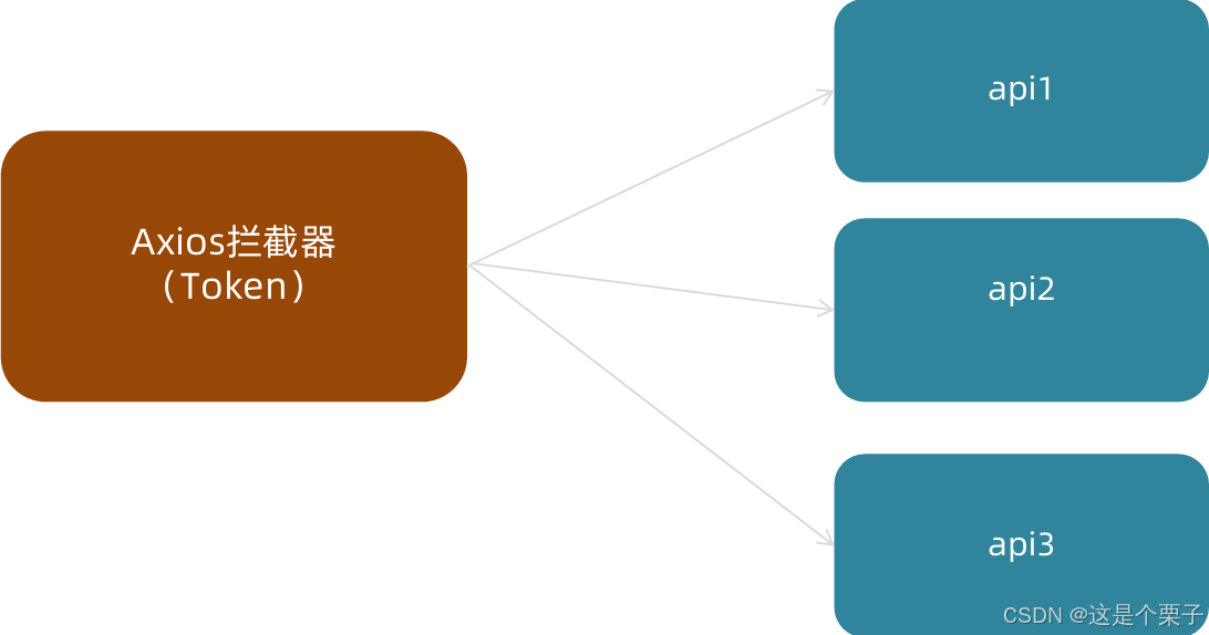
如何配置
Axios请求拦截器可以在接口正式发起之前对请求参数做一些事情,通常Token数据会被注入到请求header中,格式按照后端要求的格式进行拼接处理。
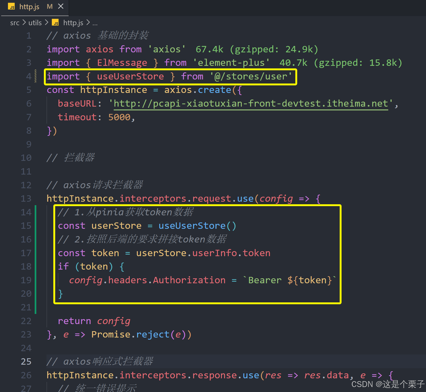
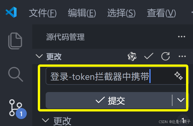
提交代码:
7. 退出登录功能实现
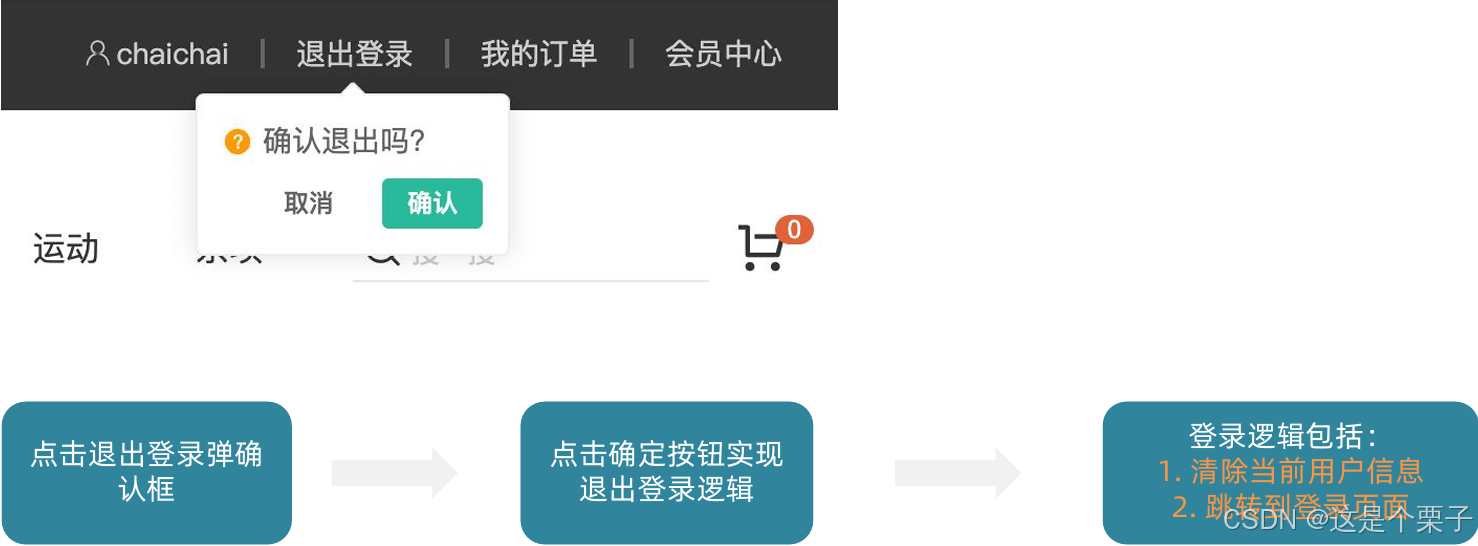
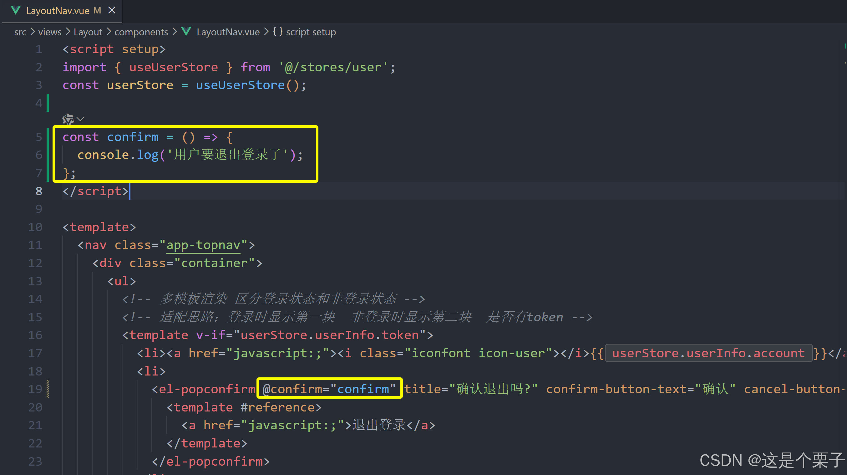
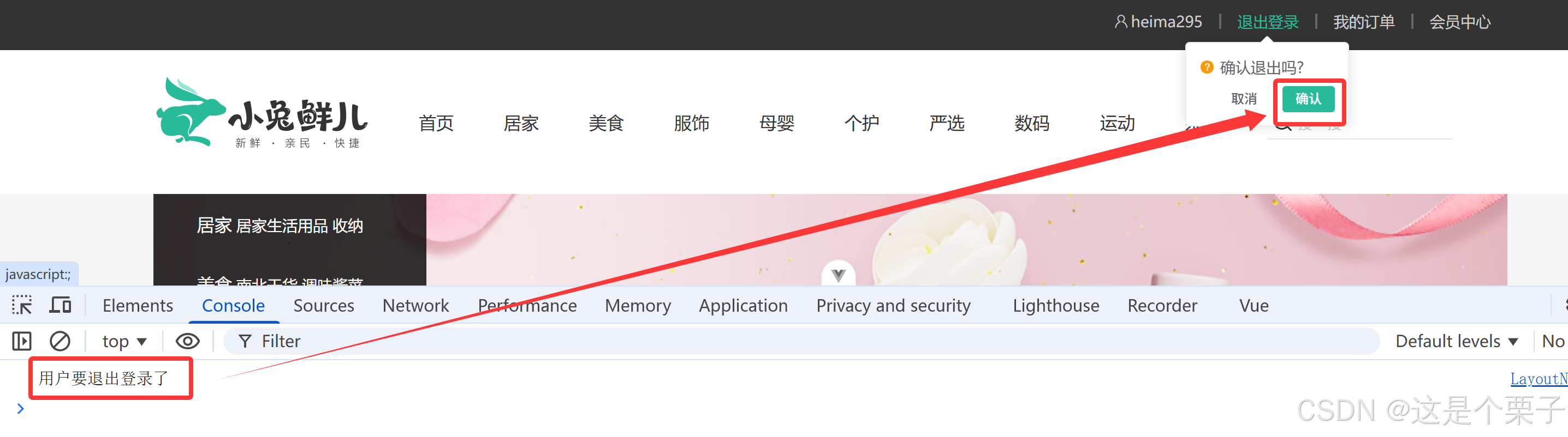
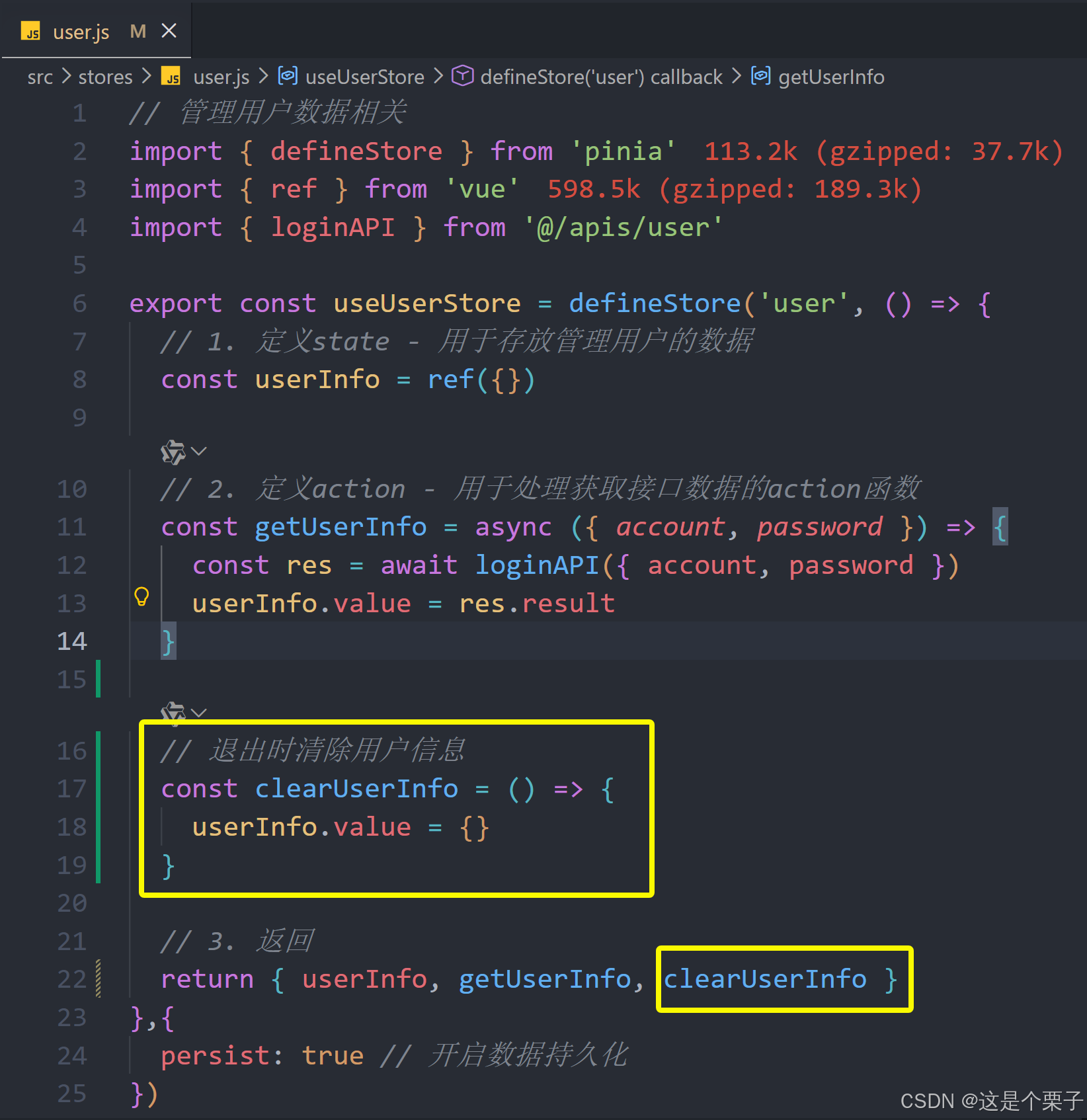
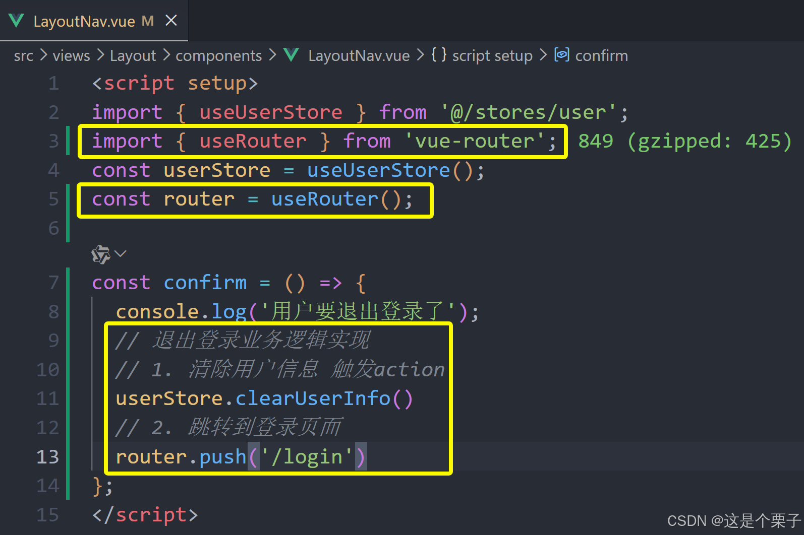
提交代码:
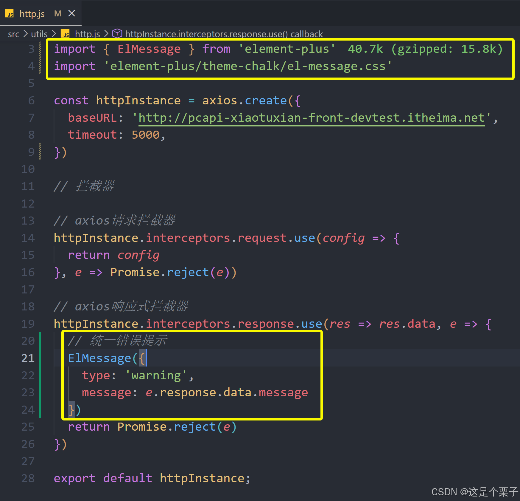
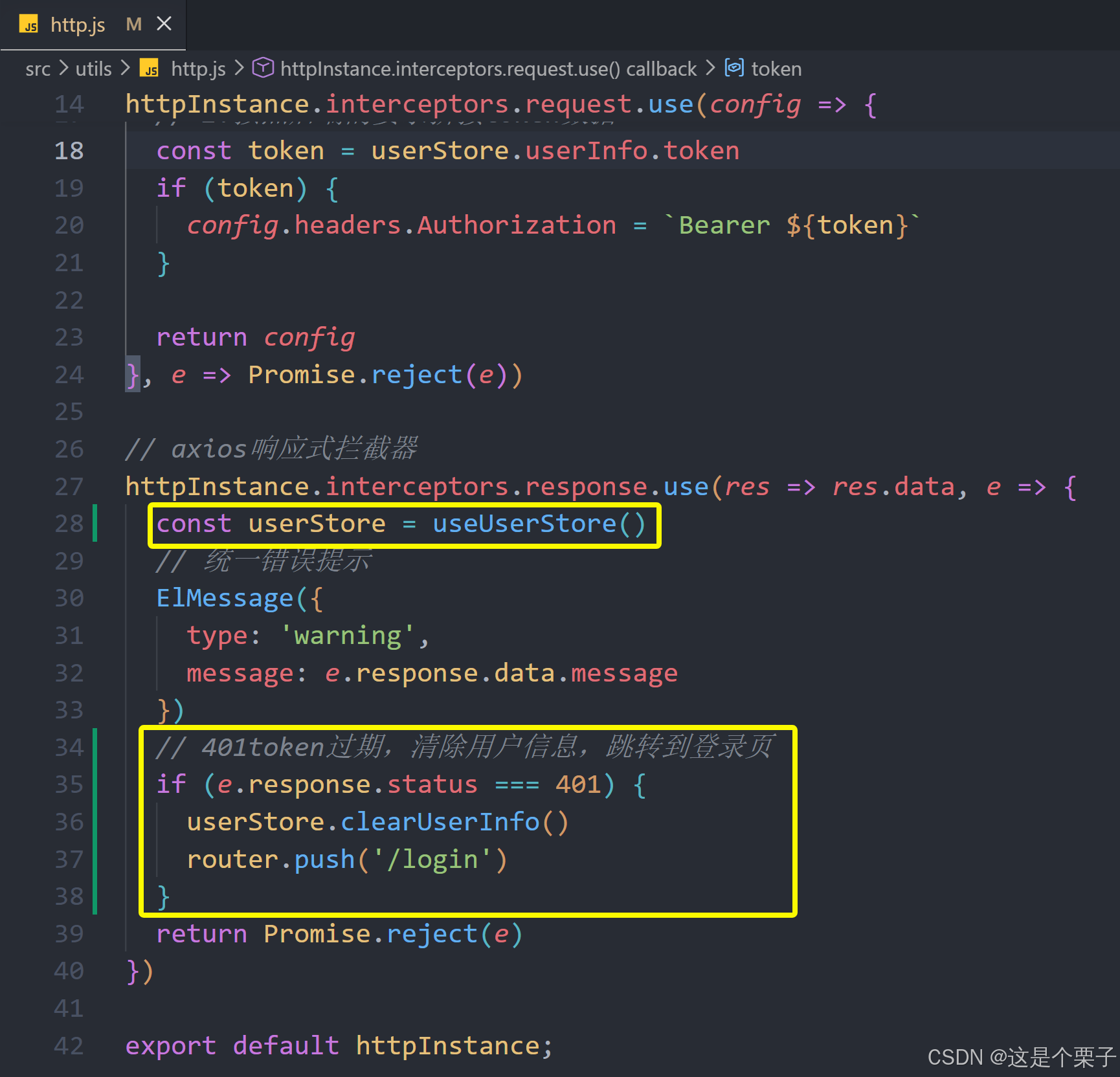
8. Token失效401拦截
业务背景
Token的有效性可以保持一定时间,如果用户一段时间不做任何操作,Token就会失效,使用失效的Token再去请求一些接口,接口就会报401状态码错误,需要我们做额外处理上。
俩个需要思考的问题:
- 我们能确定用户到底是在访问哪个接口时出现的401错误吗?在什么位置去拦截这个401?
- 检测到401之后又该干什么呢?
解决方案-在axios响应拦截器做统一处理。

提交代码: