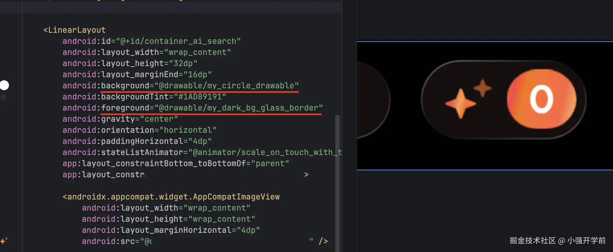
自定义胶囊 Drawable
我们可以继承 Drawable 实现我们自己的绘制逻辑,比如胶囊按钮(圆角为 50% 高度)的背景使用MyCircleRoundedDrawable实现,然后在 xml 中声明,最后直接将它作为background或者 foreground就可以适配任意高度的按钮了,这样做还有个好处是不与任何 View 绑定,可以对任意容器进行背景或者前景的定制。
MyCircleRoundedDrawable 代码实现
kt
@Keep
class MyCircleRoundedDrawable : Drawable() {

    private val mDefaultColor = Color.WHITE

    private val paint = Paint(Paint.ANTI_ALIAS_FLAG).apply {
        color = mDefaultColor
        style = Paint.Style.FILL
    }

    private val mRect = RectF()


    // tint 相关
    private var tintList: ColorStateList? = null
    private var tintFilter: ColorFilter? = null
    private var customColorFilter: ColorFilter? = null
    // 旧 & 新模式
    private var porterDuffMode: PorterDuff.Mode = PorterDuff.Mode.SRC_IN
    private var blendMode: BlendMode = BlendMode.SRC_IN

    private var cornerRadiusPx: Float = 0f
        set(value) {
            field = value
            invalidateSelf()
        }

    override fun draw(canvas: Canvas) {
        canvas.drawRoundRect(mRect, cornerRadiusPx, cornerRadiusPx, paint)
    }

    override fun onBoundsChange(bounds: Rect) {
        super.onBoundsChange(bounds)
        cornerRadiusPx = bounds.height() / 2f
        mRect.set(bounds)
    }

    override fun setAlpha(alpha: Int) {
        paint.alpha = alpha
    }

    override fun setColorFilter(colorFilter: ColorFilter?) {
        customColorFilter = colorFilter
        paint.colorFilter = customColorFilter
        invalidateSelf()
    }

    @Deprecated("Deprecated in Java")
    override fun getOpacity(): Int = PixelFormat.TRANSLUCENT

    override fun setTintList(tint: ColorStateList?) {
        tintList = tint
        updateTintFilter()
        invalidateSelf()
    }

    override fun setTintMode(mode: PorterDuff.Mode?) {
        super.setTintMode(mode)
        porterDuffMode = mode ?: PorterDuff.Mode.SRC_IN
        updateTintFilter()
        invalidateSelf()
    }

    override fun setTintBlendMode(mode: BlendMode?) {
        super.setTintBlendMode(mode)
        if (Build.VERSION.SDK_INT >= 29) {
            blendMode = mode ?: BlendMode.SRC_IN
            updateTintFilter()
            invalidateSelf()
        }
    }

    override fun isStateful(): Boolean {
        return tintList?.isStateful == true || super.isStateful()
    }

    override fun onStateChange(state: IntArray): Boolean {
        if (tintList != null) {
            updateTintFilter()
            invalidateSelf()
            return true
        }
        return false
    }

    private fun updateTintFilter() {
        if(customColorFilter != null) return

        val color = tintList?.getColorForState(state, mDefaultColor)
            ?: run {
                tintFilter = null
                return
            }

        tintFilter = when {
            Build.VERSION.SDK_INT >= 29 -> {
                BlendModeColorFilter(color, blendMode)
            }
            else -> {
                PorterDuffColorFilter(color, porterDuffMode)
            }
        }
        paint.colorFilter = tintFilter
    }

}
my_circle_drawable.xml
xml
<?xml version="1.0" encoding="utf-8"?>
<drawable class="com.test.MyCircleRoundedDrawable" />
玻璃效果背景
在上面的基础上我们可以拓展实现类似 iOS 液态玻璃效果的背景,这样做的好处是与 View 逻辑解耦,可以填充到任意容器中。
首先这是静态玻璃效果,没有像 iOS 一样根据陀螺仪对描边做实时角度变化。
其次,这个渐变效果需要使用二维插值,iOS CAGradientLayer原生支持,为了在安卓上能使用我们需要依赖runtimeShader这个 API,但它在 Android 13(API 33)及以上才可用,所以低版本我只使用一维插值做了兼容。
步骤也还是一样,先写自定义 Drawable:
MyGradientBorderDrawable 代码
kt
/**
 * 渐变 Border 的Drawable 默认玻璃效果
 *
 * 目前有两套,可以通过 [withLightBackground] 切换,默认深色背景
 * 深色背景 [strokeWidthPx] = 0.5, [colors] = [darkBgColor]
 * 浅色背景 [strokeWidthPx] = 1, [colors] = [lightBgBorder]
 *
 */
@Keep
class MyGradientBorderDrawable : Drawable() {

    private val paint = Paint(Paint.ANTI_ALIAS_FLAG).apply {
        style = Paint.Style.STROKE
        strokeJoin = Paint.Join.ROUND
        strokeCap = Paint.Cap.ROUND
    }

    private val rect = RectF()

    private var strokeWidthPx: Float = 0.5f.vdpf
        set(value) {
            field = value
            paint.strokeWidth = value
        }

    private var isCustomCornerRadius = false
    private var cornerRadiusPx: Float = 0f
    private var colors: IntArray = darkBgColor

    var withLightBackground: Boolean = false
        set(value) {
            field = value
            colors = if (value) lightBgBorder else darkBgColor
            if (Build.VERSION.SDK_INT >= Build.VERSION_CODES.TIRAMISU) {
                updateRuntimeShaderColor()
            }
            strokeWidthPx = if (value) 1f.vdpf else (0.5f).vdpf
            invalidateSelf()
        }

    private val runtimeShader: RuntimeShader? by lazy {
        if (Build.VERSION.SDK_INT >= Build.VERSION_CODES.TIRAMISU) {
            RuntimeShader(SHADER_GRADIENT)
        }else{
            null
        }
    }

    init {
        paint.strokeWidth = strokeWidthPx
    }

    override fun inflate(
        r: Resources,
        parser: XmlPullParser,
        attrs: AttributeSet,
        theme: Resources.Theme?
    ) {
        super.inflate(r, parser, attrs, theme)
        val a = theme?.obtainStyledAttributes(
            attrs,
            R.styleable.MyGradientBorderDrawable,
            0,
            0
        ) ?: r.obtainAttributes(attrs, R.styleable.MyGradientBorderDrawable)
        withLightBackground =
            a.getBoolean(R.styleable.MyGradientBorderDrawable_withLightBackground, false)

        a.recycle()

    }

    override fun draw(canvas: Canvas) {
        canvas.drawRoundRect(rect, cornerRadiusPx, cornerRadiusPx, paint)
    }

    override fun onBoundsChange(bounds: Rect) {
        super.onBoundsChange(bounds)
        val half = strokeWidthPx / 2f
        if (!isCustomCornerRadius) {
            cornerRadiusPx = bounds.height() / 2f
        }
        rect.set(
            bounds.left + half,
            bounds.top + half,
            bounds.right - half,
            bounds.bottom - half
        )
        updateShader()
    }

    override fun setAlpha(alpha: Int) {
        paint.alpha = alpha
    }

    override fun setColorFilter(colorFilter: ColorFilter?) {
        paint.colorFilter = colorFilter
    }

    fun updateCornerRadiusInPx(radiusInPx: Float) {
        this.cornerRadiusPx = radiusInPx
        this.isCustomCornerRadius = true
        if (Build.VERSION.SDK_INT >= Build.VERSION_CODES.TIRAMISU) {
            this.runtimeShader?.setFloatUniform("cornerRadius", cornerRadiusPx)
        }
        invalidateSelf()
    }

    @Deprecated("Deprecated in Java")
    override fun getOpacity(): Int = PixelFormat.TRANSLUCENT

    private fun updateShader() {
        if (rect.width() <= 0 || rect.height() <= 0) return

        if (Build.VERSION.SDK_INT >= Build.VERSION_CODES.TIRAMISU) {
            this.runtimeShader?.apply {
                this.setFloatUniform("cornerRadius", cornerRadiusPx)
                this.setFloatUniform(
                    "iResolution",
                    floatArrayOf(bounds.width().toFloat(), bounds.height().toFloat())
                )
                paint.shader = this
            }
        }else{
            paint.shader = LinearGradient(
                0f, 0f, this.bounds.width().toFloat(), this.bounds.height().toFloat(),
                colors, null, Shader.TileMode.CLAMP
            )
        }
    }

    @RequiresApi(Build.VERSION_CODES.TIRAMISU)
    private fun updateRuntimeShaderColor(){
        runtimeShader?.apply {
            this.setFloatUniform("colorStart", colors[0].asFloatArray())
            this.setFloatUniform("colorMid", colors[1].asFloatArray())
            this.setFloatUniform("colorEnd", colors[2].asFloatArray())
        }
    }

    private fun @receiver:ColorInt Int.asFloatArray(): FloatArray {
        return floatArrayOf(this.red / 255f,this.green / 255f,this.blue / 255f,this.alpha / 255f)
    }

    companion object {
        // 浅色背景下的颜色值
        val lightBgBorder = intArrayOf(
            Color.argb(0.7f, 1f, 1f, 1f),
            Color.TRANSPARENT,
            Color.argb(0.6f, 1f, 1f, 1f),
        )

        // 深色背景下的颜色值
        val darkBgColor = intArrayOf(
            Color.argb(0.4f, 1f, 1f, 1f),
            Color.TRANSPARENT,
            Color.argb(0.3f, 1f, 1f, 1f),
        )

        private const val SHADER_GRADIENT = """
        uniform float2 iResolution;   // View 尺寸
        uniform half4 colorStart;     // 左上角颜色
        uniform half4 colorMid;       // 中间透明
        uniform half4 colorEnd;       // 右下角颜色
        uniform float cornerRadius;       // 右下角颜色

        half4 main(float2 fragCoord) {
            // 归一化坐标
            float2 uv = fragCoord / iResolution;
            // 投影到左上 -> 右下对角线
            float t = (uv.x + uv.y) / 2.0;
            half4 color;
            if (t < 0.5) {
                // 左上 -> 中间 Interpolator 先缓后急
                color = mix(colorStart, colorMid, (t * 2.0) * (t * 2.0));
            } else {
                // 中间 -> 右下 先急后缓
                float pivot = (t - 0.5) * 2.0; // 左到右 => 0 -> 1
                float mixValue = 1 - (1 - pivot) * (1 - pivot);
                color = mix(colorMid, colorEnd, mixValue);
            }
            return half4(color.rgb * color.a, color.a);
        }
    """
    }
}


val Float.vdpf
    get() = TypedValue.applyDimension(
        TypedValue.COMPLEX_UNIT_DIP,
        this,
        Resources.getSystem().displayMetrics
)目前根据暗色、亮色背景预设了两种边框颜色,通过withLightBackground可以切换,为了支持从 drawable 的 XML 中指定暗色、亮色,还需要定义一个 styleable 文件attr_my_gradient_border.xml。
xml
<resources>
    <declare-styleable name="MyGradientBorderDrawable">
        <attr name="withLightBackground" format="boolean"/>
    </declare-styleable>
</resources>
然后新增 drawable 文件my_light_bg_glass_border和my_dark_bg_glass_border 分别指向具体的类的实现,标识亮色背景和白色背景,仅修改withLightBackground属性的值,类似这样:
my_light_bg_glass_border.xml
xml
<?xml version="1.0" encoding="utf-8"?>
<drawable xmlns:app="http://schemas.android.com/apk/res-auto"
    class="com.test.MyGradientBorderDrawable"
    app:withLightBackground="true" />
最后就可以直接在具体业务场景直接使用了。