修改上一个demo,使用自定义主题。直接修改Theme.kt, 修改里面的颜色、字体形状的配置。并且创建自定义包装函数,代码如下:
Kotlin
package com.example.testcompose1.ui.theme
import android.os.Build
import androidx.compose.foundation.isSystemInDarkTheme
import androidx.compose.foundation.shape.RoundedCornerShape
import androidx.compose.material3.*
import androidx.compose.runtime.Composable
import androidx.compose.ui.graphics.Color
import androidx.compose.ui.platform.LocalContext
import androidx.compose.ui.text.TextStyle
import androidx.compose.ui.text.font.FontFamily
import androidx.compose.ui.text.font.FontWeight
import androidx.compose.ui.unit.dp
import androidx.compose.ui.unit.sp
// 定义自定义颜色方案 .创建两个颜色方案:浅色主题和深色主题。
// 浅色主题的颜色方案
val LightColorScheme = lightColorScheme(
primary = Color(0xFF6200EE), // App主色调。用于关键交互元素(选中状态、按钮、下划线)
secondary = Color(0xFF03DAC6), // 次色调。次要强调色,用于次要按钮、图标等
tertiary = Color(0xFF3700B3), // 第三强调色(补充色),用于特殊强调的元素
background = Color(0xFFFFFBFE), // App 页面的整体背景色
surface = Color(0xFFFFFBFE), // 控件 / 卡片的背景色(比如 TextField、Card、按钮的背景)
onPrimary = Color.White, // 显示在 primary 颜色上的文字 / 图标色(保证对比度)
onSecondary = Color.Black, // 显示在 secondary 颜色上的文字 / 图标色
onBackground = Color(0xFF1C1B1F), // 显示在 background 上的文字 / 图标色
onSurface = Color(0xFF1C1B1F), // 显示在 surface 上的文字 / 图标色
// 可以继续自定义其他颜色
)
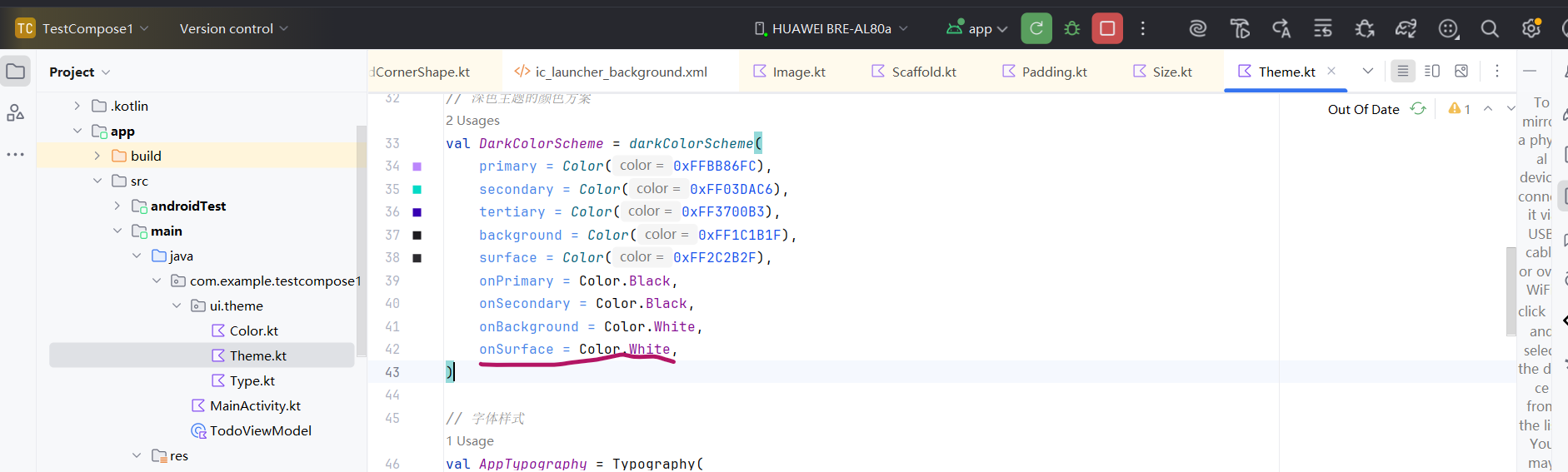
// 深色主题的颜色方案
val DarkColorScheme = darkColorScheme(
primary = Color(0xFFBB86FC),
secondary = Color(0xFF03DAC6),
tertiary = Color(0xFF3700B3),
background = Color(0xFF1C1B1F),
surface = Color(0xFF2C2B2F),
onPrimary = Color.Black,
onSecondary = Color.Black,
onBackground = Color.White,
onSurface = Color.White,
)
// 字体样式
val AppTypography = Typography(
titleLarge = TextStyle(
fontFamily = FontFamily.Default,
fontWeight = FontWeight.Bold,
fontSize = 22.sp,
lineHeight = 28.sp,
letterSpacing = 0.sp
),
bodyLarge = TextStyle(
fontFamily = FontFamily.Default,
fontWeight = FontWeight.Normal,
fontSize = 16.sp,
lineHeight = 24.sp,
letterSpacing = 0.5.sp
),
// 可以继续自定义其他样式
)
// 形状
val AppShapes = Shapes(
extraSmall = RoundedCornerShape(4.dp),
small = RoundedCornerShape(8.dp),
medium = RoundedCornerShape(12.dp),
large = RoundedCornerShape(16.dp),
extraLarge = RoundedCornerShape(24.dp)
)
// 创建自定义主题包装函数
// 这个函数会判断当前是否为深色模式(通过系统设置或用户手动选择),然后应用对应的颜色方案、字体和形状。
// 一会我加入一个状态来控制用户的手动深色模式选择。即增加一个按钮切换。
@Composable
fun MyAppTheme(
darkTheme: Boolean = isSystemInDarkTheme(), // 默认跟随系统
dynamicColor: Boolean = false, // 是否启用动态颜色(Android 12+)
content: @Composable () -> Unit
) {
// 根据暗色标志选择颜色方案
val colorScheme = when {
dynamicColor && Build.VERSION.SDK_INT >= Build.VERSION_CODES.S -> {
// 动态颜色(基于壁纸)
val context = LocalContext.current
if (darkTheme) dynamicDarkColorScheme(context) else dynamicLightColorScheme(context)
}
darkTheme -> DarkColorScheme
else -> LightColorScheme
}
MaterialTheme(
colorScheme = colorScheme,
typography = AppTypography,
shapes = AppShapes,
content = content
)
}
// 自动生成的。
@Composable
fun TestCompose1Theme(
darkTheme: Boolean = isSystemInDarkTheme(), // 是否深色主题
// Dynamic color is available on Android 12+
dynamicColor: Boolean = true, //动态取色
content: @Composable () -> Unit
) {
val colorScheme = when {
dynamicColor && Build.VERSION.SDK_INT >= Build.VERSION_CODES.S -> {
val context = LocalContext.current
if (darkTheme) dynamicDarkColorScheme(context) else dynamicLightColorScheme(context)
}
darkTheme -> DarkColorScheme
else -> LightColorScheme
}
// 统一应用所有 Material Design 组件的样式
MaterialTheme(
colorScheme = colorScheme,
typography = Typography, // 排版配置.管理App中文字样式
content = content
)
}再修改MainActivity,使用这个主题。
Kotlin
package com.example.testcompose1
import android.os.Bundle
import android.widget.Toast
import androidx.activity.ComponentActivity
import androidx.activity.compose.setContent
import androidx.activity.enableEdgeToEdge
import androidx.compose.foundation.layout.Arrangement
import androidx.compose.foundation.layout.Column
import androidx.compose.foundation.layout.Row
import androidx.compose.foundation.layout.Spacer
import androidx.compose.foundation.layout.padding
import androidx.compose.material3.Text
import androidx.compose.runtime.Composable
import androidx.compose.ui.Modifier
import androidx.compose.ui.tooling.preview.Preview
import androidx.compose.ui.unit.dp
import androidx.compose.foundation.layout.fillMaxWidth
import androidx.compose.foundation.layout.height
import androidx.compose.foundation.lazy.LazyColumn
import androidx.compose.foundation.lazy.items
import androidx.compose.material.icons.Icons
import androidx.compose.material.icons.filled.Delete
import androidx.compose.material3.Button
import androidx.compose.material3.ButtonDefaults
import androidx.compose.material3.Card
import androidx.compose.material3.CardDefaults
import androidx.compose.material3.Icon
import androidx.compose.material3.IconButton
import androidx.compose.material3.MaterialTheme
import androidx.compose.material3.Switch
import androidx.compose.material3.TextField
import androidx.compose.material3.TextFieldDefaults
import androidx.compose.runtime.collectAsState
import androidx.compose.runtime.getValue
import androidx.compose.runtime.mutableStateListOf
import androidx.compose.runtime.mutableStateOf
import androidx.compose.runtime.remember
import androidx.compose.runtime.setValue
import androidx.compose.ui.Alignment
import androidx.compose.ui.platform.LocalContext
import androidx.lifecycle.viewmodel.compose.viewModel
import com.example.testcompose1.ui.theme.MyAppTheme
import com.example.testcompose1.ui.theme.TestCompose1Theme
class MainActivity : ComponentActivity() {
override fun onCreate(savedInstanceState: Bundle?) {
super.onCreate(savedInstanceState)
enableEdgeToEdge()
setContent {
MyAppTheme(
darkTheme = ThemeManager.isDarkTheme // 覆盖系统设置
,dynamicColor = false // 暂时禁用动态颜色。
) {
todoJobList()
}
}
}
}
@Preview
@Composable
fun todoJobList(
viewModel: TodoViewModel = viewModel() // 获取ViewModel实例。 在同一个activity作用域中是单例。
) {
val context = LocalContext.current
// 使用 remember 和 mutableStateOf 保存输入框的文本
var text by remember { mutableStateOf("") }
// 使用 mutableStateListOf 保存待办项列表
// val todoItems = remember { mutableStateListOf<String>() }
// 将 StateFlow 转换为 Compose 可观察的 State
val todoItems by viewModel.todoItems.collectAsState()
Column(modifier = Modifier.padding(16.dp)) {
ThemeSwitch() // 添加开关
Spacer(modifier = Modifier.height(8.dp))
// 文本输入框
TextField(
value = text,
onValueChange = { text = it }, // 反向绑定,视图变化--> 数据变化
label = { Text("输入待办事项") },
colors = TextFieldDefaults.colors(
focusedContainerColor = MaterialTheme.colorScheme.surface, // 获得焦点时的背景色
unfocusedContainerColor = MaterialTheme.colorScheme.surfaceVariant, // 失去焦点时,输入框背景色
focusedIndicatorColor = MaterialTheme.colorScheme.primary, // 输入框底部下划线的颜色。
unfocusedIndicatorColor = MaterialTheme.colorScheme.onSurface.copy(alpha = 0.5f)
),
modifier = Modifier.fillMaxWidth()
)
// 添加按钮
Button(
onClick = {
viewModel.addItem(text)
text = ""
},
shape = MaterialTheme.shapes.small, // 使用主题形状
colors = ButtonDefaults.buttonColors(
containerColor = MaterialTheme.colorScheme.primary, // 容器背景色,按钮底色
contentColor = MaterialTheme.colorScheme.onPrimary // 内容颜色,按钮上文字 / 图标的颜色
),
modifier = Modifier.padding(top = 8.dp)
) {
Text("添加")
}
// 显示待办列表
Spacer(modifier = Modifier.height(16.dp))
Text("待办列表", style = MaterialTheme.typography.titleMedium)
LazyColumn {
items(items = todoItems) { item ->
TodoItem(item = item
, onDelete = { viewModel.removeItem(item) })
}
}
}
}
@Composable
fun TodoItem(item: String, onDelete: () -> Unit // 添加删除回调,删除逻辑放在上层。即把回调传给里面的按钮。
) {
Card(
modifier = Modifier
.fillMaxWidth()
.padding(vertical = 4.dp),
shape = MaterialTheme.shapes.medium, // 使用主题形状
colors = CardDefaults.cardColors(
containerColor = MaterialTheme.colorScheme.surface
)
) {
Row(
modifier = Modifier
.fillMaxWidth()
.padding(vertical = 8.dp),
horizontalArrangement = Arrangement.SpaceBetween // 横向布局子元素两端对齐,剩余空白空间平均分配到子元素之间
) {
Text(text = item
,style = MaterialTheme.typography.bodyLarge,
color = MaterialTheme.colorScheme.onSurface)
IconButton(onClick = onDelete) {
Icon(Icons.Default.Delete, contentDescription = "删除"
, tint = MaterialTheme.colorScheme.error)
}
}
}
}
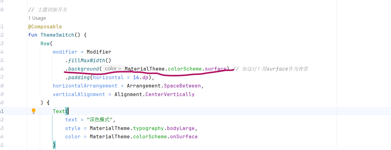
// 主题切换开关
@Composable
fun ThemeSwitch() {
Row(
modifier = Modifier
.fillMaxWidth()
.padding(horizontal = 16.dp),
horizontalArrangement = Arrangement.SpaceBetween,
verticalAlignment = Alignment.CenterVertically
) {
Text(
text = "深色模式",
style = MaterialTheme.typography.bodyLarge,
color = MaterialTheme.colorScheme.onSurface
)
Switch(
checked = ThemeManager.isDarkTheme,
onCheckedChange = { ThemeManager.toggleTheme() }
)
}
}
// 为了允许手动切换深色/浅色模式,在应用中保存用户的选择,并在主题中读取. 后面改用DataStore保存
object ThemeManager {
var isDarkTheme by mutableStateOf(false)
private set
fun toggleTheme() { // 切换是否为深色主题
isDarkTheme = !isDarkTheme
}
}ok. 主题替换了,UI也使用了主题中定义的颜色、字体、形状等。而且加了一个切换是否为深色主题的按钮。测试下:
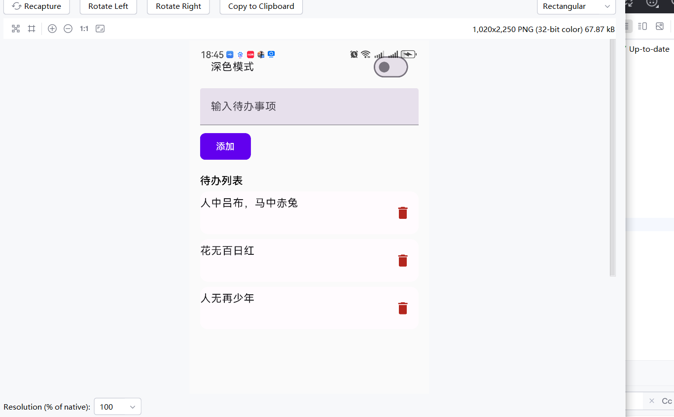
点击顶部的切换主题的按钮:
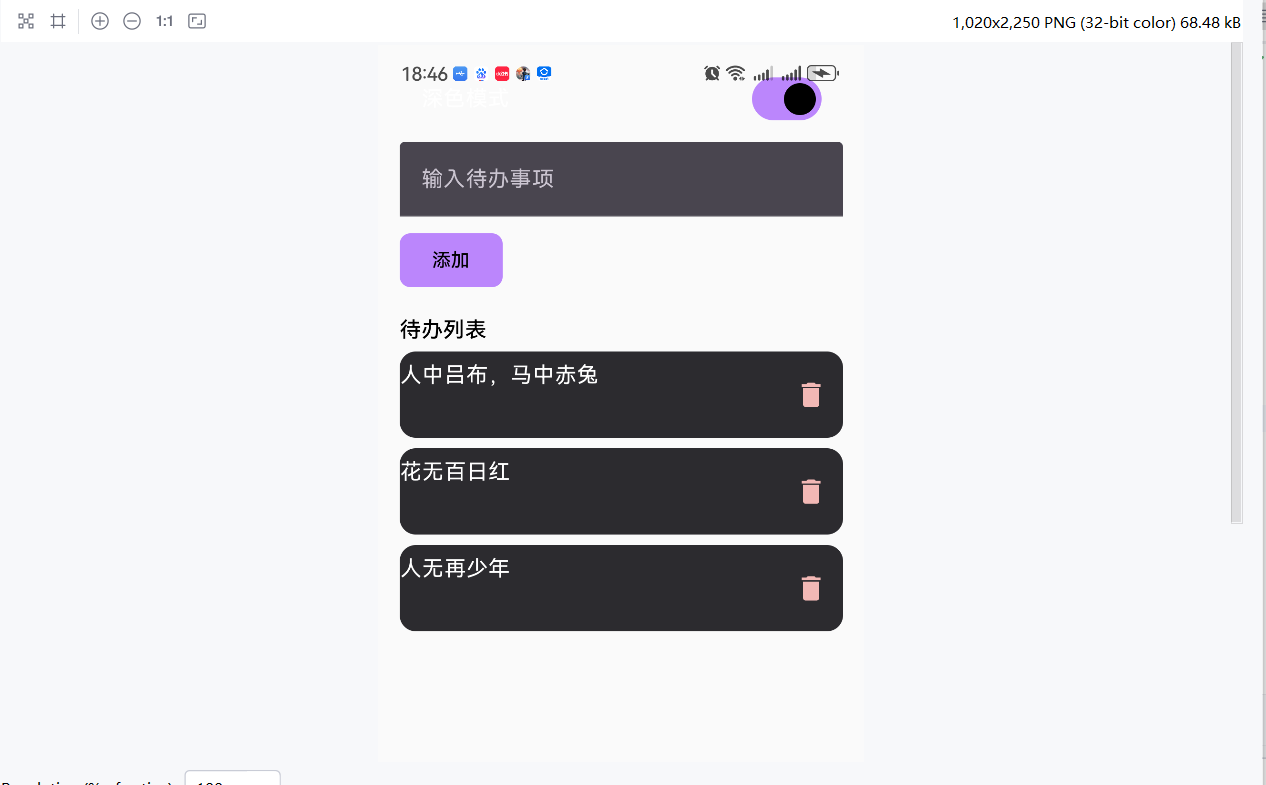
ok. 但是上面的是否为深色主题的文案怎么看不到了。
开关这一行的Row容器加个背景试试:
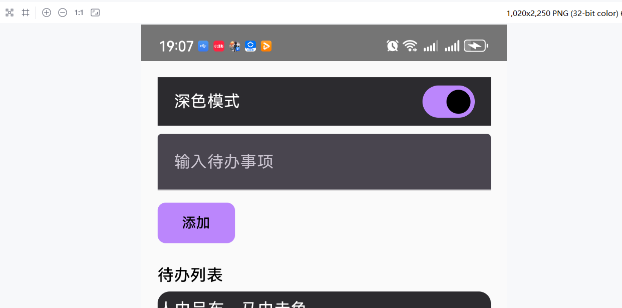
ok. 现在能看到顶部的深色模式文字了。 再显示成圆角的形状:
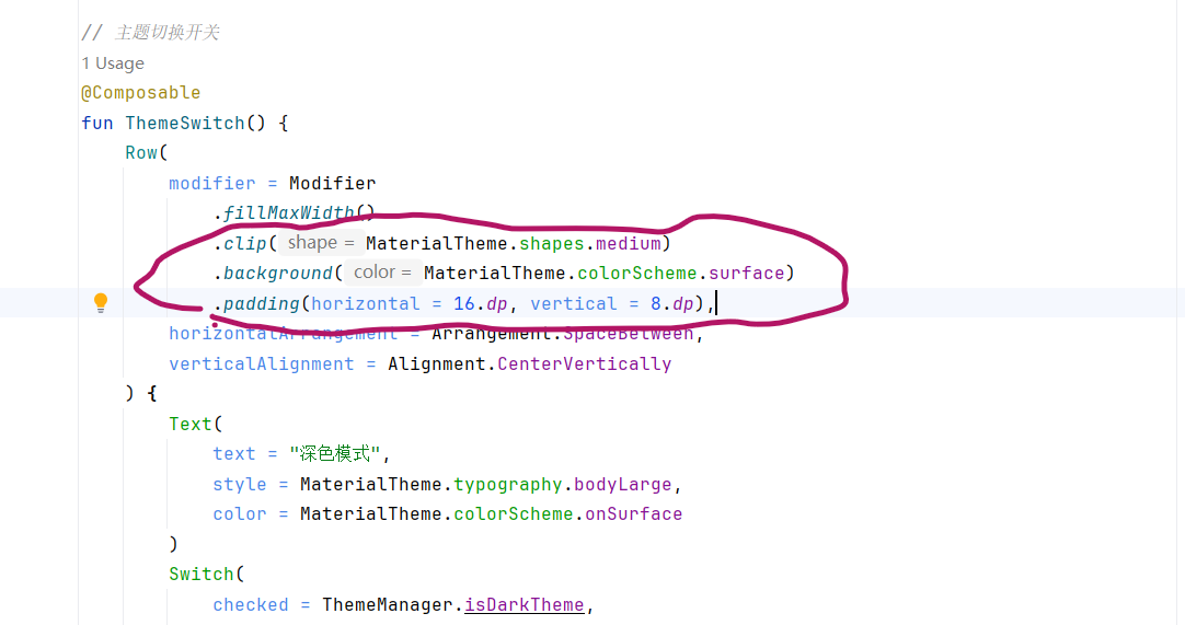
注意这个调用顺序,先定形状再铺背景。效果:
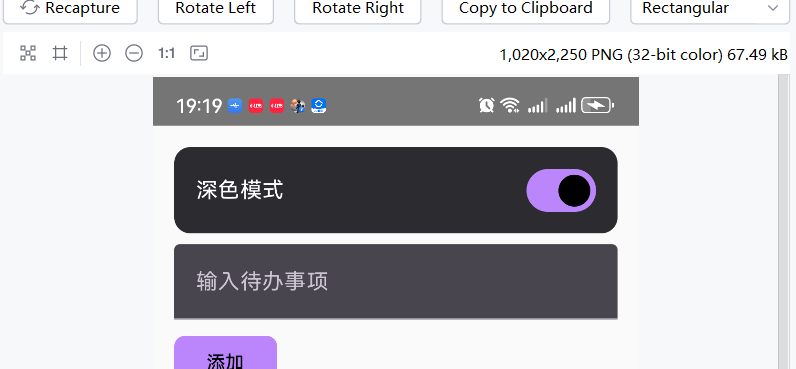
ok.