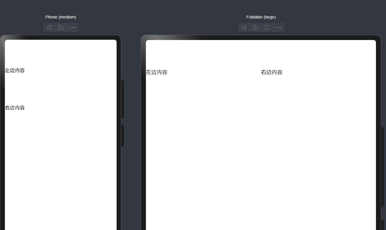
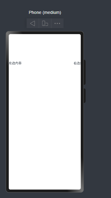
案例解释1 GridRow + GridCol
c
@Entry
@Component
struct DemoPage {
  build() {
    GridRow() {
      GridCol({ span: { sm: 12, md: 6, lg: 4 } }) {
        Text('左边内容')
          .width('100%')
          .height(120)
      }

      GridCol({ span: { sm: 12, md: 6, lg: 8 } }) {
        Text('右边内容')
          .width('100%')
          .height(120)
      }
    }
  }
}-
span就代表了这一个GridCol所占的列数 在鸿蒙布局 默认共有12列
当当前列数占用超出total row之后 就会换行
-
.width('100%') .height(120)这两个写法有什么区别?
- '100%'是让大小跟着父容器走 父容器变大 他也会跟着变大
- 具体值写法是想让他大小固定 大小不会跟着父容器走
- sm md lg到底是什么?
他们就相当于窗口宽度的标签 实际开发可以用这个办法来判断应该选择哪个大小
c
let windowWidthVp = windowWidth / display.getDisplayByIdSync(displayId).densityPixels

if (windowWidthVp < 320) {
  newBp = 'xs'
} else if (windowWidthVp < 600) {
  newBp = 'sm'
} else if (windowWidthVp < 840) {
  newBp = 'md'
} else {
  newBp = 'lg'
}- 小于 320vp,算 xs
- 320 到 600vp 左右,算 sm
- 600 到 840vp 左右,算 md
- 大于等于 840vp,算 lg
- GridRow和GridCol和正常的row和column也有一些区别
Grid~他是有自动换行的 正常的row和column会直接挤出去
举个例子
c
@Entry
@Component
struct DemoPage {
  build() {
    Row() {
      Column() {
        Text('左边内容')
          .width('60%')
          .height('30%')
      }

      Column() {
        Text('右边内容')
          .width('30%')
          .height('30%')
      }
    }
  }
}
案例解释2 layoutWeight
这个就相当于划分权重 差不多也是按比例分配界面吧
c
@Entry
@Component
struct WeightDemo {
  build() {
    Row() {
      Text('固定')
        .width(80)
        .height(50)

      Text('自适应1')
        .layoutWeight(1)
        .height(50)
        .fontSize(50)

      Text('自适应2')
        .layoutWeight(2)
        .height(50)
        .fontSize(50)
    }
    .width('100%')
  }
}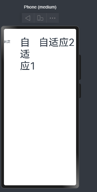
我们可以看到不同的权重的界面拥有的大小不同 显示上也有很多差异
方案三 displayPriority (此文章未完善)
用在画面发生变化时隐藏某些界面
displayPriority设置优先级 优先级越高(数字越大) 越先隐藏
c
@Entry
@Component
struct Index {
build() {
Row() {
Text('标题')
.displayPriority(3)
.margin(20)
Text('副标题')
.displayPriority(2)
.margin(20)
Text('更多')
.displayPriority(1)
.margin(20)
}
.width('100%')
}
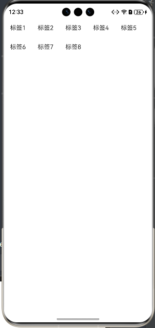
}方案四 Flex 的 wrap
华为官方 Flex 文档说明,Flex 用于排列、对齐、分配剩余空间;而多行流式排布,通常就配合换行来做。官方旧版相关容器说明里也明确有 wrap / nowrap 这类设置。
- 效果:
- 一行放得下就一行
- 放不下自动到下一行
- 这个很适合:
- 标签组
- 按钮组
- 筛选条件区
- 小卡片流式排布
c
@Entry
@Component
struct WrapDemo {
  build() {
    Flex({ wrap: FlexWrap.Wrap }) {
      ForEach([1, 2, 3, 4, 5, 6, 7, 8], (item: number) => {
        Text(`标签${item}`)
          .padding(10)
          .margin(6)
      })
    }
    .width('100%')
  }
}
- 解释一下这个foreach吧
c
      ForEach([1, 2, 3, 4, 5, 6, 7, 8], (item: number) => {
        Text(`标签${item}`)
        }
其实就相当于
cpp
for (int i = 0; i < 3; i++) {
    // 创建一个组件
}
${item}是把变量转化为能在字符串里输出的样子
Image($r('app.media.xxx'))
是加载图片的 用的是相对路径
绝对路径用法
Image('resources/base/media/a.png')