/* TODO:待补充代码 */
#pond {
display: flex;
flex-wrap: wrap;
flex-direction: column;
}
/* 以下代码不需要修改 */
.fruit.apple .bg {
background-image: url(../images/apple.svg);
}
.fruit.pear .bg {
background-image: url(../images/pear.svg);
}
.fruit.banana .bg {
background-image: url(../images/banana.svg);
}
#pond {
z-index: 20;
}
#pond,
#fruit-background {
display: flex;
position: absolute;
top: 0;
left: 0;
width: 100%;
height: 100%;
padding: 1em;
}
.lilypad,
.fruit {
position: relative;
width: 20%;
height: 20%;
overflow: hidden;
}
.lilypad .bg,
.fruit .bg {
width: 100%;
height: 100%;
background-position: center center;
background-repeat: no-repeat;
}
.animated.infinite {
-webkit-animation-iteration-count: infinite;
animation-iteration-count: infinite;
}
.pulse {
-webkit-animation-name: pulse;
animation-name: pulse;
}
.animated {
-webkit-animation-duration: 1s;
animation-duration: 1s;
-webkit-animation-fill-mode: both;
animation-fill-mode: both;
}
@-webkit-keyframes pulse {
0% {
-webkit-transform: scaleX(1);
transform: scaleX(1);
}
50% {
-webkit-transform: scale3d(1.05, 1.05, 1.05);
transform: scale3d(1.05, 1.05, 1.05);
}
to {
-webkit-transform: scaleX(1);
transform: scaleX(1);
}
}
@keyframes pulse {
0% {
-webkit-transform: scaleX(1);
transform: scaleX(1);
}
50% {
-webkit-transform: scale3d(1.05, 1.05, 1.05);
transform: scale3d(1.05, 1.05, 1.05);
}
to {
-webkit-transform: scaleX(1);
transform: scaleX(1);
}
}
.lilypad .bg,
.fruit .bg {
width: 100%;
height: 100%;
background-position: center center;
background-size: 80% 80%;
background-repeat: no-repeat;
}
.fruit .bg {
background-size: 30% 30%;
}
* {
box-sizing: border-box;
}
.lilypad.apple .bg {
border-radius: 50%;
background-image: url(../images/redplate.svg);
opacity: 0.6;
}
.lilypad.banana .bg {
border-radius: 50%;
background-image: url(../images/yellowplate.svg);
opacity: 0.6;
}
.lilypad.pear .bg {
border-radius: 50%;
opacity: 0.6;
background-image: url(../images/blueplate.svg);
}
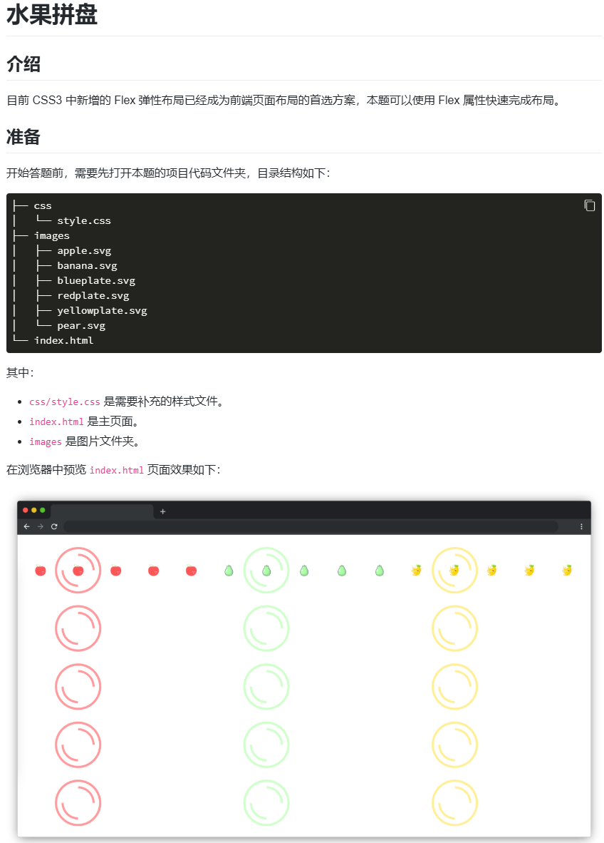
#pond {
display: flex; /* 定义为 Flex 容器 */
flex-wrap: wrap; /* 允许项目换行 */
flex-direction: column; /* 项目垂直排列(从上到下) */
}