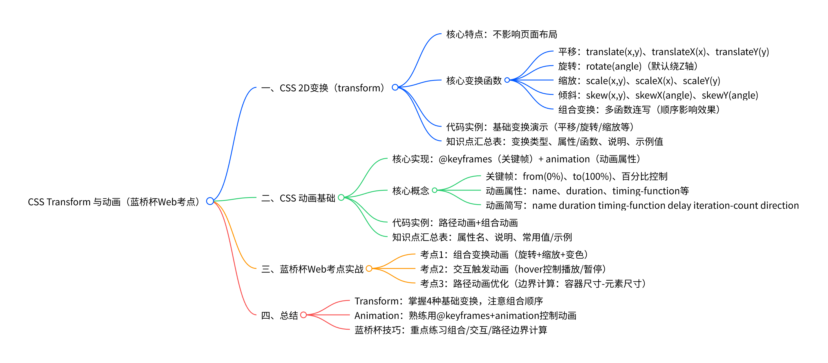
 CSS 中的
 transform(变换)和 animation(动画)是实现网页动态效果的核心工具,也是蓝桥杯 Web 应用开发赛道的高频考点
一、CSS 2D 变换(transform)
transform 用于对元素进行平移、旋转、缩放、倾斜等 2D 或 3D 变换,不影响页面布局(仅视觉上移动元素)。
核心变换函数
(1)平移(translate)
移动元素位置,支持 X 轴、Y 轴单独或同时移动。
-
translate(x, y):同时沿 X、Y 轴移动 -
translateX(x):仅沿 X 轴移动 -
translateY(y):仅沿 Y 轴移动
(2)旋转(rotate)
绕元素中心点旋转,单位为 deg(角度)。
rotate(angle):默认绕 Z 轴旋转(平面旋转)
(3)缩放(scale)
缩放元素大小,1 为原始大小,>1 放大,<1 缩小。
-
scale(x, y):同时沿 X、Y 轴缩放 -
scaleX(x)/scaleY(y):单轴缩放
(4)倾斜(skew)
使元素沿 X 轴或 Y 轴倾斜,单位为 deg。
-
skew(x-angle, y-angle):同时沿 X、Y 轴倾斜 -
skewX(angle)/skewY(angle):单轴倾斜
(5)组合变换
多个变换函数可连写,顺序影响效果(建议先平移后旋转 / 缩放)。
代码实例(基础变换演示)
<!DOCTYPE html>
<html lang="zh-CN">
<head>
    <meta charset="UTF-8">
    <title>Transform 基础演示</title>
    <style>
        .box {
            width: 150px;
            height: 150px;
            background-color: aqua;
            margin: 50px;
            float: left;
            line-height: 150px;
            text-align: center;
            font-size: 18px;
        }
        /* 平移 */
        .translateBox { transform: translate(50px, 30px); }
        /* 旋转 */
        .rotateBox { transform: rotate(45deg); }
        /* 缩放 */
        .scaleBox { transform: scale(0.8, 1.2); }
        /* 倾斜 */
        .skewBox { transform: skew(15deg, 5deg); }
        /* 组合变换 */
        .comboBox { transform: translate(20px, 20px) rotate(30deg) scale(1.1); }
    </style>
</head>
<body>
    <div class="box translateBox">平移</div>
    <div class="box rotateBox">旋转</div>
    <div class="box scaleBox">缩放</div>
    <div class="box skewBox">倾斜</div>
    <div class="box comboBox">组合变换</div>
</body>
</html>
Transform 知识点汇总表
|------|-----------------------|---------------|---------------------------------|
| 变换类型 | 属性 / 函数 | 说明 | 示例值 |
| 平移 | translate(x, y) | 同时沿 X、Y 轴移动 | translate(100px, 50px) |
| 平移 | translateX(x) | 仅沿 X 轴移动 | translateX(80px) |
| 旋转 | rotate(angle) | 绕 Z 轴旋转(平面旋转) | rotate(90deg) |
| 缩放 | scale(x, y) | 同时沿 X、Y 轴缩放 | scale(1.5, 0.8) |
| 倾斜 | skew(x, y) | 同时沿 X、Y 轴倾斜 | skew(20deg, 10deg) |
| 组合变换 | 多函数连写 | 按顺序执行多个变换 | translate(20px) rotate(45deg) |
二、CSS 动画基础
CSS 动画通过 @keyframes 定义关键帧,结合 animation 属性控制播放,实现元素的动态变化。
核心概念
1)关键帧(@keyframes)
定义动画在不同阶段的状态,支持 from(0%)、to(100%)或百分比控制
@keyframes 动画名 {
    0% { /* 初始状态 */ }
    50% { /* 中间状态 */ }
    100% { /* 结束状态 */ }
}
2)动画属性(animation)
控制动画的播放方式,核心属性如下:
animation-name:指定关键帧名称animation-duration:动画时长(单位s或ms)animation-timing-function:速度曲线(如linear、ease-in-out)animation-iteration-count:播放次数(infinite为无限循环)animation-direction:播放方向(normal正向、alternate往返)animation-play-state:播放状态(running播放、paused暂停)
3)动画简写
合并多个属性为一行,顺序为: animation: name duration timing-function delay iteration-count direction;
代码实例(路径动画 + 组合动画)
<!DOCTYPE html>
<html lang="zh-CN">
<head>
    <meta charset="UTF-8">
    <title>CSS 动画演示</title>
    <style>
        .container {
            width: 600px;
            height: 600px;
            border: 2px solid #333;
            margin: 50px auto;
            position: relative;
        }
        .box {
            width: 80px;
            height: 80px;
            background-color: aqua;
            line-height: 80px;
            text-align: center;
            border-radius: 10px;
            position: absolute;
            top: 0;
            left: 0;
        }

        /* 关键帧:沿矩形路径运动 */
        @keyframes moveRect {
            0% { transform: translate(0, 0); background-color: aqua; }
            25% { transform: translate(520px, 0); background-color: aquamarine; }
            50% { transform: translate(520px, 520px); background-color: blue; }
            75% { transform: translate(0, 520px); background-color: blueviolet; }
            100% { transform: translate(0, 0); background-color: aqua; }
        }

        /* 应用动画 */
        .animation-box {
            animation: moveRect 6s linear infinite;
        }
    </style>
</head>
<body>
    <div class="container">
        <div class="box animation-box">GGX</div>
    </div>
</body>
</html>
动画知识点汇总表
|---------------------------------|------------|----------------------------------------------------|
| 属性名 | 说明 | 常用值 / 示例 |
| @keyframes | 定义关键帧 | @keyframes move { 0%{...} 100%{...} } |
| animation-name | 指定关键帧名称 | animation-name: move; |
| animation-duration | 动画时长 | animation-duration: 4s; |
| animation-timing-function | 速度曲线 | linear、ease-in-out、cubic-bezier(0.4,0,0.2,1) |
| animation-iteration-count | 播放次数 | 3、infinite |
| animation-direction | 播放方向 | normal、alternate |
| animation-play-state | 播放状态(交互控制) | running、paused |
| animation 简写 | 合并属性 | animation: move 4s linear infinite; |
三、蓝桥杯 Web 考点实战
蓝桥杯常考「组合动画实现 」「交互触发动画 」「路径动画」等题型,以下是典型考点解析。
3.1 考点 1:组合变换动画(旋转 + 缩放 + 变色)
题目要求:实现一个元素,同时进行旋转、缩放和颜色变化,无限循环播放。
代码实现
<!DOCTYPE html>
<html lang="zh-CN">
<head>
    <meta charset="UTF-8">
    <title>蓝桥杯考点:组合动画</title>
    <style>
        .box {
            width: 120px;
            height: 120px;
            background-color: #00bcd4;
            margin: 100px auto;
            border-radius: 10px;
            animation: comboAnim 5s ease-in-out infinite;
        }

        @keyframes comboAnim {
            0% {
                transform: rotate(0deg) scale(1);
                background-color: #00bcd4;
            }
            25% {
                transform: rotate(90deg) scale(1.3);
                background-color: #8bc34a;
            }
            50% {
                transform: rotate(180deg) scale(0.8);
                background-color: #ff9800;
            }
            75% {
                transform: rotate(270deg) scale(1.2);
                background-color: #e91e63;
            }
            100% {
                transform: rotate(360deg) scale(1);
                background-color: #00bcd4;
            }
        }
    </style>
</head>
<body>
    <div class="box"></div>
</body>
</html>
3.2 考点 2:交互触发动画(hover 控制播放 / 暂停)
题目要求:元素默认静止,鼠标悬停时播放旋转动画,移开后暂停。
代码实现
<!DOCTYPE html>
<html lang="zh-CN">
<head>
    <meta charset="UTF-8">
    <title>蓝桥杯考点:交互动画</title>
    <style>
        .box {
            width: 150px;
            height: 150px;
            background-color: #4caf50;
            margin: 100px auto;
            border-radius: 50%;
            line-height: 150px;
            text-align: center;
            color: white;
            font-size: 20px;
            /* 定义动画,但默认暂停 */
            animation: rotateAnim 3s linear infinite;
            animation-play-state: paused;
        }

        /* 鼠标悬停时播放 */
        .box:hover {
            animation-play-state: running;
        }

        @keyframes rotateAnim {
            from { transform: rotate(0deg); }
            to { transform: rotate(360deg); }
        }
    </style>
</head>
<body>
    <div class="box">Hover 我</div>
</body>
</html>
3.3 考点 3:路径动画优化(边界计算)
题目要求:在 700x700px 容器内,让 100x100px 的元素沿矩形边缘运动(不超出边界)。
关键逻辑
元素位移距离 = 容器尺寸 - 元素尺寸(如 X 轴最大位移:700px - 100px = 600px)。
四、总结
-
Transform:掌握平移、旋转、缩放、倾斜的基础用法,注意组合变换的顺序。
-
Animation :熟练使用
@keyframes定义关键帧,结合animation属性控制动画效果。 -
蓝桥杯技巧:重点练习「组合动画」「交互触发动画」「路径边界计算」