在移动应用中,空状态页面是用户体验的重要组成部分。当数据不足或列表为空时,一个友好的空状态设计能够引导用户完成下一步操作。本文以时间洞察页面的数据不足状态为例,讲解如何设计一个信息完整、引导清晰的空状态页面。
功能概述
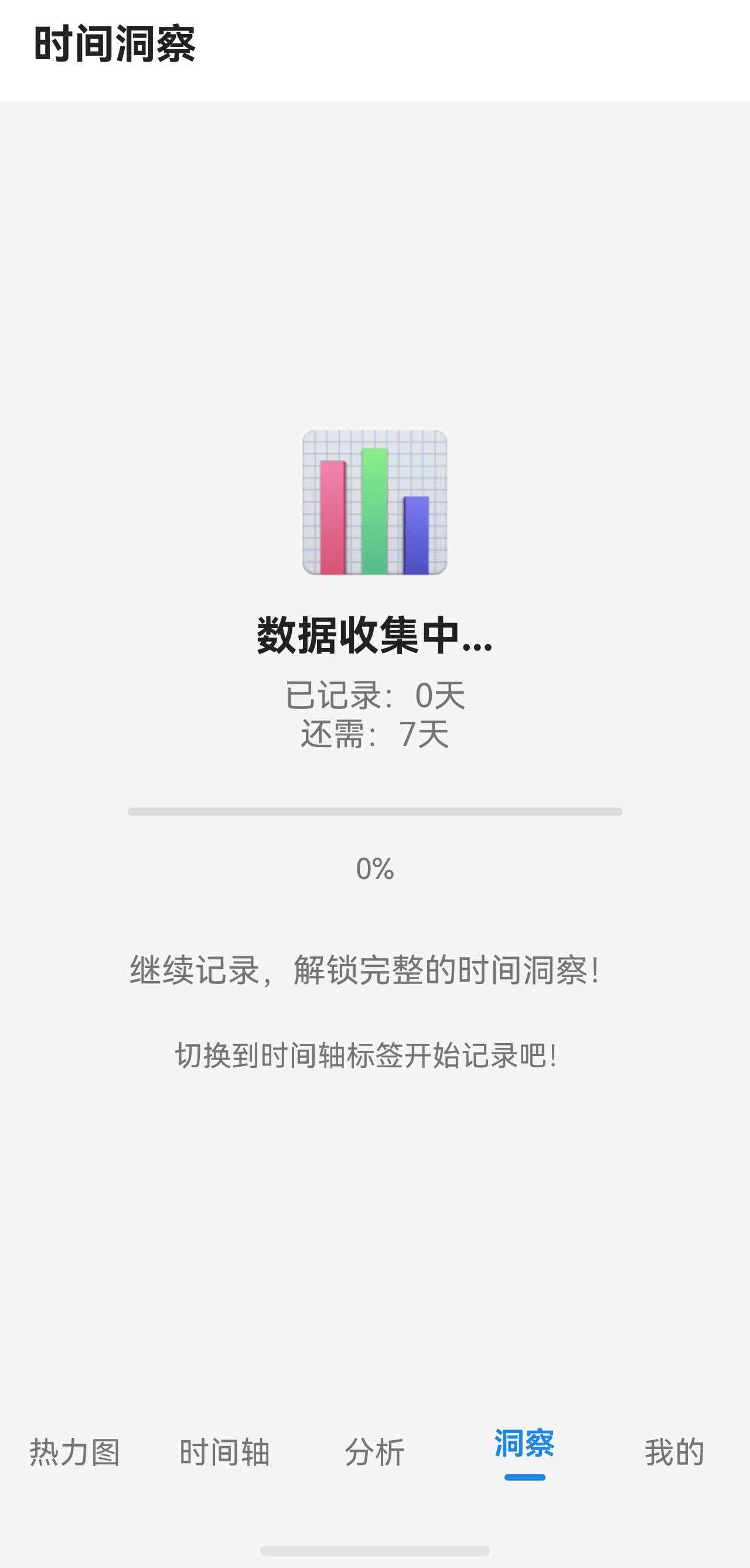
时间洞察页面需要至少 7 天的数据才能进行分析。当数据不足时,显示空状态页面,包含:
- 视觉图标吸引注意
- 当前状态说明(已记录/还需天数)
- 进度可视化
- 操作引导提示
页面状态判断逻辑
在页面构建时,根据数据状态决定显示内容:
typescript
build() {
  Column() {
    this.TopBar()

    if (this.isLoading) {
      this.LoadingView()
    } else if (this.dataInsufficientDays > 0) {
      // 数据不足,显示空状态
      this.DataInsufficientView()
    } else {
      // 数据充足,显示洞察内容
      Scroll() {
        // ... 正常内容
      }
    }
  }
  .width('100%')
  .height('100%')
  .backgroundColor($r('app.color.background_color'))
}
通过 dataInsufficientDays 变量判断是否需要显示空状态,值为 0 表示数据充足,大于 0 表示还差几天。
空状态布局实现
整体结构
空状态页面采用垂直居中布局,所有内容水平居中排列:
typescript
@Builder
DataInsufficientView() {
  Column() {
    // 图标
    Text('📊')
      .fontSize(64)
      .margin({ bottom: 16 })

    // 主标题
    Text('数据收集中...')
      .fontSize(this.fs(20))
      .fontWeight(FontWeight.Bold)
      .fontColor($r('app.color.text_primary'))
      .margin({ bottom: 8 })

    // 状态信息
    Text(`已记录:${7 - this.dataInsufficientDays}天`)
      .fontSize(this.fs(16))
      .fontColor($r('app.color.text_secondary'))

    Text(`还需:${this.dataInsufficientDays}天`)
      .fontSize(this.fs(16))
      .fontColor($r('app.color.text_secondary'))
      .margin({ bottom: 24 })

    // 进度条
    Progress({
      value: 7 - this.dataInsufficientDays,
      total: 7,
      type: ProgressType.Linear
    })
      .width('80%')
      .height(8)
      .color($r('app.color.primary_color'))
      .margin({ bottom: 16 })

    // 百分比
    Text(`${Math.round(((7 - this.dataInsufficientDays) / 7) * 100)}%`)
      .fontSize(this.fs(14))
      .fontColor($r('app.color.text_secondary'))
      .margin({ bottom: 32 })

    // 鼓励文字
    Text('继续记录,解锁完整的时间洞察!')
      .fontSize(this.fs(16))
      .fontColor($r('app.color.text_secondary'))
      .margin({ bottom: 24 })

    // 操作引导
    Text('切换到时间轴标签开始记录吧!')
      .fontSize(this.fs(14))
      .fontColor($r('app.color.text_secondary'))
  }
  .width('100%')
  .layoutWeight(1)
  .justifyContent(FlexAlign.Center)
  .padding(32)
}
布局要点
1. 垂直居中
使用 layoutWeight(1) 让 Column 占据剩余空间,配合 justifyContent(FlexAlign.Center) 实现内容垂直居中:
typescript
Column() {
  // 内容
}
.width('100%')
.layoutWeight(1)
.justifyContent(FlexAlign.Center)
2. 视觉层次
通过字体大小、颜色、粗细区分信息层次:
| 元素 | 字号 | 颜色 | 粗细 |
|---|---|---|---|
| 图标 | 64 | - | - |
| 主标题 | 20 | text_primary | Bold |
| 状态信息 | 16 | text_secondary | Regular |
| 百分比 | 14 | text_secondary | Regular |
| 引导文字 | 14-16 | text_secondary | Regular |
3. 间距控制
使用 margin 控制元素间距,形成视觉分组:
- 图标与标题:16px
- 标题与状态信息:8px
- 状态信息与进度条:24px
- 进度条与百分比:16px
- 百分比与鼓励文字:32px
Progress 进度条组件
空状态页面的核心是进度条,直观展示数据收集进度:
typescript
Progress({
  value: 7 - this.dataInsufficientDays,
  total: 7,
  type: ProgressType.Linear
})
  .width('80%')
  .height(8)
.color($r('app.color.primary_color'))参数说明:
value:当前进度值total:总进度值type:进度条类型,ProgressType.Linear为线性进度条
样式设置:
width('80%'):宽度为父容器的 80%,两侧留白height(8):高度 8px,视觉上更加精致color():进度条颜色,使用主题色
加载状态设计
除了空状态,还需要处理数据加载中的情况:
typescript
@Builder
LoadingView() {
  Column() {
    LoadingProgress()
      .width(48)
      .height(48)
      .color($r('app.color.primary_color'))

    Text('正在分析你的时间数据...')
      .fontSize(this.fs(16))
      .fontColor($r('app.color.text_secondary'))
      .margin({ top: 16 })
  }
  .width('100%')
  .layoutWeight(1)
  .justifyContent(FlexAlign.Center)
}
LoadingProgress 是 HarmonyOS 内置的加载动画组件,只需设置尺寸和颜色即可。
小结
本文介绍了空状态页面的设计要点:
- 状态判断:使用条件变量区分加载中、空状态、正常状态
- 布局居中 :
layoutWeight(1)+justifyContent(FlexAlign.Center) - 视觉层次:通过字号、颜色、间距区分信息重要性
- 进度展示 :
Progress组件可视化数据收集进度
空状态页面虽然内容简单,但设计得当能有效提升用户体验,引导用户完成预期操作。