文章目录
-
- 前言
- 一、清空按钮机制
-
- [1.1 清空按钮的显隐逻辑](#1.1 清空按钮的显隐逻辑)
- [1.2 清空操作的完整处理链](#1.2 清空操作的完整处理链)
- [1.3 两种 clearTrigger 对比演示](#1.3 两种 clearTrigger 对比演示)
- 二、密码显隐切换机制
-
- [2.1 切换按钮的可见性判断](#2.1 切换按钮的可见性判断)
- [2.2 切换状态与 InputType 的联动](#2.2 切换状态与 InputType 的联动)
- [2.3 密码输入完整演示](#2.3 密码输入完整演示)
- 三、后缀图标的优先级仲裁
-
- [3.1 为什么需要优先级仲裁](#3.1 为什么需要优先级仲裁)
- [3.2 优先级设计的合理性](#3.2 优先级设计的合理性)
- [3.3 后缀图标点击事件实战](#3.3 后缀图标点击事件实战)
- 四、回车确认事件
-
- [4.1 enterKeyType 键盘语义化配置](#4.1 enterKeyType 键盘语义化配置)
- [4.2 handleConfirm 的实现](#4.2 handleConfirm 的实现)
- [4.3 搜索框完整示例](#4.3 搜索框完整示例)
- 总结
前言
一个优秀的输入框组件,不仅要处理好"输入"本身,还要把围绕输入框的操作行为 做得足够细腻。RcInput 经过半年磨一剑 的迭代,在清空按钮、密码显隐切换、后缀图标、键盘确认键这几个看似简单的交互点上,隐藏了大量精心设计的细节:清空的时机判断、密码切换的状态联动、三类后缀图标的优先级仲裁、回车键的语义化配置......本文将逐一拆解这些交互机制,让你彻底掌握 RcInput 操作行为层的完整逻辑。
一、清空按钮机制
1.1 清空按钮的显隐逻辑
清空按钮并不是"开启 clearable 就一直显示",其可见性由 shouldShowClear() 方法综合多个条件动态判断:
typescript
private shouldShowClear(): boolean {
  // 前置条件:未开启 clearable、或已禁用、或只读,都不显示
  if (!this.clearable || this.disabled || this.readonly) {
    return false
  }

  // always 模式:有内容就显示
  if (this.clearTrigger === 'always') {
    return this.innerValue.length > 0
  }

  // focus 模式(默认):聚焦 + 有内容才显示
  return this.isFocused && this.innerValue.length > 0
}
两种 clearTrigger 策略的对比:
| 值 | 显示条件 | 适用场景 |
|---|---|---|
focus(默认) |
聚焦中 + 有内容 | 通用表单,减少非输入状态的视觉干扰 |
always |
有内容即显示,无论是否聚焦 | 搜索框、筛选栏,用户随时需要一键清空 |
提示:
disabled(禁用)和readonly(只读)状态下清空按钮永远不出现,因为这两种状态的语义是"内容不可修改",清空操作与此矛盾。
1.2 清空操作的完整处理链
点击清空按钮后,handleClear 会触发一整条处理链:
typescript
private handleClear() {
  // 清空内部值
  this.innerValue = ''

  // 通知父组件更新(双向绑定)
  this.onValueChange('')

  // 重置 lastValue,避免失焦时误触发 onTextChange
  this.lastValue = ''

  // 触发清空事件
  if (this.onInputClear) {
    this.onInputClear()
  }

  // 同时触发 onTextChange(清空也是一种值变更)
  if (this.onTextChange) {
    this.onTextChange('')
  }
}注意:清空操作会同时触发 onInputClear 和 onTextChange 。这个设计非常关键------如果业务逻辑监听了 onTextChange 做表单验证,清空输入框时也应该触发验证逻辑(如:清空后显示"必填项不能为空"的红色提示)。
lastValue 被同步重置为空字符串的原因:如果不重置,清空后再失焦,handleBlur 会发现 innerValue('') !== lastValue(原来的值),从而再次触发一次 onTextChange(''),造成重复触发。
1.3 两种 clearTrigger 对比演示
typescript
import { RcInput } from 'rchoui'

@Entry
@ComponentV2
struct ClearTriggerDemo {
  @Local v1: string = '试着清空我'
  @Local v2: string = '试着清空我'

  build() {
    Column({ space: 20 }) {
      Text('clearTrigger 对比演示').fontSize(20).fontWeight(FontWeight.Bold)

      Column({ space: 6 }) {
        Text('focus 模式(默认):聚焦时才显示清空按钮').fontSize(13).fontColor('#909399')
        RcInput({
          value: this.v1,
          onValueChange: (v: string) => { this.v1 = v },
          clearable: true,
          clearTrigger: 'focus',
          placeholder: '点击聚焦后出现清空按钮'
        })
      }
      .alignItems(HorizontalAlign.Start)
      .width('100%')

      Column({ space: 6 }) {
        Text('always 模式:有内容就显示清空按钮').fontSize(13).fontColor('#909399')
        RcInput({
          value: this.v2,
          onValueChange: (v: string) => { this.v2 = v },
          clearable: true,
          clearTrigger: 'always',
          placeholder: '有内容时始终显示清空按钮'
        })
      }
      .alignItems(HorizontalAlign.Start)
      .width('100%')
    }
    .padding(24)
    .width('100%')
    .backgroundColor('#F5F7FA')
  }
}
二、密码显隐切换机制
2.1 切换按钮的可见性判断
密码切换按钮的显示条件比清空按钮更严格,需要同时满足四个条件:
typescript
private shouldShowPasswordToggle(): boolean {
  // 必须同时满足:开启 showPassword + 类型为 password + 非禁用 + 非只读
  return this.showPassword && this.inputType === 'password' && !this.disabled && !this.readonly
}
四个条件缺一不可:
showPassword: true:开发者显式开启密码切换功能inputType === 'password':只有密码类型才有切换意义!disabled:禁用状态不应允许任何操作!readonly:只读状态同理
2.2 切换状态与 InputType 的联动
typescript
// 切换密码显隐
private handlePasswordToggle() {
  this.showPasswordText = !this.showPasswordText
  // showPasswordText 变化后,getInputType() 会重新计算:
  // showPasswordText = false  =>  InputType.Password(隐藏密码,显示圆点)
  // showPasswordText = true   =>  InputType.Normal(显示明文)
}状态切换后,getInputType() 方法的判断逻辑:
typescript
private getInputType(): InputType {
  // 密码类型且处于"隐藏"状态,才使用 Password 类型
  if (this.inputType === 'password' && !this.showPasswordText) {
    return InputType.Password
  }
  // 开启"显示密码"后,降级为普通文本,让用户看到明文
  switch (this.inputType) {
    case 'password':
    case 'text':
    default:
      return InputType.Normal
  }
}这里有一个精妙的设计:showPasswordText = true 时,InputType 被降级为 Normal,而不是继续用 Password。这样键盘行为完全不变(仍然弹出字母键盘),只是输入框从圆点变为明文显示。
2.3 密码输入完整演示
typescript
import { RcInput } from 'rchoui'

@Entry
@ComponentV2
struct PasswordDemo {
  @Local password: string = ''

  build() {
    Column({ space: 16 }) {
      Text('密码输入演示').fontSize(20).fontWeight(FontWeight.Bold)

      RcInput({
        value: this.password,
        onValueChange: (v: string) => { this.password = v },
        inputType: 'password',
        showPassword: true,
        placeholder: '请输入密码(点击眼睛图标切换显示)'
      })

      Text(`密码长度:${this.password.length} 位`)
        .fontSize(14)
        .fontColor('#909399')
    }
    .padding(24)
    .width('100%')
    .backgroundColor('#F5F7FA')
  }
}
三、后缀图标的优先级仲裁
3.1 为什么需要优先级仲裁
后缀图标区域是一个"共享空间",三类内容都可能出现在这里:
- 清空按钮 :
clearable: true且满足显示条件时 - 密码切换按钮 :
showPassword: true且类型为password时 - 自定义后缀图标 :传入了
suffixIcon时
如果不加限制,三者可能同时出现导致图标堆叠。组件通过 else if 链实现互斥显示,并明确规定了优先级顺序:
typescript
@Builder
renderSuffix() {
  Row() {
    // 优先级 1:清空按钮(最高优先级)
    if (this.shouldShowClear()) {
      RcIcon({
        name: 'icon-houi_close_circle',
        iconSize: this.getIconSize(),
        color: this.iconColor,
        onIconClick: () => { this.handleClear() }
      }).margin({ left: 8 })
    }
    // 优先级 2:密码切换按钮(次优先)
    else if (this.shouldShowPasswordToggle()) {
      RcIcon({
        name: this.showPasswordText ? 'icon-houi_eye' : 'icon-houi_eye_off',
        iconSize: this.getIconSize(),
        color: this.iconColor,
        onIconClick: () => { this.handlePasswordToggle() }
      }).margin({ left: 8 })
    }
    // 优先级 3:自定义后缀图标(最低优先级)
    else if (this.suffixIcon) {
      RcIcon({
        name: this.suffixIcon,
        iconSize: this.getIconSize(),
        color: this.iconColor,
        onIconClick: () => {
          if (this.onSuffixClick) { this.onSuffixClick() }
        }
      }).margin({ left: 8 })
    }
  }
}
3.2 优先级设计的合理性
主要特点:
- 清空按钮最高:用户正在输入时,最迫切的操作往往是清空,应优先展示;且清空是一次性动作,完成后按钮消失,不会长期占用空间
- 密码切换次之:密码框的眼睛图标是固定功能按钮,比业务方自定义的辅助图标更具通用性和必要性
- 自定义图标最低:自定义后缀通常是辅助性的扩展功能,在前两者均不需要时才展示
核心优势:
- 同一位置不会同时出现两个图标,布局始终整洁
- 优先级规则透明可预期,开发者无需手动处理互斥逻辑
else if链性能极低,没有多余的计算开销
3.3 后缀图标点击事件实战
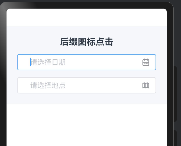
后缀图标的典型用途是触发关联的选择器(日期、地点、颜色等):
typescript
import { RcInput } from 'rchoui'

@Entry
@ComponentV2
struct SuffixIconDemo {
  @Local dateValue: string = ''
  @Local locationValue: string = ''

  build() {
    Column({ space: 16 }) {
      Text('后缀图标点击').fontSize(20).fontWeight(FontWeight.Bold)

      RcInput({
        value: this.dateValue,
        onValueChange: (v: string) => { this.dateValue = v },
        placeholder: '请选择日期',
        suffixIcon: 'icon-houi_calendar_outline',
        onSuffixClick: () => {
          // 点击日历图标,打开日期选择器
          console.log('打开日期选择器')
          this.dateValue = '2026-03-19'
        }
      })

      RcInput({
        value: this.locationValue,
        onValueChange: (v: string) => { this.locationValue = v },
        placeholder: '请选择地点',
        suffixIcon: 'icon-houi_map_outline',
        onSuffixClick: () => {
          console.log('打开地图选择')
          this.locationValue = '深圳市南山区'
        }
      })
    }
    .padding(24)
    .width('100%')
    .backgroundColor('#F5F7FA')
  }
}
四、回车确认事件
4.1 enterKeyType 键盘语义化配置
键盘右下角的确认键不仅可以触发事件,还可以通过 enterKeyType 自定义其显示文字和图标,传递更准确的操作语义:
| 值 | 键盘显示 | 适用场景 |
|---|---|---|
done |
"完成" | 通用表单,填写完毕 |
go |
"前往" | URL 输入框 |
next |
"下一项" | 多字段表单,跳转下一个输入框 |
search |
"搜索" | 搜索框 |
send |
"发送" | 聊天输入框 |
4.2 handleConfirm 的实现
typescript
private handleConfirm() {
  // 确认时也检查值是否改变,触发 onTextChange
  if (this.innerValue !== this.lastValue) {
    this.lastValue = this.innerValue
    if (this.onTextChange) {
      this.onTextChange(this.innerValue)
    }
  }

  if (this.onInputConfirm) {
    this.onInputConfirm(this.innerValue)
  }
}
回车确认与失焦的事件触发对比:
| 行为 | onTextChange | onInputBlur | onInputConfirm |
|---|---|---|---|
| 用户点击其他区域失焦 | 值改变时触发 | 触发 | 不触发 |
| 用户按下回车/确认键 | 值改变时触发 | 不触发 | 触发 |
这个区分非常实用:搜索框按回车应该执行搜索(onInputConfirm),但用户只是切换焦点不代表要搜索(不应触发 onInputConfirm)。
4.3 搜索框完整示例
typescript
import { RcInput } from 'rchoui'

@Entry
@ComponentV2
struct SearchBarDemo {
  @Local keyword: string = ''
  @Local searchResult: string = ''

  build() {
    Column({ space: 16 }) {
      Text('搜索框演示').fontSize(20).fontWeight(FontWeight.Bold)

      RcInput({
        value: this.keyword,
        onValueChange: (v: string) => { this.keyword = v },
        placeholder: '输入关键词搜索',
        prefixIcon: 'icon-houi_search_outline',
        clearable: true,
        enterKeyType: 'search',
        onInputChange: (v: string) => {
          // 实时搜索:边输入边更新结果
          if (v.length > 0) {
            this.searchResult = `正在搜索 "${v}"...`
          } else {
            this.searchResult = ''
          }
        },
        onInputConfirm: (v: string) => {
          // 按下搜索键:执行正式搜索
          this.searchResult = `搜索 "${v}" 的结果:找到 42 条记录`
        },
        onInputClear: () => {
          this.searchResult = ''
        }
      })

      if (this.searchResult !== '') {
        Text(this.searchResult)
          .fontSize(14)
          .fontColor('#606266')
          .padding(12)
          .backgroundColor('#FFFFFF')
          .borderRadius(6)
          .width('100%')
      }
    }
    .padding(24)
    .width('100%')
    .backgroundColor('#F5F7FA')
  }
}
这个搜索框示例综合运用了三个事件:
onInputChange:实时显示"正在搜索..."的提示,给用户即时反馈onInputConfirm:按下搜索键才执行真正的搜索逻辑,避免每个字符都触发请求onInputClear:清空时同步清除搜索结果,保持界面一致性
总结
RcInput 的操作行为层设计围绕确定性 和优先级 两个核心概念展开。清空机制通过 clearTrigger 在"随时可用"与"按需出现"之间给开发者选择权,并通过 lastValue 去重避免清空后的重复事件;密码切换将 showPasswordText 状态与底层 InputType 的映射完全封装在组件内部,外部使用零感知;后缀图标区域的三级优先级仲裁让清空、密码切换、自定义图标三者和谐共存;enterKeyType 的语义化配置则让键盘确认键成为真正有意义的操作触发器。这些细节的总和,构成了 HarmonyOS6 应用中一个"体验有质感"的输入框组件的基础。
如果这篇文章对你有帮助,欢迎点赞、收藏、关注,你的支持是我持续创作的动力!