欢迎加入开源鸿蒙跨平台社区:https://openharmonycrossplatform.csdn.net
📌 开发环境声明:本文基于 React Native 0.72.90 版本进行开发适配
🚀 一、开篇引言
Flash Message 是一种轻量级的消息提示组件,用于在应用顶部或底部显示短暂的通知信息。react-native-flash-message 是 React Native 社区中广受欢迎的消息提示库,支持多种预设类型、自定义样式和动画效果,非常适合用于显示成功、错误、警告等提示信息。本文将带你深入了解如何在 HarmonyOS 平台上集成和使用这个实用的 UI 组件。
1.1 你将学到什么?
- ✅ FlashMessage 的核心概念与工作原理
- ✅ HarmonyOS 平台的完整集成流程
- ✅ 基础消息提示与多种类型
- ✅ API 属性的深度解析
- ✅ 实际应用场景的最佳实践
1.2 适用人群
- 正在进行 React Native 鸿蒙化迁移的开发者
- 需要优雅消息提示方案的开发者
- 对跨平台 UI 组件开发感兴趣的技术爱好者
1.3 为什么选择 FlashMessage?
| 特点 | 说明 |
|---|---|
| 轻量级 | 无需复杂配置,开箱即用 |
| 多种类型 | 支持 success、info、warning、danger |
| 灵活定位 | 支持 top、bottom、center 位置 |
| 自定义渲染 | 支持自定义内容渲染 |
| 动画效果 | 流畅的显示/隐藏动画 |
📦 二、库概览
2.1 基本信息
| 项目 | 内容 |
|---|---|
| 库名称 | react-native-flash-message |
| 版本信息 | 0.4.2 |
| 官方仓库 | https://github.com/lucasferreira/react-native-flash-message |
| 开源协议 | MIT |
2.2 版本兼容性
| 三方库版本 | 支持RN版本 |
|---|---|
| 0.4.2 | 0.72 / 0.77 |
2.3 核心能力矩阵
| 能力项 | 描述 | HarmonyOS 支持 |
|---|---|---|
| 消息显示 | showMessage | ✅ 完全支持 |
| 消息隐藏 | hideMessage | ✅ 完全支持 |
| 位置控制 | position 属性 | ✅ 完全支持 |
| 类型预设 | type 属性 | ✅ 完全支持 |
| 自动隐藏 | autoHide 属性 | ✅ 完全支持 |
| 自定义渲染 | renderCustomContent | ✅ 完全支持 |
| 点击事件 | onPress / onLongPress | ✅ 完全支持 |
| 图标支持 | icon 属性 | ✅ 完全支持 |
2.4 技术架构图
平台层
功能层
React Native 应用层
FlashMessage 组件
showMessage 方法
hideMessage 方法
消息类型
位置控制
动画效果
自定义渲染
Android
iOS
HarmonyOS
2.5 典型应用场景
| 场景 | 描述 | 示例 |
|---|---|---|
| 操作反馈 | 成功/失败提示 | ✅ 保存成功、提交失败 |
| 警告提示 | 重要信息提醒 | ⚠️ 电量低、网络异常 |
| 信息通知 | 系统消息展示 | ℹ️ 系统维护、新功能 |
| 自定义消息 | 复杂内容展示 | 📱 带操作按钮的消息 |
📖 三、安装与配置
3.1 安装依赖
进入到工程目录并输入以下命令:
bash
npm install react-native-flash-message@0.4.2或使用 yarn:
bash
yarn add react-native-flash-message@0.4.23.2 验证安装
安装完成后,检查 package.json 文件中是否包含以下依赖:
json
{
  "dependencies": {
    "react-native-flash-message": "0.4.2"
  }
}
3.3 基本导入
tsx
import FlashMessage, { showMessage, hideMessage } from 'react-native-flash-message';📖 四、API 详解
4.1 showMessage 方法
用于显示消息提示的全局方法。
签名:
typescript
showMessage(options: FlashMessageProps): void用法:
tsx
import { showMessage } from 'react-native-flash-message';

showMessage({
  message: '操作成功',
  description: '数据已保存',
  type: 'success',
});
4.2 hideMessage 方法
用于手动隐藏消息的全局方法。
签名:
typescript
hideMessage(): void用法:
tsx
import { hideMessage } from 'react-native-flash-message';

hideMessage();
4.3 属性详解
message - 消息标题
消息的主标题文本。
类型: string
必填: 是
tsx
showMessage({
  message: '操作成功',
});
description - 消息描述
消息的详细描述文本。
类型: string
tsx
showMessage({
  message: '操作成功',
  description: '您的数据已成功保存!',
});
type - 消息类型
预设的消息类型,决定消息的背景颜色和图标。
类型: 'success' | 'info' | 'warning' | 'danger'
默认值: 'info'
| 类型 | 颜色 | 用途 |
|---|---|---|
| success | 绿色 | 成功操作 |
| info | 蓝色 | 信息提示 |
| warning | 橙色 | 警告提醒 |
| danger | 红色 | 错误提示 |
tsx
showMessage({
  message: '操作成功',
  type: 'success',
});
position - 消息位置
消息显示的位置。
类型: 'top' | 'bottom' | 'center'
默认值: 'top'
tsx
showMessage({
  message: '底部消息',
  position: 'bottom',
});
duration - 显示时长
消息自动隐藏的时间(毫秒)。
类型: number
默认值: 1850
tsx
showMessage({
  message: '显示3秒',
  duration: 3000,
});
autoHide - 自动隐藏
是否自动隐藏消息。
类型: boolean
默认值: true
tsx
showMessage({
  message: '需手动关闭',
  autoHide: false,
});
icon - 图标设置
消息图标的配置。
类型: 'none' | 'auto' | 'success' | 'info' | 'warning' | 'danger' | object
默认值: 'auto'
tsx
showMessage({
  message: '自定义图标',
  icon: 'success',
});
hideOnPress - 点击隐藏
点击消息是否隐藏。
类型: boolean
默认值: true
tsx
showMessage({
  message: '点击不关闭',
  hideOnPress: false,
});
onPress - 点击回调
点击消息时的回调函数。
类型: () => void
tsx
showMessage({
  message: '点击我',
  onPress: () => console.log('消息被点击'),
});
onLongPress - 长按回调
长按消息时的回调函数。
类型: () => void
tsx
showMessage({
  message: '长按我',
  onLongPress: () => console.log('消息被长按'),
});
animated - 动画开关
是否启用显示/隐藏动画。
类型: boolean
默认值: true
tsx
showMessage({
  message: '无动画',
  animated: false,
});
animationDuration - 动画时长
动画持续时间(毫秒)。
类型: number
默认值: 225
tsx
showMessage({
  message: '慢动画',
  animationDuration: 500,
});
floating - 浮动样式
是否使用浮动卡片样式。
类型: boolean
默认值: false
tsx
showMessage({
  message: '浮动消息',
  floating: true,
});
style - 容器样式
消息容器的自定义样式。
类型: ViewStyle
tsx
showMessage({
  message: '自定义样式',
  style: { backgroundColor: '#9b59b6', borderRadius: 10 },
});
titleStyle - 标题样式
标题文本的自定义样式。
类型: TextStyle
tsx
showMessage({
  message: '自定义标题',
  titleStyle: { fontSize: 18, fontWeight: 'bold' },
});
textStyle - 描述样式
描述文本的自定义样式。
类型: TextStyle
tsx
showMessage({
  message: '标题',
  description: '描述文本',
  textStyle: { fontSize: 14, color: '#fff' },
});
renderBeforeContent - 前置渲染
在标题之前渲染自定义内容。
类型: () => JSX.Element
tsx
showMessage({
  message: '消息标题',
  renderBeforeContent: () => (
    <View style={{ width: 40, height: 40, backgroundColor: '#fff', borderRadius: 20 }} />
  ),
});
renderCustomContent - 自定义内容
在标题下方渲染自定义内容。
类型: () => JSX.Element
tsx
showMessage({
  message: '消息标题',
  renderCustomContent: () => (
    <Text>自定义内容区域</Text>
  ),
});
renderAfterContent - 后置渲染
在内容之后渲染自定义内容。
类型: () => JSX.Element
tsx
showMessage({
  message: '消息标题',
  renderAfterContent: () => (
    <TouchableOpacity onPress={() => hideMessage()}>
      <Text>关闭</Text>
    </TouchableOpacity>
  ),
});
💡 五、使用示例
5.1 基础消息提示
展示四种基本类型的消息提示。
适用场景: 操作反馈、状态提示。
tsx
import React from 'react';
import { View, TouchableOpacity, Text, StyleSheet } from 'react-native';
import FlashMessage, { showMessage } from 'react-native-flash-message';

const BasicFlashMessage = () => {
  const showSuccess = () => {
    showMessage({
      message: '操作成功',
      description: '您的数据已成功保存!',
      type: 'success',
    });
  };

  const showError = () => {
    showMessage({
      message: '操作失败',
      description: '网络连接失败,请重试。',
      type: 'danger',
    });
  };

  const showWarning = () => {
    showMessage({
      message: '电量警告',
      description: '设备电量低于 20%,请及时充电。',
      type: 'warning',
    });
  };

  const showInfo = () => {
    showMessage({
      message: '系统通知',
      description: '系统将于今晚 23:00 进行维护升级。',
      type: 'info',
    });
  };

  return (
    <View style={styles.container}>
      <TouchableOpacity style={[styles.button, styles.successBtn]} onPress={showSuccess}>
        <Text style={styles.buttonText}>成功提示</Text>
      </TouchableOpacity>
      <TouchableOpacity style={[styles.button, styles.errorBtn]} onPress={showError}>
        <Text style={styles.buttonText}>错误提示</Text>
      </TouchableOpacity>
      <TouchableOpacity style={[styles.button, styles.warningBtn]} onPress={showWarning}>
        <Text style={styles.buttonText}>警告提示</Text>
      </TouchableOpacity>
      <TouchableOpacity style={[styles.button, styles.infoBtn]} onPress={showInfo}>
        <Text style={styles.buttonText}>信息提示</Text>
      </TouchableOpacity>

      <FlashMessage position="top" />
    </View>
  );
};

const styles = StyleSheet.create({
  container: {
    flex: 1,
    justifyContent: 'center',
    alignItems: 'center',
    padding: 20,
    gap: 16,
  },
  button: {
    width: 200,
    padding: 14,
    borderRadius: 8,
    alignItems: 'center',
  },
  successBtn: { backgroundColor: '#32a54a' },
  errorBtn: { backgroundColor: '#cc3232' },
  warningBtn: { backgroundColor: '#cd853f' },
  infoBtn: { backgroundColor: '#2b73b6' },
  buttonText: {
    color: '#fff',
    fontSize: 16,
    fontWeight: '600',
  },
});

export default BasicFlashMessage;
代码解析:
type属性设置消息类型,自动应用对应颜色description提供详细描述信息FlashMessage组件放在组件树最外层
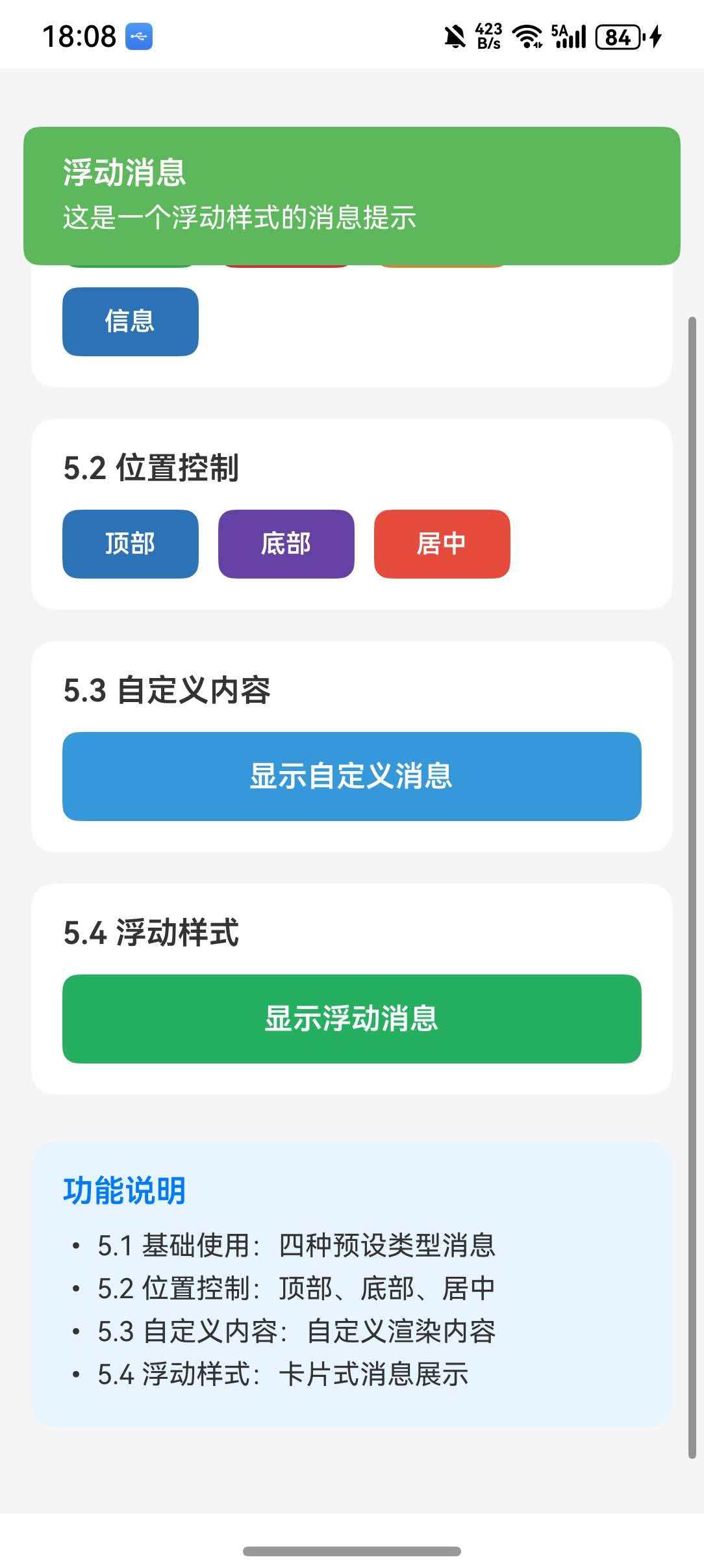
5.2 位置控制
控制消息显示的位置。
适用场景: 不同场景下的消息展示需求。
tsx
import React from 'react';
import { View, TouchableOpacity, Text, StyleSheet } from 'react-native';
import FlashMessage, { showMessage } from 'react-native-flash-message';

const PositionFlashMessage = () => {
  const showTop = () => {
    showMessage({
      message: '顶部消息',
      description: '这是从顶部弹出的消息提示。',
      type: 'info',
      position: 'top',
    });
  };

  const showBottom = () => {
    showMessage({
      message: '底部消息',
      description: '这是从底部弹出的消息提示。',
      type: 'info',
      position: 'bottom',
    });
  };

  const showCenter = () => {
    showMessage({
      message: '居中消息',
      description: '这是居中显示的消息提示。',
      type: 'info',
      position: 'center',
    });
  };

  return (
    <View style={styles.container}>
      <TouchableOpacity style={[styles.button, { backgroundColor: '#2b73b6' }]} onPress={showTop}>
        <Text style={styles.buttonText}>顶部弹出</Text>
      </TouchableOpacity>
      <TouchableOpacity style={[styles.button, { backgroundColor: '#6441A4' }]} onPress={showBottom}>
        <Text style={styles.buttonText}>底部弹出</Text>
      </TouchableOpacity>
      <TouchableOpacity style={[styles.button, { backgroundColor: '#e74c3c' }]} onPress={showCenter}>
        <Text style={styles.buttonText}>居中显示</Text>
      </TouchableOpacity>

      <FlashMessage position="top" />
    </View>
  );
};

const styles = StyleSheet.create({
  container: {
    flex: 1,
    justifyContent: 'center',
    alignItems: 'center',
    gap: 16,
  },
  button: {
    width: 200,
    padding: 14,
    borderRadius: 8,
    alignItems: 'center',
  },
  buttonText: {
    color: '#fff',
    fontSize: 16,
    fontWeight: '600',
  },
});

export default PositionFlashMessage;
代码解析:
position属性控制消息显示位置- 支持
top、bottom、center三种位置 - 可根据场景灵活选择
5.3 自定义内容
使用自定义渲染函数添加额外内容。
适用场景: 需要丰富内容展示的场景。
tsx
import React from 'react';
import { View, TouchableOpacity, Text, StyleSheet } from 'react-native';
import FlashMessage, { showMessage, hideMessage } from 'react-native-flash-message';

const CustomFlashMessage = () => {
  const showCustomContent = () => {
    showMessage({
      message: '新消息通知',
      description: '您有一条新的消息,点击查看详情。',
      type: 'info',
      autoHide: false,
      renderBeforeContent: () => (
        <View style={styles.avatarContainer}>
          <View style={styles.avatar}>
            <Text style={styles.avatarText}>👤</Text>
          </View>
        </View>
      ),
      renderAfterContent: () => (
        <View style={styles.actionContainer}>
          <TouchableOpacity
            style={styles.actionBtn}
            onPress={() => {
              console.log('查看消息');
              hideMessage();
            }}
          >
            <Text style={styles.actionText}>查看</Text>
          </TouchableOpacity>
          <TouchableOpacity
            style={styles.actionBtn}
            onPress={() => hideMessage()}
          >
            <Text style={styles.actionText}>忽略</Text>
          </TouchableOpacity>
        </View>
      ),
    });
  };

  return (
    <View style={styles.container}>
      <TouchableOpacity
        style={[styles.button, { backgroundColor: '#3498db' }]}
        onPress={showCustomContent}
      >
        <Text style={styles.buttonText}>显示自定义消息</Text>
      </TouchableOpacity>

      <FlashMessage position="top" />
    </View>
  );
};

const styles = StyleSheet.create({
  container: {
    flex: 1,
    justifyContent: 'center',
    alignItems: 'center',
  },
  button: {
    width: 200,
    padding: 14,
    borderRadius: 8,
    alignItems: 'center',
  },
  buttonText: {
    color: '#fff',
    fontSize: 16,
    fontWeight: '600',
  },
  avatarContainer: {
    marginRight: 12,
  },
  avatar: {
    width: 40,
    height: 40,
    borderRadius: 20,
    backgroundColor: '#e0e0e0',
    justifyContent: 'center',
    alignItems: 'center',
  },
  avatarText: {
    fontSize: 20,
  },
  actionContainer: {
    flexDirection: 'row',
    marginTop: 12,
    gap: 12,
  },
  actionBtn: {
    paddingHorizontal: 16,
    paddingVertical: 8,
    backgroundColor: 'rgba(255,255,255,0.2)',
    borderRadius: 4,
  },
  actionText: {
    color: '#fff',
    fontSize: 14,
  },
});

export default CustomFlashMessage;
代码解析:
renderBeforeContent在标题前渲染头像renderAfterContent在内容后渲染操作按钮autoHide: false禁用自动隐藏,需手动关闭
5.4 浮动样式
使用浮动模式显示消息。
适用场景: 需要卡片样式的消息提示。
tsx
import React from 'react';
import { View, TouchableOpacity, Text, StyleSheet } from 'react-native';
import FlashMessage, { showMessage } from 'react-native-flash-message';

const FloatingFlashMessage = () => {
  const showFloating = () => {
    showMessage({
      message: '浮动消息',
      description: '这是一个浮动样式的消息提示,带有圆角和边距。',
      type: 'success',
      floating: true,
      icon: 'success',
    });
  };

  return (
    <View style={styles.container}>
      <TouchableOpacity
        style={[styles.button, { backgroundColor: '#27ae60' }]}
        onPress={showFloating}
      >
        <Text style={styles.buttonText}>显示浮动消息</Text>
      </TouchableOpacity>

      <FlashMessage position="top" floating={true} />
    </View>
  );
};

const styles = StyleSheet.create({
  container: {
    flex: 1,
    justifyContent: 'center',
    alignItems: 'center',
  },
  button: {
    width: 200,
    padding: 14,
    borderRadius: 8,
    alignItems: 'center',
  },
  buttonText: {
    color: '#fff',
    fontSize: 16,
    fontWeight: '600',
  },
});

export default FloatingFlashMessage;
代码解析:
floating: true启用浮动样式- 消息会与屏幕边缘分离,显示圆角
六、常见问题
6.1 遗留问题
| 问题 | 说明 | 解决方案 |
|---|---|---|
| 状态栏隐藏抖动 | iOS 和鸿蒙效果有差异 | 暂未解决,系统非安全区域范围变化导致 |
6.2 常见问题解答
Q1: 消息不显示怎么办?
A: 确保 FlashMessage 组件已放置在应用的最外层,作为最后一个子组件。
Q2: 如何修改消息颜色?
A: 使用 style 属性自定义背景色,或使用 type 选择预设类型。
Q3: 如何让消息不自动消失?
A: 设置 autoHide: false,然后通过 hideMessage() 手动关闭。
Q4: 如何在消息中添加按钮?
A: 使用 renderAfterContent 渲染自定义按钮组件。
6.3 最佳实践
- 全局配置:在应用入口处放置 FlashMessage 组件
- 消息简洁:保持消息内容简短明了
- 合理时长:根据内容长度调整 duration
- 类型匹配:根据场景选择合适的消息类型
💻 七、完整示例代码
综合示例
tsx
import React, { useState } from 'react';
import {
  View,
  Text,
  StyleSheet,
  SafeAreaView,
  ScrollView,
  TouchableOpacity,
} from 'react-native';
import FlashMessage, { showMessage, hideMessage } from 'react-native-flash-message';

type MessageType = 'success' | 'info' | 'warning' | 'danger';

const BasicDemo = () => {
  const showMessageWithType = (type: MessageType, message: string, description: string) => {
    showMessage({
      message,
      description,
      type,
      icon: 'auto',
    });
  };

  return (
    <View style={styles.section}>
      <Text style={styles.sectionTitle}>5.1 基础使用</Text>
      <View style={styles.buttonRow}>
        <TouchableOpacity
          style={[styles.typeButton, { backgroundColor: '#32a54a' }]}
          onPress={() => showMessageWithType('success', '操作成功', '数据已保存')}
        >
          <Text style={styles.typeButtonText}>成功</Text>
        </TouchableOpacity>
        <TouchableOpacity
          style={[styles.typeButton, { backgroundColor: '#cc3232' }]}
          onPress={() => showMessageWithType('danger', '操作失败', '请重试')}
        >
          <Text style={styles.typeButtonText}>错误</Text>
        </TouchableOpacity>
        <TouchableOpacity
          style={[styles.typeButton, { backgroundColor: '#cd853f' }]}
          onPress={() => showMessageWithType('warning', '警告', '请注意')}
        >
          <Text style={styles.typeButtonText}>警告</Text>
        </TouchableOpacity>
        <TouchableOpacity
          style={[styles.typeButton, { backgroundColor: '#2b73b6' }]}
          onPress={() => showMessageWithType('info', '提示', '系统消息')}
        >
          <Text style={styles.typeButtonText}>信息</Text>
        </TouchableOpacity>
      </View>
    </View>
  );
};

const PositionDemo = () => {
  return (
    <View style={styles.section}>
      <Text style={styles.sectionTitle}>5.2 位置控制</Text>
      <View style={styles.buttonRow}>
        <TouchableOpacity
          style={[styles.typeButton, { backgroundColor: '#2b73b6' }]}
          onPress={() =>
            showMessage({
              message: '顶部消息',
              description: '从顶部弹出',
              type: 'info',
              position: 'top',
            })
          }
        >
          <Text style={styles.typeButtonText}>顶部</Text>
        </TouchableOpacity>
        <TouchableOpacity
          style={[styles.typeButton, { backgroundColor: '#6441A4' }]}
          onPress={() =>
            showMessage({
              message: '底部消息',
              description: '从底部弹出',
              type: 'info',
              position: 'bottom',
            })
          }
        >
          <Text style={styles.typeButtonText}>底部</Text>
        </TouchableOpacity>
        <TouchableOpacity
          style={[styles.typeButton, { backgroundColor: '#e74c3c' }]}
          onPress={() =>
            showMessage({
              message: '居中消息',
              description: '居中显示',
              type: 'info',
              position: 'center',
            })
          }
        >
          <Text style={styles.typeButtonText}>居中</Text>
        </TouchableOpacity>
      </View>
    </View>
  );
};

const CustomDemo = () => {
  return (
    <View style={styles.section}>
      <Text style={styles.sectionTitle}>5.3 自定义内容</Text>
      <TouchableOpacity
        style={[styles.fullButton, { backgroundColor: '#3498db' }]}
        onPress={() =>
          showMessage({
            message: '自定义消息',
            description: '带有额外内容的消息',
            type: 'info',
            autoHide: false,
            renderAfterContent: () => (
              <View style={styles.customContent}>
                <Text style={styles.customText}>点击下方按钮操作</Text>
                <View style={styles.actionRow}>
                  <TouchableOpacity
                    style={styles.actionBtn}
                    onPress={() => {
                      console.log('确认操作');
                      hideMessage();
                    }}
                  >
                    <Text style={styles.actionBtnText}>确认</Text>
                  </TouchableOpacity>
                  <TouchableOpacity
                    style={styles.actionBtn}
                    onPress={() => hideMessage()}
                  >
                    <Text style={styles.actionBtnText}>取消</Text>
                  </TouchableOpacity>
                </View>
              </View>
            ),
          })
        }
      >
        <Text style={styles.fullButtonText}>显示自定义消息</Text>
      </TouchableOpacity>
    </View>
  );
};

const FloatingDemo = () => {
  return (
    <View style={styles.section}>
      <Text style={styles.sectionTitle}>5.4 浮动样式</Text>
      <TouchableOpacity
        style={[styles.fullButton, { backgroundColor: '#27ae60' }]}
        onPress={() =>
          showMessage({
            message: '浮动消息',
            description: '这是一个浮动样式的消息提示',
            type: 'success',
            floating: true,
          })
        }
      >
        <Text style={styles.fullButtonText}>显示浮动消息</Text>
      </TouchableOpacity>
    </View>
  );
};

export default function App() {
  return (
    <SafeAreaView style={styles.container}>
      <ScrollView contentContainerStyle={styles.content}>
        <Text style={styles.title}>FlashMessage 组件示例</Text>
        <Text style={styles.subtitle}>
          轻量级消息提示组件,支持多种类型和自定义样式
        </Text>

        <BasicDemo />
        <PositionDemo />
        <CustomDemo />
        <FloatingDemo />

        <View style={styles.infoSection}>
          <Text style={styles.infoTitle}>功能说明</Text>
          <Text style={styles.infoText}>• 5.1 基础使用:四种预设类型消息</Text>
          <Text style={styles.infoText}>• 5.2 位置控制:顶部、底部、居中</Text>
          <Text style={styles.infoText}>• 5.3 自定义内容:自定义渲染内容</Text>
          <Text style={styles.infoText}>• 5.4 浮动样式:卡片式消息展示</Text>
        </View>
      </ScrollView>

      <FlashMessage position="top" />
    </SafeAreaView>
  );
}

const styles = StyleSheet.create({
  container: {
    flex: 1,
    backgroundColor: '#f5f5f5',
  },
  content: {
    padding: 16,
  },
  title: {
    fontSize: 24,
    fontWeight: 'bold',
    color: '#333',
    textAlign: 'center',
  },
  subtitle: {
    fontSize: 14,
    color: '#666',
    textAlign: 'center',
    marginTop: 8,
    marginBottom: 24,
  },
  section: {
    backgroundColor: '#fff',
    borderRadius: 12,
    padding: 16,
    marginBottom: 16,
  },
  sectionTitle: {
    fontSize: 16,
    fontWeight: '600',
    color: '#333',
    marginBottom: 12,
  },
  buttonRow: {
    flexDirection: 'row',
    flexWrap: 'wrap',
    gap: 10,
  },
  typeButton: {
    paddingHorizontal: 16,
    paddingVertical: 10,
    borderRadius: 8,
    minWidth: 70,
    alignItems: 'center',
  },
  typeButtonText: {
    color: '#fff',
    fontSize: 13,
    fontWeight: '600',
  },
  fullButton: {
    paddingVertical: 14,
    borderRadius: 8,
    alignItems: 'center',
  },
  fullButtonText: {
    color: '#fff',
    fontSize: 15,
    fontWeight: '600',
  },
  infoSection: {
    backgroundColor: '#e8f4ff',
    borderRadius: 12,
    padding: 16,
    marginTop: 8,
  },
  infoTitle: {
    fontSize: 16,
    fontWeight: '600',
    color: '#007AFF',
    marginBottom: 8,
  },
  infoText: {
    fontSize: 14,
    color: '#333',
    lineHeight: 22,
  },
  customContent: {
    marginTop: 12,
    padding: 12,
    backgroundColor: 'rgba(255,255,255,0.15)',
    borderRadius: 8,
  },
  customText: {
    color: '#fff',
    fontSize: 14,
    textAlign: 'center',
    marginBottom: 12,
  },
  actionRow: {
    flexDirection: 'row',
    justifyContent: 'center',
    gap: 16,
  },
  actionBtn: {
    paddingHorizontal: 20,
    paddingVertical: 8,
    backgroundColor: 'rgba(255,255,255,0.25)',
    borderRadius: 6,
  },
  actionBtnText: {
    color: '#fff',
    fontSize: 14,
    fontWeight: '600',
  },
});