我来为你撰写一篇关于这个自定义数字键盘组件的博客。基于你提供的代码和参考样式,我将按照CSDN博客的格式来组织内容。
uni-app组件开发----自定义数字键盘组件
1. 前言
在uni-app开发中,我们经常需要自定义键盘来满足特定的业务需求。本文将介绍一个自定义数字键盘组件的实现,支持数字输入、删除、确认等功能,适用于密码输入、金额输入等场景。
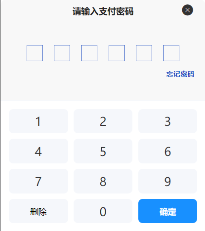
2. 组件效果
3. 组件特点
- 使用
uni-popup底部弹出,符合移动端交互习惯 - 支持最大长度限制
- 支持
v-model双向绑定 - 支持自定义插槽内容
- 简洁美观的UI设计
4. 组件代码
4.1 组件结构
创建组件文件 components/sys-keyboard/index.vue:
vue
<template>
  <view>
    <uni-popup ref="popup" background-color="#fff" type="bottom">
      <view class="bg-white rounded-t-[20rpx]">
        <view class="border-b border-[#F5F7FB]">
          <slot>
            <view class="cc rh-90 fs-32 text-[#303133] fw-600">请输入</view>
            <view class="cc rh-90 fs-32 text-[#303133] rmt-10 fw-600">{{ inputValue }}</view>
          </slot>
        </view>

        <view class="rpx-30 rpy-30">
          <view class="grid grid-cols-3 gap-20">
            <view
              v-for="(num, index) in numberKeys"
              :key="index"
              class="cc rh-90 bg-[#F5F7FB] rounded-[16rpx] active:bg-[#E8E8E8]"
              @click="onInput(num)"
            >
              <text class="fs-44 text-[#303133]">{{ num }}</text>
            </view>

            <view
              class="cc rh-90 fs-30 bg-[#F5F7FB] rounded-[16rpx] active:bg-[#E8E8E8]"
              @click="onDelete"
            >
              删除
            </view>

            <view
              class="cc rh-90 bg-[#F5F7FB] rounded-[16rpx] active:bg-[#E8E8E8]"
              @click="onInput(0)"
            >
              <text class="fs-44 text-[#303133]">0</text>
            </view>

            <view
              class="cc rh-90 bg-[#1890FF] rounded-[16rpx] active:bg-[#1677D9]"
              @click="onConfirm"
            >
              <text class="fs-30 text-white fw-600">确定</text>
            </view>
          </view>
        </view>
      </view>
    </uni-popup>
  </view>
</template>

<script>
export default {
  name: 'sys-keyboard',
  props: {
    modelValue: {
      type: String,
      default: ''
    },
    maxLength: {
      type: Number,
      default: 6
    }
  },
  watch: {
    modelValue(newVal, oldVal) {
      this.inputValue = newVal
    }
  },
  data() {
    return {
      numberKeys: [1, 2, 3, 4, 5, 6, 7, 8, 9],
      inputValue: ''
    }
  },
  methods: {
    open() {
      this.inputValue = ''
      this.$refs.popup.open()
    },
    close() {
      this.inputValue = ''
      this.$emit('close', '')
      this.$refs.popup.close()
    },
    onInput(num) {
      if (this.inputValue.length >= this.maxLength) {
        return
      }
      this.inputValue += num
      this.$emit('input', this.inputValue)
      this.$emit('update:modelValue', this.inputValue)
    },
    onDelete() {
      this.inputValue = this.inputValue.slice(0, -1)
      this.$emit('input', this.inputValue)
    },
    onConfirm() {
      this.$emit('confirm', this.inputValue)
      this.close()
    }
  }
}
</script>

<style scoped>
.active:active {
  opacity: 0.8;
}
</style>
5. 使用方式
5.1 在页面中引用组件
vue
<template>
  <view>
    <!-- 触发按钮 -->
    <button @click="openKeyboard">打开数字键盘</button>

    <!-- 数字键盘组件 -->
    <sys-keyboard
      v-model="inputValue"
      :maxLength="6"
      @input="onInput"
      @confirm="onConfirm"
      @close="onClose"
      ref="keyboard"
    ></sys-keyboard>
  </view>
</template>

<script>
import sysKeyboard from '@/components/sys-keyboard/index.vue';

export default {
  components: { sysKeyboard },
  data() {
    return {
      inputValue: ''
    }
  },
  methods: {
    openKeyboard() {
      this.$refs.keyboard.open()
    },
    onInput(value) {
      console.log('输入中:', value)
    },
    onConfirm(value) {
      console.log('确认输入:', value)
      // 处理确认逻辑
    },
    onClose() {
      console.log('键盘关闭')
    }
  }
}
</script>
6. 属性说明
| 属性名 | 类型 | 默认值 | 说明 |
|---|---|---|---|
| modelValue | String | '' | 当前输入的值(支持v-model) |
| maxLength | Number | 6 | 最大输入长度限制 |
7. 事件说明
| 事件名称 | 说明 |
|---|---|
| input | 输入时触发,参数为当前输入值 |
| confirm | 点击确定按钮时触发,参数为当前输入值 |
| close | 键盘关闭时触发 |
| update:modelValue | 用于v-model双向绑定 |
8. 方法说明
| 方法名 | 说明 |
|---|---|
| open() | 打开数字键盘 |
| close() | 关闭数字键盘 |
9. 自定义插槽
组件提供了默认插槽,可以自定义顶部显示内容:
vue
<sys-keyboard ref="keyboard" v-model="password">
  <view class="custom-header">
    <text>请输入支付密码</text>
    <view class="password-dots">
      <view v-for="i in 6" :key="i" :class="['dot', password.length >= i ? 'active' : '']"></view>
    </view>
  </view>
</sys-keyboard>
10. 样式说明
组件使用了Tailwind CSS类名进行样式定义:
bg-white:白色背景rounded-t-[20rpx]:顶部圆角grid grid-cols-3 gap-20:三列网格布局bg-[#F5F7FB]:按键背景色bg-[#1890FF]:确定按钮主题色active:bg-[#E8E8E8]:点击态效果
11. 总结
这个自定义数字键盘组件具有以下优点:
- 易于使用:支持v-model双向绑定,API简洁
- 可扩展性强:支持自定义插槽,满足不同场景需求
- 交互友好:底部弹出,符合移动端操作习惯
- 样式美观:使用圆角、阴影等现代UI设计元素