在数据分析类后台系统中,「趋势图」是最常见且最有价值的可视化方式之一。本文将基于一个脱敏后的实际业务案例 ,讲解如何使用 Vue + ECharts 实现一个"价格历史趋势图",并重点分析数据处理与图表优化思路。
组件完整代码(需要修改代码可用)
- 修改为自己的接口
- 修改X轴和Y轴的选用的接口返回的数据的字段我这里用的是
vue
<template>
<el-dialog :close-on-click-modal="false" :visible.sync="dialogVisible" title="预估采购价历史趋势" width="1350px" @close="handleClose">
<div ref="chartContainer" style="width: 100%; height: 750px;"></div>
<div slot="footer" class="dialog-footer">
<el-button type="primary" @click="dialogVisible = false">关闭</el-button>
</div>
</el-dialog>
</template>
<script>
import * as echarts from 'echarts'
import crudMethodProfit from '@/api/modules/config/stAlchemyProfitResult'
export default {
name: 'PriceHistoryChart',
props: {
visible: {
type: Boolean,
default: false
},
storeGoodsId: {
type: Number,
default: null
},
useMockData: {
type: Boolean,
default: false // 默认不使用 Mock 数据
}
},
data() {
return {
chart: null
}
},
computed: {
dialogVisible: {
get() {
return this.visible
},
set(val) {
this.$emit('update:visible', val)
}
}
},
watch: {
visible(newVal) {
if (newVal && this.storeGoodsId) {
// 延迟初始化,等待对话框动画完成
setTimeout(() => {
this.$nextTick(() => {
this.initChart()
})
}, 300)
}
}
},
beforeDestroy() {
this.disposeChart()
},
methods: {
initChart() {
// 如果图表实例已存在,先销毁
this.disposeChart()
// 创建新的图表实例
this.chart = echarts.init(this.$refs.chartContainer)
// 显示加载动画
this.chart.showLoading()
if (this.useMockData) {
this.loadMockData()
} else {
this.loadRealData()
}
},
// 加载真实数据
loadRealData() {
crudMethodProfit.getHistoryList({ storeGoodsId: this.storeGoodsId }).then(res => {
this.chart.hideLoading()
if (!res || res.length === 0) {
this.$message.warning('暂无历史数据')
return
}
this.renderChart(res)
}).catch(err => {
this.chart.hideLoading()
this.$message.error('获取历史数据失败')
console.error(err)
})
},
// 加载 Mock 数据
loadMockData() {
setTimeout(() => {
this.chart.hideLoading()
// 生成 Mock 数据
const mockData = []
const now = new Date()
const basePrice = 150 + Math.random() * 50 // 基础价格 150-200
for (let i = 6; i >= 0; i--) {
const date = new Date(now)
date.setDate(date.getDate() - i)
// 每天生成4个时间点的数据
for (let hour = 0; hour < 24; hour += 6) {
const timePoint = new Date(date)
timePoint.setHours(hour, 0, 0, 0)
// 价格在基础价格上下波动
const fluctuation = (Math.random() - 0.5) * 30 // ±15的波动
const price = basePrice + fluctuation + (Math.random() - 0.5) * 10
mockData.push({
queryTime: timePoint.toISOString(),
totalCost: Number(price.toFixed(2))
})
}
}
this.renderChart(mockData)
}, 500) // 模拟网络延迟
},
// 渲染图表
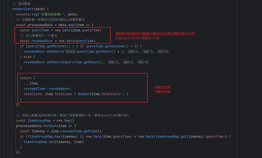
renderChart(data) {
console.log('处理后的数据:', data)
// 处理数据:将每条记录的时间向上取整到整点
const processedData = data.map(item => {
const queryTime = new Date(item.queryTime)
// 向上取整到下一个整点
const roundedHour = new Date(queryTime)
if (queryTime.getMinutes() > 0 || queryTime.getSeconds() > 0) {
roundedHour.setHours(queryTime.getHours() + 1, 0, 0, 0)
} else {
roundedHour.setHours(queryTime.getHours(), 0, 0, 0)
}
return {
...item,
roundedTime: roundedHour,
totalCost: item.totalCost ? Number(item.totalCost) : 0
}
})
// 按向上取整后的时间分组,每组只保留最新的一条(原始queryTime最大的)
const timeGroupMap = new Map()
processedData.forEach(item => {
const timeKey = item.roundedTime.getTime()
if (!timeGroupMap.has(timeKey) || new Date(item.queryTime) > new Date(timeGroupMap.get(timeKey).queryTime)) {
timeGroupMap.set(timeKey, item)
}
})
// 转换为数组并按时间排序
const sortedData = Array.from(timeGroupMap.values())
.sort((a, b) => a.roundedTime - b.roundedTime)
// 提取时间和价格数据
const times = sortedData.map(item => {
const date = item.roundedTime
const month = date.getMonth() + 1
const day = date.getDate()
const hour = String(date.getHours()).padStart(2, '0')
return `${month}/${day} ${hour}:00`
})
const prices = sortedData.map(item => item.totalCost.toFixed(2))
// 计算价格区间用于Y轴
const validPrices = prices.filter(p => p > 0).map(Number)
const minPrice = validPrices.length > 0 ? Math.min(...validPrices) : 0
const maxPrice = validPrices.length > 0 ? Math.max(...validPrices) : 0
const priceRange = maxPrice - minPrice
const yAxisMin = Math.max(0, minPrice - priceRange * 0.1)
const yAxisMax = maxPrice + priceRange * 0.1
// 配置图表选项
const option = {
title: {
text: '预估采购价历史趋势',
left: 'center',
textStyle: {
fontSize: 16,
fontWeight: 'bold'
}
},
tooltip: {
trigger: 'axis',
formatter: function(params) {
const data = params[0]
const dataIndex = data.dataIndex
// 从原始数据中获取对应的 errMsg
const itemData = sortedData[dataIndex]
const price = parseFloat(data.value)
// 格式化查询时间
let queryTimeStr = ''
if (itemData && itemData.queryTime) {
const queryTime = new Date(itemData.queryTime)
const year = queryTime.getFullYear()
const month = String(queryTime.getMonth() + 1).padStart(2, '0')
const day = String(queryTime.getDate()).padStart(2, '0')
const hour = String(queryTime.getHours()).padStart(2, '0')
const minute = String(queryTime.getMinutes()).padStart(2, '0')
const second = String(queryTime.getSeconds()).padStart(2, '0')
queryTimeStr = `<br/>查询时间: ${year}-${month}-${day} ${hour}:${minute}:${second}`
}
if (price === 0 && itemData && itemData.errMsg) {
return `${data.axisValue}<br/>预估采购价: ¥${data.value}${queryTimeStr}<br/>失败原因: ${itemData.errMsg}`
}
return `${data.axisValue}<br/>预估采购价: ¥${data.value}${queryTimeStr}`
}
},
grid: {
left: '3%',
right: '4%',
bottom: '15%',
containLabel: true
},
xAxis: {
type: 'category',
boundaryGap: false,
data: times,
axisLabel: {
rotate: 45,
interval: 'auto',
fontSize: 10
}
},
yAxis: {
type: 'value',
name: '价格(¥)',
min: yAxisMin,
max: yAxisMax,
axisLabel: {
formatter: '¥{value}'
}
},
series: [
{
name: '预估采购价',
type: 'line',
smooth: true,
data: prices,
itemStyle: {
color: '#409EFF'
},
lineStyle: {
width: 2
},
areaStyle: {
color: new echarts.graphic.LinearGradient(0, 0, 0, 1, [
{ offset: 0, color: 'rgba(64, 158, 255, 0.5)' },
{ offset: 1, color: 'rgba(64, 158, 255, 0.1)' }
])
},
markPoint: {
data: [
{ type: 'max', name: '最高价' },
{ type: 'min', name: '最低价' }
],
label: {
fontSize: 11
}
},
markLine: {
data: [
{ type: 'average', name: '平均值' }
],
label: {
fontSize: 11
}
}
}
]
}
this.chart.setOption(option)
// 多次调用resize确保图表正确填充容器
this.$nextTick(() => {
if (this.chart) {
this.chart.resize()
// 再次延迟调用,确保宽度也正确调整
setTimeout(() => {
if (this.chart) {
this.chart.resize()
}
}, 200)
}
})
},
// 销毁图表
disposeChart() {
if (this.chart) {
this.chart.dispose()
this.chart = null
}
},
// 关闭对话框
handleClose() {
this.disposeChart()
}
}
}
</script>
<style scoped>
</style>接口返回数据结构(可以参照这个写接口)
json
[
    {
        "queryTime": "2026-04-09 08:48:12",
        "totalCost": 3143.78
    },
    {
        "queryTime": "2026-04-09 10:02:57",
        "totalCost": 3145.38
    },
    {
        "queryTime": "2026-04-09 11:17:54",
        "totalCost": 3142.13
    },
    {
        "queryTime": "2026-04-09 12:35:43",
        "totalCost": 3139.6
    }
]
一、需求背景(已脱敏)
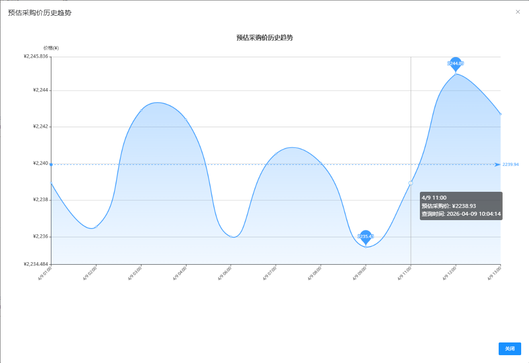
在某业务系统中,需要实现如下功能:
- 展示某个商品的历史价格变化趋势
- 支持按时间维度聚合(小时级)
- 同一时间段只保留最新一条记录
- 支持异常数据提示(如计算失败原因)
- 提供 Mock 数据方便前端调试
二、整体实现结构
组件核心结构如下:
- 弹窗(Dialog)承载图表
- ECharts 负责渲染折线图
- API 提供历史数据
- 前端负责数据清洗 + 聚合 + 展示
三、图表初始化关键点
vue
watch: {
  visible(newVal) {
    if (newVal && this.itemId) {
      setTimeout(() => {
        this.$nextTick(() => {
          this.initChart()
        })
      }, 300)
    }
  }
}
为什么要延迟?
👉 因为 Dialog 有动画:
- 如果立即初始化 ECharts
- 容器宽高还没计算完成
- 会导致图表 显示异常 / 尺寸错误
四、数据处理核心逻辑(重点)
1️⃣ 时间归一(向上取整到整点)
vue
if (time.getMinutes() > 0 || time.getSeconds() > 0) {
  rounded.setHours(time.getHours() + 1, 0, 0, 0)
}
📌 作用:
- 统一时间粒度(避免分钟级噪声)
- 提高趋势可读性
2️⃣ 分组去重(保留最新数据)
vue
if (!map.has(key) || new Date(item.time) > new Date(map.get(key).time)) {
  map.set(key, item)
}
📌 逻辑:
- key:整点时间
- value:该时间段"最新的一条记录"
👉 这是很多人容易忽略但非常关键的优化点
3️⃣ 排序保证时间线正确
vue
.sort((a, b) => a.roundedTime - b.roundedTime)4️⃣ X轴格式化
vue
`${month}/${day} ${hour}:00`示例:
vue
04/08 14:00五、Y轴动态范围优化
vue
const yMin = min - range * 0.1
const yMax = max + range * 0.1
📌 优点:
- 避免图表"贴边"
- 提升视觉舒适度
- 自动适配不同价格区间
六、Tooltip 交互增强
vue
if (price === 0 && item.errMsg) {
  return `失败原因: ${item.errMsg}`
}
📌 实现效果:
- 正常数据 → 显示价格
- 异常数据 → 显示错误原因
👉 让图表不仅"展示数据",还能"解释数据"
七、图表美化设计
1️⃣ 平滑曲线
vue
smooth: true2️⃣ 渐变填充
vue
areaStyle: {
  color: new echarts.graphic.LinearGradient(...)
}
效果:
- 更有"趋势感"
- 提升视觉层次
3️⃣ 极值标记
vue
markPoint: [
  { type: 'max' },
  { type: 'min' }
]
4️⃣ 平均线
vue
markLine: [
  { type: 'average' }
]
八、Mock 数据设计(开发神器)
vue
const base = 150 + Math.random() * 50特点:
- 模拟真实波动(±区间)
- 多时间点分布
- 可重复调试 UI
👉 在后端接口未完成时非常有用
九、性能与稳定性优化
✅ 图表销毁
vue
this.chart.dispose()避免:
- 内存泄漏
- 多实例叠加
✅ 多次 resize
vue
this.chart.resize()原因:
- Dialog 动画 & 宽度变化
- 防止图表错位
十、总结
这个趋势图实现的核心,不在于 ECharts 本身,而在于:
⭐ 三个关键能力:
- 数据建模能力
- 时间归一
- 分组去重
- 用户体验意识
- Tooltip 信息增强
- 动态坐标轴
- 工程细节处理
- 弹窗延迟渲染
- 图表销毁与重建
十一、可扩展方向
如果你要进一步优化,可以考虑:
- 支持时间范围筛选(7天 / 30天)
- 多商品对比趋势
- 加入数据缩放(dataZoom)
- 异常点高亮(红点标记)
- 实时刷新(WebSocket)
结语
一个优秀的图表,不只是"画出来",而是:
让用户一眼看懂趋势,并能快速定位问题