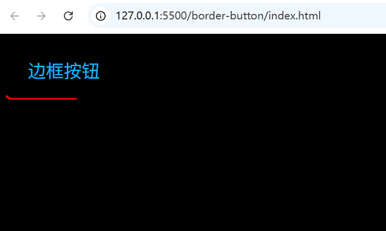
边框按钮(纯CSS)
- [1. 思路](#1. 思路)
- [2. 实现代码](#2. 实现代码)
- [3. 拓展](#3. 拓展)
-
- [3.1 双边滑动按钮](#3.1 双边滑动按钮)
- [3.2 双边不滑动按钮](#3.2 双边不滑动按钮)
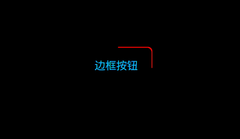
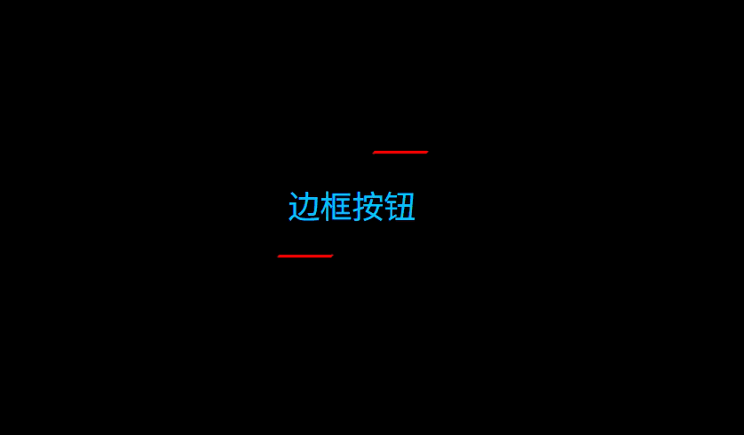
1. 思路
(1)主体部分
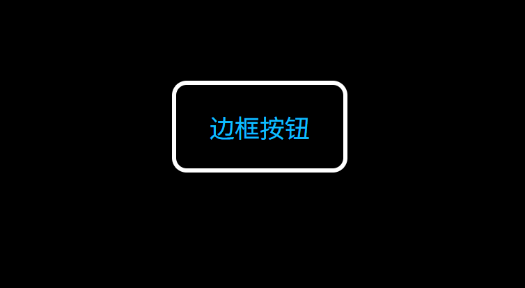
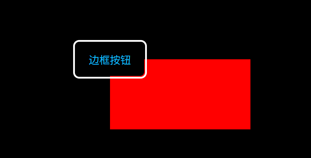
(2)伪元素before设置在-2层
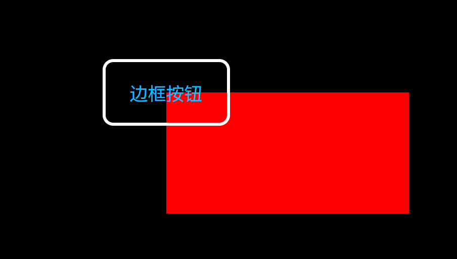
(3)伪元素after设置在-1层
(4)去掉按钮的边框,并且隐藏超出部分
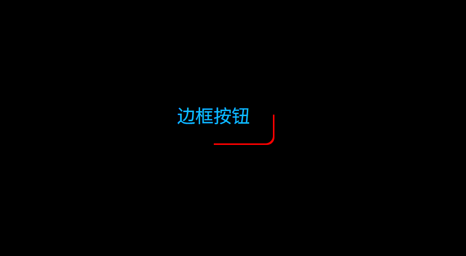
(5)添加动画,旋转伪元素 before
2. 实现代码
index.html:
html
<!doctype html>
<html lang="en">
  <head>
    <meta charset="UTF-8" />
    <meta name="viewport" content="width=device-width, initial-scale=1.0" />
    <title>Document</title>
    <link rel="stylesheet" href="./index.css" />
  </head>
  <body>
    <button>边框按钮</button>
  </body>
</html>
index.css:
css
body{
  background-color: #000;
}
button{
  width: 160px;
  height: 80px;
  color: #0ebeff;
  font-size: 24px;
  background: #000;
  border:none;
  z-index: 1;
  cursor: pointer;
  border-radius: 10px;
  position: relative;
  overflow: hidden;
}

button::before{
  content: '';
  position: absolute;
  --ratio: 200%;
  width: var(--ratio);
  height: var(--ratio);
  background: red;
  z-index: -2;
  left: 50%;
  top: 50%;
  transform-origin: left top;
  animation: rotation 2s linear infinite;
}

button::after{
  content: '';
  position: absolute;
  --w: 2px;
  width: calc(100% - 2 * var(--w));
  height: calc(100% - 2 * var(--w));
  left: var(--w);
  top: var(--w);
  background: #000;
  z-index: -1;
  border-radius: inherit;
}

@keyframes rotation {
  to {
    transform: rotate(1turn);
  }
}
3. 拓展
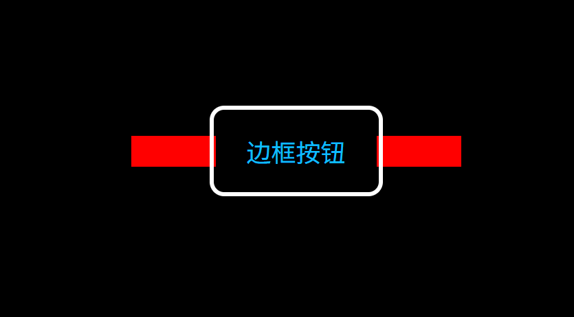
3.1 双边滑动按钮
其实思路也很简单,将伪元素 bofore 调整为矩形,并且中心点和旋转点重合即可(这里看着卡顿,只是因为 gif 压缩后导致的,实际很顺滑)。
index.css:
css
body{
  background-color: #000;
  display: flex;
  align-items: center;
  justify-content: center;
}
button{
  margin-top: 200px;
  --button-width: 160px;
  --button-height: 80px;
  width: var(--button-width);
  height: var(--button-height);
  color: #0ebeff;
  font-size: 24px;
  background: #000;
  border:none;
  z-index: 1;
  cursor: pointer;
  border-radius: 10px;
  position: relative;
  overflow: hidden;
  /* outline: 4px solid #fff; */
}

button::before{
  content: '';
  position: absolute;
  --w: 320px;
  --h: 30px;
  width: var(--w);
  height: var(--h);
  background: red;
  z-index: -2;
  left: calc(50% - var(--w) / 2);
  top: calc(50% - var(--h) / 2);
  animation: rotation 15s linear infinite;
}

button::after{
  content: '';
  position: absolute;
  --w: 2px;
  width: calc(100% - 2 * var(--w));
  height: calc(100% - 2 * var(--w));
  left: var(--w);
  top: var(--w);
  background: #000;
  z-index: -1;
  border-radius: inherit;
}

@keyframes rotation {
  to {
    transform: rotate(1turn);
  }
}
3.2 双边不滑动按钮
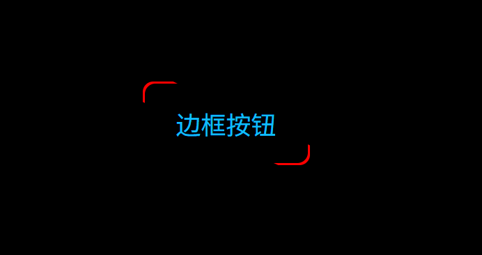
基于 3.1 双边滑动按钮 取消动画,修改伪元素before旋转角度即可。
index.css:
css
body{
  background-color: #000;
  display: flex;
  align-items: center;
  justify-content: center;
}
button{
  margin-top: 200px;
  --button-width: 160px;
  --button-height: 80px;
  width: var(--button-width);
  height: var(--button-height);
  color: #0ebeff;
  font-size: 24px;
  background: #000;
  border:none;
  z-index: 1;
  cursor: pointer;
  border-radius: 10px;
  position: relative;
  overflow: hidden;
  /* outline: 4px solid #fff; */
}

button::before{
  content: '';
  position: absolute;
  --w: 320px;
  --h: 30px;
  width: var(--w);
  height: var(--h);
  background: red;
  z-index: -2;
  left: calc(50% - var(--w) / 2);
  top: calc(50% - var(--h) / 2);
  transform: rotate(25deg);
  /* animation: rotation 15s linear infinite; */
}

button::after{
  content: '';
  position: absolute;
  --w: 2px;
  width: calc(100% - 2 * var(--w));
  height: calc(100% - 2 * var(--w));
  left: var(--w);
  top: var(--w);
  background: #000;
  z-index: -1;
  border-radius: inherit;
}

/* @keyframes rotation {
  to {
    transform: rotate(1turn);
  }
} */