一、开发思想
1.1 声明式 UI
一种描述用户界面的开发范式,开发者只需描述 "界面在不同状态下应该是什么样",无需关心 "界面如何从一个状态切换到另一个状态",由框架自动完成视图更新。
两大核心思想:
-
状态驱动视图:状态数据变化 → 框架自动触发 UI 重绘
-
描述最终效果:只声明不同状态的 UI 呈现,不写过渡过程代码
开发三步曲:
-
定义界面状态 → 用
@State装饰器声明状态变量 -
描述不同状态下的 UI 效果 → 用条件渲染实现
-
修改状态变量 → 触发 UI 自动更新
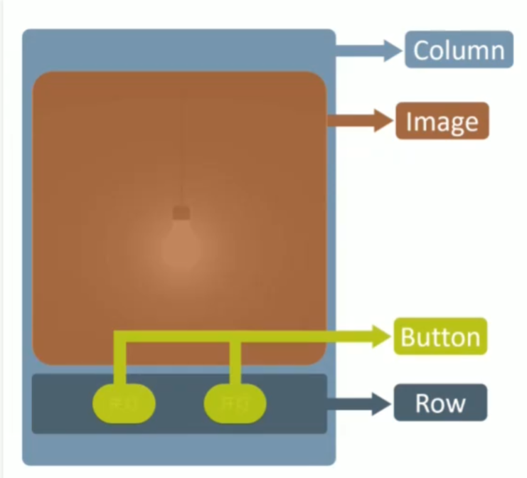
1.2 组件化思想
将界面拆分为独立、可复用的组件,复杂界面由多个组件组合而成。
-
基础组件:构成界面的最小单元(Text、Button、Image 等)
-
容器组件:用于布局和组织其他组件(Column、Row、Stack 等)
-
自定义组件:将重复的 UI 和逻辑封装为独立组件,提高代码复用性
二、基础语法与组件使用
2.1 声明组件完整语法
TypeScript
// 组件名(参数) { 子组件 }
//   .属性方法1(参数)
//   .属性方法2(参数)
//   .事件方法(回调函数)

// 示例:声明一个带点击事件的按钮
Button('点击我')
  .width(200)          // 属性方法:设置宽度
  .height(50)          // 属性方法:设置高度
  .backgroundColor(Color.Blue)  // 属性方法:设置背景色
  .onClick(() => {     // 事件方法:绑定点击事件
    console.log('按钮被点击了')
})语法说明:
-
组件参数:写在组件名后的小括号中,不同组件支持不同参数
-
子组件:写在大括号中,只有容器组件支持子组件
-
链式调用:多个属性 / 事件方法可以连续调用
-
API 文档查看:鼠标悬停在组件名上 → 点击 "Show in API Reference"
2.2 常用基础组件
Image 组件(显示图片)
TypeScript
// 显示本地图片(路径相对于ets目录)
Image('pages/hello_world/light/practice/images/light_on.png')
  .width(300)  // 设置宽度
  .height(300) // 设置高度
Button 组件(按钮)
TypeScript
// 文字按钮
Button('开灯')
.onClick(() => {
// 点击事件逻辑
})
// 圆形图标按钮
Button({ type: ButtonType.Circle }) {
Image('pages/hello_world/custom/practice/images/icon_switch.png')
.width(30)
.height(30)
}
.width(50)
.height(50)
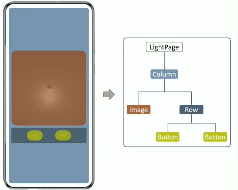
.backgroundColor(Color.Red)2.3 常用容器组件
Column(纵向布局)
TypeScript
// 纵向排列子组件,设置子组件间距为20
Column({ space: 20 }) {
  Image('...')
  Button('按钮1')
  Button('按钮2')
}
.width('100%')       // 占满屏幕宽度
.height('100%')      // 占满屏幕高度
.justifyContent(FlexAlign.Center)  // 子组件纵向居中
Row(横向布局)
TypeScript
// 横向排列子组件,设置子组件间距为50
Row({ space: 50 }) {
  Button('开灯')
  Button('关灯')
}
三、状态管理与 @State 装饰器
3.1 @State 装饰器作用
-
标记变量为状态变量
-
只有状态变量的值发生变化时,才会触发 UI 更新
-
普通变量修改不会引起 UI 变化
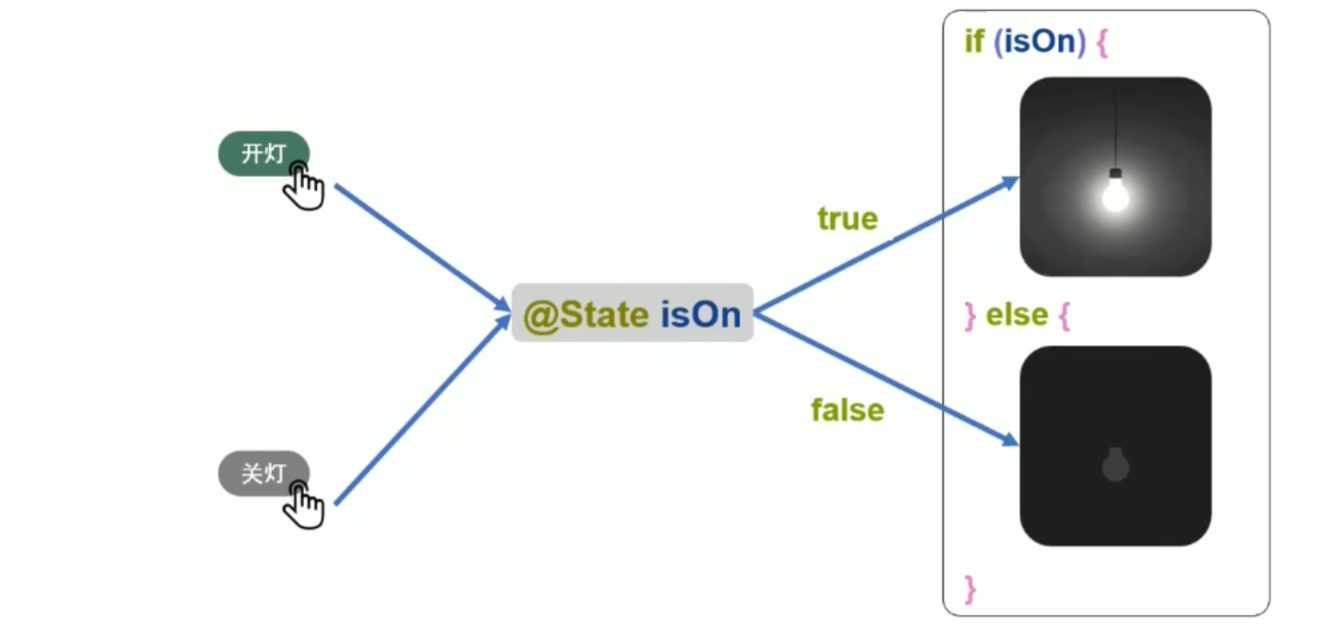
3.2 完整示例:开关灯应用
TypeScript
@Entry
@Component
struct LightPage {
  // 声明状态变量:true表示开灯,false表示关灯
  @State isOn: boolean = false

  build() {
    Column({ space: 20 }) {
      // 根据状态显示不同图片
      if (this.isOn) {
        Image('pages/hello_world/light/practice/images/light_on.png')
          .width(300)
          .height(300)
      } else {
        Image('pages/hello_world/light/practice/images/light_off.png')
          .width(300)
          .height(300)
      }

      Row({ space: 50 }) {
        // 开灯按钮:点击时将isOn设为true
        Button('开灯')
          .onClick(() => {
            this.isOn = true
          })

        // 关灯按钮:点击时将isOn设为false
        Button('关灯')
          .onClick(() => {
            this.isOn = false
          })
      }
    }
    .width('100%')
    .height('100%')
    .justifyContent(FlexAlign.Center)
  }
}
四、自定义组件
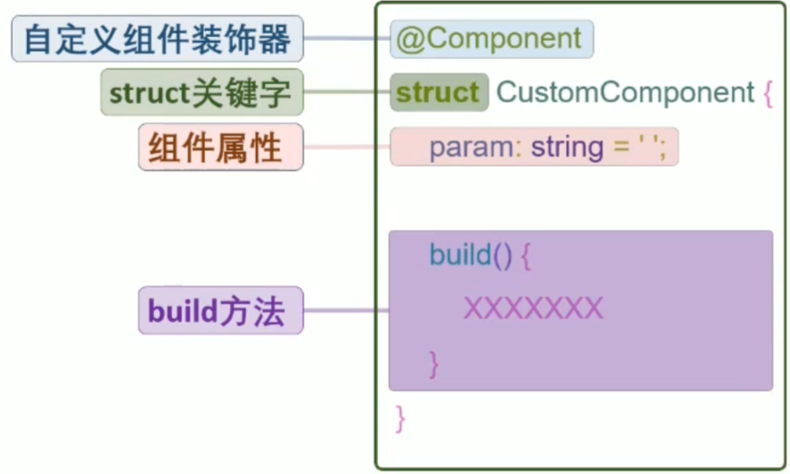
4.1 自定义组件语法
TypeScript
// 定义自定义组件
@Component
export struct SwitchButton {
  // 组件属性:接收外部传入的参数
  color: Color = Color.Blue

  build() {
    // 声明组件的UI结构
    Button({ type: ButtonType.Circle }) {
      Image('pages/hello_world/custom/practice/images/icon_switch.png')
        .width(30)
        .height(30)
    }
    .width(50)
    .height(50)
    .backgroundColor(this.color)  // 使用传入的颜色参数
  }
}

// 使用自定义组件
SwitchButton({ color: Color.Red })
  .onClick(() => {
    // 给自定义组件绑定事件
})关键装饰器:
-
@Component:标记结构体为自定义组件 -
@Entry:标记组件为页面入口(组件树的根节点) -
export:导出组件,供其他文件导入使用
4.2 模块化导入导出
-
新建组件文件 :
SwitchButton.ets -
导出组件 :在组件定义前加
export关键字 -
导入组件:在使用组件的文件中添加导入语句
TypeScriptimport { SwitchButton } from './SwitchButton'
4.3 完整示例:自定义开关按钮
TypeScript
// SwitchButton.ets
@Component
export struct SwitchButton {
  color: Color = Color.Blue

  build() {
    Button({ type: ButtonType.Circle }) {
      Image('pages/hello_world/custom/practice/images/icon_switch.png')
        .width(30)
        .height(30)
    }
    .width(50)
    .height(50)
    .backgroundColor(this.color)
  }
}
TypeScript
// LightPage.ets
import { SwitchButton } from './SwitchButton'

@Entry
@Component
struct LightPage {
  @State isOn: boolean = false

  build() {
    Column({ space: 20 }) {
      if (this.isOn) {
        Image('pages/hello_world/light/practice/images/light_on.png')
          .width(300)
          .height(300)
      } else {
        Image('pages/hello_world/light/practice/images/light_off.png')
          .width(300)
          .height(300)
      }

      Row({ space: 50 }) {
        // 使用自定义红色按钮(关灯)
        SwitchButton({ color: Color.Red })
          .onClick(() => {
            this.isOn = false
          })

        // 使用自定义绿色按钮(开灯)
        SwitchButton({ color: Color.Green })
          .onClick(() => {
            this.isOn = true
          })
      }
    }
    .width('100%')
    .height('100%')
    .justifyContent(FlexAlign.Center)
  }
}
五、渲染控制语句
5.1 条件渲染(if/else)
根据状态变量的值,有条件地渲染不同的 UI 组件。
TypeScript
@State isPlaying: boolean = false

build() {
  Column() {
    if (this.isPlaying) {
      Image('images/pause.png')
        .width(100)
        .height(100)
    } else {
      Image('images/play.png')
        .width(100)
        .height(100)
    }

    Button('切换')
      .onClick(() => {
        this.isPlaying = !this.isPlaying
      })
  }
}
5.2 循环渲染(ForEach)
基于数组数据,批量渲染相同结构的组件列表。
语法格式:
TypeScript
ForEach(
  arr: any[],               // 1. 数据源数组
  itemGenerator: (item: any, index?: number) => void,  // 2. 组件生成函数
  keyGenerator?: (item: any, index?: number) => string // 3. 可选:key生成函数
)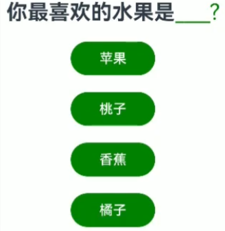
完整示例:选择题选项列表
TypeScript
@Entry
@Component
struct QuestionPage {
  // 选项数组
  private options: string[] = ['苹果', '香蕉', '桃子', '橙子']
  // 用户选择的答案
  @State answer: string = ''

  build() {
    Column({ space: 20 }) {
      // 显示问题和答案
      Row({ space: 10 }) {
        Text('你最喜欢的水果是:')
          .fontSize(18)
        Text(this.answer)
          .fontSize(18)
          .fontColor(Color.Red)
      }

      // 循环渲染选项按钮
      ForEach(
        this.options,
        (item: string) => {
          Button(item)
            .width(200)
            .height(50)
            .onClick(() => {
              this.answer = item
            })
        },
        // 自定义key生成函数:使用元素本身作为key
        (item: string) => item
      )
    }
    .width('100%')
    .height('100%')
    .justifyContent(FlexAlign.Center)
  }
}
key 的作用:
-
唯一标识数组中的每个元素
-
当数组发生变化时,帮助框架高效复用组件对象
-
避免不必要的组件重建,提高渲染性能