官方学习视频:鸿蒙应用开发实战课-华为开发者学堂
系统组件分为功能组件和布局组件,功能组件自身具备一定的UI效果,而布局组件自身无实际的UI效果,可以对功能组件进行排列控制
ArkUI常用信息类功能组件,像是展示类有文字(参考上篇文章),图片,加载动效以及二维码;输入类则是文本输入框,搜索框,滑动条以及按钮;选择类就有单选,多选,切换以及下拉;还有一些其他的常用组件,如日期选择器,信息标记,评分,密码锁,列表,轮播,滚动组件都会在下方展示,更多组件还请参考官方文档
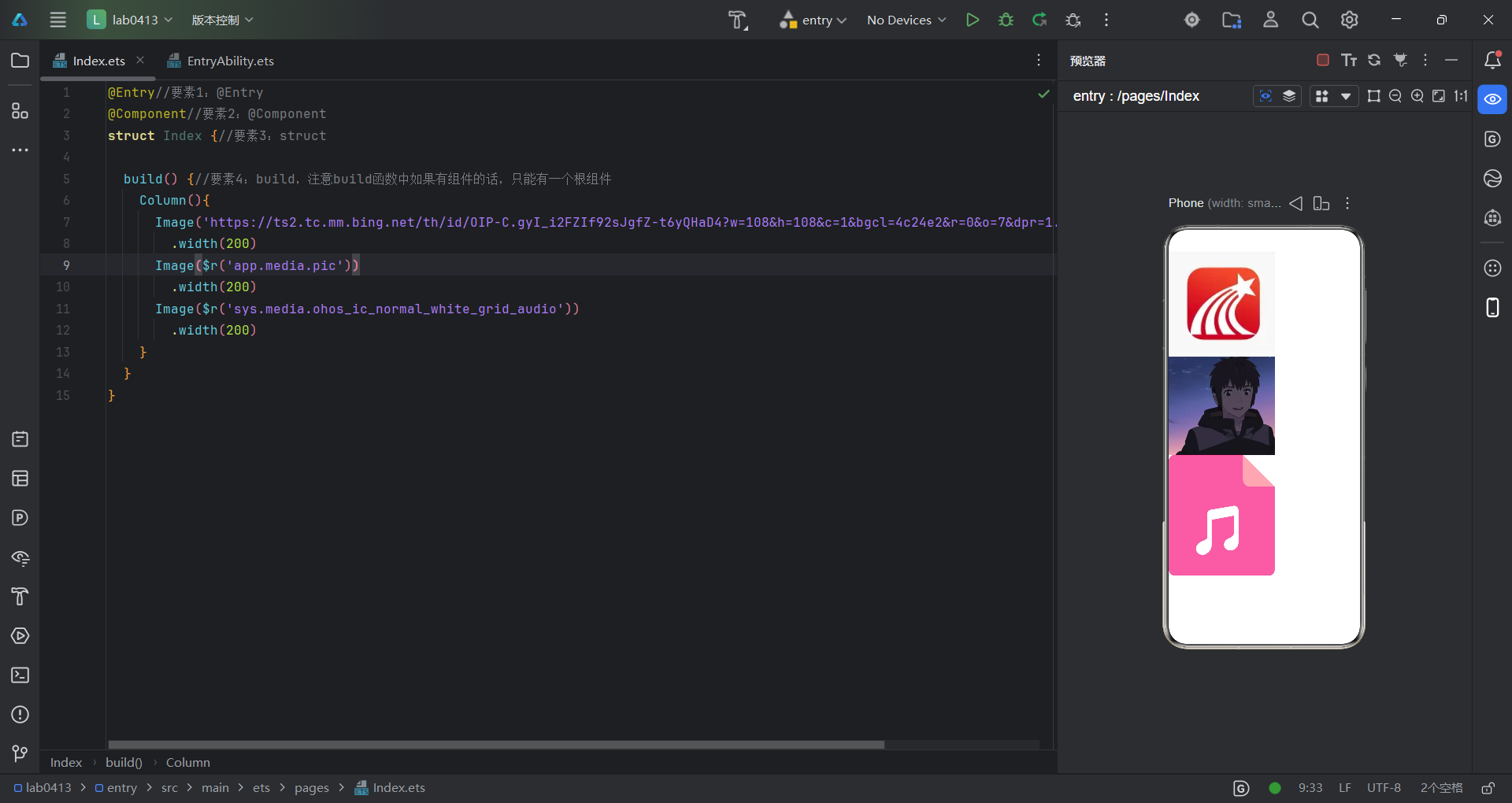
示例来了,借用一下超星的图标,图片展示有三种方式,第一种是使用网络图片链接,第二种是使用本地图片,但是要先放在src/main/resources/base/media地址下,同时还要注意图片的名称不得有中文,第三种就是使用内置图标,可自由切换,代码如下:
@Entry//要素1:@Entry
@Component//要素2:@Component
struct Index {//要素3:struct

  build() {//要素4:build,注意build函数中如果有组件的话,只能有一个根组件
    Column(){
      Image('https://ts2.tc.mm.bing.net/th/id/OIP-C.gyI_i2FZIf92sJgfZ-t6yQHaD4?w=108&h=108&c=1&bgcl=4c24e2&r=0&o=7&dpr=1.3&pid=ImgRC&rm=3')
        .width(200)
      Image($r('app.media.pic'))
        .width(200)
      Image($r('sys.media.ohos_ic_normal_white_grid_audio'))
        .width(200)
    }
  }
}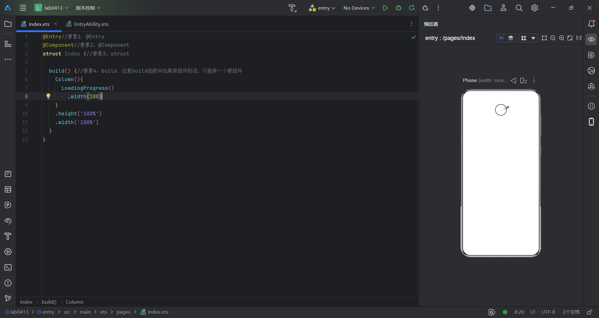
这是一个加载动效组件,比较简单,就是展示一个加载效果,代码如下:
@Entry//要素1:@Entry
@Component//要素2:@Component
struct Index {//要素3:struct

  build() {//要素4:build,注意build函数中如果有组件的话,只能有一个根组件
    Column(){
      LoadingProgress()
        .width(100)
    }
    .height('100%')
    .width('100%')
  }
}
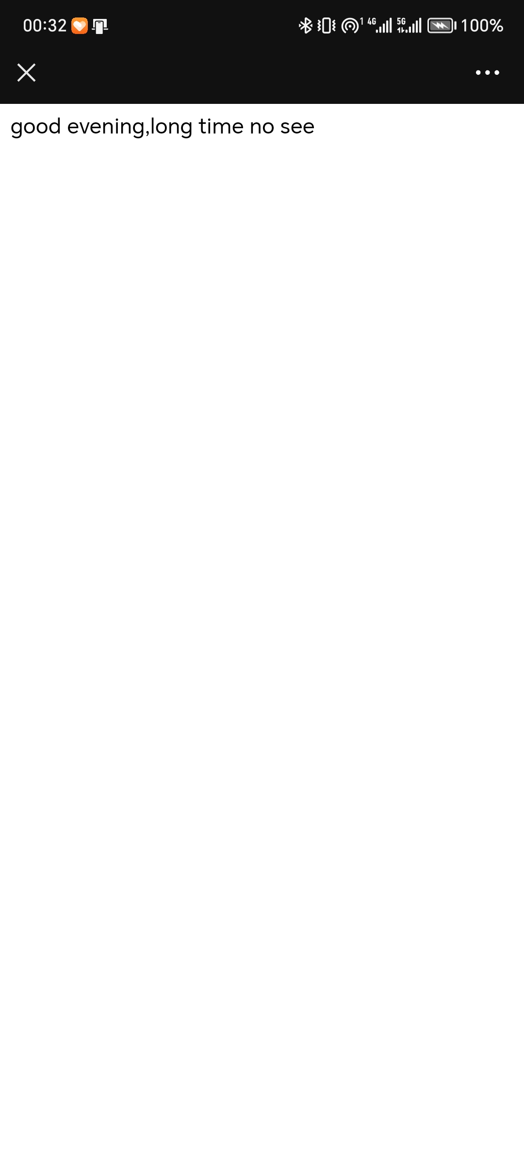
这是一个二维码组件,使用QRCode指令,你想展示什么内容就在括号中写什么(右边的二维码我用微信扫了一下,效果如下:)
代码如下:
@Entry//要素1:@Entry
@Component//要素2:@Component
struct Index {//要素3:struct

  build() {//要素4:build,注意build函数中如果有组件的话,只能有一个根组件
    Column(){
      QRCode('good evening,long time no see')
        .width(300)
    }
    .height('100%')
    .width('100%')
  }
}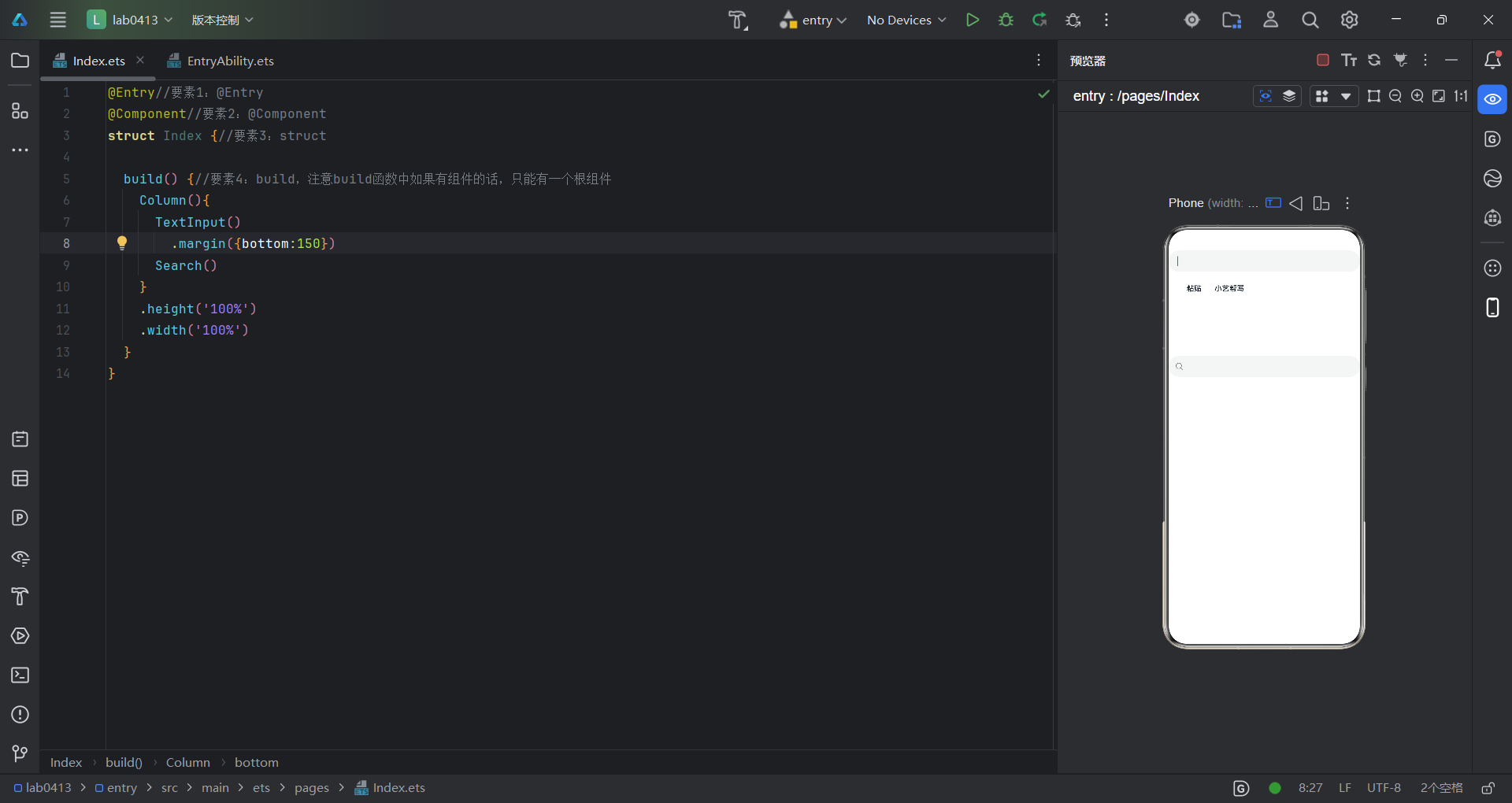
这是文本输入框和搜索框的组件,在预览器中点击后效果如图,代码如下:
@Entry//要素1:@Entry
@Component//要素2:@Component
struct Index {//要素3:struct

  build() {//要素4:build,注意build函数中如果有组件的话,只能有一个根组件
    Column(){
      TextInput()
        .margin({bottom:150})
      Search()
    }
    .height('100%')
    .width('100%')
  }
}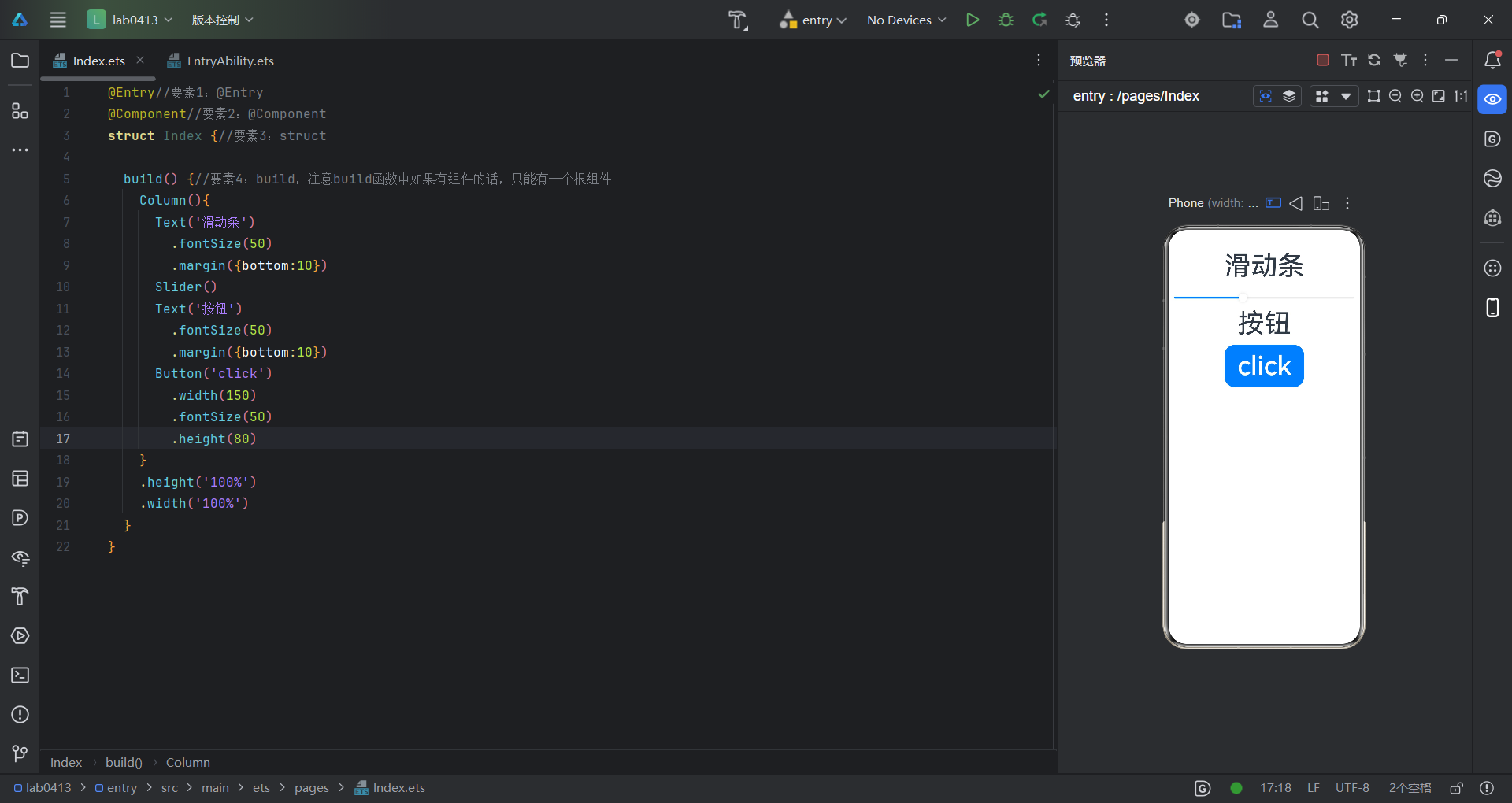
以上是滑动条和按钮的实现,代码如下:
@Entry//要素1:@Entry
@Component//要素2:@Component
struct Index {//要素3:struct

  build() {//要素4:build,注意build函数中如果有组件的话,只能有一个根组件
    Column(){
      Text('滑动条')
        .fontSize(50)
        .margin({bottom:10})
      Slider()
      Text('按钮')
        .fontSize(50)
        .margin({bottom:10})
      Button('click')
        .width(150)
        .fontSize(50)
        .height(80)
    }
    .height('100%')
    .width('100%')
  }
}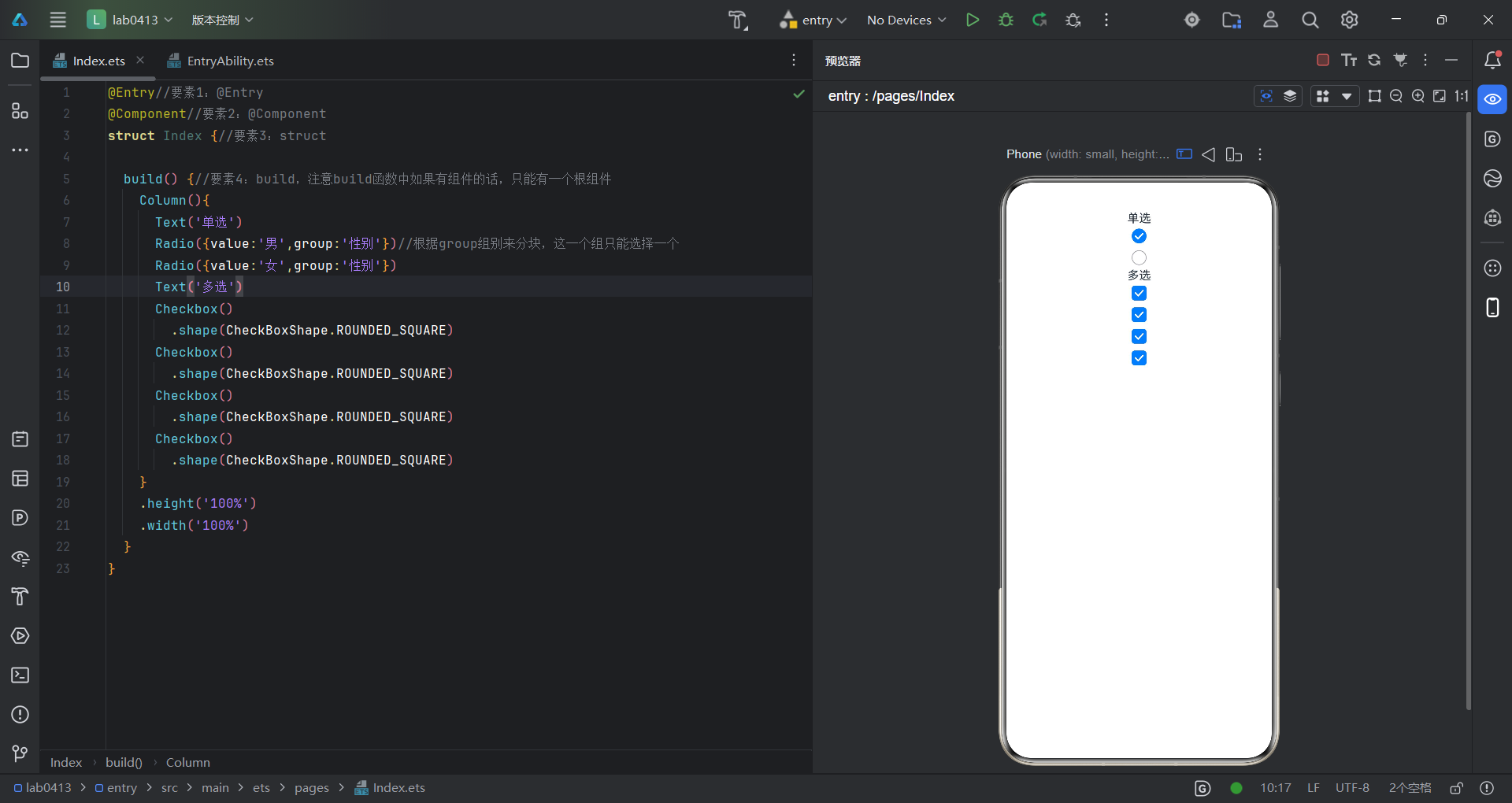
这是单选和多选的一个实现,代码如下:
@Entry//要素1:@Entry
@Component//要素2:@Component
struct Index {//要素3:struct

  build() {//要素4:build,注意build函数中如果有组件的话,只能有一个根组件
    Column(){
      Text('单选')
      Radio({value:'男',group:'性别'})//根据group组别来分块,这一个组只能选择一个
      Radio({value:'女',group:'性别'})
      Text('多选')
      Checkbox()
        .shape(CheckBoxShape.ROUNDED_SQUARE)
      Checkbox()
        .shape(CheckBoxShape.ROUNDED_SQUARE)
      Checkbox()
        .shape(CheckBoxShape.ROUNDED_SQUARE)//可以更改点击区域形状
      Checkbox()
        .shape(CheckBoxShape.ROUNDED_SQUARE)
    }
    .height('100%')
    .width('100%')
  }
}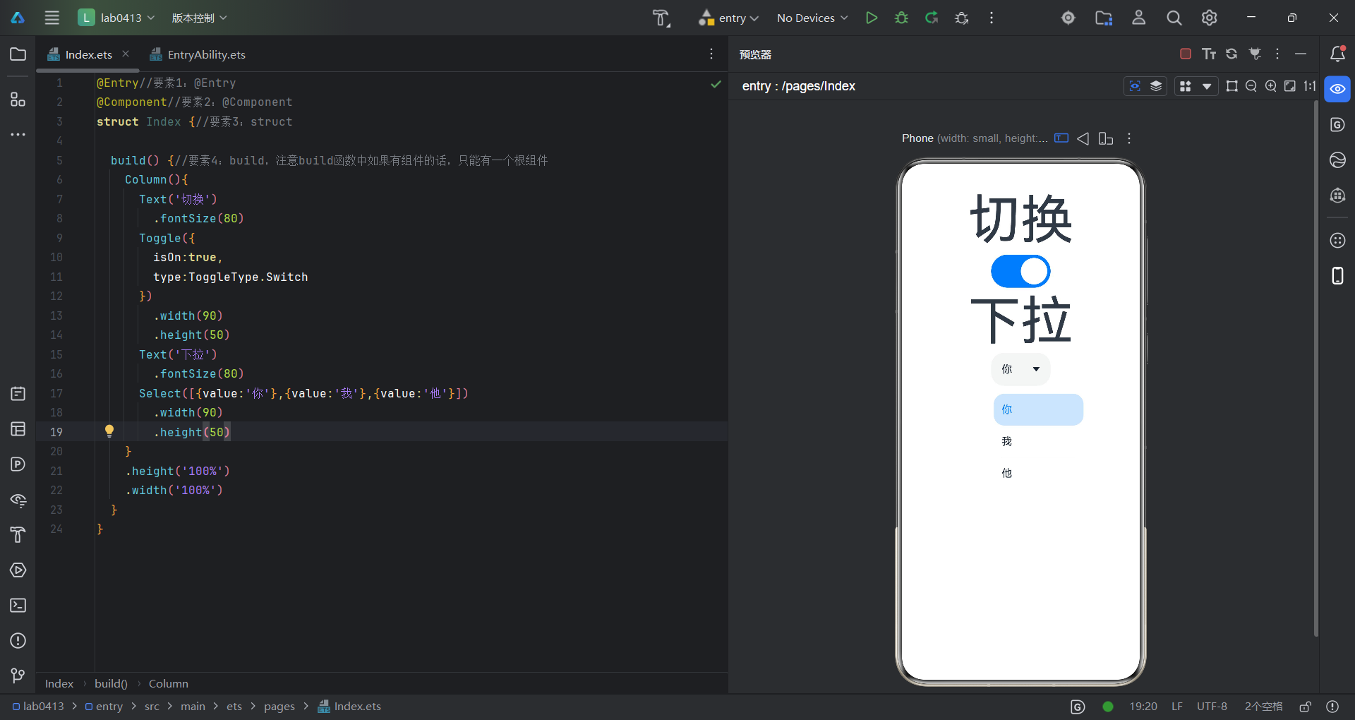
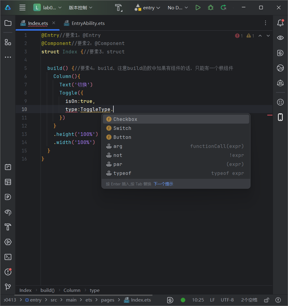
这是切换组件和下拉组件的一个实现效果,具体参数大家可以根据需求更改,像是切换组件,有三个显示方式,大家可以自由选择
代码如下:
@Entry//要素1:@Entry
@Component//要素2:@Component
struct Index {//要素3:struct

  build() {//要素4:build,注意build函数中如果有组件的话,只能有一个根组件
    Column(){
      Text('切换')
        .fontSize(80)
      Toggle({
        isOn:true,
        type:ToggleType.Switch
      })
        .width(90)
        .height(50)
      Text('下拉')
        .fontSize(80)
      Select([{value:'你'},{value:'我'},{value:'他'}])
        .width(90)
        .height(50)
    }
    .height('100%')
    .width('100%')
  }
}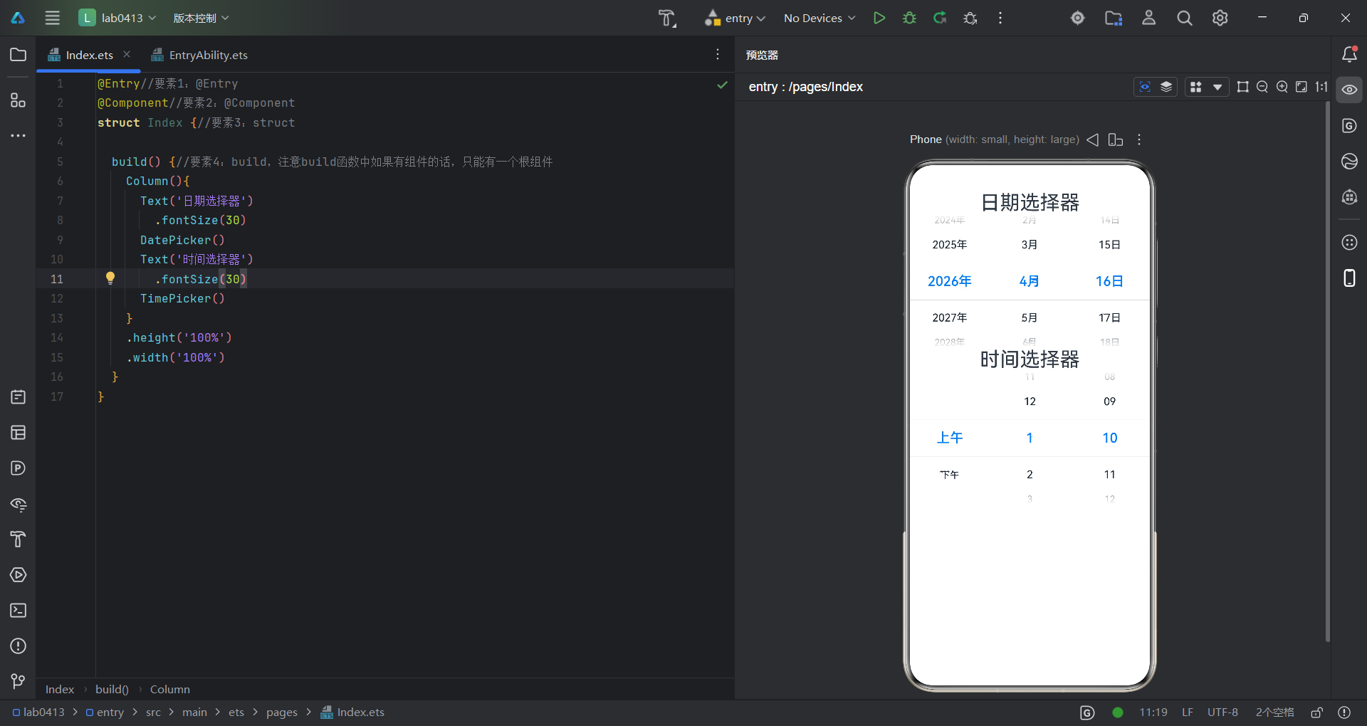
日期选择器和时间选择器组件的显示效果,代码如下:
@Entry//要素1:@Entry
@Component//要素2:@Component
struct Index {//要素3:struct

  build() {//要素4:build,注意build函数中如果有组件的话,只能有一个根组件
    Column(){
      Text('日期选择器')
        .fontSize(30)
      DatePicker()
      Text('时间选择器')
        .fontSize(30)
      TimePicker()
    }
    .height('100%')
    .width('100%')
  }
}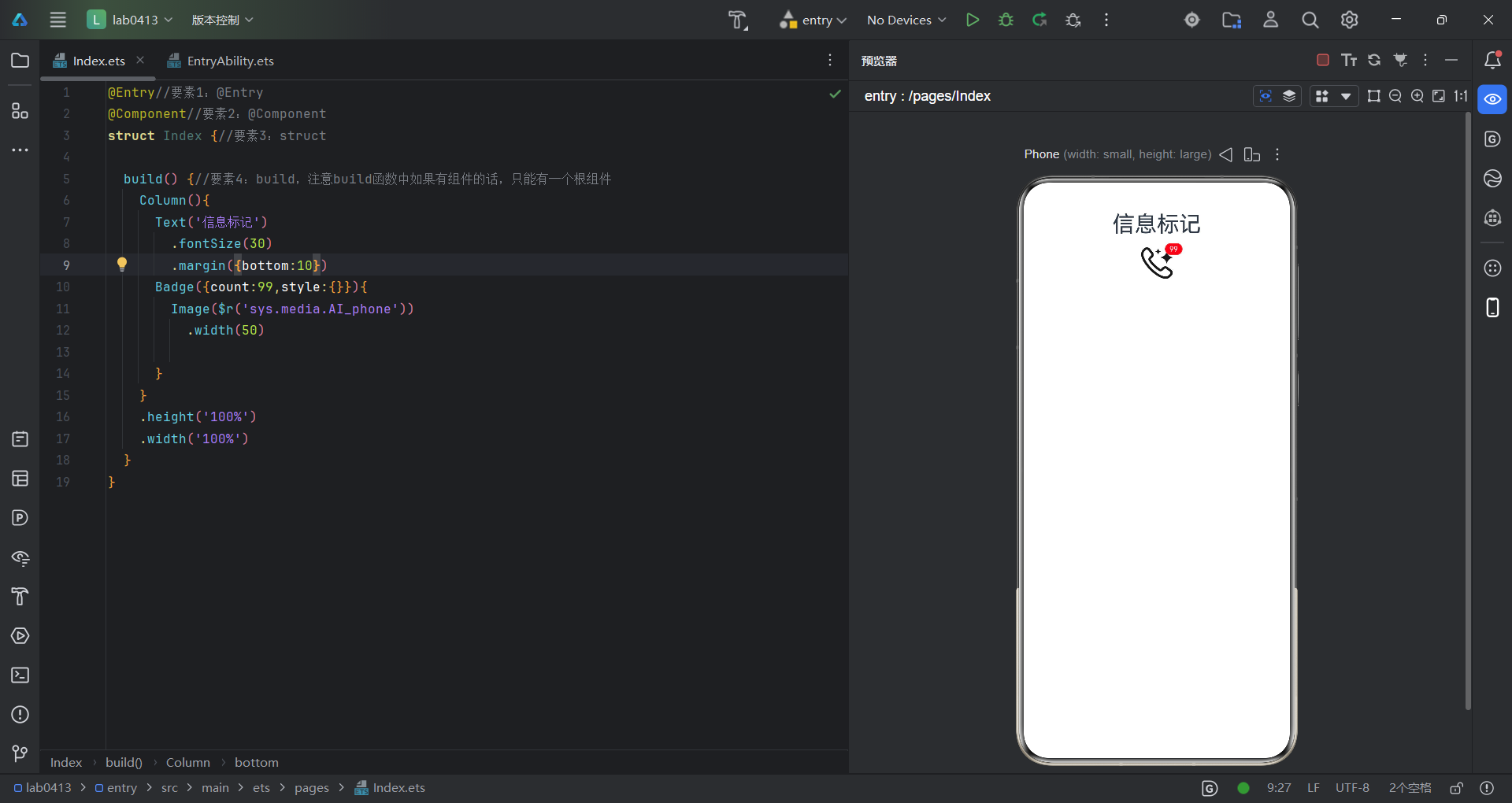
这是信息标记组件的实现,注意count是需要传递的参数,这边只是一个简要的显示,需要根据实际情况设置参数,代码如下:
@Entry//要素1:@Entry
@Component//要素2:@Component
struct Index {//要素3:struct

  build() {//要素4:build,注意build函数中如果有组件的话,只能有一个根组件
    Column(){
      Text('信息标记')
        .fontSize(30)
        .margin({bottom:10})
      Badge({count:99,style:{}}){
        Image($r('sys.media.AI_phone'))
          .width(50)

      }
    }
    .height('100%')
    .width('100%')
  }
}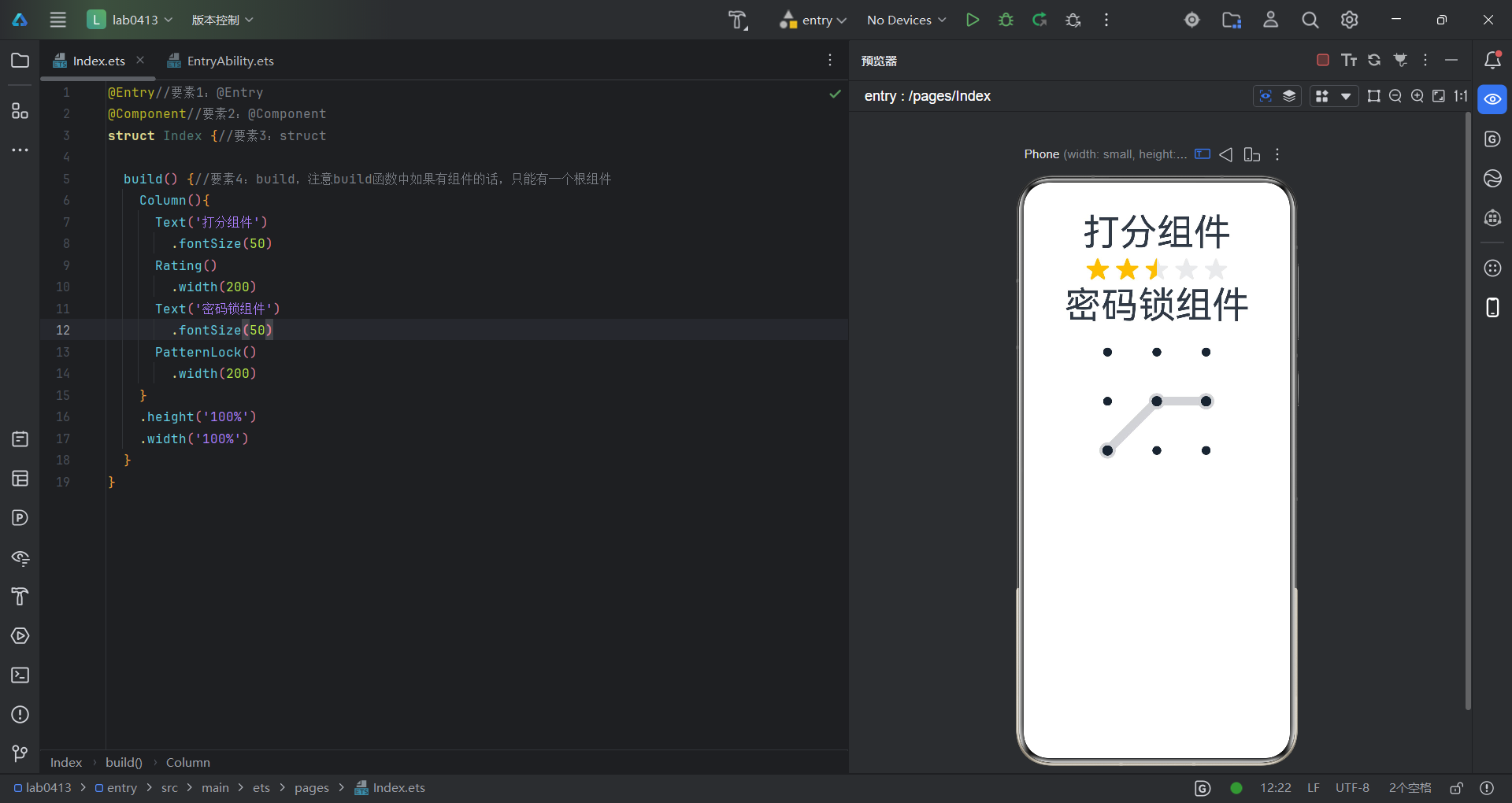
打分组件和密码锁组件的一个展示,代码如下:
@Entry//要素1:@Entry
@Component//要素2:@Component
struct Index {//要素3:struct

  build() {//要素4:build,注意build函数中如果有组件的话,只能有一个根组件
    Column(){
      Text('打分组件')
        .fontSize(50)
      Rating()
        .width(200)
      Text('密码锁组件')
        .fontSize(50)
      PatternLock()
        .width(200)
    }
    .height('100%')
    .width('100%')
  }
}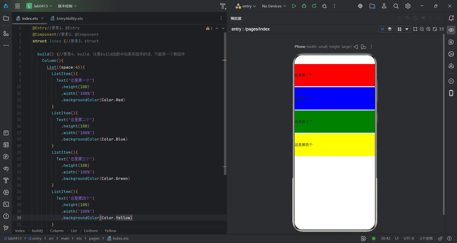
这是列表组件的一个实现效果,就像是竖向排列一堆图形,代码如下:
@Entry//要素1:@Entry
@Component//要素2:@Component
struct Index {//要素3:struct

  build() {//要素4:build,注意build函数中如果有组件的话,只能有一个根组件
    Column(){
      List({space:4}){//space为图形之间的间隔
        ListItem(){
          Text('这是第一个')
            .height(100)
            .width('100%')
            .backgroundColor(Color.Red)
        }
        ListItem(){
          Text('这是第二个')
            .height(100)
            .width('100%')
            .backgroundColor(Color.Blue)
        }
        ListItem(){
          Text('这是第三个')
            .height(100)
            .width('100%')
            .backgroundColor(Color.Green)
        }
        ListItem(){
          Text('这是第四个')
            .height(100)
            .width('100%')
            .backgroundColor(Color.Yellow)
        }
      }
    }
    .height('100%')
    .width('100%')
  }
}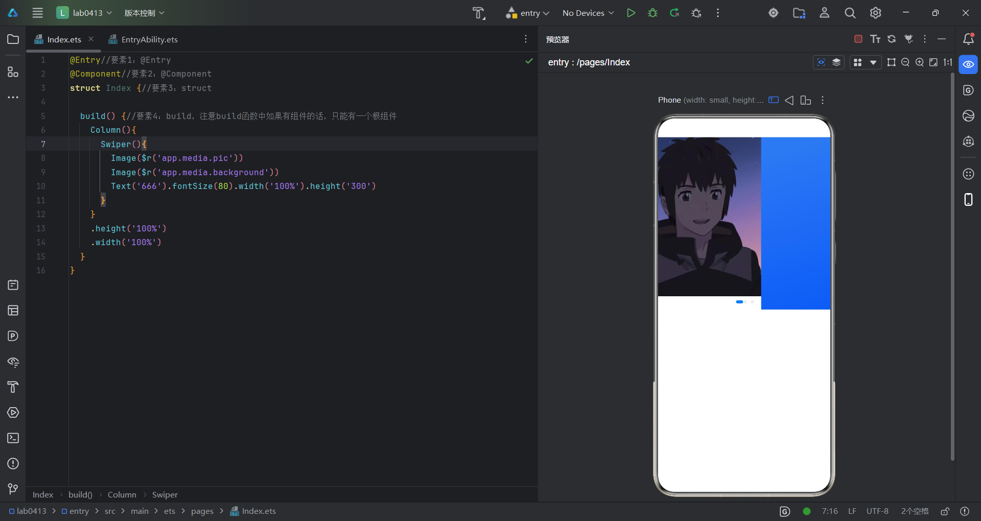
这是轮播图组件的一个实现效果,可以在里面放图片也可以放文字,代码如下:
@Entry//要素1:@Entry
@Component//要素2:@Component
struct Index {//要素3:struct

  build() {//要素4:build,注意build函数中如果有组件的话,只能有一个根组件
    Column(){
      Swiper(){
        Image($r('app.media.pic'))
        Image($r('app.media.background'))
        Text('666').fontSize(80).width('100%').height('300')
      }
    }
    .height('100%')
    .width('100%')
  }
}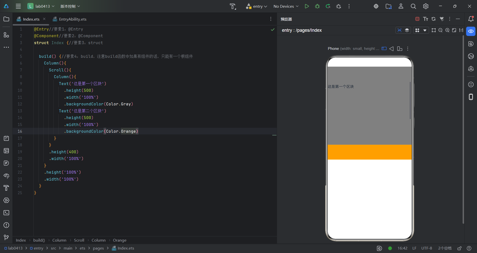
这是滚动组件的一个实现效果,在一个区域内滚动切换显示内容,代码如下:
@Entry//要素1:@Entry
@Component//要素2:@Component
struct Index {//要素3:struct

  build() {//要素4:build,注意build函数中如果有组件的话,只能有一个根组件
    Column(){
      Scroll(){
        Column(){
          Text('这是第一个区块')
            .height(500)
            .width('100%')
            .backgroundColor(Color.Gray)
          Text('这是第二个区块')
            .height(500)
            .width('100%')
            .backgroundColor(Color.Orange)
        }
      }
      .height(400)
      .width('100%')
    }
    .height('100%')
    .width('100%')
  }
}